Moody and meticulously finished, these two kitchens share design trends that you can recreate in your own home. We talk to architects and hear about the latest product developments from Fisher & Paykel’s design team
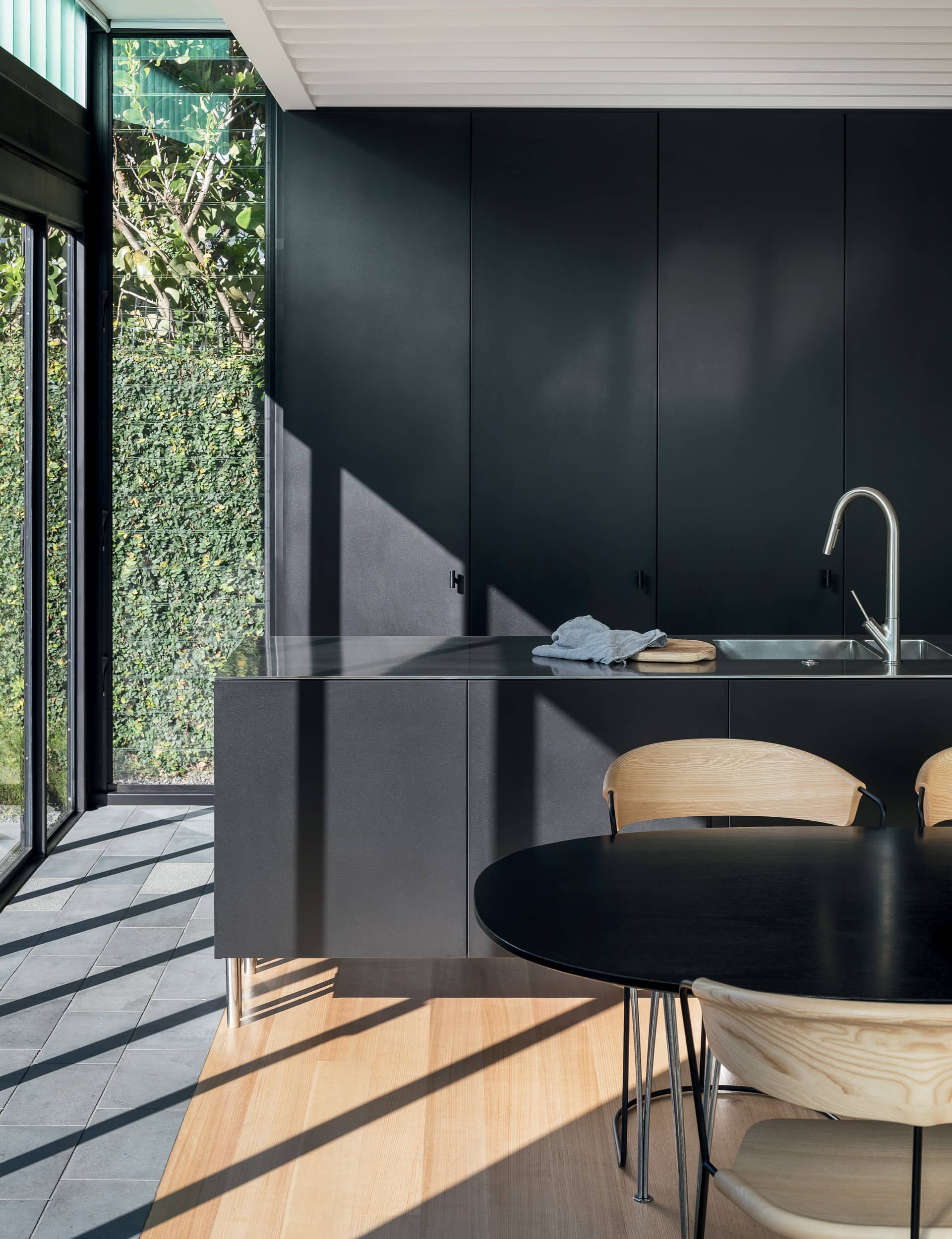
1. A connected kitchen designed like furniture
+ Location: Ponsonby, Auckland
+ Architect: Ken Crosson
+ Project: Architect’s own home
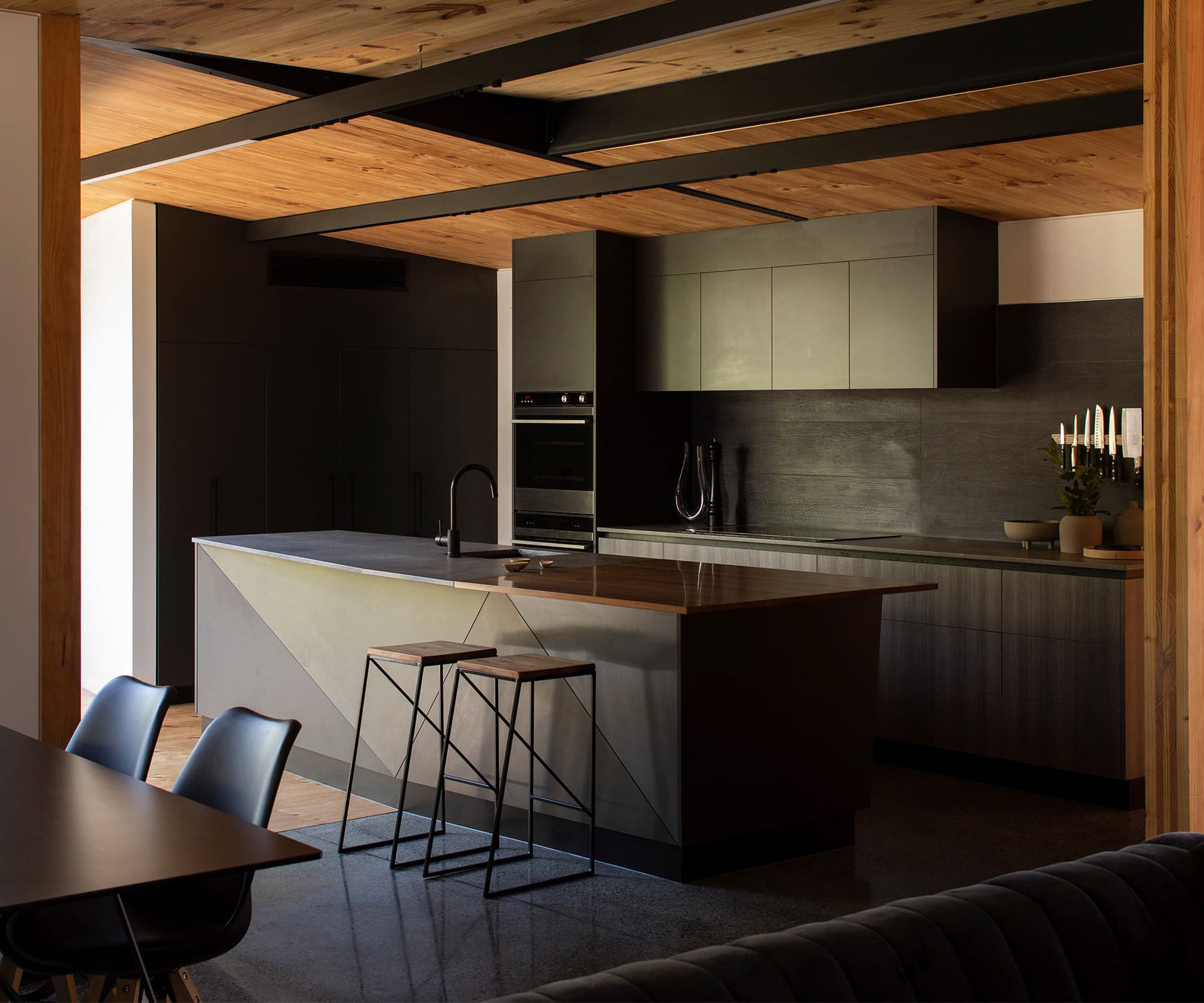
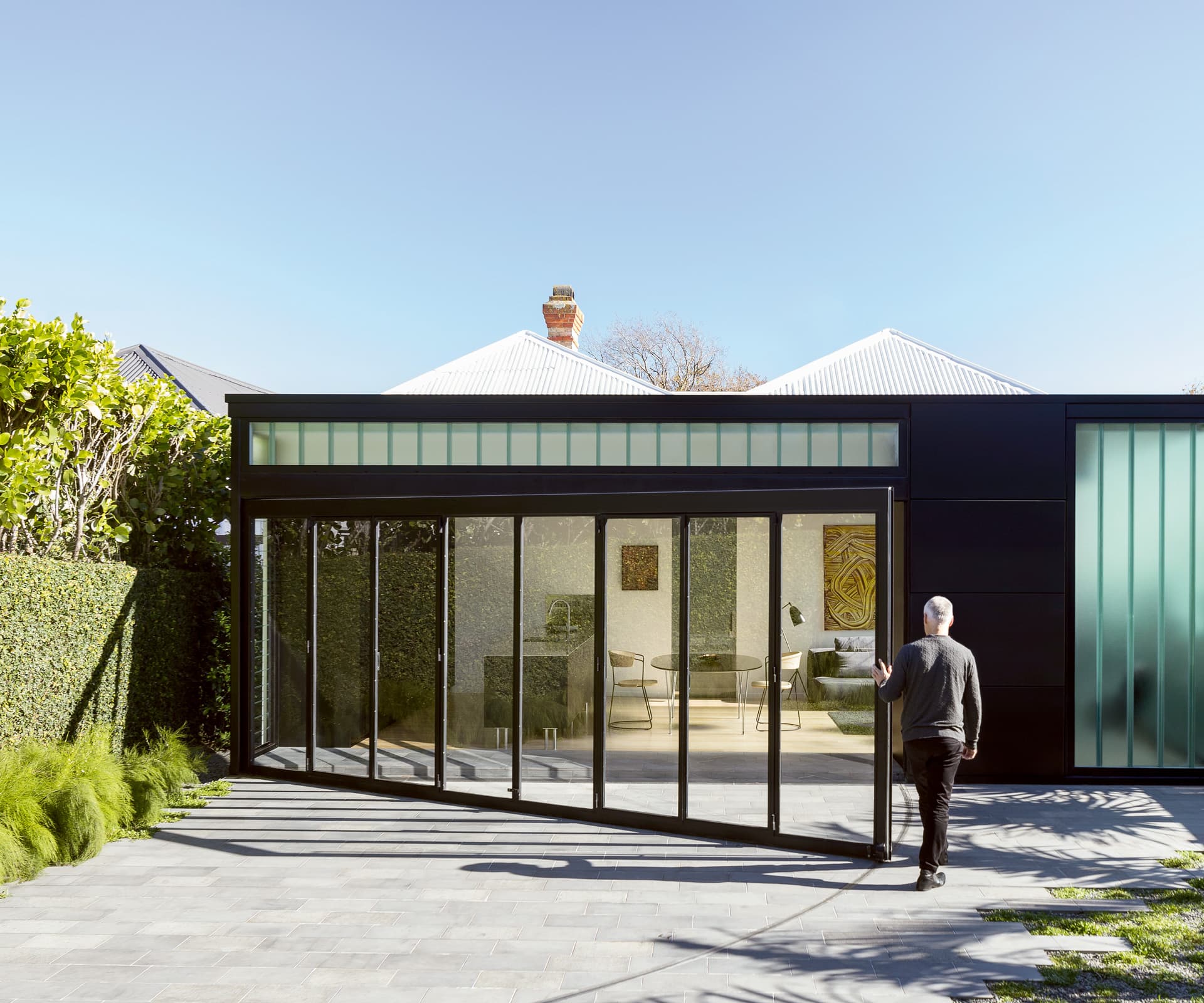
When designing this kitchen for his home, Ken Crosson referenced the farm gates of his childhood as a form of connection.
How is the kitchen placed within the plan and how does it relate to the rest of the house?
It’s at the back of the house and connects to the courtyard, which connects us with greenery and to outdoor living in the courtyard.
Were there any design challenges to overcome to achieve what you wanted?
The door was a novel idea and novel piece of engineering. I grew up on a farm and like the idea of big gates and thought why not apply this at home. It’s a simple idea but it needed to be easy to use. Bearings are located at the hinge side and a jockey wheel at the opening side. French doors sit within the gate frame so you don’t have to open the whole door if you don’t need to.
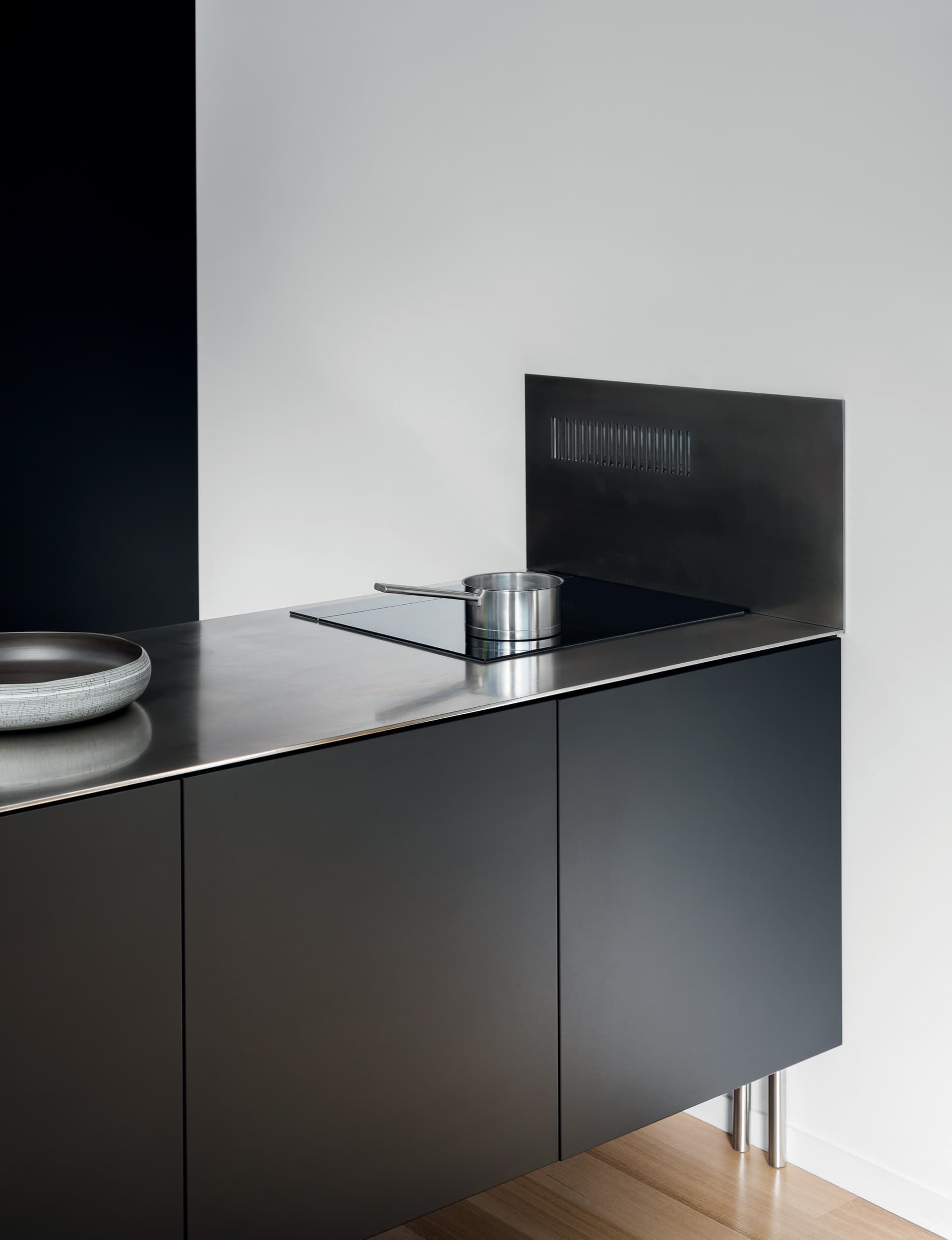
The layout includes a Fisher & Paykel Column refrigerator (pictured below) and two single DishDrawers in different parts of the kitchen – one in the island, and one in a utility area with a second sink behind the tall doors at right.
What do you enjoy most about the kitchen?
The idea was for it to sit in the background as a piece of furniture. The sense of space in the room was the most important thing, which is why the island sits off the ground. The kitchen feels lightweight in the space. The back wall has small, modest handles, while there are none on the island.
 The kitchen features a full suite of integrated Fisher & Paykel appliances, including the Column refrigerator to help create a furniture-like feel.
2. An entertainer’s kitchen in a small home
+ Location: Grey Lynn, Auckland
+ Architect: Craig Wilson, TOA Architects
+ Project: Architect’s own home
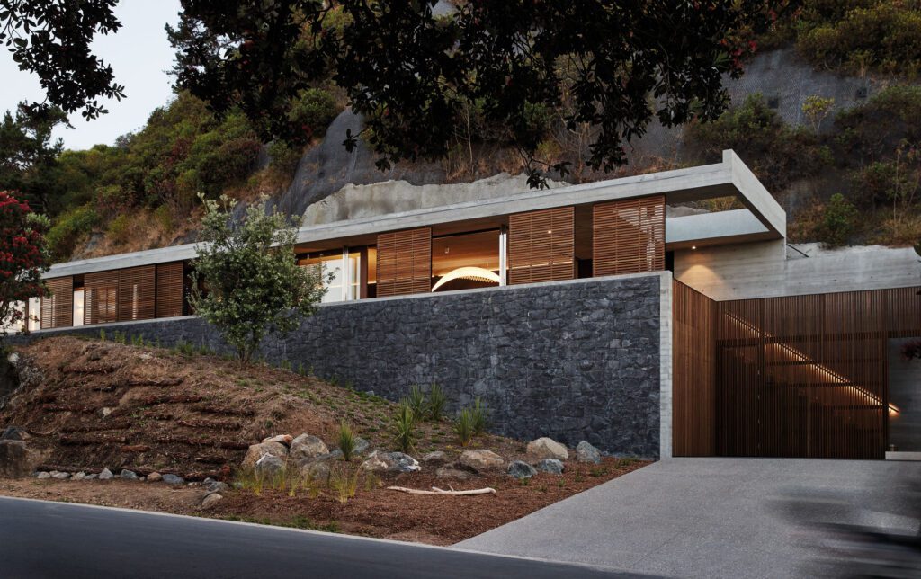
Faced with a steep, narrow site, Craig Wilson used his architectural smarts to design an efficient family home with the kitchen at its heart.
You have a young family and enjoy entertaining. How does the kitchen respond to your requirements?
I love to cook and entertain, so the kitchen design was something that took priority. Sitting at the centre of the house, it’s a space where I can entertain and work. I have easy access to the appliances (and, most importantly, the wine cabinet) and can continue cooking while interacting at a dinner party, or when people are enjoying the sun on the deck. The scullery behind the kitchen makes it easy to keep the kitchen clean and tidy no matter what the occasion. With a one-year-old always on the go, we’ve found that clean, modern lines and soft-close drawers have minimised the need for additional baby-proofing.
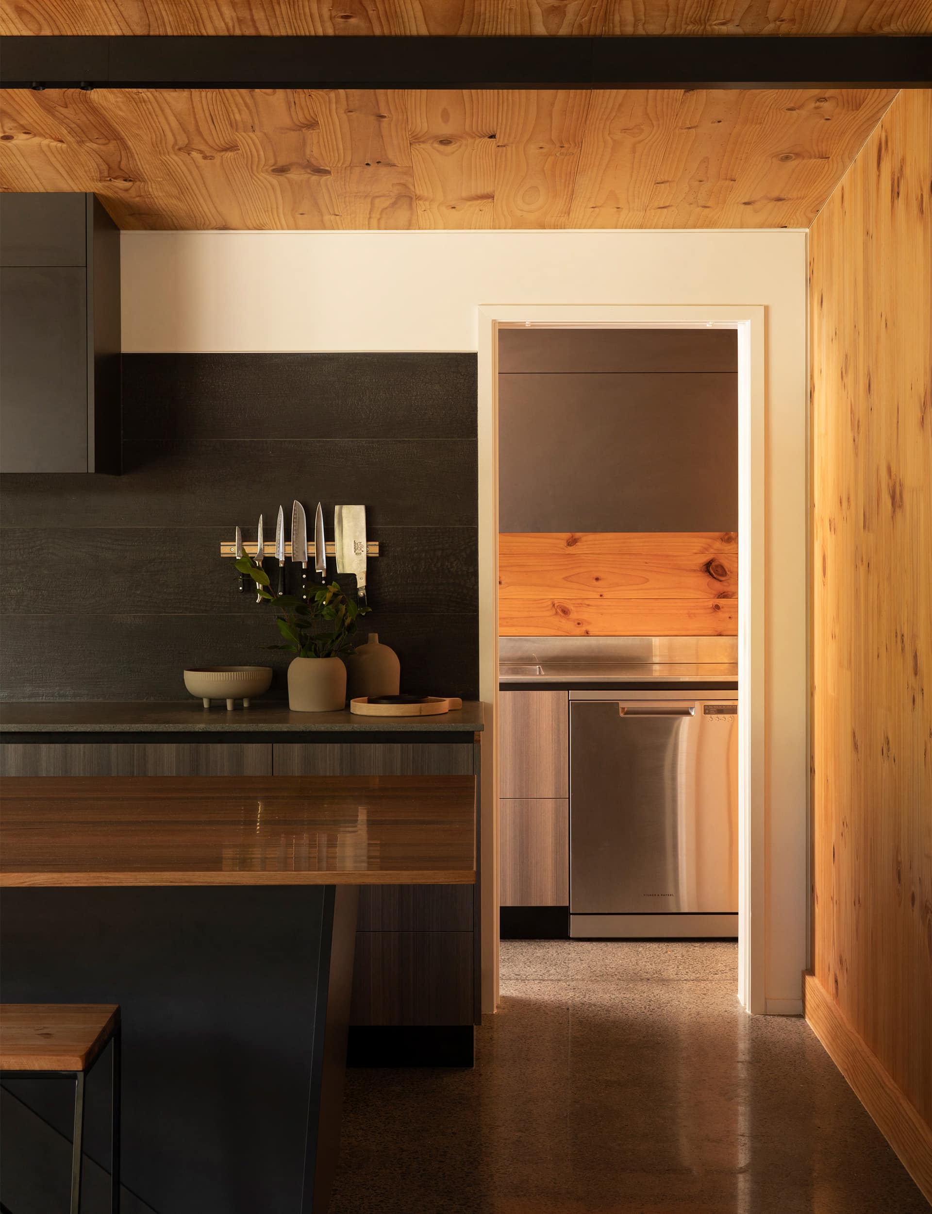 The scullery houses a second dishwasher and additional storage and bench space.
Were there design challenges to overcome to achieve what you wanted?
It’s a very narrow site, so space was always at a premium. We worked hard to ensure dimensions were efficient while still providing a spacious look, but we didn’t want our design struggles to be visible. Ensuring the design responds to its challenges, such as tapering forms and odd angles, has created the distinct fractured forms and interesting lines. There’s a lot of warm timber in the house so we wanted the kitchen to create a strong contrast while continuing the home’s natural palette.
What design aspect of the kitchen do you enjoy most?
Good kitchen design and great appliances make it very easy to be a good cook and Tuarangi’s design has helped me up my game. I really enjoy the small details – my extra-large spice drawer and knife rack bring me much joy and the particularly beautiful swamp rimu benchtop is a bit of a highlight.
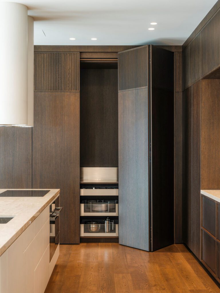
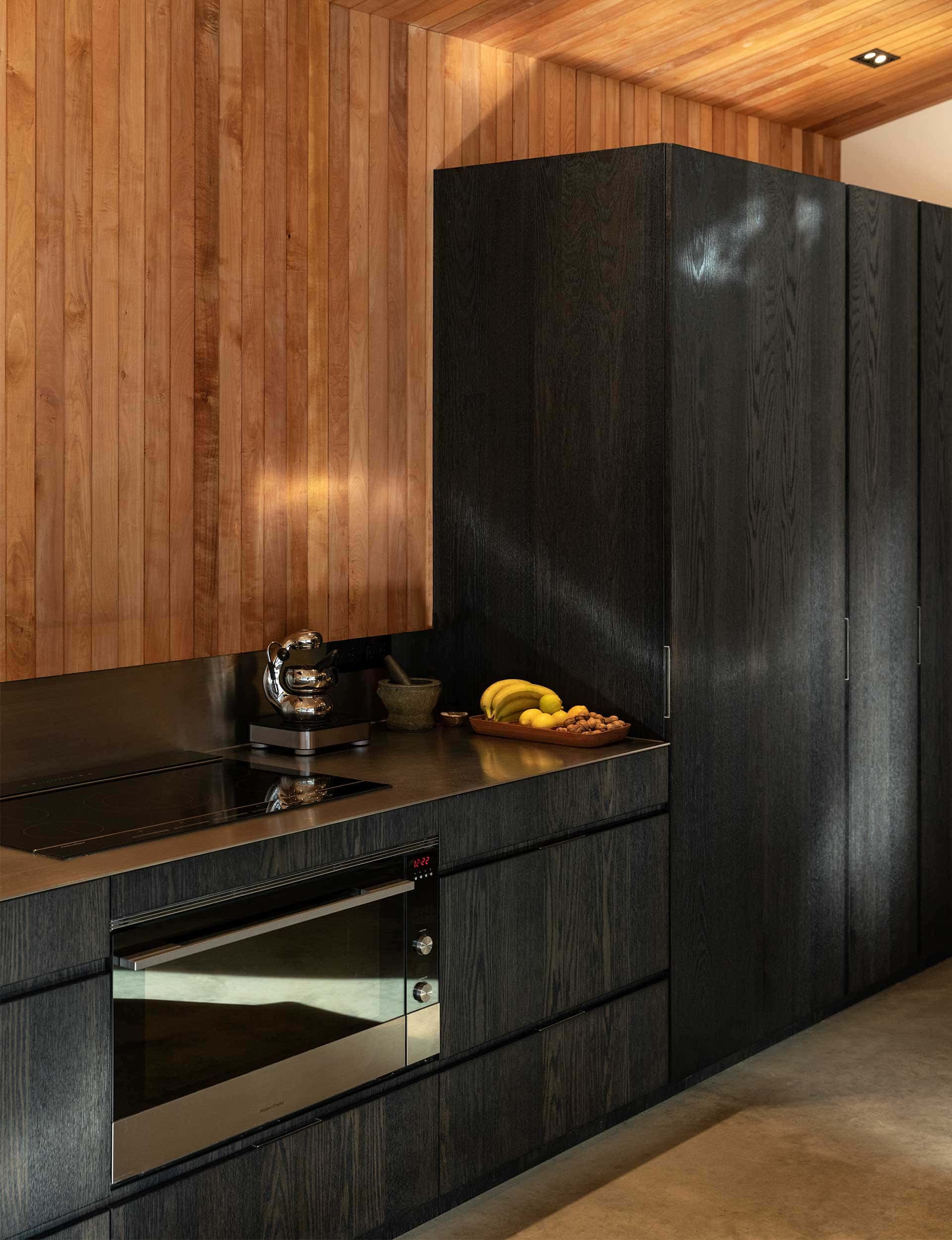 By Hofmans Architects, the verticle elements contain the pantry and fridge.
The design challenges and new trends for kitchen
Fisher & Paykel’s Senior Designer, Product Development – Simone Stephens discusses design challenges, inspiring details – and the future of our kitchen spaces.
What are the big challenges and opportunities in kitchens?
Kitchens are now multi-use spaces, and need to be high performing on many levels. Like a building, a kitchen is made up of many disparate parts that ideally come together as a cohesive and resolved space. It takes a lot of time and effort to detail these, and we know our appliances are just one aspect – we work with designers and their clients to find the right appliances and create product information to support the design details. A big (but exciting) challenge is to create something timeless that has longevity of materials, usability, and sustainability.
What do you see coming over the horizon in terms of design trends for kitchens?
The craft, materials and consideration going into kitchens and homes is creating highly personalised solutions. We talk a lot about kitchen as furniture, but in many projects it is even further – even the furniture is built-in and bespoke. We see more and more zones: designers are breaking away from the triangle placement for appliances that was all about a single person cooking efficiently, to thinking about how areas can be enjoyed by more than one participant.
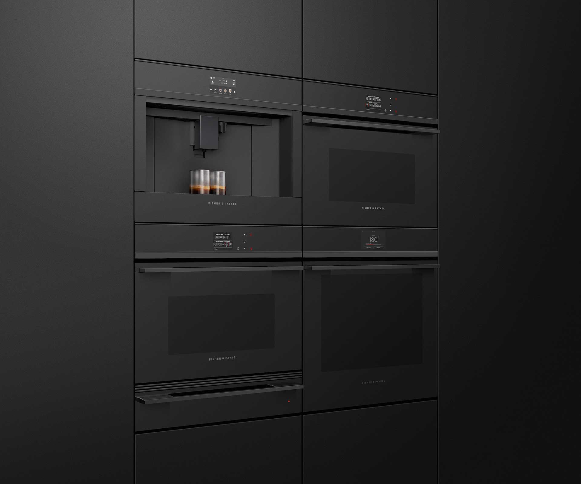 Products within the Companion range, including the 11-function oven, warming drawer, coffee maker, combination steam oven, combination microwave oven are designed to work seamlessly together.
The latest range of kitchen appliances
Fisher & Paykel’s chief designer, cooking – Adam Moody discusses the brand’s new built-in cooking companion products in black, due to launch early 2020.
Why the new black range?
We’ve made all of the design elements in the new range black. There’s a lot less visual contrast within the product, which results in a more refined palette and materiality. They can either blend in with the environment and recede into the background to provide a minimal look, or become the hero piece and really stand out.
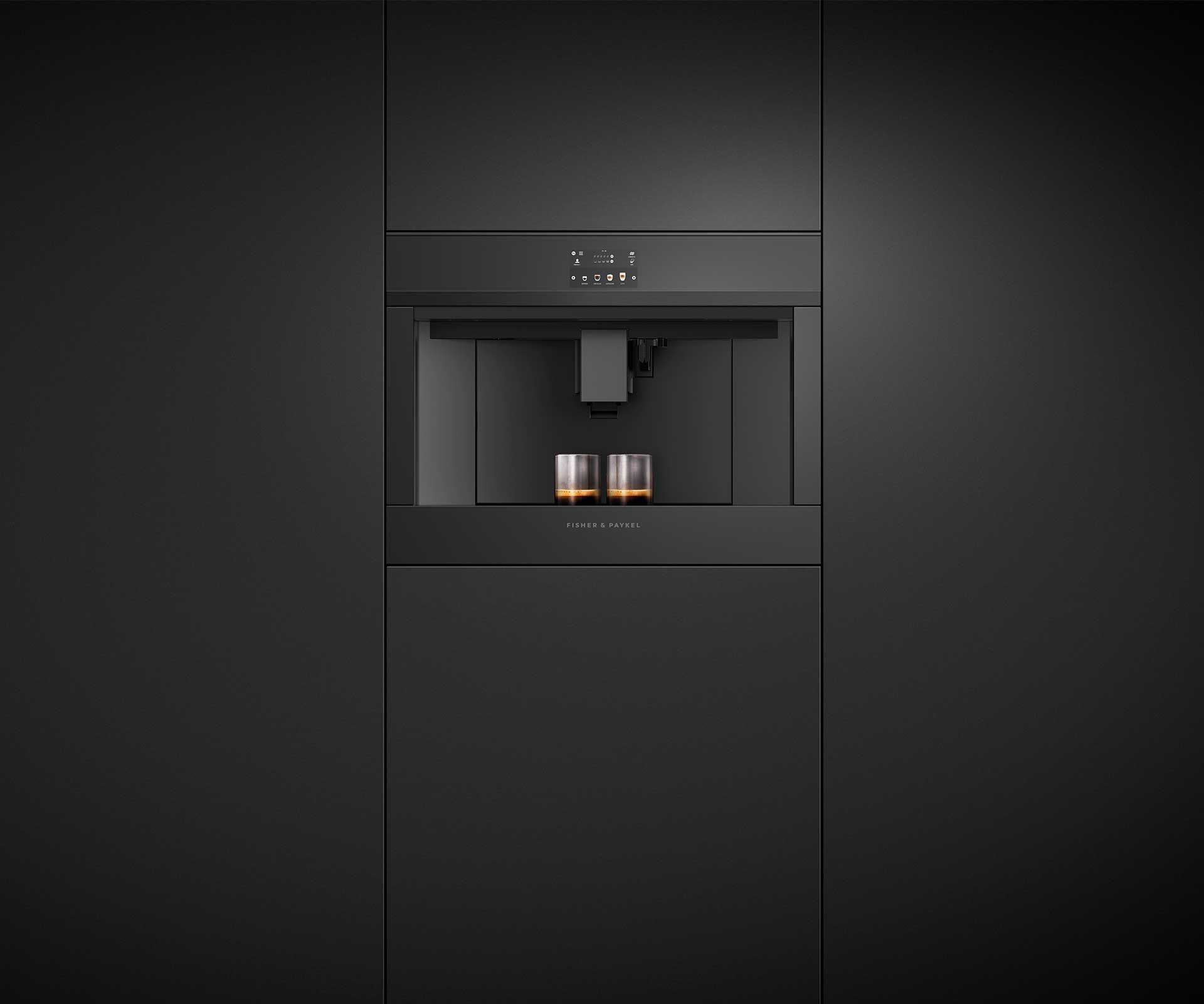 The coffee maker has a refined aesthetic and an impressive 13 different beverage options.
How do the products tie together?
The design is carefully considered – the products can work on their own or together with consistent dimensions and cohesive design detailing. We get really excited about seeing our products seamlessly installed into a well-designed kitchen, where the architect or designer has really thought about finer details. This follows through to the detail we put into the design of our products.
Built-in cooking companion products will be available in Black early 2020
Photography by: Simon Wilson, David Straight, Patrick Reynolds.
This article was first published in HOME New Zealand. Follow HOME on Instagram, Facebook and sign up to the monthly email for more great architecture.
