The 2024 Home of the Year | Boathouse Bay by Crosson Architects
For the first time in the history of the Home of the Year awards, a multi-unit project has taken the top accolade. Crosson Architects’ Boathouse Bay displays the ideas that should be informing our architectural vocabulary, and, more importantly, the community building ethos that should be at the heart of any higher density project.
As a traditional developer of build-to-sell multi-units, part of your role is to find efficiencies in repeatable forms. If you engage an architect to design one apartment typology and repeat it 50 times, your design fees are for one apartment, plus the formula to replicate it 49 times and stack them efficiently. Compliance costs are lower. Construction fees decrease. Materials can be manufactured or prepared en masse.
In the best of cases, the savings found through that formula trickle down to buyers. In the worst cases, you get dwellings with serious compromises in quality, craftsmanship, longevity, and well-being.
It is no surprise, then, that for many years we have come to associate apartments with relatively unimaginative and uniform housing that seeks efficiency rather than wonderment.
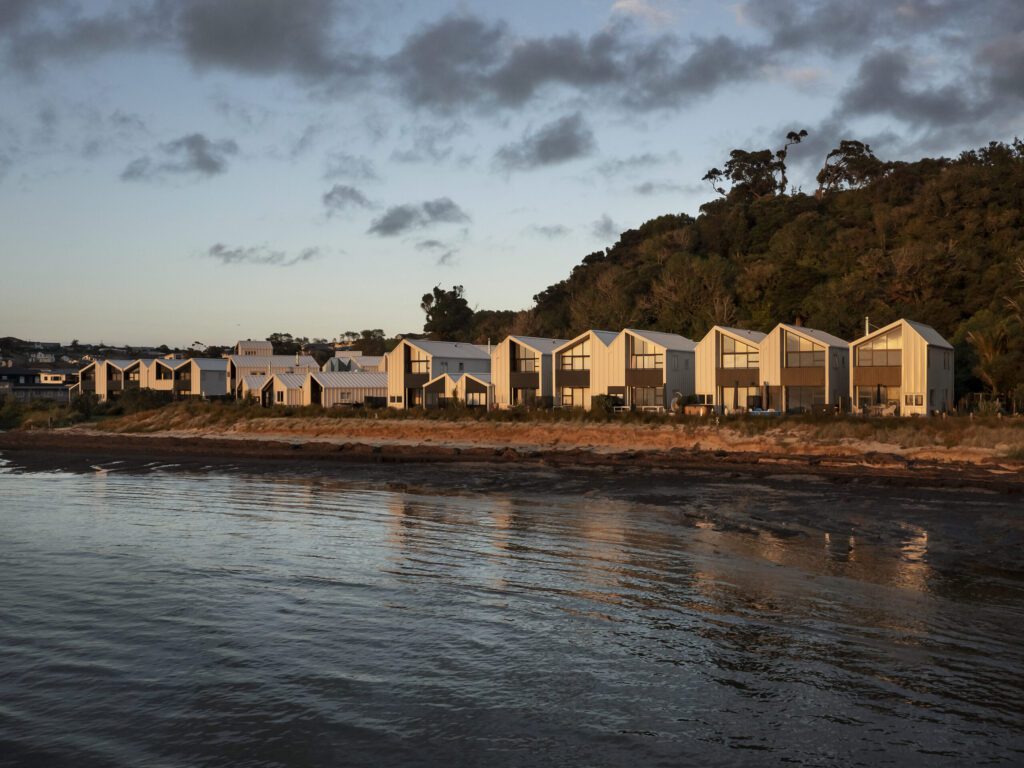
Yet … here we are, with a multi-unit project of 33 residences all clustered together on the northernmost end of Snells Beach as winner of the Home of the Year 2024.
The site is at the end of a small road on the furthest enclave of a town of approximately 4000 people, one hour north of Auckland. This complex is spread along a ragged, crescent shape sandwiched between verdant hills, the adjacent coastline, and, to the south, sleepy houses peeking out through the sea mist.
Brick Bay Wines, with its stunning sculpture trail and restaurant, is a mere kilometre away, and the hypergentrified Matakana a 10-minute drive. Kawau Island’s Mansion House, its adjacent Boating Club, and enticing post-sail fare can be reached via strong biceps and a sturdy kayak or dinghy — preferably of the sailing variety, so as to take advantage of the southerlies that prevail here.
The single dwelling that previously occupied this space was divided — in a moat-like manner — from the rest of the coast by a small creek that flowed into the sea, resulting in a ‘manor on the hill’ persona.
“Locals used to walk down the beach and then turn around as soon as they got to the creek,” says Sam Caradus from Crosson Architects. “Early conversations at the office were about creating a sort of democratic connection to the beach.”
On paper, the concept is simple: to formulate a modulation of a repeated typology to create a village cluster.
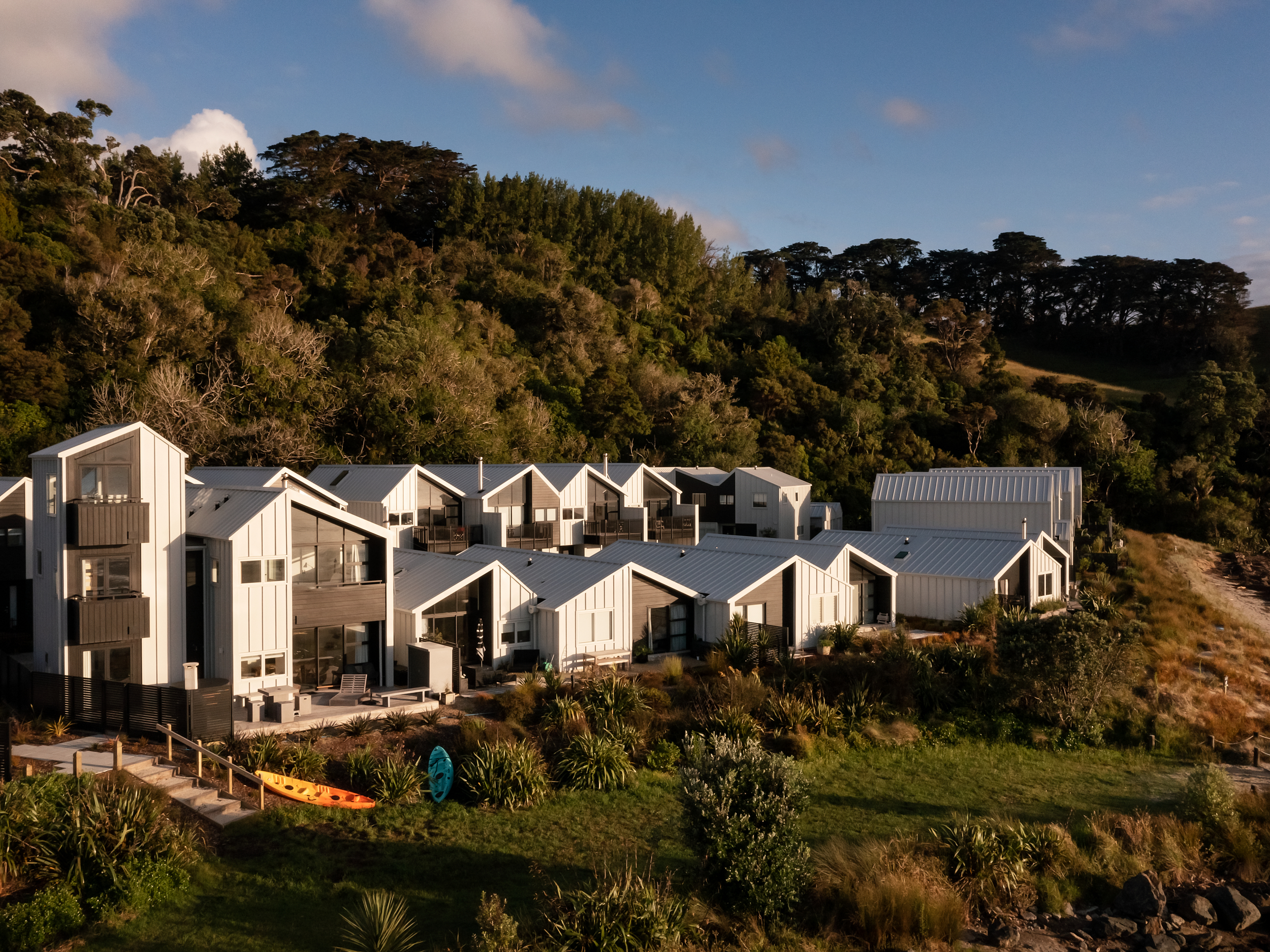
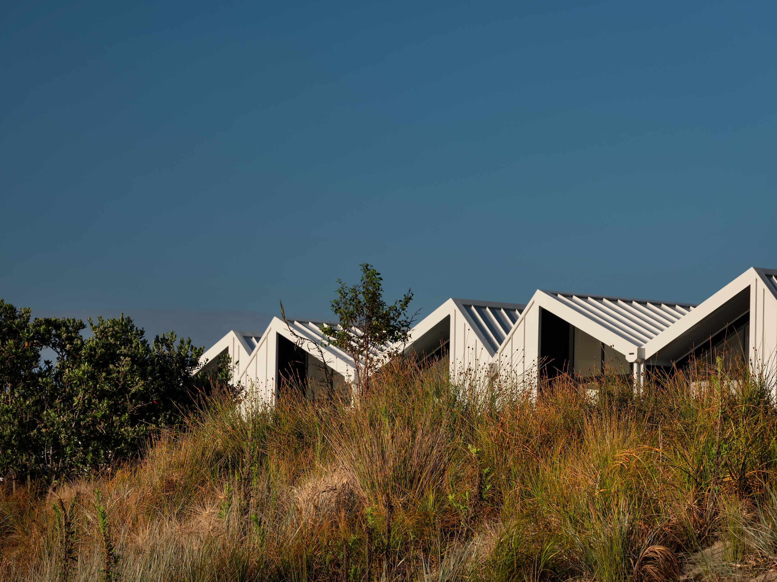
Gables are pushed and pulled, their proximity to each other seeking tension rather than balance. Heights are arranged in a seemingly haphazard way, with only materials and colours — off-white Metalcraft Espan profile and dark brown weatherboards — fighting to maintain a cohesion of some sort.
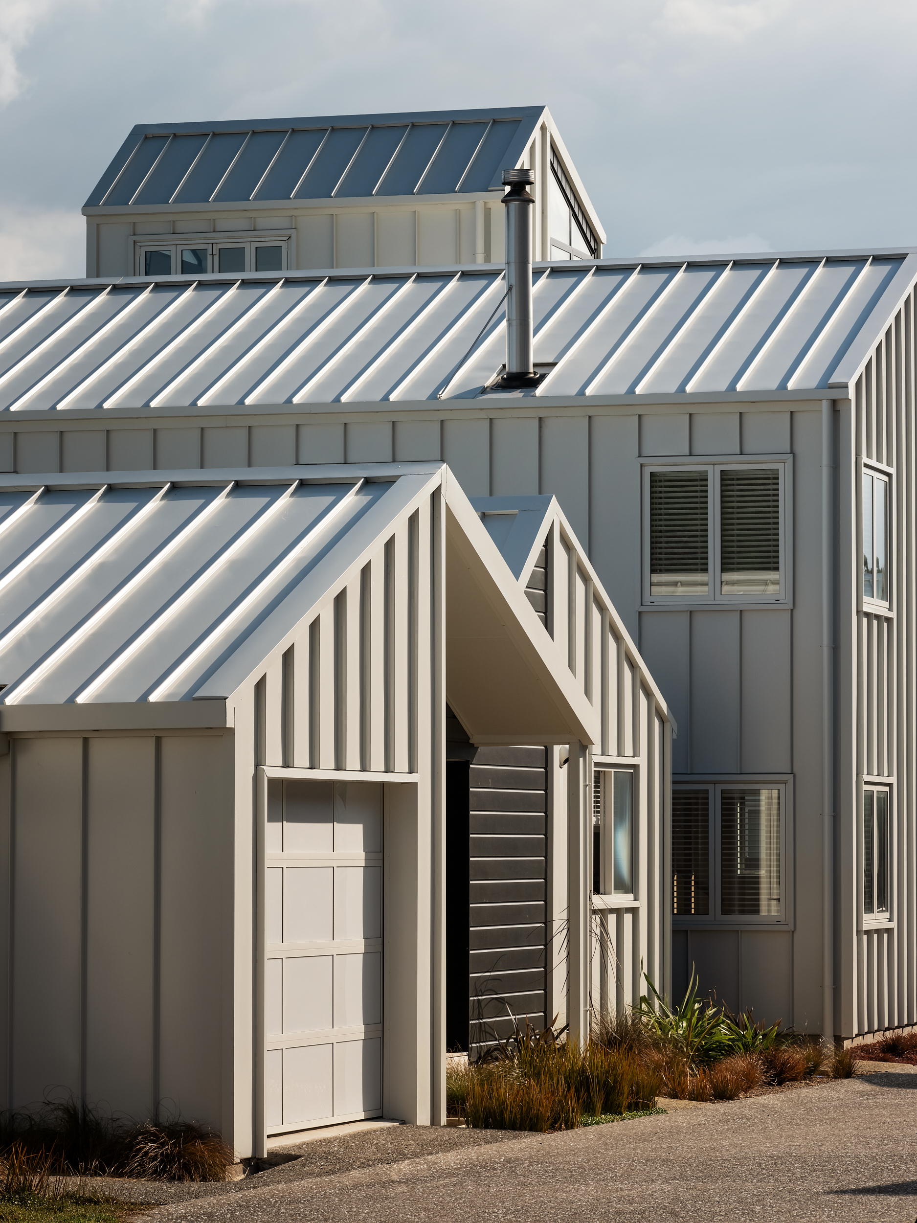
Modulation happens at all levels at Boathouse Bay: from larger brushstrokes (master-planning) through to details (type of aggregate — a mixture that uses seashells and varies in colour from grey to yellowish) and from unit sizing through to orientation of materials.
Due in part to the irregular topology and curved nature of the site, positioning of these homes naturally fell on a somewhat scattered pattern of clusters of up to five buildings.
At first sight this is a Kiwi “beachside row of houses; a jaunty assemblage with something of the shanty town in it,” according to our judge Megan Edwards.
She says that this place succeeds, in part, because it manages to create a “designed vernacular, [which is] a massive achievement”.
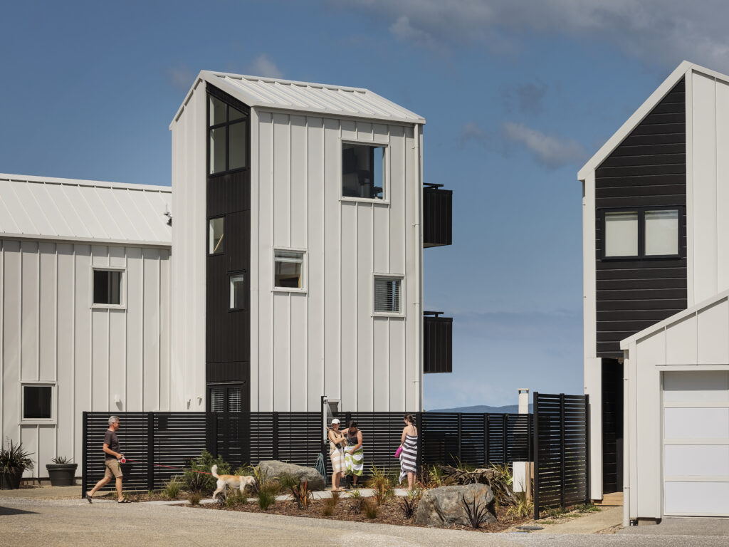
The clusters were organised to face either the ocean or a combination of ocean and bush.
“Everyone comes down here and wants to get to the seaside,” says Mat Peters, director of Avant Group, the developer behind this property, “but, actually, we forget about how important our bush is, especially around the coastline.”
Considerable resources were spent on revitalising that green belt, ensuring easier access to it from that end of the town, and making certain the height of the units allow it to be visible as a dominant backdrop.
“As you come down on the left-hand side, you’ve got a little gateway building there, which is a little, three-level tower,” explains Peters. “The idea of that is to formalise the entrance; it tells you that you’re now walking into something that’s a bit more formal … However, you then start to go through a series of experiences that were designed to help create a sense of community.”
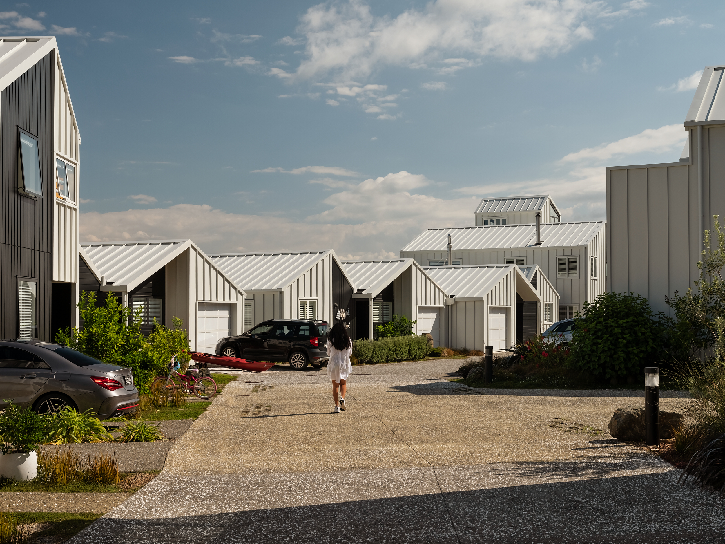
One of the reasons this complex endeared itself to the judges was the undeniable quest for every aspect of the project to strive toward human connection.
“There are simple little moves,” says judge Jeremy Smith, “[such as] opening verandahs to look into the shared spaces, removing kerbs and shaping edges loosely, raising entries as pause points and connecting them to the street, making shared garden spaces where the community meets for Fridays drinks and birthdays.”
Add to that a seeming lack in hierarchy of the different-sized units (e.g. the larger ones are skinnier; the smaller ones have great views) and you have a series of moves that go beyond the aesthetic and into a much more succinct desire for well-being.
That, in a nutshell, is what made this project rise to the top, beyond the cool or the beautiful, past the clever or the experimental; this place accomplishes something deeply generous for its residents, and acts as a strong example to follow and a formula that could be oft repeated on our quest for liveable higher density.
Edwards agrees. “[They] are seemingly ad hoc but, in fact, are skilfully designed exterior spaces for encountering others.”
The most obvious of the moves is this variation of unit size, profile, and location, which led to a wide range of price points.
“It’s hard to actually deliver a community,” says Peters. “You actually have to have very variable typologies to make that happen, because then you’re enticing a variety of people to live in them. We didn’t want this to be only one demographic; we wanted this to be a mixture of people.”
During our tour we encounter an undeniable sense of community here, a crew of characters who all use terms like “life-changing”, and “like old friends” when talking about their neighbours. There is a young woman carrying an easel, a surfer on his way home, a mother enjoying a book in the sun while her child naps in grandma’s house.
“We have some retirees, a young lady who owns a business, there are single women who find this place really good because the community is so strong. If you’re going to create a community, it’s got to happen through a variety of demographics,” insists Peters.
Car garages are either beside the house or clustered away from them. Their roller doors are made white to match façades and — in that Crosson motif — translucent so that the movement and life of the interior at points spills onto the laneway through glimpses of the light and shadow shifting inside.
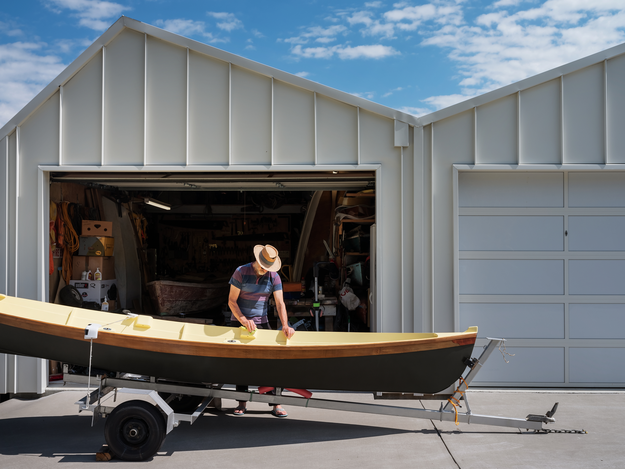
There is also a cluster of five workshop sheds, which are independently owned by individual residents but, apparently, have surprised the developer by becoming almost like communal property.
“The workshops summarise the community,” says Smith, “in that they are now collectively rather than individually used.”
There are little pockets of community: courtyard-like spaces tucked between units, which provide views; BBQ spots; seating for weekly gatherings. The planning of the laneway works incredibly hard at being a shared space rather than an anti-social, car-only thoroughfare.
Inside, the variation between houses is just as marked, and reflects that varied demographic. Rather than strict body corporate rules restricting design to a set of pre-approved palettes and modifications, each unit’s interior is a remarkable expression of its owner’s personality.
This project, agree the judges, would have been a strong contender in each of the City, Green, Small, and Multi-Unit categories, and it is its repeatability in different contexts that succeeds at a big-picture level.
The architecture is all around, quietly working in the background, almost subliminally, alongside an incredibly thought out landscape (by Boffa Miskell), to fuel a palpable sense of well-being and neighbourliness.
“This was an opportunity to put together a completely new community,” says Peters. “We could have made a hell of a lot more money if we had just sold the site for a big house, or you could have put three or five big homes here, but we didn’t want to do that.”
Words: Federico Monsalve
Photography: Sam Hartnett, David Straight
Judges’ Citation
This development is an exemplary model of multi-unit design, embodying the quest for community living through a marriage of architecture, landscape and master-planning.
Described as “permanent baches”, these dwellings foster a collective spirit, weaving together the sand and the bush into a harmonious tapestry of living spaces.
The development eschewed greed, opting instead to shape homes full of modulation and openness, which, combined with a concerted effort to revitalise the nearby bush and democratise the beach, showed a development with its heart in all the right places. It could have been a strong finalist in the Small, City, Multi-Unit, and Green categories, making this a highly deserving overall winner.

