Assembly Architects drew on lightweight Californian modernism to craft this elegant mountain retreat
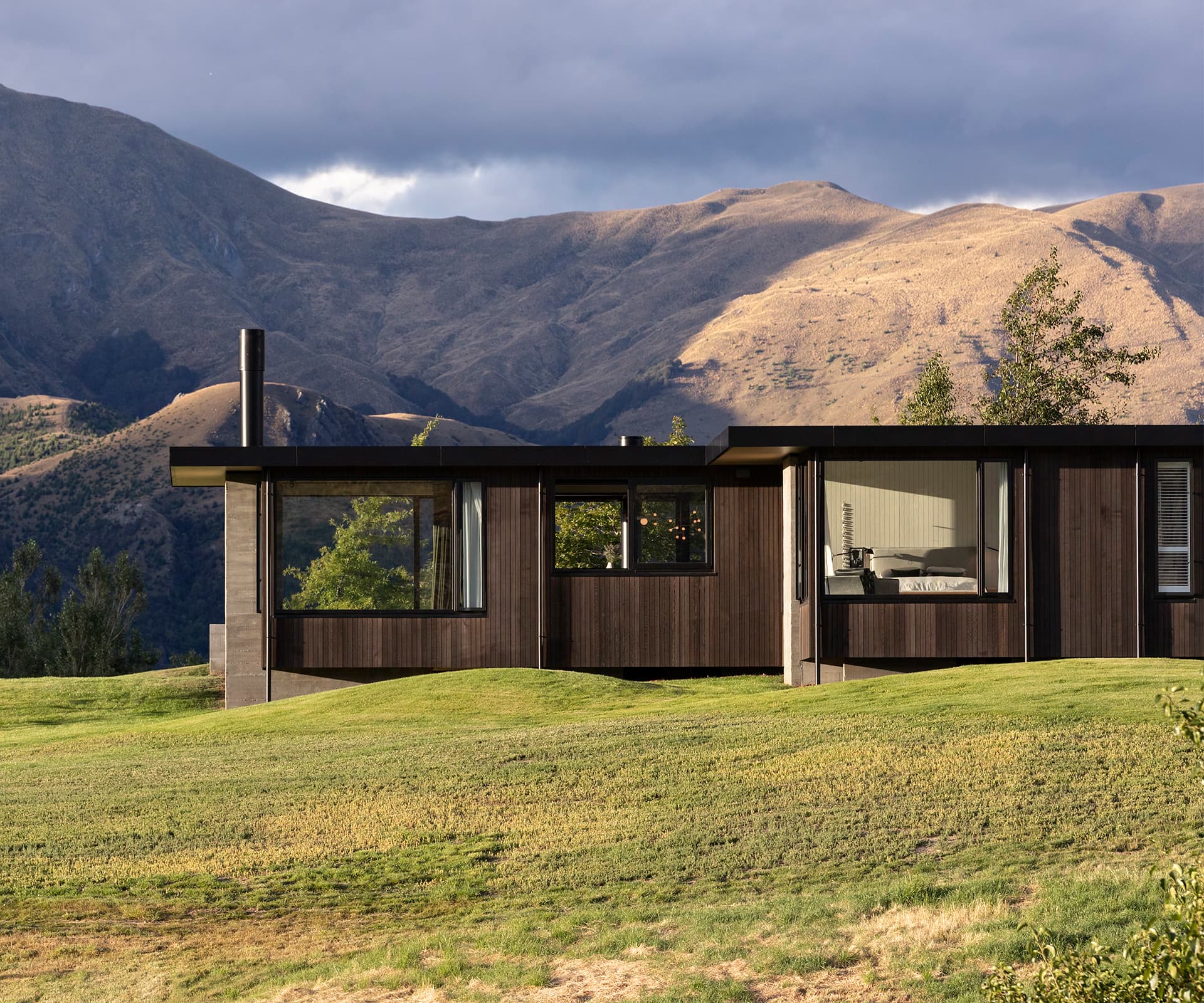
The privilege of living in Central Otago’s dramatic landscape often means making design compromises. Subdivisions in the region tend to have strict covenants – usually requiring gabled rooflines and the use of stone, all of it solidly anchored to the ground by a thick concrete slab.
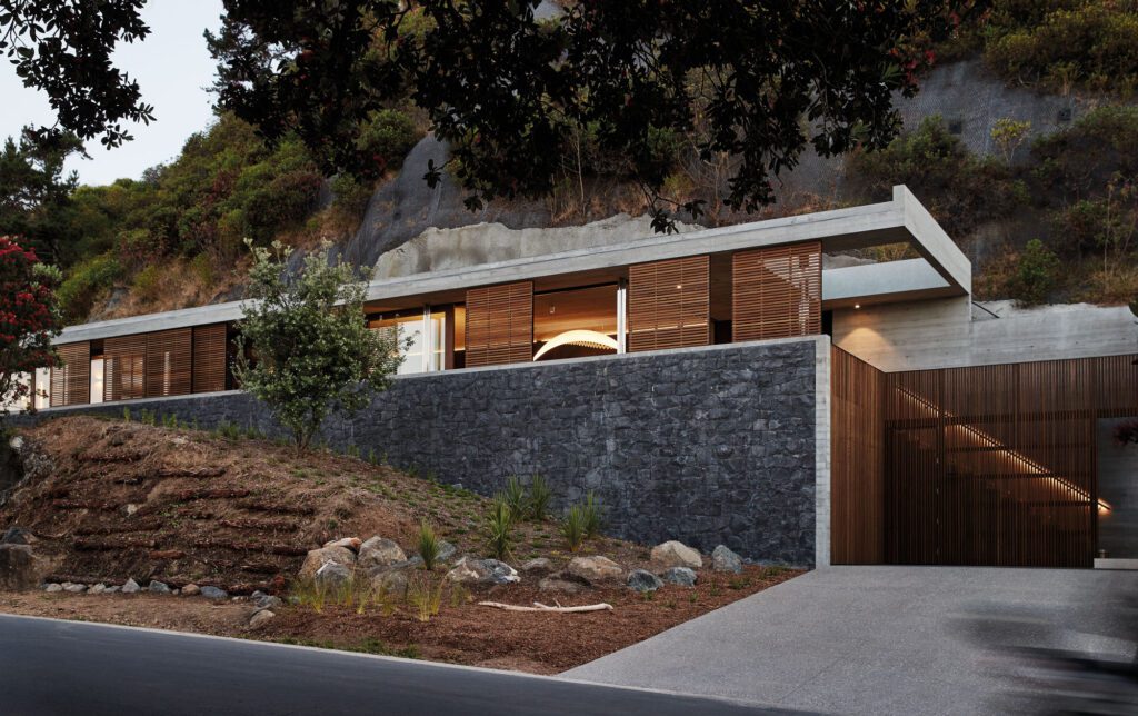
Louise and Justin Wright of Arrowtown’s Assembly Architects were given a welcome opportunity to dodge the pitfalls and clichés of big Queenstown houses: the chance to work for a client with a passion for mid-century modernism and a collection of mid-century furniture, in a subdivision with relaxed design rules. Their response – a flat-roofed, modernist-inspired family home – sits delicately in the landscape, rather than trying to impose itself.
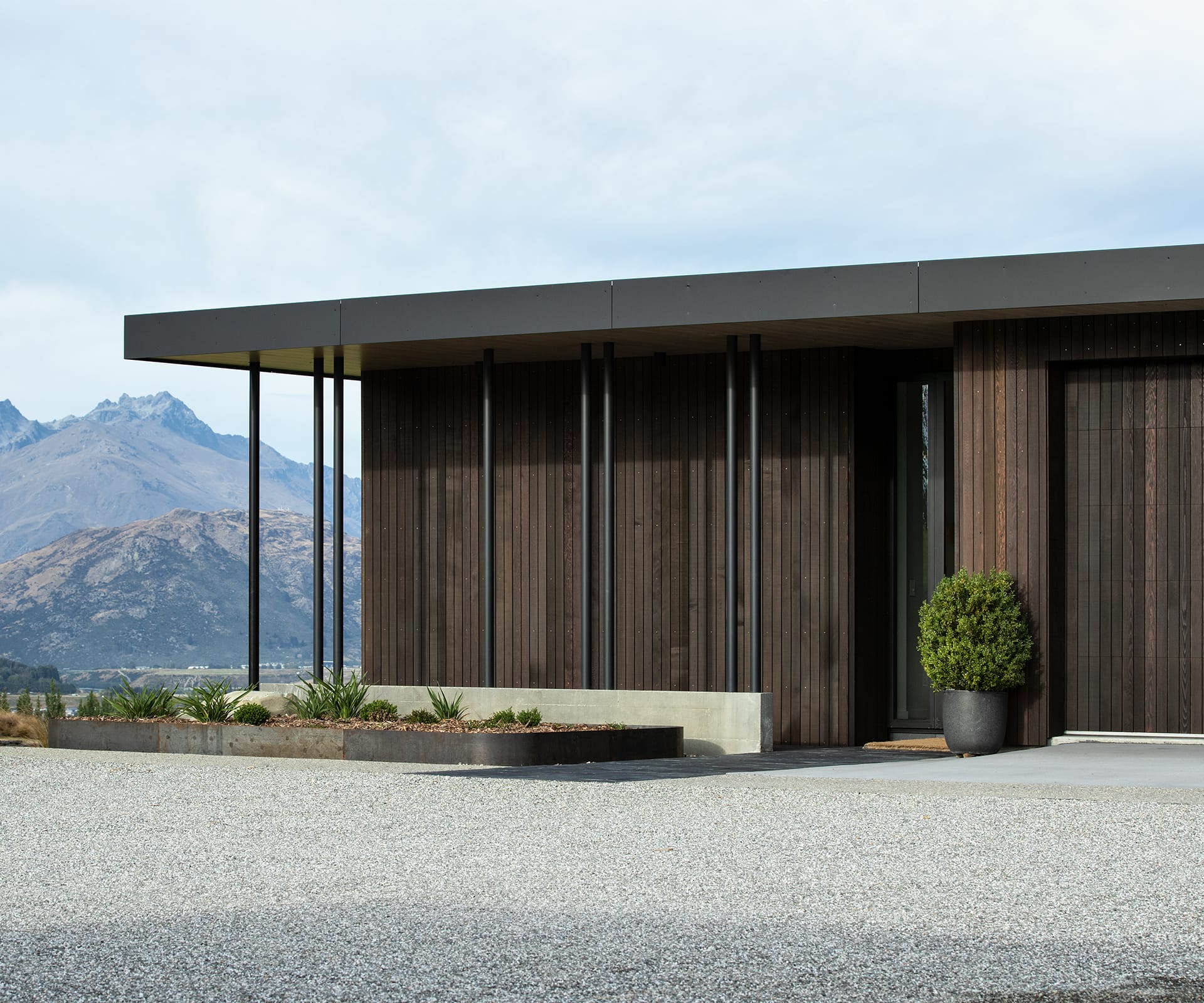
Taking cues from classics such the ‘Kaufmann’ house in Palm Springs by Richard Neutra, the roof gives the house its defining line; a horizontal marker designed so “it doesn’t break the ridgeline of the landscape beyond” in the way a gable would, says Louise. The modernist roots are clear: elegant lines, simple forms and a limited range of materials.
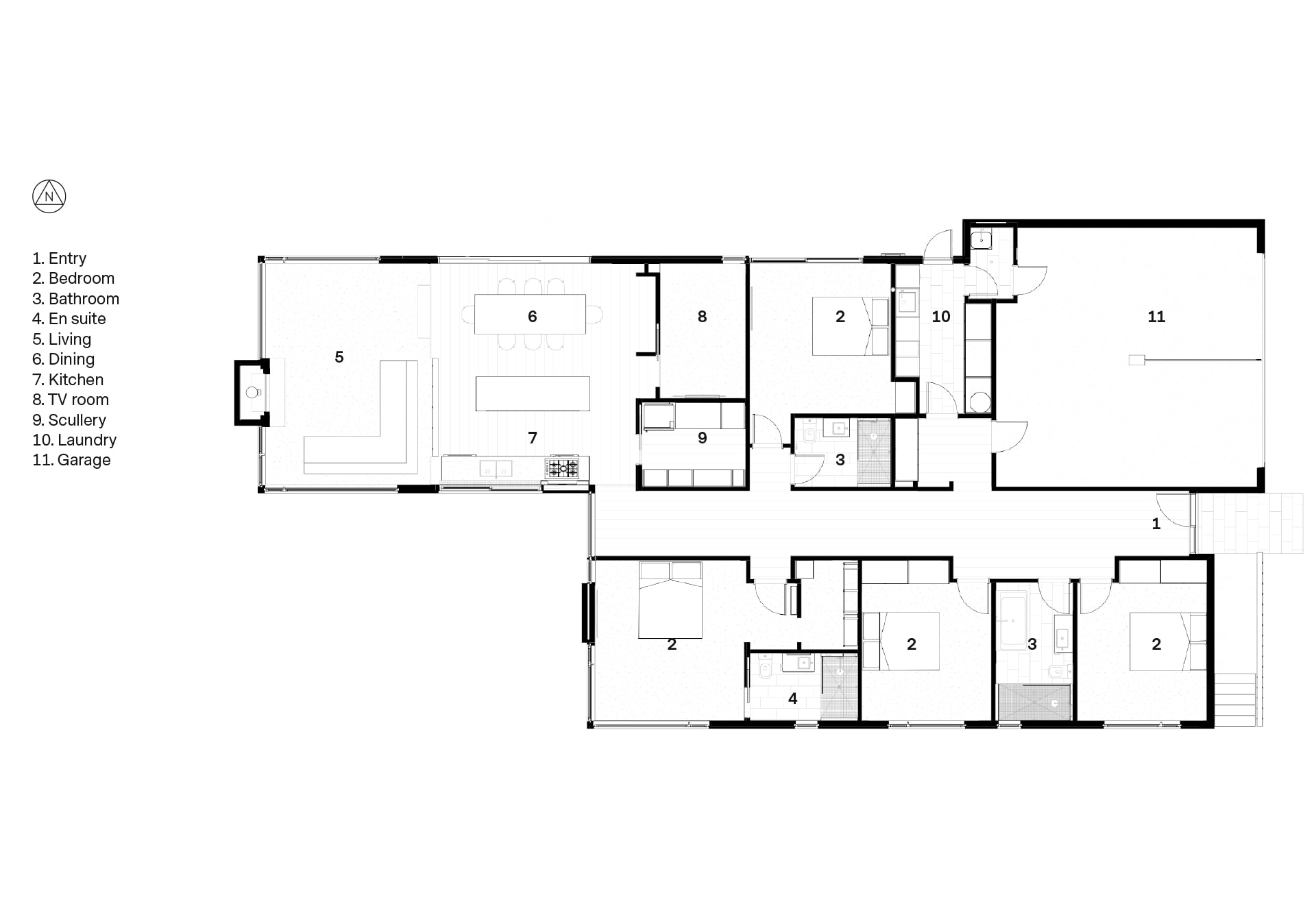
The house consists of two boxes wrapped in dark cedar, inside and out, and connected by a hallway between them. The living areas, a bedroom and garage are in the northern box; bedrooms in the southern box. To the north, a sheltered outdoor room with fireplace.
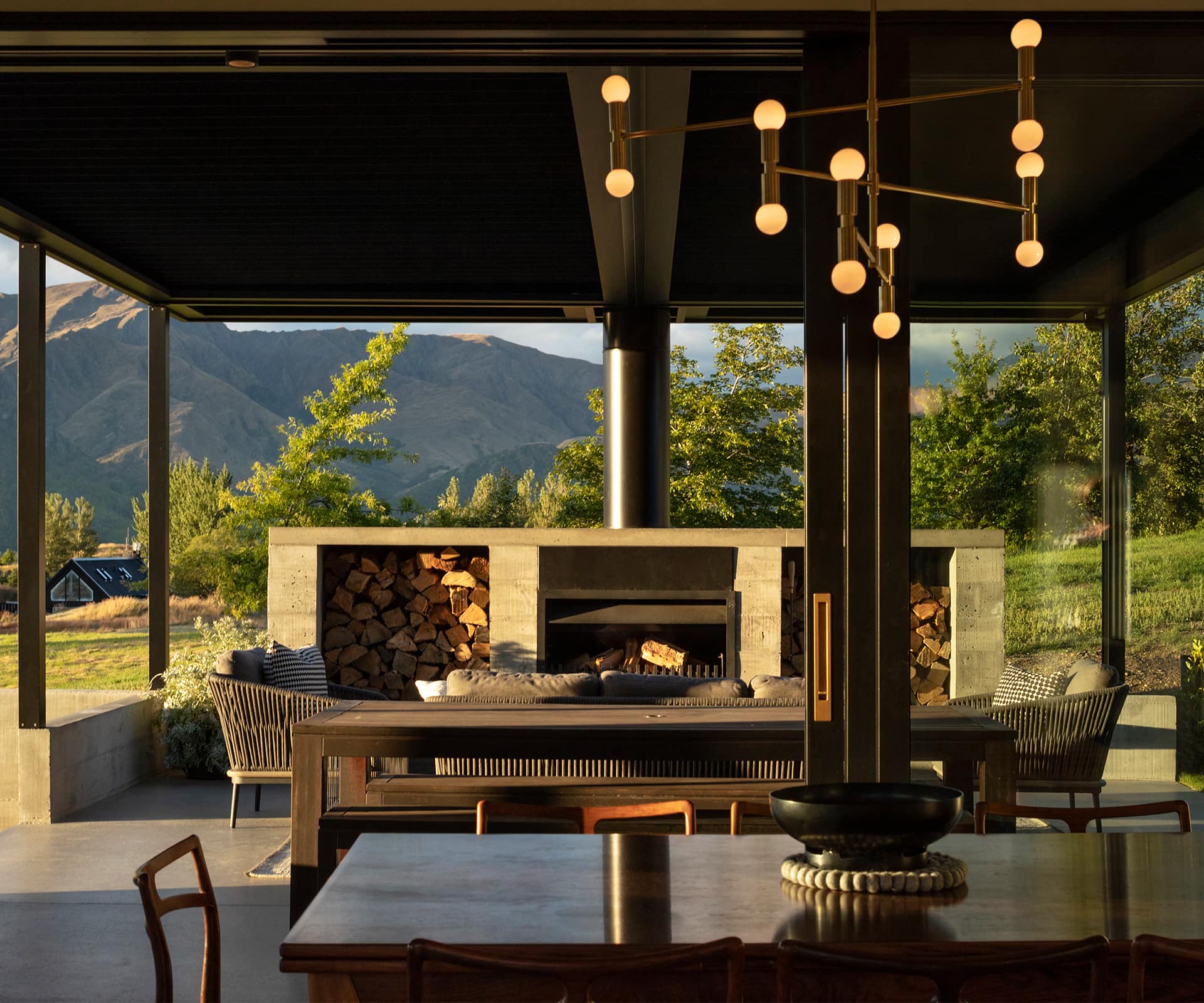
Throughout the house, in-situ concrete stands in place of the usual Central Otago stone. As much as it’s a strong aesthetic feature, it’s also doing a huge amount of structural bracing. From the outside, concrete footings are clearly visible in the space between ground and floor; it’s also the defining material in the outdoor room. The Wrights have run the concrete into the house as a design element, too, where it acts as a low dividing wall between the living area and the kitchen/dining space.
There are plenty of other moments where structural components double as design features. Rather than opting for a single beam that spans the entire open-plan space, the Wrights have gone for finer, visible steel structures. Painted black and propped by slim columns, these help delineate a boundary between the living and kitchen/dining areas, while still allowing a natural flow between them. There’s a thermal dimension to this, too: the steel is completely contained within the building envelope.
On the outside, it’s continued by heavily insulated timber, which doesn’t conduct heat, and more slender steel columns. As a result, the steel isn’t a conduit for heat to escape, or cold to penetrate. The floors and ceilings are also made from a structural material rather than a decorative one – cross-laminated timber.
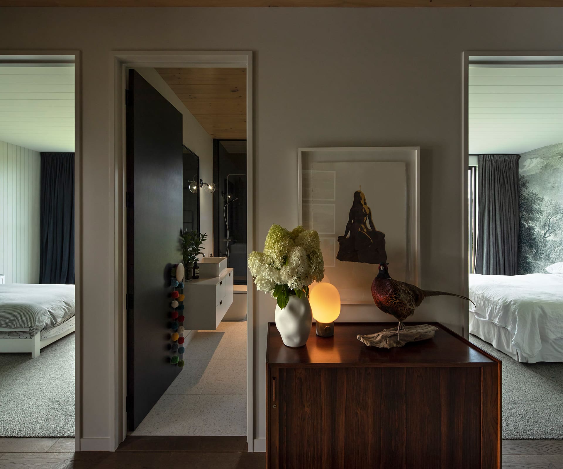
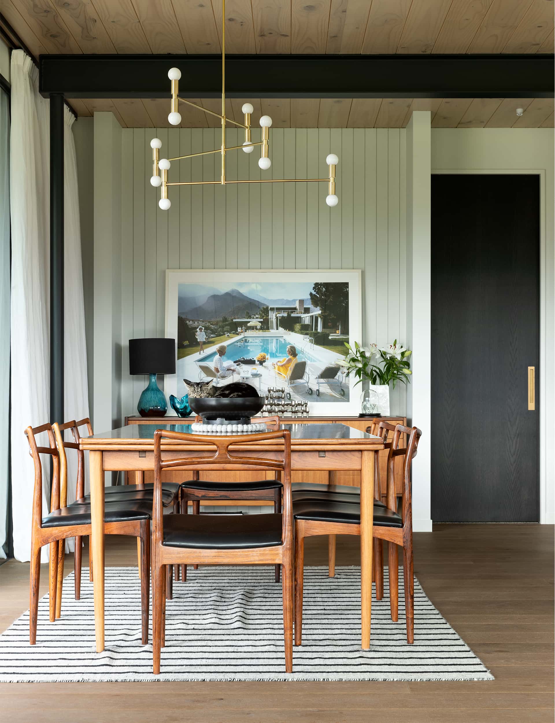
The surprise of this four-bedroom family home is that, with so much emphasis on elemental structure, it manages a softness and liveability. This arrives in a variety of ways. That dark wood in the hall is one example. The bedrooms also have a softer edge; moderately sized spaces, carpeted, with vertical boards painted in light tones. The client’s collection of art and mid-century objects adds a level of well-worn comfort, too.
The living room – at the end of the house, with a grandstand view – has a similarly softening effect. It’s slightly sunken, with an intimacy that comes from the flat roof line. “Often in living rooms, you get the reverse situation,” says Louise, “and you have a raised ceiling. But in this house, the ceiling is a strong datum, and the subtle dropping of the floor works really nicely on the interior and exterior.”
That drop – about two steps – is made possible due to a slight fall in the undulating land. The architects decided to exploit that fall by floating the house on concrete footings, rather than pouring a big slab. “An equally strong response to the landscape is to let it flow underneath, as it is to bulldoze and define it,” says Justin.
The result, as Louise points out, is a house that “hovers between the ridgeline of the surrounding hills and the land on which it sits”. In a region increasingly pocked by gabled monoliths, it’s a rare and subtle piece of modernist elegance.
Words by: Anthony Byrt. Photography by: Simon Devitt.
This article was first published in HOME New Zealand. Follow HOME on Instagram, Facebook and sign up to the monthly email for more great architecture.
[related_articles post1=”3523″ post2=”55142″]

