What began as a conversation between the client and 2017 Home of the Year Awards judge, Todd Saunders, has now become a winning entry itself. We explore this dynamic and colourful house by Bell + Co Architecture above the hills of Dunedin’s St Clair.
An imposing form rests above Forbury Hill in the sophisticated little enclave of St Clair in Dunedin.
From a distance, it reveals itself as a monolith, a ‘Dunedin black’ object that, although sizable, is not entirely excessive in the enormity of the views here.
“I try to stick out a bit,” says its colourful owner — art patron and collector Jan Warburton — with a grin. The house is nestled into the site to account for height restrictions, and it is shaped, twirled, and oriented to take in different aspects of the site, slivers of the city, and of the expansive ocean beyond it.
“It’s fundamentally a beautiful sculptural object,” says architect Andrew Kissell from Bell + Co, who co-designed this with Norwegian firm Todd Saunders Architecture, “primarily to create something that has a life on its own”.
Todd, whose commission for this place began at a 2017 dinner when he was in New Zealand helping to judge this magazine’s Home of the Year Awards, initially conceived the house as a concrete ground-floor base, with two metal-clad levels above it. It then evolved into just becoming a single form, all clad in one element — high-tech aluminium skin “consistent everywhere and consistently set out to run up the building and wrap around it”, according to Andrew.
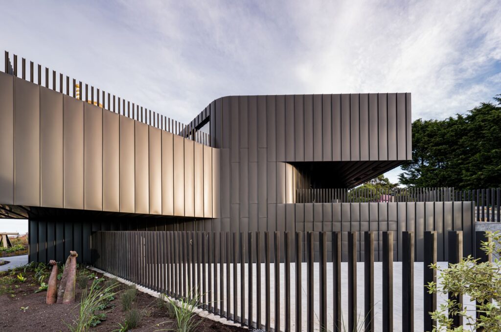
The house is clad in Euramax pre-coated aluminium in matte grey-black. The Ambro product, supplied and installed by Architectural Envelopes from Central Otago, continues that growing trend of roofing materials being used throughout the envelope, helping to extend the life of the facade, minimising maintenance costs, and adding a consistency throughout the exterior. The closer one comes to the building, the more this feeling of ‘wrapping’ and ‘twisting’ becomes apparent.
Facade and roofing profiles have been lined up, but at the soffit — especially under the 7-metre cantilever — they run diagonally. Andrew explains: “[It] creates that dynamic nature and expression. It is not an easy thing to achieve, structurally, but the building is basically built around and hung off a very strong concrete core, and then steel structures connect to that and cantilever off.
“A serious amount of work went into coordinating and setting it out, and getting it so it all flows down, and it flows around, and even wraps down underneath on the soffit. And that’s a key part of the success of the finished house.”
The variety of linear treatments and the way the light reacts against these results in a very dynamic composition, a sort of twister of sunshine and shadow quietly humming above the Otago horizon. “The light moves around it and plays on it,” says
Andrew. “The sort of grey-black, very simple colour facade just picks up the light and changes.” Touches of gold fade to copper and sometimes even hint at metallic blue as the sun progresses along the structure. “It’s really quite stunning and really enjoyable to experience.”
The twisting motion effect is further compounded by metal balustrading along the ground floor and on the balconies. “It [has] simple steel angles that have been incredibly successful and pick up the light and shadow differently on the different faces of the house. They were designed with an irregular top edge of the angle.”
Although Andrew says the idea came from something the owner saw on a trip to Mexico — it does echo the cactus fencing on Frida Khalo’s Blue House — he agrees that in this Pacific context, the design can be read as a nod to fortified pā architecture. “It provides a very strong sense of security and closure,” he says, “but at the same time, a degree of openness.”
Those two polarities are important in this house — security as the owner has a jaw-dropping collection of contemporary art, and openness as the home’s interior has been built to take in the views of the Pacific Ocean.
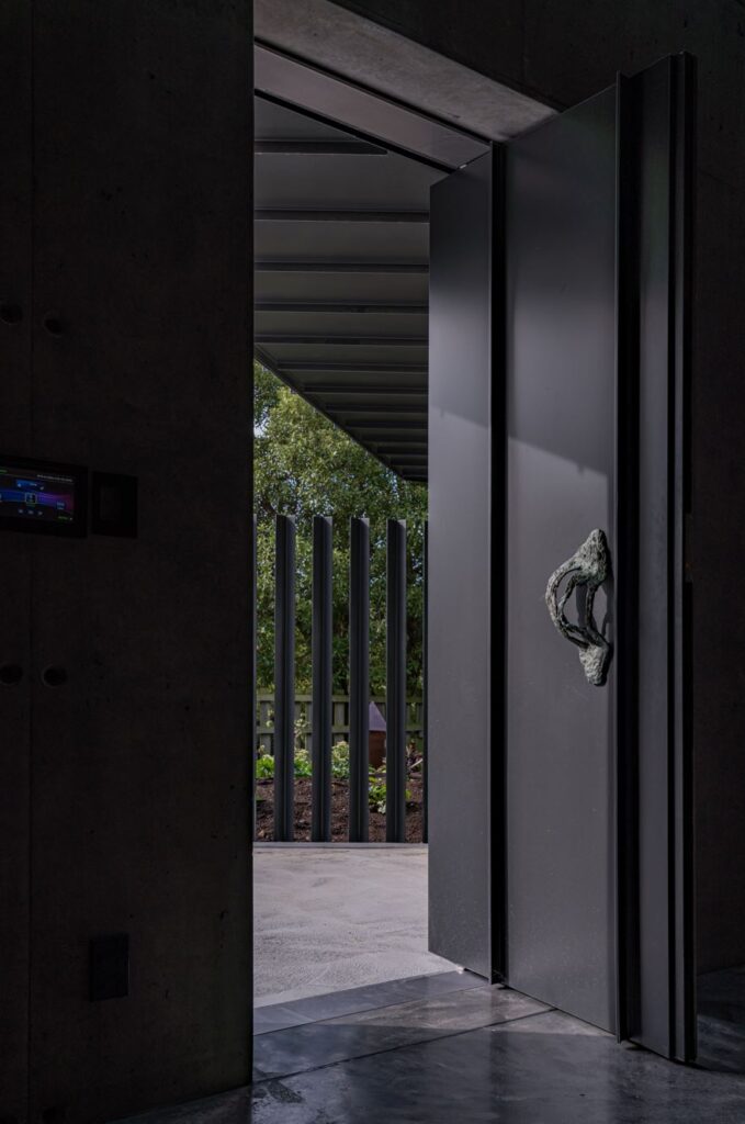
As a foreword to the collection that is inside, the front door handles were crafted by New Zealand artist Kate Newby, resident in Texas. Newby, who has a fascination with modifying or interacting with architectural stock, has previously crafted door handles for retail spaces. “I’ve seen one of the handles in Auckland and I thought that would be a great way of arriving,” says Jan, who explains that the two bronze pieces “have bits of Texas flora”. The artist asked the client to bury them in the sand, near salt water, and later do the same in the garden for a few weeks so as to patina and suffuse the objects with local elements.
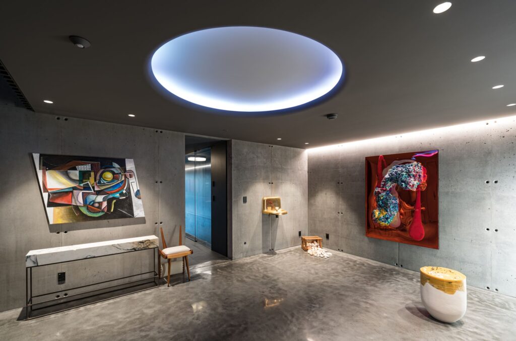
This touch of magic realism at the entrance is carried through to the interior where an impressive Imogen Taylor painting shares space with a giant bear head, a grinning mannequin stands by dried flowers, and the glow of neon lights lend an eerie but playful tone to the whole thing. To the left, a narrow corridor leads one to a dark internal lap pool with an orange changing room / bathroom where one starts to get the feeling that colour, and lots of it, are likely to be prominent features.
A set of raw, blue-tinged steel stairs — a touch of Dunedin Gothic — is a key element of the entry experience. “You walk up and it makes a beautiful sound as you step on it,” says Andrew. The stairs sit inside a nine-metre-high, in situ poured concrete core structure.
“Plywood shutters and the steel stairs were craned in and down through the top, which was quite an exciting part of the project.”
As you step out onto the upper floors “there are explosions of colour and art and views out through the building, to the city and harbour, and the coastline beyond the steel balustrade”.
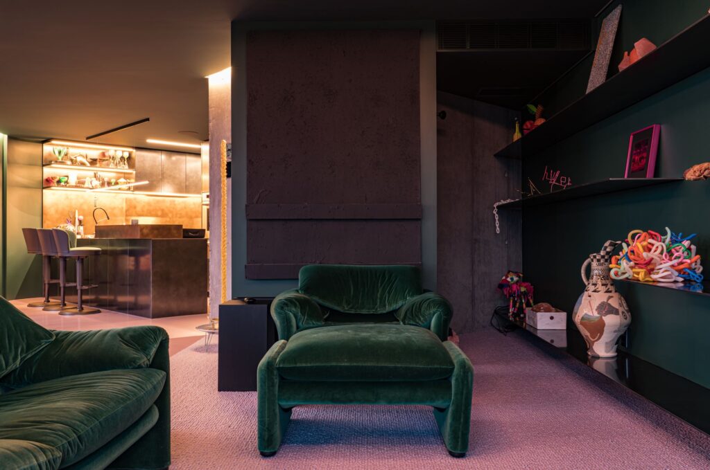
The spaces here are compact, a modest 2.4m stud height keeping this Otago twister grounded. Yet the colours on walls, natural stone, art, and furniture give a sense of variety and uniqueness to every surface. “My daughter is a fashion designer in London, and she is a very good colourist,” says Jan, lighting up when pointing to a green Cassina couch. Faye Toogood Roly Poly chairs and all manner of bold designers work in tandem through a love of form and not an ounce of timidity. There are reds and oranges, lots of pink, London Fog, iridescence, and striation. Marbles compete with dark timbers and plush fabrics in all manner of treatments. “I said to my daughter in London, ‘What would go with pink and dark grey?’ She’d seen the marble [table] and she said ‘acid green’. I said, ‘Okay, that’s what it is then!’”
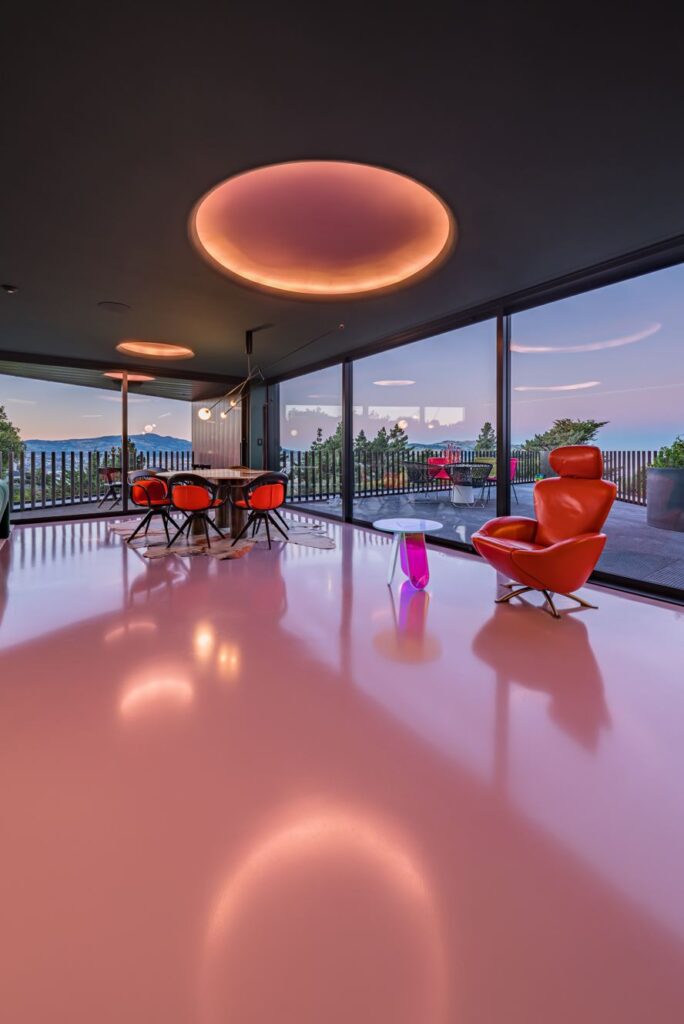
Maximalism is the rule here but without opting for clutter. Eclecticism rules but, aside from some of the top, first-generation New Zealand artists here, it doesn’t veer toward multiculturalism. It hints at Memphis revival but doesn’t quite emulate the Ettore Sottsass vibe. It has some Todd Saunders motifs from his seminal work in Fogo Islands, a touch of Canberra’s Hotel Hotel, while also being entirely of its place. “What, then holds this hotchpotch together?” I ask Jan. “It stimulates me and makes me feel good,” she replies. “It’s my happy place.” And yes, if there is one overarching feeling one gets within these walls it is one of joy and unapologetic individualism.
Words: Federico Monsalve
Images: Nick Beadle
Videography: Paul Brandon

Judges’ Citation
A suburban-filled hilltop overlooking the Southern Ocean is the last place one would expect a bold sculptural house filled with contemporary art. The result is the vision of a courageous client and a collaboration between talented, cross-continental and determined architects. The black metal clad exterior accentuates the curving forms swinging to the views. This darkness extends inside — it is a Dunedin house after all — but it becomes a setting for video art, sculpture, installations, and the panoramic views. Colour floods the floors and the interior materials are rich. Though conceived as an object of art, the house is very much a functioning home — one that exudes warmth, playfulness, and urbanity.
