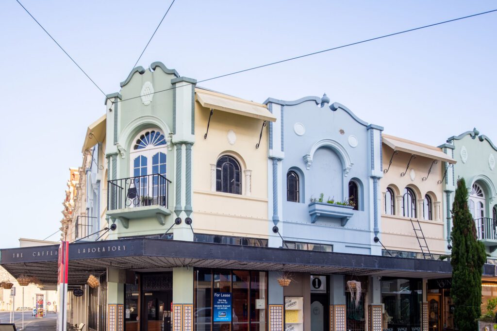
This Herne Bay bungalow was crying out for a connection to its backyard, until a clever architect manipulated its gables in a genius space-making design
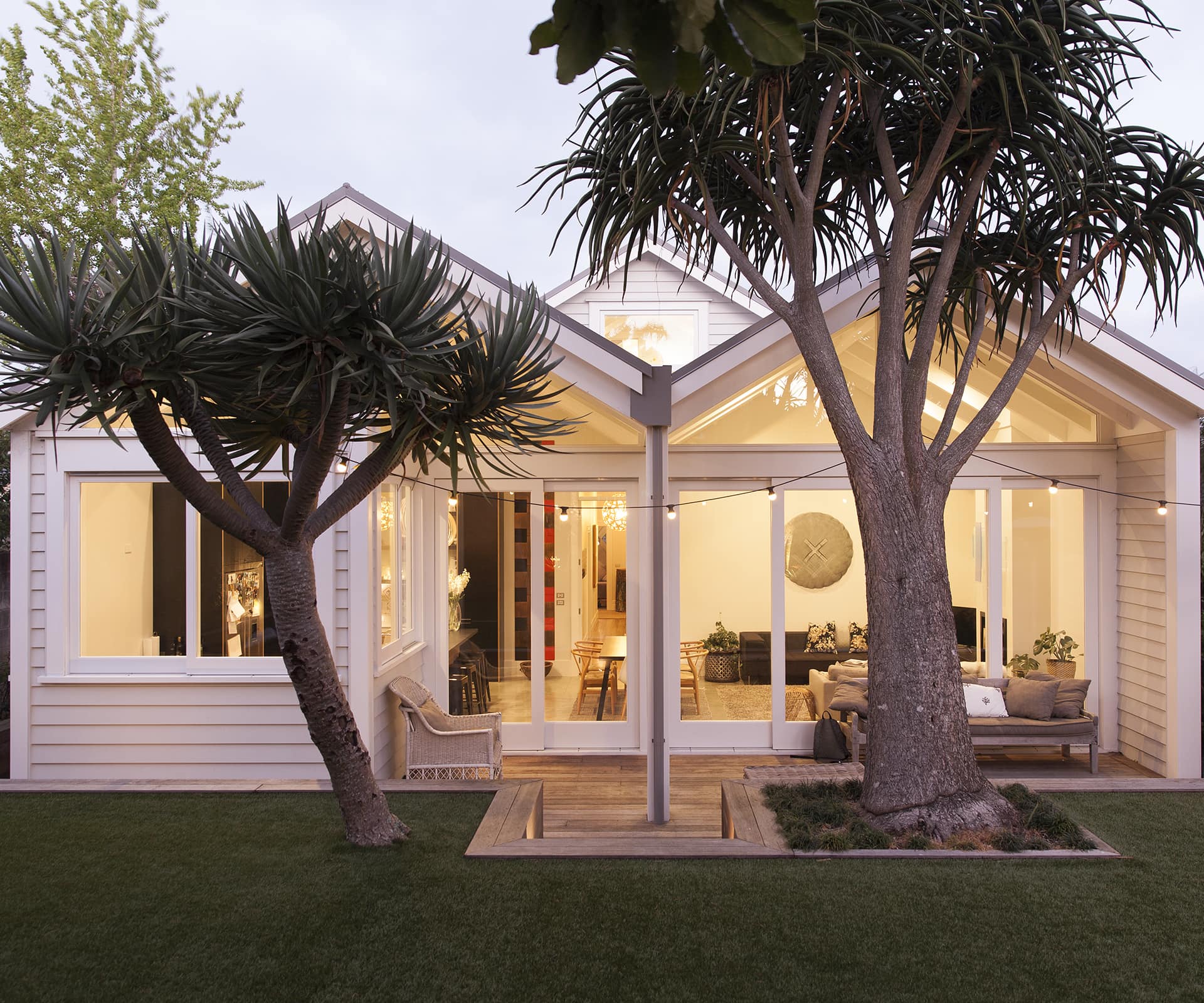
A clever gable manipulation opens a bungalow to the outdoors
We talk freely about villas and bungalows as if the transition between them was instant and clear, rather than being a process of a decade or two of change happening by the smallest of degrees.
This house sits reasonably far along – though far from the end – of that spectrum. It’s less overtly bungalow than a Californian one and perhaps it was the ambiguity that drew its owners – builder Wayne Ashford and his wife Kate – to it. It’s a house of high ceilings and wide-plank kauri floor boards, with intricate plaster in the elegant ‘good’ room at the front of the house. Out the back, there was a jumble of lean-tos jutting awkwardly into the backyard.
The house was as fine a prospect for renovation as the couple was likely to find in the rapidly gentrifying southern slopes of Herne Bay. They snapped it up and lived in it for a few years, delighting – as parents with young families do – in the discrete spaces of the old bungalow. But the house was crying out for a connection to its backyard, and the boys were reaching the age where they needed a place to kick a ball about.
The challenge for architect Jack McKinney was that the northern neighbour – currently a 1970s pub with a vast carpark, perfect for skateboarding – was likely to be redeveloped at some stage. In fact, the site was recently fast-tracked for more intensive development under the Auckland Council’s special housing scheme. The family, which now numbers five, may have 70 apartments on their northern boundary, so opening the house up to the north to get the light wasn’t really an option.
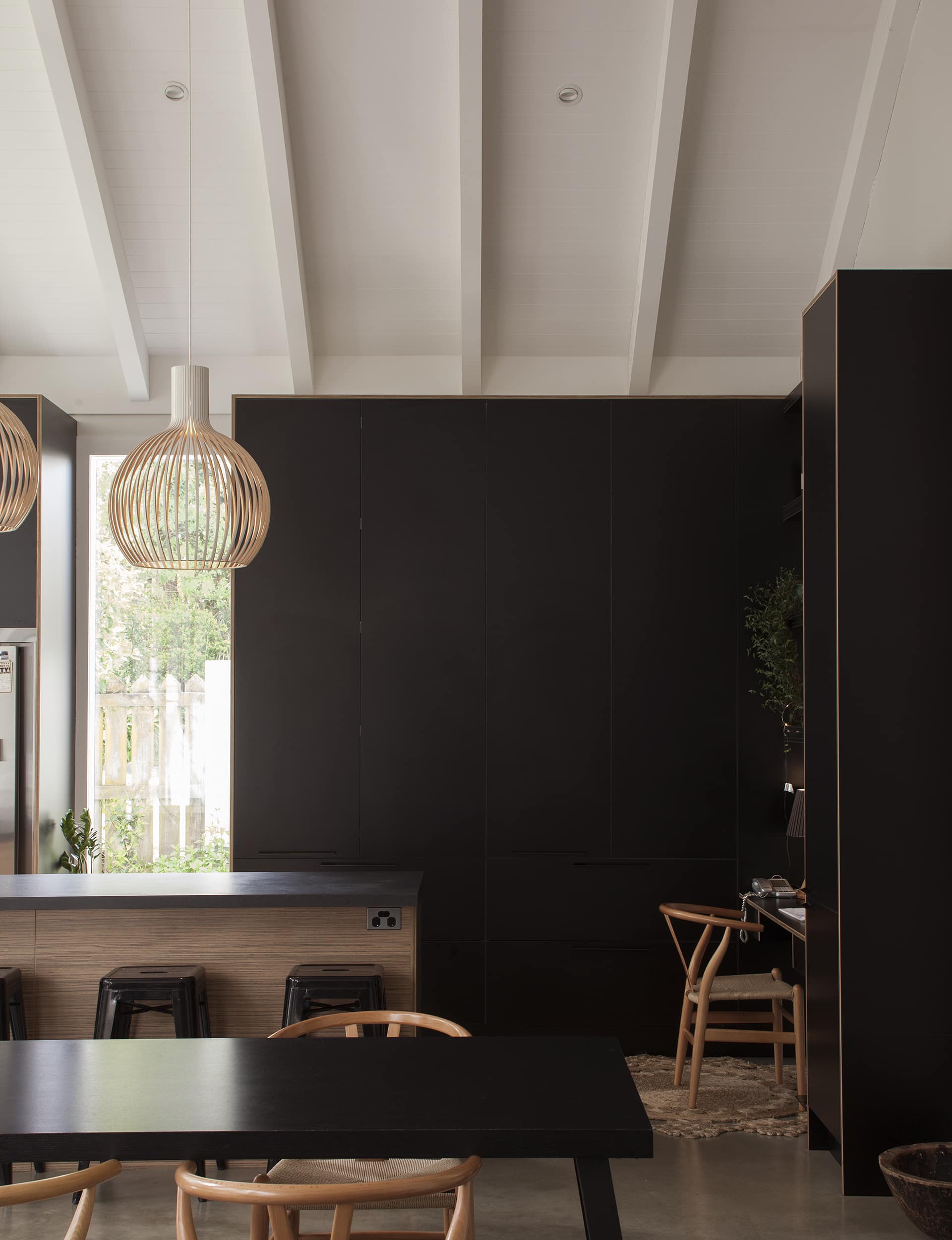
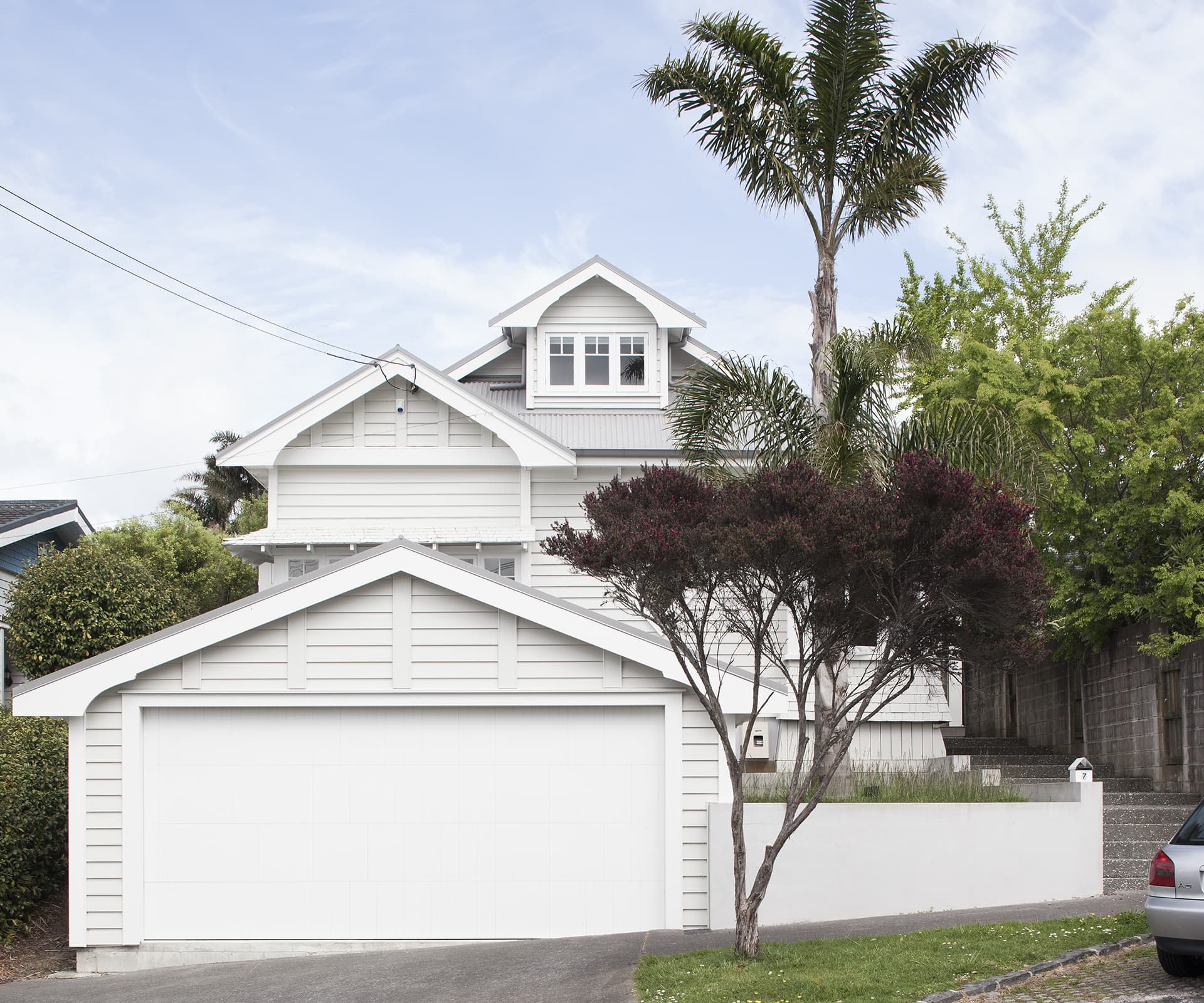
Now built, McKinney’s design plays with geometry and light to gently dance away from the yet-to-be-built neighbours. One of his first moves was to push up into the attic, pulling the hip roof forward and back to create a gable with space underneath for two generous kids’ bedrooms.
[quote title=”I didn’t want” green=”true” text=” this to be one space” marks=”true”]
From the front, the house’s appearance became more bungalow-like, with a pitched gable – and at the back, it gave him something to play with. “I didn’t want this to be one space,” McKinney says. “It needed differentiation – so I took the roofline and folded it down. It’s about creating shape out of the volume, making two rooms out of one.”
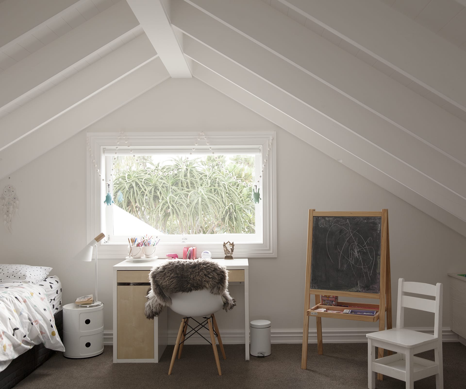
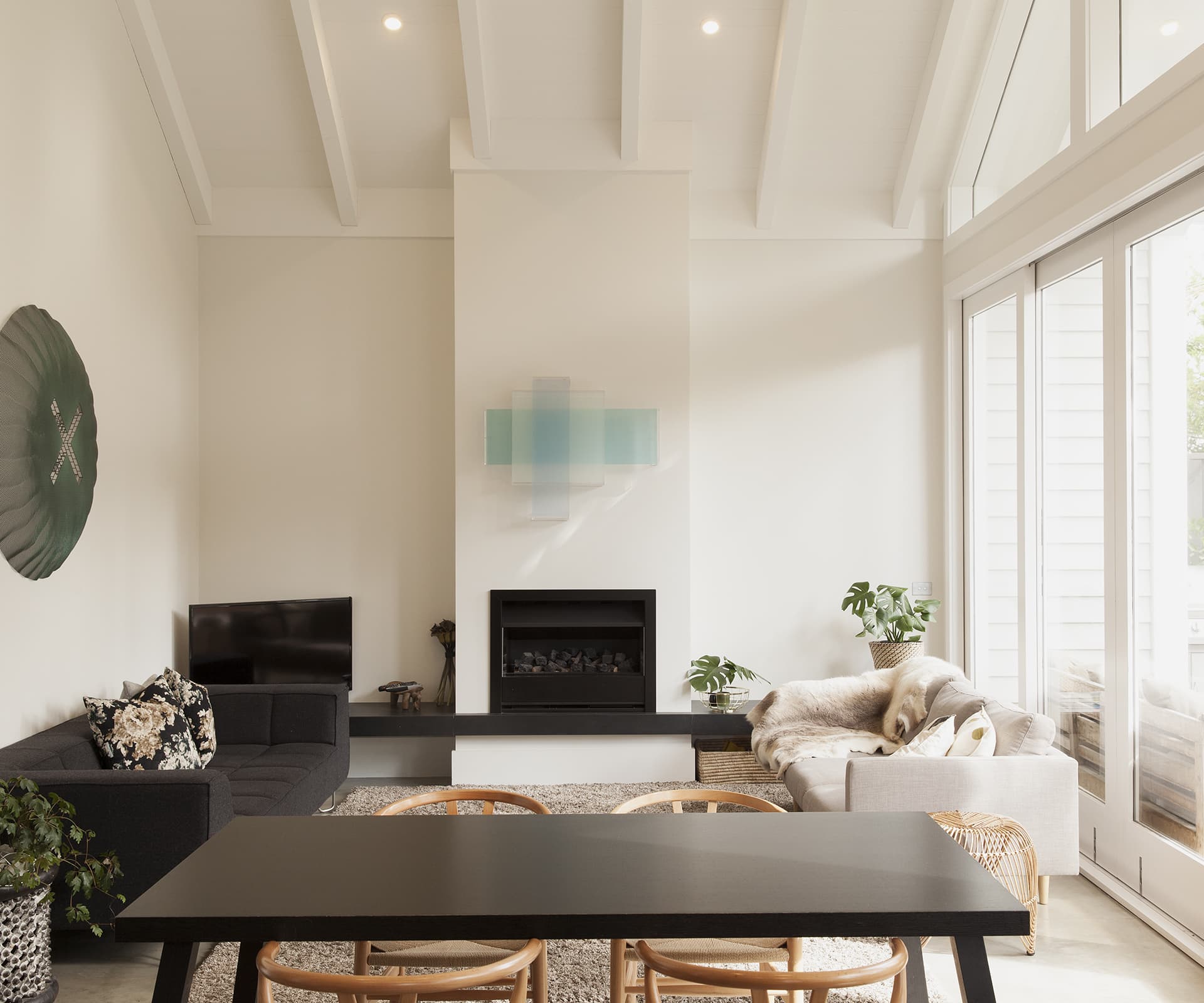
The attic stops at the back wall of the old bungalow, where the roof inverts into an ‘M’, creating an elegant, folded roofline that drapes over an open-plan kitchen-living-dining area and flows out to a sheltered outdoor living area. The kitchen is on the northern side to provide a shoulder against the future neighbours: two long windows bring in sun and light without gaining unwanted attention.
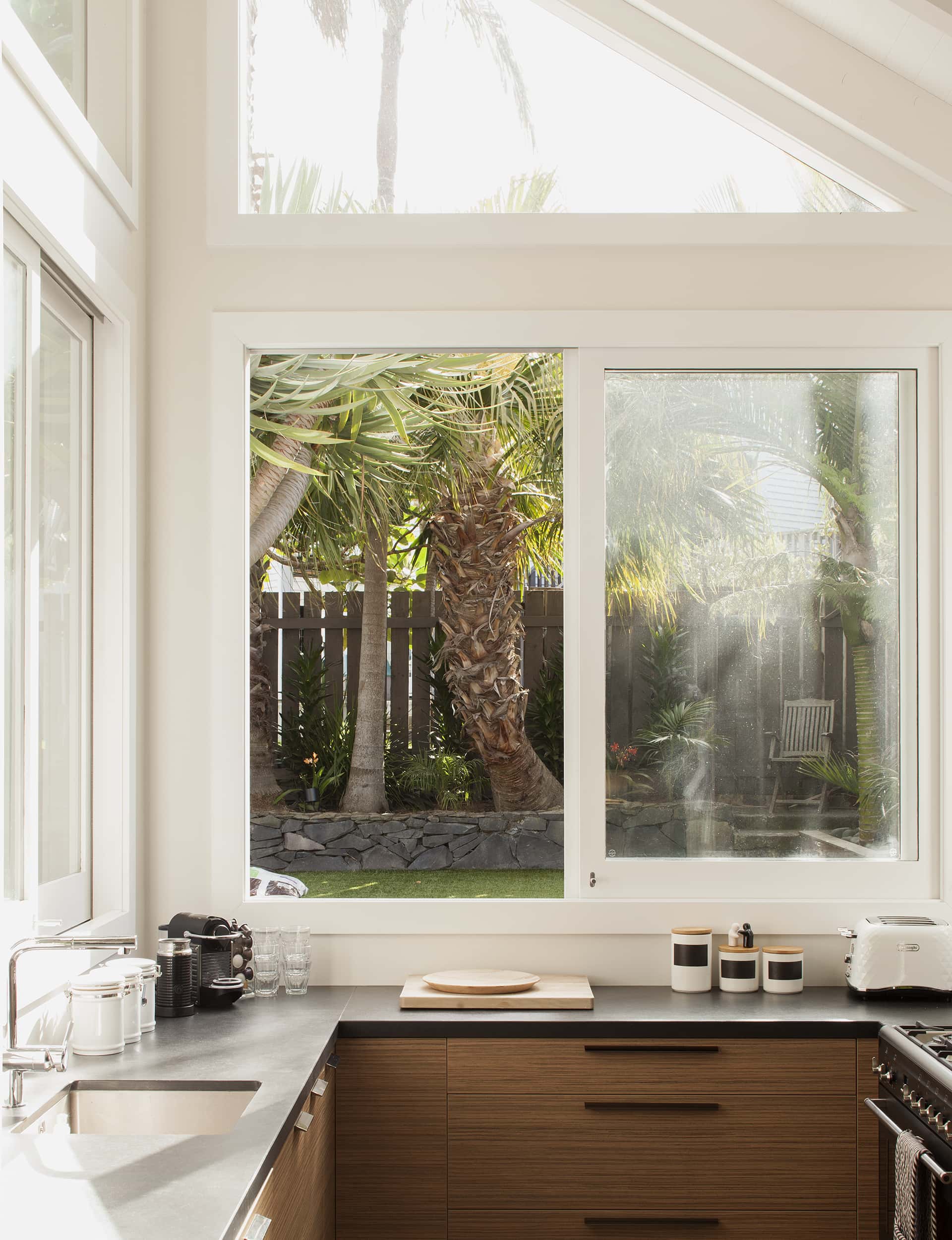
It’s not a big room, but it feels generous, with the arms of the ‘M’ reaching above and light pouring in through high windows up to the apex of the gables, the space anchored by the black cabinetry in the kitchen. “It’s really an expression of the original geometry in the old roof,” says McKinney, “It mutates from one to the other, so we’re not applying something alien to the back – it’s more an evolution.”
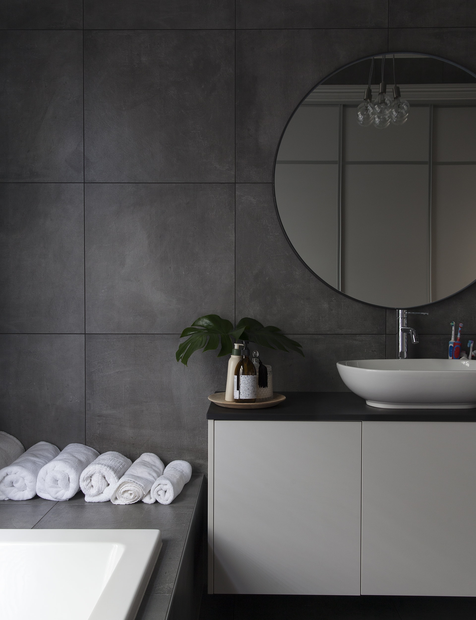
For the family, the house works perfectly. Most Fridays, the place is over-run with neighbourhood kids – there are cousins in the same street – and there’s always somewhere for them to go. “It’s not just a house for three kids,” says McKinney. “There can be 10 – it’s really a congregation space.”
Words by: Simon Farrell-Green. Photography by: David Straight.
[related_articles post1=”56518″ post2=”28730″]
