A mixture of intelligent design and collaboration was the key to overcoming the many challenges that faced the completion of this hillside home
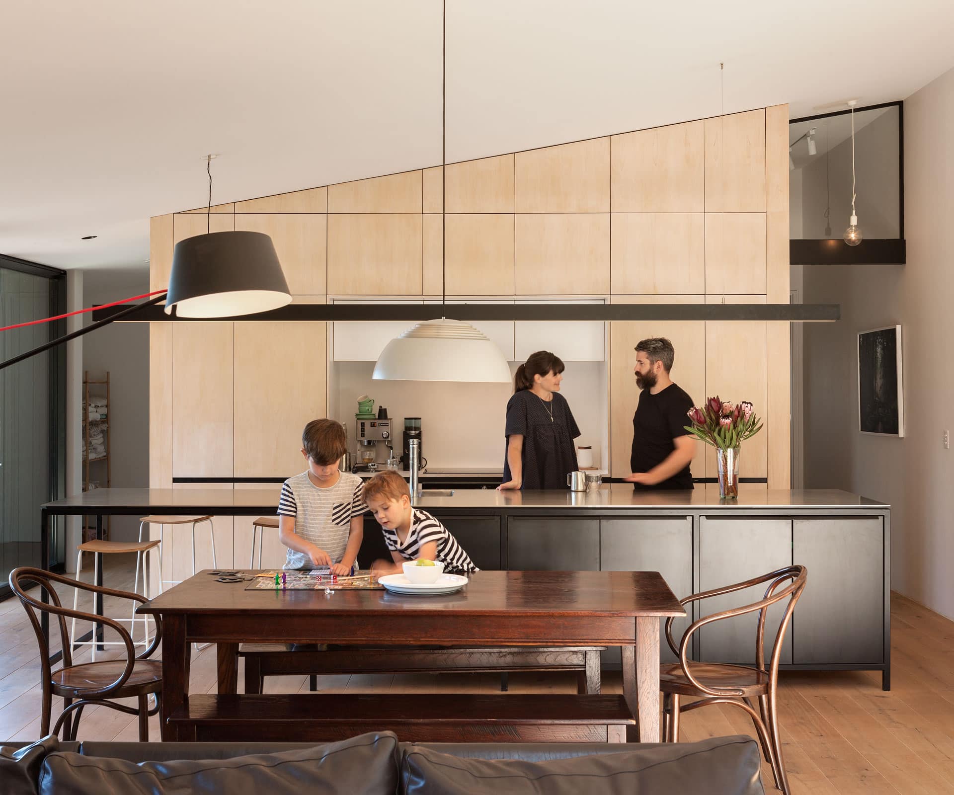
Collaboration was the key to completing this tricky new-build
For Tobin Smith of Christchurch practice CoLab Architecture and his designer client Tim Kelleher of Sons & Co, the challenges of collaboration were never an issue.
The two met in passing a decade ago after Tim and his wife Elizabeth had purchased a steep Lyttelton section. Tim is the first to admit that back then, at 25, he had no real understanding of the building process or how to finance it – and in the years following, his life changed radically with the establishment of his web design business, the birth of two children (they’ve since had a third) and the fact that the family lived in five different rental properties.
But Tim’s long-held passion for design and his desire to live in an architecturally designed home prevailed and together with Smith, the Kellehers set about designing their first home. The couple wanted a dwelling that would “lift the spirits”, accommodate a growing family and pay homage to Tim’s interest in mid-century New Zealand design and Japanese architecture.
“We never sat down with a formal brief,” says Tim. “Our process was collaborative from the outset. We agreed on the home’s orientation to the harbour and the afternoon sun and beyond that, it was a process of evolving ideas together as we progressed.”
[gallery_link num_photos=”12″ media=”https://homemagazine.nz/wp-content/uploads/2016/10/house-2.jpg” link=”/inside-homes/home-features/the-lyttelton-home-that-took-10-years-to-come-to-life” title=”Click here to see more of this fantastic Lyttelton home.”]
The evolution of their hillside house to the home that stands today has been a long one: 10 years to be precise. “Tim and I would meet for a chinwag about what was happening in Christchurch – especially following the earthquakes – and then we’d talk about the house,” Smith says. “It was a very natural process for us.
We’re mates and the design process usually advanced from someone tabling an idea and then the two of us working it through together. We’re open-minded and we’re not precious about who tables the ideas.”
The collaboration process went beyond Tobin and Tim to involve Elizabeth’s brother James Turner, the joiner who worked closely with designer and client to devise innovative aesthetic solutions despite the tight, stripped-back budget.
Everyone involved worked in the belief that each had something valuable to bring to the process, and that their combined design intelligence was the most effective way of delivering a positive final result that the Kellehers could happily call home. Everyone was encouraged to contribute unfiltered ideas to create a budget-conscious home that looks anything but.
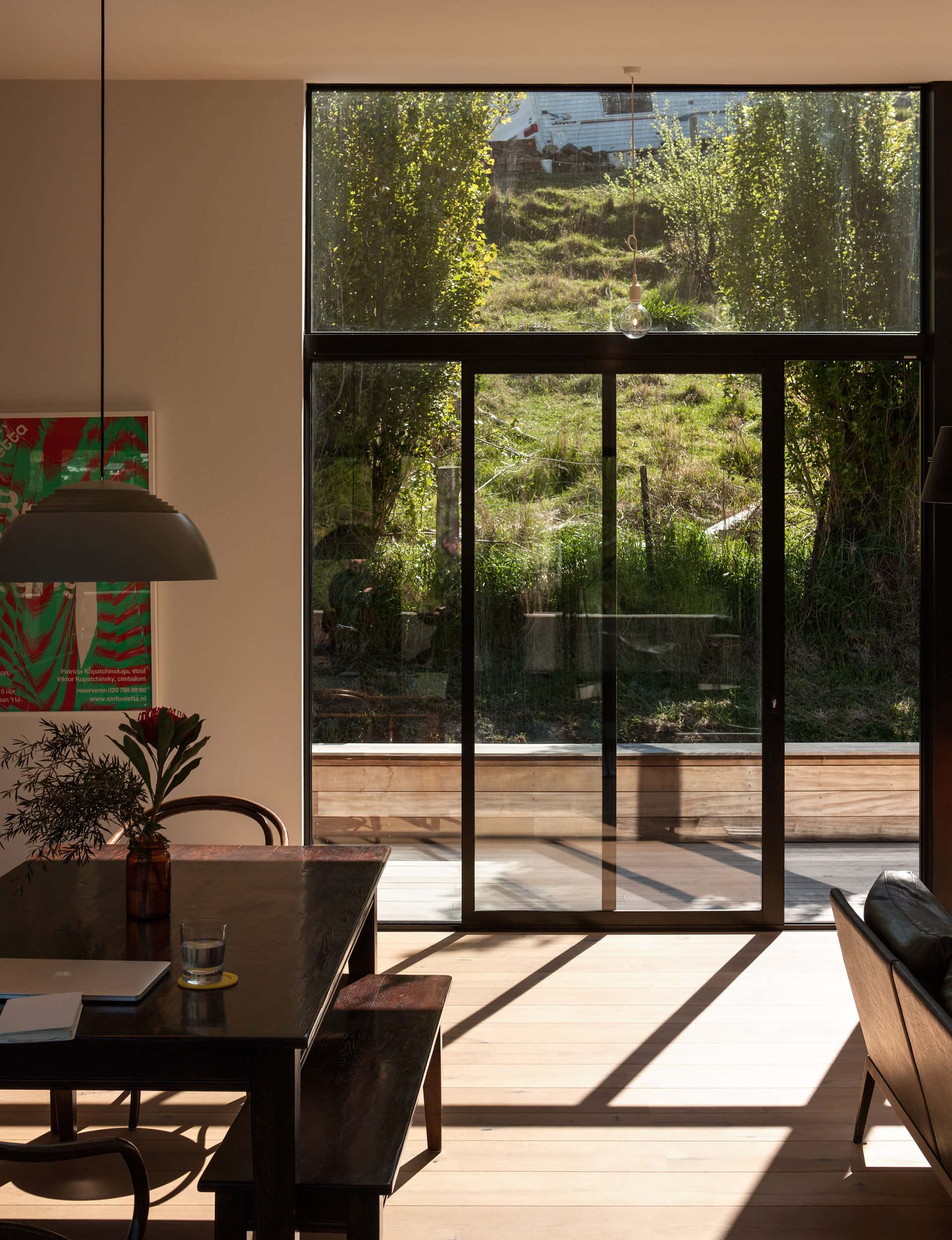
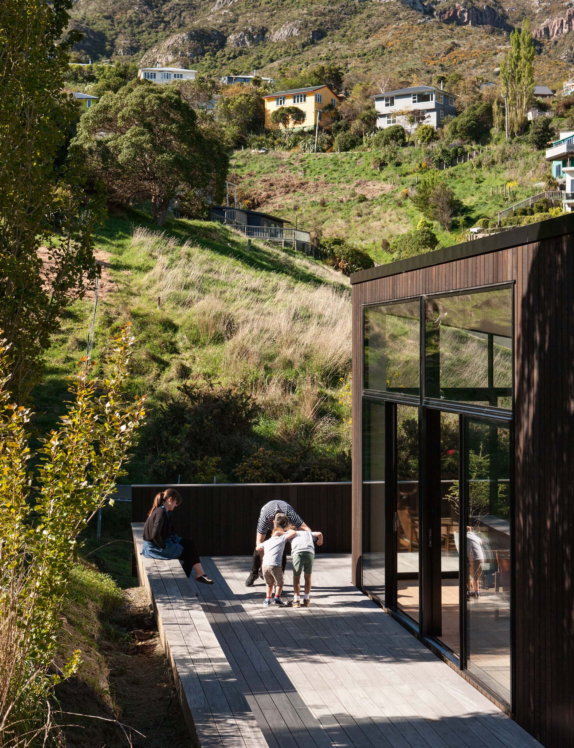
The floor plan follows a practical layout, with the house sitting at the top of a steep, wedged-shaped section oriented to the expansive views of Lyttelton Harbour and the neighbouring hillsides. There are two bedrooms downstairs and two up, with main living areas on the upper floor to maximise views and to give access to east and west-facing balconies.
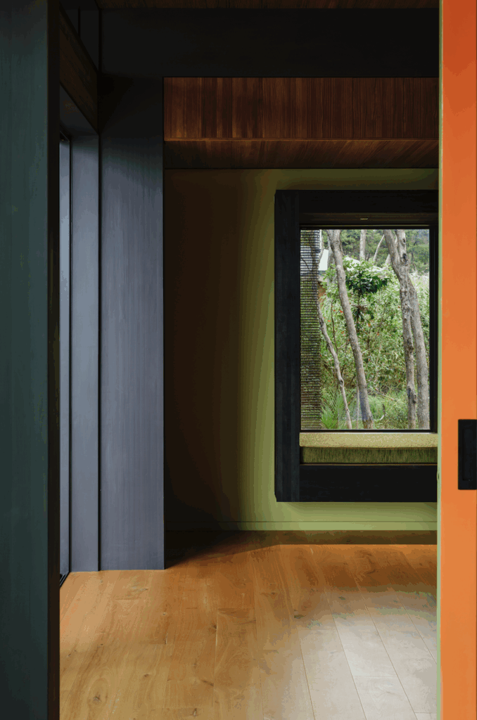
Large glass windows on three sides harness the warmth of the sun, while the home’s monochromatic dark form tucks into the hillside, belying the light, open spaces within.
The larger upper floor sits directly over the lower level and there is a separate parking pad – something Smith felt strongly about. “It meant we didn’t have to excavate the site in the same way and it meant we could spend money on the house – on the people, rather than on the cars.”
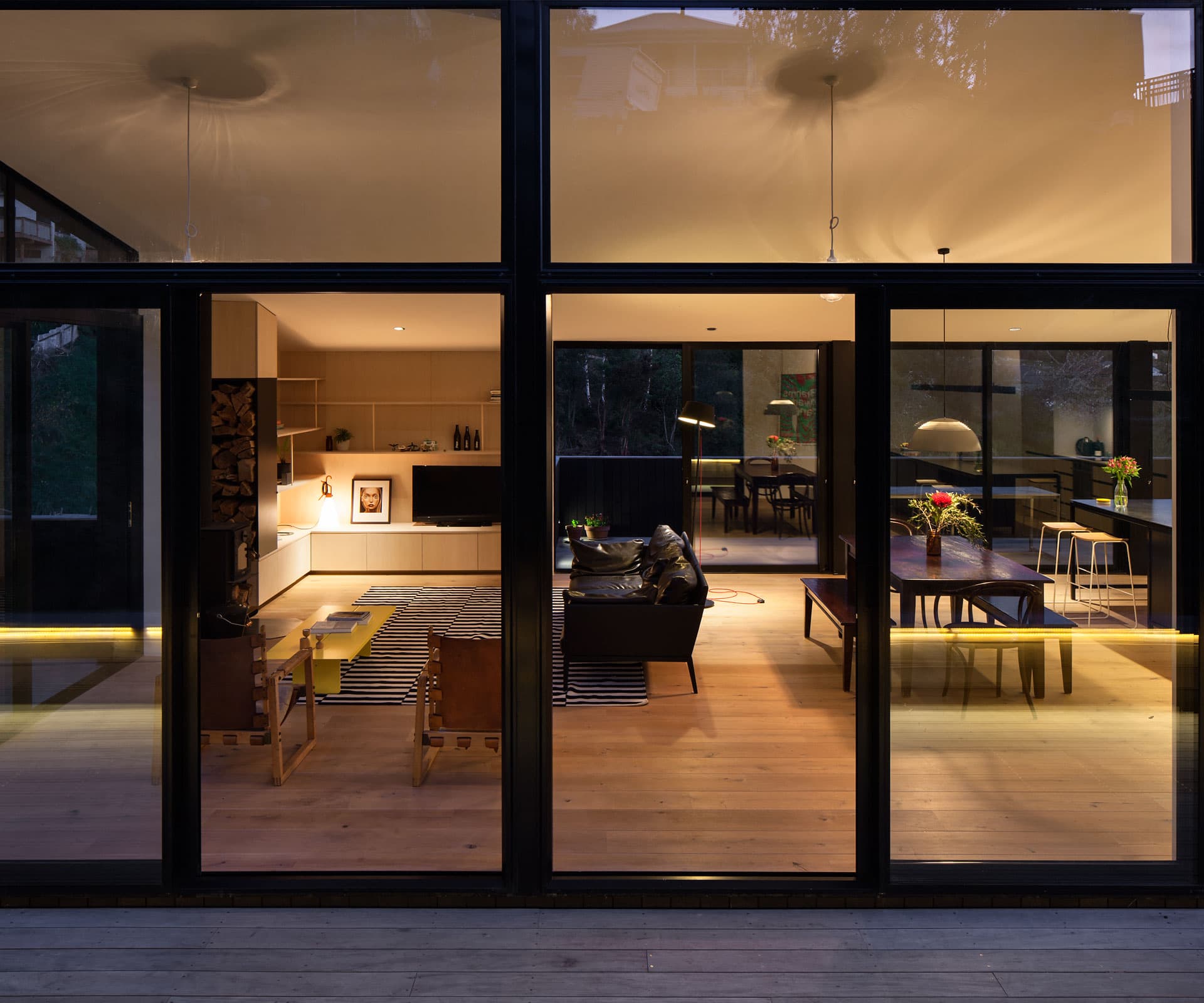
Smith was keen to create a sense of lightness in building elements and although the team was working to a tight budget, they never let go of the finer detailing, from the bevel on the edges of the oak floors – they looked too perfect with square edges, Smith explains, so he asked the builder nicely to run them through his saw – to the light birch-ply stairwell, the shape of the stairs, the handrail detailing and the one-off living-room joinery.
“We paid a lot of attention to micro-detailing,” says Smith. “We achieved a unique finish by including James in key joinery decisions.”
As a result, everything in the house has a story and there’s an element of fun in the final interior. That’s been important to the Kellehers, who have used the work of artist and designer friends (such as Auckland designer Jamie McLellan, who designed the coffee table and the stairwell mobile) in the finishing touches.
It has been a case of creativity thriving on shared, unfiltered ideas taken to the next level through a process of trust, support and encouragement. It has involved creative people leveraging their innate abilities to sow and grow design concepts for a greater good. And for Smith, the end result is “arguably one of the best first houses” he’s seen yet.
Words by: Adrienne Rewi. Photography by: Simon Devitt.
[related_articles post1=”55710″ post2=”55440″]

