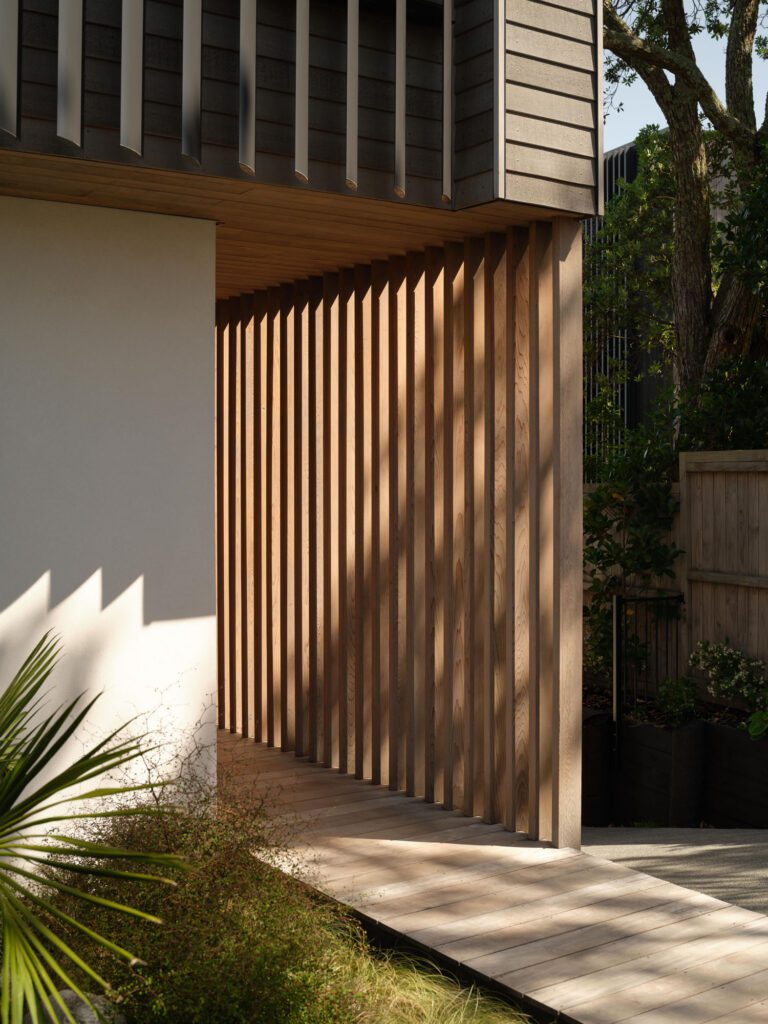
The problem? Expand a celebrated 80-square-metre home by Marc Lithgow without compromising the original structure. The solution? Create a compound.
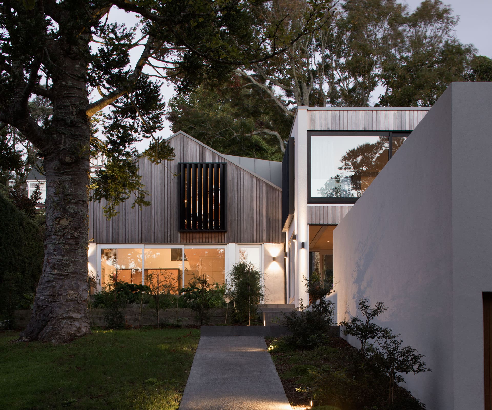
A compact home expands thanks to a clever compound solution
More than a decade ago, architect Marc Lithgow of Space Division designed a compact, clever little house for a young family in Mount Albert, Auckland. The site had been subdivided off the property next door and – due to huge listed trees – the easiest thing to do was build on the footprint of the 80-square-metre garage. Lithgow rendered its brick base, added a lightweight cedar and black-steel second level and tucked bedrooms, bathrooms and a study into the place in a Rubik’s cube of geometry. From within, high-level windows draw your eye up into the trees.
The 125-square-metre house – which was first covered in HOME June/July 2012 – went on to win global acclaim. A few years later, with their children now teenagers, the clients approached Lithgow to add more room. “There was always talk of a second stage,” says Lithgow. “It just took a while to work out what shape or form that might be. They always knew there would come a time when it wouldn’t suit them anymore.”
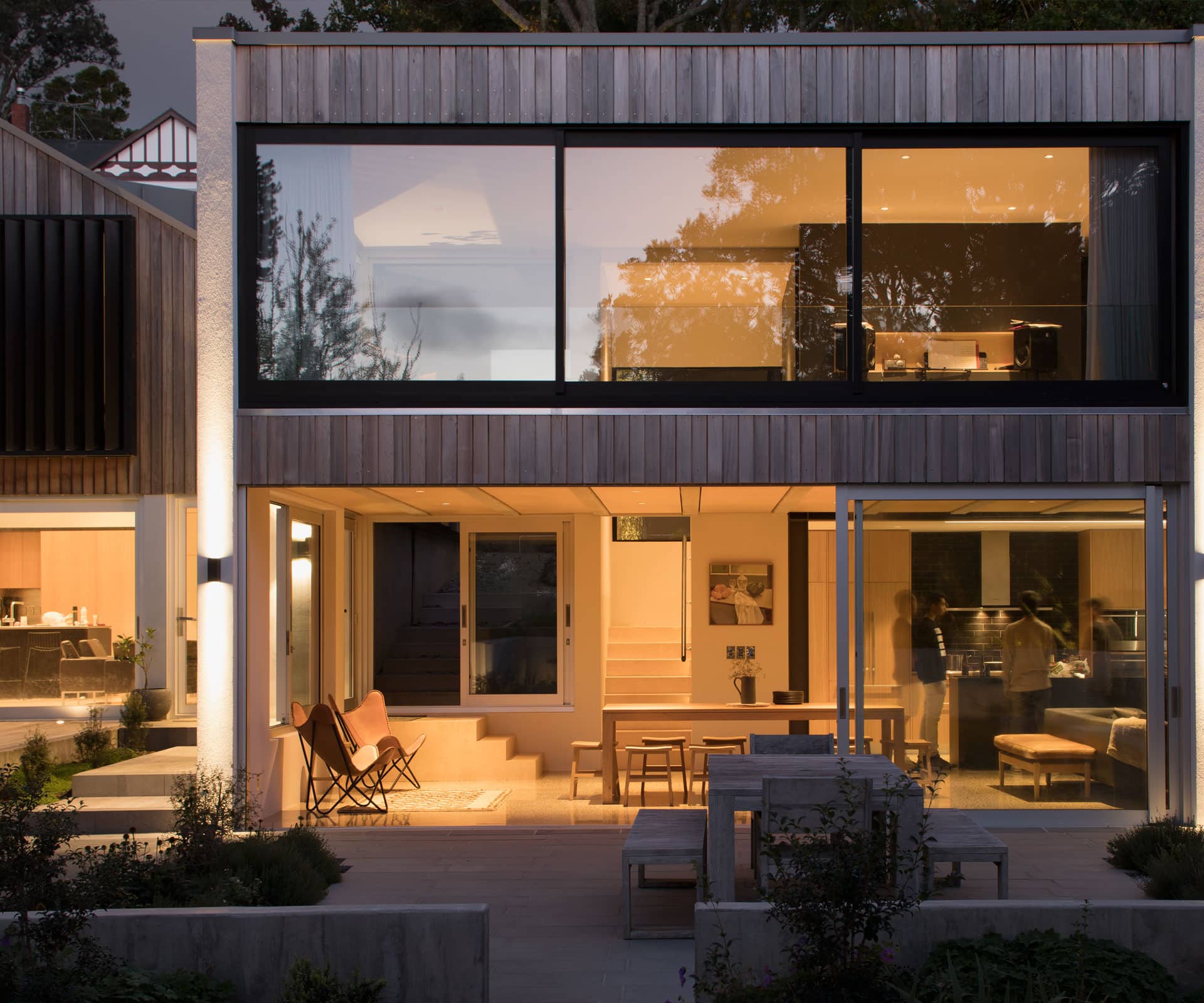
One thing was off the table from the start: making one big house. Both architect and client were conscious that doing so would destroy the purity of the original structure, and would create an awkward relationship between new and old. Instead, Lithgow proposed a compound-like approach, with a self-contained one-bedroom pavilion located close to the original.
Previously, the driveway stopped just in front of the house: now, it ends at the bottom of the slope next to a double garage topped with a lawn and courtyard garden. Beside that, a concrete path leads up beside the wall of the garage, which will eventually be covered with creeper, to a landing between the two glass-front doors. The new house mimics the old with its use of rendered walls, cedar and black steel, but it’s a different shape – a rectangle beside a triangle. “The scale of it is the same,” says Lithgow, “but moved through 90 degrees.”
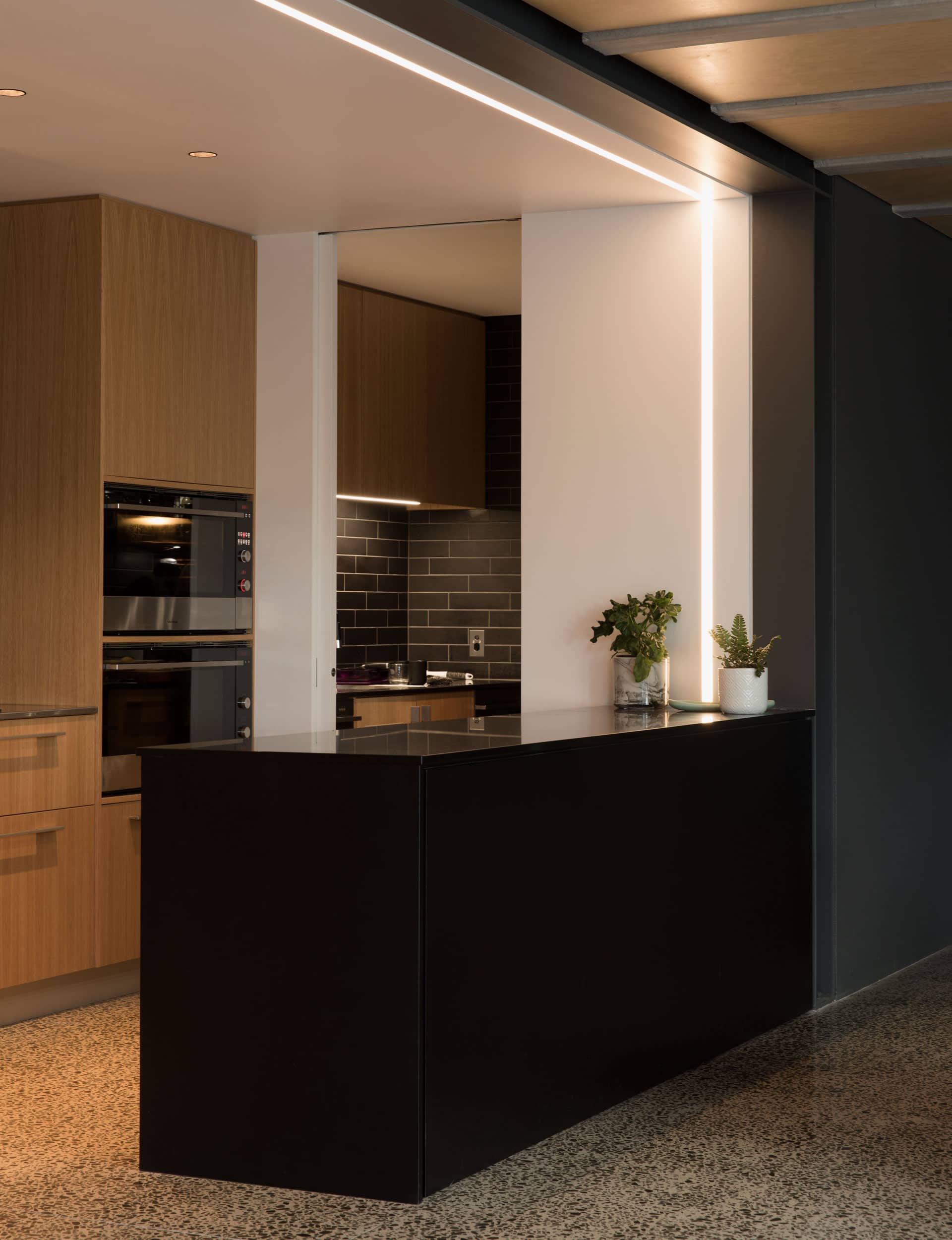
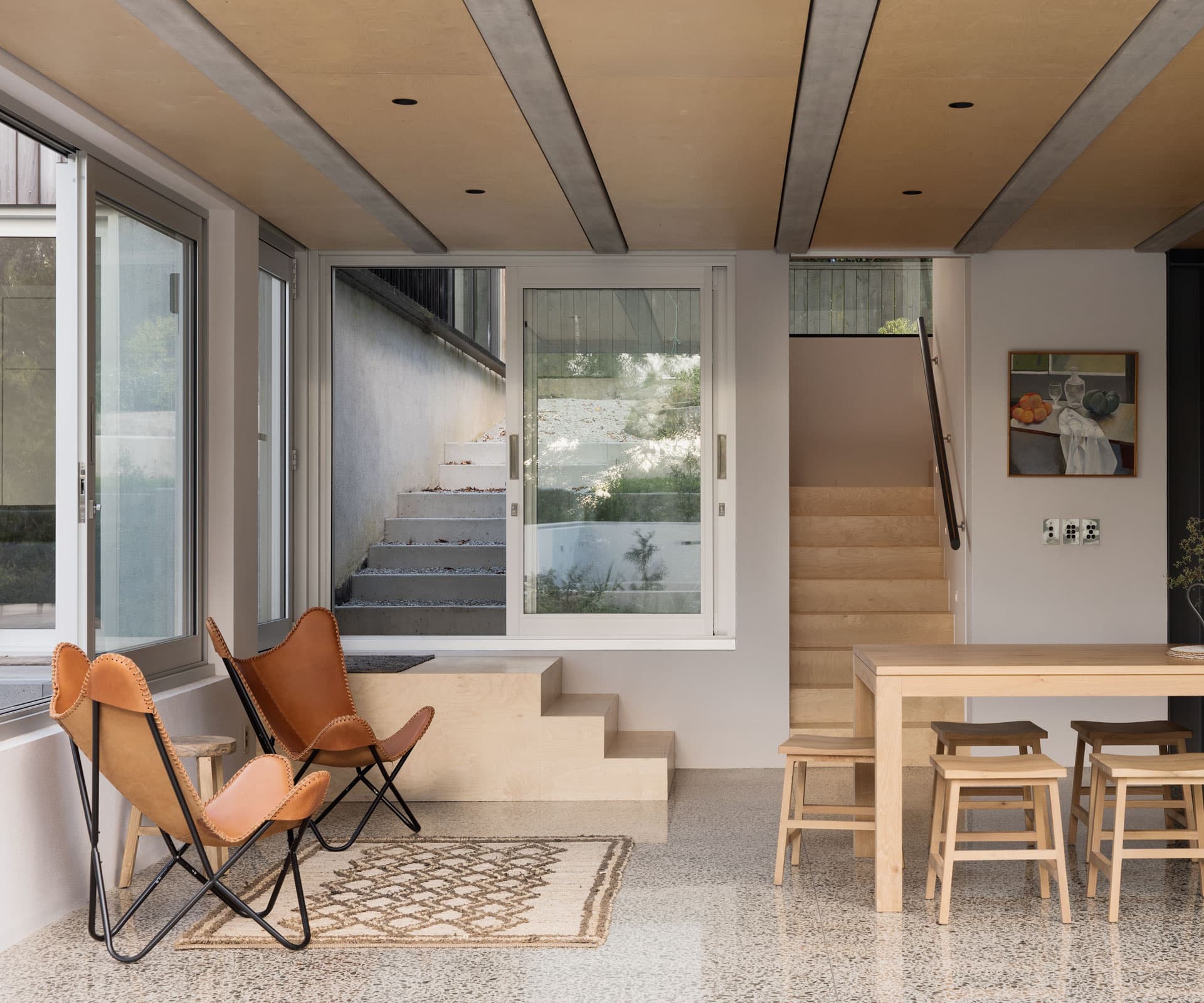
Whereas the old spaces are tightly defined and carefully programmed – Lithgow spent months working out how to get services into the smallest of spaces, and detailed entire walls of cabinetry – the new place is much more expansive and a little more bullet-proof. Concrete floors, birch ply stairs and exposed concrete beams inset with timber have replaced the crisp white angles of the original.
Downstairs is one large, open room with a big kitchen and sliding doors that stack back, opening up to a big courtyard built on top of the garage – it feels as if it’s sitting in the trees. Upstairs, there’s a generous bedroom and bathroom, with big sliding windows and a view over the rooftops and out to the Waitakere Ranges in the distance.
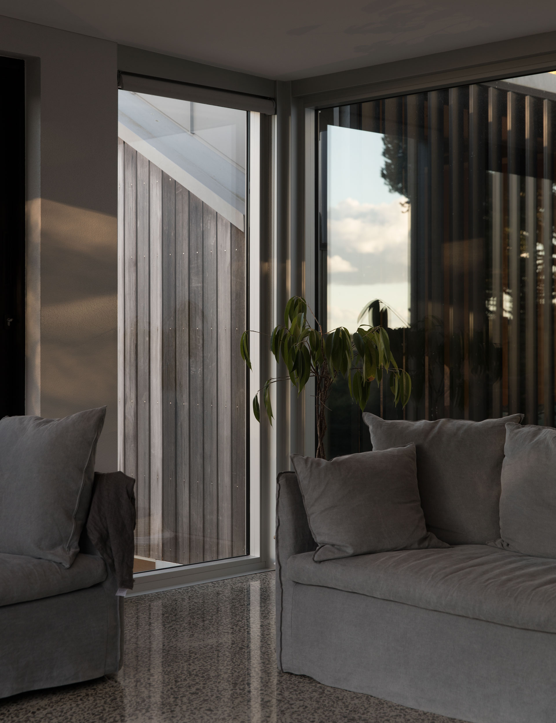
Almost immediately, the family started using this room as their main living space, and it’s here where they come to eat dinner as a family around the eight-seater dining table. Breakfast, meanwhile, happens next door. The adults gravitate to the new space early on Saturday mornings; teenagers disappear into the original house in the afternoon, while adults have a glass of wine on the terrace. Big windows and doors, meanwhile, dissolve the corners between the two.
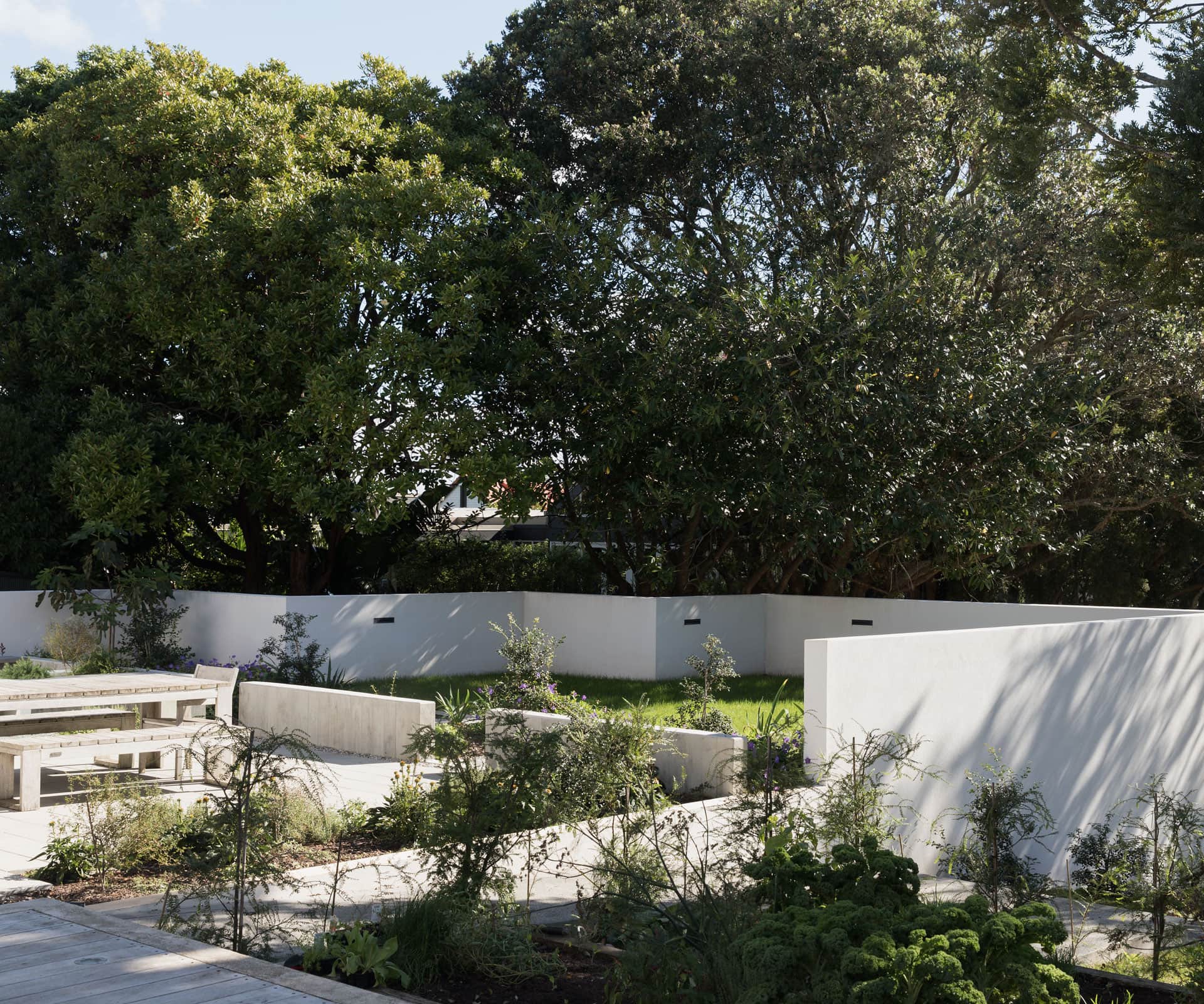
The addition is respectful, of course, but it also gives its owners options. There are two living areas – three if you count the big bedroom upstairs currently used as a music room, and two kitchens, as well as two big outdoor areas. Eventually, the clients plan to leave the old place to the kids altogether, creating a compound that will grow and change with the family in the way that one big house never could.
“I was always thinking about multiple spaces and fluidity of space,” says Lithgow. “It’s a series of volumes climbing up the hill, with these different spaces in them – this is because the owners allowed us to pull apart what would otherwise have been one building.”
[gallery_link num_photos=”10″ media=”https://homemagazine.nz/wp-content/uploads/2015/09/F_SMALL_IS_BEAUTIFUL4_5.jpg” link=”/inside-homes/home-features/small-is-beautiful-space-saver” title=”See the original story here”]
Words by: Simon Farrell-Green. Photography by: David Straight.
[related_articles post1=”71372″ post2=”46256″]


