Robust, angular and with a modern industrialist feel, this family home by Dorrington Atcheson Architects challenges the concept of suburban living
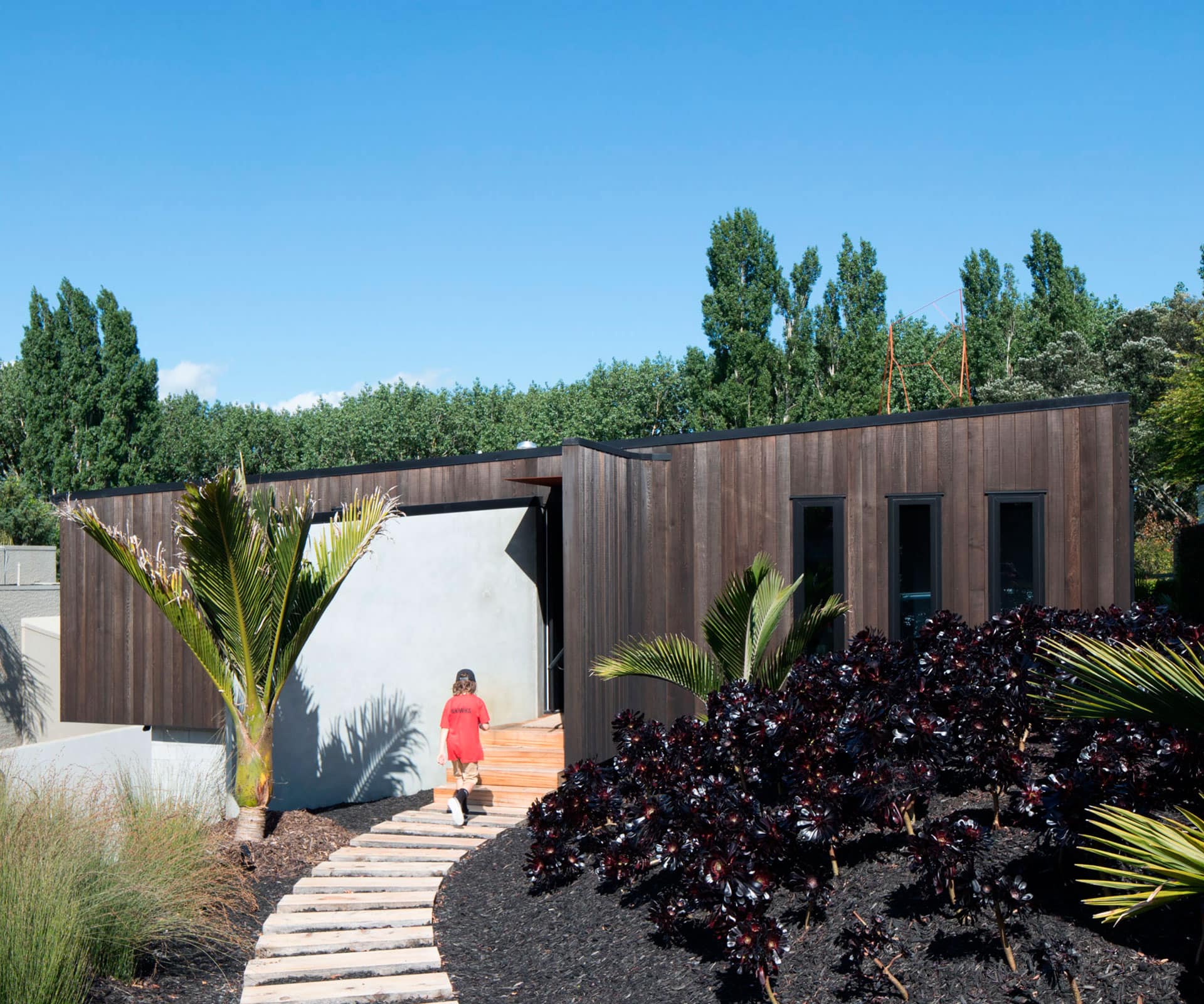
This solid concrete home reimagines what a family home should look like
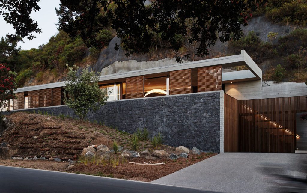
In a neighbourhood where the front wall and pool are emblems of suburban family living, enigmatic architecture may be hard to find. Yet this home, with an entrance along a curved sleeper pathway between landscaped mounds, delivers surprise from start to finish.
Tim Dorrington and Sam Atcheson of Dorrington Atcheson Architects had a clear directive for the 1100-square-metre section in Kohimarama. A neatly typed list of 32 points and a selection of photographs was an exemplary brief – evidence that this sense of surprise is no accident. A typical suburban setting at the front gives way to a green vista over Madills Farm at the rear. Poplars and oaks tower above dog walkers and joggers – and on Saturday mornings, the air is punctuated by the trill of the referee’s whistle.
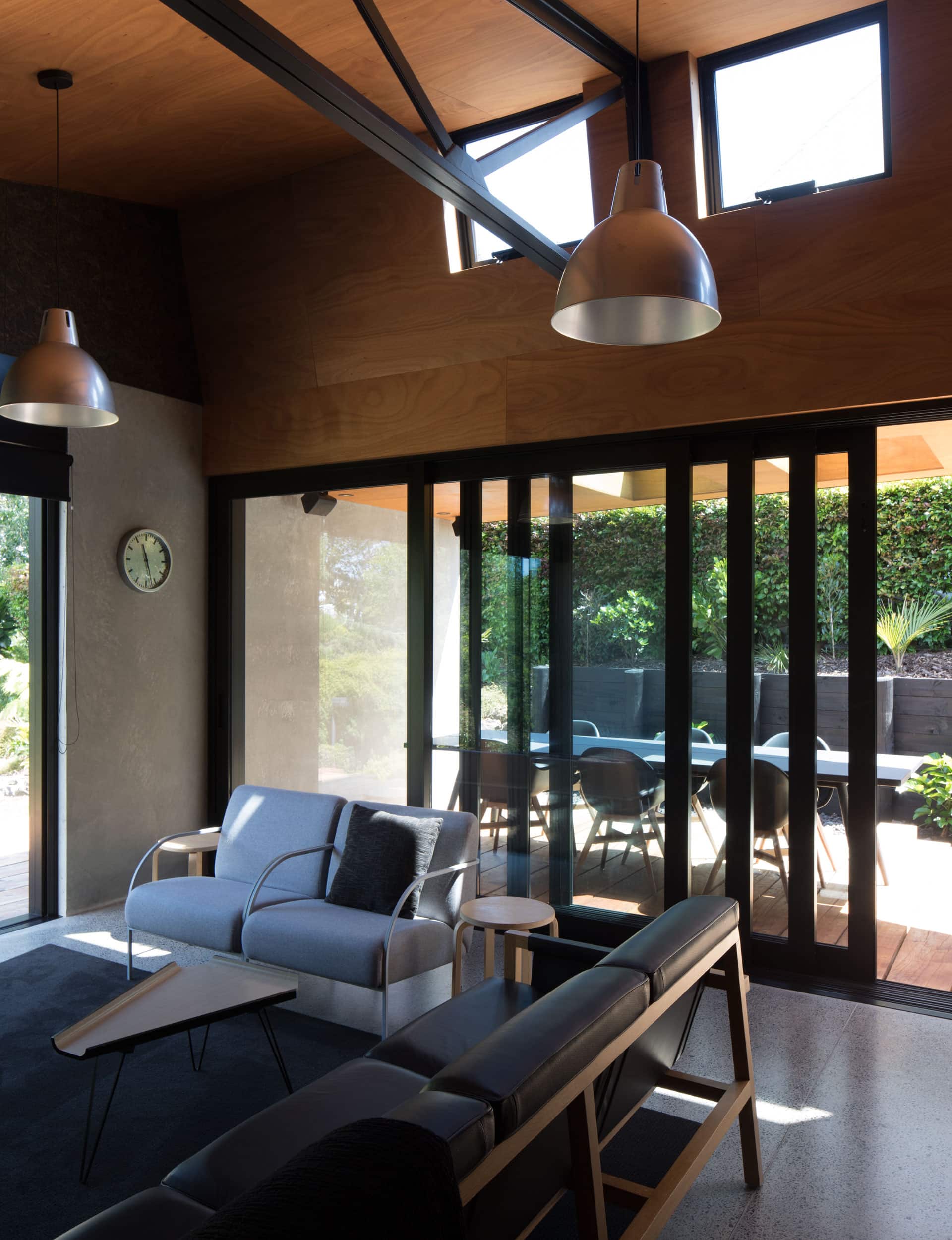
‘Modernist industrial’ – the first phrase on the list – became the guiding mantra. “The owners wanted something that didn’t appear big or ostentatious from the street, and exposed steel trusses were a given from the word go,” says Dorrington. The site was large and sloped away to the reserve but the obvious solution of digging out a massive platform was off the menu. “The owners were keen to work as closely as possible with the lie of the land,” he says.
With general goals such as ‘timelessness’ and ‘strong shapes’ and more specific requests such as ‘no security gates for cars’ and ‘curtains that disappear into the ceiling’, the path was well-marked. Yet when the architects’ first design went out to tender, it came back as too expensive. It was back to the drawing board. “It was frustrating at the time,” admits Dorrington, “yet it proved a valuable process.” They pulled the budget apart, modified the form and the next iteration sailed through.
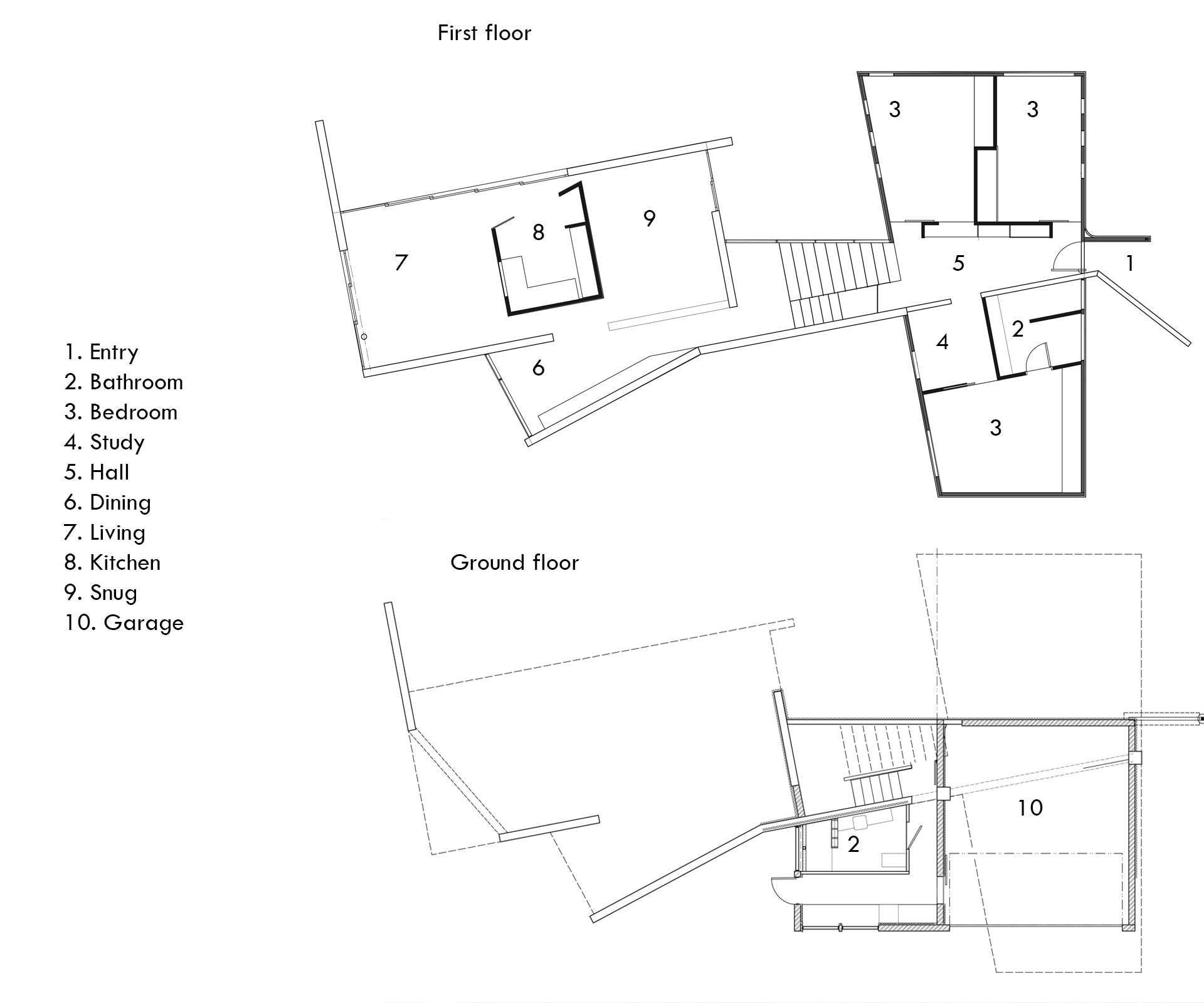
Discreet from the street, yet intriguing, the home is loosely composed of two elemental blocks. The front, clad in vertical cedar, is the bedroom zone. Stepped down a level, the living rooms beneath a saw-tooth roof are encased in a pre-cast concrete shell. Between the two is a moment of pause – a stairwell that leads past an internal courtyard. A ‘secret underground’ basement links to the garage, houses the laundry and a guest bathroom behind a slide-away wall.
Conceptually, Dorrington calls this “the most different house we’ve ever done”. It’s not hard to see why. It’s as far from open-plan standard as you can get. Unexpected geometries, slivered-in spaces and hidden discoveries are tightly knit, and there’s not a white plasterboard wall in sight.
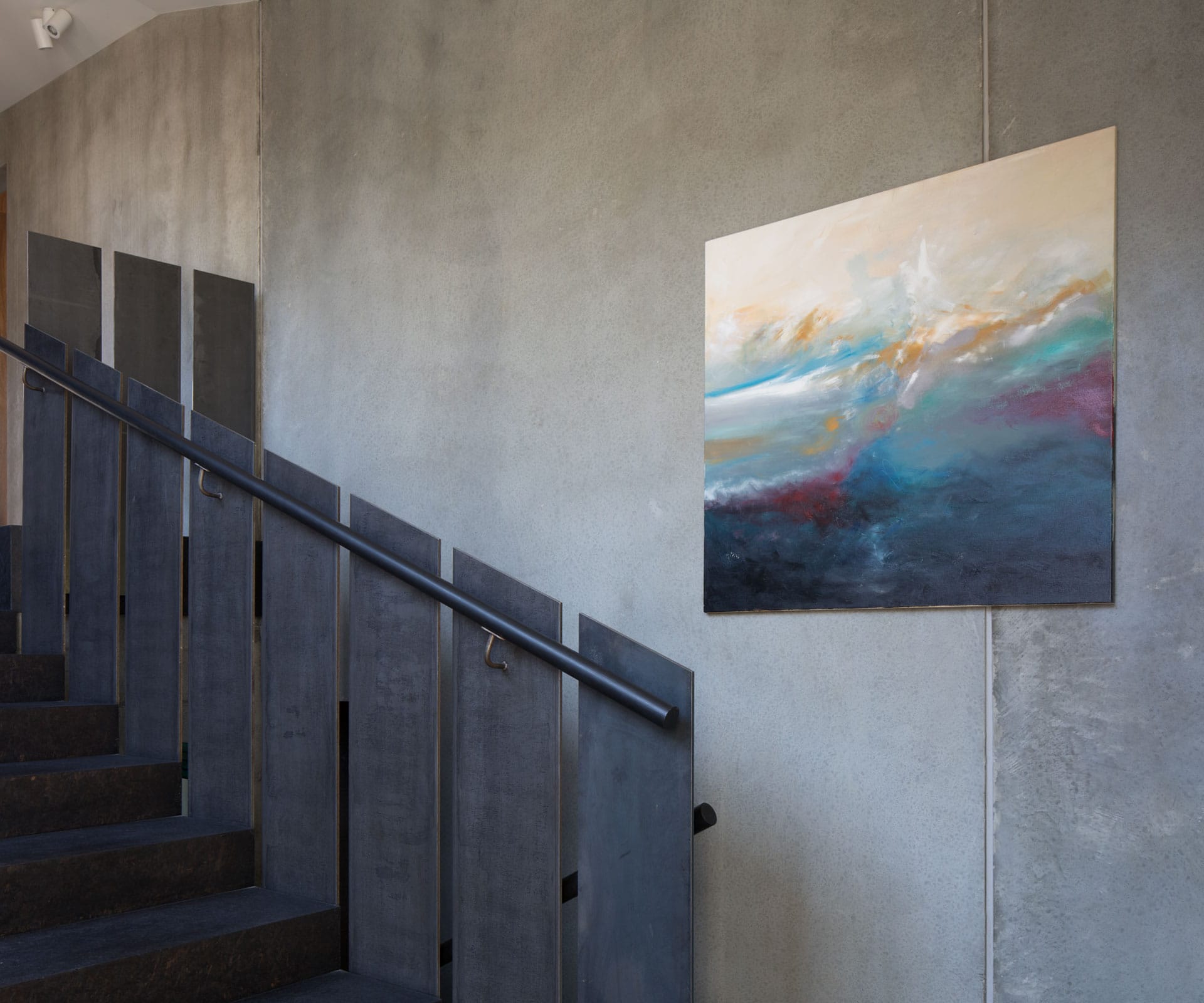
Just beyond the front door, sheltered by a Corten canopy (another point on the list), a mild-steel cabinet separates the hallway from a bedroom. “It’s our version of a hall table,” says Dorrington. This elemental material is picked up on the stairwell, where the balustrades are shafts of steel. Weighing many kilograms each, they were just one of the challenges the builder had to deal with.
Unusual spatial parameters with variously sloped ceilings meant it was rather like putting together a 3D jigsaw. He has done his job well; the faceted texture of the programme is perfectly planned – there’s reason behind each twist from the norm. “We were exacting on height-to-boundary requirements. There’s no extra floor space that wasn’t required,” says Dorrington.
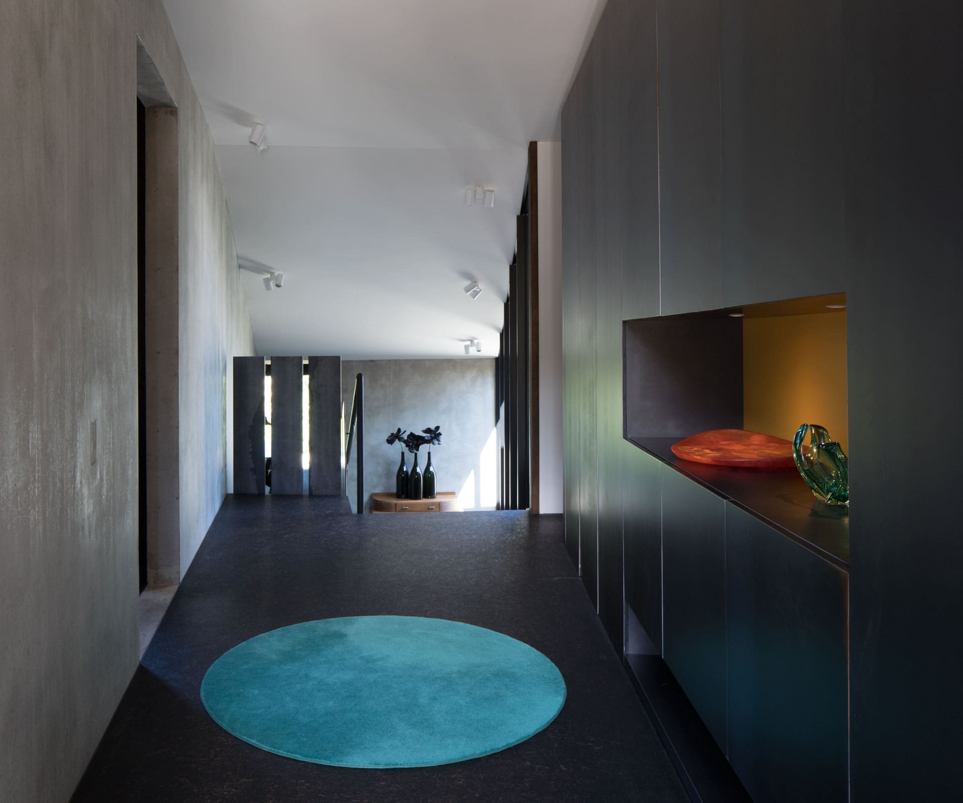
Contrary to first impressions, the bedroom block is not rectangular, but two right angles set off from each other by about 10 per cent. The panellised ceiling here gives an illusion of twisting from the wall lines.
Such complex thinking delivers the opposite – a Zen-like state of being where spaces are revealed slowly and the moodiness of the palette keys into the adventure of discovery. Raw concrete blade walls meet salt-and-pepper flooring, charcoal-stained dividers and black joinery. This is darkness by design.
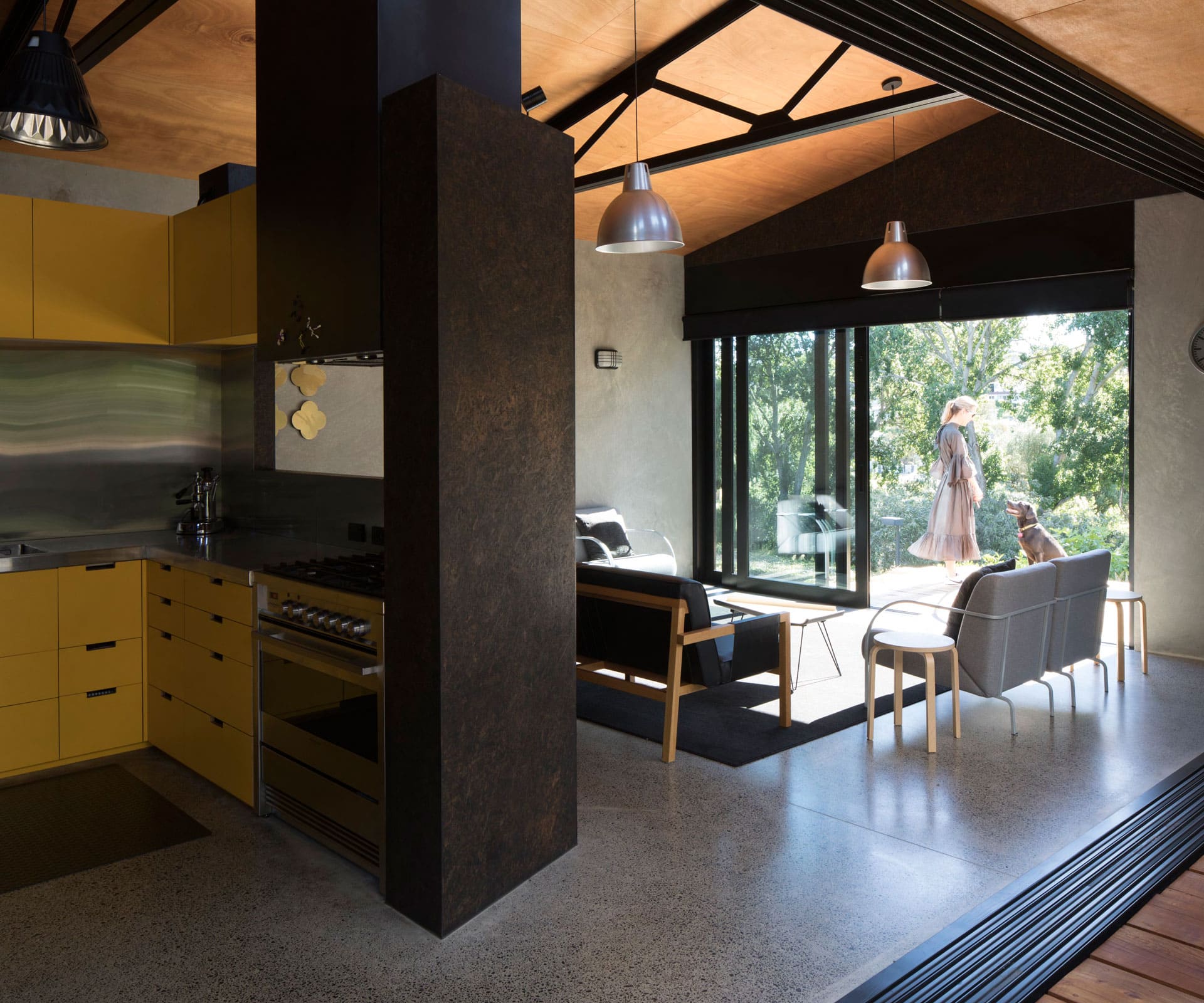
Not that there aren’t moments of levity. The kitchen, housed within a chocolate-stained Strandboard box with a window to the view, has sunny yellow cabinetry inspired by the Bailey house, Pierre Koenig’s less-famous Hollywood Hills case study. “It’s an insertion in the main volume and, to me, it’s like a Kinder egg, that chocolate shell with the yellow capsule inside,” says Dorrington.
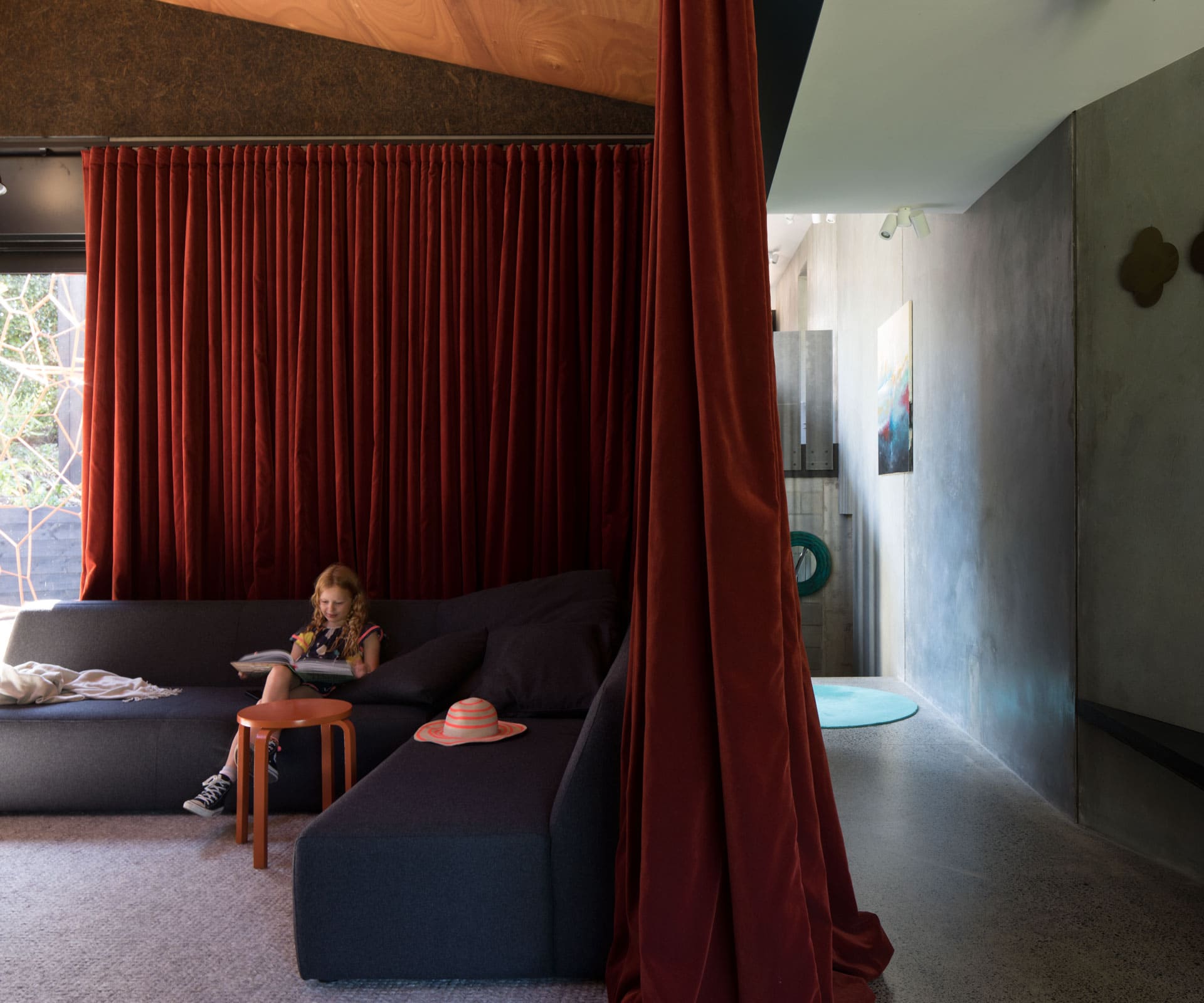
More from the magical mystery tour: a sumptuous blood-red velvet curtain draws open to reveal a snug TV room; a guitar on a stand inhabits the ‘music’ room where the touch of a plywood wall panel allows the built-in bed to descend; beneath the stairs, a wine cellar that only those in the know would be able to raid. “The owners felt that cupboard and door handles would date the house, so we used none,” says Dorrington.
It must have been tempting to string a horizontal band of glazing across the face of that view to the park, a window on the parade of the seasons. But this is modernism deconstructed and the owners preferred sectioned glass, so DAA split the glazing to frame individual aspects. Glass doors in the main living room on the north-west corner of the home lead to a small deck overlooking the park; another set opens up to the secluded dining courtyard to the north. The internal dining room shafts off the living space at a 20-degree angle, separated by a solid concrete wall. It’s a stepped-back room that serves to break up the singularity of the western elevation.
[gallery_link num_photos=”17″ media=”https://www.homemagazine.nz/wp-content/uploads/2018/02/Kohimarama14.jpg” link=”/real-homes/home-tours/family-home-kohimarama-architectural-design” title=”See more of the home here”]
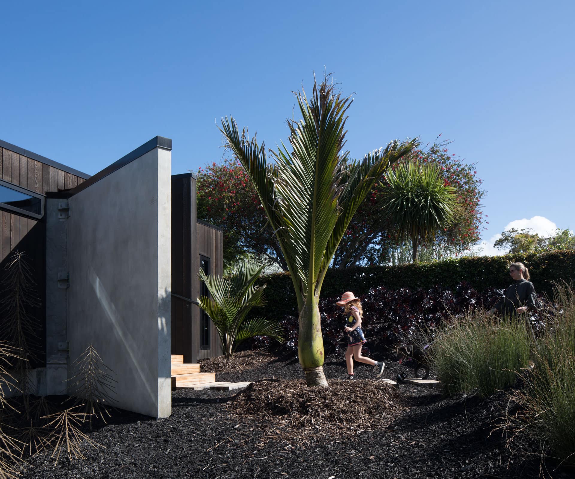
Whereas angles abound in the architecture, the landscaping takes a deliberately fluid form. Atcheson suggested the chunky sleepers laid at random lengths that make up the decking, and the couple, who were highly involved in the design, re-imagined the piles of earth that had been removed by diggers as magnificent mounds in the front garden. They planted them with waving oioi and installed a sculptural nikau near the front door.
Then, at the rear of the home, they built the timber path that snakes around an elevated lawn and down to a concealed ‘gin deck’. In summer-time, sundowners are a life-is-good way to celebrate the end of day here at this intersection of private domain and public park. If they’re feeling energetic, they can carry a kayak to the nearby beach for a post-work paddle, then return for a lingering supper on the deck.
From a wish-list of 32, only the pool – a ‘maybe’ from the outset – fell off the final programme. Not quite full marks but definitely a top-of-the-class result.
Words by: Claire McCall. Photography by: Patrick Reynolds.
[related_articles post1=”76705″ post2=”77707″]

