Tucked away on a rear site in suburban Mt Albert, this double dwelling is a home for two generations; it brings together a collection of materials and moments to deliver a beautifully cohesive whole.
There is what could sound like a haphazard group of materials at play here: there’s corrugate, brick, and weatherboards in different configurations; there’s concrete, tiling, crazy paving; there’s curvature; there are deep, bold hues and there are more subtle tones.
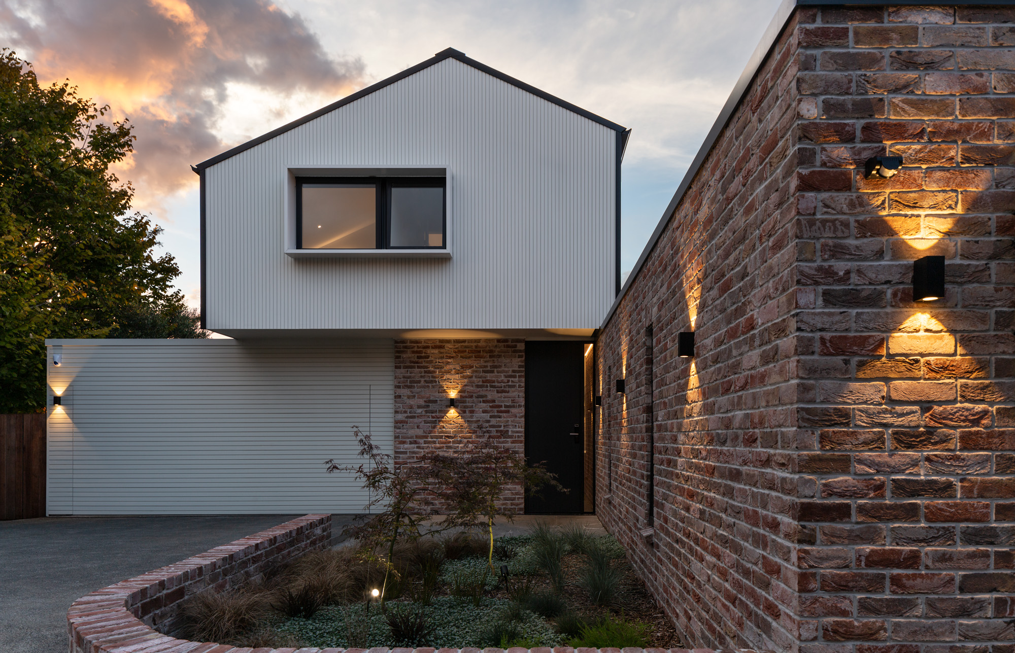
Yet, despite the seemingly disparate palette there is a beautiful synergy, with each element complementing the next in delightful moments of connection and pause — unfolding almost unknowingly, and understood only after the experience of the next. It’s a careful layering and juxtaposition that comes together like an impressionist painting, moving from individual strokes to an image of clarity when considered as a whole.
This was a house designed for two family groups: a couple and one set of their parents. Initially, it was to be a renovation but after the couple came upon a site just down the road it became a new build. For architect Kate Beilby of Milieu Architecture, it was an opportunity to give rise to a style of residential architecture that is on the increase in Aotearoa: the house for multiple generations, where both privacy and connection are front and centre.
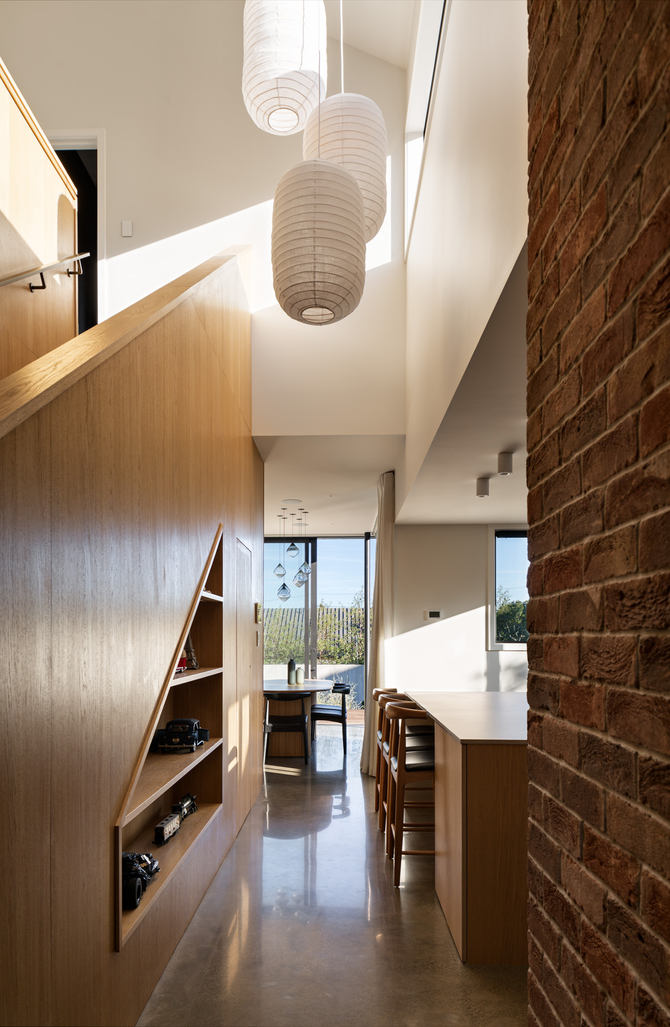
In the case of this small, rear site, tucked behind a modest brick house, the solution had to deliver much with a compact footprint. The street is in a heritage area that is home to a mix of bungalows and 1960s abodes whose predominant materials are brick and horizontal weatherboards — materials that provided Kate’s key design drivers.
Approaching the house, the eye is immediately drawn upwards to take in an asymmetrical gable framed by black roofing and joinery — this upper level clad in white vertical shiplap. The narrow boards of this storey give way to a deeper board below, used horizontally, and next to another section of the form that is clad in aged brick. Underfoot, crazy paving leads to a full-height black front door. A vertical slot window next to it offers a glimpse inside, where the external brick continues.
Curved brick planters fold around the brick-clad element of the lower level, which houses a connected yet self-contained flat. Japanese maples pick up the apricot tones of the brick, while Carex, dwarf flax, and Coleonema were chosen for their light, almost lime-green tones.
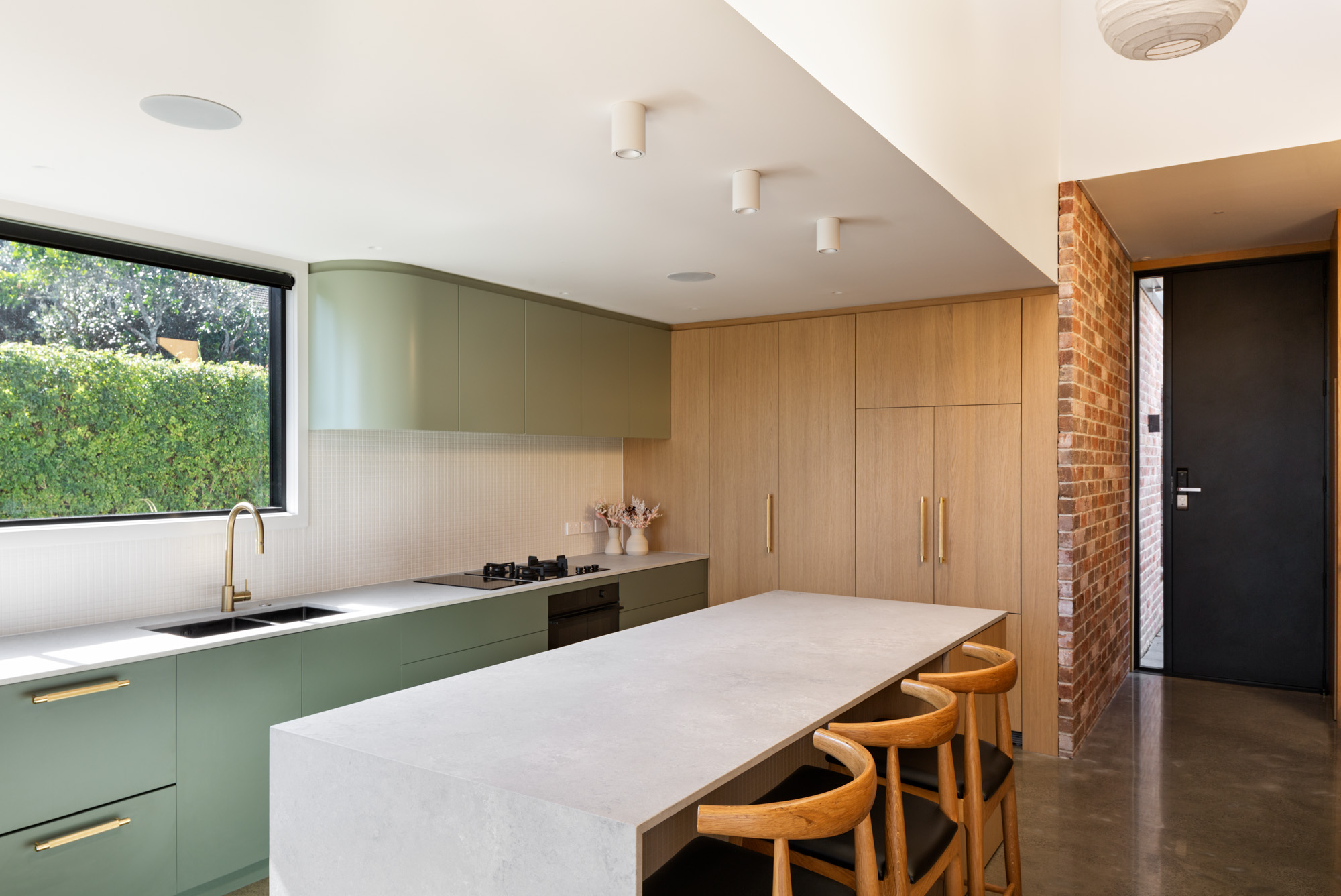
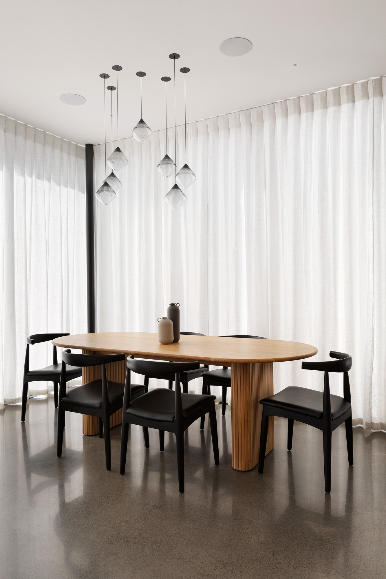
Enter the house proper and the brick wall leads from the entrance void to link with the kitchen and main living/dining area. Here, the tones of the planting at the entrance that may have been missed on arrival are reintroduced in soft green cabinetry. Then there’s the curvature of the overhead cabinetry; it mimics that of the planters out the front. There’s a melting of moments here, a sense of perfectly executed familiarity.
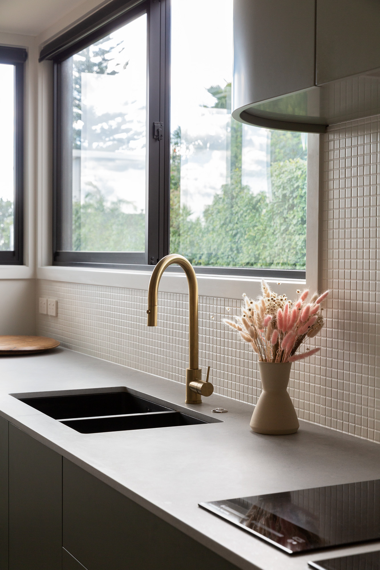
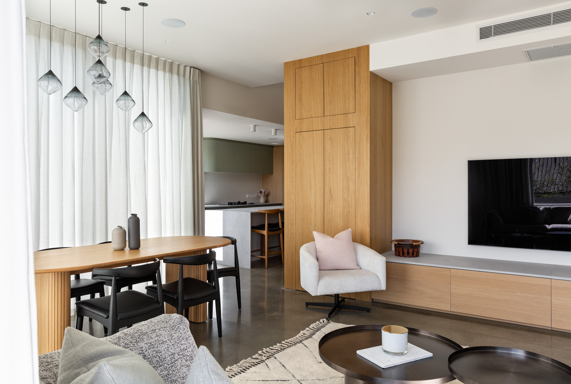
Mosaic tiles adorn the splashback, and meet full-height timber cabinetry at the rear of the kitchen. There’s a richness to this tactile palette, and it’s one that doesn’t end here. Wander around into the lounge and the timber cabinetry is continued, giving way to a low-height cabinet with the same caesar stone top as the island bench in the kitchen — another subtle link that draws you into the sense of allure this compact house offers.
With a modest total footprint of 230m², including garaging and the flat, along with a gym turned home office post-Covid and three bedrooms on the upper floor, the sense of space is created in part by the use of 2.9m ceilings and a 6.7m double-height space by the entrance.
“Upstairs, the ceilings slope up from 2m to 3.5m. We generally like to use sloped ceilings and double-height spaces, particularly if the footprint is small, as the height gives the illusion of more space,” Kate explains.
Perhaps what is most remarkable about this design is what it manages to deliver on a small, rear, suburban site. There are strong connections to place; there are beautiful and functional gardens — one for the flat and one for the main house, separate but able to be opened to one another. There are views up to the top of the local maunga, Ōwairaka — the site is just to the south of it — and out west to the Waitākere Ranges.
These connections are vital, and arguably also inform the basis of the interconnected spaces inside. Downstairs, the concrete floor was lightly polished to offer a subtle textural appearance, mimicking that of the bench and cabinet top. Brass handles and tapware introduce a further element to this sophisticated yet subtle palette.
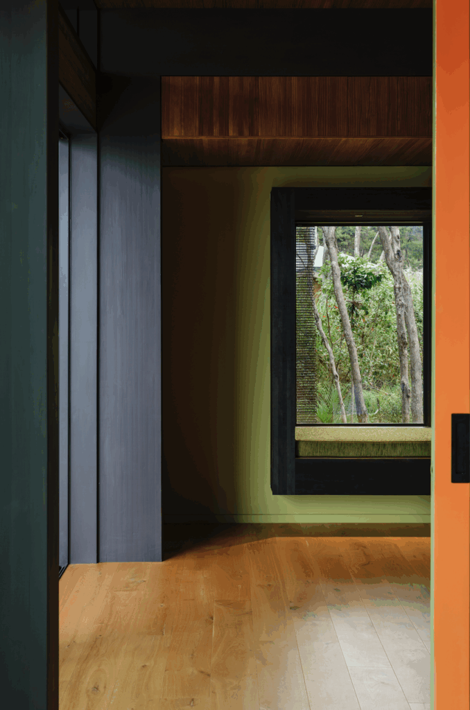
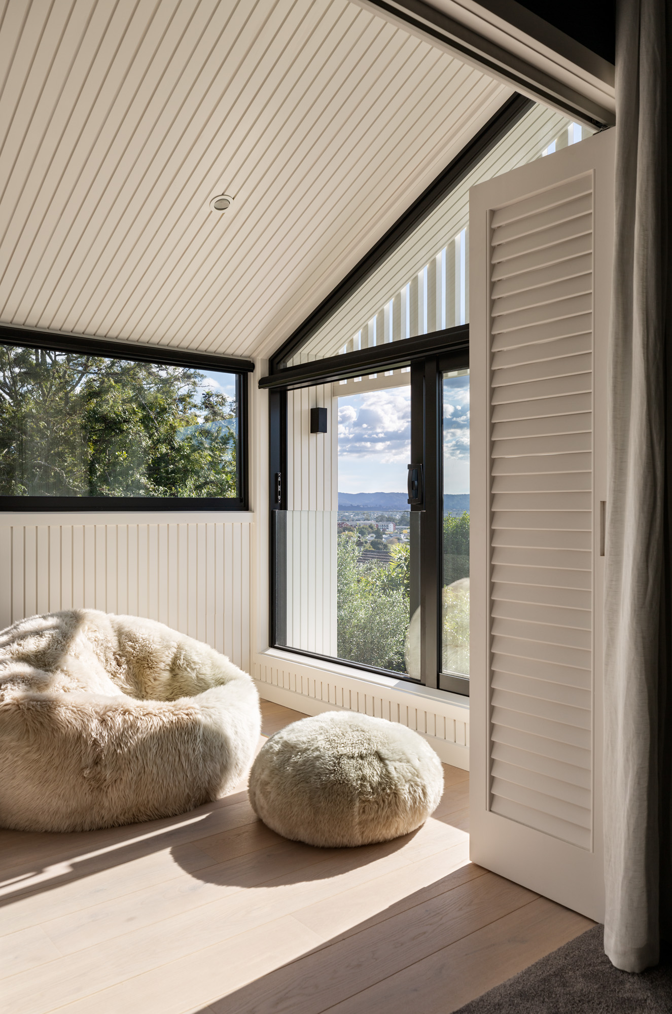
Upstairs, the concrete gives way to carpet. Here, there’s a different — but still entirely connected — approach. To the west, an enclosed sunroom is conceived as an ‘outdoor’ space. The vertical shiplap wraps inside to line the walls and ceiling of this room, while a sliding door with a glass balustrade allows the room to be opened to the elements and view. Underfoot, timber flooring is a departure from the carpeted stairs and bedrooms, further accentuating the sense of an alfresco area.
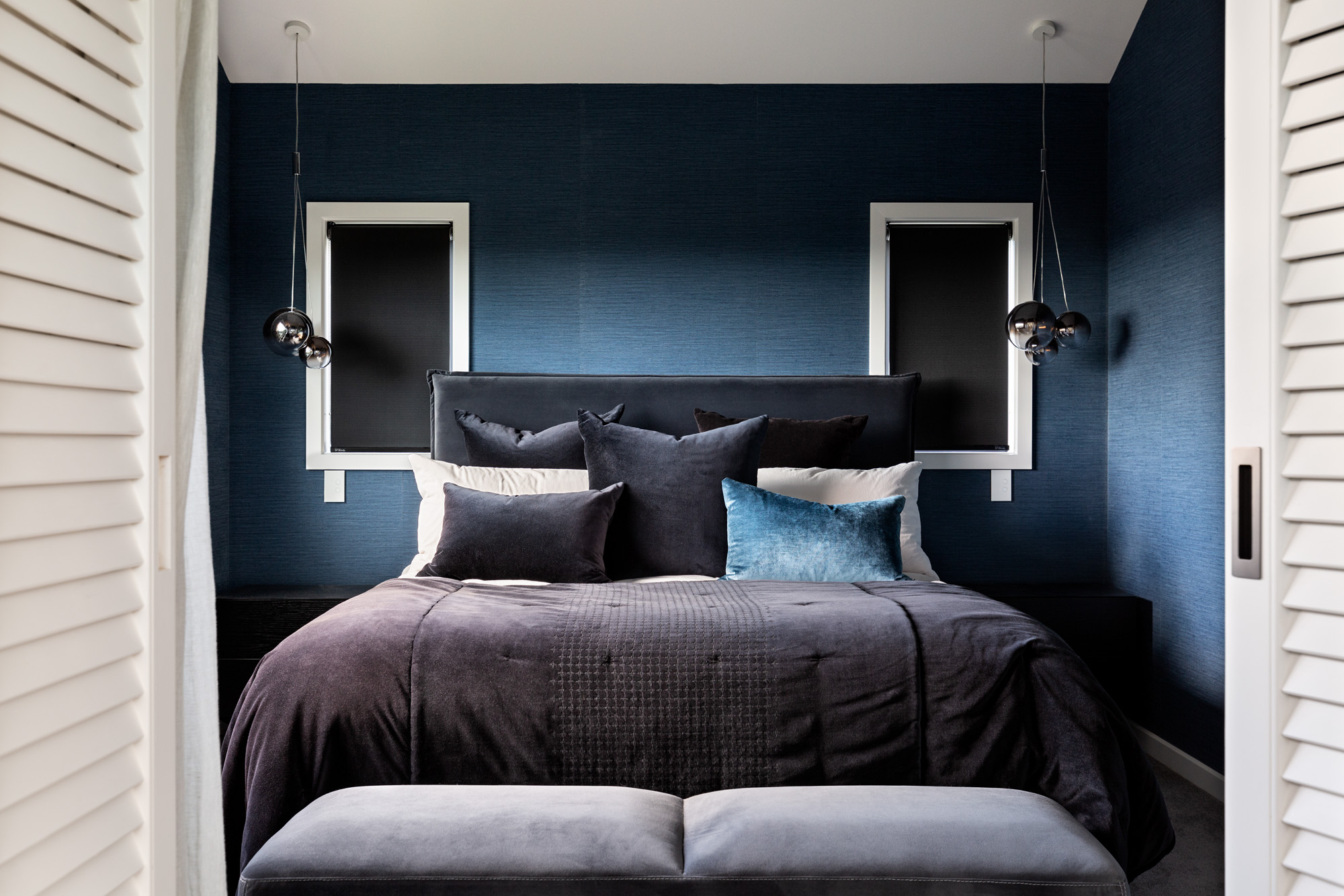
The master bedroom, also west facing, is a bright space with a ceiling that follows the gabled roofline. The walls are papered in a deep blue, creating a moody and comforting retreat. The ensuite and main bathroom, both on the upper level, offer a sense of luxury and space in stud height and material.
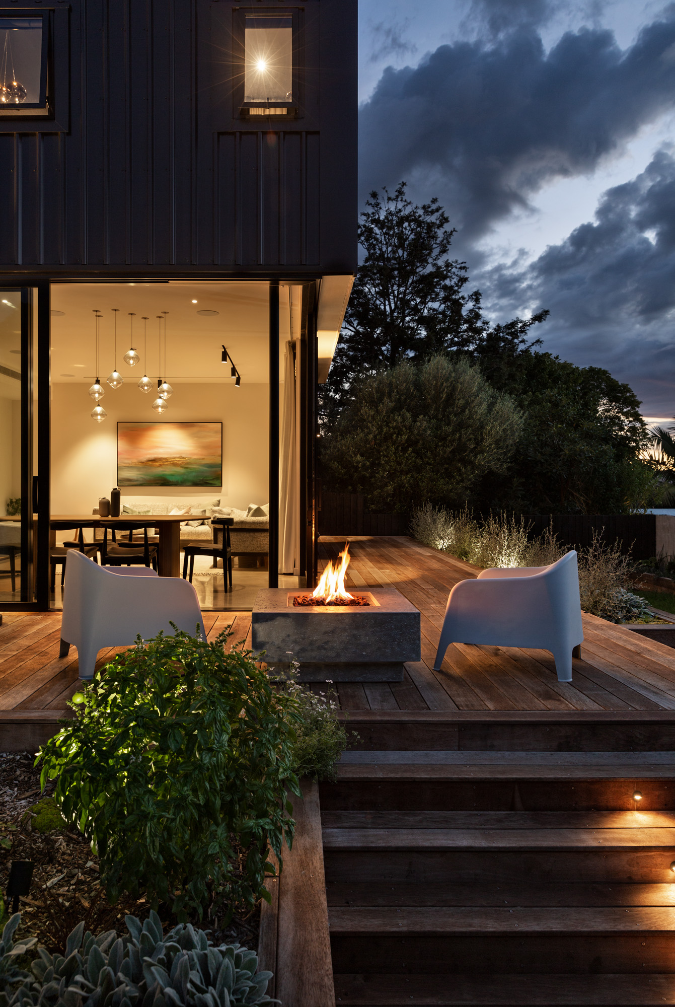
Downstairs, the main home’s garden extends out to the west. Looking back to the house, it can be conceived of in different parts: the dining area a glazed form, the living in brick, and the kitchen wrapped in weatherboard — a trio of distinct areas, each looking out to the deck, lawn, and planting beyond — while the upper level sits effortlessly atop the grounded form below.
“The clients’ parents lived overseas for part of each year prior to Covid,” Kate explains, “so they wanted a house that could accommodate a private and separate area for them for the months they were in this country.
“The design had to incorporate these separate living arrangements; both dwellings needed their own garden and their own privacy. It’s a style of living we find we are getting asked about more and more. It’ll be interesting to see if these conversations increase even more when the medium density rules change this month.”
For now, though, this is a house that has a lot to say about successful medium density design. There’s give and take, movement and light; there’s boldness and subtlety. Most of all, there’s connection. For Kate, that is the most important thing as densification increases.
“There’s value in living like this with extended family groups — obviously socially and for monetary reasons, but also in being able to reduce the footprint of the building to ensure more of a site can be utilised for that all-important garden and connection to the outdoors.”
