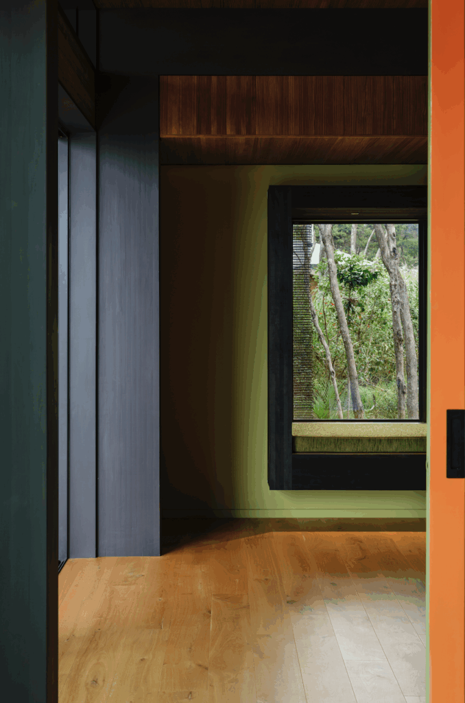
A modest project in Sandringham, Auckland by Pac Studio took the highest honours at the 2022 Dulux Colour Awards, being named the New Zealand Grand Prix winner.
Eden View was also the recipient of a commendation in the Residential Interior Category. It is a home that celebrates the richness of everyday life.
“Its unwavering commitment to colour sets this practice’s strategy apart,” the judges said of the project. “Redefining the potential of a small-scale renovation, Pac Studio has ambitiously designed a scheme to do much more than unite or revitalise an existing home. It has investigated the potential for colour to delineate space, affect mood and define identity. Despite the project’s modest scope, the result is transformative and highly effective — a credit to the architects’ vision and resolve.”
For the architect Sarosh Mulla, the project presented an opportunity to consider the use of colour as a way to redefine the interior of a late 1970s house in need of an updated kitchen and bathroom. “Part of the brief was about bringing more life into the house and finding ways to use colour to signal different experiences within it,” Sarosh explains.
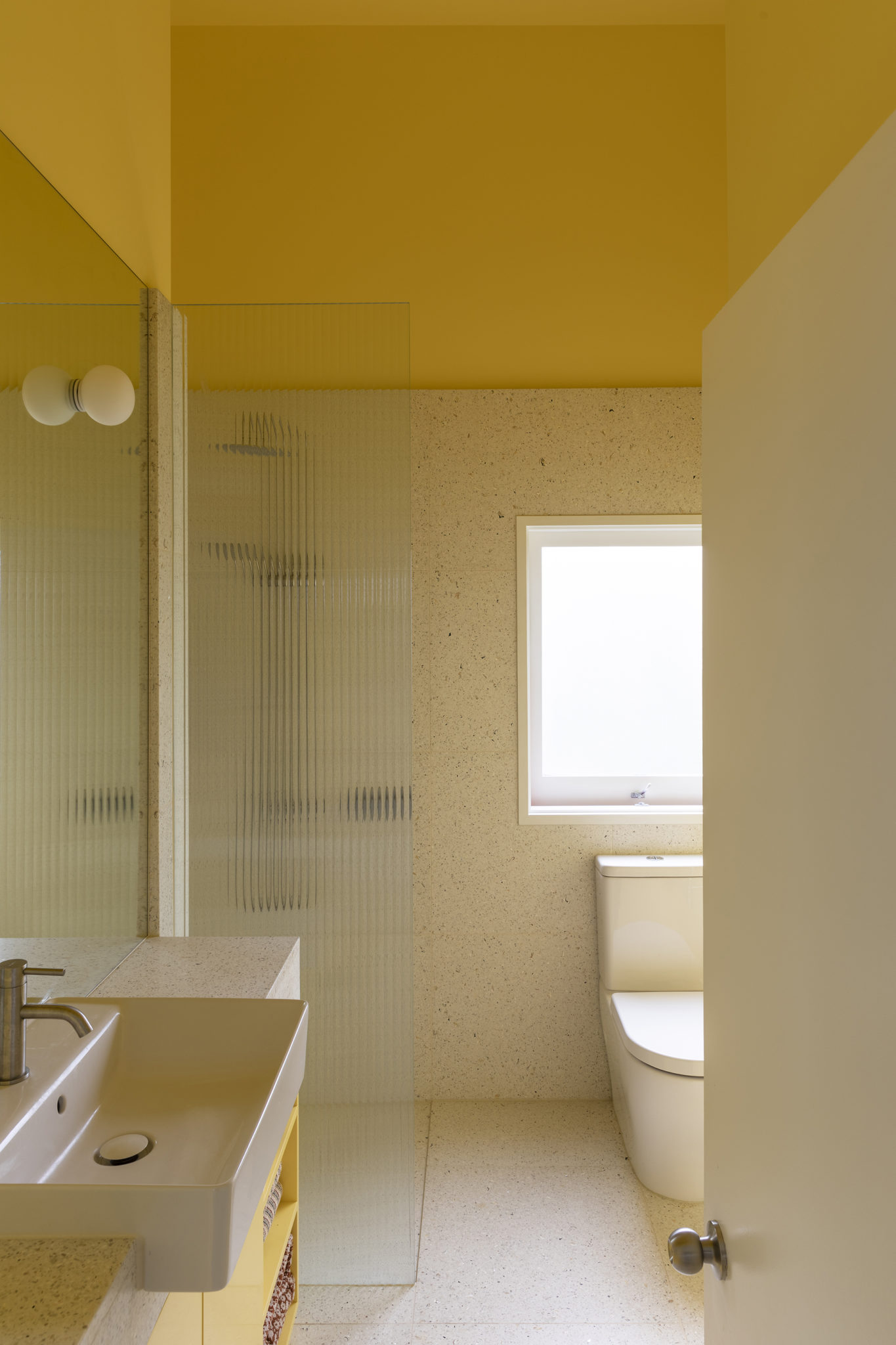
The kitchen and bathroom are compact spaces, so colour texture takes on a greater significance. “For us, this reworking of a tired and dated townhouse kitchen and bathroom was also an opportunity to continue our research into colour: how it defines identity, delineates space, affects mood and atmosphere. Here, the bathroom could signal the start of a fresh and sunny day; the kitchen could provide a calming and quiet place to cook in the evening and close the day with a cup of coffee.
“The starting point was the rearrangement of space for efficiency. The relocated laundry freed up space for an additional guest bathroom. Lifting the ceiling height in the bathroom transformed the sense of space. New doors from the kitchen connect with a lovely herb garden and bring in natural light.
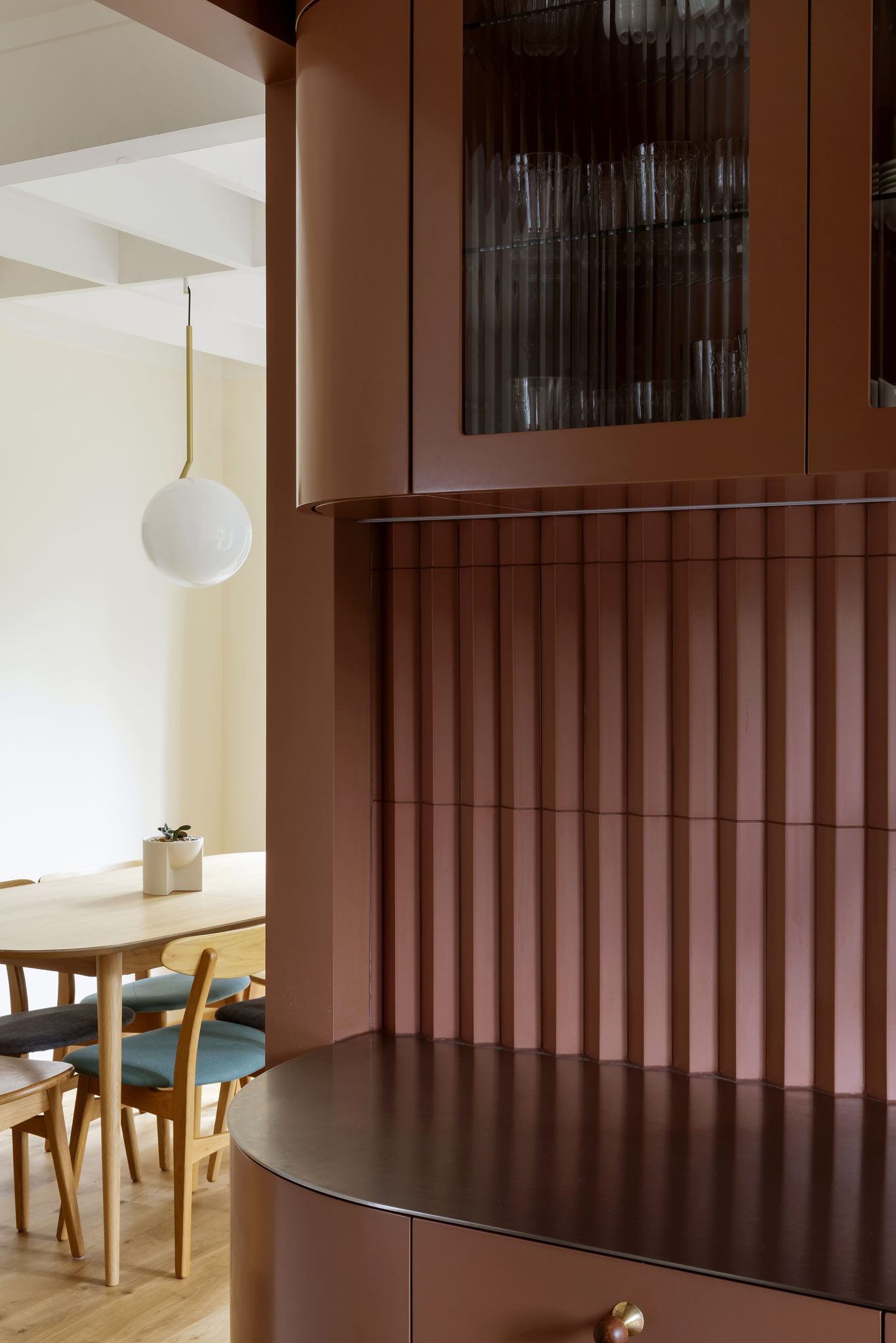
“The overarching aim was to create two distinct spatial experiences – using colour and texture as a counterpoint to the home’s more neutral rooms. A ‘pleated’ kitchen tile was selected for warmth and the way that it captures the light when it falls across its surface. This was matched with rich Dulux Coyote paint-finished cabinetry, while solid brass and salvaged pōhutukawa we had turned were used for handles as a way to turn the kitchen into something really special.
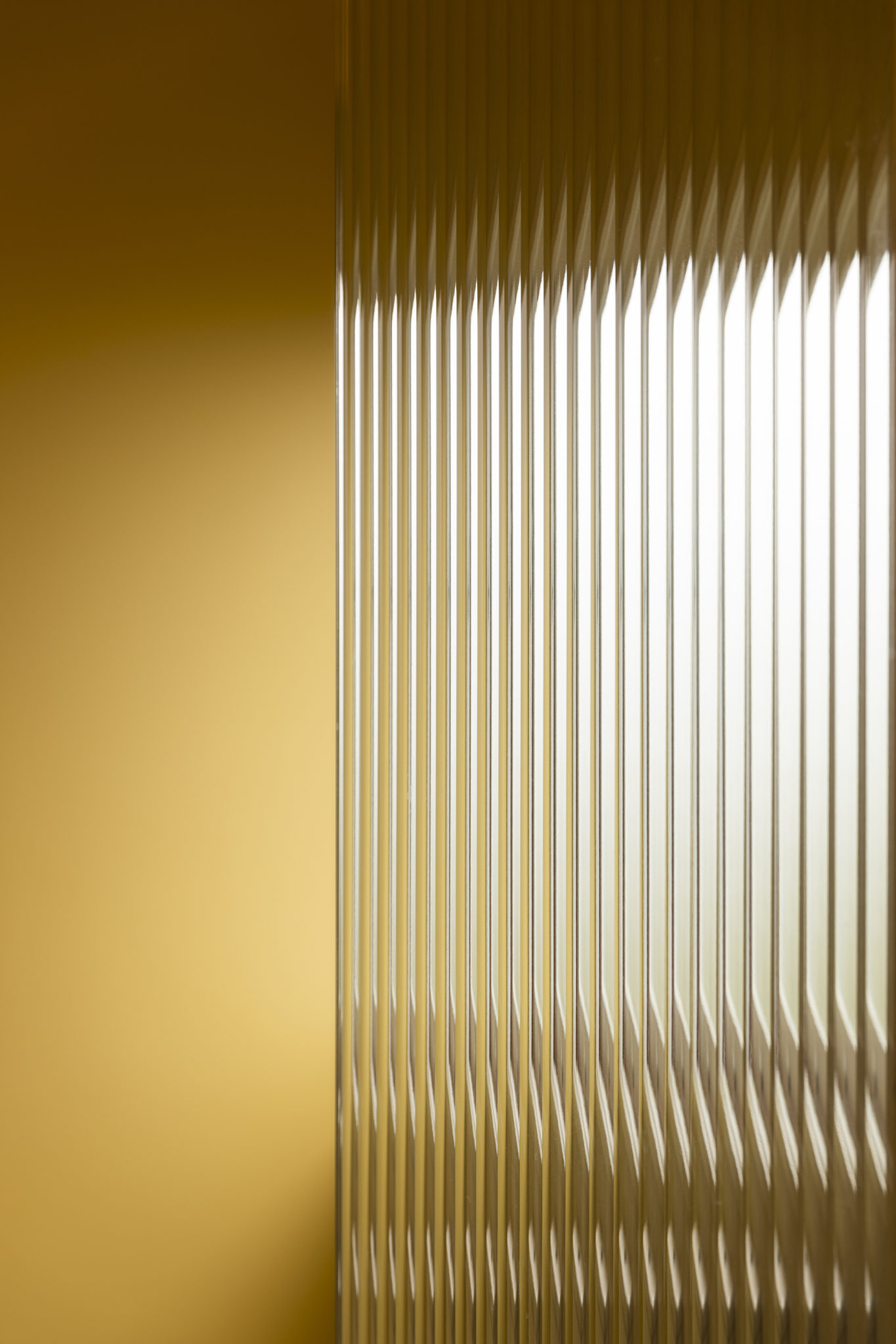
“The fresh yellow of the bathroom, in Dulux Cape Kidnappers, was carefully matched to a terrazzo tile with a yellow gold fleck of crushed shell. Both feel light and bright even on the most cloudy day.
“I think the use of colour here really enlivens all the spaces within this house. In both the kitchen and bathroom, you feel like you are stepping into a volume that is its own dedicated area. While all the rooms in this house are in different tones, the kitchen and bathroom are the punchiest and work to anchor the other areas.”
The winners of the 2022 Dulux Colour Awards were announced in June at events in Auckland and Melbourne.
