Our new issue is on newsstands Monday! This one’s a bumper, with eleven New Zealand homes featured, including six small, smart and eco-friendly baches. In this post, HOME editor Jeremy Hansen chooses his favourite images in our December/January issue.
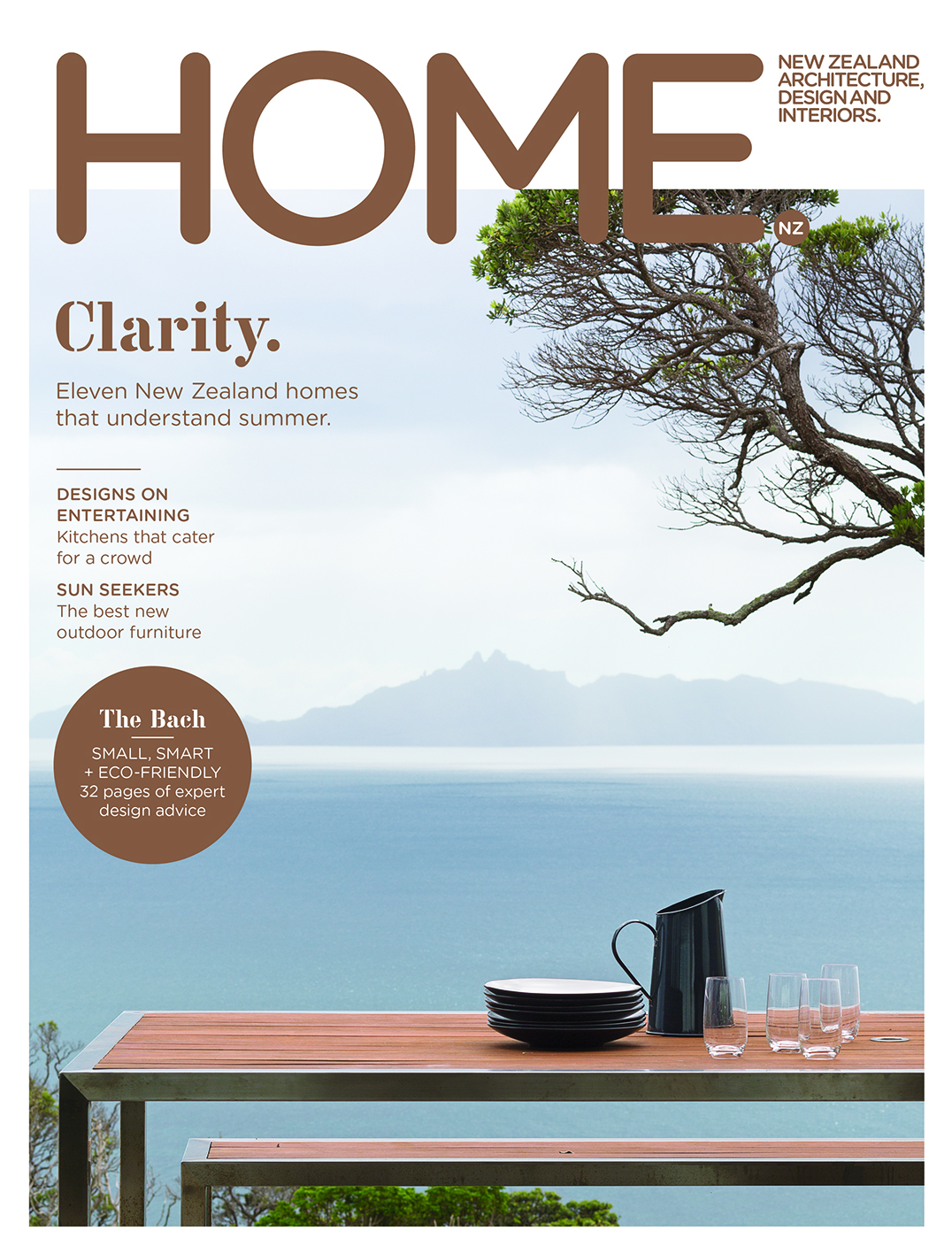
1. The cover
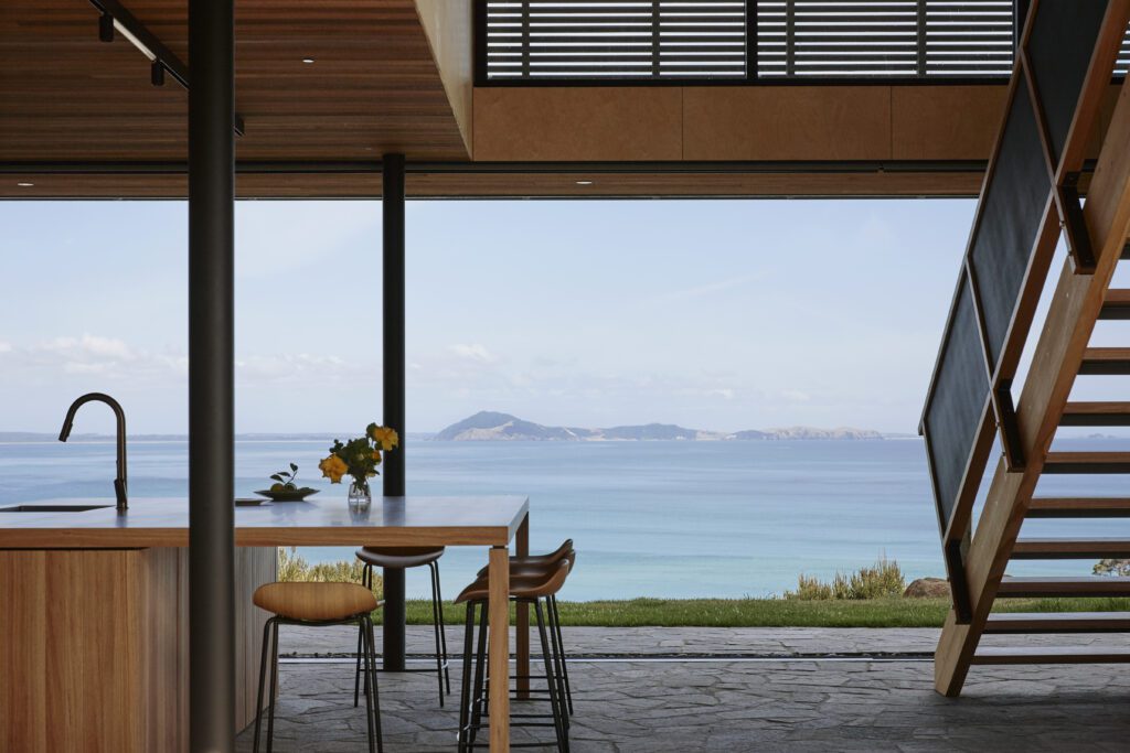
“Arch [HOME’s creative director] picked this as a cover from all the images in the issue really early on. I liked it too, but have to admit that I was nervous that it didn’t actually show a home. So I asked the team to do a whole lot of other options, but of course Arch was right – and now the cover’s done I’m really happy with it. I think Patrick Reynolds’ image (with Yvette Jay’s arrangement of a few simple objects on the table) has a great sense of calm about it, which is exactly the kind of feeling I want from a summer holiday: a beautiful view and nothing to do. The image had the added benefit of holding coverlines really nicely – I like how that single word, ‘Clarity’, really jumps in its metallic bronze ink.”
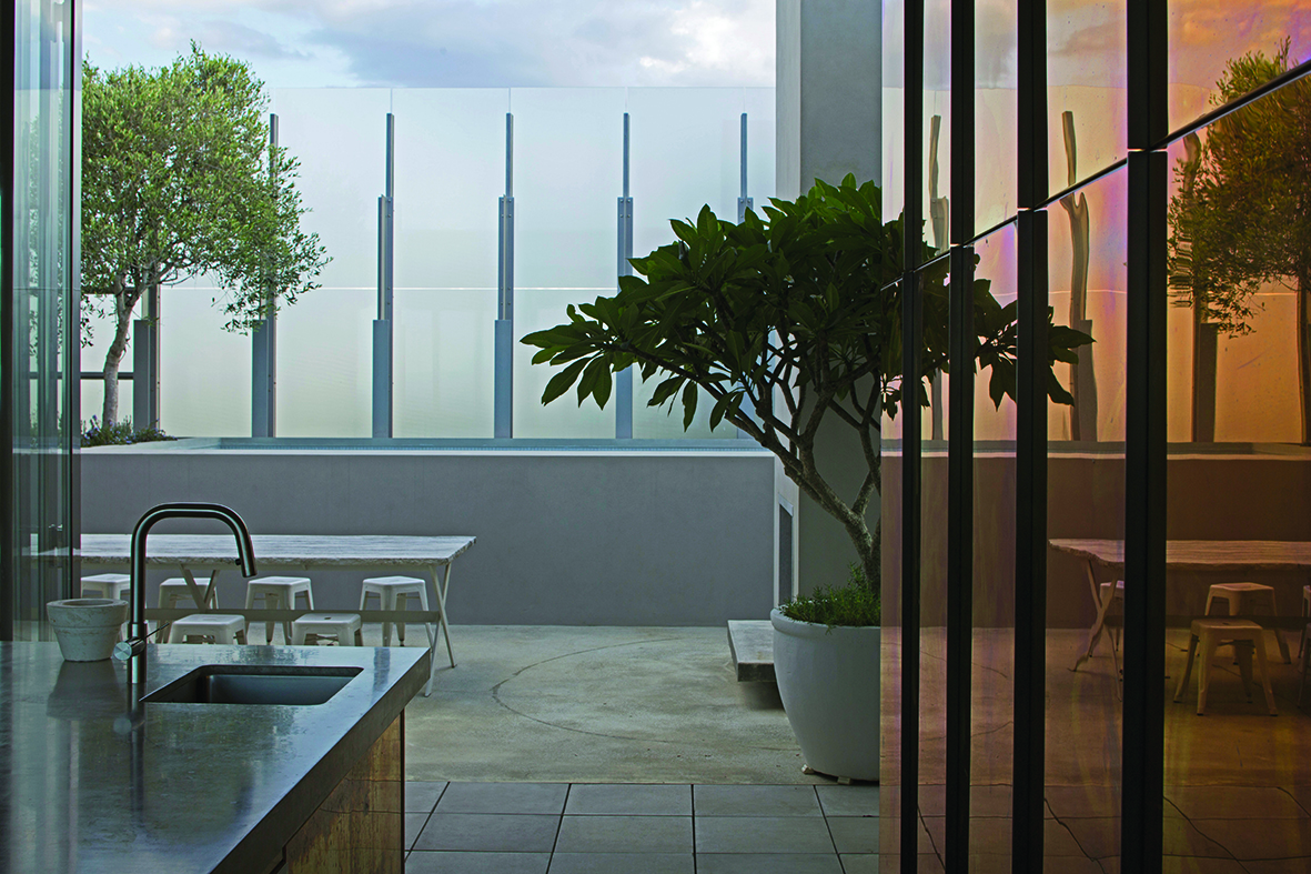
2. Dune House by Fearon Hay
“We were really lucky to be able to feature Fearon Hay’s Dune House in this issue, right after it won the ‘Villa’ category at the World Architecture Festival. The home’s big gesture is the way it is surrounded by a wall of frosted glass that creates privacy for the rear courtyard without shutting out the light. The glass wall is like an ethereal veil with a real sense of mystery to it, and makes the courtyard space feel intriguing and a little magical. The way Patrick framed this shot of the courtyard with the kitchen’s brass cabinetry in the foreground at right beautifully conveys the way light plays through this fantastic beach home.”
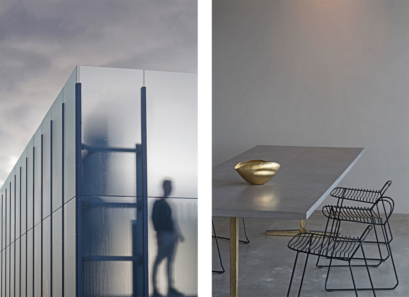
3. More from the Dune House
“Also from the Dune House by Fearon Hay, I love the way we’ve paired these two images by Patrick Reynolds across a spread in the magazine. Neither image shows a whole lot, but they both demonstrate something essential about the house. The image on the left shows architect Tim Hay behind the home’s glass screen in the courtyard – it looks intriguing and makes you want to know what’s behind the screen. The image on the right shows how much richness there can be in minimalism: the concrete floor, the plastered wall, the custom-designed table by Penny Hay with its brass legs. You can imagine this space being a cool retreat on a hot day.”
4. Seeing forever from Mangawhai
“The Breamtail House by John Irving (where our cover shot is taken from) is in one of the most spectacular locations just north of Mangawhai. This photograph by Patrick Reynolds captures the drama of this quintessentially spectacular New Zealand landscape. It stops me every time I see it and makes me want to be in that house, looking at that view, all day.”
5. A staircase to lounge under
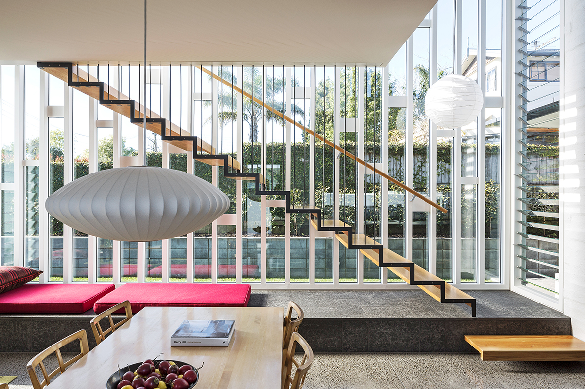
“This staircase is in architect Guy Tarrant’s own Auckland home in our new issue, and I think it and the window behind it are incredibly beautiful. Guy says the window design was inspired by windows in mid-century churches – appropriately, it blesses the home’s living areas with wonderful morning light. The staircase itself looks incredibly slim and delicate, and I love the fact that you can curl up on the daybed beneath it with a book. Guy is fastidious with details, which you can see in the staircase itself and also in the timber step at right that eases the transition to the staircase’s slate base. I also like how Patrick has composed this image with his usual precision.”
6. A home with a sashay
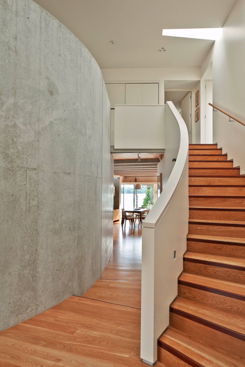
“This issue features a home on Lake Pupuke by Mitchell & Stout Architects. When I interviewed architects David Mitchell and Julie Stout about the house, David said that Julie kept drawing a ‘sashay’ in the plan to make the house work on its long, narrow site. Photographer Toaki Okano beautifully captured this sashay, which takes place inside the home’s front door: the staircase and an adjacent concrete wall curve in elegant harmony, and a glimpse of the lake reveals itself as you round the bend.”
7. Away from it all
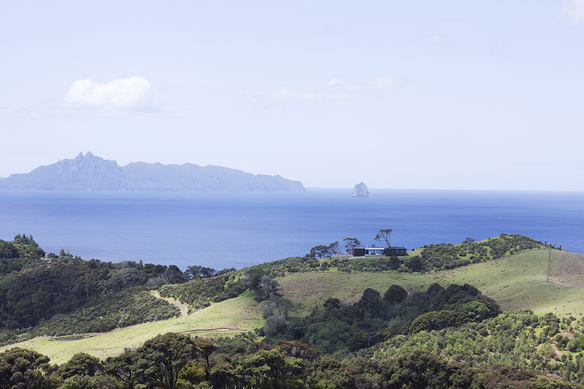
“Our special section in this issue on The Bach includes this photograph by Simon Wilson of a home on Great Barrier Island designed by David Loughlin. I really like the drama of the landscape, and the way the home on the hill peeks out just above the trees. It really emphasises the notion of escape that we always want our summer issues to convey. It also makes me want to go up there and see what the view is like.”
8. Three’s company
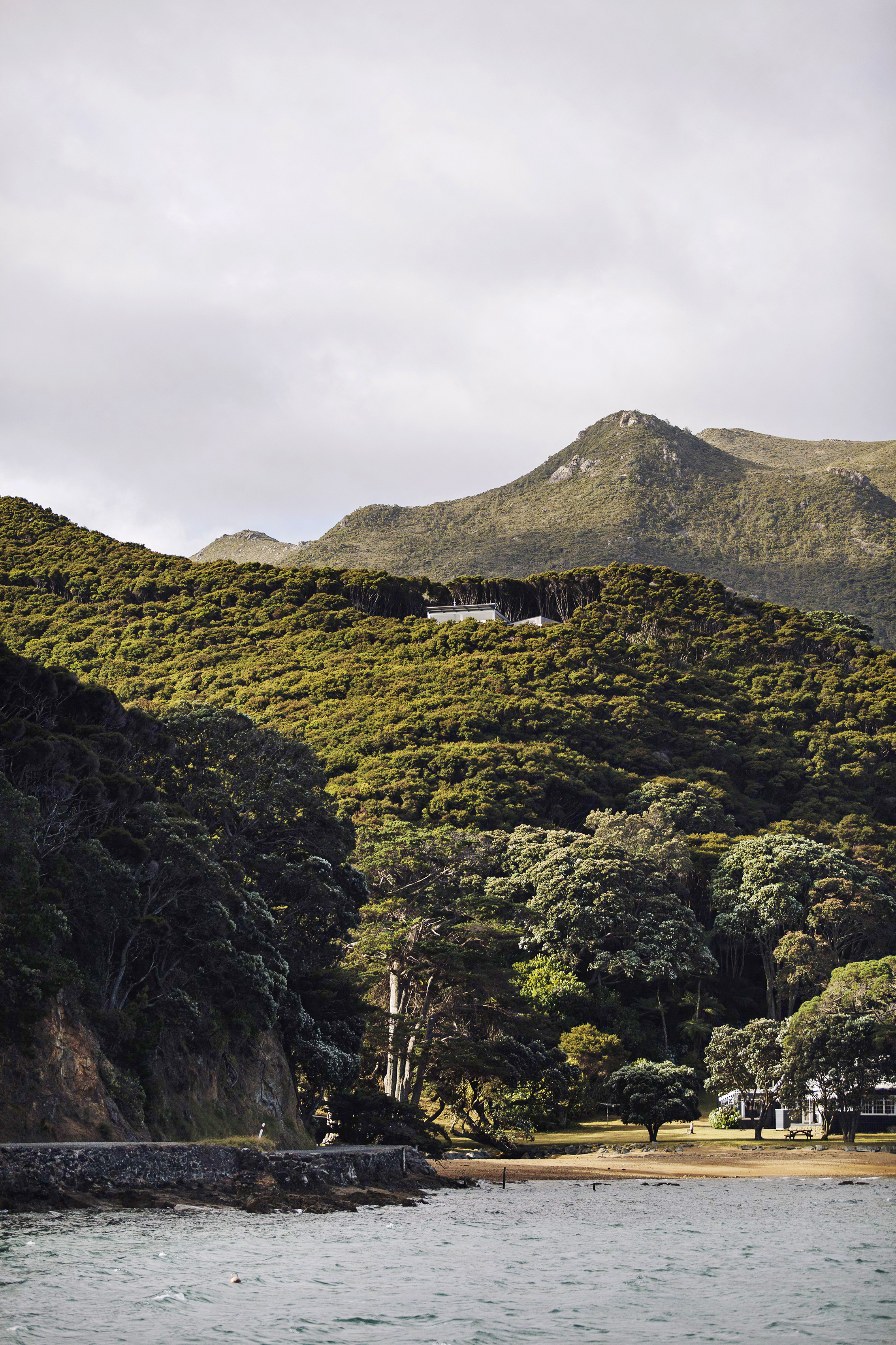
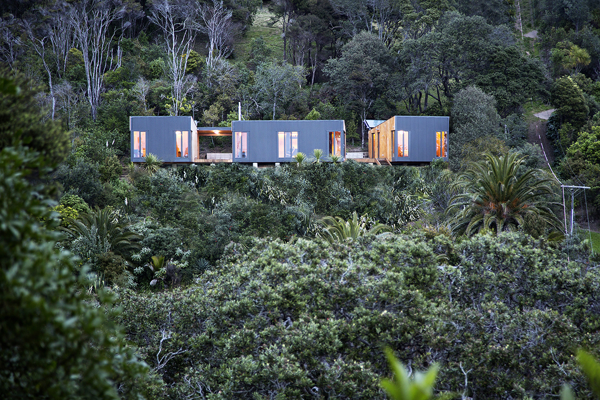
“I like the arresting but simple form of this little bach on Waiheke Island by William Giesen and Cecile Bonnifait of Wellington’s Bonnifait + Giesen. It’s actually made up of three pieces: two small bedroom pods and a central living, dining and kitchen pod with decks between them. It combines serious environmental discipline with a sense of warmth and comfort. It’s not accessible by road, which meant all the building materials had to be walked in, but the fact that you can’t park a car near it only enhances the magic of the site. The steep hill drops away to the water, so I still haven’t remembered to ask Russell Kleyn how he actually got this shot. He probably got his feet wet to shoot it.”
9. A little time at the bar
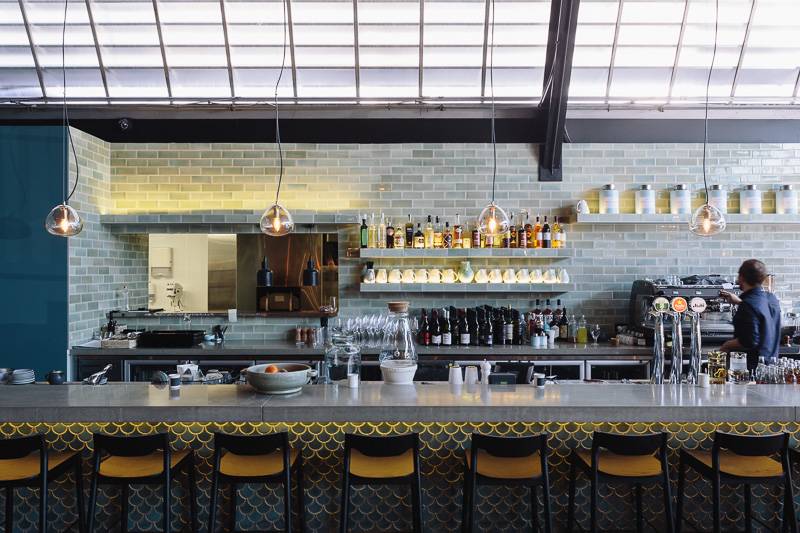
“Odette’s has just opened in our building at Auckland’s CityWorks Depot, and it’s a pleasure to visit and to introduce it to our readers by featuring it in this issue. The food is great, but we also love the interior, which co-owner Clare van Den Berg created in collaboration with Cheshire Architects. Simon Wilson’s photograph captures the bar’s warmth and elegance perfectly, and makes me want to go for a drink there now.”
10. A warm welcome
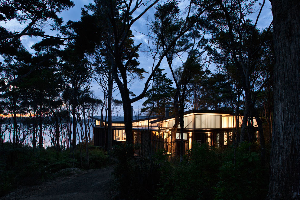
“Architect Jane Aimer told me that when she first visited the site of this bach she and the team at Scarlet Architects designed on the Kaipara Harbour, it was a rainy, miserable day, so she wanted to create a building that offered a warm welcome when people reached it down the end of the long gravel driveway. The polycarbonate clerestory looks beautiful at night, and it also means that, no matter how gloomy the day, the interior of this economical bach is filled with light. I also like the the silhouettes of the trees in this photo by Simon Devitt: the west coast bush can sometimes feel a little claustrophobic, but the way this home is photographed makes it look like a secret hideaway.”
HOME’s special summer issue is on newsstands from Monday December 1.
