A family home in Central Otago’s Gibbston Valley opts for pared-back simplicity in a lavish landscape
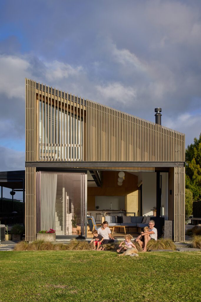
In the 1960s, the average New Zealand house size was 128 square metres. Five decades later, interior designer Nikki Wilson, web developer Michael Cox and their daughters Orla, eight, and Fehn, six, live in a home exactly that size in Central Otago’s Gibbston Valley. When you think about it that way, the house has no right to appear in an issue dedicated to small homes.
But these days, with average new house sizes over 205 square metres and climbing, a three-bedroom, one-bathroom family home like this starts to look unusually modest. Which is just how the owners wanted it. “I like compact, cosy living as opposed to rattling around in empty spaces,” Nikki says. “My Scottish heritage has given me a frugal outlook – waste really disturbs me.”
[gallery_link num_photos=”20″ media=”https://homemagazine.nz/wp-content/uploads/2016/09/gallery-feature-6.jpg” link=”/real-homes/home-tours/rules-of-designing-a-small-home-with-assembly-architects” title=”See more of this home”]
When they began the process of moving from Wellington to the valley five years ago, Nikki and Michael’s moderate budget meant frugality was essential. Money wasn’t the only constraint. The couple had sub-divided a site from a vineyard owned by Michael’s father (Michael’s brother did the same and lives nearby), and consent conditions limited the height of the building to 4.5 metres, leaving only a tight envelope within which a new home could be constructed.
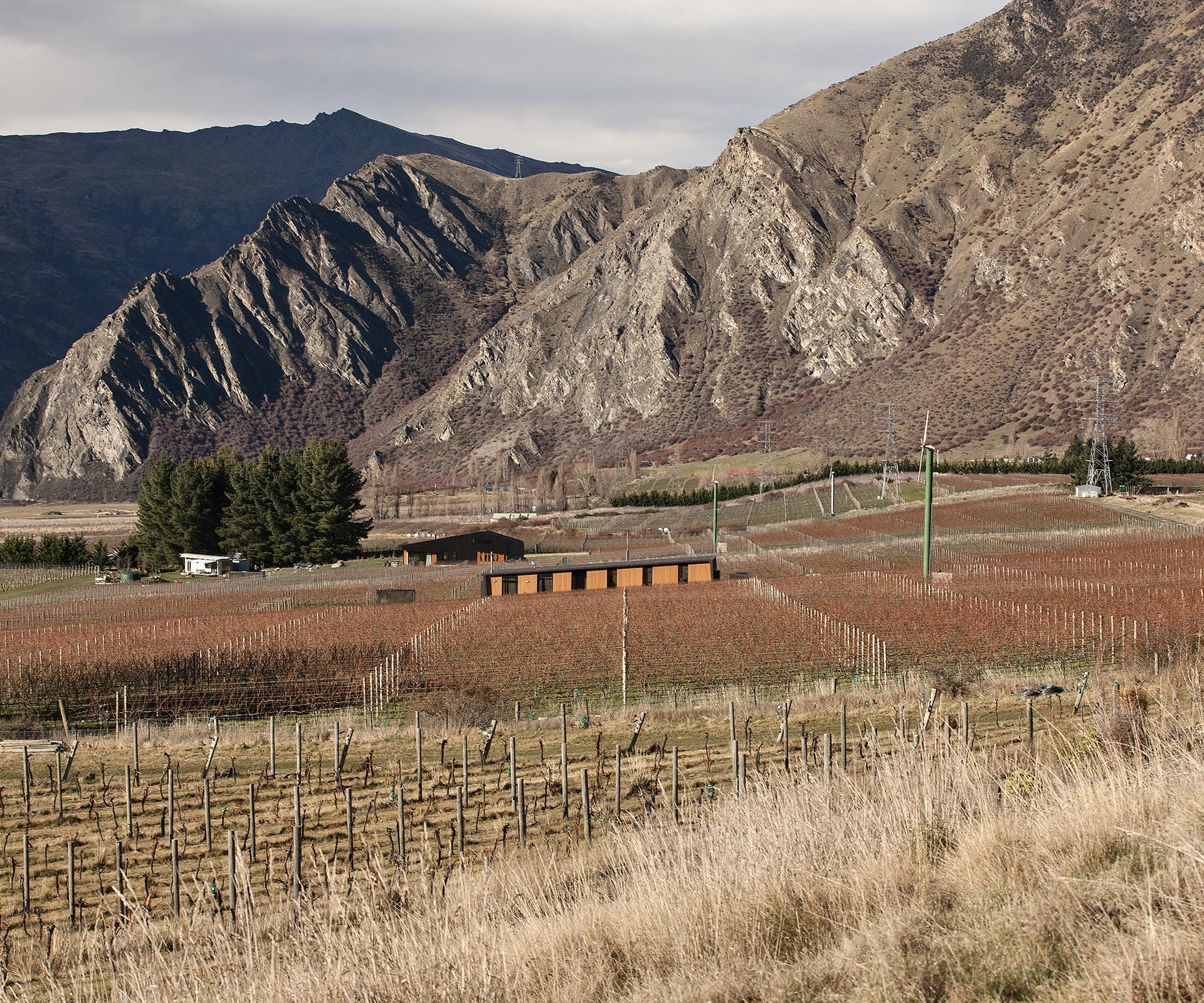
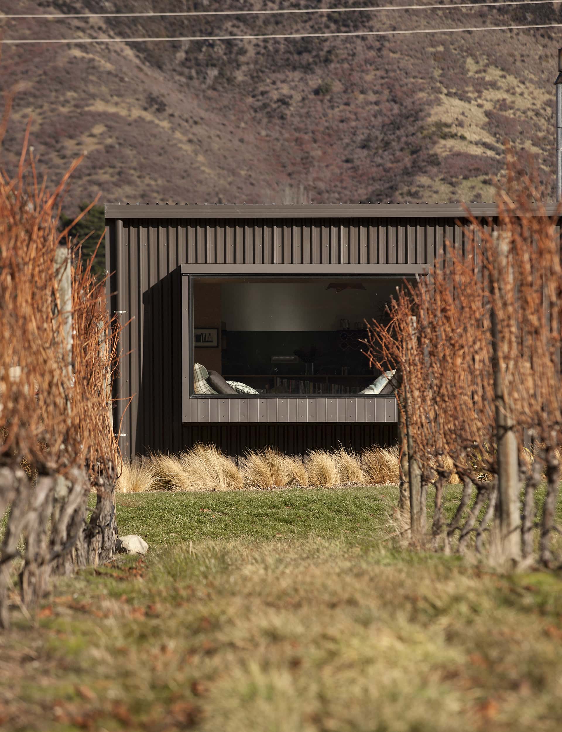
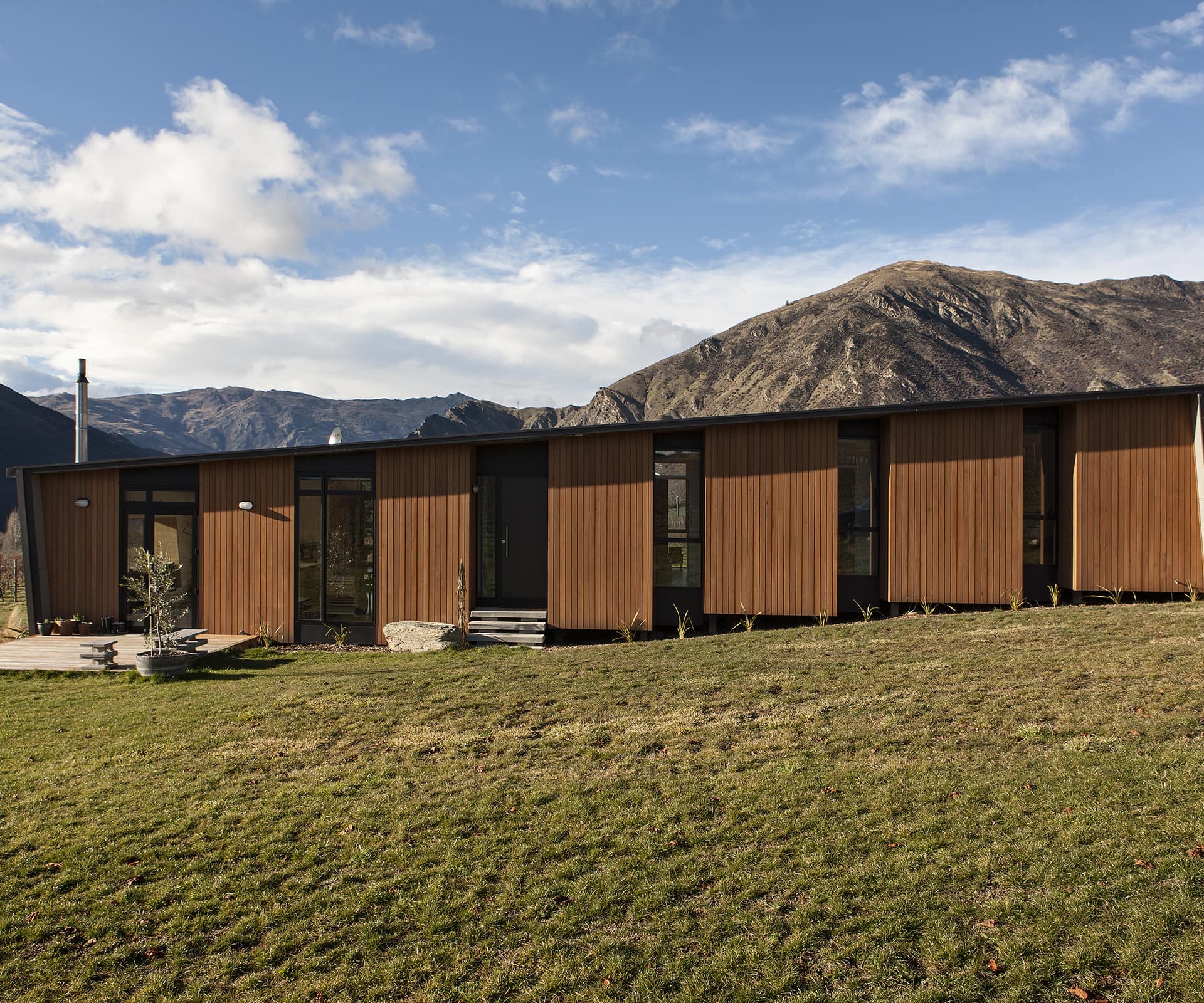
Nikki and Michael had both lived in Central Otago before and were mindful of the need to attract northern sun. They had sketched a floor plan of a north-facing house running east to west along the site but, inspired by the strict geometry of the grapevines, architects Justin and Louise Wright of Assembly Architects decided to spin that plan 90 degrees, running the home south to north in the same direction as the rows of grapes.
Its sloped roof is an expression of the building-height limit as it follows the terrain downhill. It was a move that had several advantages. It means there is now sun in some part of the house throughout the day. The home acts as a windbreak to the prevailing westerly, creating a sheltered area on the eastern side of the house that is also shaded from the hot, late-afternoon summer sun. The move allowed the house to take advantage of dramatic lateral views down the valley to the west and to Nevis Bluff, which towers in the east. The way the building slopes with the land lends a sense of dynamism and interaction with its site.
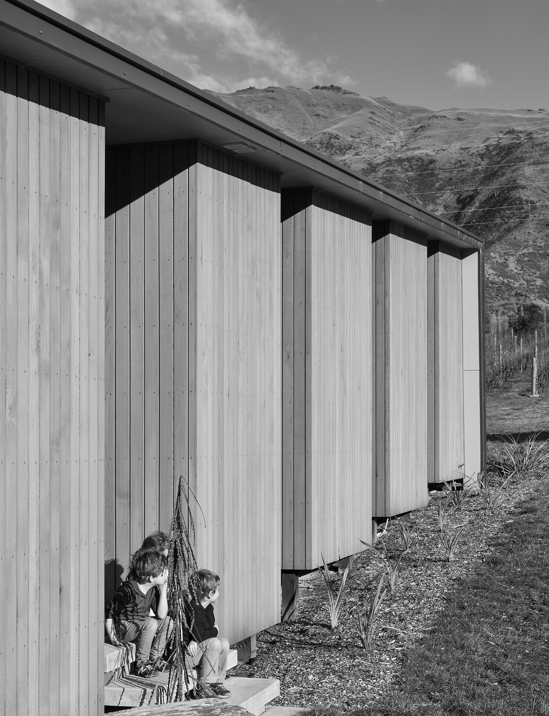
Justin and Louise designed the home so it could be built economically, with repetitive details that minimised complexity for the builders. The long hallway, lined with generous storage cupboards, lends the house a sense of height and greater volume by allowing views from one end to the other (it also allows heat from the wood burner to drift up to the bedrooms). In the combined living, dining and kitchen area, a steel-framed window seat makes for a perfect space to curl up in the sun on a winter afternoon. For a compact home, it feels surprisingly light and spacious.
This, Nikki says, was the aim. She and Michael were accustomed to living in small spaces and knew how to make them work. “We’d been living in little dark boxes for some time,” she says, “so in this home we wanted volume and light and spaciousness. It became an exercise in leanness – what do you absolutely need so you’re comfortable, but you’re not compromising light and volume? I got quite obsessed with how reductive you can be without crossing over to the point of lacking warmth.”
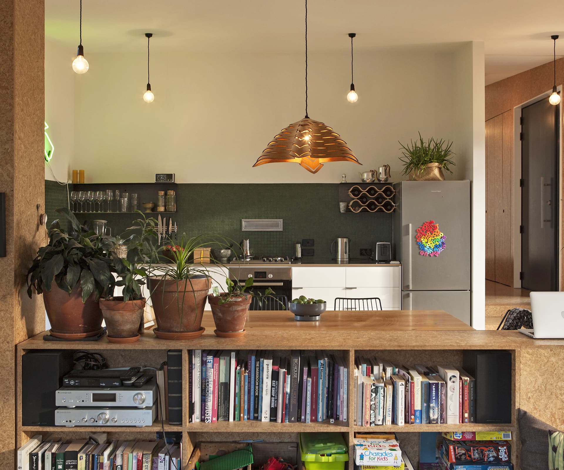
As an interior designer, Nikki has helped create well-known spaces such as Queenstown restaurant Rata, and the Madam Woo eateries founded by Josh Emett and Fleur Caulton that are opening around the country. In her family’s own home, she relished the challenge of finding the beauty in cheaper building products, such as the Strandboard that lines the floors and some of the walls. She splashed out strategically on glass mosaic tiles in the kitchen and quality tapware.
Over time, she plans to add more layers and texture, with extra cabinetry in the kitchen and another seating area near the fireplace. But for the time being, the family is delighted with their vineyard abode. “I like a small house because the family is together more,” Nikki says. “You know where the kids are and you can have much more involvement in each other’s lives. We work and the kids are at school and we’re out a lot, so coming back to a cosy, compact, warm home where you’re all close is good. I’ve never once wished for a larger place.”
Words by: Jeremy Hansen. Photography by: Simon Devitt.
[related_articles post1=”54467″ post2=”54011″]

