An architect and an industrial designer succeed in melding beach and city together flawlessly in their family home in Westmere, Auckland
A family home succeeds in bringing beach and city to the suburbs
Andrew Meiring and Helen Jones had two very good templates to follow when it came to building this house, in a secluded crescent in the Auckland suburb of Westmere. They relished the buzz and grittiness of the bolt-hole they shared in the heart of Freemans Bay, but they were equally fond of the languorous mood at the family retreat on Great Barrier Island. “We loved the smell of the cedar when we opened up at the Barrier, but also the essence of living in a smaller space in the city,” says Andrew.
They certainly had the credentials to fuse the two: Andrew is an architect and Helen an industrial designer. “Decision-making is easy because we come at it from the same place,” says Helen. Indeed, the couple recall that securing the site was the hardest part. After failing at several ferocious auctions, they went along to this one with a ‘don’t bother bidding against us’ gleam in their eyes. “I was so determined I think I even bid against myself,” says Helen.
At first they planned to renovate and extend the brick-and-tile state house that occupied this typical suburban section. Andrew: “We tried several schemes but they were all very extensive and a compromise. In the end, there wasn’t a great difference in the cost to build entirely new.”
[gallery_link num_photos=”12″ media=”https://homemagazine.nz/wp-content/uploads/2016/10/HE1016_HME_Meiring_88-1.jpg” link=”/inside-homes/home-features/a-design-savvy-couple-nail-holidaying-at-home” title=”See more of this amazing home”]
Their vision was for a garden house where the transition from room to garden and back to room was imperceptible. Having lived in a two-storey unit with a toddler, the appeal of single-level living was also uppermost in mind.
It wasn’t to be. “We simply couldn’t fit the rooms we wanted within the permitted footprint and the house would have occupied too much of the site,” says Andrew. He proposed the solution of a pop-up master suite – a second level.
While two design-savvy heads are better than one, there is the risk of some creative friction. The pair organised their roles pragmatically and with good humour. Andrew was architect and project manager; Helen managed the finances and kept a rambunctious toddler entertained – though she also acted as client, and the pair met every second week for a progress report. Close collaboration meant the home was designed in a snappy three months and built in 10. “Some things slipped through without my input,” Helen says, “but Andrew knew this job millimetre by millimetre.”
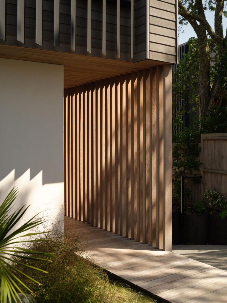
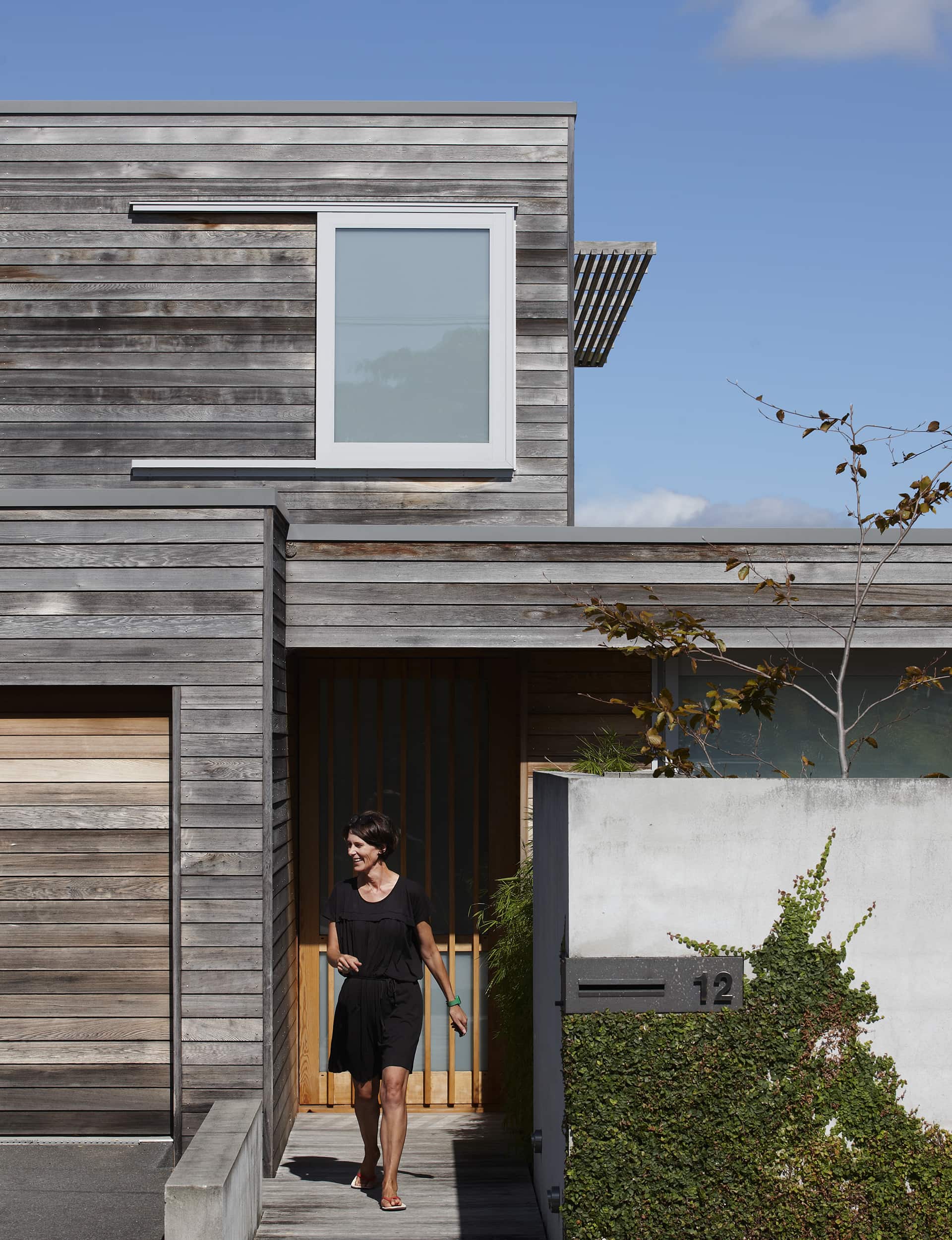
The dwelling’s compound identity is tied together by simple planning and low-key yet high-quality materials. Two rectilinear forms – one for living, the other a bedroom wing – slide past each other, one a step above the other. Flush cedar cladding has the smart-casual dictate mastered. “I wanted the elements to look like a series of timber cabinets,” says Andrew.
From the street, a concrete wall offers substance and solidity, while the translucent sheet on the timber-panelled front door works in antithesis. Inside the wall is a papyrus-edged courtyard with a bridge over a fish pond. This is Andrew’s favourite place: to relax he spends many hours tending to the constant aquatic needs of the pond or just feeding his fish – a feeling that is shared by both of them. “I never feel the need to leave,” explains Helen. “It’s such a zen place, so satisfying to be in.”
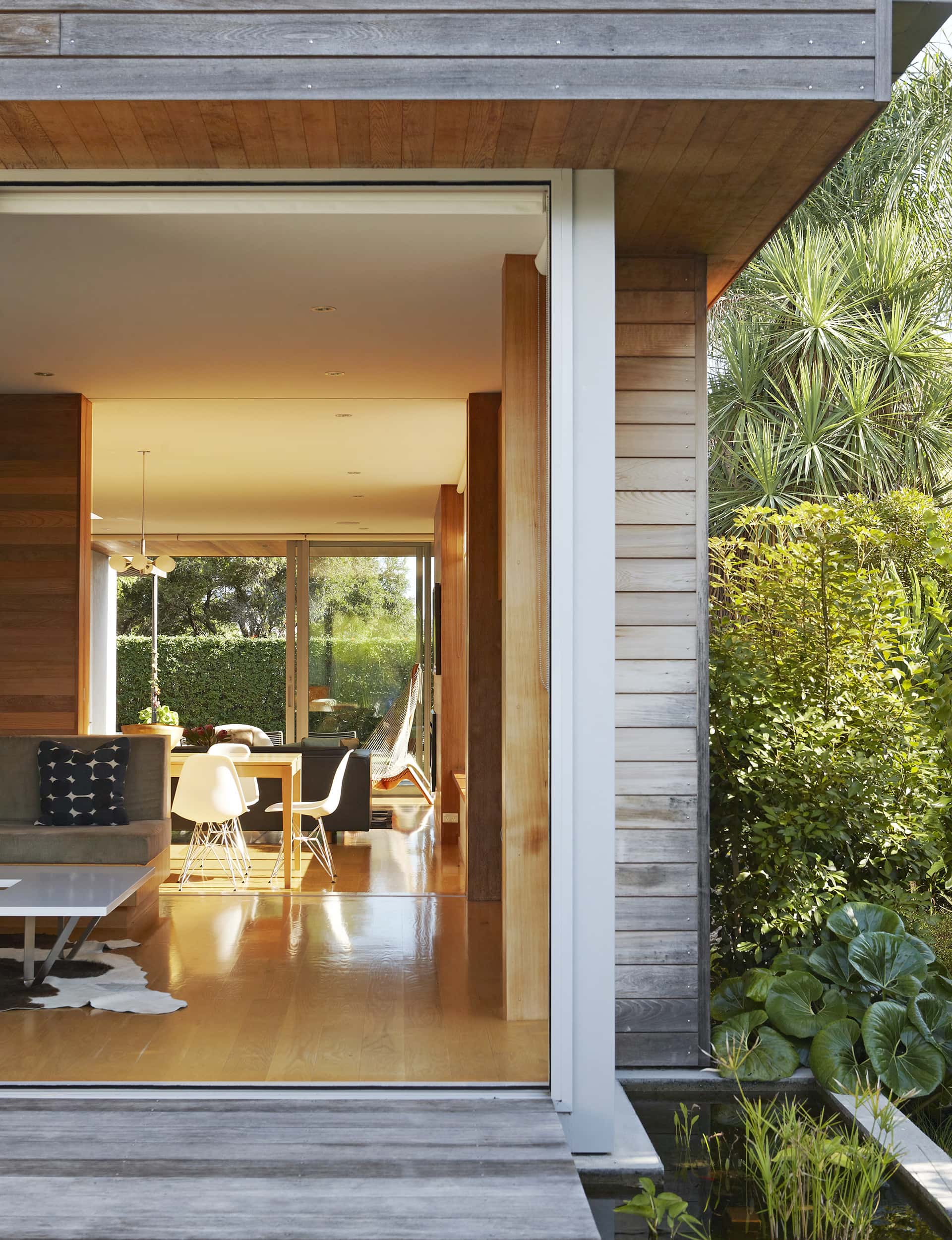
Once inside, full-height glazing draws the focus immediately outdoors to the deck and the trees that are part of the neighbouring park. The main body of the home is calm, with a careful placement of solid wall and transparent glazing to provide sunlight yet ensure privacy.
To the right of the front door, a step up from the rest of the living room, is a timber-cocooned nook aptly called the snug where contemporary crafting meets 70s style in the built-in return seating, shelving and cabinetry.
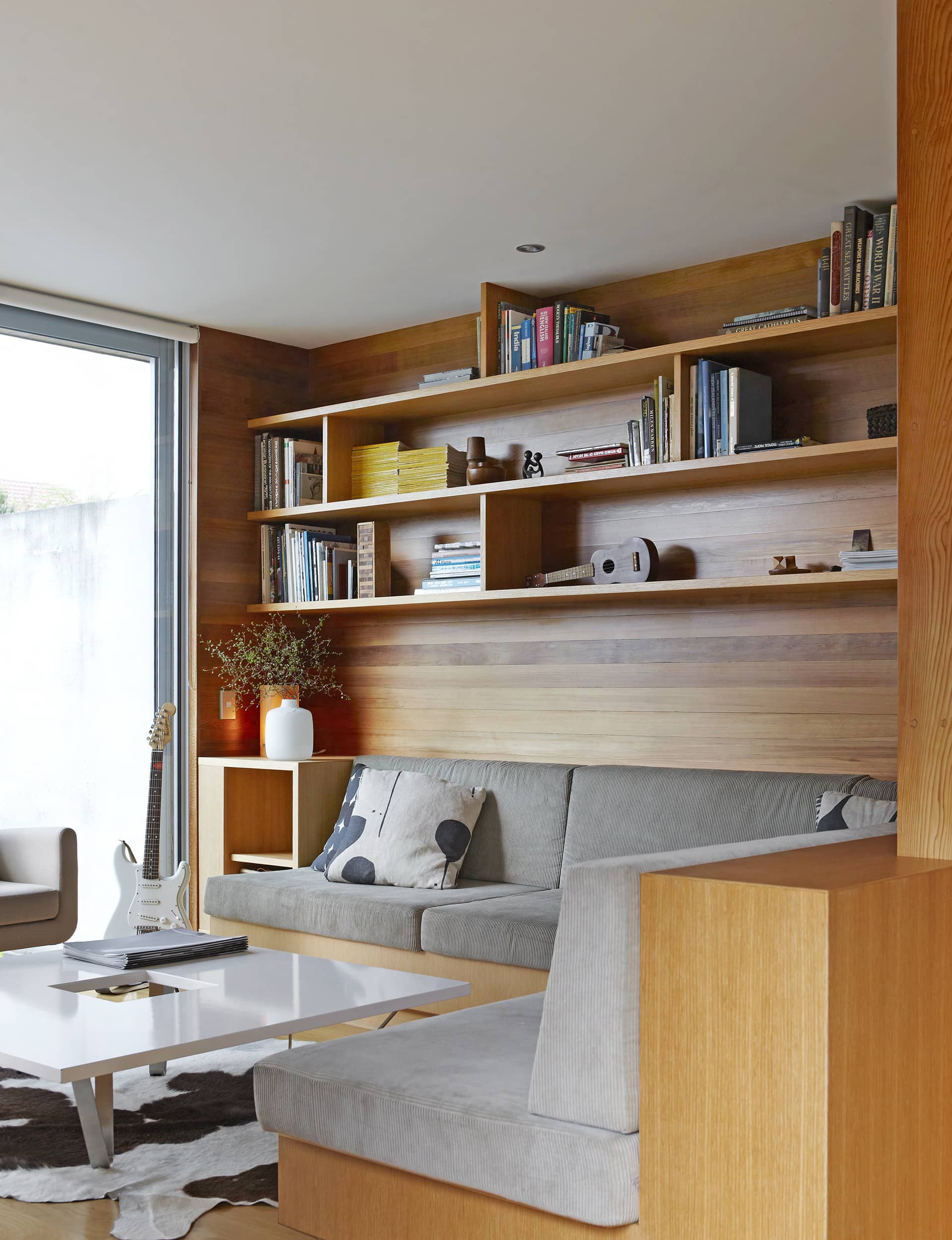
Equipped with a big-screen TV, it’s often a tussle as to who will claim their territory here first: the slider that divides the snug from the living room acts as an ‘occupied’ sign. “I like to use it for thinking time; it’s soothing as you can hear the sound of the water in the front courtyard,” says Helen. Andrew and son Alexander (8) prefer more raucous pursuits – supporting the All Blacks with gusto or a session watching ‘Star Wars’.
From the rear, decking and steps that terrace and cantilever over the ground allow the home to touch the land lightly, while the alfresco living room is beneath a roof that extends the horizontal planes of the home. This decked area – on the south side of the house – is equipped with a fireplace, where Andrew is in charge of tender-searing whole beef fillets, lamb racks and slabs of kingfish caught on frequent expeditions into the harbour. “It’s a real wood-burning barbecue with real smoke, not just an outside hob,” he says with a laugh.
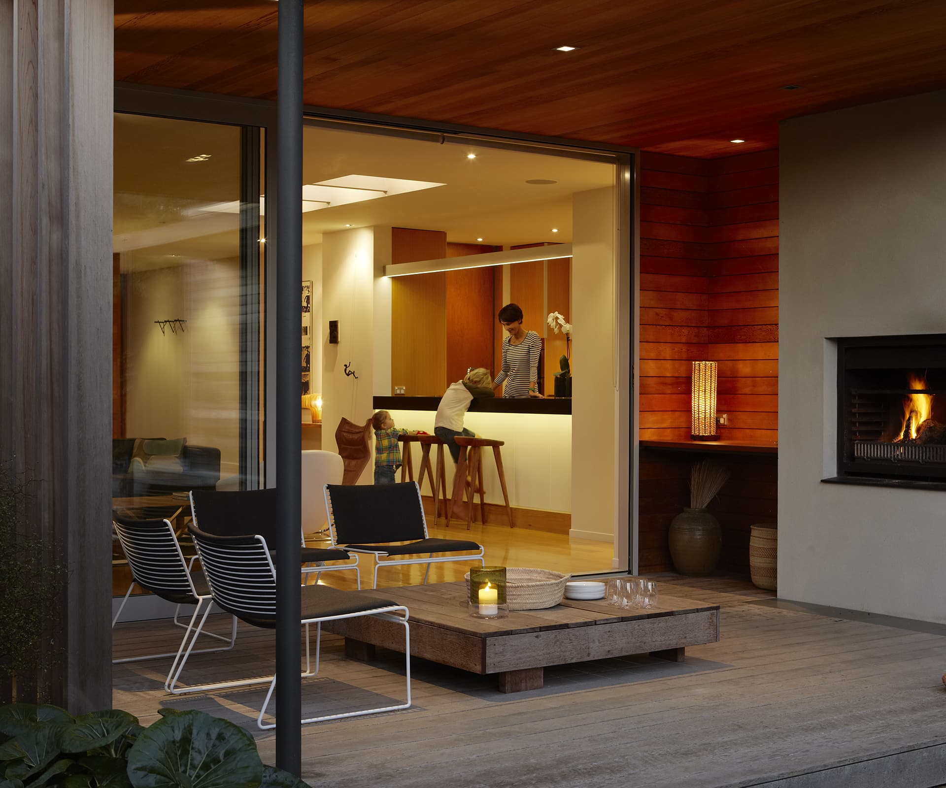
Alexander has the run of the downstairs bedroom wing, where glass sliders open up to the lawn and his treehouse in the jacaranda. Upstairs, Helen designed the built-in bookshelves with a glazed opening in just the right position so she can wake to a faraway view of the Waitakere Ranges.
She was just as specific about the spatial mapping of the laundry and kitchen cabinetry. One contentious issue was the splashback. She wanted marble; Andrew argued for a mirrored finish. “Marble would have created a blunt end to the kitchen,” he says. Now that the palm tree border and under-planted natives are thriving, dinner guests can sit up at the kitchen bench and simultaneously check out their reflection and that of the greenery behind.
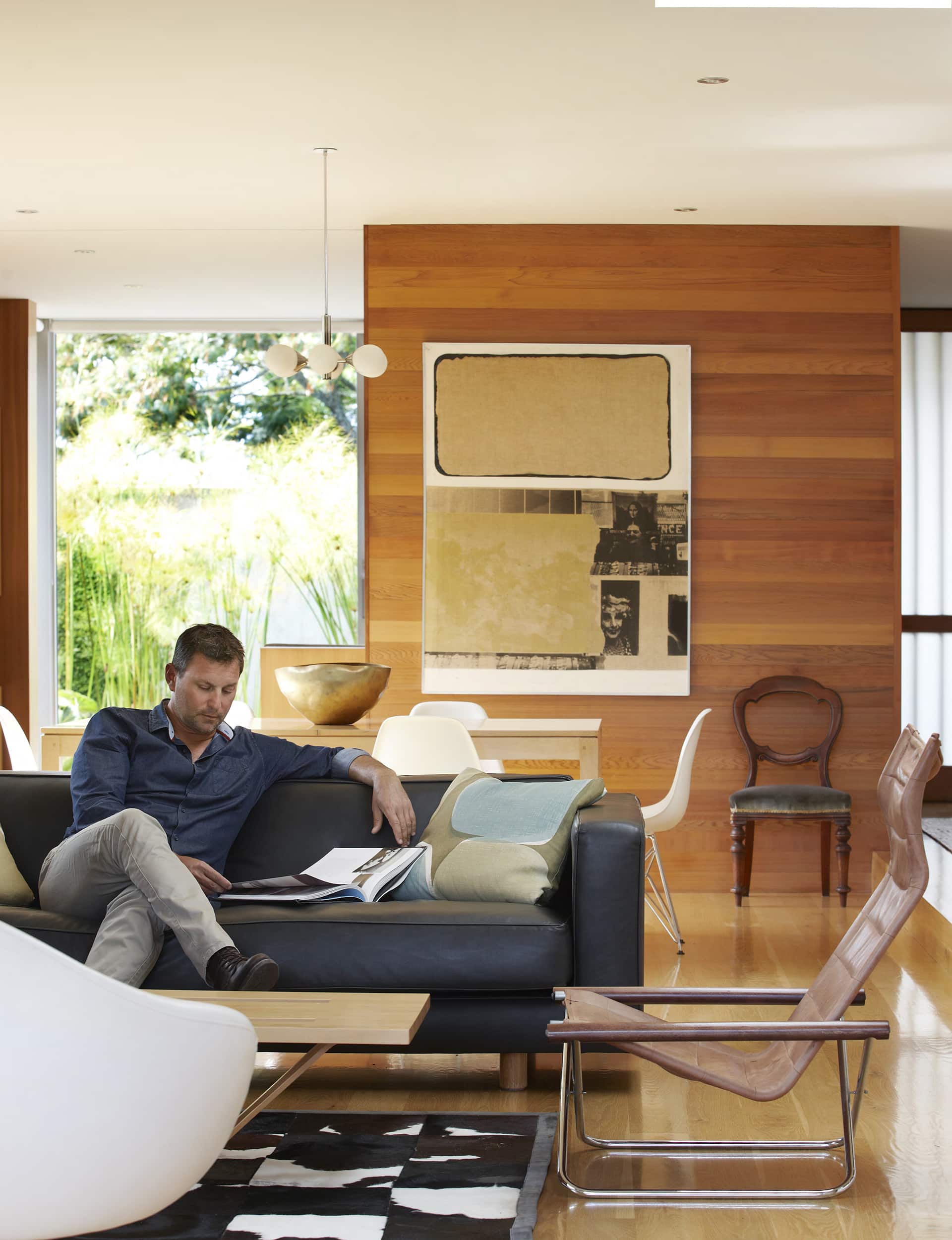
Oriented for thermal gain, and with a concrete slab overlaid with oak flooring, the home is so warm that the internal fireplace has become an aesthetic feature. Andrew confesses he told his “client” that the house was ducted for a heat pump. It wasn’t. “After four winters in a newly built home, I can confidently say, you are better to spend more on architecture than a heating system,” he concludes.
Having distilled the best of two disparate environments in this one project, Andrew is eager to flex his architectural muscle on their next home. He’ll have a fight on his hands. “I love this place,” says Helen. “To me it’s like holidaying at home. I want to grow old here.
Words by: Claire McCall. Photography by: Jackie Meiring.
[related_articles post1=”39461″ post2=”57270″]


