An unobtrusive Piha home makes the most of its small site in the bush by elevating the sleepout into the air
Q&A with Jose Gutierrez of Jose Gutierrez Architecture
How does the sleepout work with the original bach and the site?
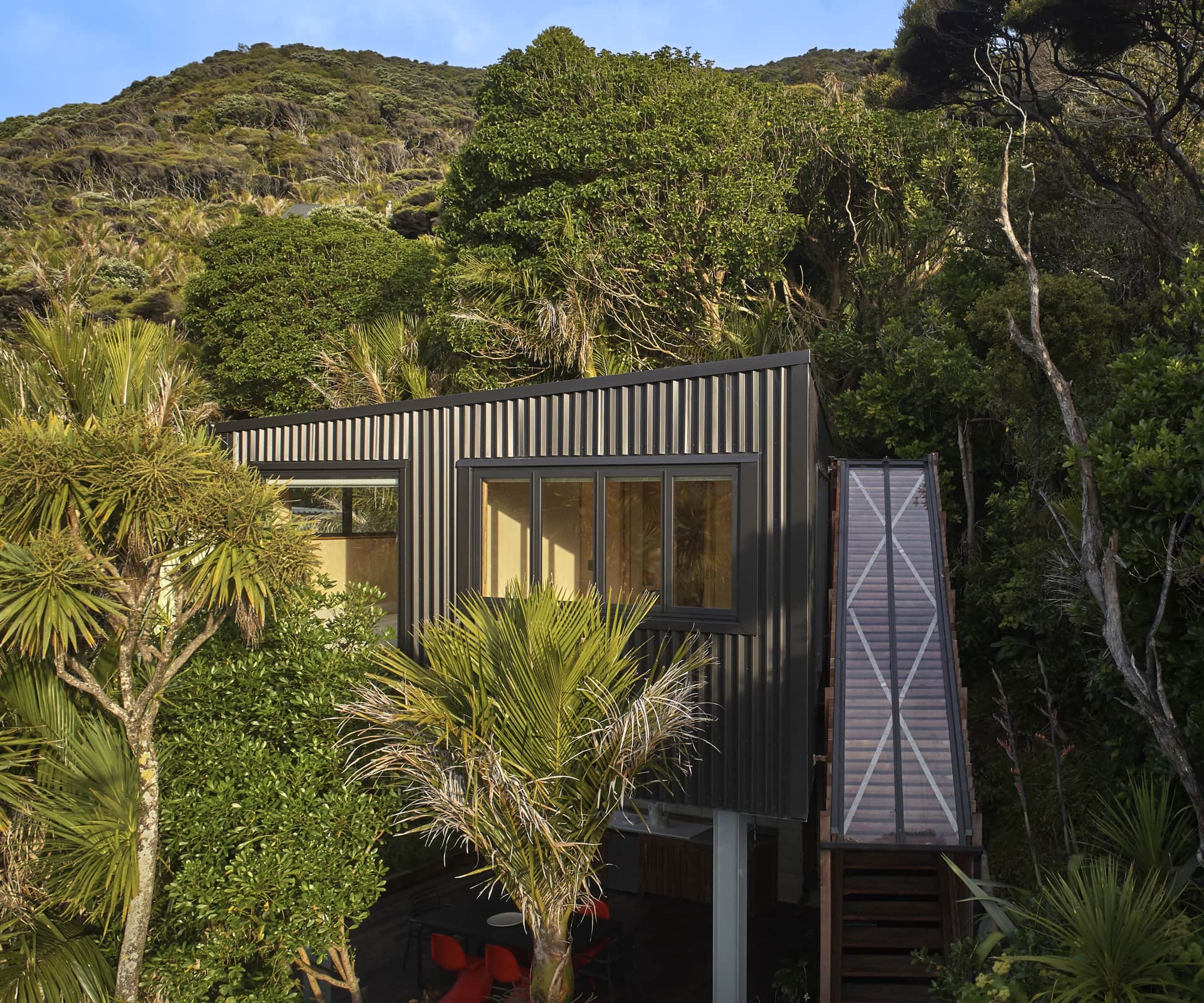
The sleepout is a stand-alone structure at the rear of the site. It sits directly behind the original bach and was elevated to create an open living space below. This platform is not a space that the clients had thought they would need, but now they couldn’t imagine the site without it. This space is multi-functional and has become the heart of the site. I like the fact that you need to circulate externally between the buildings to use them as one. It makes you more aware of the natural environment and provides a more authentic bach experience.
The entrance to the sleepout is one of many playful details, such as the blue steel post and red door. Can you explain why?
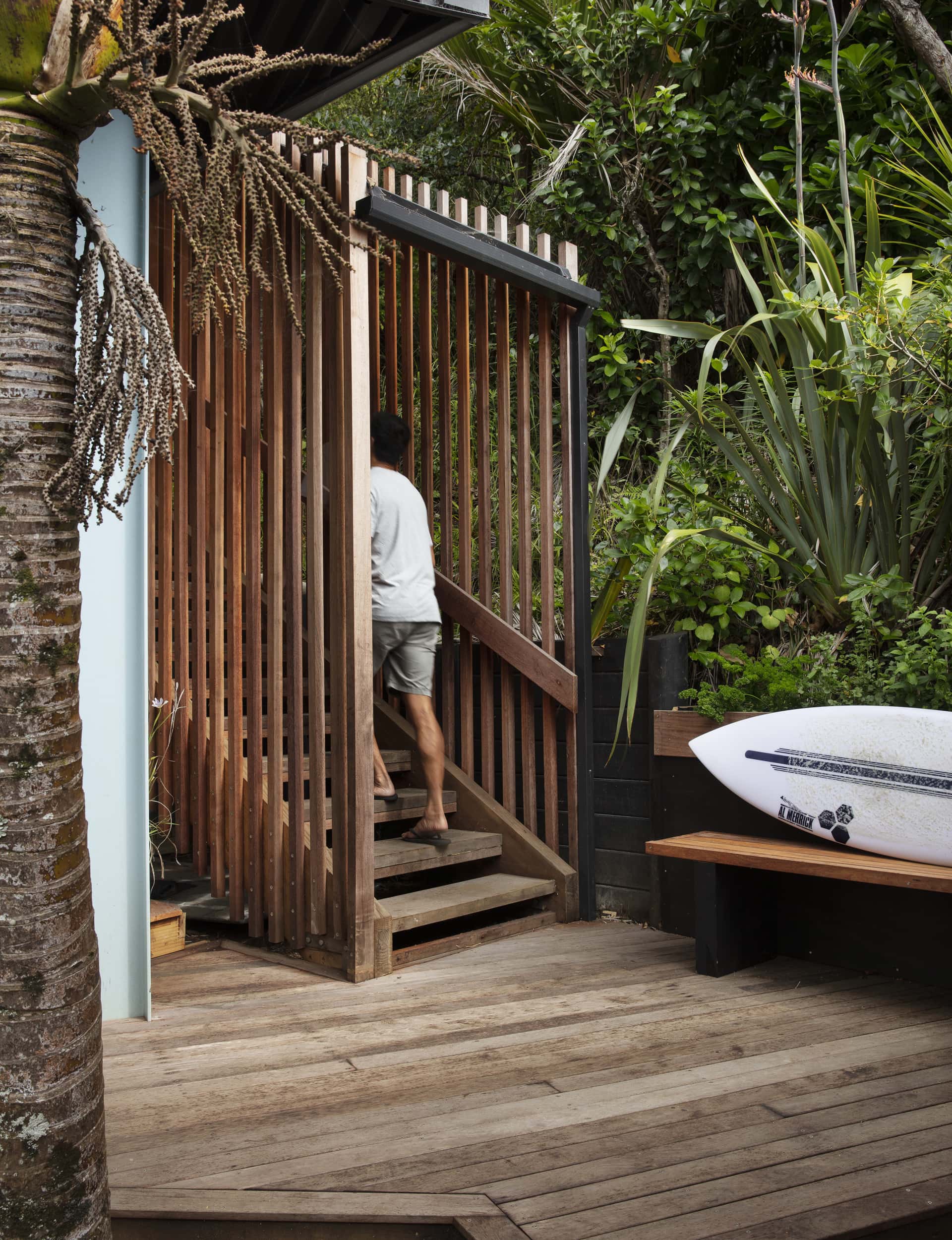
The entrance into any building is very important. I feel that, along with the architecture of the building, it should also evoke an emotional response. The form around the staircase creates a sense of diffusion between the surrounding vegetation and the architecture as you ascend up through the trees and arrive at the entry door. The clients chose the door colour, which makes it their own. I think it’s a great choice; it really makes you want to enter and it creates anticipation of what lies within. The steel posts hold the building up and the contrasting colour emphasises that the form above is disconnected from the ground.
Talk us through the sleepout’s construction and materials.
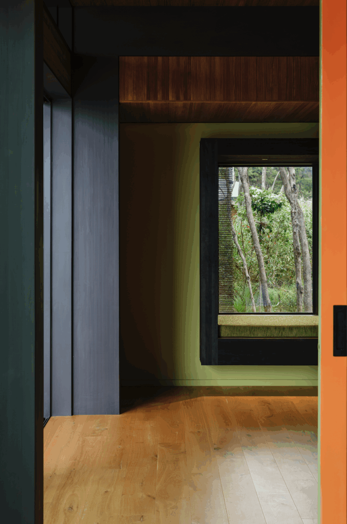
The exterior is all finished in the same material [AlumiGard] The cladding on the roof, walls and underside of the building all wrap seamlessly to emphasise the idea of one pure form hovering within the site’s dense vegetation. The materials chosen reflect the desire for a hard, robust outer protective shell, contrasting with a light, tranquil interior that throws emphasis on the native-bush outlook.
The shape of the sleepout was influenced by the Significant Ecological Area (SEA). Tell us more.
The building is discreetly nestled into the bush, providing both privacy for the inhabitants and a strong sense of connection to the surrounding trees and wildlife. In this way the design of the building optimises the beauty and uniqueness of its location, offering a tranquil retreat from today’s busy world. One of the planning constraints was the SEA, which cuts through the site. Rather than try to impose the architecture into the landscape, we worked with it – this influenced the floor plan and, in turn, also enhanced the landscape.
How did you manage the clients’ budget, yet still achieve this wonderful outcome?
Good design doesn’t have to be expensive. It can arise from the need to think outside the box, and result in unique and innovative solutions. It’s encouraging to have trusting clients that are willing to engage with that way of thinking.
See more of the home below
