Located on a sheep farm in rural Canterbury, this home is devised as a modern interpretation of the ad hoc iterations of a farm shed.
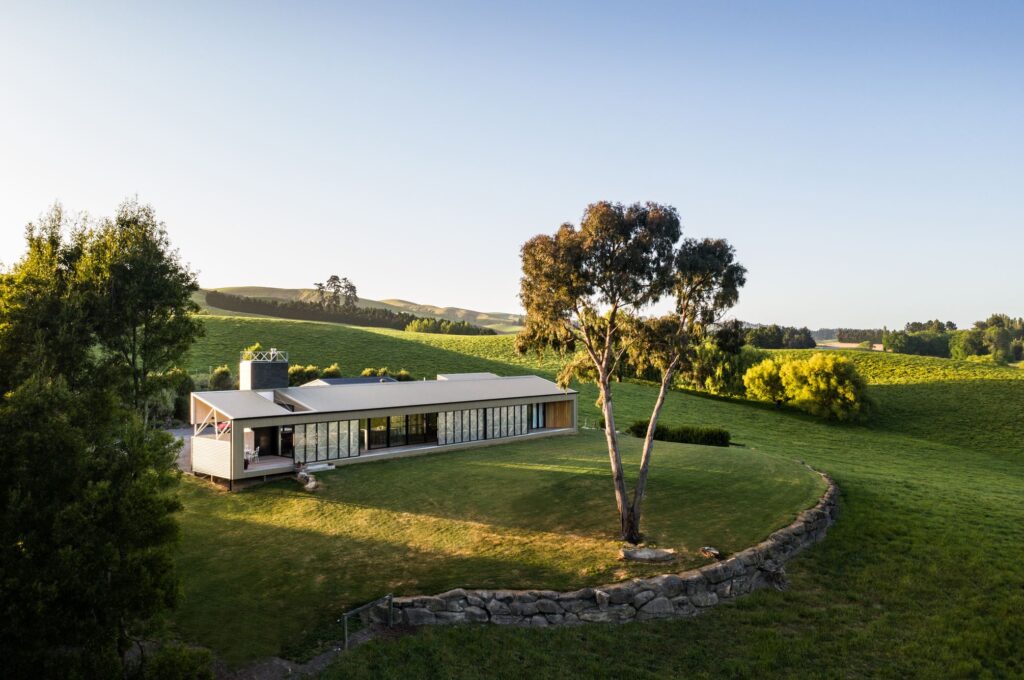
Engaged to design a home for a couple who had lived on the same land for 40 years, architectural designer Ben Brady was met with a challenging but beautiful rural site. Situated roughly halfway between Christchurch and Kaikōura on the east coast, Spotswood is a sleepy little region.
Known for its pastoral history, it’s a place of wide landscapes and rolling hills. Ben’s clients had formerly lived in a frameless 1980s house, and, having spent four decades living on the land, they knew the site well — the aspects they enjoyed the most and specific elements they wanted to make the most of. The damage done to their house by the earthquakes created an opportunity to make better use of the site with a modern take on their former home.
Located on the couple’s sheep farm, the building platform is on a ridge, which meant the need for sheltered spaces was paramount. “With working outside all day, it was important for this couple to have spaces they could retreat to, while still being connected with the land and the views,” Ben tells us.
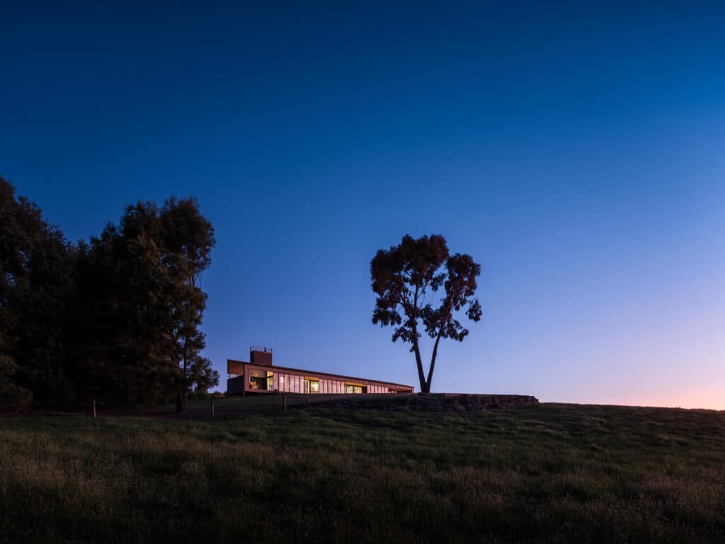
“Driving around the region, it’s hard to look past the beauty and almost ad hoc nature of the farm buildings. While there is familiarity in the traditional ‘farmhouse’, what always stands out to me the most is the shed buildings, and that’s what this design is intended to echo,” he says. The result of a relatively loose brief is a striking linear home of two parts.
Utilising Colorsteel cladding in two tones, one lighter and one darker, and in both vertical and horizontal applications, it is a building isolated geographically from others but one that sits perfectly within its wider context. “The land is beautiful. To the west there are views out to the immediate rolling hills and, beyond, to the mountains. To the north you can see some of the mountains of Kaikōura,” Ben says.
The couple enjoyed the vaulted ceilings of their former home, and Ben wanted to emulate that height in the new building, to create a sense of space within a relatively small footprint — the house proper covers 180m², with an additional footprint of 100m² for the shed and adjoining garage.
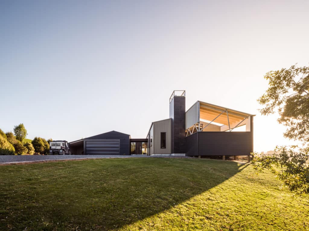
A key feature of the new living space became a semi enclosed space to the north-east. Open to the western side, this ‘outdoor’ area sits beneath the same roofline as the main house but is separated by an open-air skylight of sorts — a move that allows morning light to fall into the adjacent kitchen and ensures that the space strikes the right balance between outdoor and sheltered. To the western side, it is completely open to the elements, while to the east Ben sculpted away at the form to create a ‘glimpse’ through to the view beyond.
The long, linear, rectangular form of the house houses the main public spaces and outdoor room to the north, with three guest bedrooms to the south. An intentionally ‘added-on’ element that juts out behind the main form to the south houses the master suite. As the house faces west to capture the views, and incorporates extensive glazing, it was vital to provide a level of shelter from the sun. “The sun gets low and hot, so, without some form of shading, the house would overheat at certain times of day,” Ben explains. Having been a sheet-metal worker at one time, Ben devised a system of operable stainless-steel screens to mitigate this issue.
Taking inspiration from the rolling hills and aerial views of the paddocks and pastoral land, the screens emulate the divisions between paddocks and different crops with delicate folds between each area of dotted perforations. “The folds are very gentle; I wanted to ensure the patterning and folds were quite abstract to give a softness to the screens, and to ensure they didn’t become the centre of attention.
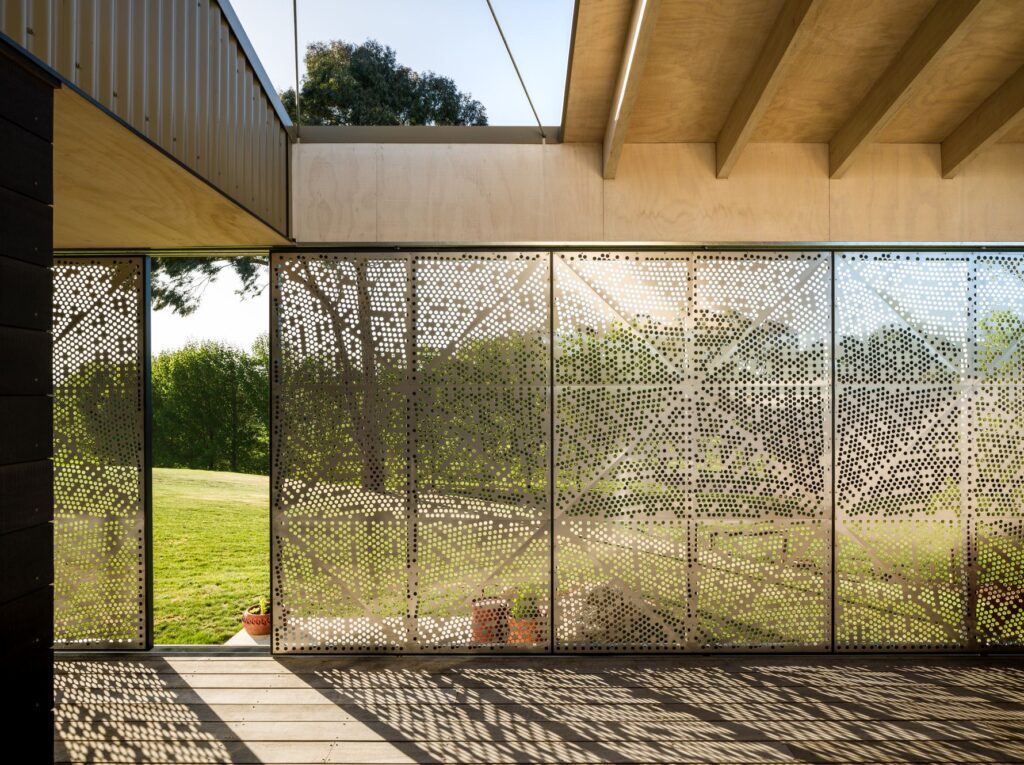
“The screens have created a really nice environment, where light falls through them and creates interesting patterns, while at the same time ensuring you can still see through them to the view when they are closed.”
When shut, the screens completely enclose the veranda — a feature that essentially increases the floor space by 2m. When opened completely, they create a 6m opening along the western elevation. Ben describes the screens as having “a beauty that coexists with a key functionality”.
This was a project with a tight budget, so material choices were important. Ben explains that utilising the external corrugate kept costs down while taking advantage of such an iconic architectural language in this rural setting. The two tones used, Lichen and Windsor Grey, work well with the natural environment year-round — as Ben says, “standing out against the lush greens but also when the grasses turn a browner shade”.
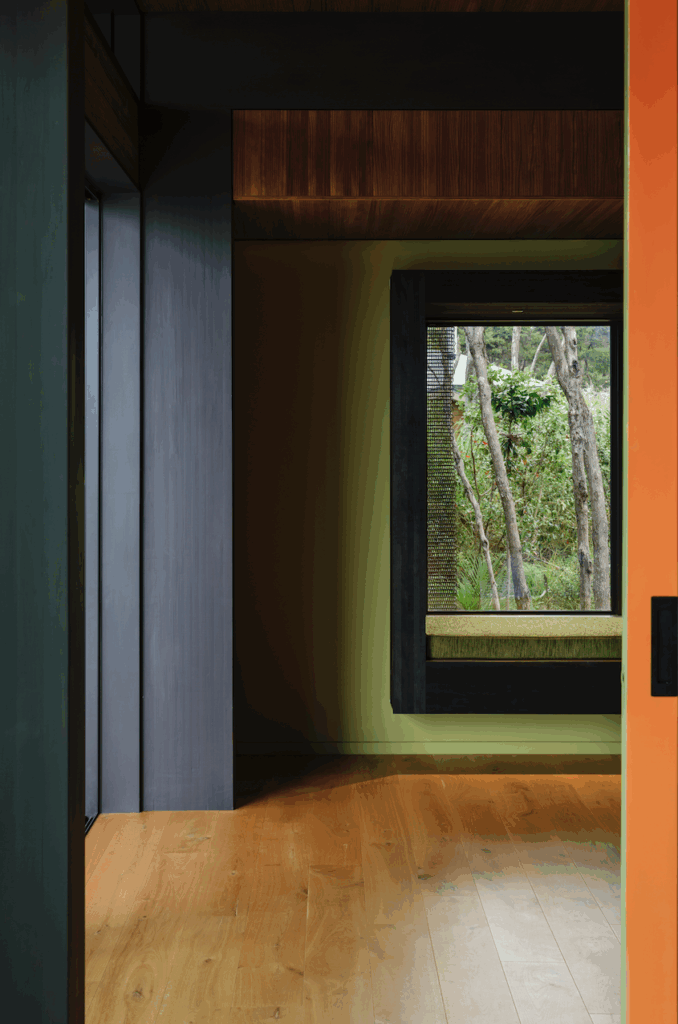
Plywood soffits and the use of timber internally, including an oak floor and dark-grey kitchen cabinetry, add a level of warmth to the interior.
“One of the clients has a passion for found and restored furniture, so I wanted to make sure the eclectic nature of their furniture would work with the interior. In the kitchen, the shelves and lining of the kitchen island are salvaged boards,” Ben mentions.
The square kitchen island, with two sides for seating and two designed as workspaces, creates a social heart. A window behind the bench on the eastern side of the kitchen draws in the view behind the house, connecting to the rolling hills behind, while a 3m stud delivers a voluminous and airy feel to this side of the house. “There is no immediate visible architectural reference here, so what you have is just the landscape references and a sense of carried reference from the rural vernacular,” Ben explains.
This is a home that delivers an abstract and beautiful refuge from, and connection to, the land and explores the ad hoc iterations of the rural shed, in an enigmatic contemporary way, encapsulating both a sense of fun and an ease of function.
Words Clare Chapman
Images Dennis Radermacher
