This home hugs the landscape and takes its design cues from local birdlife
The Waimea Inlet is a twitcher’s paradise. Sheltered by the low form of Rabbit Island at the head of Tasman Bay, the estuary is a site for several migratory, endangered and threatened bird species. The godwit breaks its flight here, among white herons, spoonbills, Caspian terns and bitterns. There are oystercatchers, too, less exotic but no less beautiful. It was the wader with the midnight plumage that captured the imaginations of architects Hugh Tennent and Sharon Jansen of Wellington’s Tennent + Brown when designing this house, set on a former apple orchard above the estuary. “Often we look for a poetic response or idea that grounds a building to its location,” says Hugh. “In semi-rural settings like this, one tends to look to nature.”
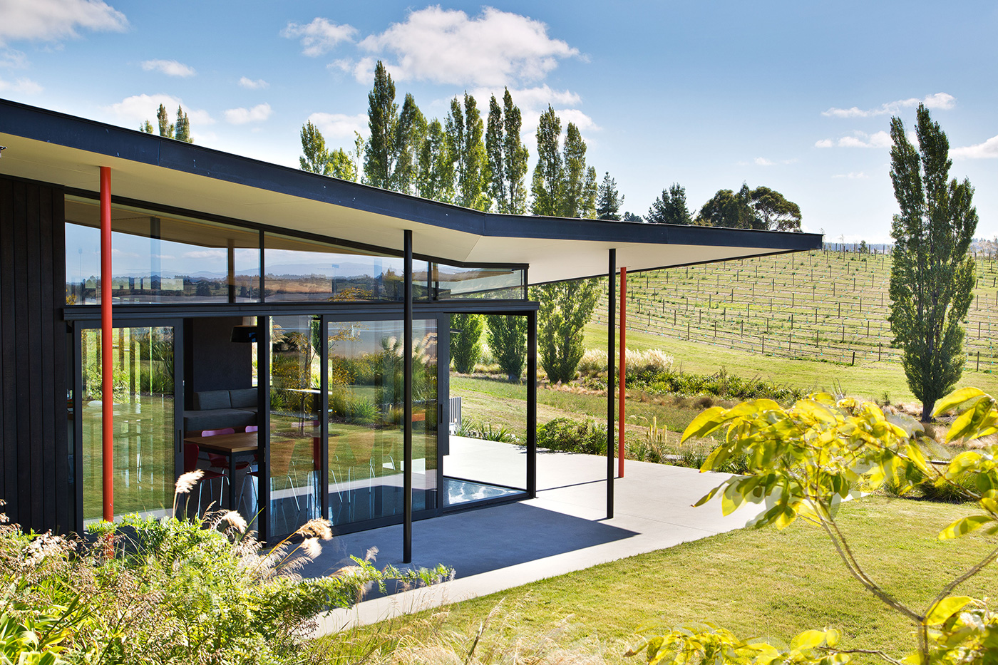
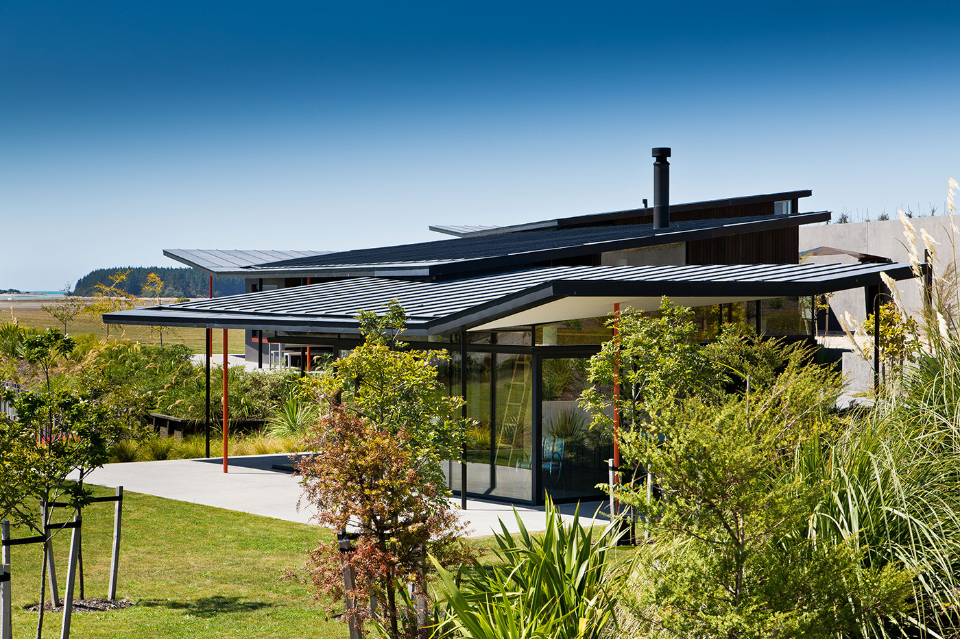
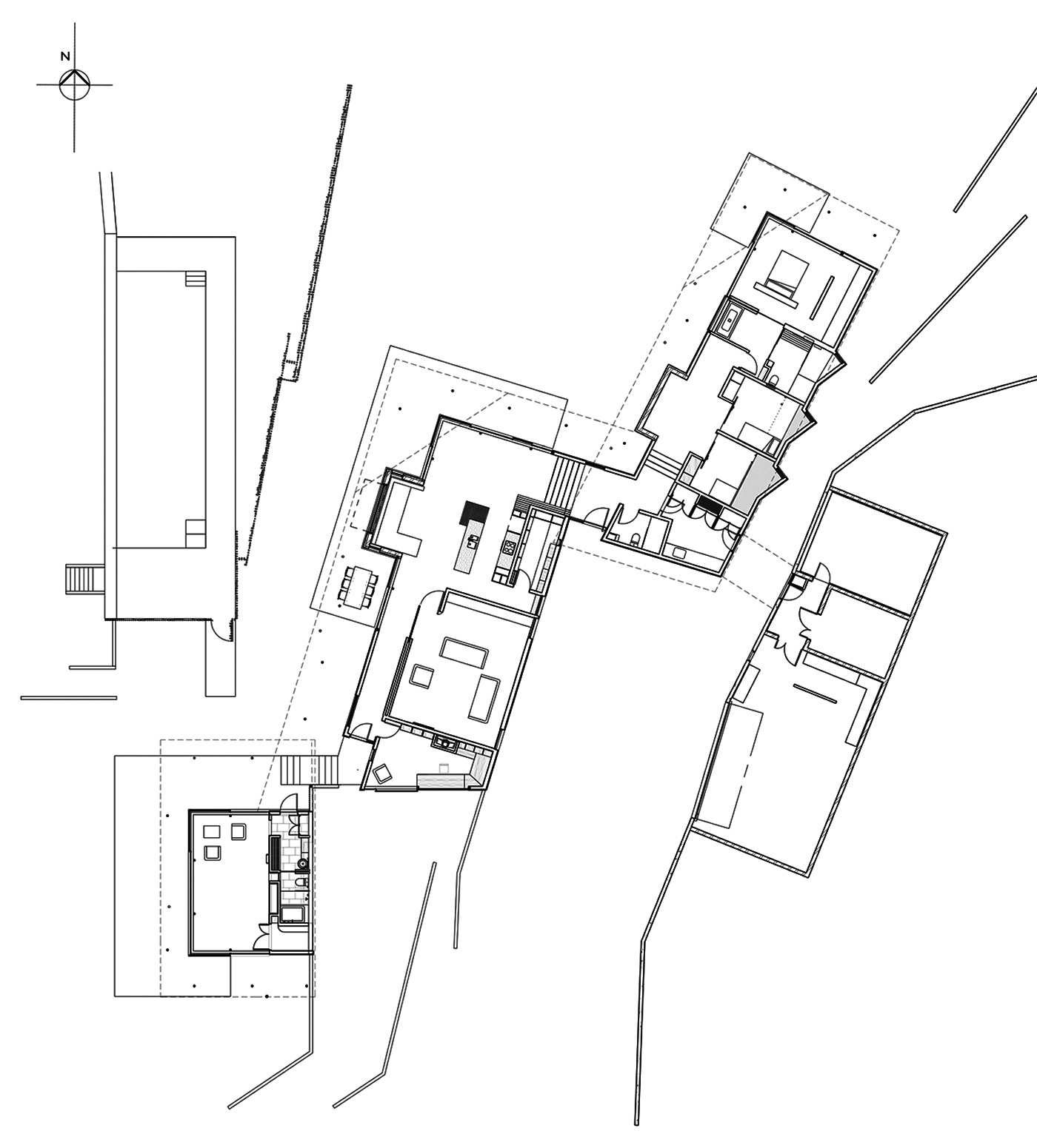
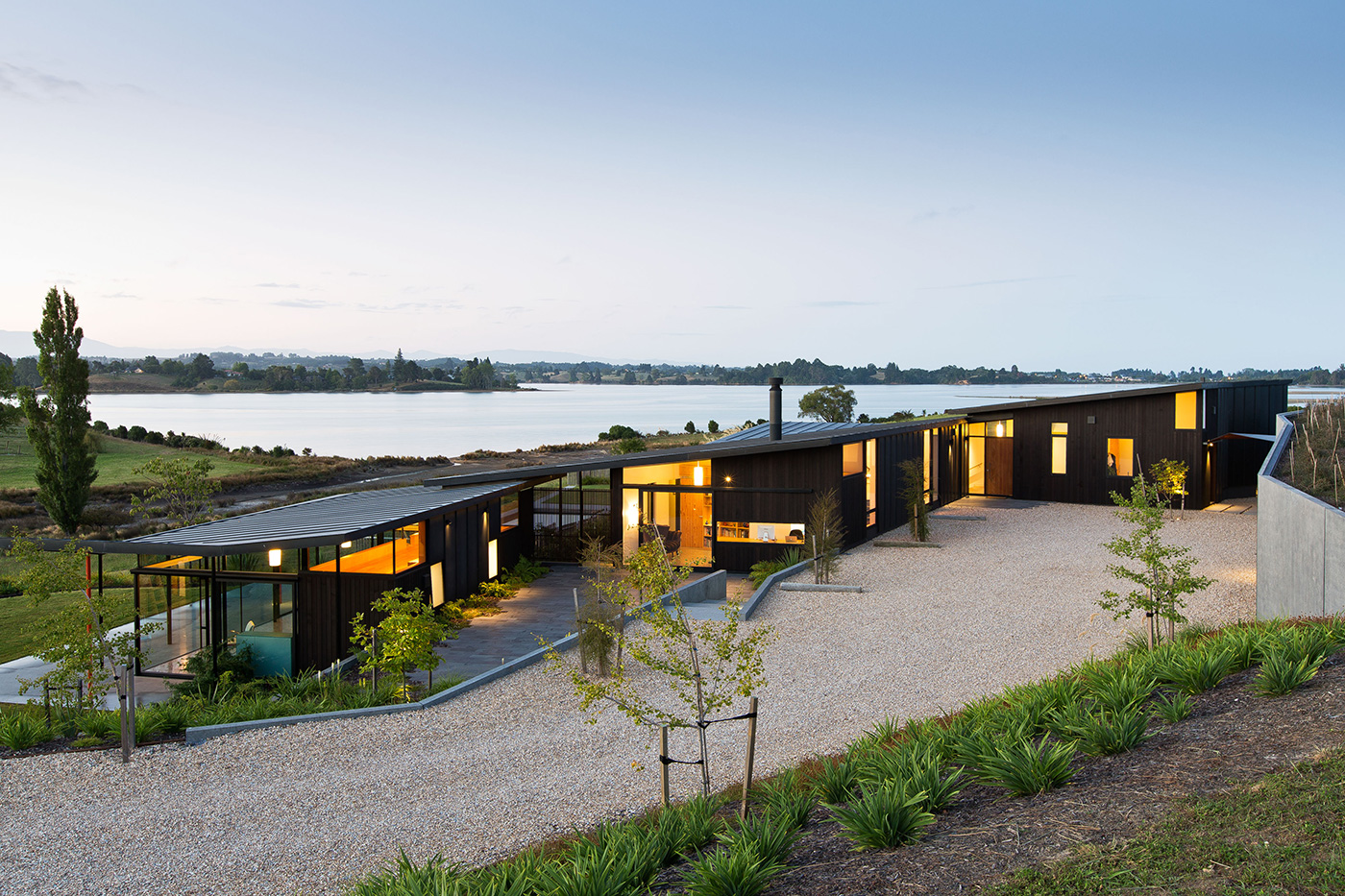
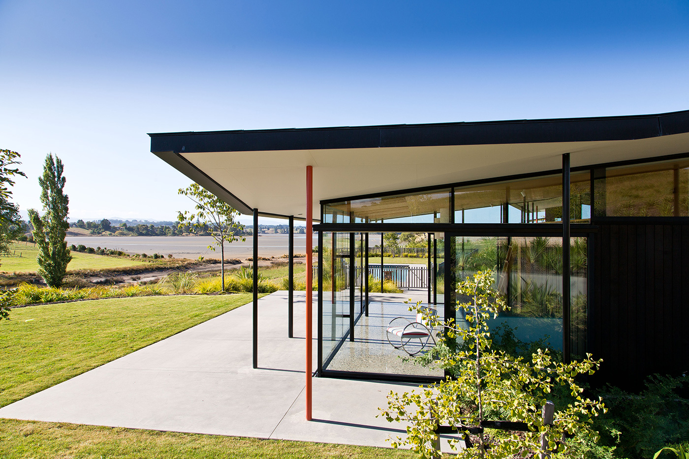
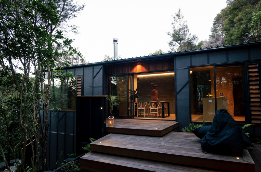
You can read the building’s inner bird at a glance in the black zinc and timber exterior, with beak-orange highlights. It’s in the roofline, however, that the architects have really run with the idea. The house comprises three stepped pavilions set slightly askew, with the smaller pool room/guest wing structurally independent. Each of the three roofs – black, naturally, and beautifully thin – overlaps the other, a “feathering” effect suggestive of a wing that also picks up on the overlapping rooflines of a couple of agricultural sheds on the property. Clinching the case for the oystercatcher, the extended dark wingline kicks up at the edges, as if flared for flight.
It’s an elegantly resolved and beautifully understated idea that contributes to the sense of a house resting lightly on the land. From the roadside, you have to scan hard to pick up any sign of a building. It’s only as you approach the end of the long driveway that it appears, a “quiet object in the landscape”, as Sharon puts it.
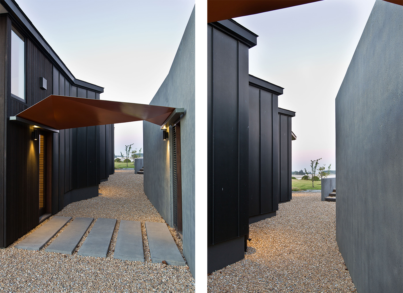
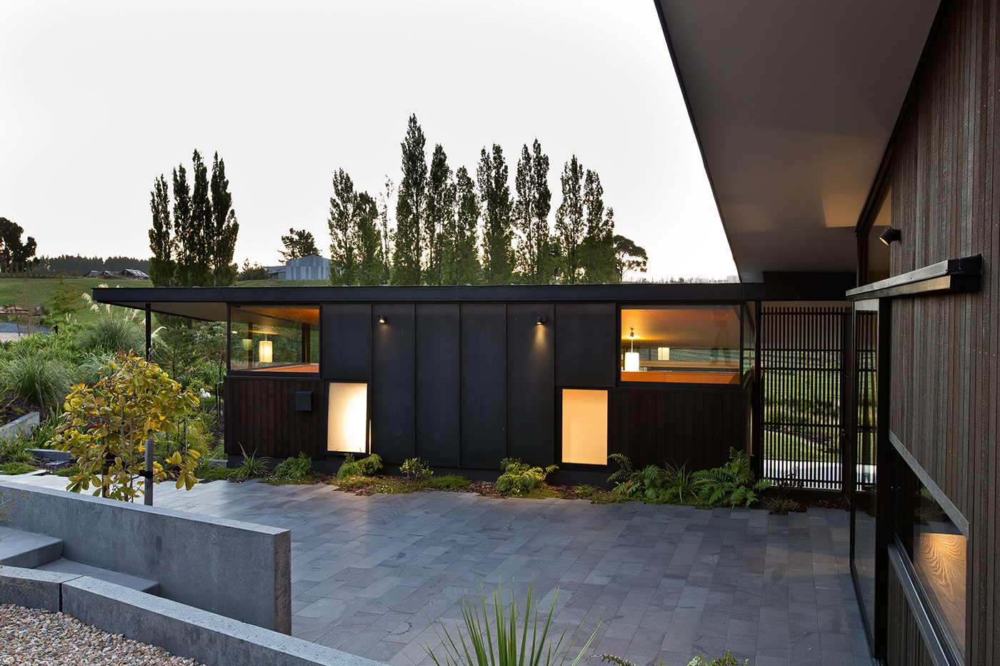
They began by siting the building platform below the ridgeline, leaving it unbroken. District scheme regulations demanded a degree of subtlety, “but it’s something we’d do anyway”, says Hugh. With the help of their regular collaborator, landscape architect Megan Wraight of Wraight + Associates, the slope was sculpted into three terraces running in the direction of the estuary, one for each pavilion. Garaging – which also houses a home cinema and the plant for the property’s impressive solar power system – is buried upslope of the house, creating a sheltered courtyard entrance.
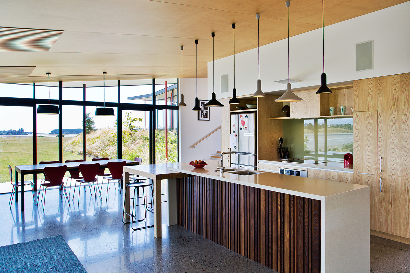
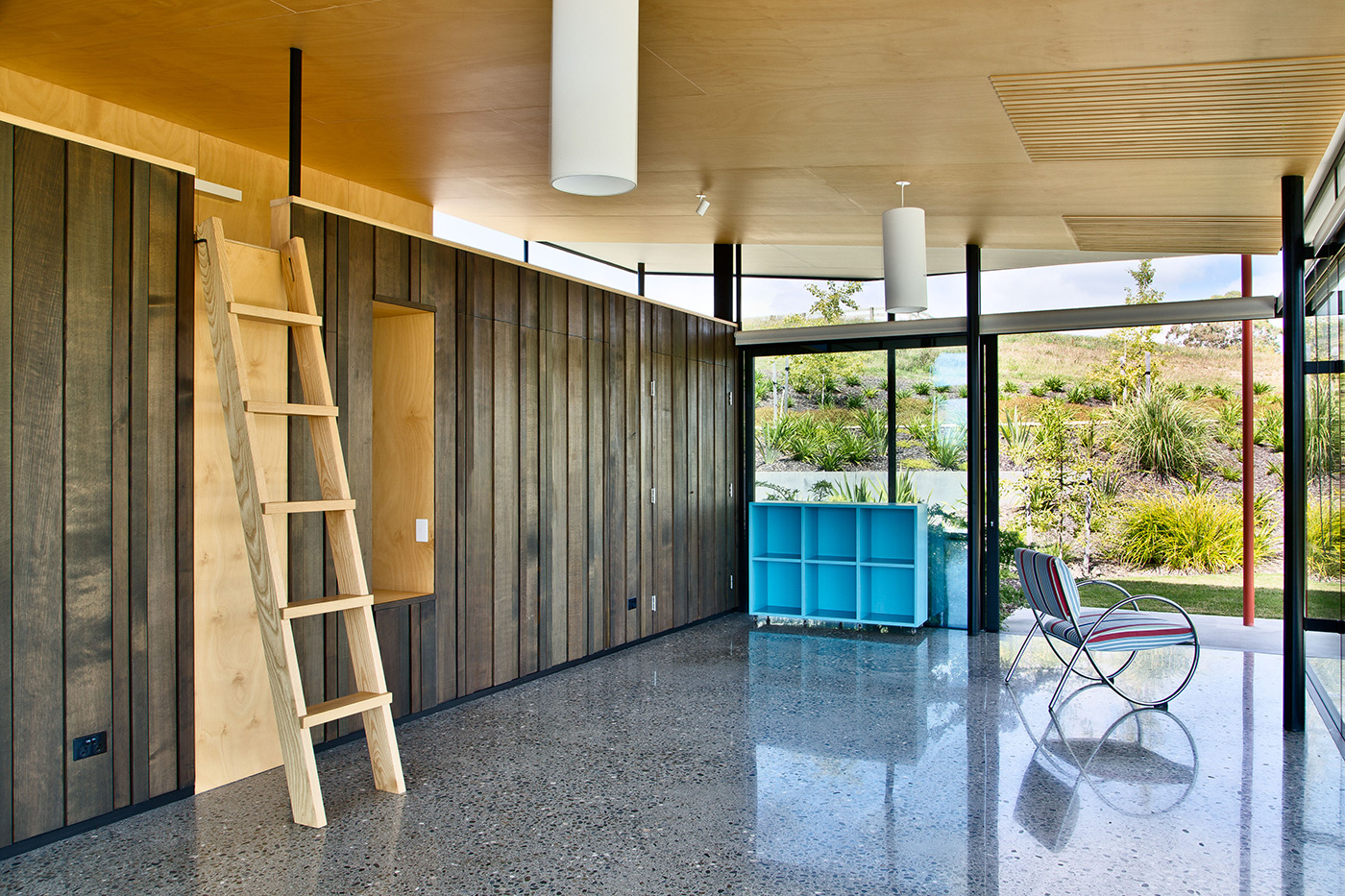
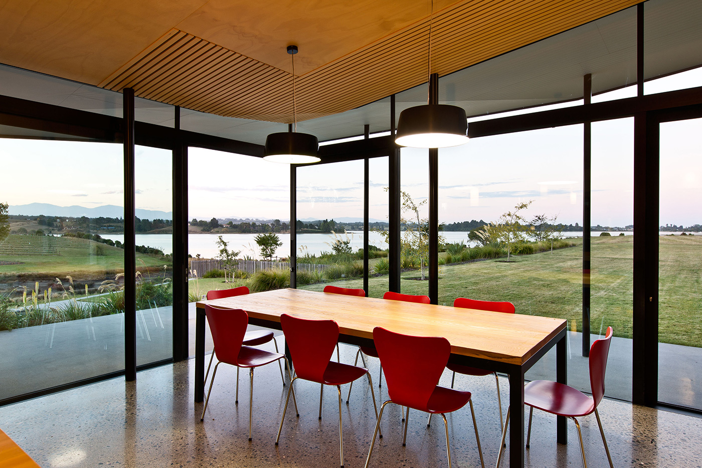
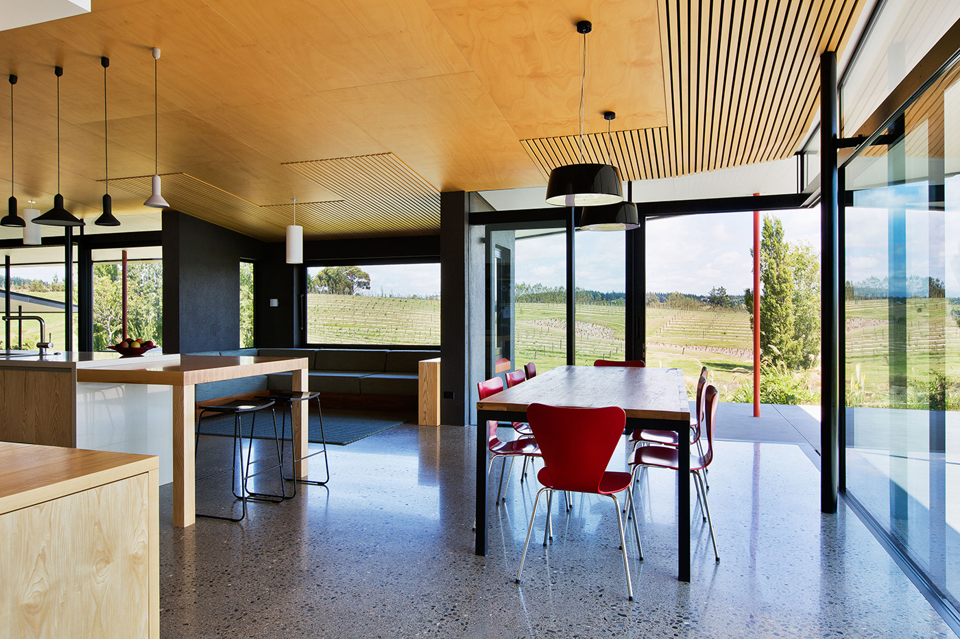
The making of the house lay in the arrangement of the pavilions. Rather than stringing them along a north-south axis, which was the strong cue from the land before the diggers got into their work, the three structures are stepped obliquely, giving each a north and a west face. “Breaking up the building both vertically and horizontally allows you to get both sun and views,” says Hugh. “And the house becomes more elegant and gentle that way, less bulky.” The same thinking applied to the glazing. A structural head was used to hold windows to columns. “It creates a much lighter feeling than endless banks of aluminium stacking doors,” explains Sharon. Everything slides back, pivots, or can otherwise be manipulated to let in the cooling Tasman sea breeze.
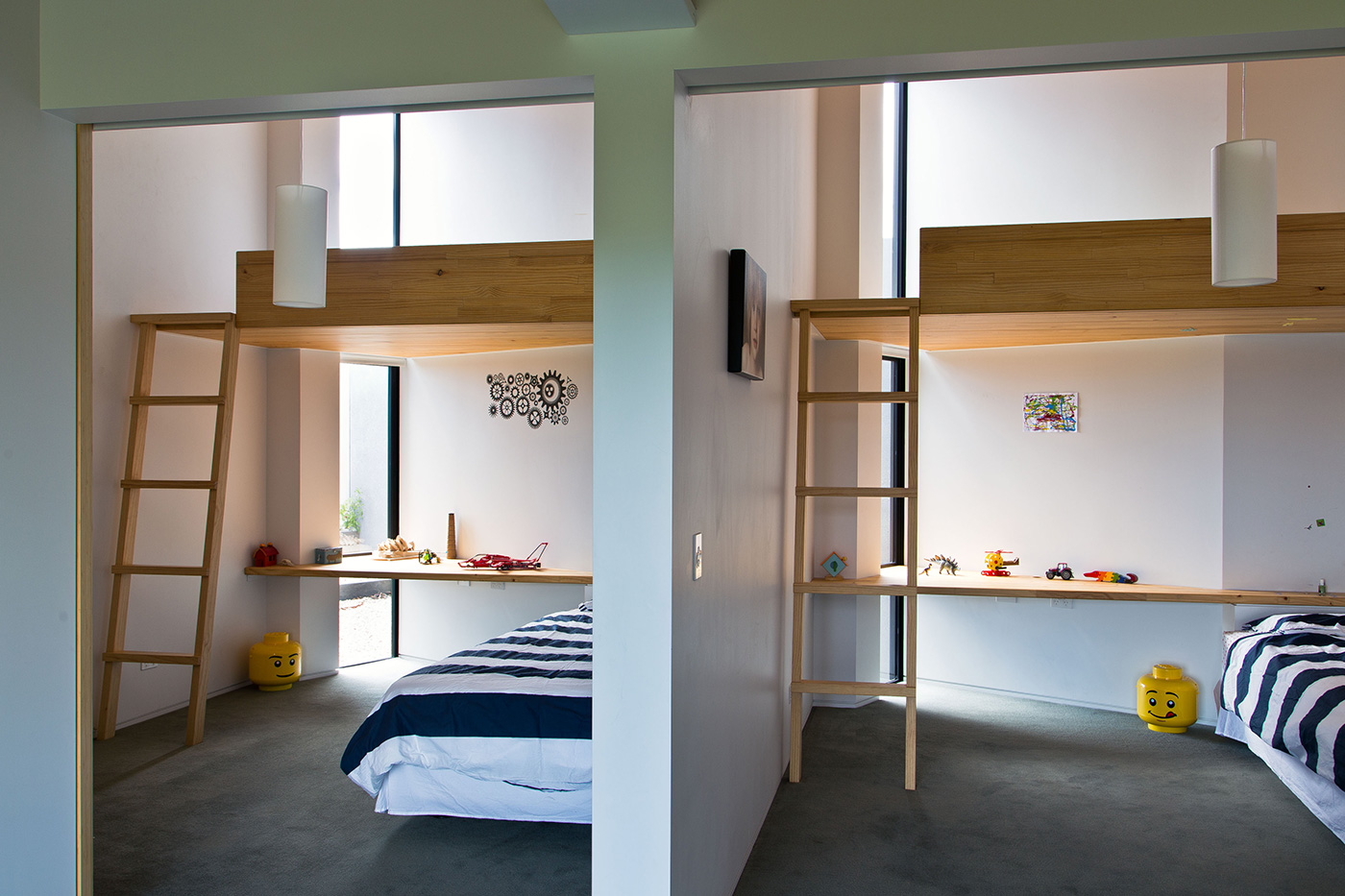
Inside, this is a home organised to suit a young family – although the two boys’ habitual route to the pool, clambering over a seat and out through an open window, underlines that even the best laid architectural plans can’t cover everything. That said, the architects have allowed for the free-flowing nature of child’s play, leaving a generous sunny hall outside the boys’ adjacent bedrooms for the daily estuarine flow of dinosaurs and Lego. At night, says their mother, “we sometimes just sweep it all back into their rooms”.
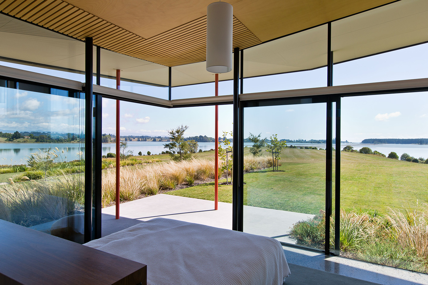
Beyond the children’s rooms is the main bedroom. Here is perhaps the house’s most idiosyncratic feature, with the entrance via the ensuite bathroom. The clients took some persuading on this one, but the arrangement allows the bedroom to occupy the full width at the pavilion’s end. With the sliders opened to the terrace on hot summer nights, they’re all but sleeping under the stars.
For all the complexity of the scheme, the internal organisation of the house feels natural and easy as you move between different levels. “It’s relaxing to be in, and it definitely feels like our space,” says one of the owners. The detailing is equally impressive, from the patterning of the various timbers and bamboos, to telling gestures such as the use of a bevelled uptick at some of the edges of the hoop pine ceiling. The architects have used the same builders (Lovell Inch Construction) on several previous Nelson projects, with similarly first-rate results. “They’re total craftspeople and great thinkers,” says Sharon. “They also really know how to integrate a house in its landscape.”
That landscape had its issues, not least a legacy of agricultural spraying. Long since denuded of trees and turned over to sheep, its estuarine fringes were silted up and the vegetation stripped. Even before they settled on their architects, the owners had done plenty of work to clean up and replant the wetlands. That work has been continued in line with a planting scheme developed by Megan Wraight, who was involved in planning from the outset. “We developed the whole concept with Megan, from the remediation of the land to the shaping of the terraces,” says Hugh. “We talked very closely with her about how the pavilions would work with the planting, how trees will run through the property, the need to heavily plant the slopes and leave the terraces in grass so you can look along them to the estuary. Her landscaping works incredibly tightly with our ideas.”
Seamlessly, in fact. And this “quiet object in the landscape” will only get better with time, as the wetlands revive and the plantings become established. Says Hugh: “I think it’s one of our best houses – and we’ve done a few of them.” –Matthew Philp
Q&A with Hugh Tennent and Sharon Jansen
HOME You included landscape architect Megan Wraight in this project from the very first meeting. What do you think are the benefits of considering the landscaping as an integral part of the architecture?
Hugh Tennent The entire conception of dwelling on the site arises from the creative inputs of landscape architect, architect and client. Enclosed and landscape spaces are conceived of at the same time. In this case the garden and building platforms were created by terracing and shaping, both vertically and horizontally, with subtle gullies and ridges wrinkling an otherwise even slope. The terraces were arranged to connect to the long views and offer more north-facing building sites.
HOME What was the inspiration behind the home’s light, overlapping roofs and their flicked ends, as well as the red poles that support them?
Sharon Jansen An existing shearing shed had lapped roofs and we had three staggered forms to link together. The idea of the feathering and folding and colour arrangement was inspired by the torea pango, the black oystercatcher found in the estuary. The slight separation of the roofs with the lapping expresses the separate building forms as they stagger and step down the terraces.
HOME The home’s site is huge, but the house itself never feels too big. How did you control the scale of the building so successfully?
Hugh Tennent We think three things contribute to the sense of scale: breaking the form of the house into three pavilions on three levels creates courtyards and differing aspects to the terraces and site; burying the garage and plant room; and the terraced landscaping extending from the building connects and places the inhabitation in this big landscape.
