A two-bedroom, one bathroom house for a family of five. A deliberately slow building process. A semi-rural site that hangs perilously above, but apart from, the city. This year’s Small Home of the Year winner — designed by Irving Smith Architects for a builder friend — is feather-inspired and undeniably daring.
“The house rests high on a hill, somewhere between town and country, land and air,” says architect Jeremy Smith of this house a few days before the jury visit. “It looks north over the city and out to Tasman Bay, yet behind [it] is forest and wilderness to the Nelson Lakes National Park and beyond.”
On our way there, I am reminded that many small communities that toe the line between hillside urban and former rural land seem to have streets like these: extremely curved, narrow, one-and-a-half lane roads bordered by a mixture of new and established trees and with unassuming driveways leading somewhere semi-secluded, where one can only presume a house might be. They hug the cliffside, and the higher one goes, the narrower they get. Titirangi and even parts of Waiheke, Kelburn, and some of Karori — they all share this peculiar tapering, as if the path was an invitation to hunkering down, to closeness: automotive or otherwise.
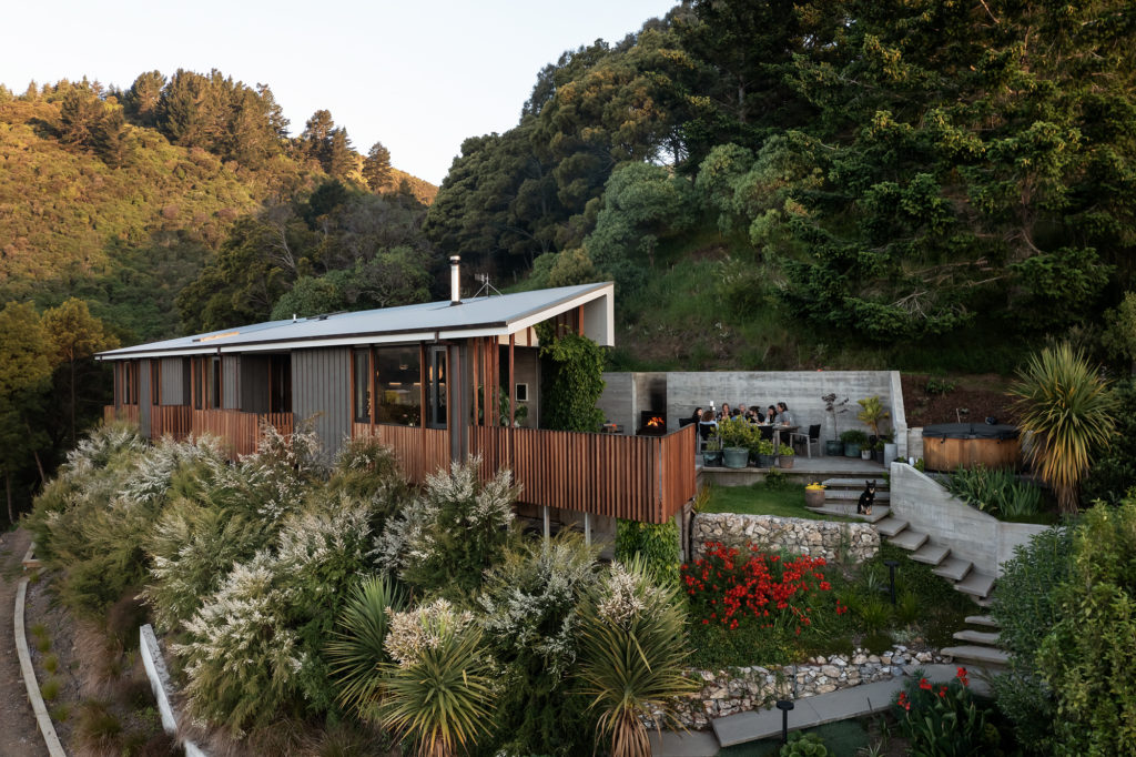
There is a similar feel to the way this house slowly reveals itself.
“By the time you arrive at the top of the winding garden path, you’ve met the house arriving above you,” continues Jeremy.
An ascending garden here is defined by a zigzagging concrete stair and gabion retaining walls. It meanders upwards, bordering beds of red crocus, cabbage trees, and kanuka bush among others. It leads toward a feature wall that slashes and holds the rest of the clifftop in place.
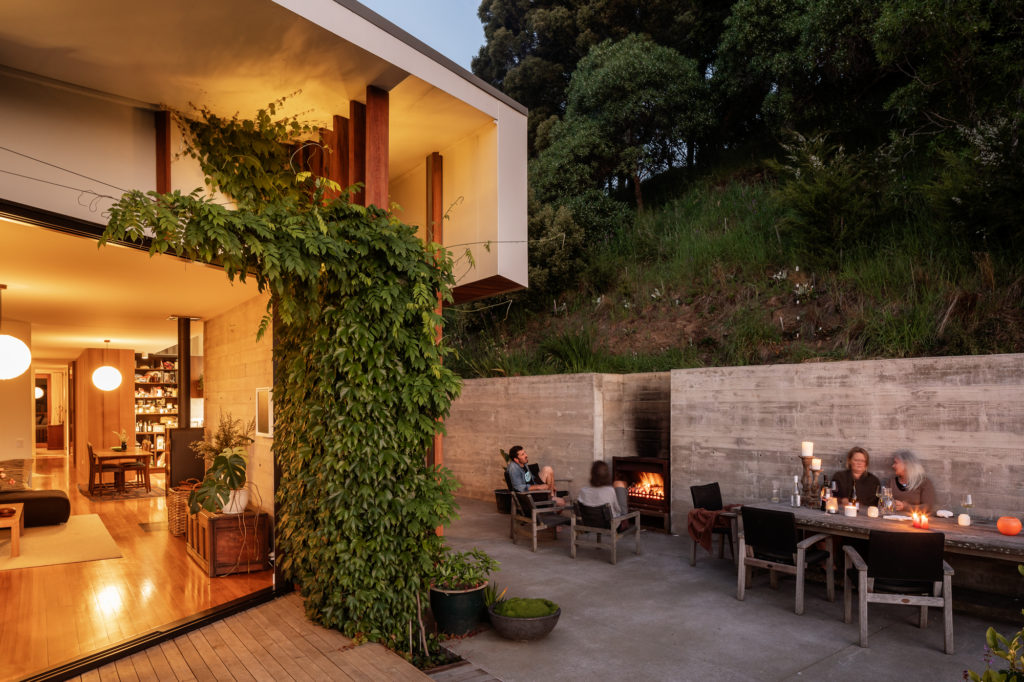
“It is in situ concrete, poured into a handmade wall propped with what looked like every stick of timber Simon [the owner, who also built the house] had cobbled together over the years!” says Jeremy. “The irregular finish and width of the boards was prototyped and set to run horizontally along the [back of the] house. Where internal, it has inbuilt insulation, and where external, it chamfers to shape a near and back side to the corridor relative to the entry, bathroom, and bedroom doorways, and to hold an old external fire.”
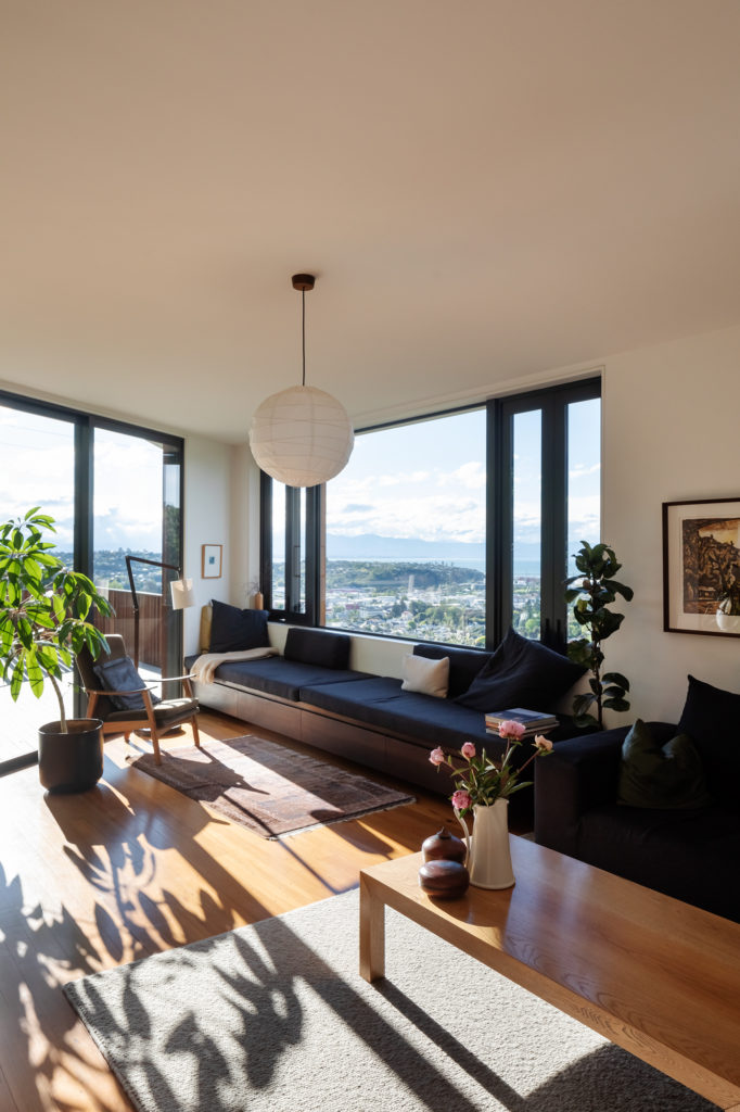
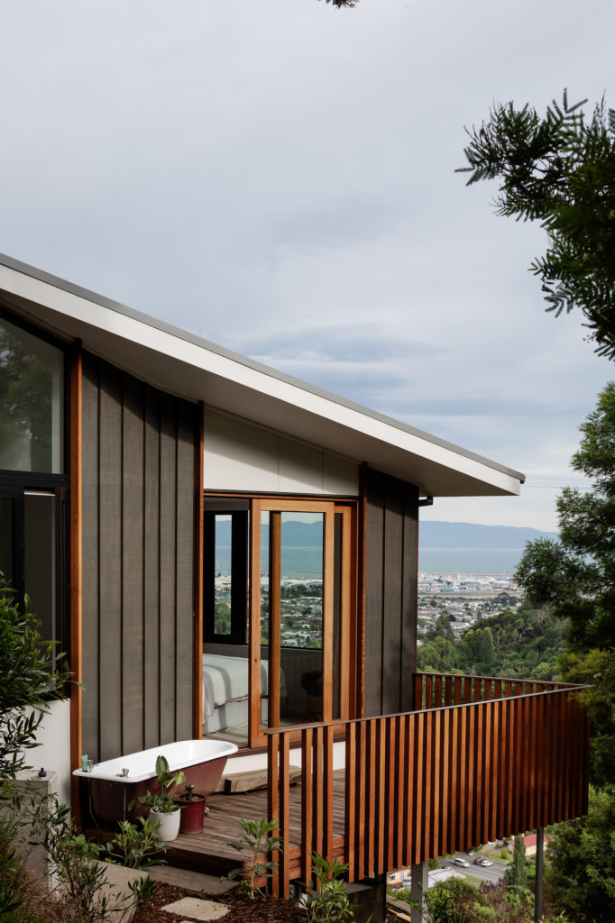
This concrete wall leads toward the house, where one has the option of either following it — on the right — towards several entry points or going in through the large sliding doors that enshrine an outdoor deck on the left. It is here that the views of Tasman Bay are revealed — perhaps a better word is ‘explode’ — in front of you.
The site used to be accessible only via a stock track up the hill and boasts uninterrupted views of the city, New Zealand’ s geographical centre, the bay with a few small islands, and Abel Tasman National Park in the distance. That urban/rural context is at its clearest from this vantage point, showing a home that is removed from, but visually stitched to, the city below. That slightly under-developed suburban/rural feel with an enviable cliffside positioning is tad bohemian — as if Laurel Canyon in the Hollywood Hills was serenaded by a ’60s acoustic guitar soundtrack and a slightly more temperate sea breeze.
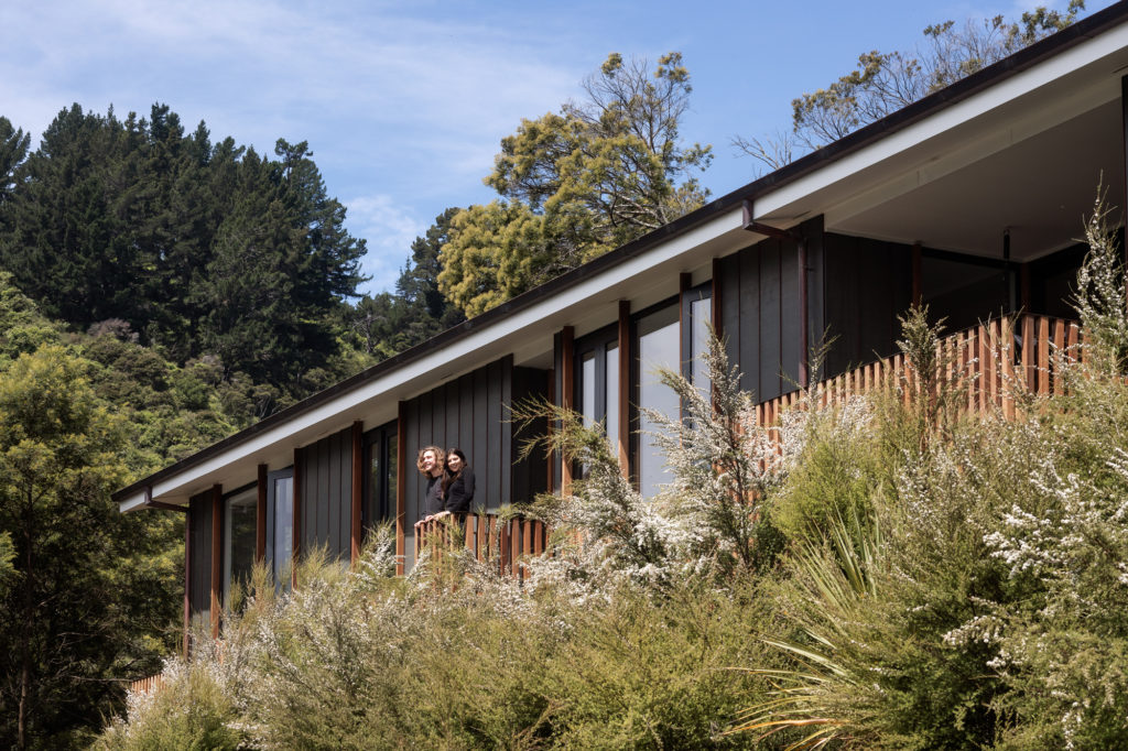
According to the architect, the house is “essentially a trussed roof with an extended top chord to form a northern eave and raised southern ceiling. The eave shades during the summer and allows low-level light in to heat the house in winter.”
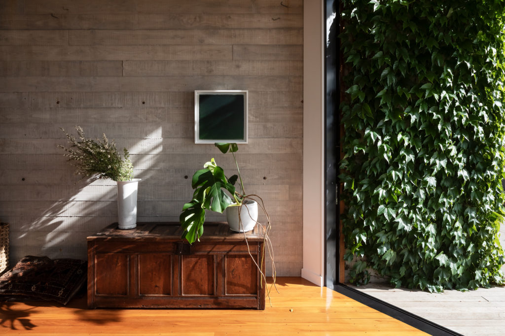
As we arrive here in the early autumn, the eave is partly covered by Virginia creeper, a thin wire, still visible, giving the vine a clear path to follow, in hopes that it will frame the deck and sliding doors and make the abode blend further into the cliffside.
Inside, the house reveals itself as an elongated interior, a preface to the idea of ‘ feathering’ that underpins this home’s design.
“It’s life in a corridor,” writes Jeremy, “communal and meandering. The house elongates and feathers to achieve this, tapering ends to open external space and make connections.”
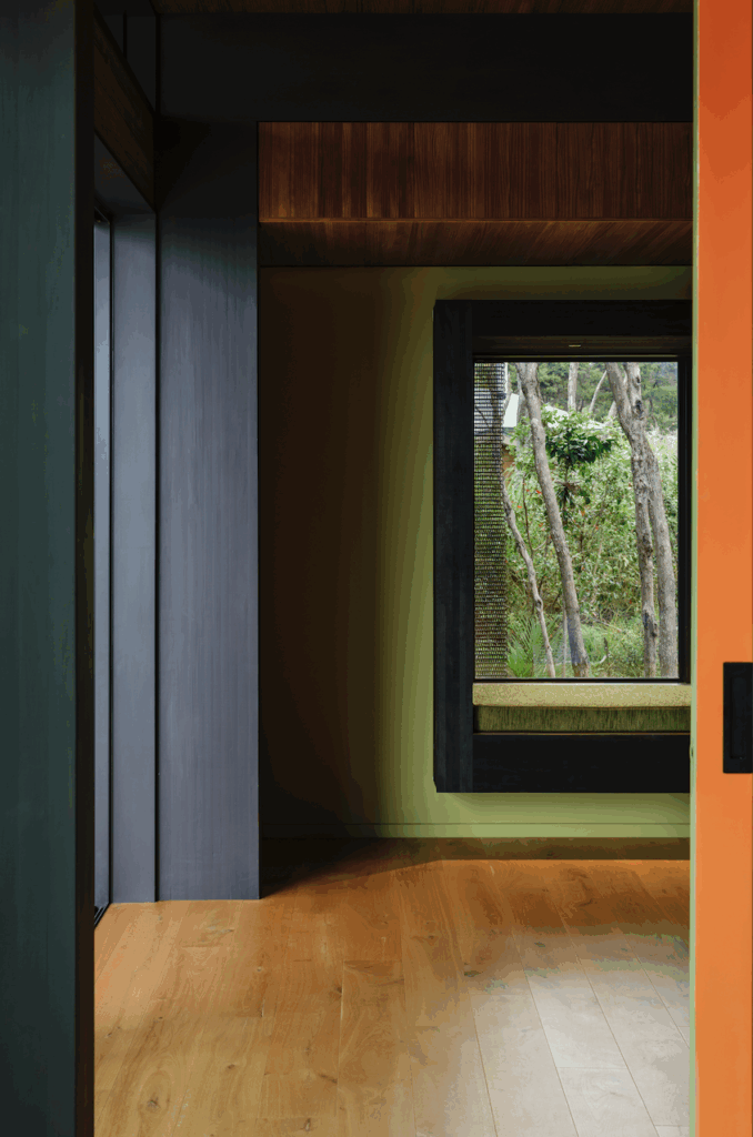
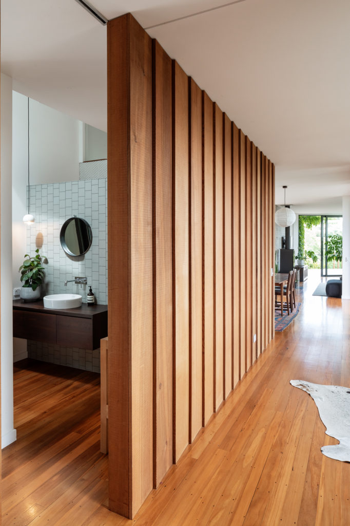
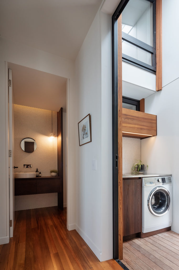
This corridor acts as a sort of feather shaft, running from the deck straight to the main bedroom at the back of the house. From the shaft, a series of spaces — kitchen, bathroom, toilet, laundry, and the only other bedroom — act as feather’s barbs on the right while on the left a medium-sized, semi-covered balcony and a two-person soapbox balcony do the same.
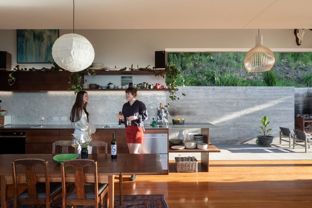
“The idea of feathering came from being high on the hill and looking outwards,” says Jeremy. “We were interested in making the building feel grounded to its people and landscape but also be light and uplifting. So, as the concrete walls ground the house and orientate it outwards, the lightness of the space and its movement provide an ongoing invitation to life.”
The feather metaphor doesn’t stop at layout level but goes as far as informing some of the materiality.
“It feathers materials as layers, so things come in stages; off-form concrete, joinery, furniture, plants, even crafting a lapped-cladding with copper tips. We were playing with material edges as we started feathering the ends of the house to open back to the hill and generate external space and the many ways in and out. It wasn’t long before we were playing with widths of materials and making a feathered cladding,” the architect says of the beautifully detailed facade.
“We considered the typical width of a shiplapped or board and batten timber cladding too narrow for the scale and elongation of the house,” he continues, “so we used wide-format plywood horizontal weatherboards and modified them so we could install them vertically to lap over each other with aligned weather grooves. The copper trims protect the ply but also fine and play the light at the edges. The outcome is a wide feathering board that has a direction that draws you along the house.”
Jeremy explains how designing and building for and with a friend, Simon of Simon Murray Builders, allowed them a slow, iterative process, which lent itself to prototyping and testing ideas such as this cladding.
It helped as well that Simon, his partner Jane, and their family moved into the house when it was merely a shell — “a roof and building wrap underlay on the walls” — and the actual process of building took place on weekends and at night after the owner clocked off from his day job. This allowed the family to live with the design as it happened, experimenting and building slowly and incrementally before fully committing to any given idea.
“Not all buildings arrive this slowly,” says Jeremy of a process that took more than five years. “Usually spaces in a house are constructed concurrently, but in this case it was actually more like a house alteration being lived in during the process, where different spaces are worked on sequentially and everybody and everything moves out of the way while it all happens.”
Did that slow process influence the design in any way?
“Perhaps it became more like structuring a canvas and then developing different parts of a painting than the more programmed or ‘colour by numbers’ way houses are usually completed,” considers the architect. “The play allowed finesse, but more than anything it allowed time and life.”
And that, it has a lot of. As we visit the home on a crisp morning, shafts of light criss-cross the interior. Young adults, a dog, and the odd chicken meander around the site. There is the scent of freshly baked muffins and coffee, and everything in the house seems to be made to offer choices and relaxation.
The many entry options mean arrivals and departures don’t have to have an air of ceremony and grandiosity; it is inviting yet fluid. That same idea of fluidity and change — quite present in Jeremy’s own academic work — also led to another surprising aspect to this home: it is only two bedrooms and one bathroom for a family of five.
“Being friends and understanding each other meant we could immediately explore a small, communal, two-bedroom house plan for a family of five,” says Jermey, “because we already understood the fluid way they like to live. We could question where people might sleep at different times into the future, be it in bedrooms, corridors, cabins, or caravans around the site, and then develop a spatial strategy with the ebbs and flows for this all to happen.”
In most similar New Zealand family residential contexts, four bedrooms, two bathrooms, and a two-car garage is the architectural equivalent of meat and three veg. Yet this abode has taken into consideration the fact that growing children tend to come in and out of family residential arrangements. It understands the way this particular troupe uses space and caters for that singularity.
The office space can easily convert into a temporary bedroom. The bathroom and laundry areas have been separated so that each component can be used independently and with privacy — toilet vs shower vs hand basins vs clothes washing area — and given sufficient space to cater for the number of family members. The extended site, including the area below the house, has been left open and undeveloped to accommodate temporary housing arrangements if and when needed, and, potentially, more permanent ones at a later date.
This year’s Small Home of the Year winner is a meritorious design, not just because of its ability to understand the clients’ spatial needs now but because it also understands them going forward. The process and methodology were changed to accommodate the design and a slow build, achieving a final product that is soulful, unique, and incredibly welcoming.
Words Federico Monsalve
Images Patrick Reynolds
JUDGES’ CITATION
It takes a certain level of daredevilry and nous to convince a client to build a two-bedroomed home for a family of five. Yet, this is not the only bold aspect that attracted the judges to this Nelson abode. Using a metaphor of ‘feathers’ to underpin both layout and materiality, the architect has achieved a level of consistency and generosity of spirit which far surpasses the smallness of its floorplate.
For full coverage of this project, pick up a copy of the June-July 2021 issue of HOME from anywhere good magazines are sold, or subscribe or purchase your copy online.

Home of the Year 2021 | Video Features
Home of the Year 2021: Black Quail House
City Home of the Year 2021: House on Takapuna Beach
MULTI-UNIT HOME OF THE YEAR 2021: FARM HOUSE
RURAL HOME OF THE YEAR 2021: HILL TO HORIZON HOUSE
