Nikki Wilson of NW Studio works relevant rhythm into a heritage Dunedin building. See how she transformed this hotel by referencing its historic roots.
What was the design brief from the client?
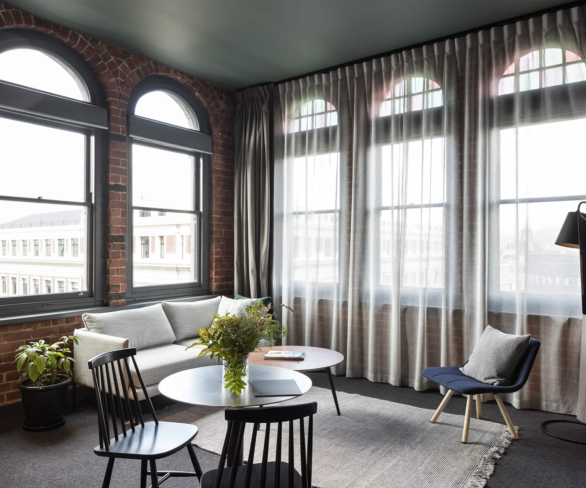
The developers have done a lot of work in Dunedin over the years and know and love the city and its buildings. Their brief was to convert the building into a hotel which would be attractive for guests staying a night or two, but with the capacity for longer stays. They wanted something that would attract the most interesting and interested visitors – a place for forward thinkers, curious people. We all agreed it was to be an inner-city hideaway – a place for the conscious traveller to have an authentic Dunedin experience.
Tell us about your design approach in this heritage-industrial building.
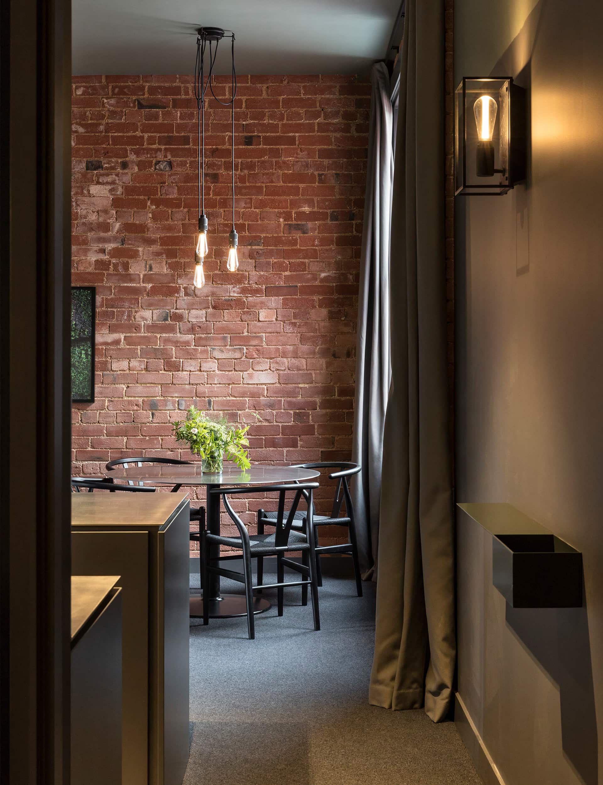
The Category 2 heritage-listed building was built in 1910 by engineers and importers Chambers & Sons – hence the name – as their offices and warehouse. Once we had stripped out the rabbit warren of partition walls, we fell in love with the building’s rhythm and materials. The structural grid allowed us to give at least one full set of phenomenally high windows to each room. They belt light in and, depending on the room, varying city views. We were more than happy to let these windows have the loudest voice. The building is full of imperfections and anomalies and we decided to honour that, to not see the effects of age as defects, but to layer them up with a new story.
You’ve used New Zealand wool products, including carpet and blankets. What other local products have you used?
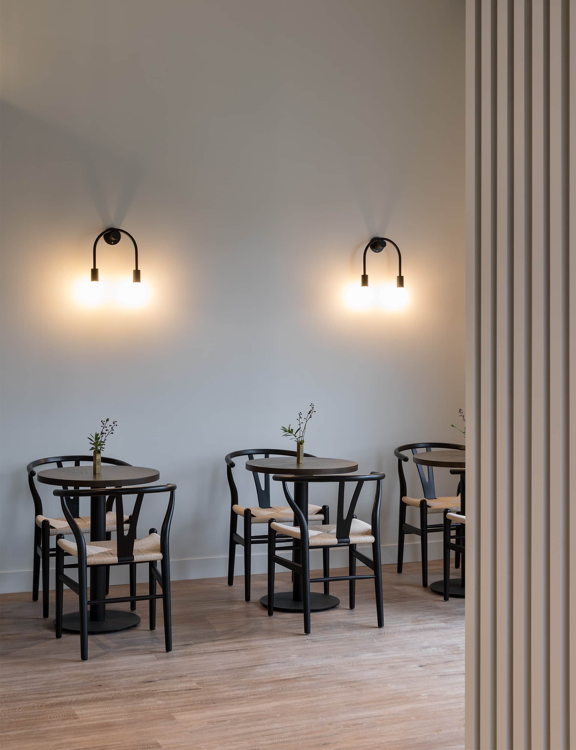
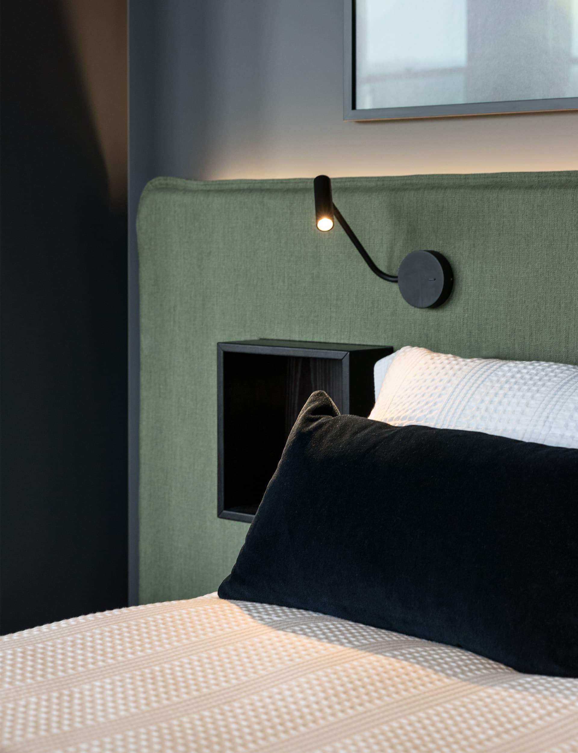
The tactile qualities of materials were important – they had to feel good, so we’ve also used New Zealand linen, and open-weave hemp curtains. We’ve worked with local artists, craftspeople, trades and suppliers, all of whom were immensely supportive of the project. Most of the furniture is from New Zealand manufacturers.
You’ve left parts of the building unadorned – such as the stairway wall that’s partially exposed brick and partially rendered. What other features have been preserved?
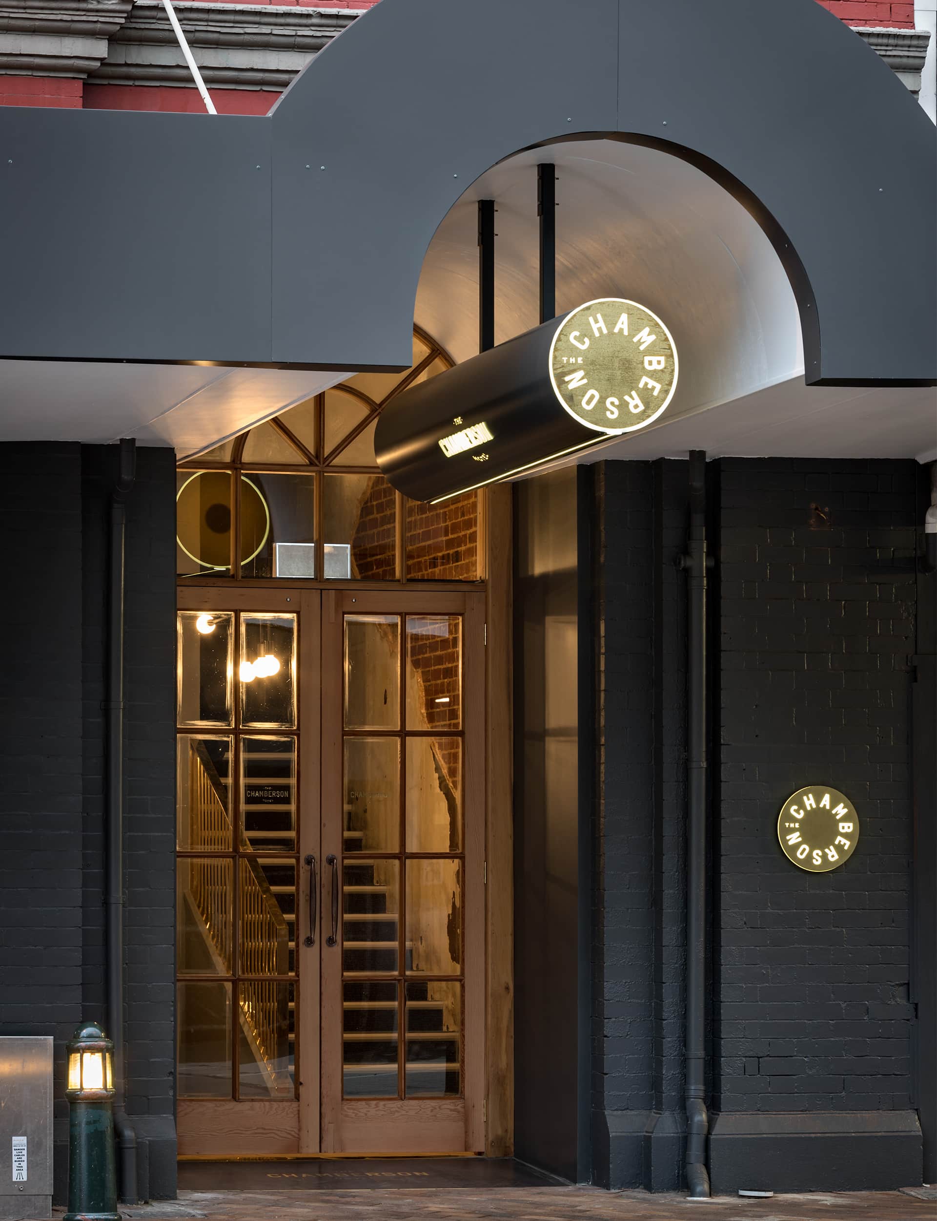
We left all brick walls exposed; some were partially rendered – the render having fallen off over time. The steel columns have splayed footings, which we’ve left exposed where possible. The windows were partially covered by a suspended ceiling in the previous office fitout and when we uncovered these in their entirety, it was a no-brainer to leave them as is. The street entrance had an unusual natural stone-tiled floor, so we chipped off the plaster, scrubbed off years of stains, and it looks beautiful. We made sure that all new architectural or interior elements served to either contrast and highlight the building’s original features, or quietly support and give them a new context in which to continue their life.
What do you enjoy most about the building?
Its no-nonsense, muscular street presence and rhythm. We hope the interior is a gentle opposition to the exterior gruffness and a shoulder-to-shoulder stroll with its rhythm.
The Chamberson Hotel
77 Stuart St, Dunedin
thechamberson.co.nz
Photography by: Simon Devitt.
[related_articles post1=”94820″ post2=”94833″]
