Tim Gittos and Caro Robertson of Spacecraft Architects discuss why this tricky site gave them inspiration and not trepidation. See more of this clever small home below
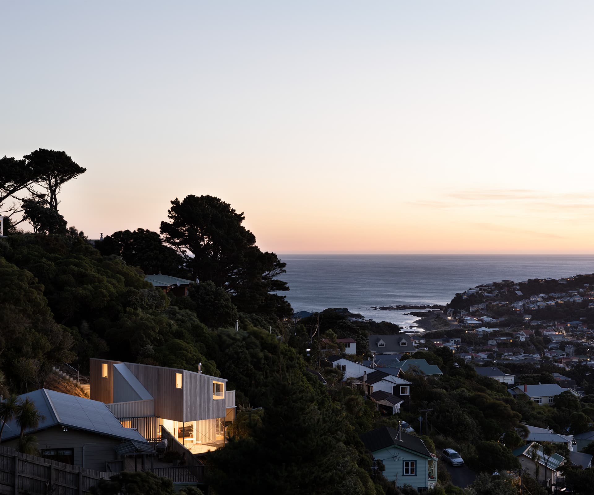
Q&A with Tim Gittos and Caro Robertson of Spacecraft
Surely a site like this fills you with trepidation?
Tim Gittos— No, it was great – all these constraints breed a lot of creativity.
Are sections like this – cheap but difficult – increasingly sought after in Wellington?
Caro Robertson— Certainly. We take on ground issues that most firms don’t want to do. What we always tell people is that you are going to spend some money getting the site to the point where you can build. We say that the $100,000 or whatever you spend bringing the site up to buildable condition is considered part of your land cost.
Did this site need much work?
TG— No. But we put the weight – the concrete – at the back where the existing cutting was, and made the house lighter at the front using steel poles, lighter materials and cross-bracing. There are only four points where the house touches down at the front – they are fairly hefty, yet simple, footings. The cross braces are just so good, I love them, and they’re great in a seismic zone.
What materials have you used?
TG— Inside, Tasmanian oak flooring and macrocarpa. For cladding we’ve also used macrocarpa and BD900 trapezoidal Colorsteel. We like it because you get bolder shadows and it’s tough.
The access point is very narrow, how did you get the materials onsite?
CR— In this case, we dismissed prefabrication; to be cost effective you need to produce a thousand units a year. And craning or choppering in material requires onsite storage and there wasn’t any. It doesn’t take much longer to hand carry and it’s actually more cost effective.
[gallery_link num_photos=”13″ media=”https://www.homemagazine.nz/wp-content/uploads/2019/04/XMarks_SpacecraftArchitects_HOTY2019_9.jpg” link=”/real-homes/home-tours/new-zealands-best-small-home-2019″ title=”Read more about this home here”]
The cross-bracing is used inside and outside, including across the living room’s picture window. Why?
TG— We’ve done this quite a bit, the big cross in the window. Some people find that aberrant, but we argue that you couldn’t have that window if you didn’t have that cross, well not without spending another $50,000. It’s a really economic and elegant way to brace a wall and it’s also really light.
The chain-link fence, rather than glass walls or a balustrade around the northern verandah, gives what is a suburban home an urbanist sense of style. Is that why you did it?
TG— Horizontal rails, traditional balustrades and glass are really expensive. The chain-link is something we’ve used in the past and it’s incredibly cost effective. The really lovely thing is it encloses the space and makes that verandah feel like a room, but you still get air through it, you can still see through to the trees around you.
You chose not to link the upper and lower wings with, say, a double height space or a void where they’re joined by the stairs. Why not?
TG— In some ways it would make this home a hell of a lot smaller. I think architects often use double height in small houses as a way of making the space feel bigger. It looks bigger, but I reckon it feels a lot smaller. Acoustic separation has a huge amount to do with how big a place feels.
See more of the ‘Best Small Home 2019’ below
