The brief for the lighting design for a home on the shores of Lake Rotoiti was simple: the light source was to be invisible, and the output needed to deliver pools of light, subtly.
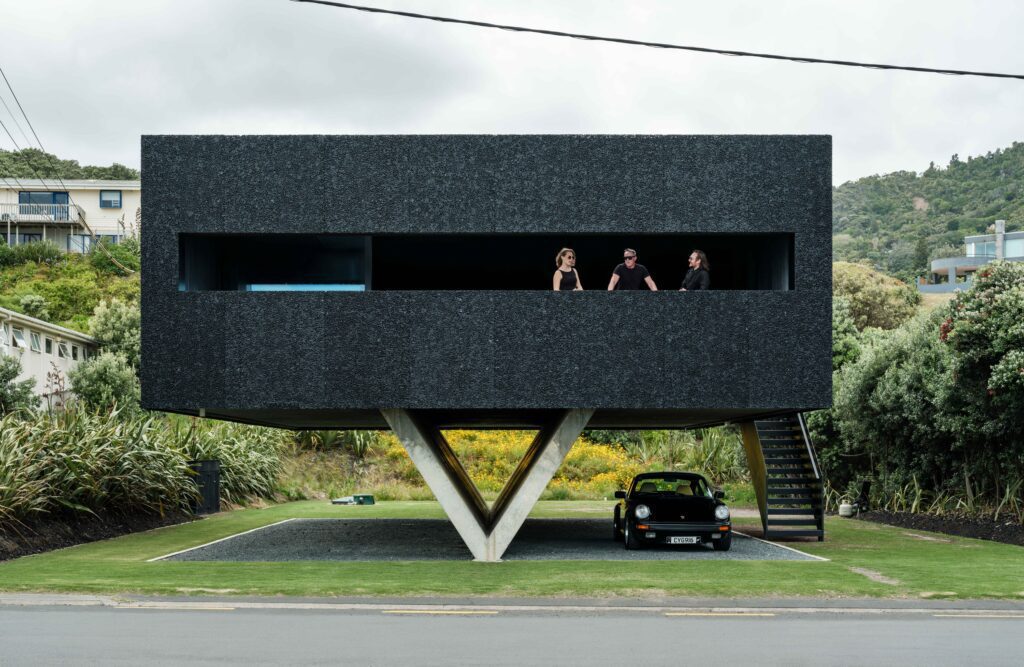
The spaces in this holiday home are deliberately pared back, bunker-like in form and material; they’re cavernous and welcoming.
The section is unfenced, like all the sections here. There’s an informality that now only exists now in certain places in New Zealand. At the rear, a sunken conversation pit overlooking the lake is centred around a built-in fire designed for connection with both lake and passersby. The sounds of nature are consuming, and the water can be heard lapping at the shore.
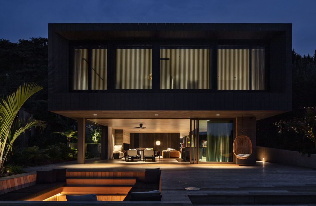
It’s a place that draws you in. Here, where the water meets the land and the colours merge into a palette of green and brown, the house seems to exist on a divide of sorts. Behind, native greenery steps up the hill, tousling with the more muted greys and lighter greens of the foreshore.
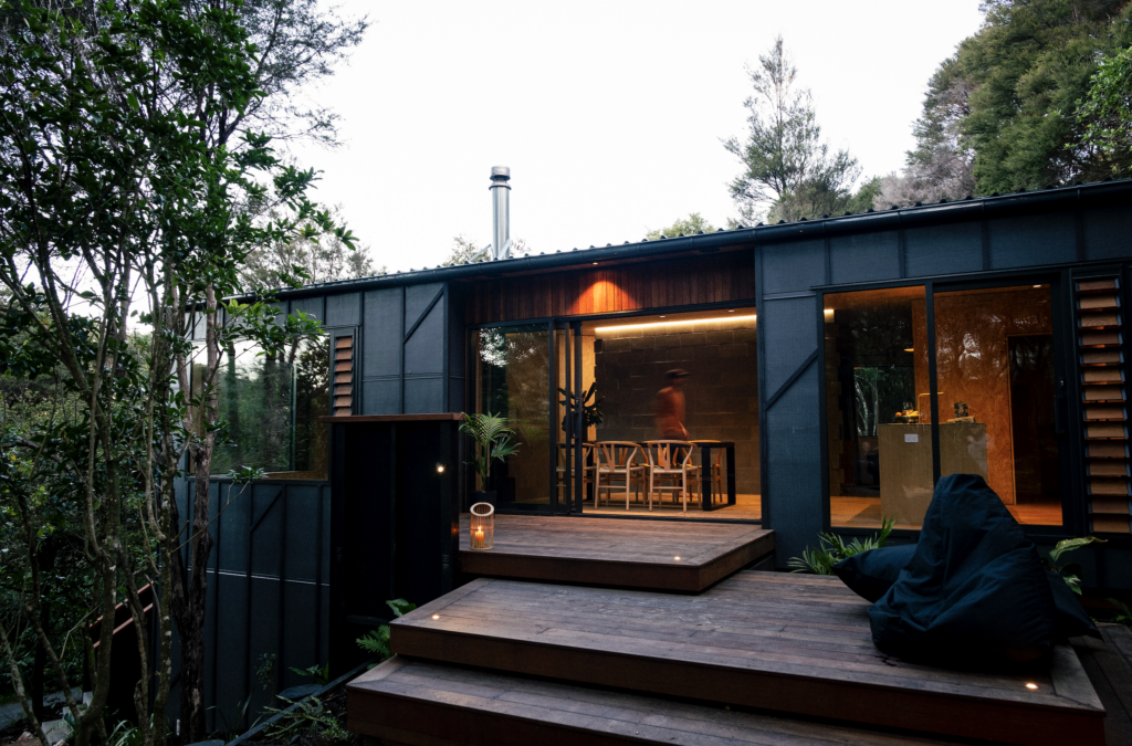
From the lake, the house appears to be nestled into the hillside; the lower level opening onto a flat deck area – at once compelling and invitational.
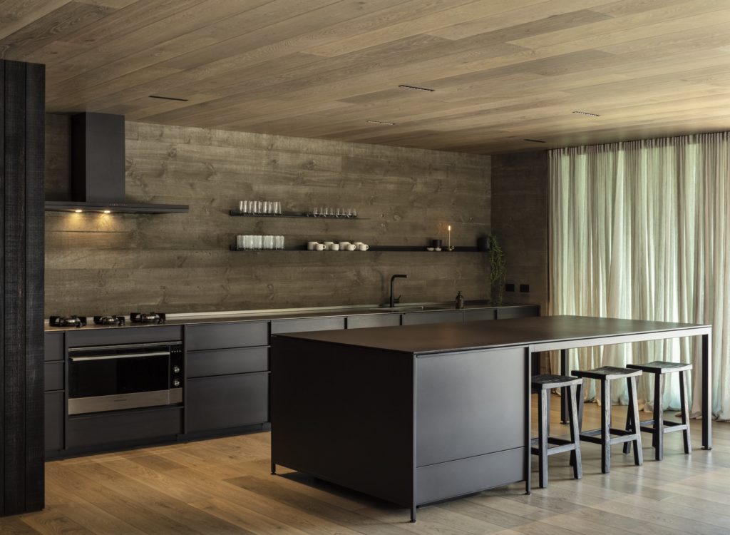
There’s a moodiness about it that, perhaps, only a lake house can achieve. It’s that moodiness that ECC’s Richard Thorburn says needed to be maintained and enhanced with the lighting.
To that end, a series of products were specified to deliver a refined subtlety and only the output needed. “It was important not to over-light this house. “We were involved right from the start when Evelyn McNamara supplied us with renders,” Richard explains.
“The brief was quite loose. Both architect and clients wanted it to be moody, capturing the lake house and bunker feel. The client wanted to ensure it wouldn’t be lit up in the typical way a city house is; only the light needed would be used.
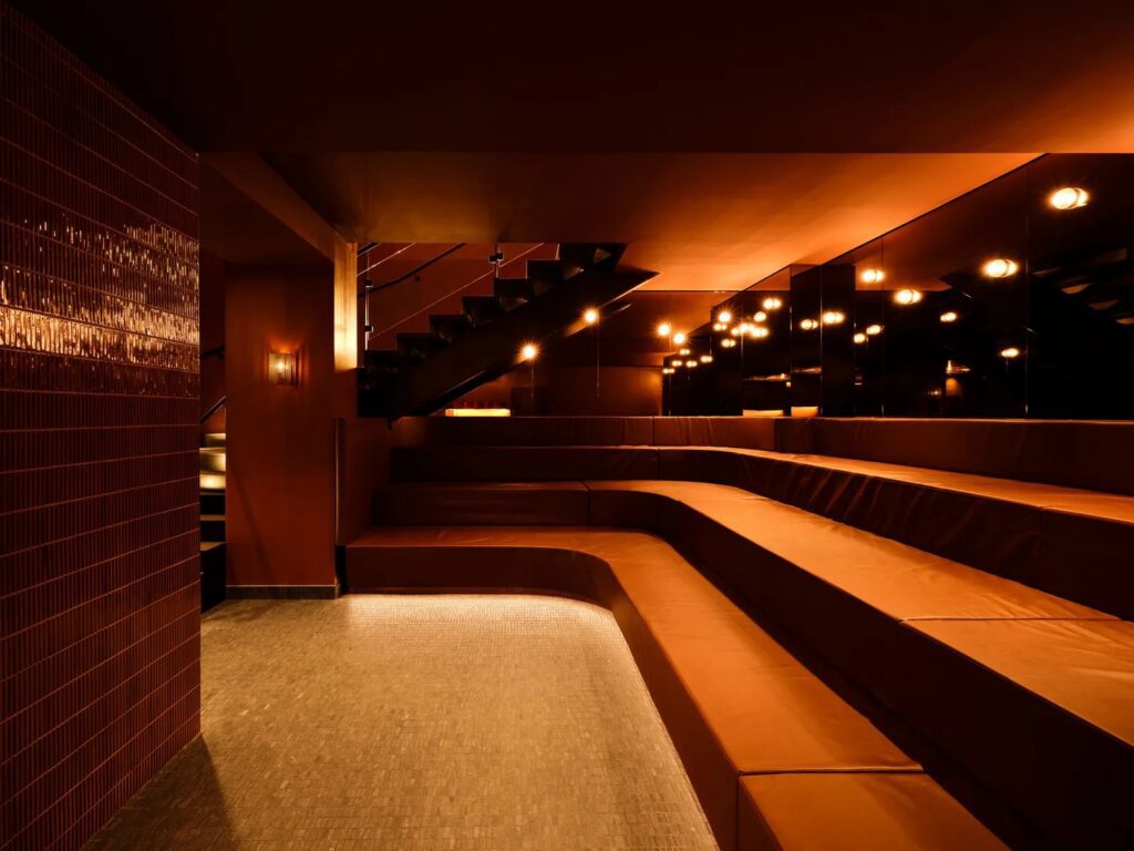
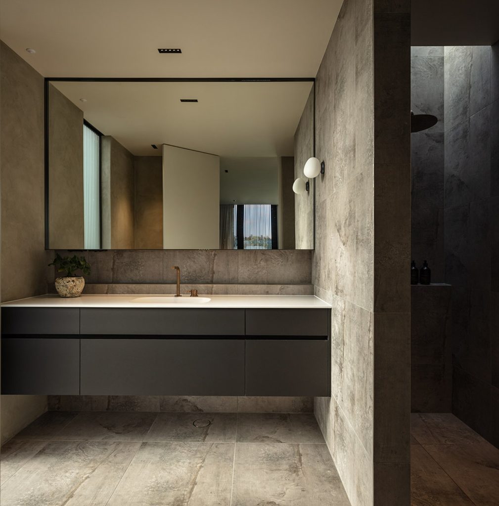
“To achieve this, we decided to use an iGuzzini downlight: the Laser Blade, throughout the house because it creates subtle pools of light while essentially concealing the light source – another important aspect of accentuating the bunker-like aesthetic.
“When you look across the room, or in from outside, you can’t see the light source. There are lots of small optics within the fitting so you get a really high level of visual comfort and no glare.
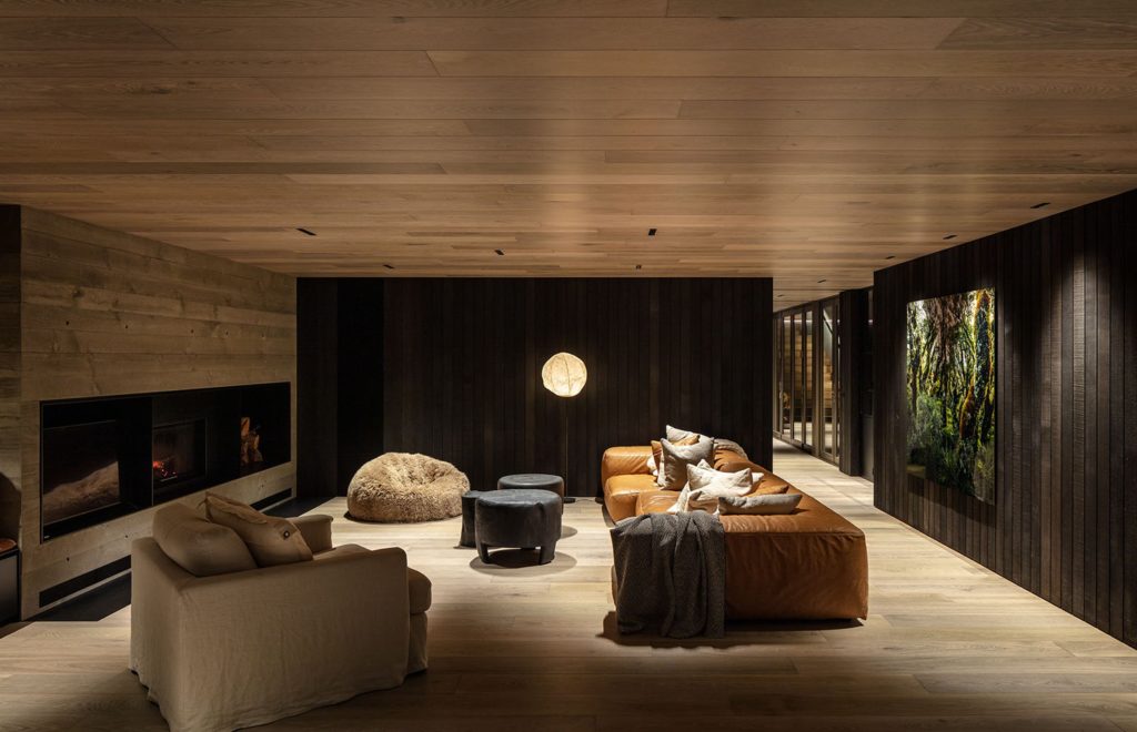
“The clients asked for an invisible light; they didn’t want it uniform – they wanted to be able to sit there with the lights dimmed and watch the fire.”
LED accents were also incorporated into the design, both inside and outside, running up the stairs.
Decorative wall lights were selected for the bathrooms, in conjunction with the Laser Blade downlights: the Gregg Wall Light by Foscarini. “It’s an unusually-shaped opal glass mount that provides a nice, warm glow. Again, it’s a subtle piece that adds to the moodiness of these spaces.”
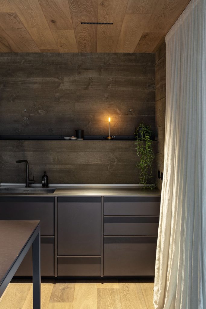
In the kitchen a freestanding, battery-powered piece takes pride of place above the bench – a nod to days gone by perhaps. “This is the Wick light by Graypants Studio, another beautifully subtle piece they can take outside when they’re sitting there in the evenings.” Perhaps best seen as a modern candle, it is the perfect piece; a nod to the light of old in a very contemporary yet classic Kiwi bach.
