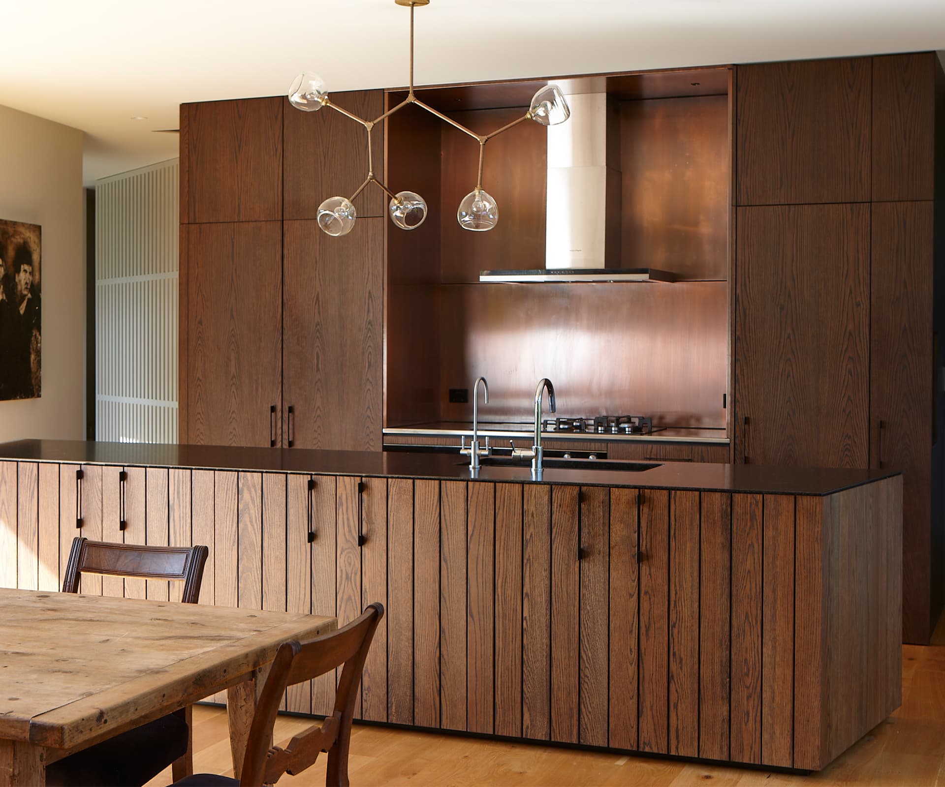
Timber and copper contrast against this Muriwai home’s pristine gallery-white walls. Architect Nicola Herbst describes the details behind the design
Herbst Architects design a rich oak and copper kitchen in a Muriwai home
Architects: Herbst Architects
Location: Muriwai, West Auckland
Brief: As a key part of the home’s beating centre, the kitchen needed to strike the right chord in tone and texture.
Briefly describe the project.
Nicola Herbst: The house is an exercise in extraversion – focusing out to the pristine New Zealand bush and beach views beyond. And introversion – focusing in on the art and books that are the treasures within.
“The dark heart of the house”, as you refer to it, looks striking against the white gibbed walls throughout. Did you use any design elements to link the two or was ‘contrast’ the point?
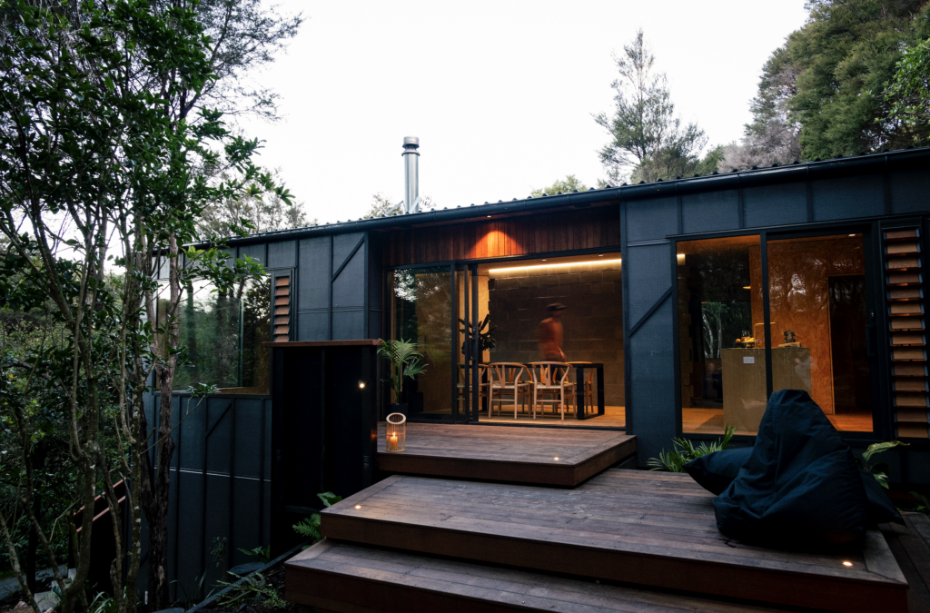
Although the kitchen, the double-height bookcase and panelling of the stairwell are a stark contrast, they were chosen to reference the dark-stained exterior cladding. The copper is another material employed both inside and out.
This oak kitchen doesn’t display its structure in the same way that much of your work does, yet there is a lot of texture and interest here. How have you achieved that?
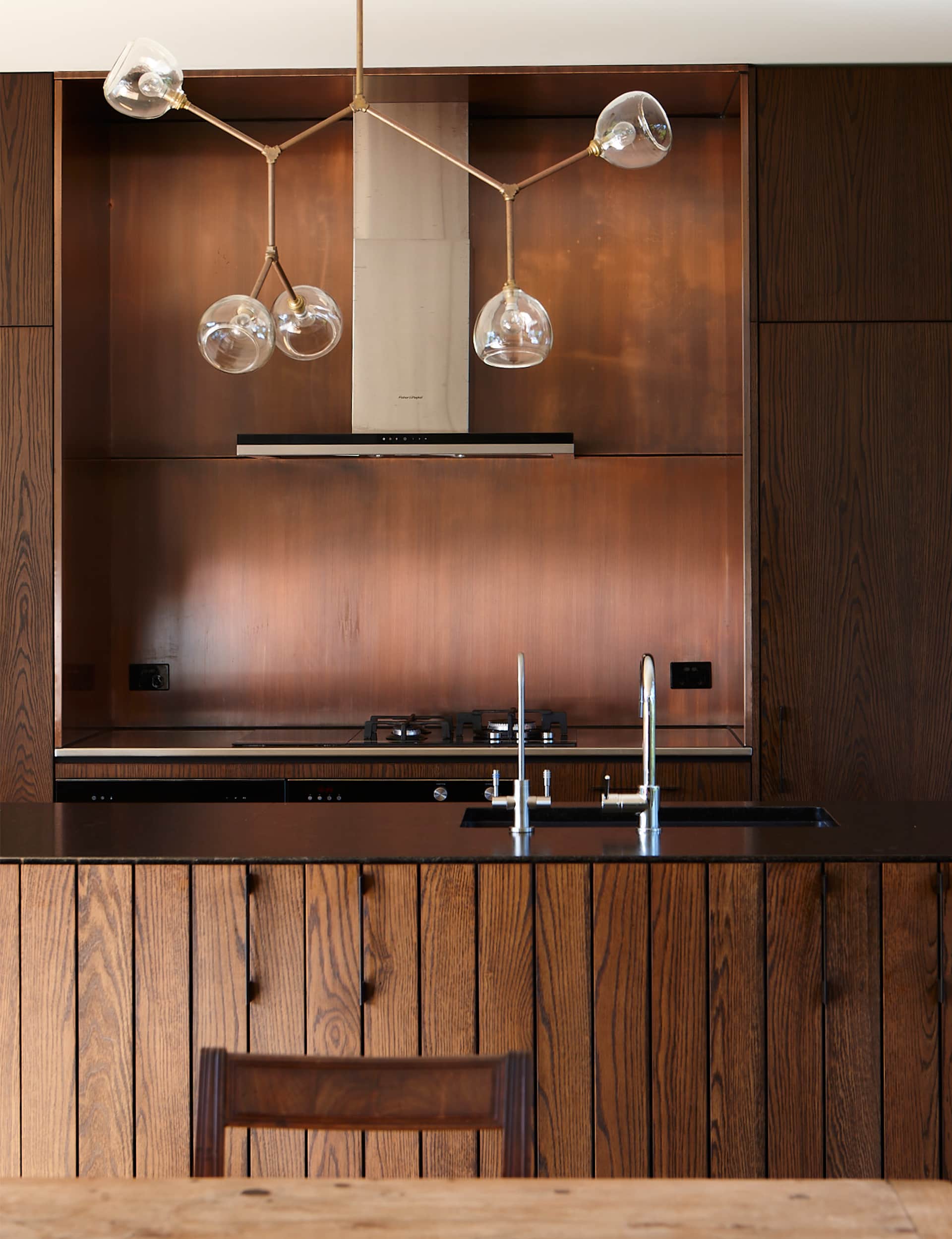
The architectural expression is about skin, not bones or expressed structure. This idea of skin is used internally, too, so for this reason we’ve chosen not to express the structure of the cupboards as we usually do. We’ve set off the oak-stained panels against pre-aged copper. The stained oak planks of the island bench give additional texture without introducing another material.
The copper splashback is a luxurious touch – how does this compare durability-wise with more traditional materials?
It’s a very tricky finish to get right. How to patina it and how to arrest the patina and seal the copper turned out to be a complex task – there is no one solution. In the end, Powersurge assisted hugely in getting the finish right. Our client wanted the copper to be free of fingerprints so sealing it was the only way.
This kitchen works almost as a piece of furniture. How have you handled storage?
All the tall storage required in the kitchen flanks the back bench. Fridge/freezer on the left and pantry on the right. The island has double-sided storage – the dining side caters for the second crockery set, vases and platters; the kitchen side has the sink, bin and dishwasher.
Words by: Suzanne Dale. Photography by: Jackie Meiring.
[related_articles post1=”76534″ post2=”76124″]
