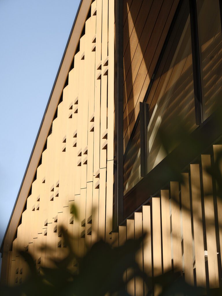
Designer Veryan Laity reworked an unusual corner of this triangular house to create a very sleek and social kitchen space
Designer: Veryan Laity of IK2 Design
Architect: Bryan Windeatt of McKinney + Windeatt
Interior: Gilly Baillie
Photography: Jackie Meiring
Location: Auckland
Brief: A new, repositioned kitchen in a renovated seaside home
Why did you relocate the kitchen in this home?
Veryan Laity: The home is by the water on a triangular section, and the house is triangular to take advantage of the view. The problem with a triangle is that the further into it you get, the smaller the space. The old kitchen was at the eastern end – where the built-in seating is now – but the spaces were a bit smaller. In kitchen design, there’s so much emphasis on the ‘triangle’ but when designing a triangular kitchen it doesn’t feel natural.
The stumbling block was that the client wanted a walk-in pantry. We tried to simplify the layout and ‘square’ it off but it didn’t work. Finally, we acknowledged the shape of the room and things came together. It was an interesting exercise in terms of listening to the space and what worked. By opening up the previous walk-in pantry and relocating the laundry to the garage we were able to create a largish kitchen and lounge area. It’s not a big house so the emphasis was on how the spaces work and are used.
We had a good brief and the client was adamant about some things. An informal lifestyle was a driver. We needed to be able to seat the family together when the children were home from holidays and we also needed a TV in the living area.
How has storage been catered for?
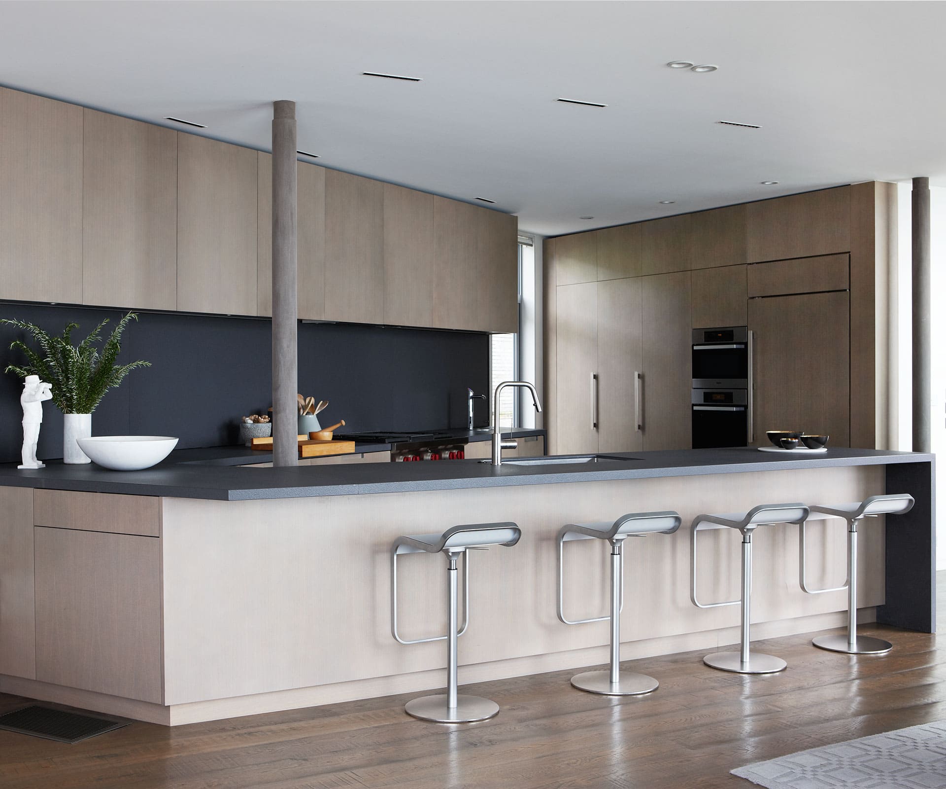
Rather than a walk-in pantry, the solution was a fold-away pantry door system from Hafele. The sliding panels on the splashback with storage behind add a sense of depth and provide easy access. One end, near the dining table, hides away phone chargers, with other niches containing paper towels and dried herbs and spices. The sliders give a nice movement to the splashback. Under-bench sliding doors behind the pole allow access to less frequently used items.
Tell us about some of the materials here
The splashback panels are made from Lapitec. The bench is also Lapitec, but with a textured Vesuvio finish. The more textured finish on the bench works well with the concrete block in the house. The cabinetry is stained oak veneer, with the timber taken right around to the base of the banquette seating, which Gilly designed.
[related_articles post1=”53317″ post2=”53191″]
