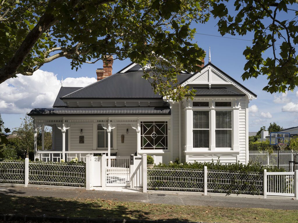
The surplus floor space in a dated 1980s bathroom in Grey Lynn has been rationalised by splitting in two to create an ensuite
A large Grey Lynn bathroom is cleverly split in two
Architect: Andrew Meiring
Location: Grey Lynn, Auckland
Brief: A new en suite and family bathroom to take the place of the former large bathroom.
One became two when one large bathroom was divided into an en suite for photographer Jackie Meiring, her husband Alex Twigg, and one for their four-year-old daughter, Zara. The family’s Grey Lynn home was designed by architect Kent Dadson in 1989. The original bathroom had a very large bath with a late-80s curved surround and surplus floor space.
One of Jackie’s architect siblings, Andrew Meiring, undertook the redesign. “We really like the bathrooms he designs,” says Jackie. “His choice of materials and special design give a real, modern-luxe feel.” Yellow was the starting point for Zara’s bathroom (right), where the space is mainly white, but yellow grout and a yellow vanity give the space a sunny and cheerful playfulness, without being too childlike.
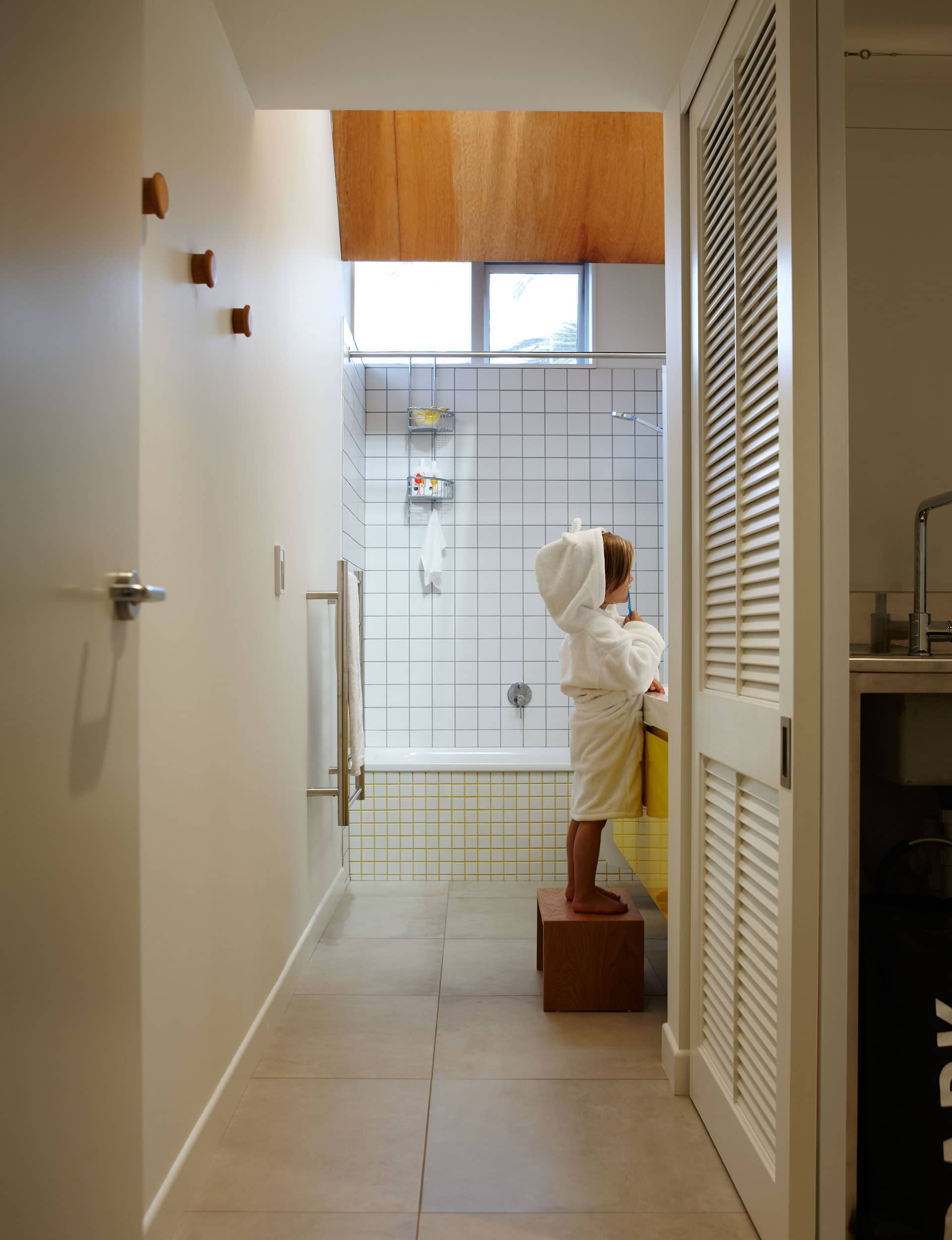
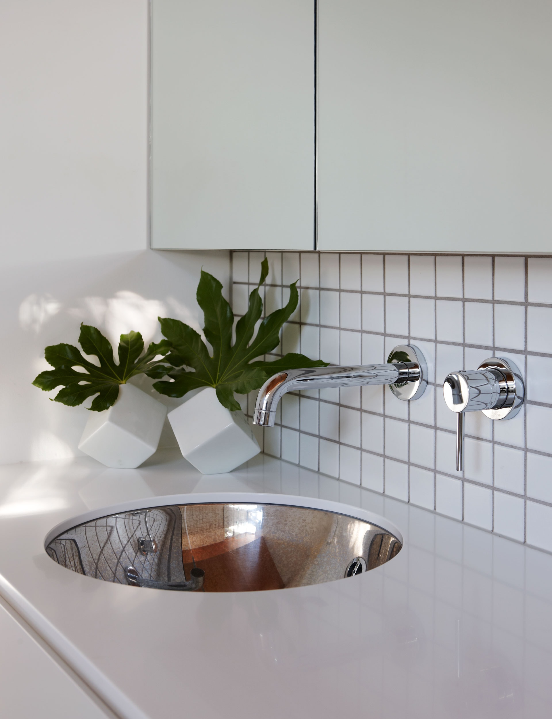
Working to a budget, Andrew sourced a generous vanity unit, keeping the top but discarding the cupboard below for one of his designs. It has a fresh new look, painted in glossy, bright yellow Resene ‘Turbo’. Matte-white wall tiles in two different sizes add interest without being overwhelming. The floor tiles resemble concrete: “We wanted them to be almost cement-grey, a little industrial,” says Jackie.
Due to space constraints, the bath is less-than-standard length, yet still feels more generous than a shub. Zara’s mirror is hung at just the right height and can be easily adjusted as she grows.
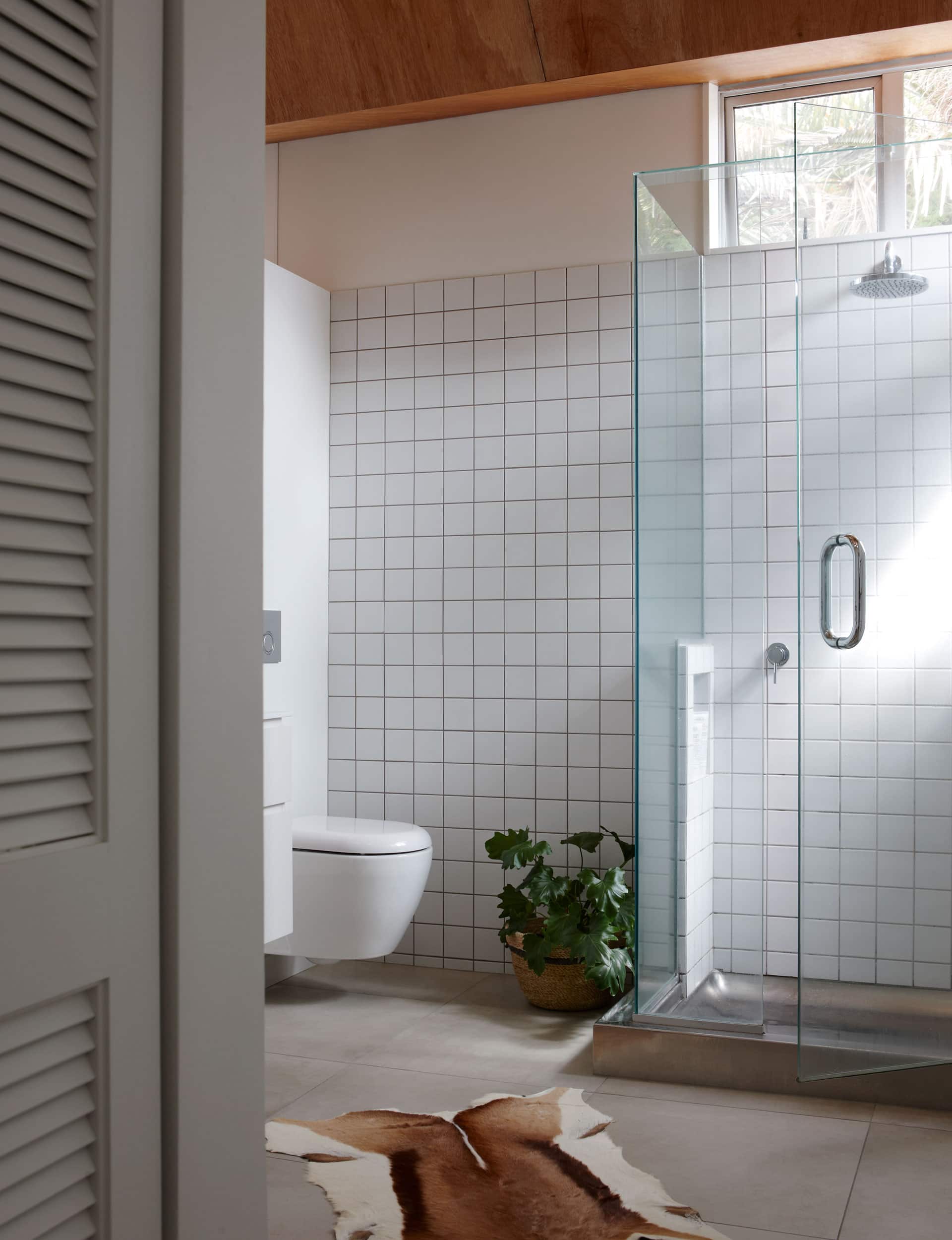
Next door, Zara’s parents’ en suite (above) has similarities to hers, but with a more moody, sophisticated ambience. Although the two bathrooms are separate, a clerestory window between them brings allows natural light to flood in. “The morning light sweeps down from the office windows above, creating an almost cathedral ambience,” says Jackie. The glass also enhances the soaring ply-clad ceiling, formerly finished in painted plasterboard.
The laundry, which had been open to the bathroom, is now hidden behind tracked louvre doors, with a new stainless-steel bench and built-in storage. “We did want to keep the language of the house and its materiality with white and stainless steel, which we like,” she says.
The laundry has an indoor washing line, created with marine-grade wire and tensioners, strung above the benchtop. “I love having the laundry between the two bathrooms and bedrooms for easy access,” says Jackie.
Words by: Penny Lewis. Photography by: Jackie Meiring.
[related_articles post1=”69758″ post2=”69150″]
