In one of the most distinctive coastal environments in New Zealand, this large family home takes its cues from the dramatic beauty of the sound it overlooks, and follows the natural contours of the land to embrace the setting and disappear into the bush-covered hillside.
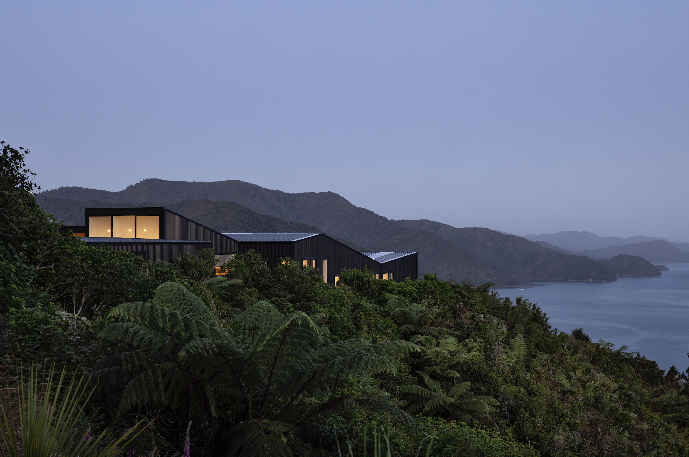
Located at the head of Queen Charlotte Sound in the Marlborough Sounds, the site is nestled high on a hill just near Anakiwa. The owners, Geoff and Jane, have a long connection with the little bay, having regularly visited a family bach in the area for close to 30 years.
The couple envisioned a large family home, a place they could share with their children and grandchildren and host their friends. They wanted a smart but welcoming house, with relaxed open-plan living and an interesting arrangement of common spaces; a design conceived for the site and one that extended beyond a single linear layout.
“What we wanted to do here was build on the magic of the place,” architect Patrick Avery of Arthouse Architects tells us. “When we first met Geoff and Jane on site, it was clear that this was a place that spoke for itself.”
The bay below is a busy little place. Ferries are in and out daily, with the small permanent population mainly servicing the tourism industry. It’s the home of the Outward Bound centre, the entrance to the Queen Charlotte Track, and a sought-after holiday destination.
“The beauty of this location is that it’s rural but it’s not as remote as other sites in the area. It’s only a 15-minute drive to Havelock and then not much further on to Picton,” Patrick explains.
A long, steep access road from the main road to the property was put in by the former owner, and more closely resembles a forestry track than a driveway. It’s only when you reach the top that the magnificence of the site becomes obvious, with consuming views to the east and right up the sound.
Patrick’s design response was to fan out across the building platform, following the contours of the site and aligning the majority of the spaces to the east and the sound.
“We went into it feeling we had a bit of room to work with, and decided to stretch the house out as much as we could. By elongating the plan, we could align more closely with the view, and pick up on other aspects, including rolling farmland to the south-east. We were interested in how the building rested on the site, transitioning from being spread along the edge of the flat building platform to hovering out along the gentle ridge towards the sound — moving between being hunkered down with its back turned against the southern weather to opening out to the desirable northern aspect.”
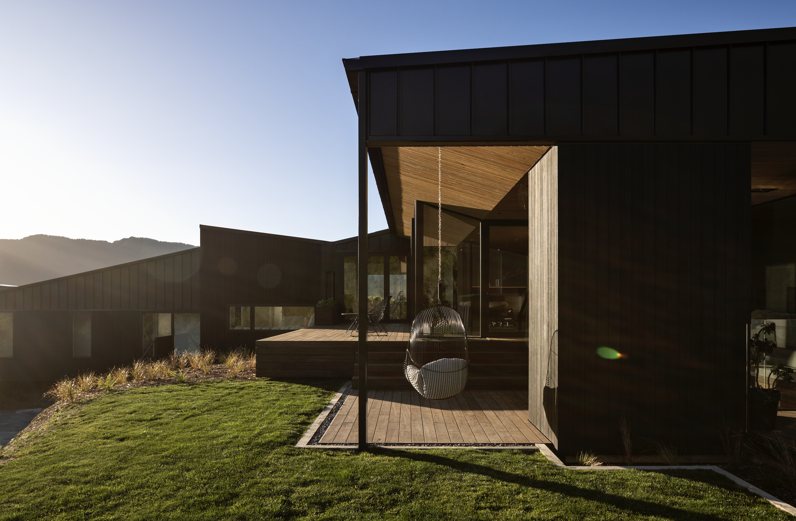
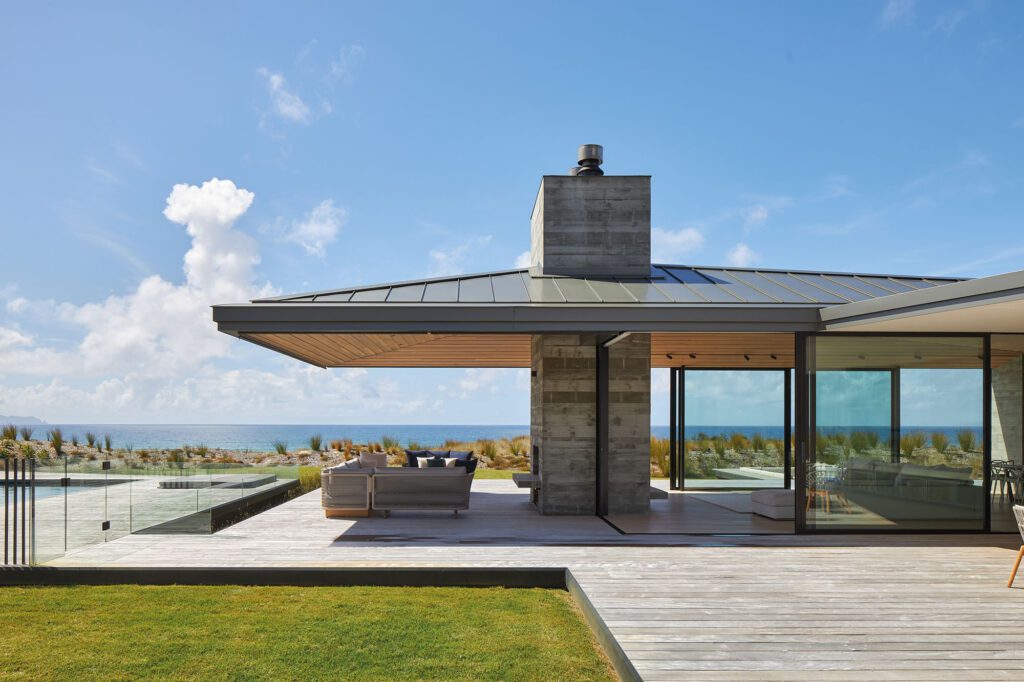
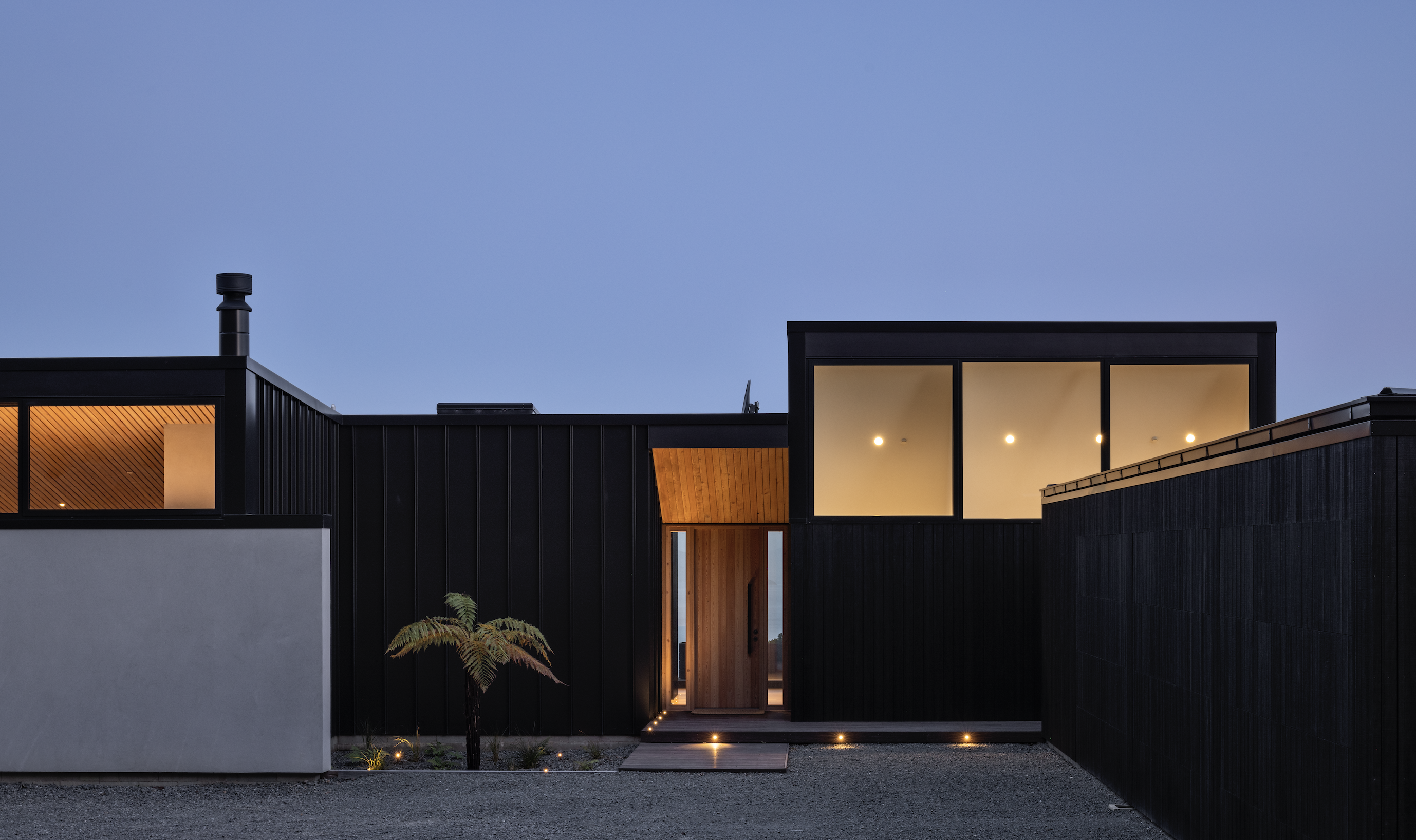
The exterior features a palette of recessive dark and textured materials punctuated by a strong spine wall in a natural concrete-toned finish. Inside, these materials give way to soft timbers and lighter hues.
The point of entry forms a central linking lens to the spatial arrangement of the house, which is loosely configured in an L-shape.
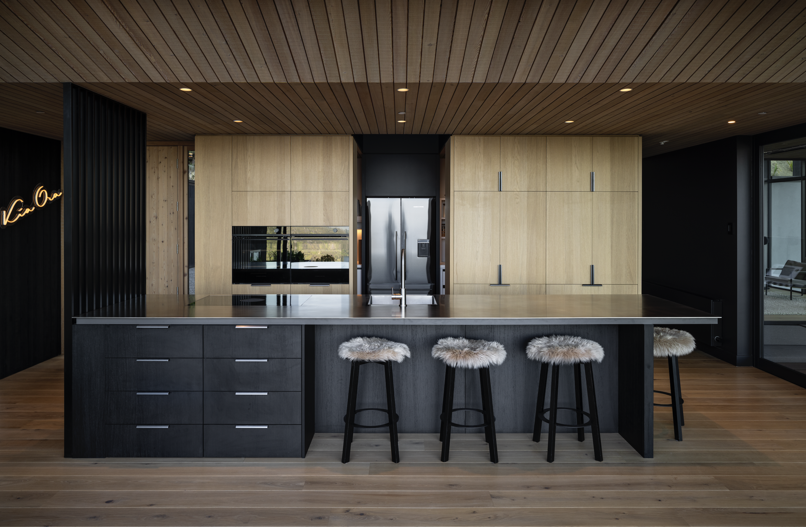
Immediately inside, the kitchen occupies the central point, flowing onto large decks. These extend out from the pool area, which is tucked against the spine wall to the south-west. A lounge at the rear of the house shares the spine wall, and offers a strong connection to the poolscape, with full-height glazing following the raked ceiling, which is pitched to the west with clerestory windows framing views of the bush behind.
The longer side of the L forms the bedroom wing, housing three guest bedrooms along with bathroom and laundry facilities. At the end — 27 metres from the centre of the house — is the main bedroom.
This part of the form is defined by the roofline, which was designed to follow the contours of the land.
“It rocks up and down, mimicking what the building is doing in relation to the site. It rolls down the hill in a way, allowing for ceilings that kick up and down to the view,” Patrick tells us.
This device allows for varying spatial experiences and tightly framed views. “From the guest bedrooms, you’re looking out to rolling farmland. With no other context, you wouldn’t even know you’re by the water,” Geoff says.
That experience is turned on its head in the main bedroom, where the ceiling follows the roofline up towards the east. Here, there’s the sense of floating above the land, with this part of the building cantilevered slightly where the ridge drops away.
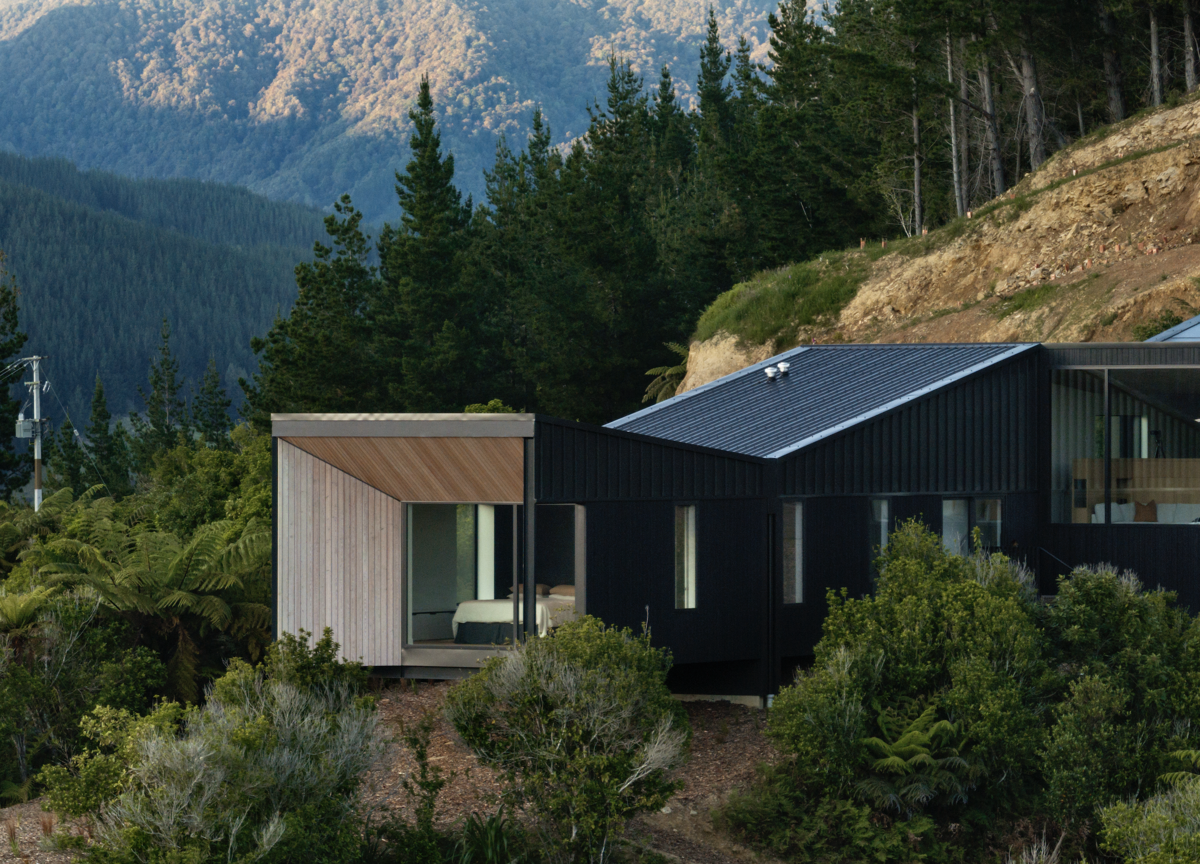
The clients’ interest in Scandinavian interior architecture is reflected in the soft, muted interiors. A European larch ceiling is finished in Dryden WoodOil Soft-Grey. The same material and finish extend to the soffits, creating moments of lightness against the dark Colorsteel and pre-stained dark Abodo cladding. Light timber floors, built-in furniture, and elegant, pared-back furnishings combine to create a series of simple, alluring spaces, where the focus remains steadfastly on the consuming beauty of the surrounding landscape.
Geoff explains, “We expected a little and we got a hell of a lot. From Queen Charlotte Drive, you look back up and the house is barely visible. It’s perfectly level with the ridgeline; all you can see is about half a metre of the roofline above the bush. As the landscaping settles in, it’ll become even more hidden away. As they say, there’s no place like home and, for us, this is it. It’s so peaceful and relaxing.”
For Patrick, the greatest success of this project is the relationship between built form and site. “I think we’ve created really nice relationships with connections that feel quite effortless and immediate; connections which are both physical and experiential. In the case of the main bedroom, there is a strong sense of physical detachment from the site, while the experience of being in this room is heightened by the way it floats above the bush line on axis with the sound.
“As a place to stop and rest, the house can be read as a series of lenses stepping out and down towards the central axis of the sound — binoculars looking out to the view.”
