A study on infill housing, this Sandringham home designed for a couple returning to New Zealand from California maximises a small footprint to deliver spaces of versatility within a simple but intriguing façade.

The original corner site with a villa, which the couple had owned for years, lent itself to subdivision — a move that allowed for careful consideration of what, as architect Matt Brew puts it, “we can achieve in Auckland when it comes to density.”
The resulting abode is one of intentional simplicity, but one that also offers an arresting play of light and spaces, with a sense of volume that belies the footprint. The 125-square-metre footprint (190m2 internal floor area) within a basic square form incorporates a double-height living area, two bedrooms, a large studio space, and a single garage.
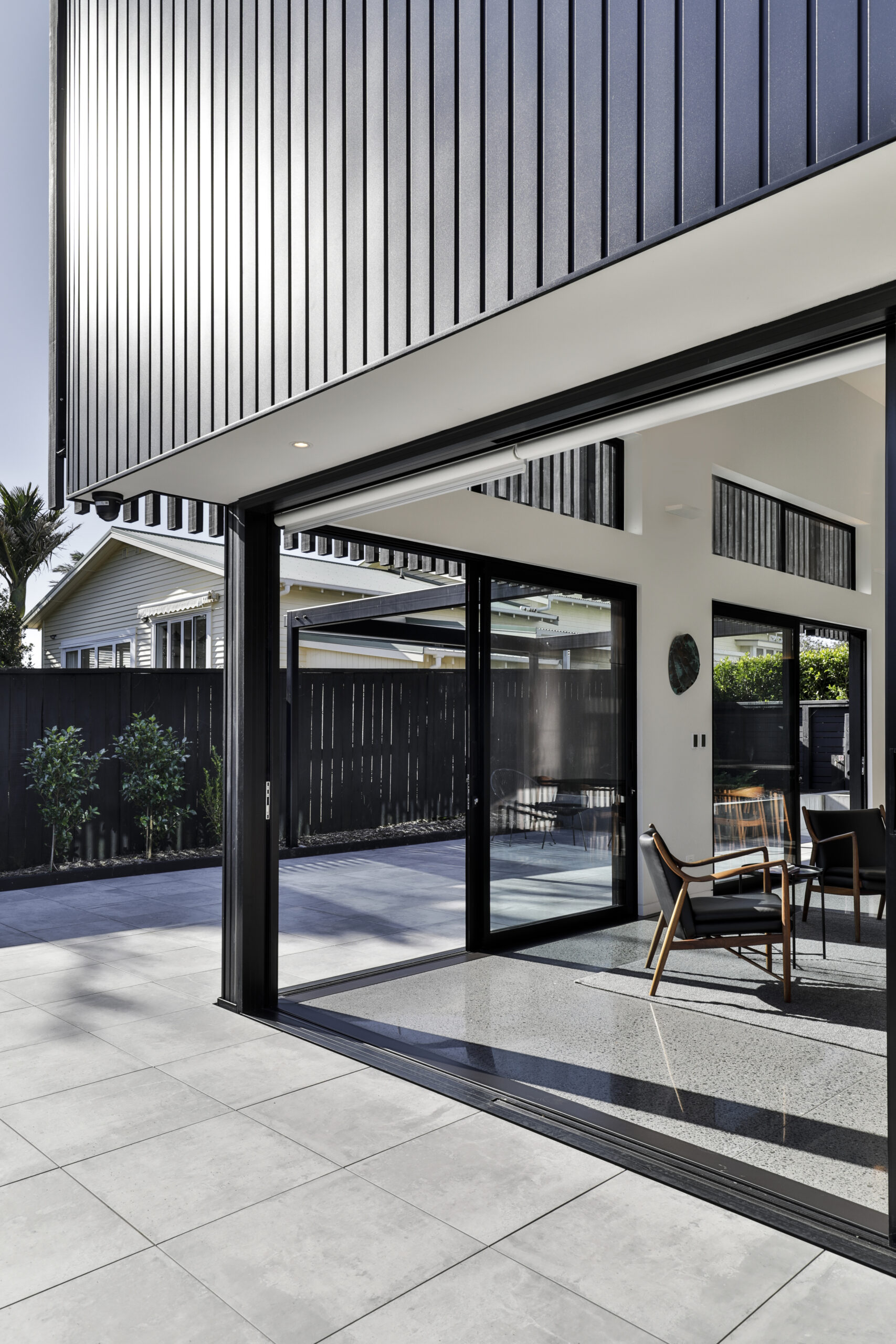
Aligned with the villa’s side elevation, the street-facing façade is a simple black box broken up with a series of cuts and apertures. A permeable timber screen wraps the upper level at front and rear — a clear juxtaposition to the horizontal rhythm of the villa.
“A simple sloping roof is concealed by the screen — an intentional move to keep the form as simple as possible,” Matt tells us. “The whole premise was to try not to overwhelm the villa but to build something that was really sympathetic to it. By that, I don’t mean in keeping with it, because I like that juxtaposition of the old and new, but I certainly spent a lot of time trying to design a form that was complementary. It’s trying to be almost recessive against the historic nature of the villa.
“It’s really a subtle statement. It’s not in your face as you go down the street but, as you engage with it, and you’re actually looking at it, there’s a little bit more detail than first meets the eye.
There’s enough happening there that it’s a little architectural statement unto itself.
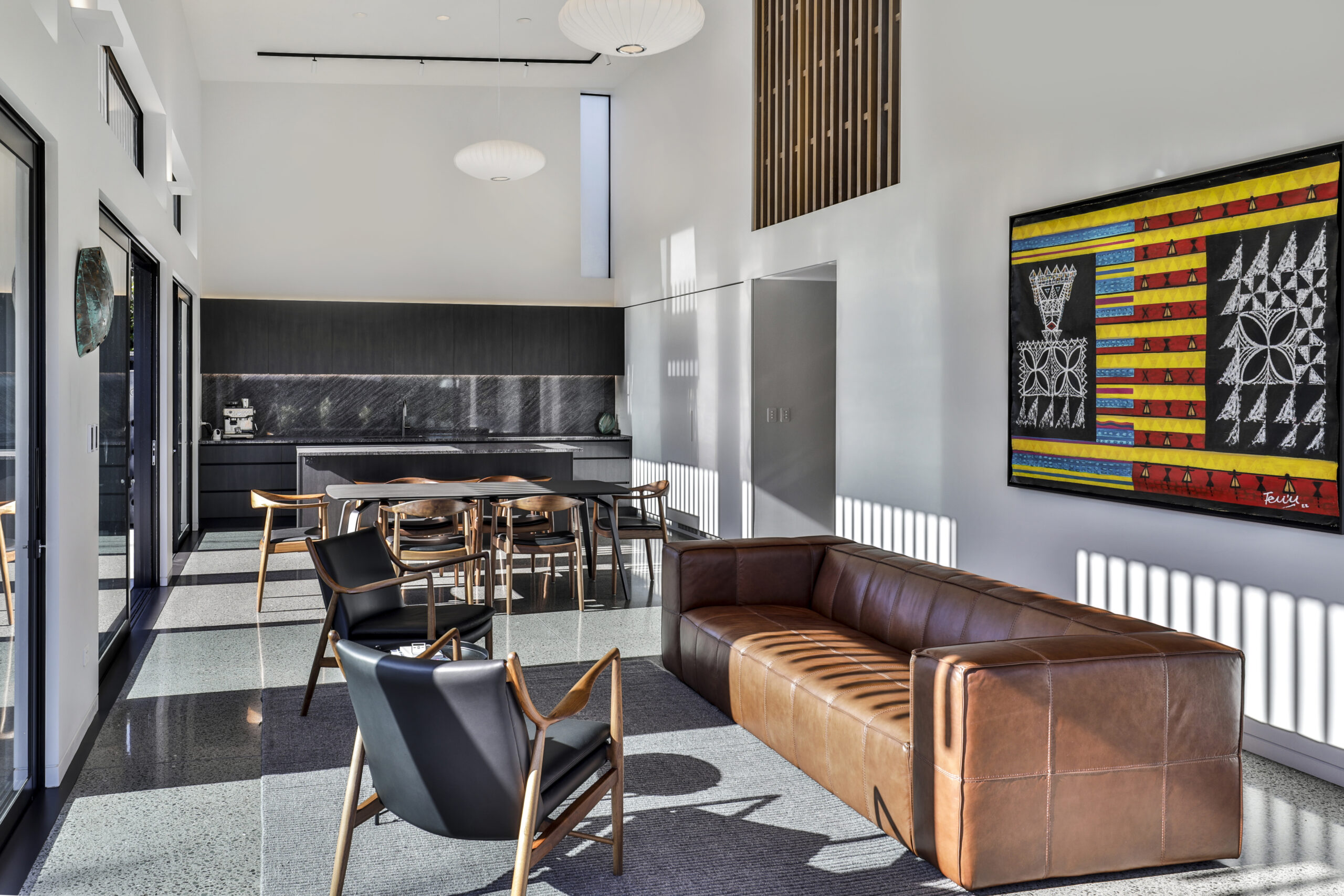
“It’s been designed as a square to make for an efficient use of space and as an easy form to build. Within that, we’ve created a nice little linear access way through the entry, where you move through a double-height space beneath a skylight that draws light in from the west. It’s formed around a cruciform shape, whereby you come in through the centre axis, which then opens up to the rear space, and then, in the south-west corner, is an extra bedroom.
“For 190 square metres of floor area it feels a lot more substantial. In part, that is down to the courtyards, which visually extend the internal spaces of the lower level to the exterior. Also, the double-height space at the rear, where the kitchen and dining [area] is housed, really adds to the sense of scale.
“I’m all in for good infill housing, and I think that in this case it has worked well. It’s a very economic footprint that we’ve built here — and that the builders, Warren Adolph Homes, have executed flawlessly. We haven’t tried too hard with the building’s form, and I think the joy is in its simplicity. It really is just good basic planning with a few architectural elements that give it some surprise and delight to make it sing.”
Architecture: Matt Brew Architecture
Photography: Jamie Cobel
