Higher density requires not just good design but good manners. This leafy, central-Nelson house by Irving Smith Architects sought to make the most out of a triple subdivision while being neighbourly to an old villa and tastefully contemporary.
The old family villa sat on a gentle hill in central Nelson and was flanked by what was probably too much gardening space at both front and back of the abode. The two-storeyed construction — although fairly traditional in its white, timber-clad façade — has a certain gravitas to it. Timber joinery with colonial casement windows and French doors, all opening onto a somewhat meandering and generous balcony. Its central, raised positioning on its large site gave a singularity to it, a kind of ‘standing proud above its domain’ vibe.
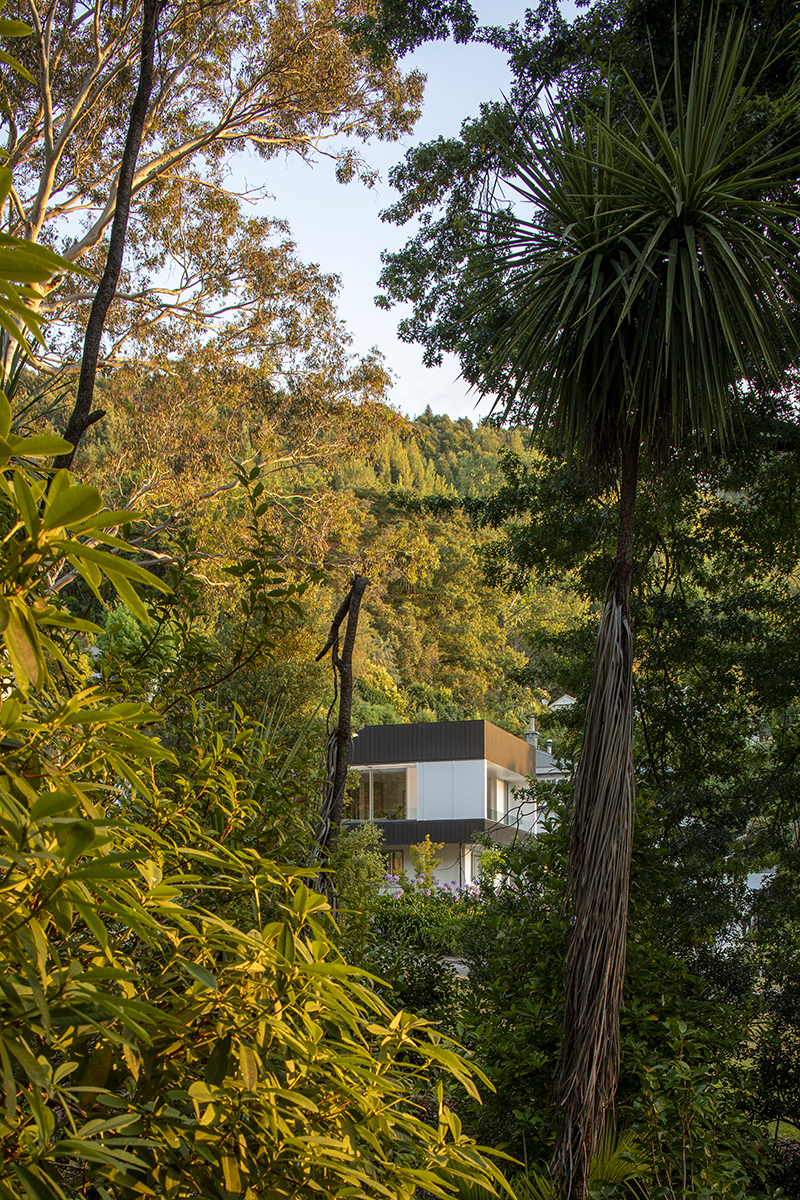
At the back of this old house, continuing the steady gradient, is a sparsity of houses followed by a small wedge of Grampians Reserve — the 161ha of city council reserve land that gives Nelson its unique, leafy backdrop.
Cross the street directly in front of the site and you are deposited into yet more greenery — Fairfield Park — while still embedded in the highly coveted heart of the city. The main street of the town
is a 15-minute walk away, the chief hospital even less. There are cafes and eateries and all the accoutrements of urban living within what could be confused, at first sight, as some mature forest on the outskirts of nowhere.
It is not surprising, then, that the owners — who had raised children here but were ready to downsize — had little desire to move elsewhere. Yet, although the land seemed generous in size, the rules at the time did not allow for the types of subdivision that are now becoming commonplace.
“We had to organise a Special Housing Area (SHA),” says architect Jeremy Smith of Irving Smith Architects, with reference to a type of central government permit that, in 2017, allowed several areas in Nelson to bypass some of the local building bylaws in an effort to help densify the city. “This means, if you’re doing a triple subdivision, you could devise a different set of rules, and that allowed a section at the back of the house and a section at the front of the house to be found, which meant we could do the project without deleting the [old villa].”
Jeremy mentions that there is real value in retaining — rather than demolishing — old housing stock while we find ways of increasing urban density. Continuity and aesthetics aside, “there is a real sustainable thing about it”, he says.
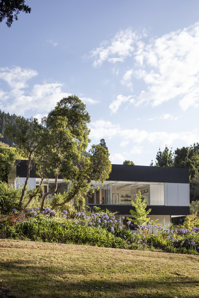
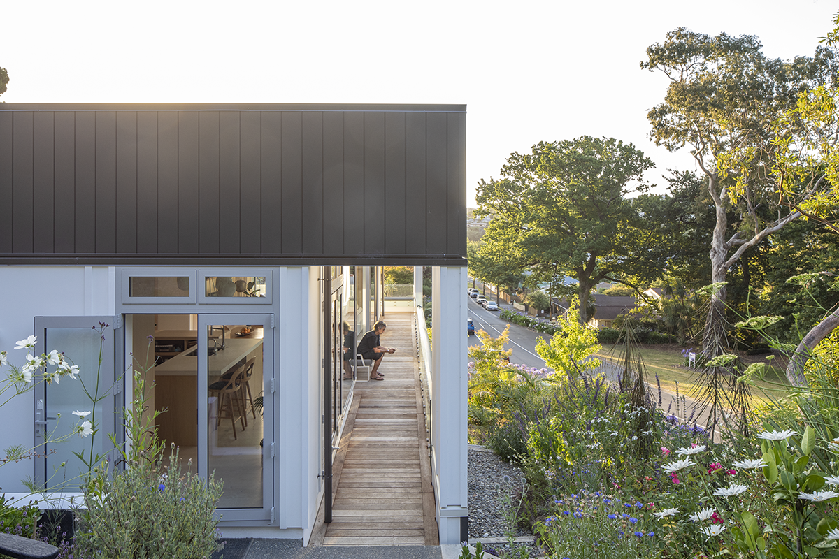
A decision was made to build a house directly in front of the villa, flushed tight against the northern boundary, which — past a footpath and a relatively busy road — overlooked Fairfield Park.
The rules of the game now were to design in a way that stitched the house as much as possible to the adjacent park, while dealing with the road’s proximity and being respectful of the villa behind it. The new house was situated “so that the villa could still breathe and still got sunshine and still got a view”, says Jeremy, “so that we were being good neighbours”.
According to the architect, the SHA rules did have some odd height restrictions, which meant that, in order to fit what was needed inside, the house had to be a straight-up, rectangular box. This, combined with a white palette — in homage to the villa — alludes to the best bits of early modernism; clean, decluttered, pavilion living atop a plinth, this house is a rectilinear affair of simplicity and practicality.
“The house really is kind of an apartment,” explains Jeremy, “with oversized living spaces.”
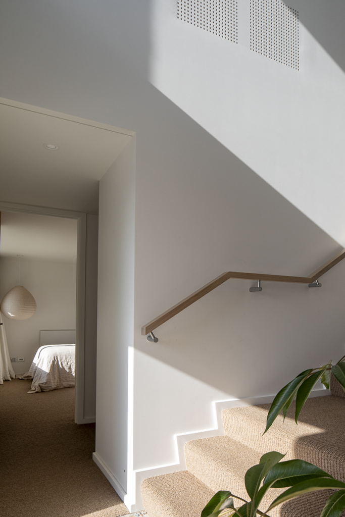
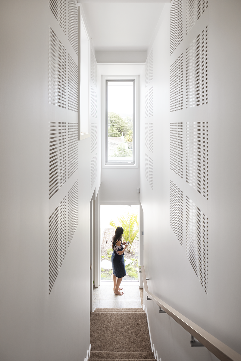
The thin entry sequence pushes anyone arriving by foot to head upstairs rather than idle at ground level. Once you are there, Fairfield Park reveals itself: a framed view of mature trees that pops and waves and fully deletes the urban context of its site. There is no road here, although there is a road here.
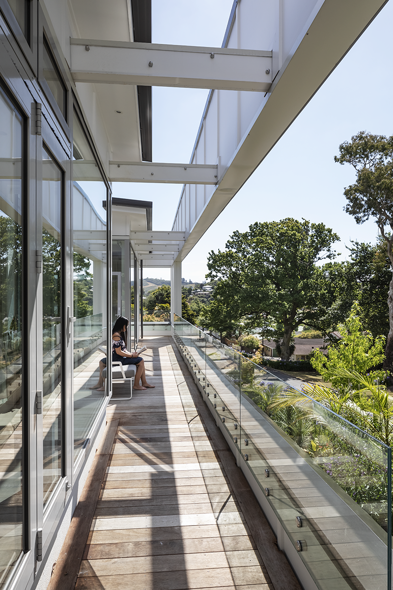
To bring additional light into the living space and, subsequently, to frame nature further, the architects created a sort of faux-façade, a secondary, roofless frame floating approximately 1.2 metres off the main façade and above the balcony. As the structure is white on the inside-facing surface, light bounces into the main living area once the sun has passed its apex.
“It’s an idea that you often see in galleries,” Jeremy explains, “taking light, secretly, and lighting the wall you’re viewing. We separated it from the roof so that suddenly it glowed. This [solution] has meant that the greens of the bush project forward and feel closer rather than being too dark. It allowed us to play with this idea of making a box, but then pulling it apart slightly.”
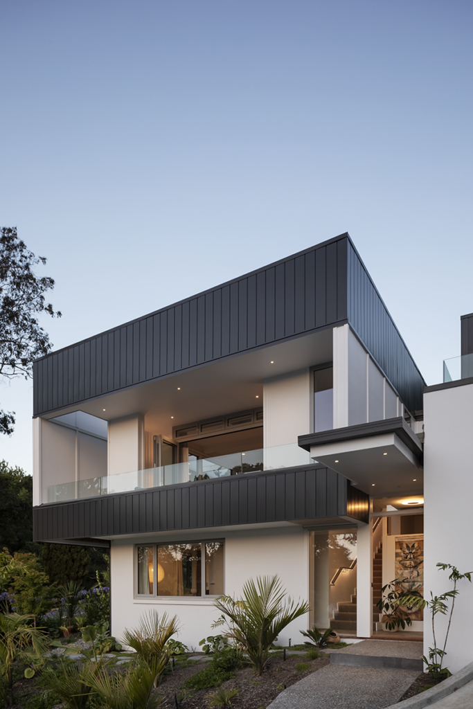
This, the architect says, is also slightly conceptual, further creating a separation between the nearby road by framing the views with enveloping — yet porous to nature — structure. In reverse, looking at the house from the park, it also means that — in the right conditions — the house glows from the bounce of that angled light.
“It is white on green and green on white,” says the architect. The floor-plan of the balcony is asymmetrical. “It’s got sections cut into it,” says Jeremy. “The sun angles in and out so that in winter, the sun’s coming through, and coming under and over [the frame], and in summer, it’s blocking it out. But … in some areas of the house we get a deeper recess between the frame and the glazing, so we can take the sun right into it by using the cut in the plan and the gap between the frame and the house to allow the sun to come deeper.”
The west-facing side of the balcony is also covered to provide a sheltered area.
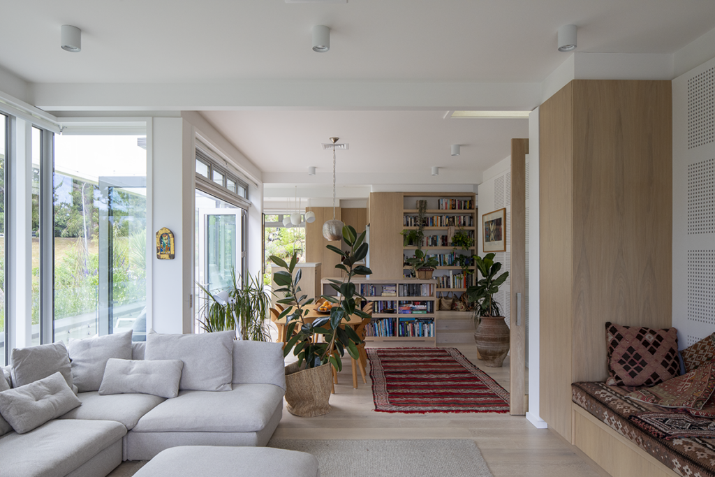
This idea of a gallery continues on the inside, with a dominating palette of white and bleached timbers. To dampen some of the noise from the nearby street, some of the surfaces in the social spaces and the main stairs are acoustic panels, their round cut-out holes still visible, adding a Dieter Rams aesthetic to an already modernist interior.
The flow is simple: a slightly raised kitchen officiates over the dining and living room. This layering effect is compounded by internal framing that visually segments various spaces within the larger whole. “Rather than doing a flat ceiling we are separating everything into a set of little spaces,” says Jeremy. “We could trim but, because we were double lining, we could project the walls forward, off the scotia, much the same way as you might see it in an art gallery.”
The main bedroom, with a large deck, is hidden beside the kitchen, accessible through a narrow passage that offers privacy and independence and could almost be closed off should the main area be used for entertaining. Downstairs are two guest bedrooms and a large garage/storage space.
It is apartment-like in essence, although not in size; it is urban, geographically, although not in outlook; and it feels both like a modernist art gallery and an entirely liveable, good neighbour to an old family villa.

