Inspired by a heritage church, this suburban Christchurch home uses its sinuous form for both impact and functionality.
Some might call it divine intervention; others might say it was pure good fortune. When the clients of architect Craig South spotted a photograph of the Chapel of the Holy Family in rural Templeton on the fringes of Christchurch, it changed the direction of their thinking. Designed by George Lucking in 1966, the humble chapel, built of raw concrete block and timber, had been recognised as an emblem of enduring architecture. Its sweetly curved roof struck a chord.

“Craig was excited to be given the green light to get a bit creative in that respect,” says one of the owners.
Talk about lucking out!
These days, when the architect drives along the Fendalton road and catches a glimpse of the sinuous roofline that is the crowning glory of this Elysian dwelling, it gives him a warm thrill of achievement. The owners, too, enjoy the sense of drama that accompanies homecomings.
“When we’ve been out at night, and the lights come on up the driveway, the house just looks so beautiful,” says one of the owners.
That deific turning point was a blessing because it offered Craig, of South Architects, a challenge that forged a more daring outcome. While the clients did brief him for a design that was timeless, they also wanted something “not standard”. The section — flat, roomy, with a genteel aspect towards a stream — was almost too perfect to be a prod of inventiveness.
“Considering it was in urban Christchurch, it was really private, with no visual connection to neighbours,” says Craig.
Thank God — or the stars — then, for that roof.
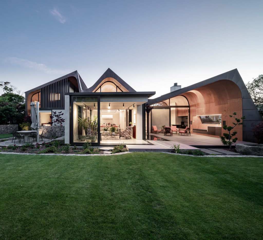
A basic descriptor of the home goes something like this: three concrete pavilions tied together by a sculptural copper form. Of course, it’s not that simple.
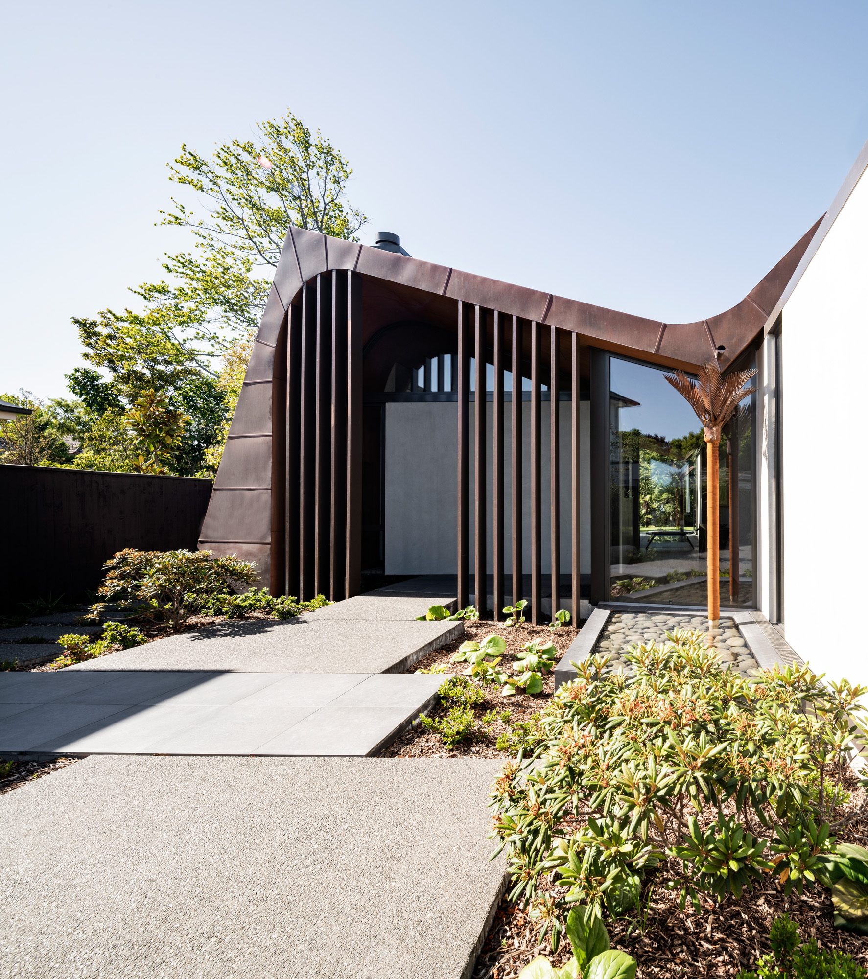
“The roof rises up from the entrance over the den and outdoor area, dips to meet with the rusted-steel downpipes, then rises again over the kitchen and dining zones before it rakes up over the first-floor sleeping spaces,” explains Craig.
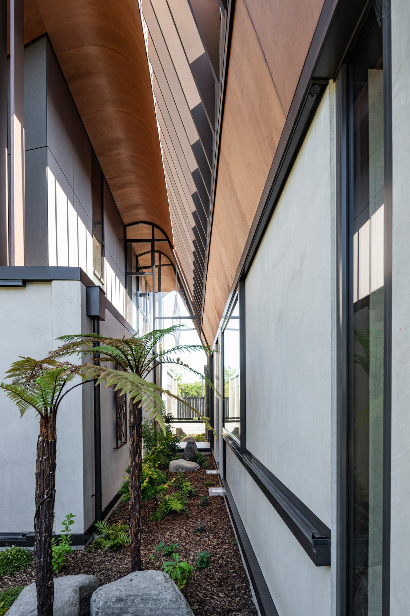
He particularly likes the way the roof beds into the landscape to the left of the entry and, in contrast, the way the inverted ridge that runs through the entry corridor seemingly floats in the air; the sculpted nikau palm downpipes collect the rainwater without connecting the form to the ground.
That’s a lot of ups and downs in one mouthful; it can’t have been easy to conceptualise. Well, yes and no.
“It’s a shape that worked itself out according to the scale and spaces that were needed,” says Craig. “It’s three peaks and two troughs strategically placed.”
Put that way, it sounds like a doddle, yet Craig does acknowledge the builders had to tussle with the complexities of trying to understand where the curves were happening — both in plan form and in section.
“The curved ceilings were also a unique proposition,” he tells us.
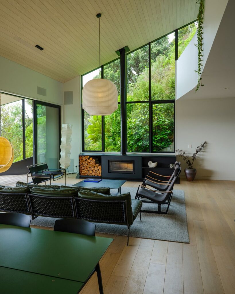
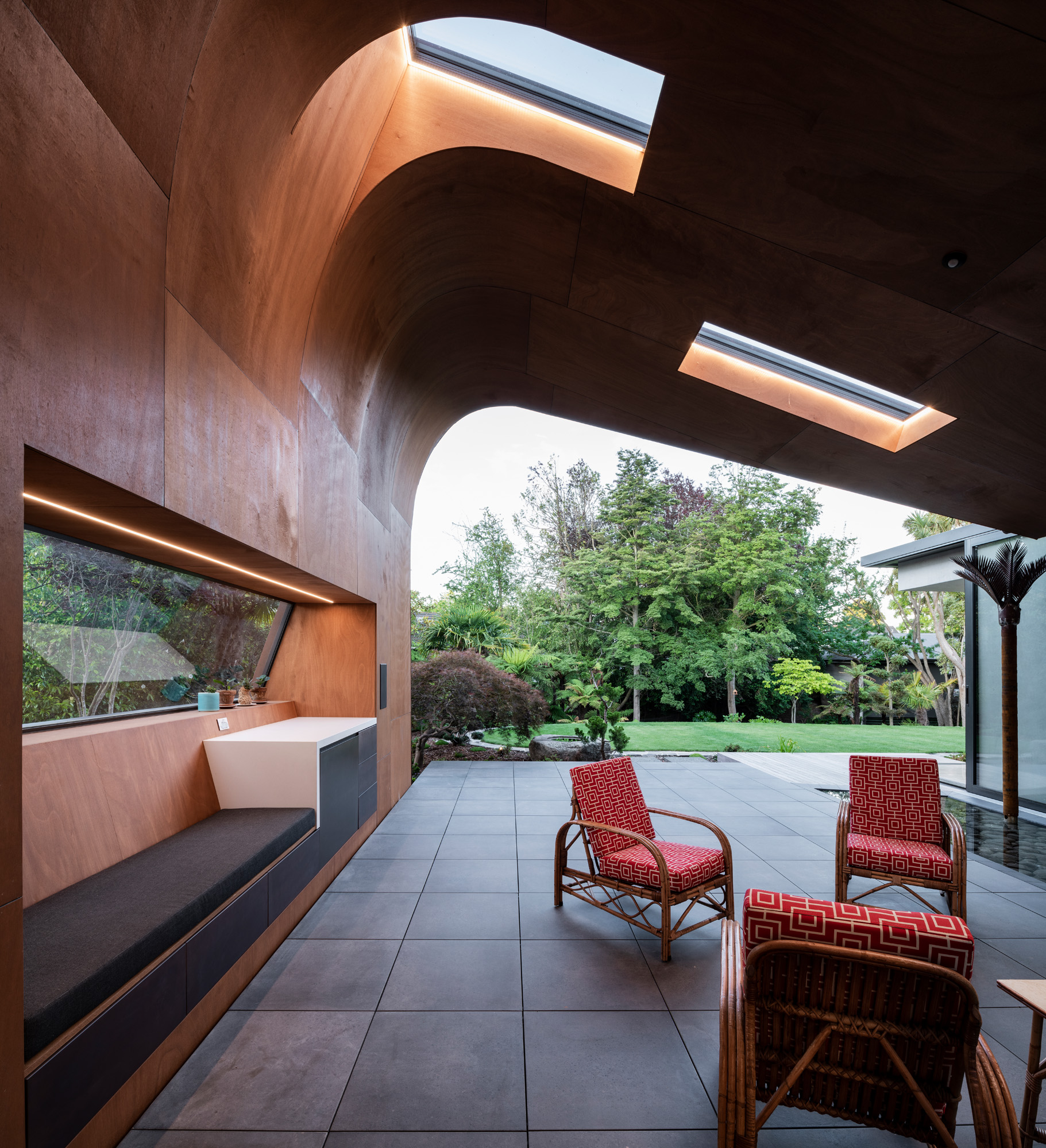
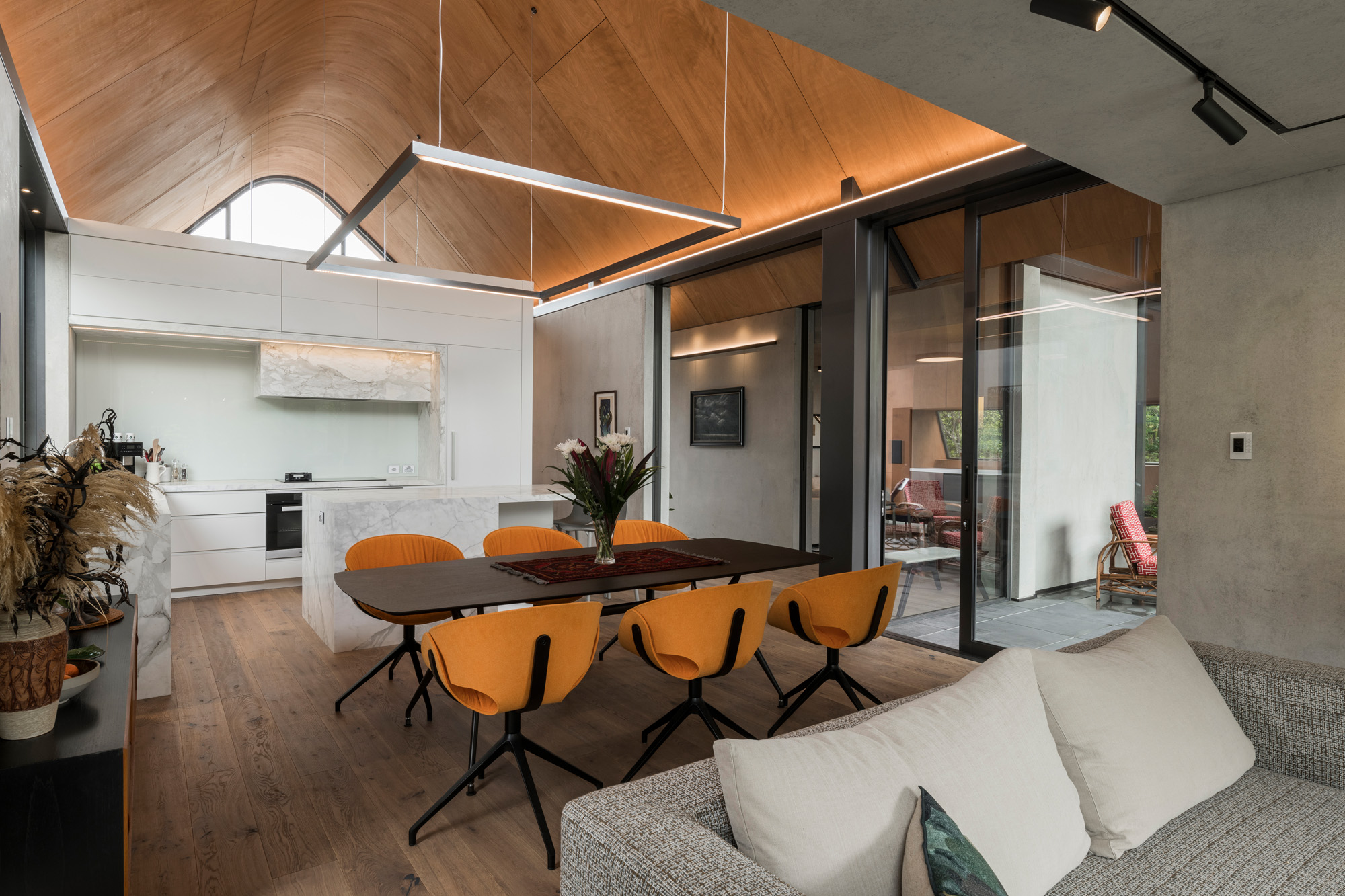
Made of stained gaboon ply, they echo the geometry of the roof to create incredible volume over, say, the dining area but are countered by dropped ceilings where more intimacy is required — such as in the TV den and living room.
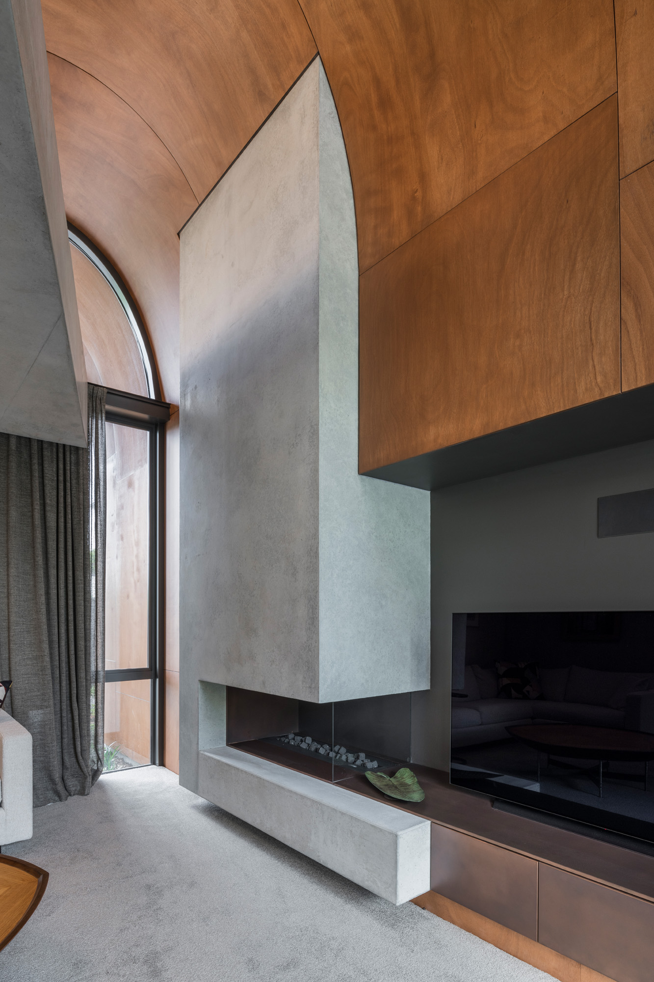
The connectivity between inside and out may play second fiddle to the flamboyant roofline in photographs, but as lived experience it has real impact. The journey is as important as the destination.
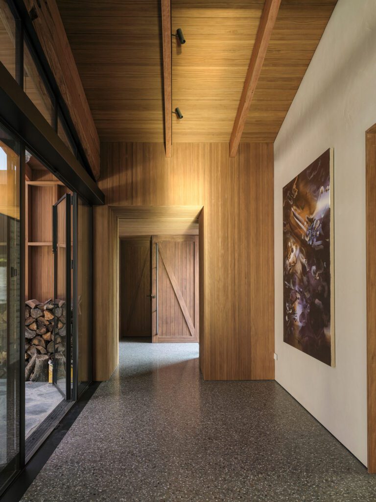
“Down every corridor, there is a landscape vista,” says Craig. “You are never too far from the trees.”
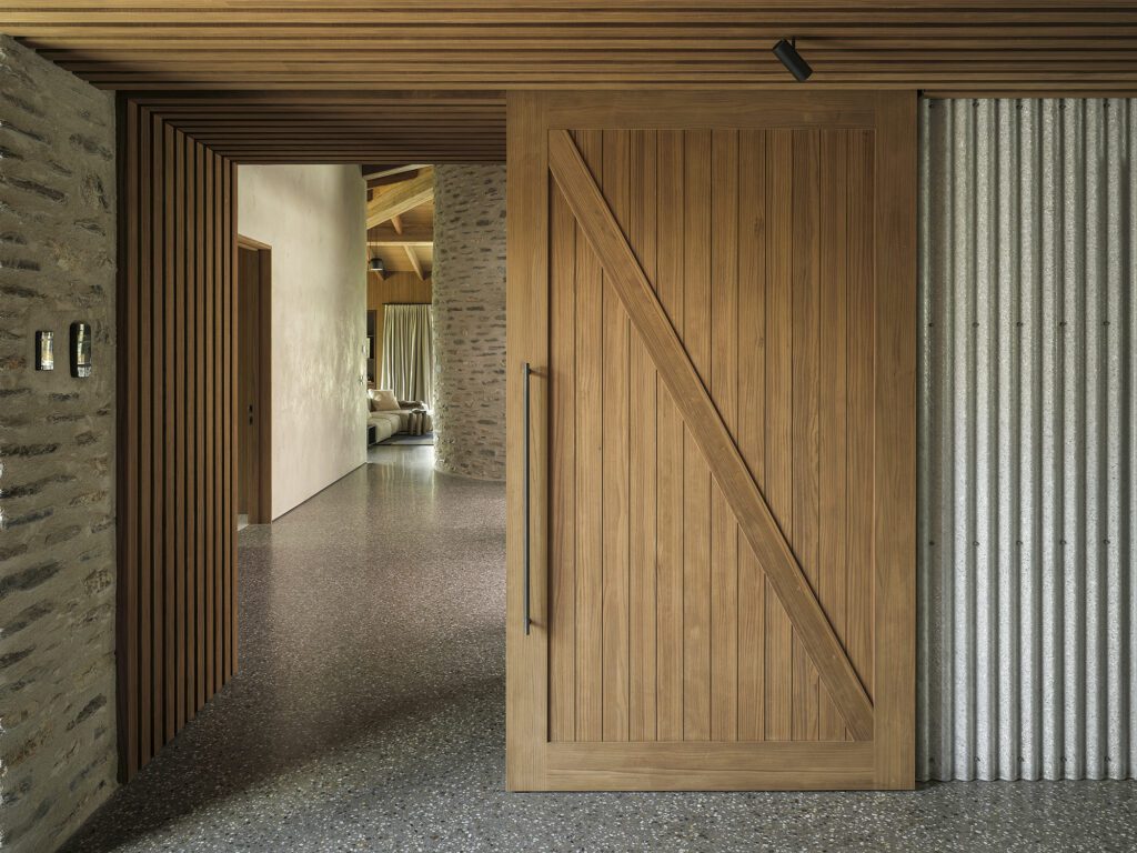
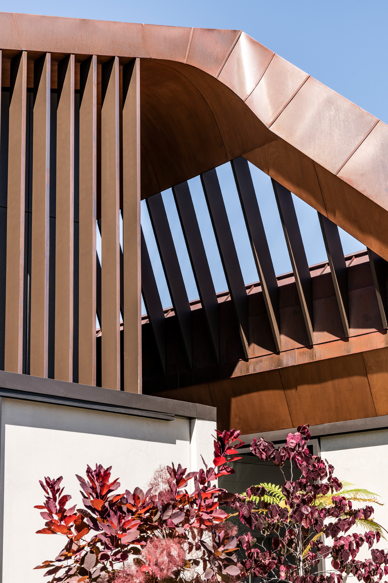
The entry is along an asymmetrical path where copper fins disguise the front door from the street. Once inside, however, mystery turns to transparency with glazed edges to push visual connection with the garden through the heart of the dwelling. The owners rescued mature trees from their former home, rendered unlivable by the earthquake. They brought with them rhododendrons and azaleas, a magnolia grandiflora and a ginkgo tree, maples and fan palms that give the landscaping a Japanese flavour.
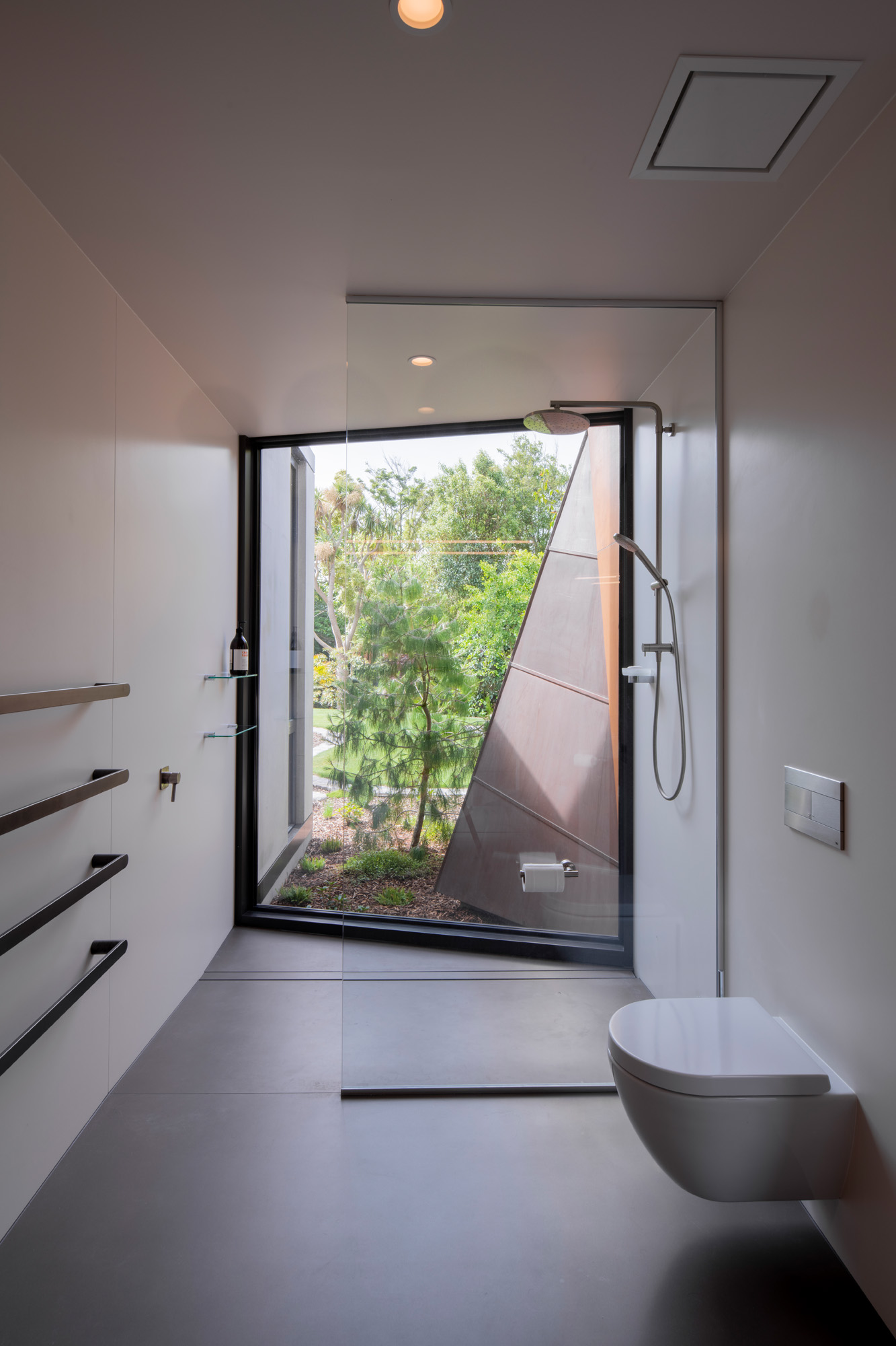
Inside, smooth concrete walls are a backdrop to art, but many windows break up the solidity to allow the foliage its stint in the spotlight. A narrow fern garden that occupies the sliver of garden between the public and private zones downstairs can be seen from the scullery; there’s a strategically placed ‘modesty palm’ for when the owners are having a shower, and a cut-away window in the living area frames a crazy-paved circular courtyard. Beyond this, mature rescue trees — “we didn’t lose a single one” — fringe the lawn near the stream.
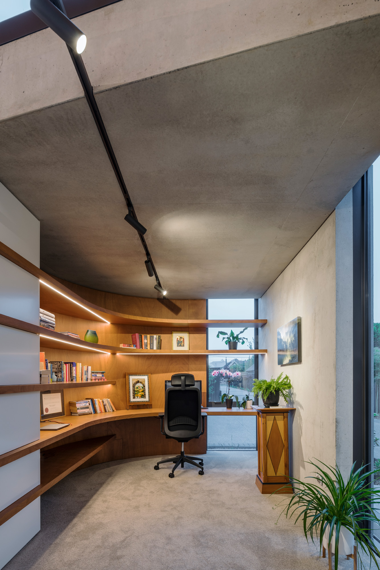
“When you stand in the kitchen and look out, it feels as though our property goes on and on forever,” says one of the owners.
Craig, who gets to hang out at the house on occasion, tends also to notice how the man-made materials make a special play for attention — like the way, at a certain time of day, the fins in the roof plane that straddles the gap between the living and sleeping pavilion create a woven criss-cross of shadow on the concrete wall.
“Your timing has to be perfect to capture that; 15 minutes later, the pattern changes,” he says.
Durable materials, chosen for low maintenance, are an aesthetic symphony that means the owners can focus on what they love best — having family around. On warm evenings, there’s no better place to gather than on the cane chairs set beneath the warm glow of the undercroft that spans out over the patio. The embrace of this place is relaxed, fun, and comfortable. It’s ‘gezellig’.
“That’s a Dutch word the clients gave me to describe how they wanted the home to feel,” explains Craig.
He can confidently tick that box — but what about its timelessness? Will the patina of that curvaceous copper top hold up to history? The architectural precedent in Canterbury are the well-proportioned homes beneath a simple gable that have become the vernacular. This is far from that. In the four years it has taken for this project to reach fruition, Craig has had occasion enough to finesse his thinking.
“By going so sculptural, this home can’t be tied to an era or what others are doing. It breaks the mould,” he says. “In future, no one will be able to say when it was designed.”
Words Claire McCall
Images Stephen Goodenough
In Detail: A closer look into the finer features
Gallery
Concrete Copper House by South Architects was a finalist in the Home of the Year 2021 awards


