A group of Wellington apartments by Parsonson Architects slots 16 bedrooms onto the site of a single villa – and wins HOME magazine’s Best Multi-Unit Project prize in its Home of the Year awards. But not without controversy.
[jwp-video n=”1″]
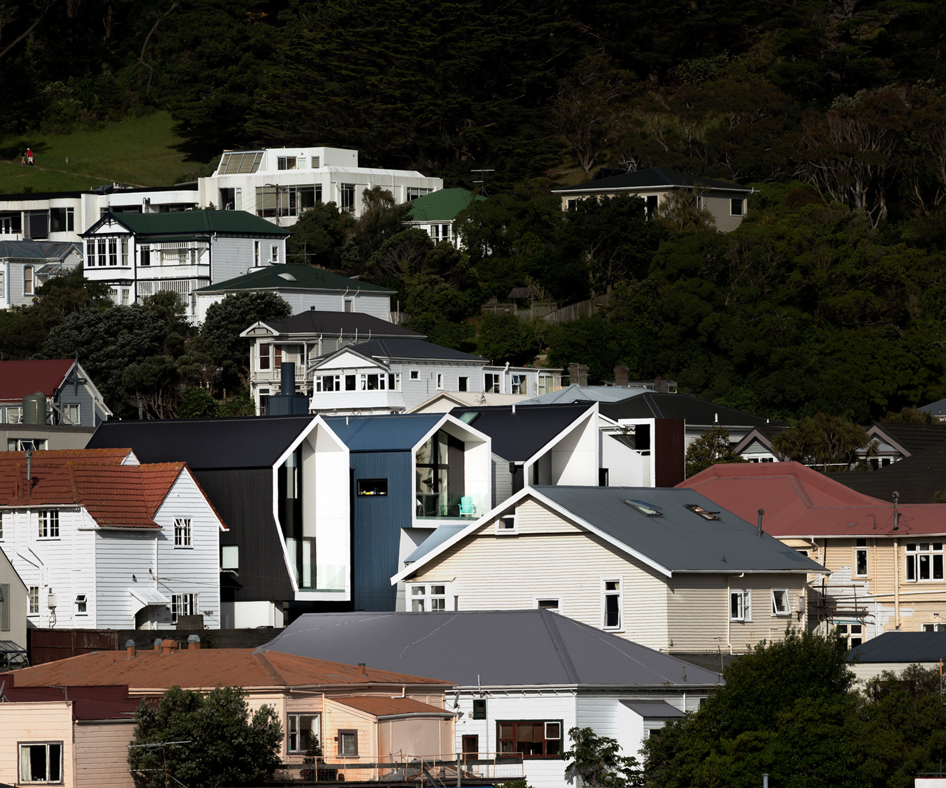
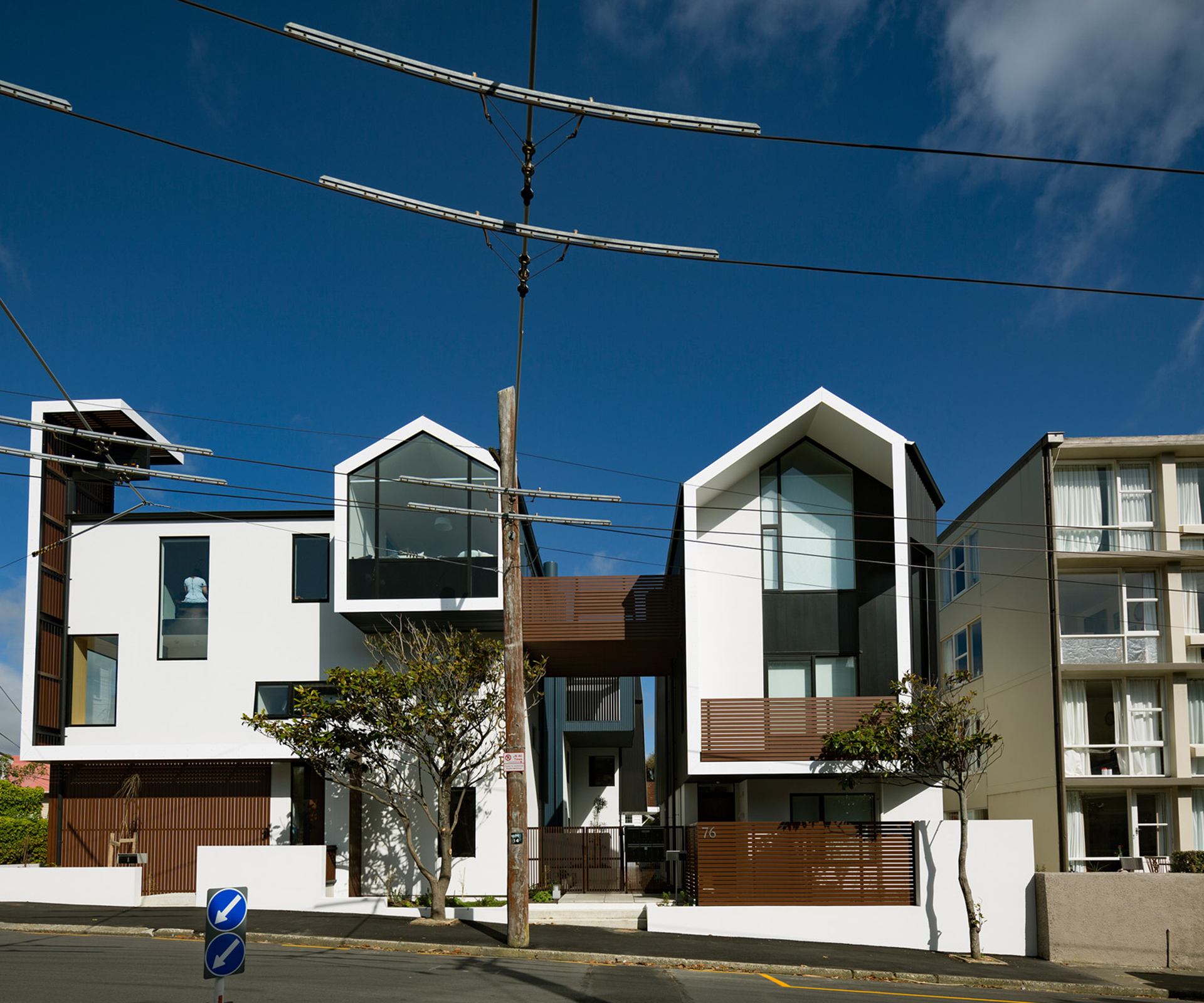
The Zavos Corner Apartments are located on a prominent corner in the Wellington suburb of Mount Victoria, and they weren’t erected without a fight. In fact, architect Gerald Parsonson of Parsonson Architects, the firm that designed the building, called the consent process “a bastard”: despite the fact that it complied with all planning rules, it was still opposed by some within the council and by the local residents’ association. You can see the difference between the old and new in the photographs below. (The new photographs are by Jeff Brass).
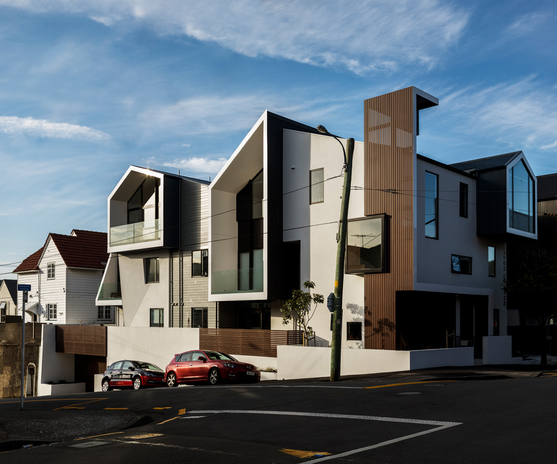
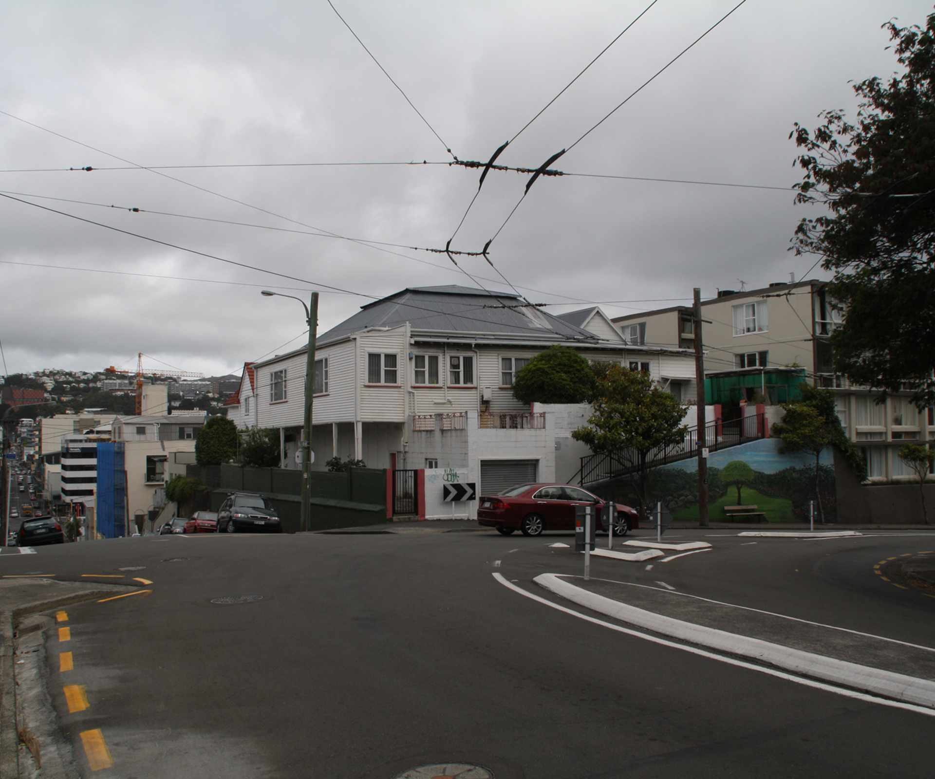
Now the building is finished – it contains eight apartments, fitting 16 bedrooms onto what was once the site of a single rundown villa – it is regarded as something as a model development by the council. The local residents’ association, however, remains opposed, saying it is concerned about the “constant chipping away” of the suburb’s character.
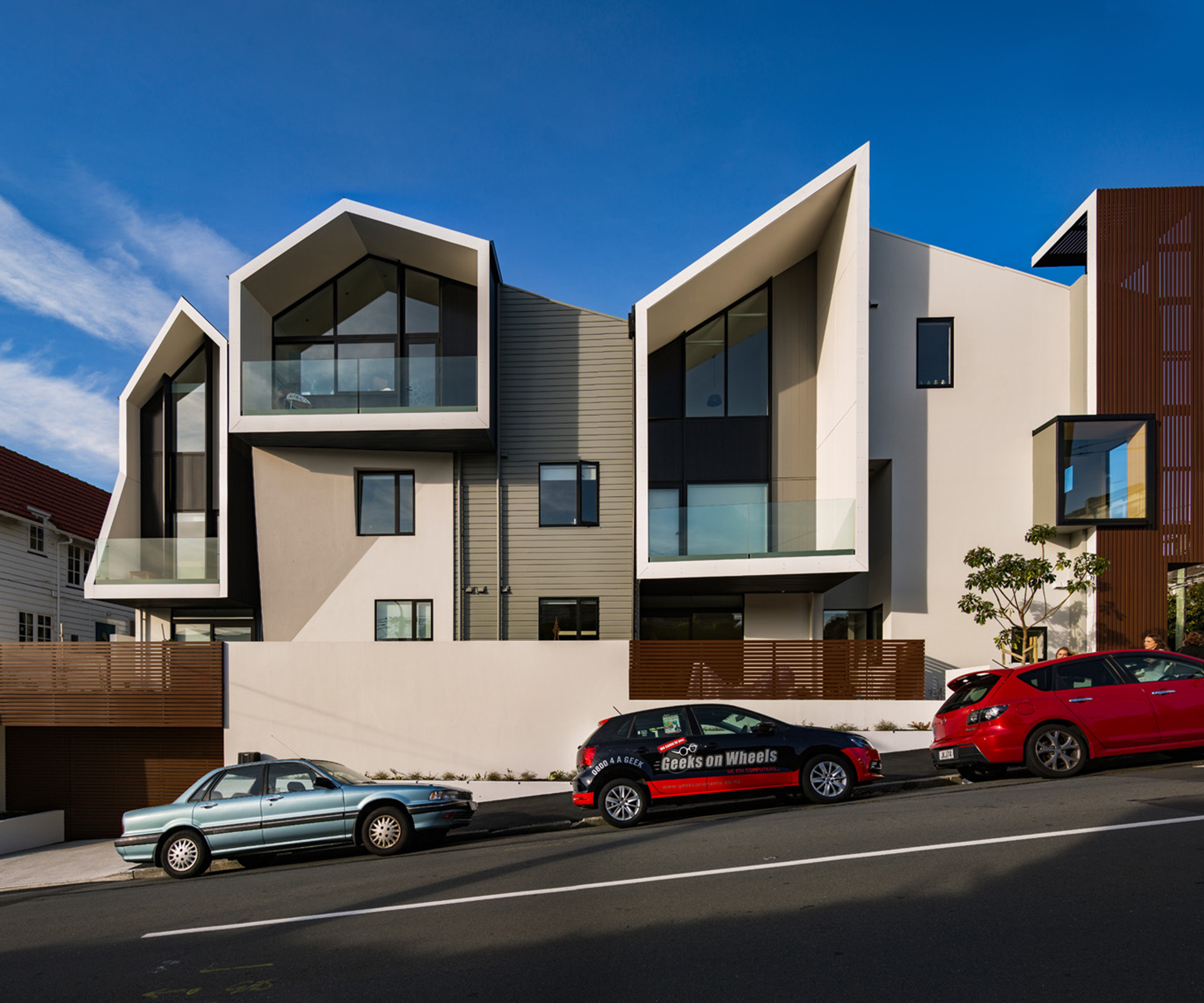
The development is the winner of HOME magazine’s Best Multi-Unit Project in its Home of the Year award (which is sponsored by Altherm Window Systems), chosen because the jury believe it is a wonderful example of density done well in a sensitive area, something our growing cities need more and more of. Here, HOME editor Jeremy Hansen speaks to architect Gerald Parsonson about the building.
HOME The apartments are in a neighbourhood with tough design guidelines. How did the process go?
Gerald Parsonson It was a bastard. Because we were knocking over a pre-1935 building, the council had the option to put us through the hoops on absolutely everything. It was expensive in terms of architects, lawyers and council costs. We were pushing for a non-notified consent because the new building complied in every way – it was under coverage, under envelope, it satisfied the multi-unit housing design guide. The Mount Victoria Residents’ Association was consulted and they said they couldn’t support the demolition of the existing house or the new building. They thought the building was an abomination.
HOME How did you decide what the building would look like?
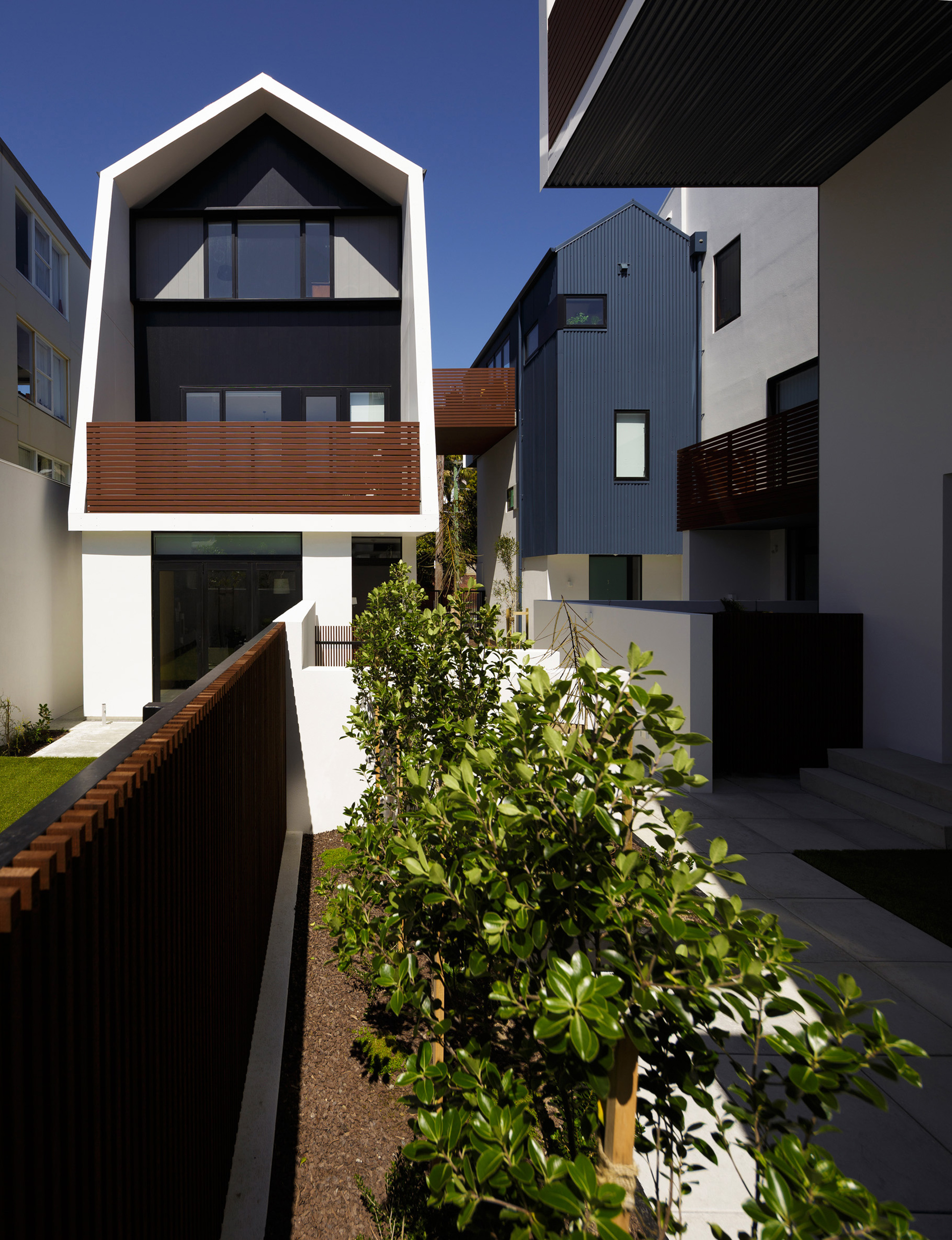
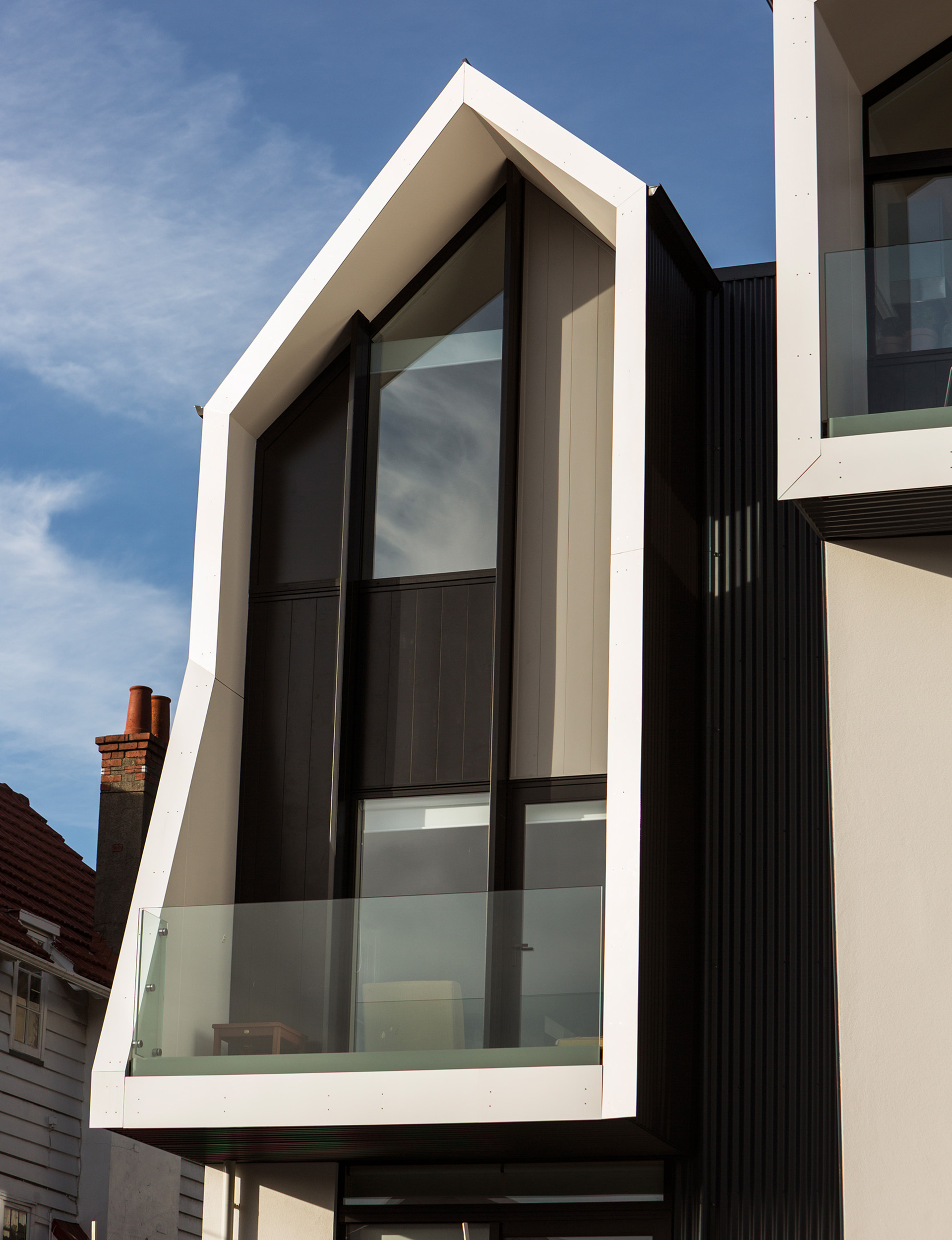
Gerald Parsonson Quite quickly we came to this idea of abstracted frames that would contain the verandahs and decks and, in some cases, made them larger so they contained the windows of the apartment below. It almost confuses what were stratified apartments and gives them vertical presence – it’s interweaving two dwellings together instead of identifying them as one. There are eight units, ranging in size from one two-bedroom, 110-square-metre apartment, to a 52-square-metre studio. Angelos Argus [the developer] wanted single-level apartments, so the building is a hybrid that may look like townhouses or apartments. This approach breaks the building down into smaller elements, and we were pleased this created a reference to roofscapes by Athfield and Walker, who have been busy in Mt Vic in the past. The gabled forms are abstracted references to roofscapes in the area, as is the corrugated iron that’s used on the sides and rooves of houses throughout the neighbourhood. There’s a sense of playfulness.
HOME Do the rules aimed at preserving character in heritage suburbs work as they should?
Gerald Parsonson I find them quite primitive. The end result of that sort of thing is what you see if you go to new villages in France and England where everything is built to a design guide. If you want something to get approved, you put in an arched window and fake double-hung windows and rusticated weatherboards. Your proportions are all stuffed but the people judging it don’t see proportion. The [result] is just bland boring nothingness, a formula for developers to get close-ish to the style. It’s not a horrific train crash, but it ends up quite bland.
HOME The interiors of each apartment are related, but are all unique. How did you achieve this?
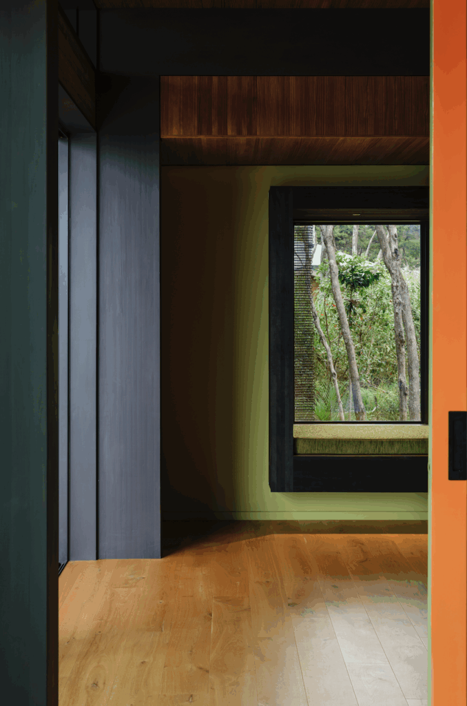
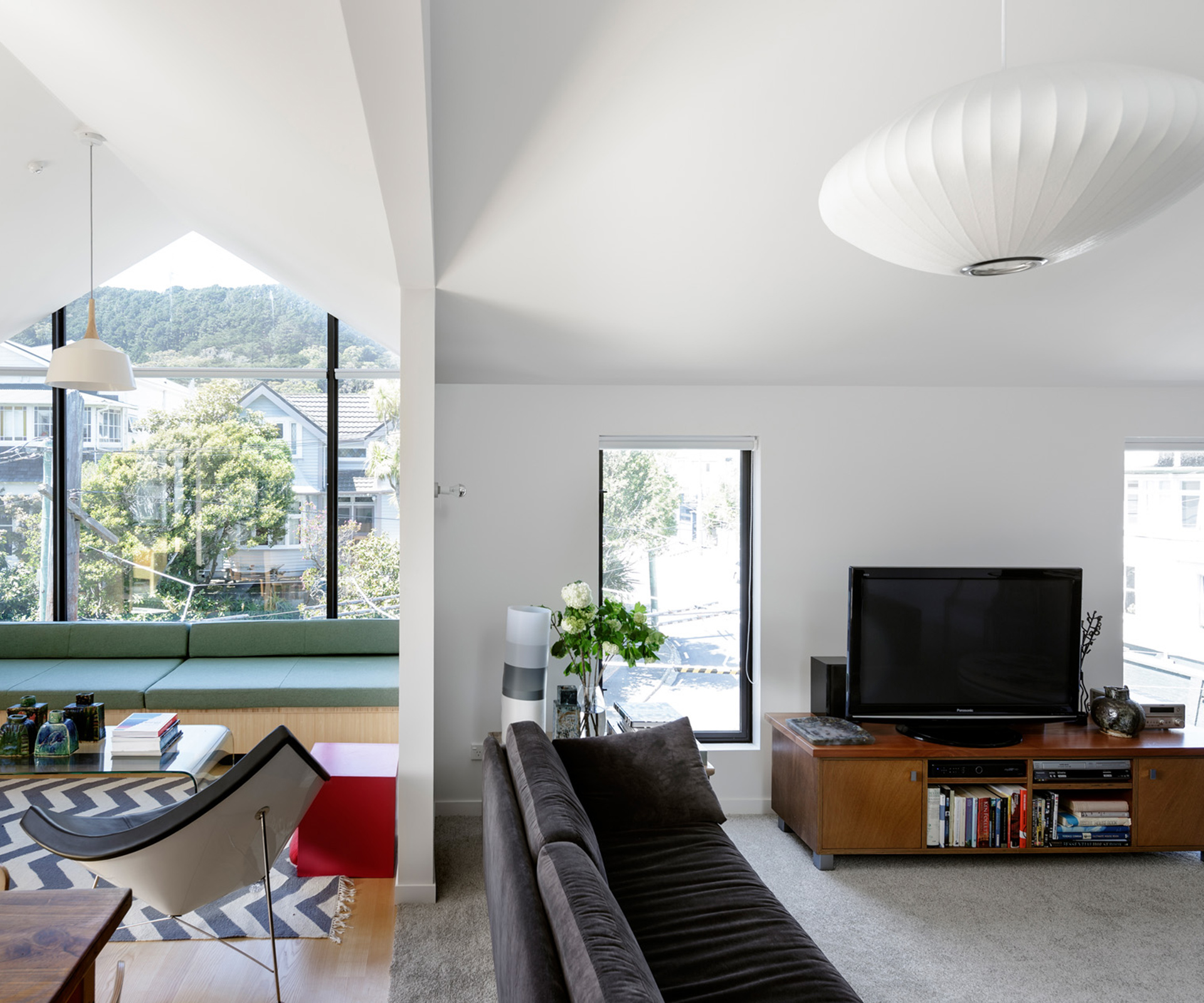
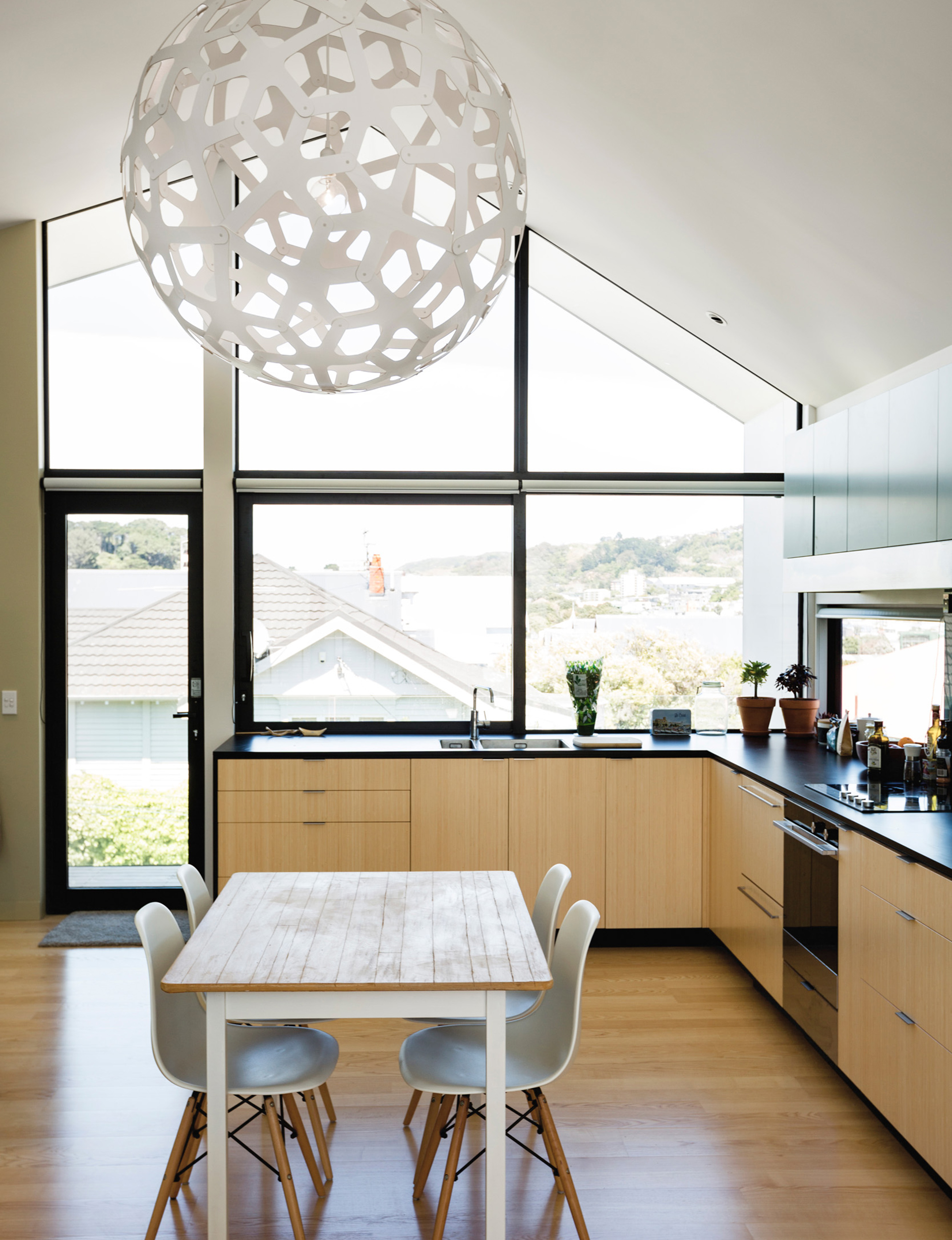
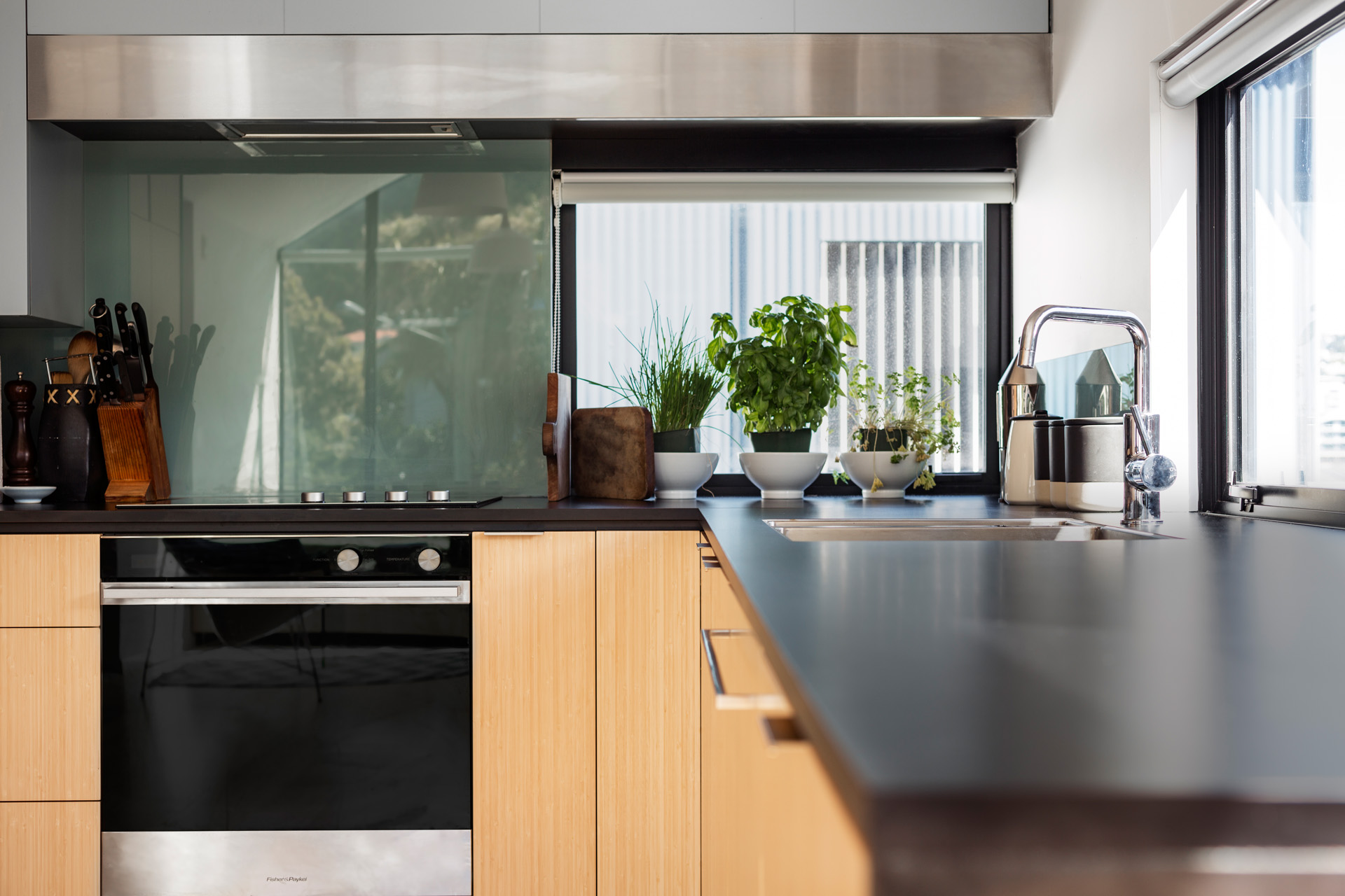
Gerald Parsonson Inside, we tried to create something that was really liveable but dense. We worked hard to make sure that light came in from all sorts of different directions. We worked hard to make sure the spaces felt open and generous but there was privacy between different dwellings. One thing that we spoke about was this idea of the Rubik’s Cube. It’s not all lined up side by side, it’s more interwoven. Perhaps there’s a strategy that creates interesting outcomes. Within that, we developed interior packages within the overall scheme. The bathrooms and laundries are predominantly modular, and the kitchens are pretty similar. We liked the idea of using bamboo as a joinery element, as its a robust material for cabinets and has a golden colour. We used small areas of splashbacks with a subtle bluey-green colour. The timber floors are European ash in a standardised system. Everything else is bespoke and it did take a bit longer. But there’s a value in that. [The owners] rent out the apartments – they’re not for sale. Because these guys are looking at the long game they can build quality.
HOME Now that it’s complete, what has been the reaction to the building?
Gerald Parsonson The opposite of what it was beforehand. Hopefully [the council] is embracing that sort of thing. I think it’s the way of the future. It’s how you create denser, sustainable cities that don’t have transport issues. Otherwise we’ll just keep building more suburbia, more motorways, more spread.
[related_articles post1=”44283″ post2=”44373″]
