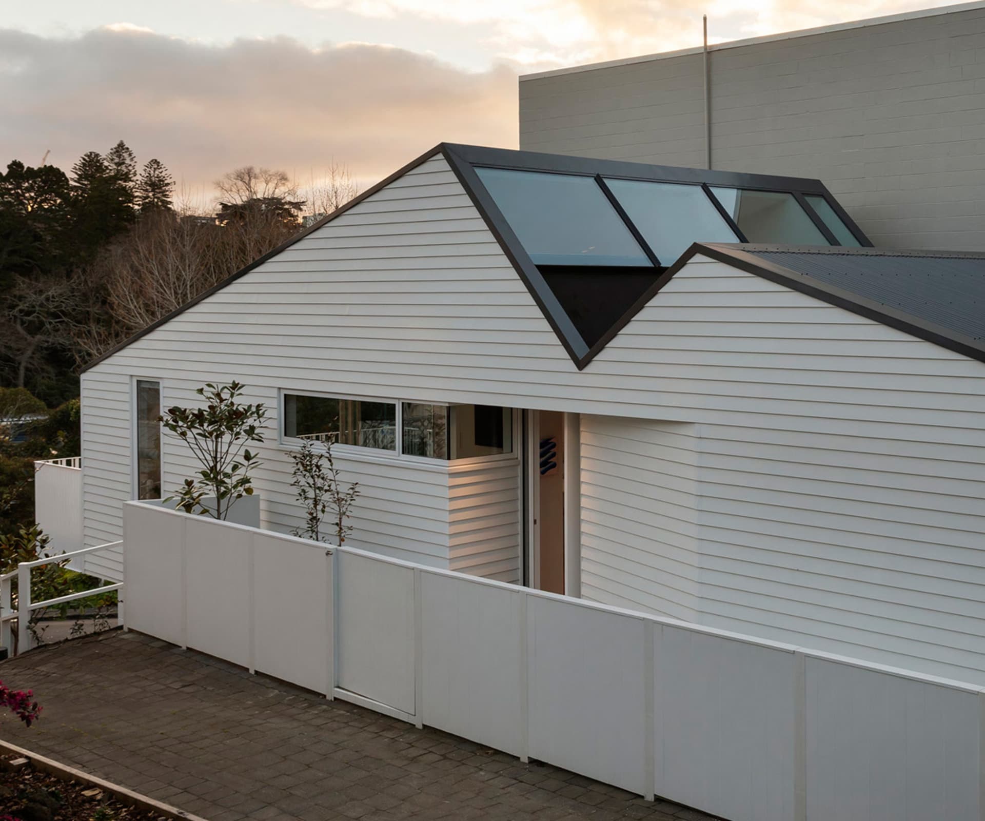
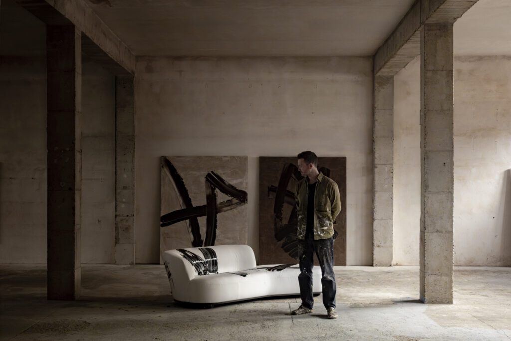
Faced with a difficult alternation, architect Henri Sayes used a clear and uncompromising vision to create this wonderful little apartment. He discusses the design process behind the project
Q&A with architect Henri Sayes of Sayes Studio
Good clients make good projects and that’s true in this case. Tell us more about that.
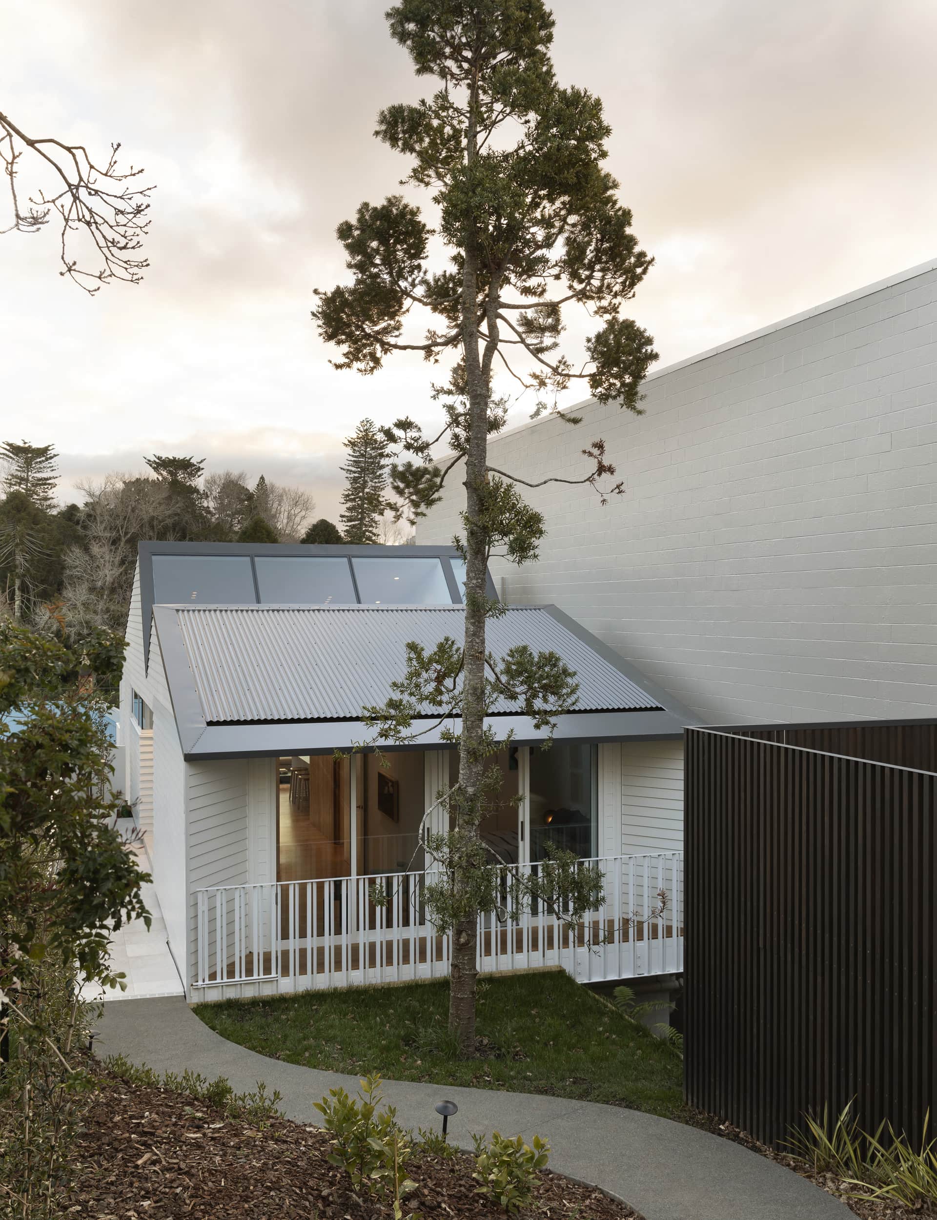
Not many people would have seen a dilapidated workshop on a sloping, shadowed strip of land and seen the potential. The client drove this project from the beginning with his ability to imagine the possibility of what it could be. He also had a clear vision of what he wanted, and what it didn’t need to be. Architecture can suffer when people want to cram too many ideas, too many potential scenarios, into a single project. This project succeeds through its clarity and focus, and that confidence and thinking were led by the client.
This was the first time you worked with builder Jared Banks of Master Craft Construction. What were some of the more challenging aspects of the build?
Good architecture can’t happen without a good client, but it also can’t happen without a good builder. This was a really interesting project in that the client, the builder and I were all similar in age and stage. There was real energy that came from that dynamic; we were all focused on making this small project exceptional. Jared really understood the intention of the project and executed the complexity and detailing to perfection. He made the build look simple, which is hugely skillful.
[gallery_link num_photos=”10″ media=”http://www.homestolove.co.nz/wp-content/uploads/2019/10/HenriSayes_ParnellApartment_HOMEOct-Nov19_Living.jpg” link=”/real-homes/home-tours/small-sunny-home-next-concrete-building” title=”Find out more about this home here”]
What have you learnt about designing small spaces?
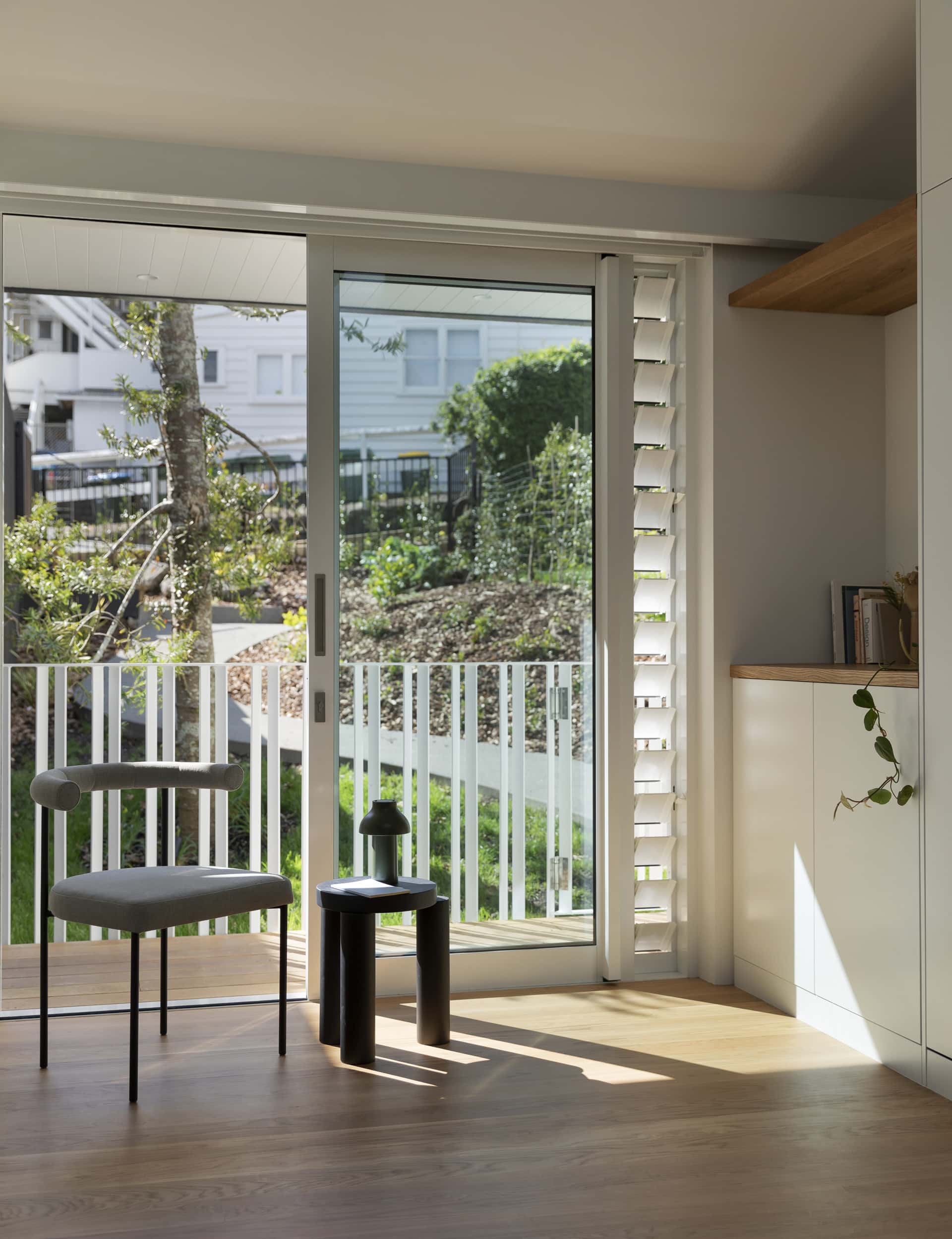
They take just as much time, effort and energy as large spaces, if not more, because everything has to work harder. Every element needs to have functional and aesthetic purpose, and read well with everything else. To me, if you focus on designing for great light, everything else slots into place. This is quite a small apartment, but the volume and light from the skylights, in particular, give it a scale that belies its modest footprint. Light should be the most important material to any architect, in any project, but especially so for small spaces.
What are your thoughts on the Unitary Plan and how it has opened up new opportunities for design?
I was a big supporter of the Unitary Plan and how it should open up opportunities for making the most of awkward and tight sites like this one. I still believe the city needs to become denser, but this needs to be coupled with better design. You’re seeing projects that are making the most of new height allowances, but don’t seem to be adding to their surroundings or creating good internal spaces. The Unitary Plan isn’t going to solve all our problems.
What has this project taught you about yourself?
That I’m stubborn? Design is partly about imagining what is possible, and partly about making it so. Sometimes everything seems to work against good design, from planning controls to fire regulations and acceptable solution details. The pressure to compromise is continuous. My role is to hold the line and solve a thousand small problems that threaten to compromise a small or large detail. You do make compromises and take on suggestions from the builder or metalworkers or clients, but a good architect has to maintain the integrity of the project as a whole. I’m sure at times I’ve frustrated everyone, from the client to the builder, but I think the beautiful result is partly due to that stubbornness.
See more of the apartment below
