Floating on the white sand dunes, this black steel-clad Otama beach house manages to make the most of its views whilst maintaining its privacy
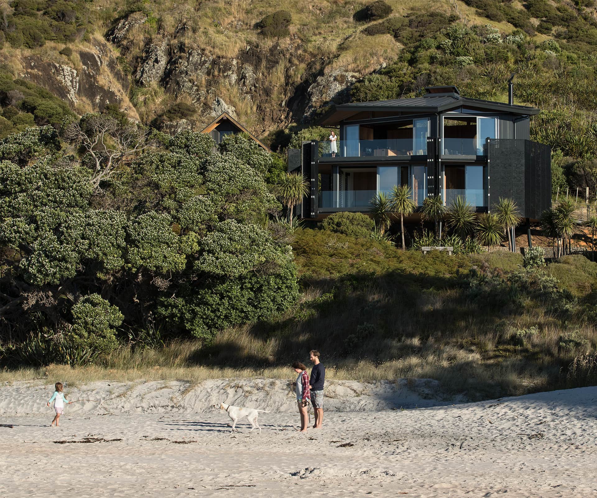
Otama is one of the most perfect beaches on the Coromandel Peninsula. There’s squeaky white sand and gentle rolling surf, an estuary and bleached grassy hills behind. It’s three hours from the nearest city over narrow, winding roads and, until recently, the road from State Highway 25 was unsealed and occasionally treacherous. Sometimes, in the middle of summer storms, the one-lane bridge floods.
Architect Ken Crosson knows the area intimately. His own bach – the winner of both our Home of the Year in 2003, and Home of the Decade in 2006 – sits on a hill at one end, with a commanding view over the Mercury Islands. So when he was approached by the owners of this site to build a house in the dunes, tucked into a nook at the other end of the beach, he was justifiably nervous about what the community would think.
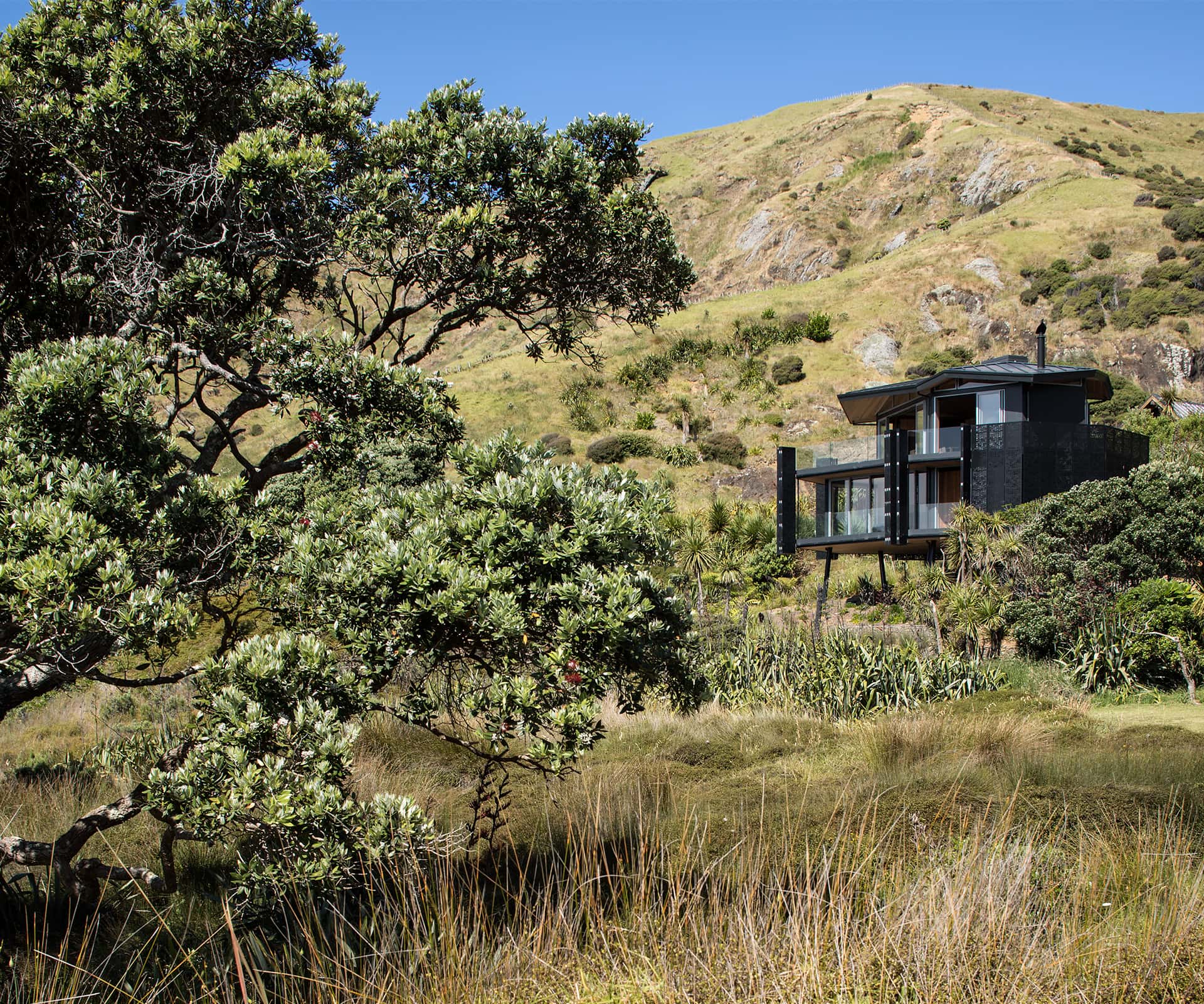
The site runs down through the dunes to a beautiful little corner of sand; a track runs through the spinafex and most of the land appears to belong to the beach, rather than a private owner – something the architect and his clients were keen to maintain. There’s no front fence, no boundary between what’s private property and what’s not. “It’s kind of nice to let the public realm be the public realm,” says Crosson, who designed a small beach house that occupies a vastly smaller footprint than he could have legally built, pulled as far back against the hill as possible. “We were all keen on that. The owners are very quiet people, and they didn’t want to show off.”
The owners requested a “barefoot love shack” in the dunes, and the driving idea became to create something that was a complete contrast to how you live in the city. It’s big enough for them and a couple of guests; there are plenty of spaces, but no superfluous square metres. Before Crosson and his team started designing, they assembled a library of contrasting images to inform the process. “We wanted it open, off the ground,” he says. “We wanted levity and lightness, a structure that talked about the New Zealand context and way of life. Every decision in terms of design reinforces that.”
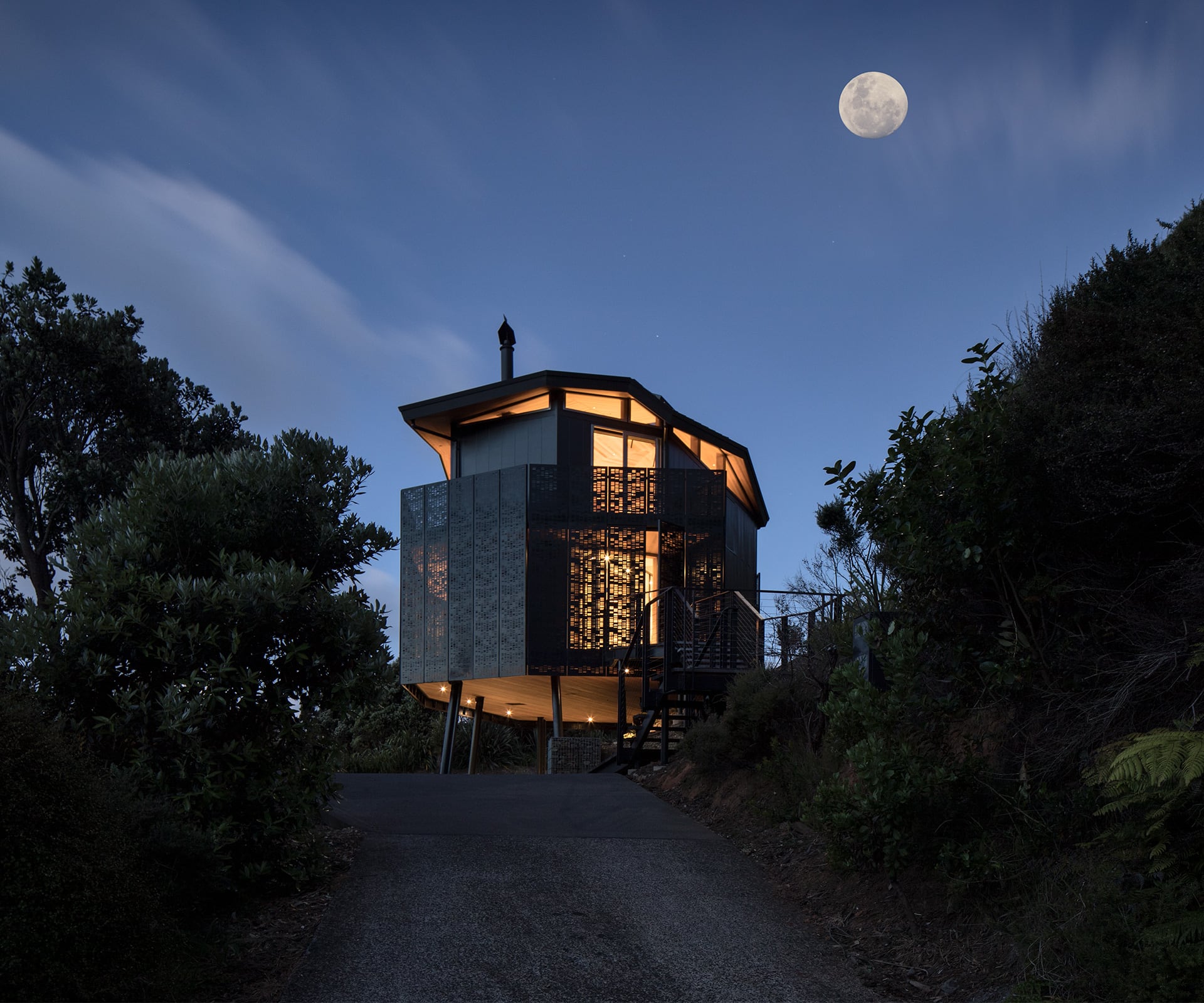
The result is a small house that you might compare to a landing ship, amoeba or lighthouse. Two black steel-clad storeys of irregular and seemingly random shapes sit loosely in the air on black steel poles; the space beneath is filled with light. The approach is from a parking pad, up steps and along a steel bridge – or, if you’re one of the owners coming back from an early morning swim, up a rope ladder and through a trapdoor in the bedroom floor.
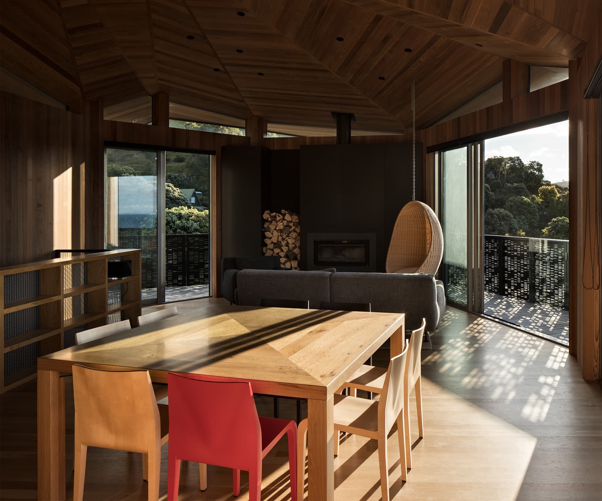
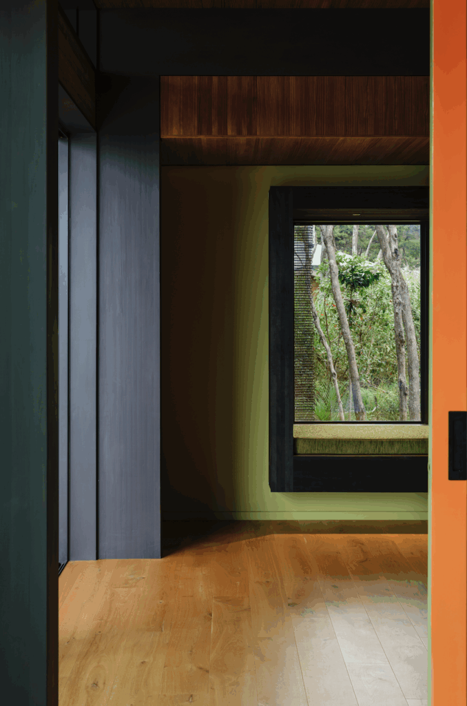
The home has two bedrooms and two bathrooms downstairs, an open-plan living area upstairs. The entire interior is lined with band-sawn cedar, which runs across doors and along the ceiling. It’s like a deftly detailed and built piece of cabinetry that affords the feeling of respite and retreat: it smells glorious. The lower level is enclosed, private. Upstairs is more open, with a floating ceiling that drapes over the top floor, a move that opens up glimpses of views through clerestory windows. It’s here the house starts to really make sense – Crosson wanted something ephemeral and floaty, with shifting elevations that create a series of experiences and spaces inside.
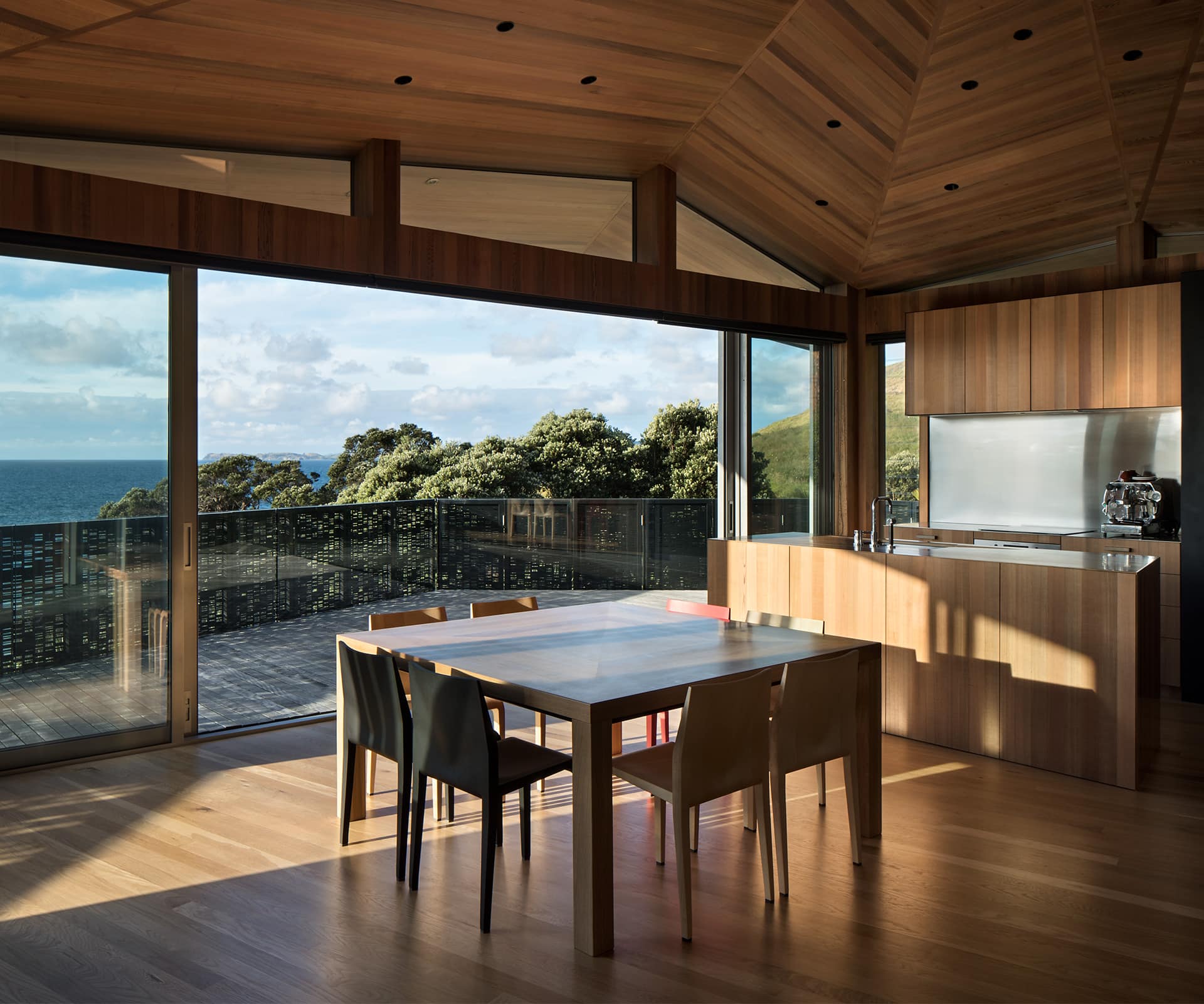
The design is carefully calibrated to bring in views and exclude others – the seemingly random facets of the top-floor living room are, in fact, oriented to maximise particular views – hills, mountains, beach and water. “We were trying to get away from that neo-modernist thing and do something specific to views and context,” says Crosson. “That was the big driver at the end of the day – it was pretty simple.”
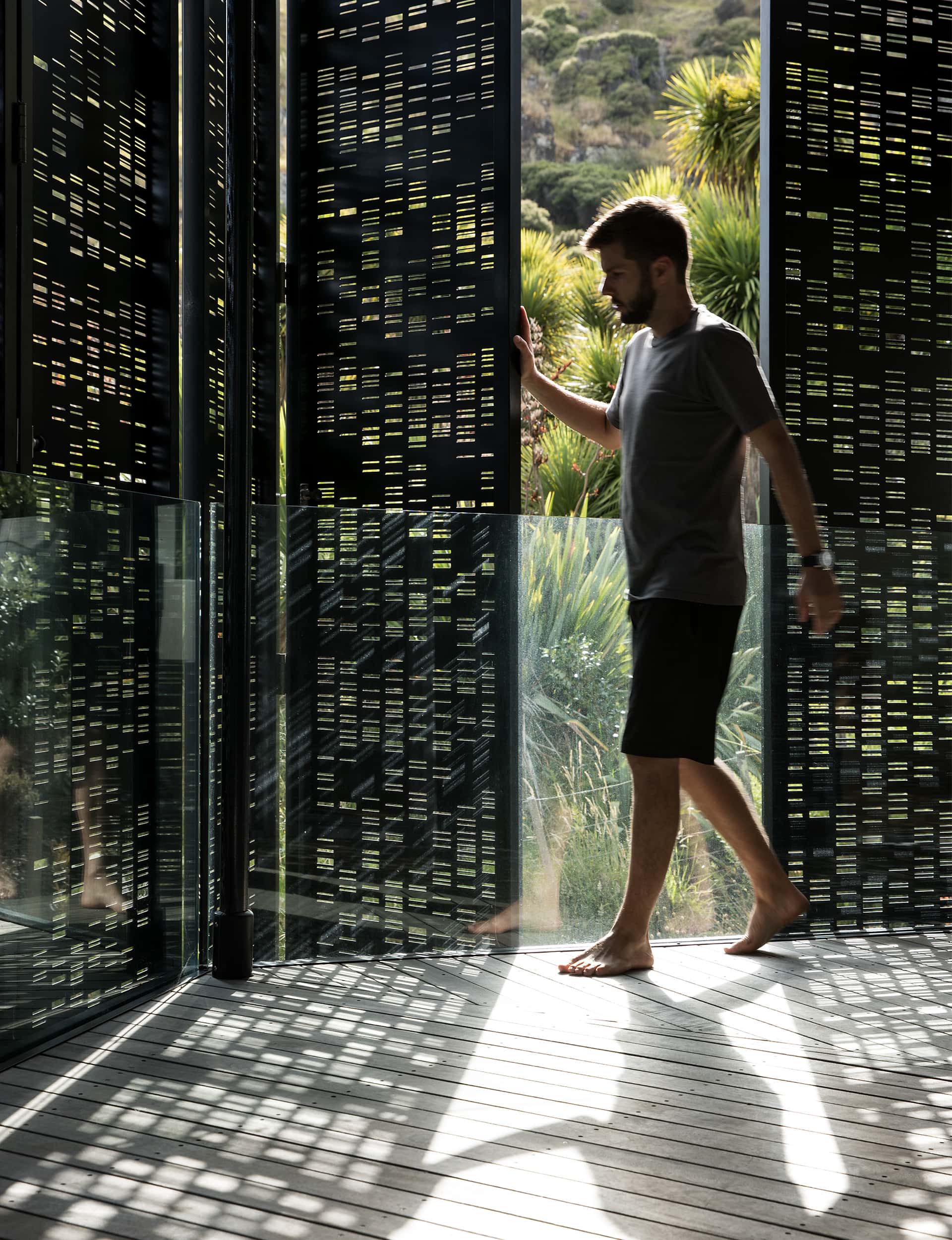
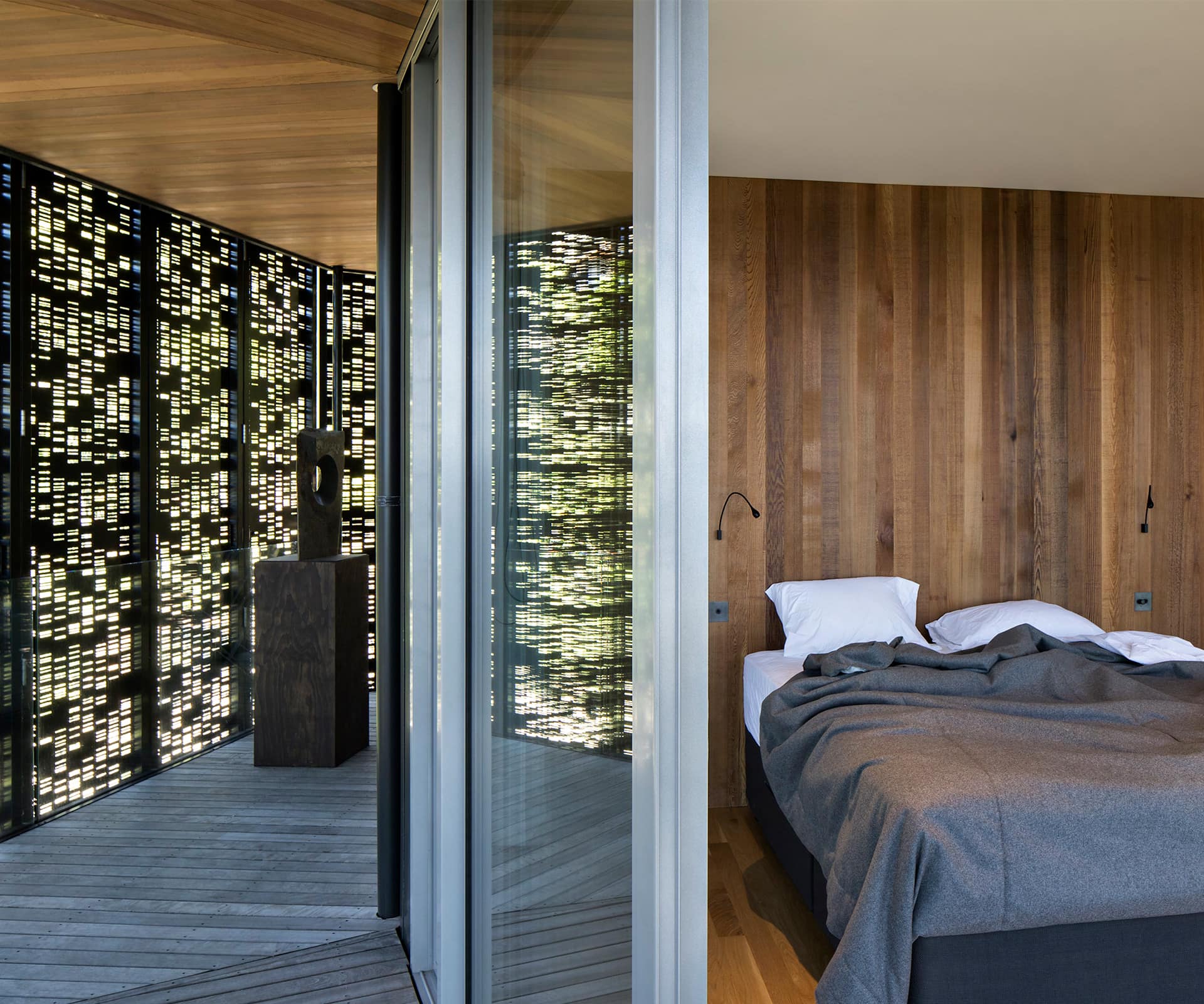
You see that thinking clearly in the metal screens that shroud the dwelling. The owners wanted to close the house completely when they were not in residence, and they wanted privacy for the bedrooms. In this salty environment, Crosson could see the value in metal screens to wrap the house, but didn’t want blank steel. “They wanted to be able to keep the sun out, but you don’t want it dead inside,” he says.
Eventually he settled on the idea of folding perforated screens, which he developed to incorporate the owners’ DNA, the sequence cut into the very fabric of the house. “It’s actually about them,” he says. “It’s an abstract pattern with a beautiful play of light, which is specific to them.”
Words by: Simon Farrell-Green. Photography by: Simon Devitt
[related_articles post1=”61005″ post2=”83574″]
