There’s no doubt this large family home makes a statement; it’s a talking point for locals who wander past and often stop to take it in. Although its scale seems perfectly fitting, it is the form that creates intrigue.
As architect Jose Gutierrez sees it, architecture should never shout. Rather, it should whisper, and it should evoke a response — good or bad.
In the case of this family home in Auckland, Jose was given a brief that presented obvious challenges: six bedrooms, a pool, and two lounges — a home for a large family group on a sloping, tapering site on the side of a Remuera valley.
What he envisioned was a home that floated over the land, drawing light in from above. It was the slope of the site that ultimately formed the basis of a design evocative of the traditional scale of homes in this Remuera street, where large bungalows are prevalent.
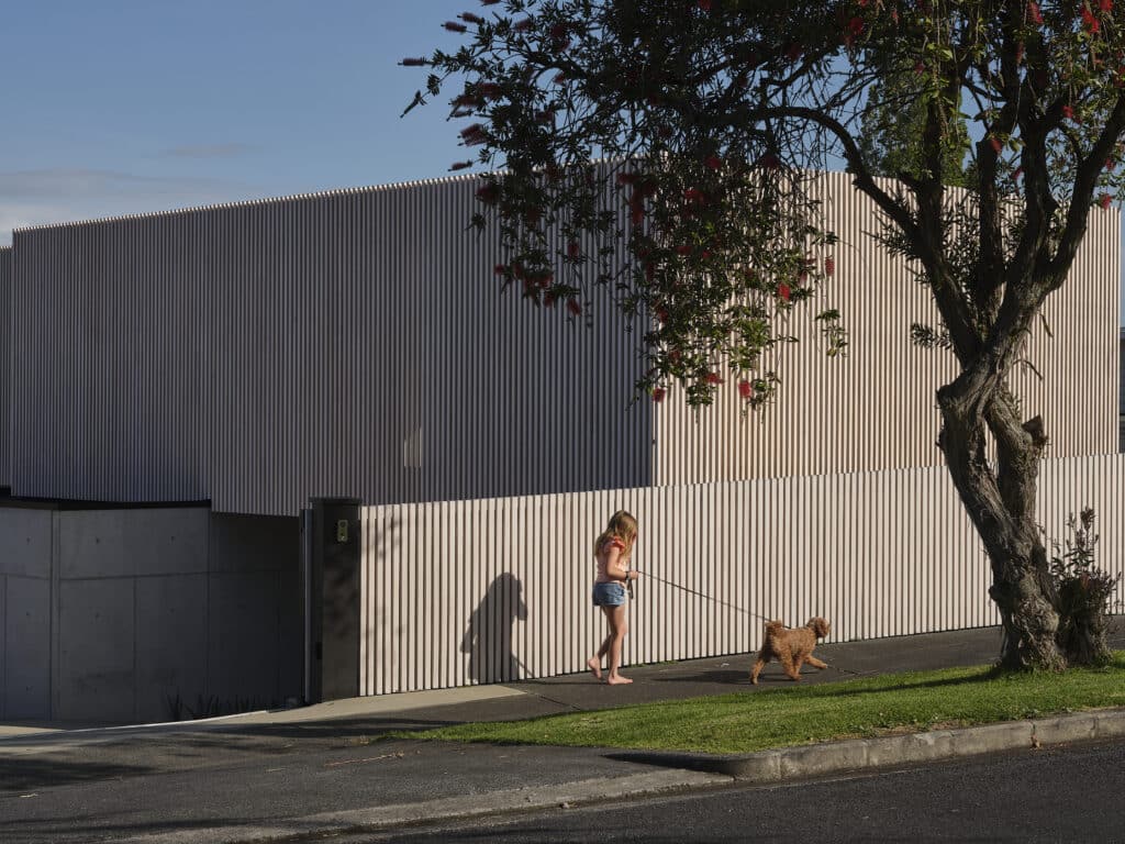
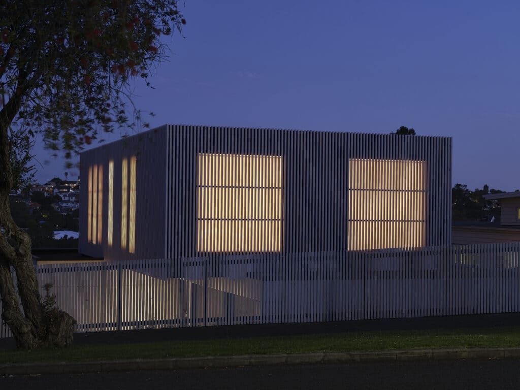
From the street the house feels like an abstract form, shielded and private, a vertical timber screen wrapping this elevation in full and marking a juxtaposition to the horizontal weatherboards of its neighbours.
“The design focused on creating a sculptural form, which, when viewed from the street, challenges the perception of a traditional street-facing façade. The delineated box has the appearance of a closed-off form without windows that evokes curiosity,” Jose explains.
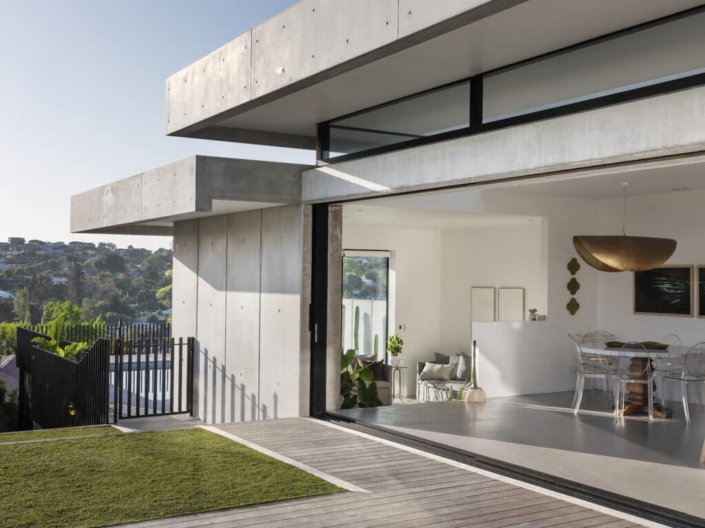
The entrance is to the north at the bottom of a short, sloping drive that leads down to the front door and garage, positioned below street level. It is upon entry that the experience of this home completely transforms the abstract exterior perception of the building.
Here the use of concrete, perhaps surprisingly, creates an overarching feeling of comfort; its muted grey tones and textural finish calming. Overhead a 16-metre skylight slices through the spine of the home from east to west drawing in a beautiful warm light even on the greyest of Auckland days. Looking out to the east from the transitional space at the entrance, the roof forms appear to float.
The building is anchored into the hillside and follows the sloping gradient of the site, down to an east-facing pool area that feels as if it is cantilevered out over the land. Views over the urban cityscape of
the Remuera valley are ever-changing — familiar and oddly captivating.
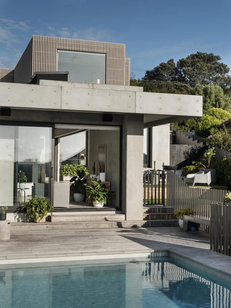
From the entrance, a living area to the north is accessed providing a space separated from the business of the kitchen and dining area, which is stepped down a level. Stepped down again is a second, casual lounge designed as a versatile, sociable space — part TV nook, part entertaining space that opens to the pool.
“As you walk in, you are drawn into the space; you want to keep walking and find out what is going on,” Jose tells us.
He couldn’t have put it better. This house has an allure that’s hard to put into words.
“The volume starts to make sense as it makes its way down the hill, allowing the house to look like a single storey from the street because it disappears down into the slope of the valley.”
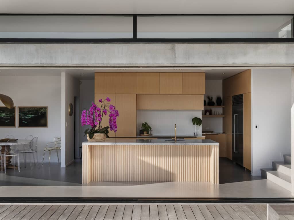
The kitchen sits below the spine of the house, with light flooding in from the skylight overhead. Sliding doors open the space completely to the north, with the doors sliding away into a pocket in the concrete wall. Behind, a scullery conceals the working and storage spaces, tucked away on the southern side of the house.
To the west of the lower level, two bedrooms and a bathroom peel off the hallway that meets a rear annex where a laundry and under-stair wine cellar exist. Upstairs, via a floating oak stair, the other three children’s bedrooms and the main bedroom and ensuite are housed, the latter east-facing with the windows framing that oddly captivating view of the valley.
The ensuite faces the same view, with a Shugg window opening the walk-in shower to what Jose describes as “a live artwork. It’s quite a special view, familiar but dramatic.”
A central courtyard and grassed area exists in the centre of the site. Stretching out to the site’s northern boundary, it is private and sheltered, both from the street and partially from the elements by the form of the house that wraps around it.
Standing here, the forms feel stacked, informed of course by the need to incorporate the number of rooms and spaces for the large family, but elegantly defined and delineated from each other; sculptural and curated. “The form evolved slowly, it was about balance and composition,” Jose explains.
Materials were central to the success of this home; each element selected was used consistently throughout, but serving different purposes at the front and rear.
“For the front façade the materials are celebrated as abstract forms for privacy, whereas at the rear they create openness and define space,” Jose says.
“The resulting building features bold forms that diffuse and transform throughout the day as the spaces are used and daylight evolves into dusk, then night. Essentially a paradox is formed: it’s a rock that is transparent, in essence heavy but also seemingly light.”
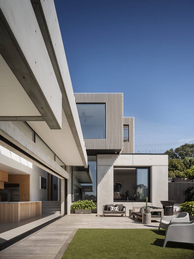
Dominated by the use of concrete and timber, these very tangible elements combine with perhaps the most important, and intangible: light. It is light that is the essence of this house, and the way it plays and falls into the different levels at different times of day makes the spaces come alive.
“On a gloomy day you walk in here and feel happy. I think that’s what good architecture does: it helps the mood or state of mind.” Within these walls, Jose has done just that. He has painted a scene that tells of family life through a sculptural lens — spaces that feel light and comforting with a palette of raw materials.
“The clients love the place and that’s the success of it. For them, it’s an easy place to live. I think architecture should be bold but not loud, respectful in a way. It’s a balancing act to achieve this.”
