Architect Paul Francis set about the extensive renovation of a 30-year-old home on the edge of Hobson Bay with the aim of removing the boundaries between architecture and landscape, envisioning a design that would fall gracefully into the background.
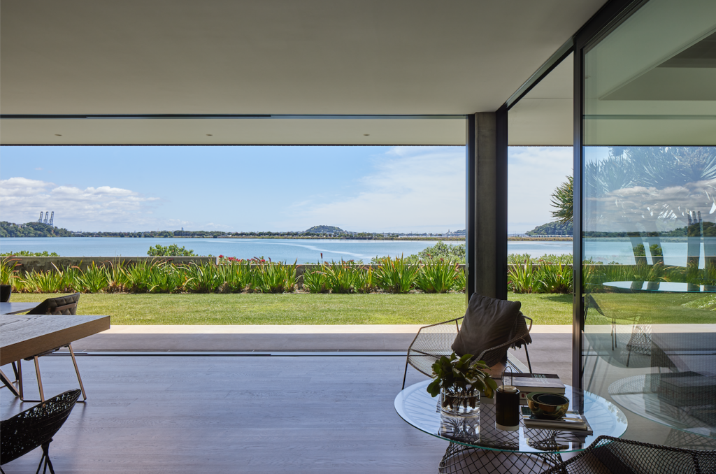
Overlooking the water, the view from this site is immediately captivating. Hobson Bay in Auckland is bounded by Tāmaki Drive and the train line to the north; to the west, the cityscape is visible in the distance, and, to the east, the distinctive forms of the Ngāpipi Road boat sheds are dotted along the water’s edge. It was these small gabled forms that informed the original design concept.
The clients spent about a year living in the house as the plan developed, and what was initially envisioned as a smaller renovation became an extensive project involving a complete reclad, structural upgrades, and an extensive interior fit out. That said, everything that could be retained was; a key element of the brief was to change as little as possible — arguably, in opposition to the desire to simplify — in itself a complex undertaking.
Another consideration was privacy, due in part to the fact that winding along the coastline in front of the property is a public walkway. While the house is elevated and set back from the walkway, it was important to maximise the separation.
The exterior plaster was replaced with random-width vertical cedar finished with Dryden WoodOil in Platinum, a light, almost sandy-toned colour that allows the building’s form to sit inconspicuously within the coastal environment. Two gables were designed to echo the vernacular of the boat sheds across the bay.
“The use of the vertical timber weatherboards, extended eaves, and gables moved the house away from its original Mediterranean styling to a vernacular more sympathetic to the local marina and heritage boat sheds of Ngāpipi Road,” Paul says.
Upstairs, little was changed in terms of the configuration of rooms; there, the work was primarily related to finishes. It was downstairs that the heart of this project unfolded, and it did so in a highly collaborative manner, with architect, kitchen designer, client, and tradesperson each playing a vital role.
“One of the clients is an artist, and to her, this project was like a painting,” Paul says of the incredible skill and relentless dedication to detail that abounded. The perfectly layered strokes of the interior material palette are the work of this artist, and as a whole they form a cohesive piece of art that catches the eye, drawing you in and immersing the visitor in the folds of this canvas with the sea as its backdrop.
The original kitchen was located along the southern wall, separated from the rest of the spaces. “At the back of the floor plan, the kitchen had limited connection with the harbour … a maze of solid walls and joinery-restricted views,” Paul explains.
To simplify the plan and open up the spaces was a challenging undertaking involving the need for additional structural supports to create the vast spans needed, but the result is striking: a large open-plan space with an increased footprint created by enclosing what was once a small outdoor room.
“We created new concrete piles in selected locations and then poured in-situ concrete columns, which support large steel beams,” Paul tells us.
The large concrete columns are so carefully placed that they almost disappear into the background. In fact, they are hardly noticeable in the expanse of the space — one creating a seating nook in the eastern corner, another offering a subtle delineation between lounge and dining areas.
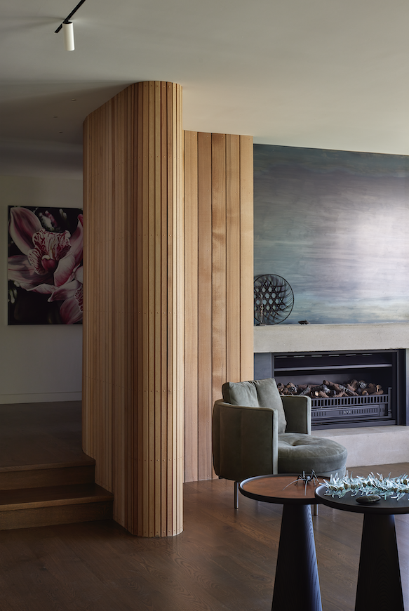
An existing curved wall that wound around the western edge of the living area was retained and the decision made to clad it with the same cedar as used on the exterior, the random-width boards introducing a sense of movement. A large fireplace is surrounded by waxed steel, juxtaposed with a concrete hearth; together, they visually anchor the western wall, and continue the simplicity of the restrained material palette.
There’s a rawness to the materials that delivers both a sense of grounding and solidity and a dose of playfulness as the light falls onto and bounces off their surfaces.
Outside, precisely angled metal-finned louvres across the west-facing windows and sliding entry gate ensure privacy from the gaze of passers-by without obscuring the view; their angular formations are replicated inside in the form of a custom stair balustrade with a striking sculptural composition that moves between the levels.
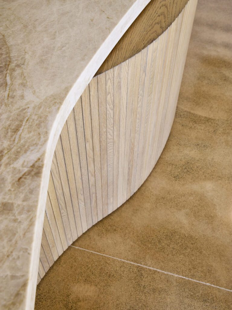
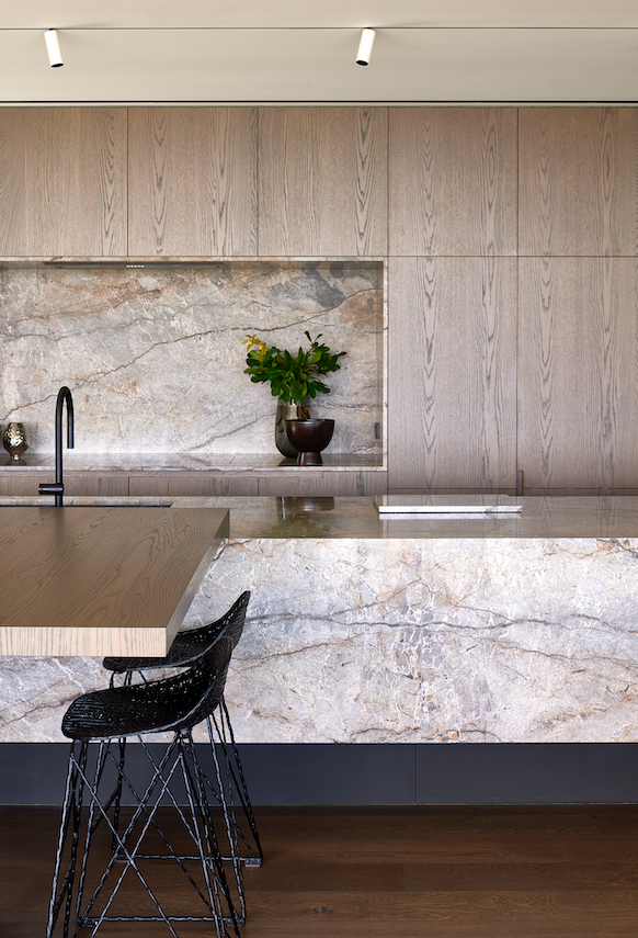
The kitchen was designed in conjunction with Cronin Kitchens and is a simple but striking space. A 5m long marble island is at its centre; to one side, a peninsula table invites people to gather. The warmth of the hues and the distinctive veins in the marble island and benchtop behind connect the tones of the oak flooring, the cabinetry, the concrete, and the darkness of the steel. A scullery occupies the position of the original kitchen along the southern wall, its door concealed within the cabinetry.
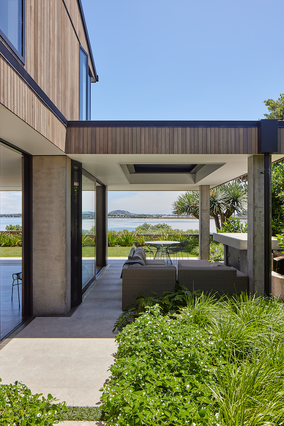
“One of the clients was particularly taken with symmetry, and he wanted a simple, flat lawn out the front. To the east, a new outdoor room meets the lawn and is protected by an operable louvre system overhead to allow it to be opened to the sky or closed as the weather permits,” Paul says.
The continued use of in-situ concrete columns — used outside to define the loose boundaries of the al fresco space — creates a blurred sense of the threshold between indoors and out.
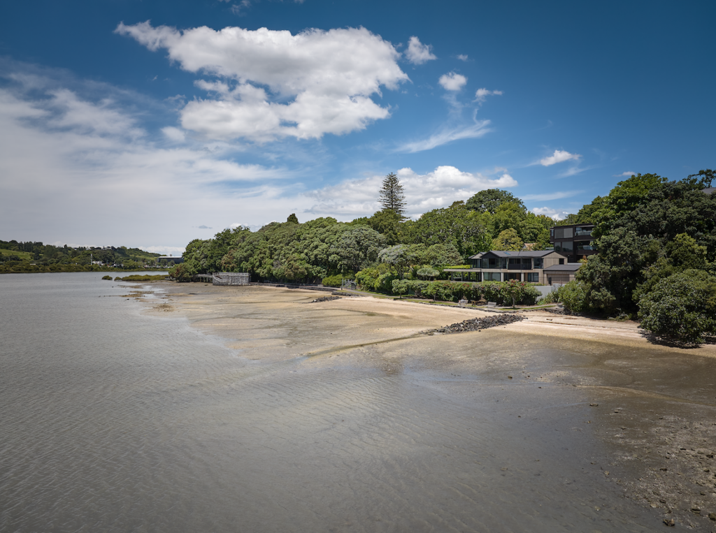
“Viewed now from its coastal frontage, the form and material palette of the house appears discreet and in keeping with the local context of the established native planting, stone walls, timber boat sheds, and sandy beachfront,” Paul says.
Driven equally by architect and artist, this is a project that has given a contemporary vibrancy to what was once a tired abode on a spectacular piece of land.

