Can great architecture and affordable housing coexist? In this case, absolutely, and it’s a topic on which Daniel Sullivan of Common Architecture is unreservedly passionate.
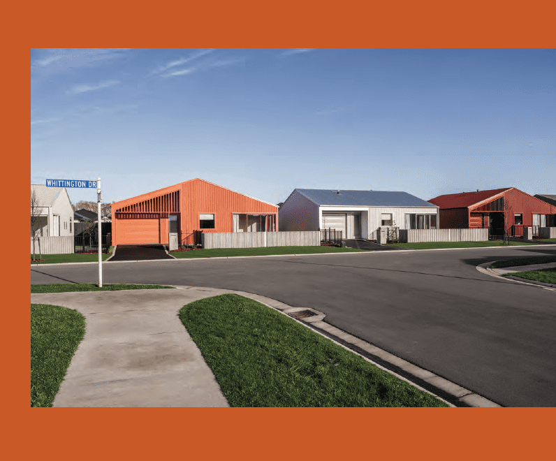
In a satellite town just outside of Christchurch, Daniel and the Common team have been working quietly behind the scenes for the past five years to prove that clever architecture and affordable housing are indeed inextricably linked, and that the pairing of the two is a vital ingredient in successful master-planned communities as density increases.
“Faringdon is a subdivision in Rolleston, on the outskirts of Christchurch, that, with the urban sprawl of recent years, is quickly being enveloped into the greater Christchurch region,” Daniel tells us.
“We’re really fortunate to have been working with the developer of parts of the area, Hughes Developments, to deliver affordable housing in various phases. Faringdon in general is known for group home builds — ‘cookie cutter’ housing is the predominant aesthetic here.
“For this project, we were engaged to design seven homes with a point of difference while still fitting into the wider context of the master-planned community. On what would traditionally have been five individual sections, we were asked to increase the density slightly — that resulted in what we’ve called ‘seven colourful little houses’.”
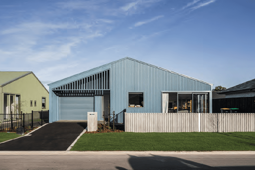
These seven abodes represent an approach that wholeheartedly steps away from the norm — but not in every aspect. With budget and design balanced at the forefront of decision-making — the brief was to deliver the homes at a cost of $3000 per square metre — the Common team devised a simple, meticulously executed plan for the builds, and delivered them for significantly less.
With the use of alternating gables and block colours, the seven abodes would create a layered street appeal, together forming a small community within a larger one.
“The alternating gables gave us the opportunity to create very subtle planning refinements between the two typologies,” Daniel says.
The footprint of each home is just over 100 square metres. They are all two-bedroom homes, but there are two slightly different models — one envisioned for families, with a double-entrance en suite; the other for a flatmate set-up, with a separate bathroom.
The colourful dwellings are not separated by traditional fences demarcating ownership. Instead, they are defined by colour, with the garage walls marking the end of one property and the beginning of the next.
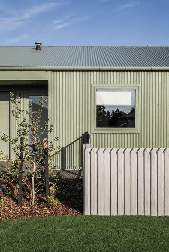
“I think this has really helped develop a sense of community and belonging within this little enclave,” Daniel says.
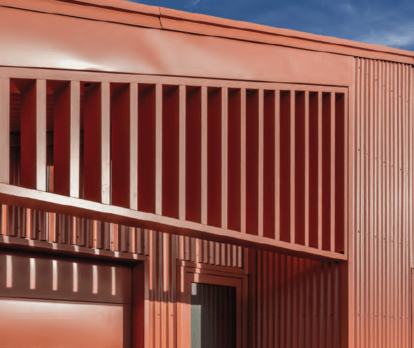
“The colour was about having fun with the design and invigorating the streetscape and wider area. We wanted to activate that north-east street façade, so it was about balancing privacy and activation. There is modulation to these elevations; we wanted to create interest through form, light and shadow play, and texture.”
Although the sites are small, the alternating gables allow the sun to penetrate the living areas between the lots successfully.
“Without fences between them, the backdrop to these areas is a colourful wall of corrugate instead of a block wall or traditional fence, which is a nice unexpected element. I like the idea that they blend into one another a bit more, which strengthens the sense of community.”
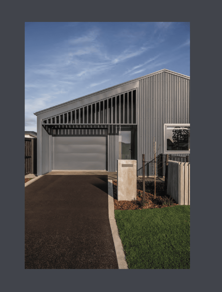
Bookended by two blue-toned homes, the development unfolds between them with vibrant colour. “We started by deciding on New Denim Blue, which was the most prevalent colour dotted around the area. In opposition to that, for the home at the other end of the row, we selected Nimbus, a cloudy, chalky blue, which is a more contemporary take on the prevalent tonality of Denim Blue.”
Between those two homes, hues range from Mist Green to Scoria — a reference to the historical agricultural vernacular of the area — Terracotta, a striking orange tone, Zincalume, and Titania, an off-white grey hue.
“Once we landed on the exterior colours, we ran those palettes throughout the interior of each home. Rather than doing anything bespoke, our challenge was to find materials, paints, and finishes that were available off the shelf to keep costs down.”
The interiors belie the compact nature of these homes. The front door opens to a carefully planned entry zone — something Daniel was meticulous about from early on.
“We were really careful to provide a proper entry threshold rather than walking into a living area. Once you step into that entry zone, you get a real sense of the unexpected. It is here where the spaces reveal themselves, and you get a sense of volume with vaulted skillion ceilings through the living/dining and kitchen areas. It’s at this point you realise the continuity of the colour from the exterior wrapping inside.”
That colour palette becomes the linking thread between streetscape and interior, with everything from joinery to benchtops, carpet, vinyl, walls, and doors adhering to the vibrant palettes.
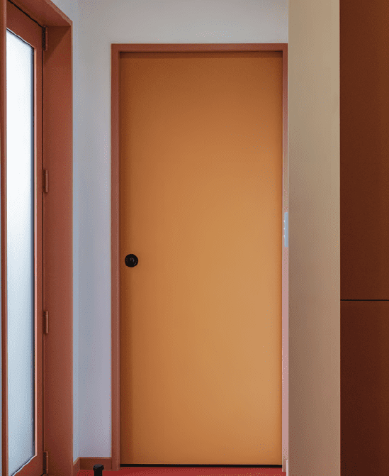
“The default would be white. We’ve done the opposite. It takes effort and energy to deliver great design when affordability is at the forefront, but these homes are a great example of what can be achieved and [proof] that architecture can be delivered across the spectrum of budget and scope.”
In an unassuming setting, these homes represent a reimagining of the Kiwi suburban quarter-acre dream with a vibrant take on living at density.
“I think as architects we have a responsibility to bring our skill sets and creativity to the table to deliver excellence to this market. I hope that these little homes are part of a paradigm shift; we don’t need to always do the same thing when it comes to affordable housing,” Daniel comments.
