The 2024 Dulux Colour Forecast is a sumptuous splash of warmth, nostalgia, and vibrancy. We explore the three alluring palettes: Muse, Solstice, and Journey – together, they are a sophisticated and buoyant expression of the year ahead for interiors.
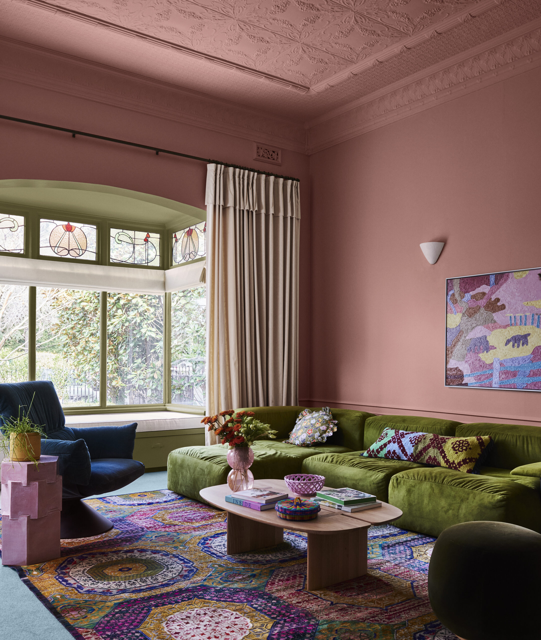
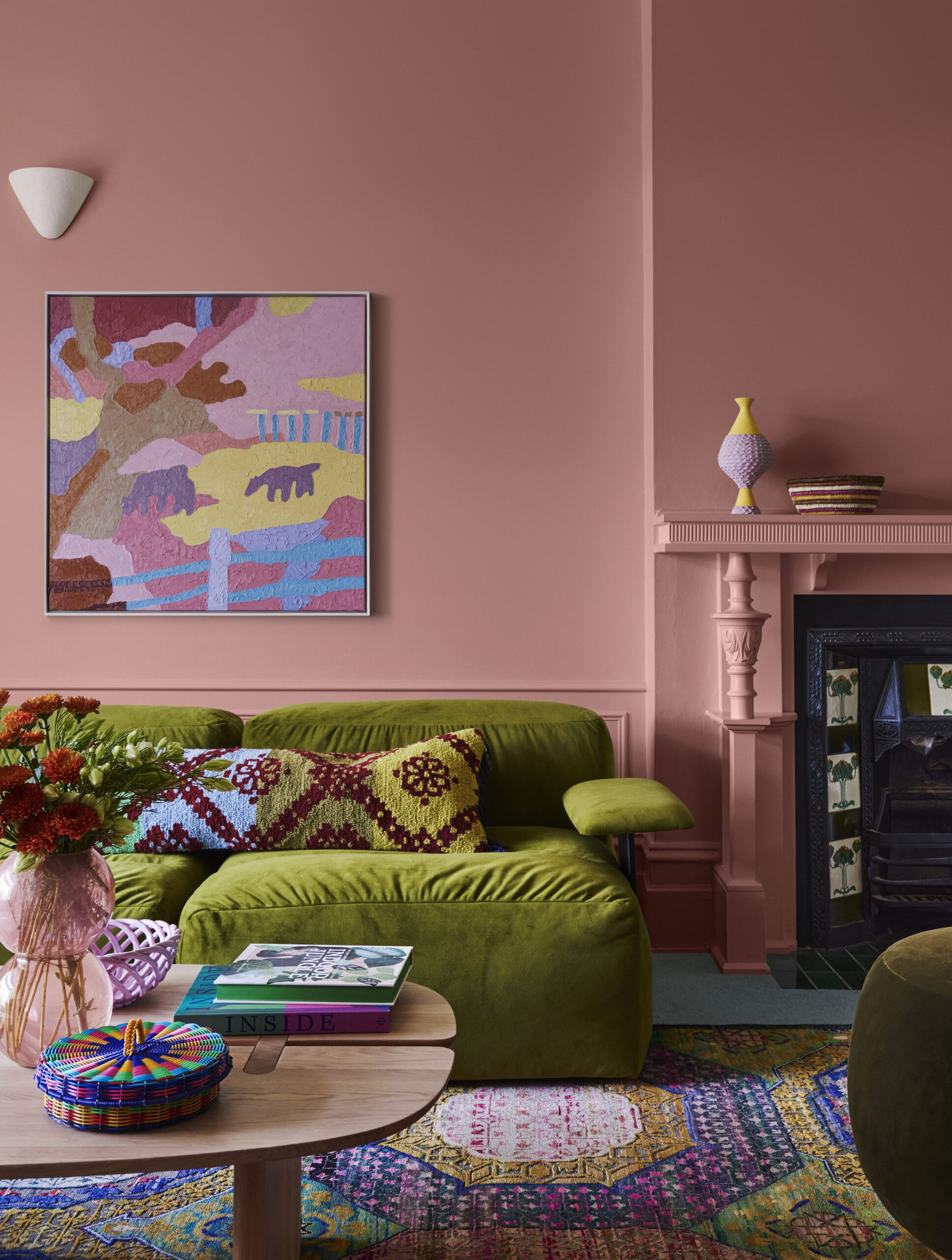
Free-Spirited Glamour: The Muse Palette
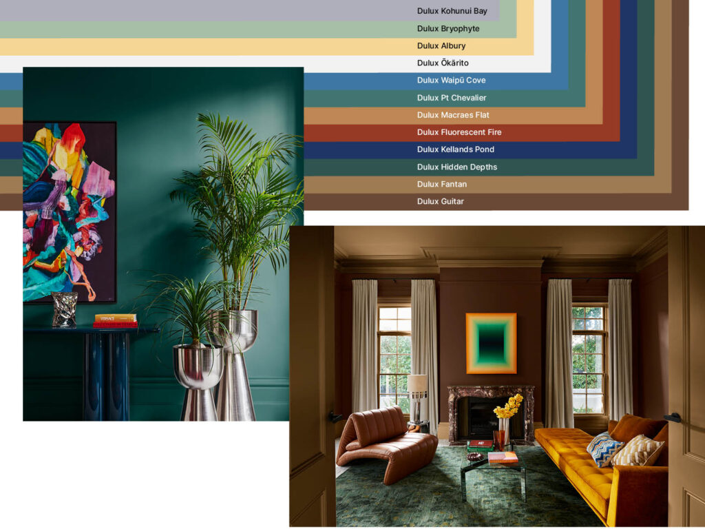
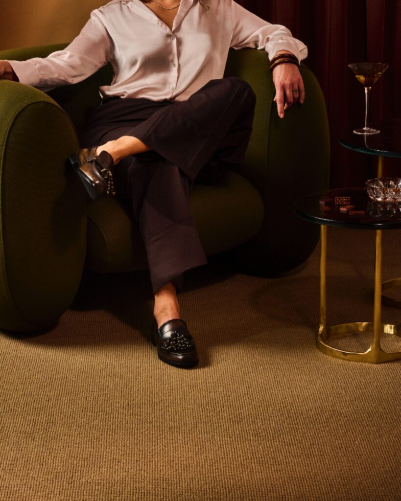
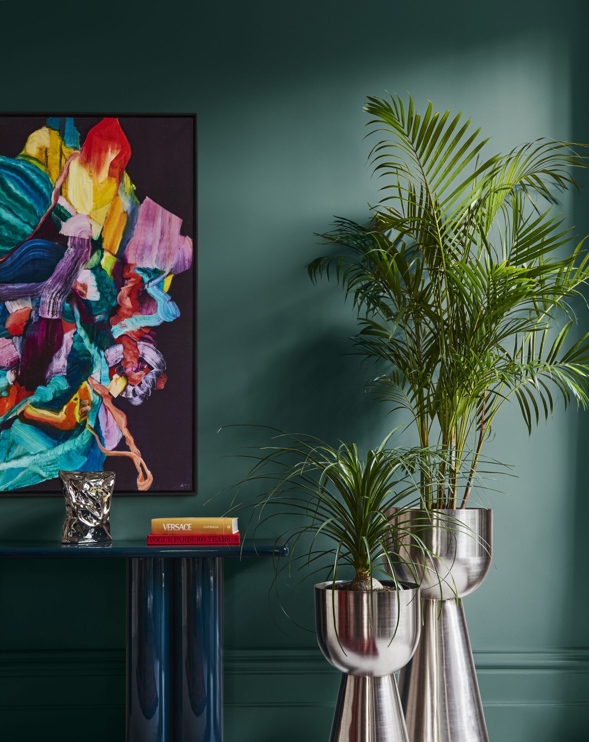
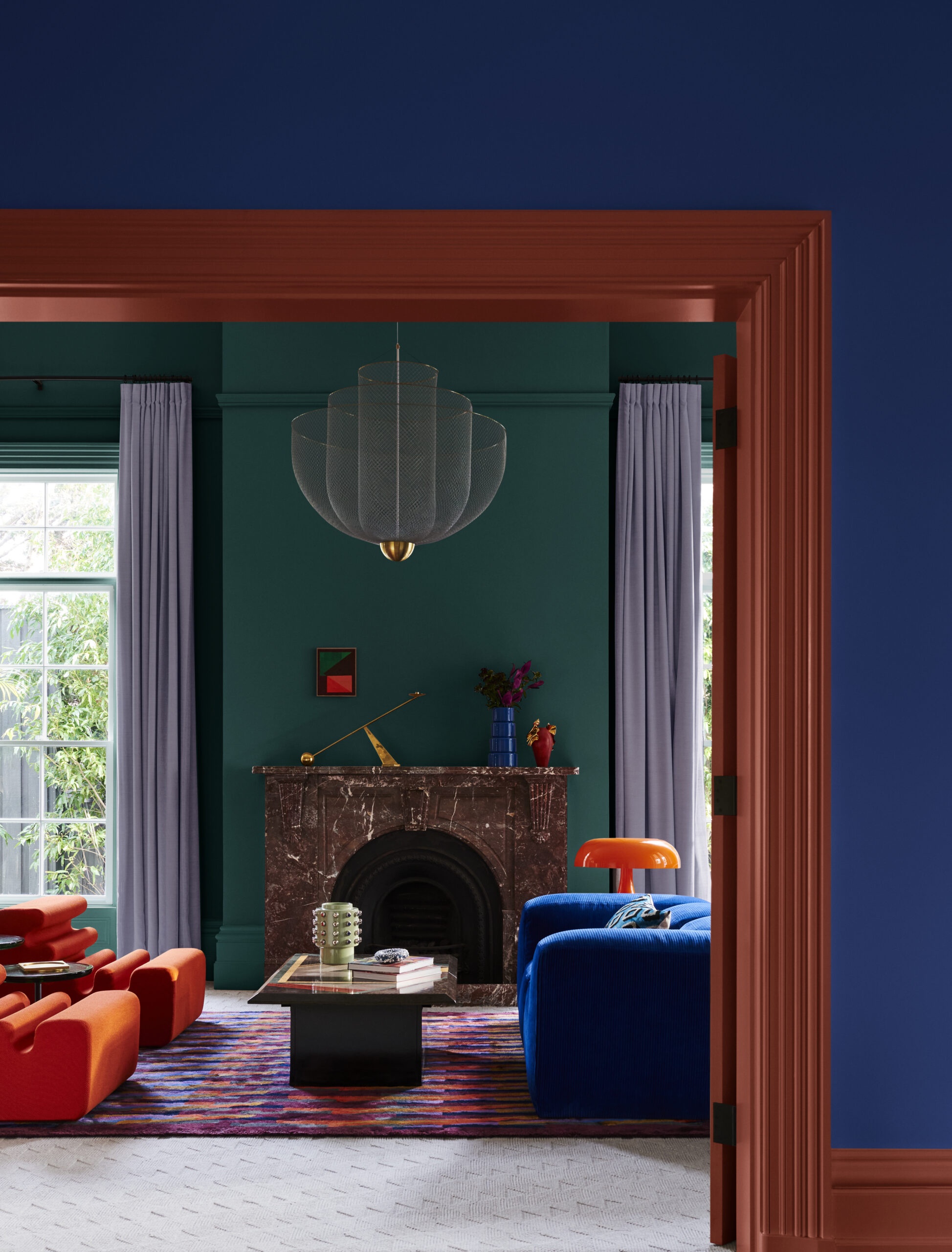
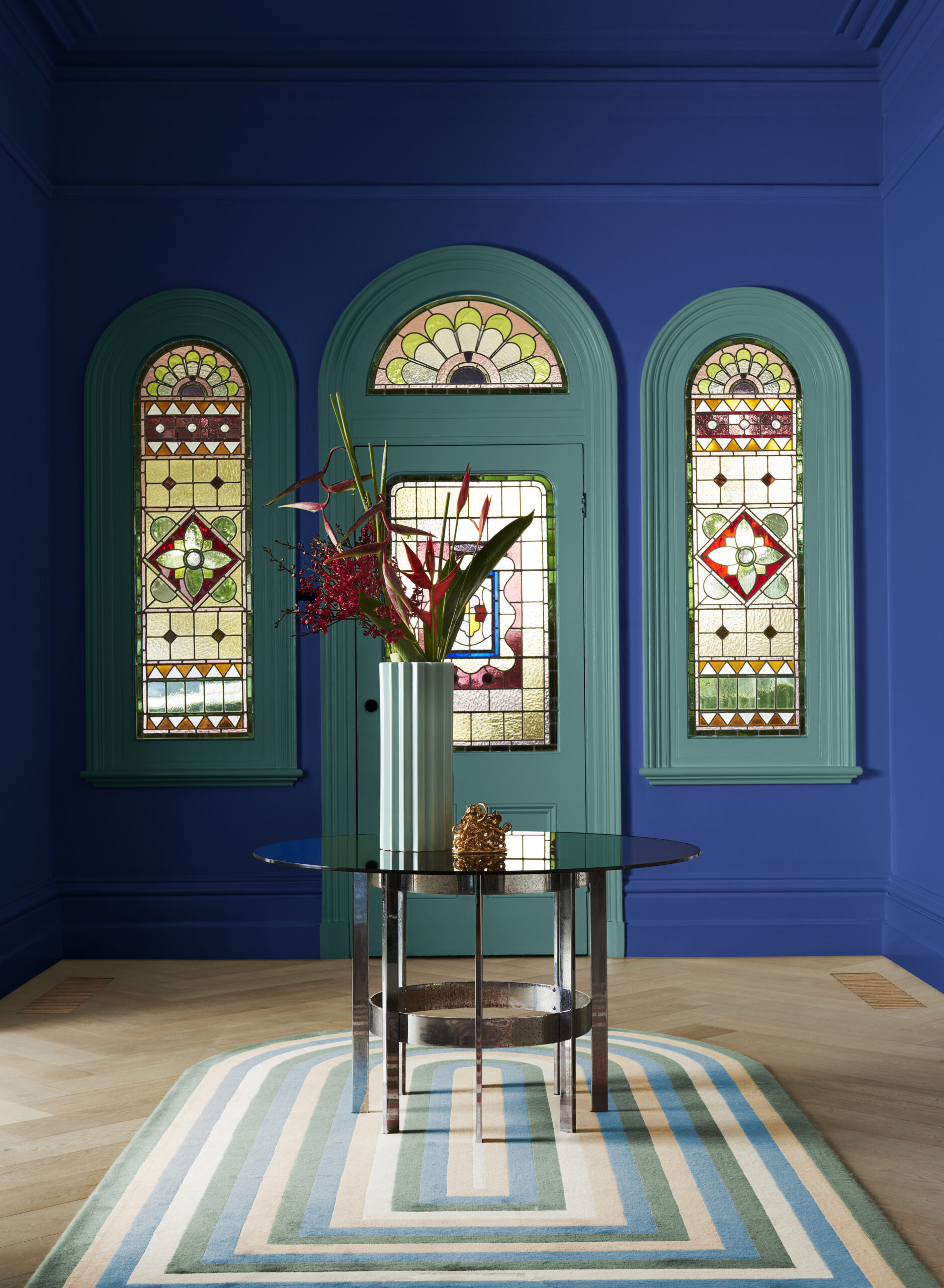
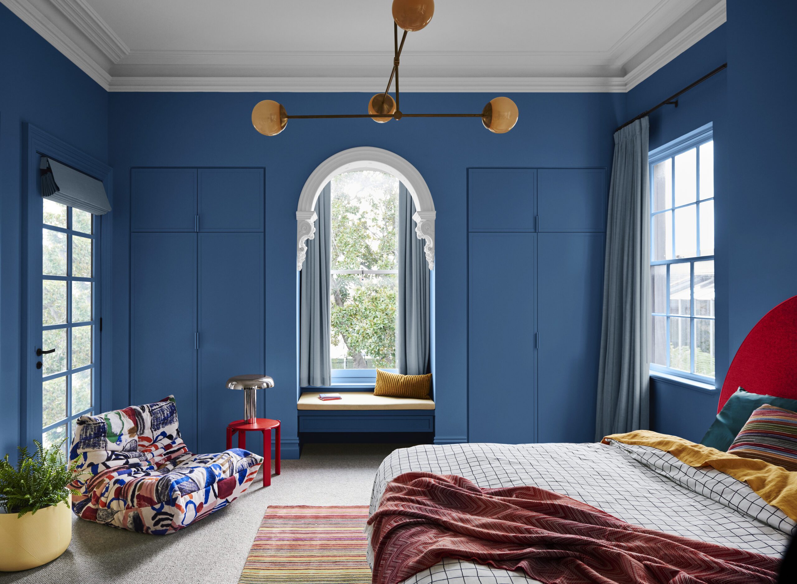
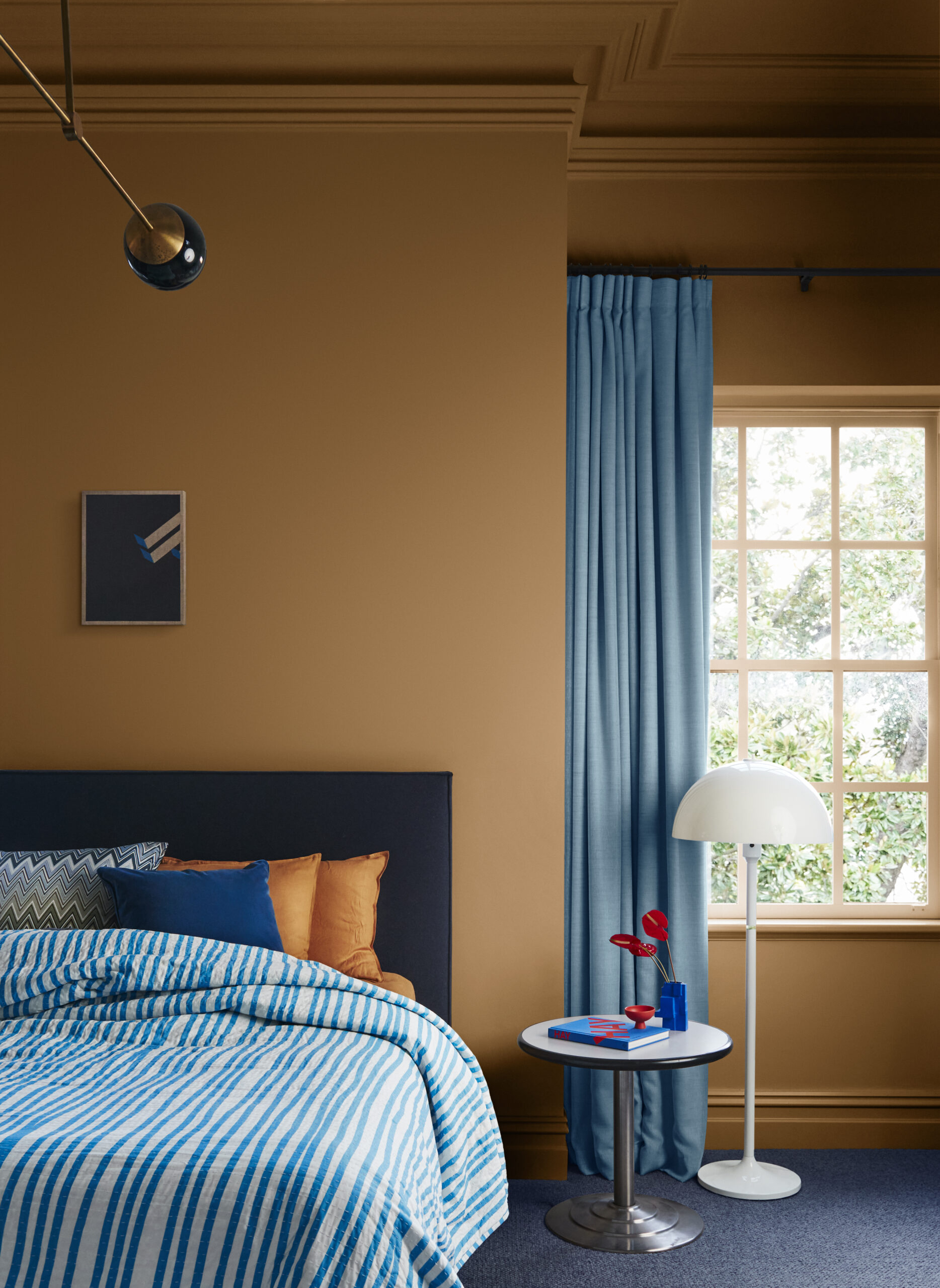
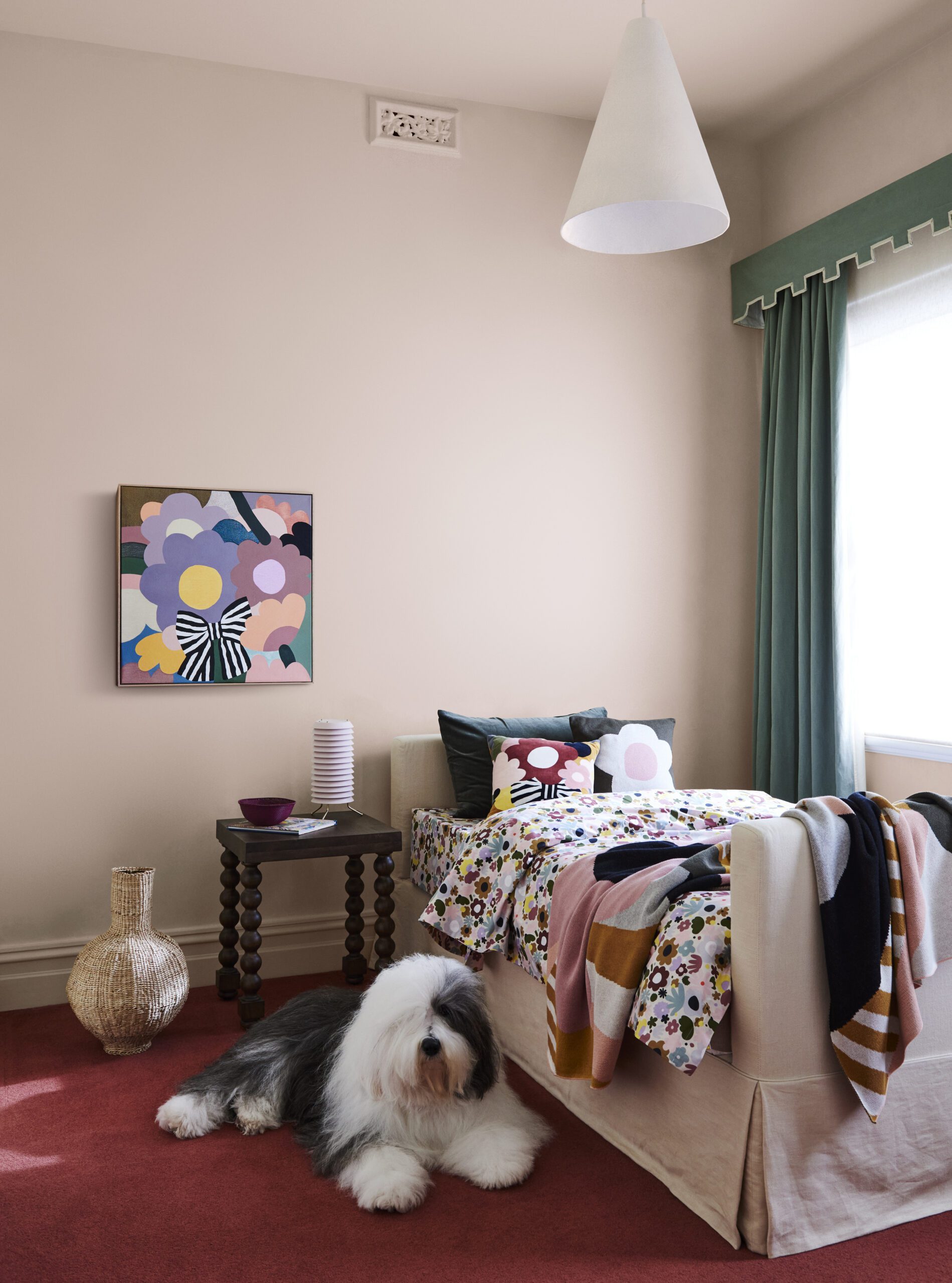
The Dulux Muse palette is as evocative as it is joyful. Comprising hues predominantly within the mid-tone range, it celebrates iconic designers and design details from the 1960s through to the 1980s, with a particular focus on 1970s glamour.
Muse is bold, expressive, and strikes the perfect balance between the colours of postmodern interiors and the emerging hues of contemporary design — it is a palette that at once pays homage to the past and leaps forward with joy at its heart.
Heavily influenced by the nostalgia of the postmodern era, Muse is a celebration of modernising the freespirited styles of the past.
“Whilst sustainability is an underlying theme for each of the 2024 Colour Forecast palettes, it’s particularly prominent within the Muse palette as we reimagine past trends with vintage pieces to create an interior that feels unmistakably contemporary,” says Dulux colour specialist Davina Harper.
“The Muse palette is a colourful array of hues predominantly in the [mid tones] with warm browns and rich tans, accented with deep blues and soothing greens, to create a distinctly modern interior that has been fused with nostalgic design references reminiscent of the ’60s to the ’80s, in addition to the textures and glamour from the ’70s.”
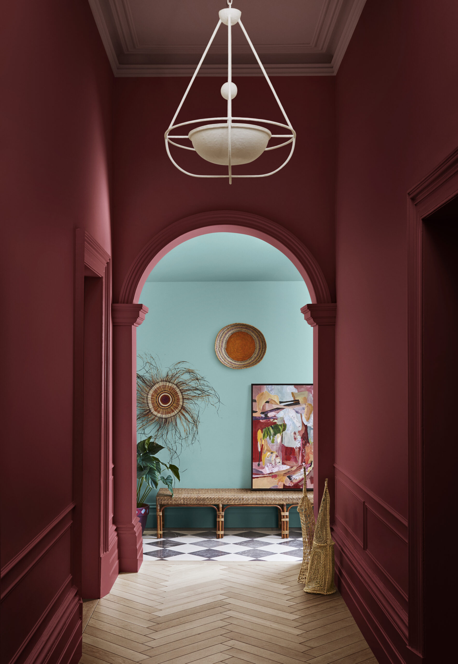
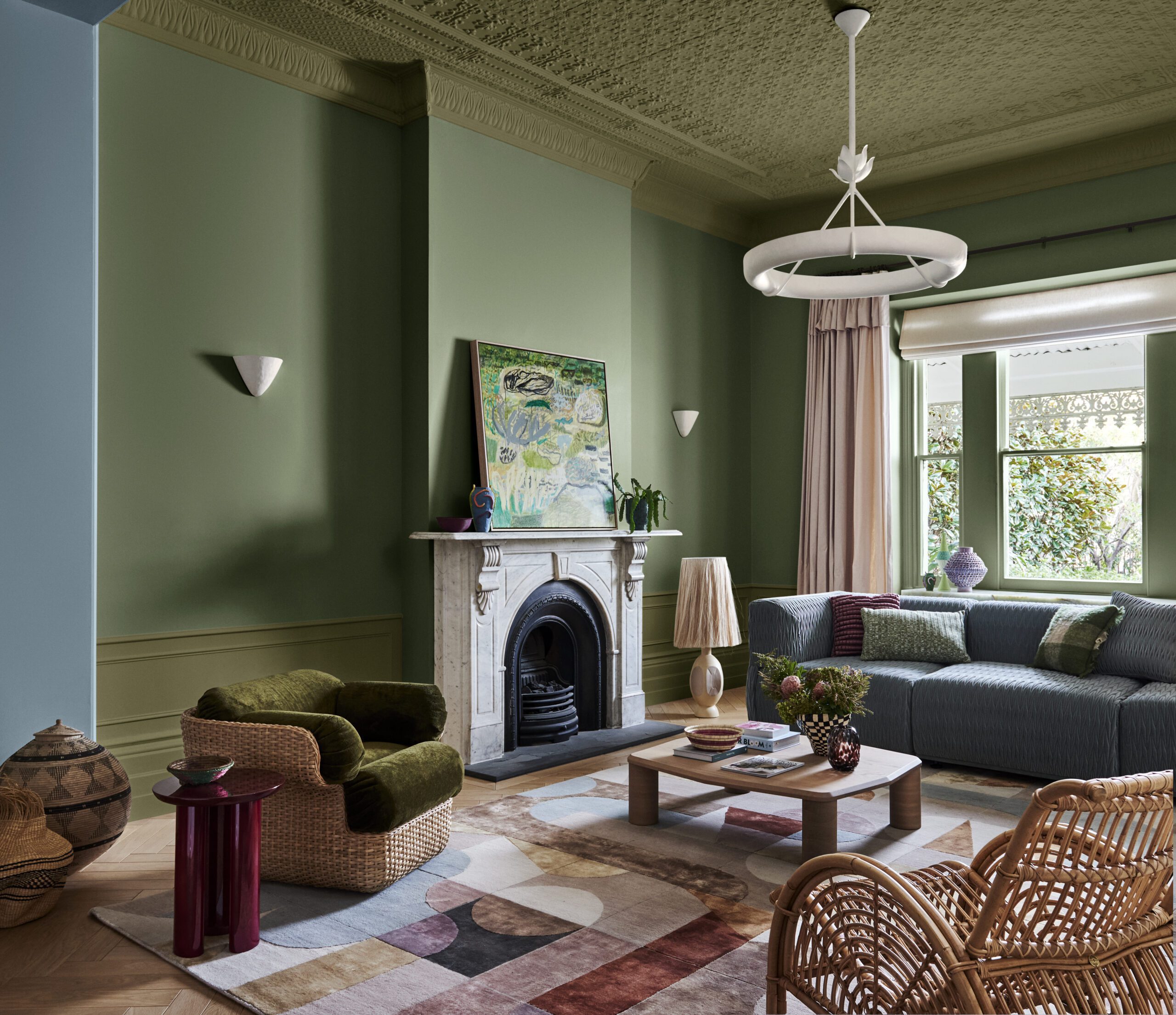
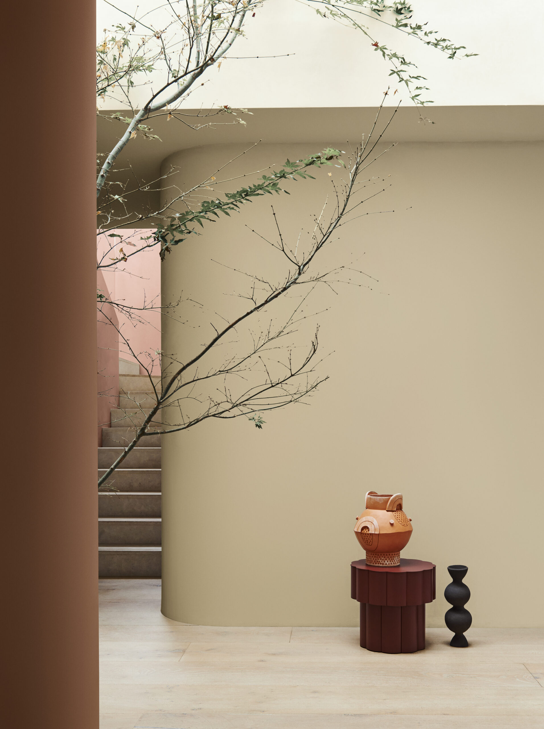
Bohemian and Maximalist: The Journey Palette
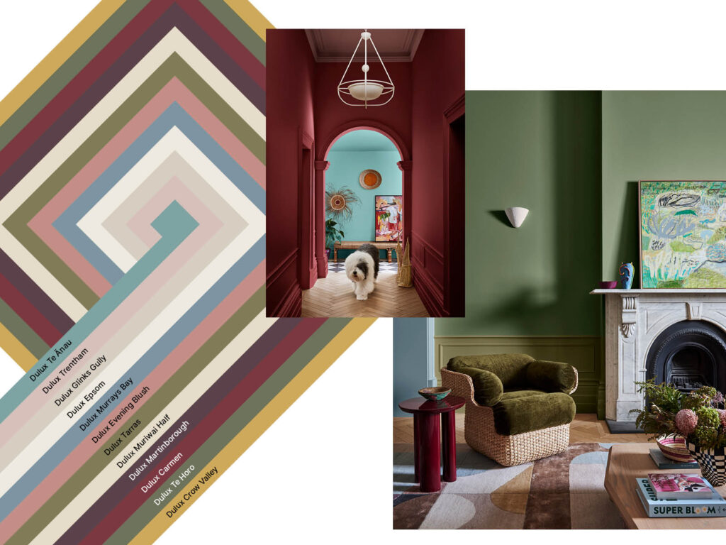
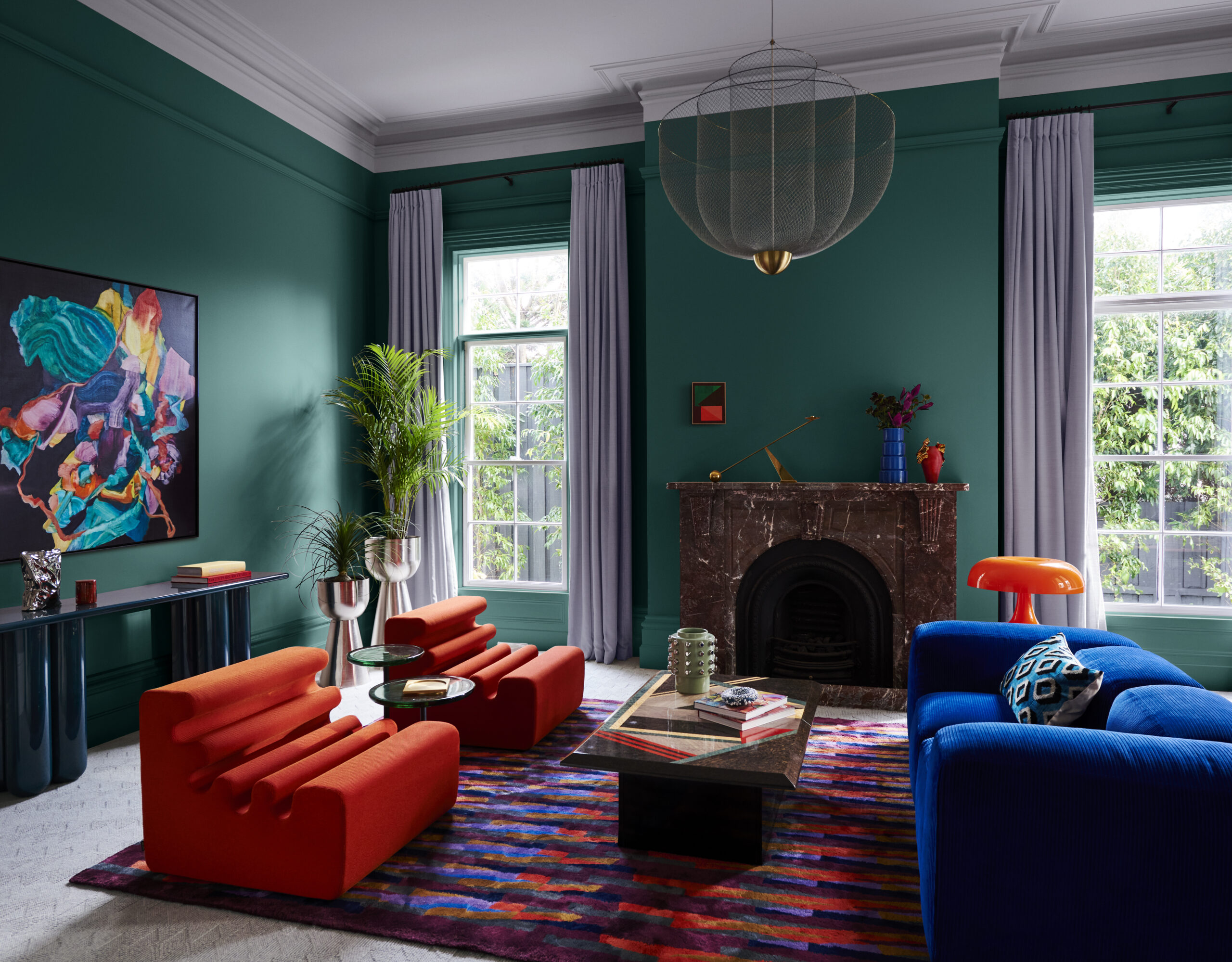
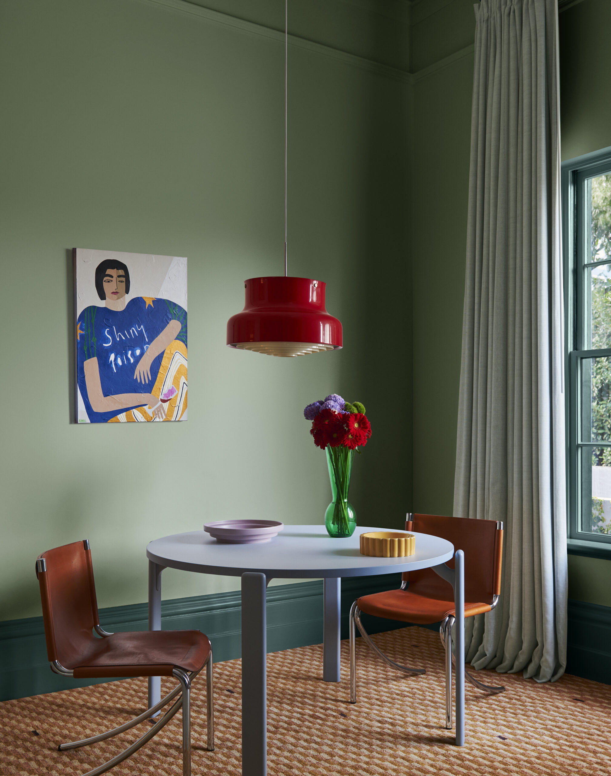
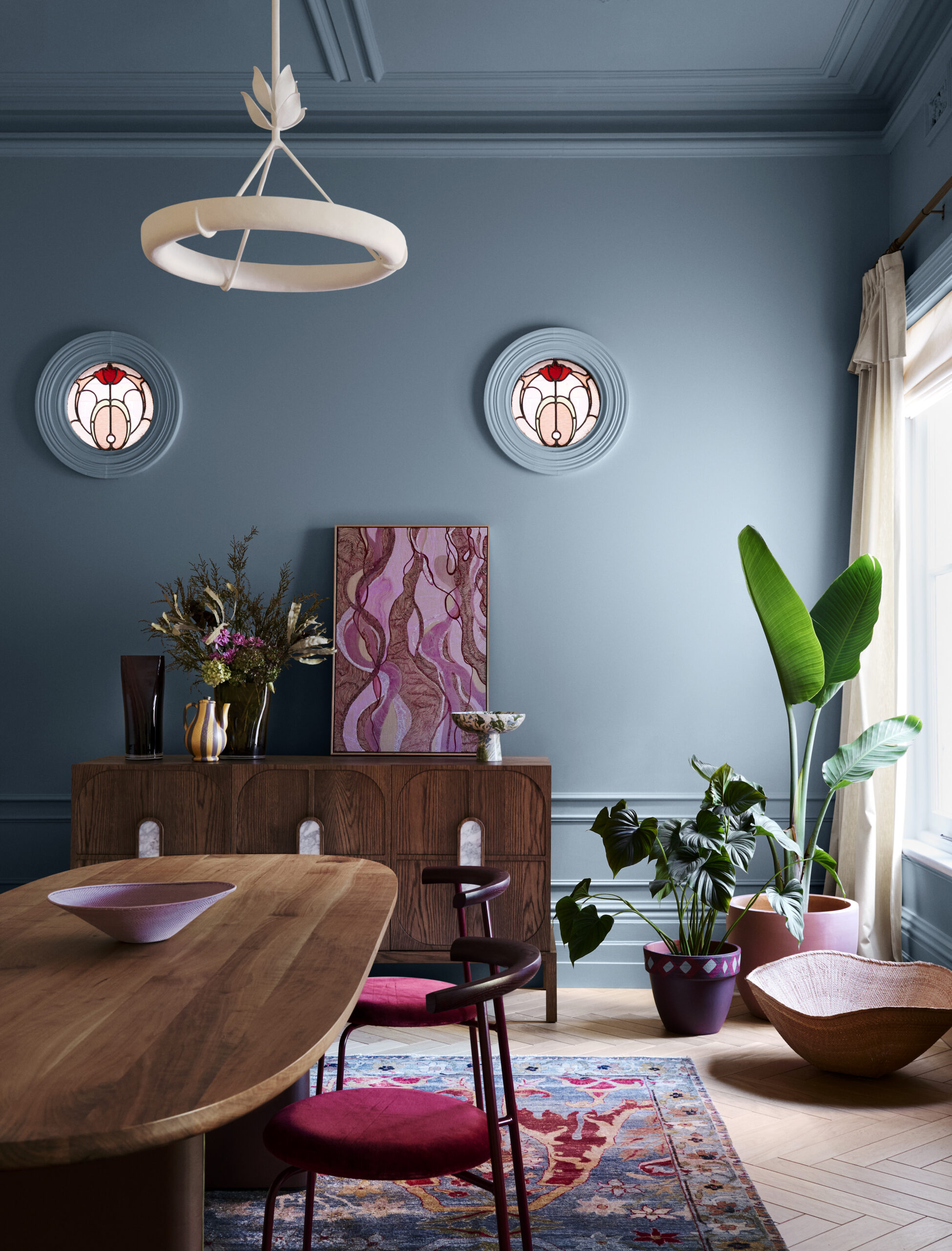
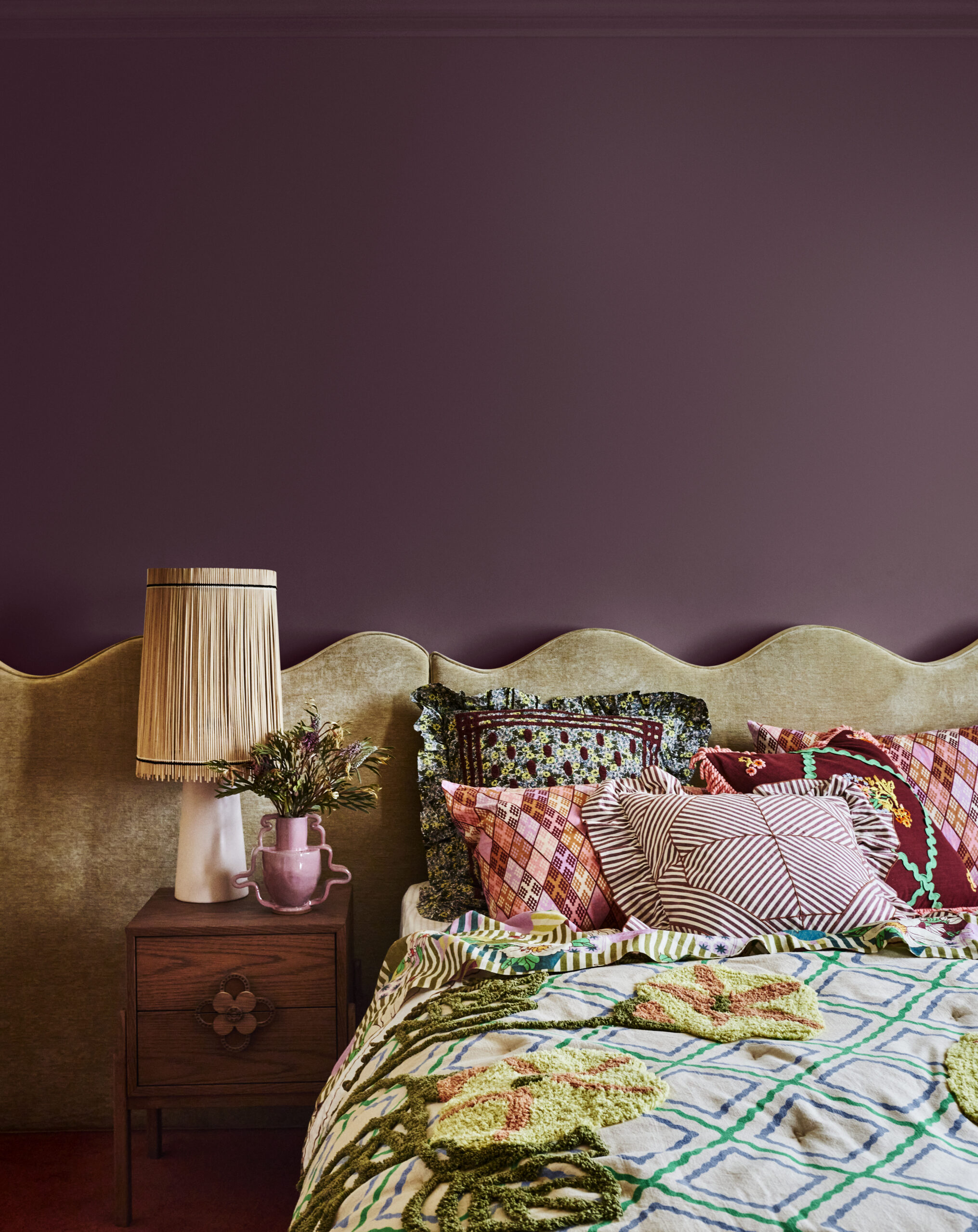
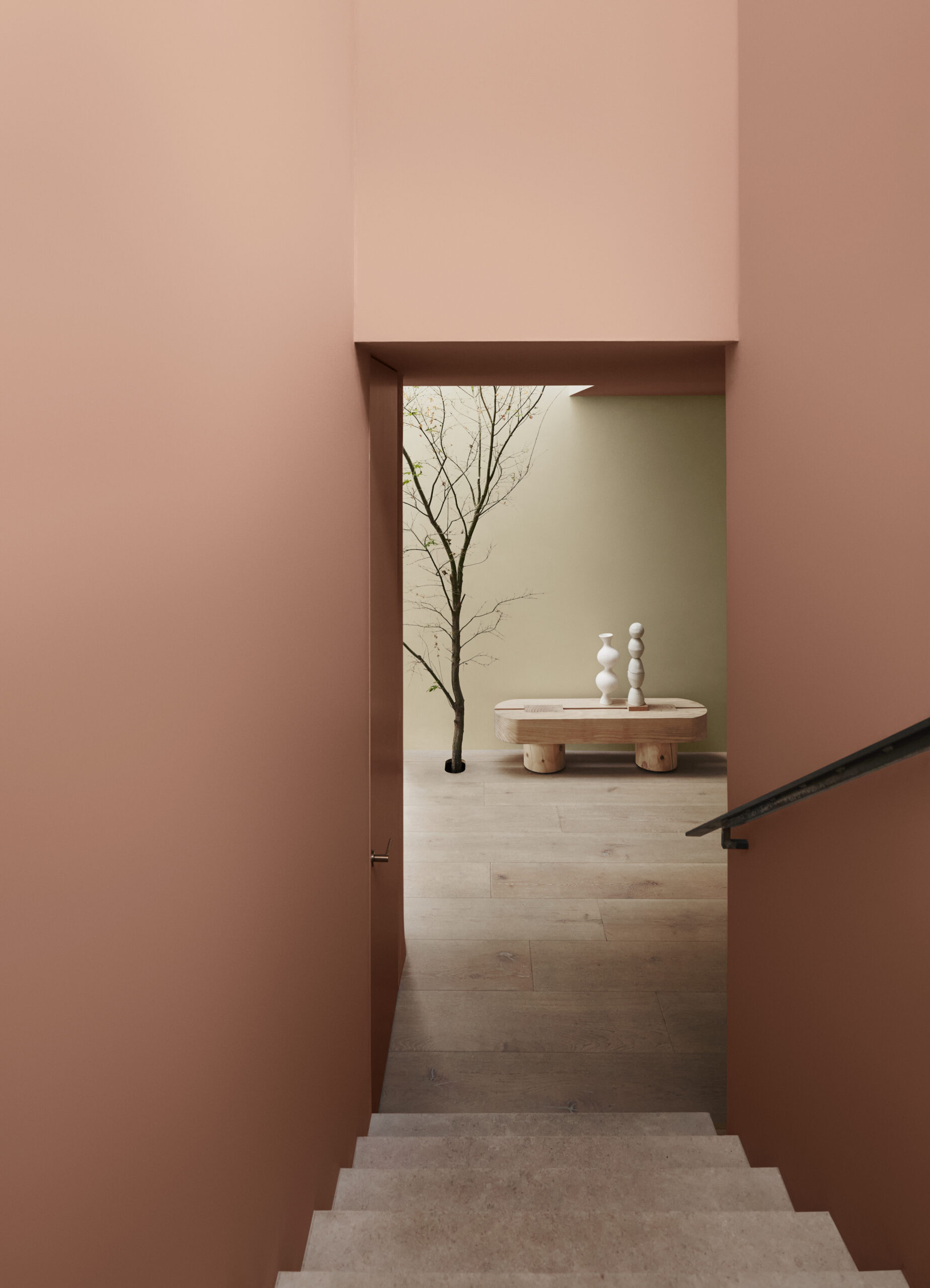
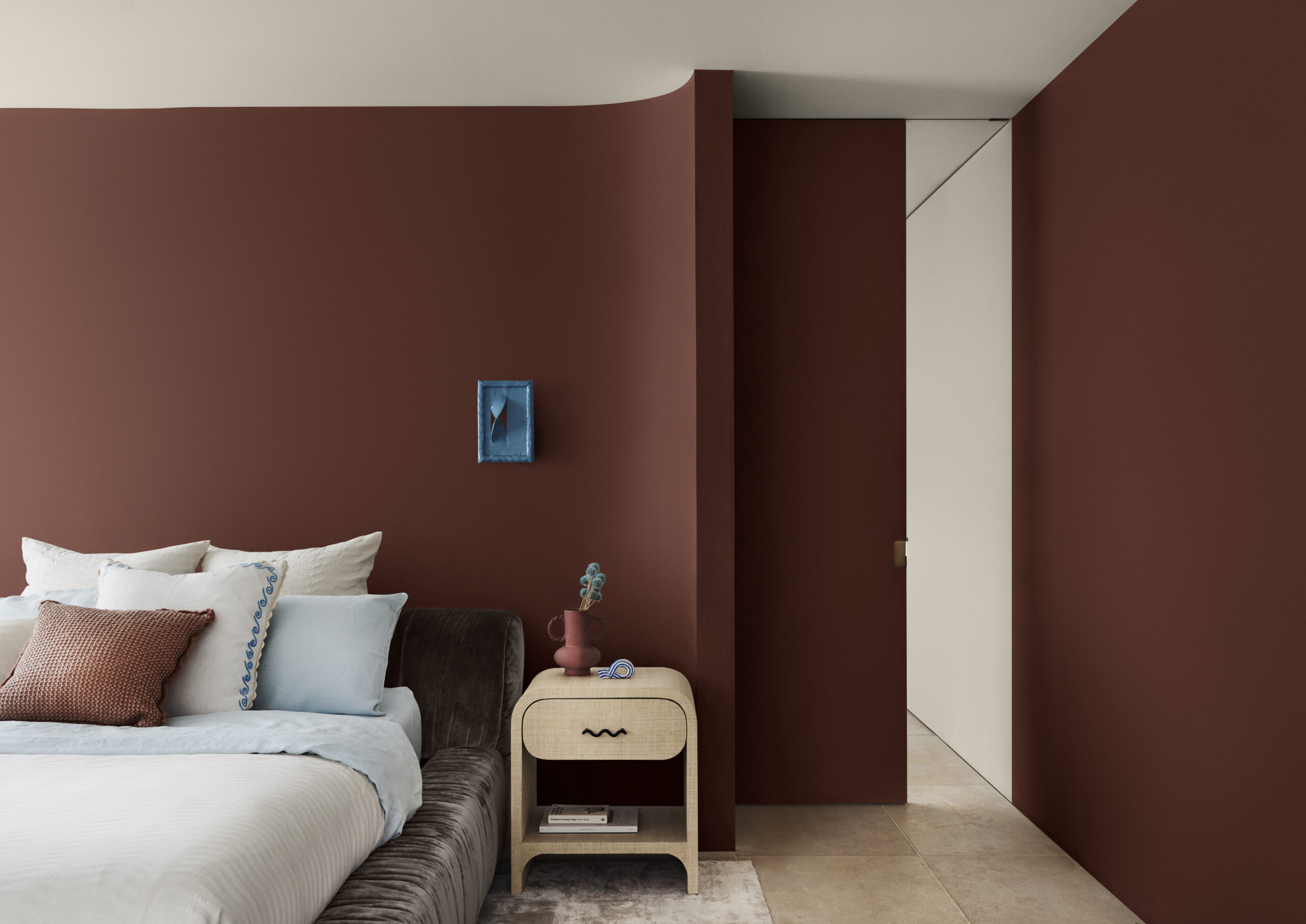
The Dulux Journey palette weaves together elements of bohemian charm and eclectic allure, and highlights the art of craft. A maximalist and pattern-heavy palette, Dulux Journey is about the story of an interior with a focus on the objects and items handed down and the rich ancestral heritage they represent.
The palette takes inspiration from our travels and cultural differences, highlighting rich mid-tone hues, yellow greens, and decadent reds for contrast.
“At its core, Journey celebrates the art of storytelling, where mythical iconography and cherished folk aesthetics find their rightful place, adding layers of depth and colour,” Davina says.
“Olive greens and pale yellow are prominent shades within our Journey palette, with dusty blues and rich burgundy acting as accents within a mix of faded and soft-textured furnishings and handmade pieces, including painted wicker.”
Similar to the rich and diverse tapestry of our own lives, the Journey palette beckons you in with an overarching warmth. Incorporating yellow greens such as Dulux Tarras and Dulux Te Horo, and blues like Dulux Te Ānau and Dulux Murrays Bay, alongside rich decadent reds and plum, including Dulux Carmen and Dulux Martinborough, for contrast, Journey is just that — a voyage through hue and sentiment.
Furniture and fabrics are heavily patterned and textured. In living spaces, time-worn rugs are adorned with geometric shapes, wicker chairs are softened with plush velvet, and woven vessels picked up from travels or passed down through generations create interesting focal points.
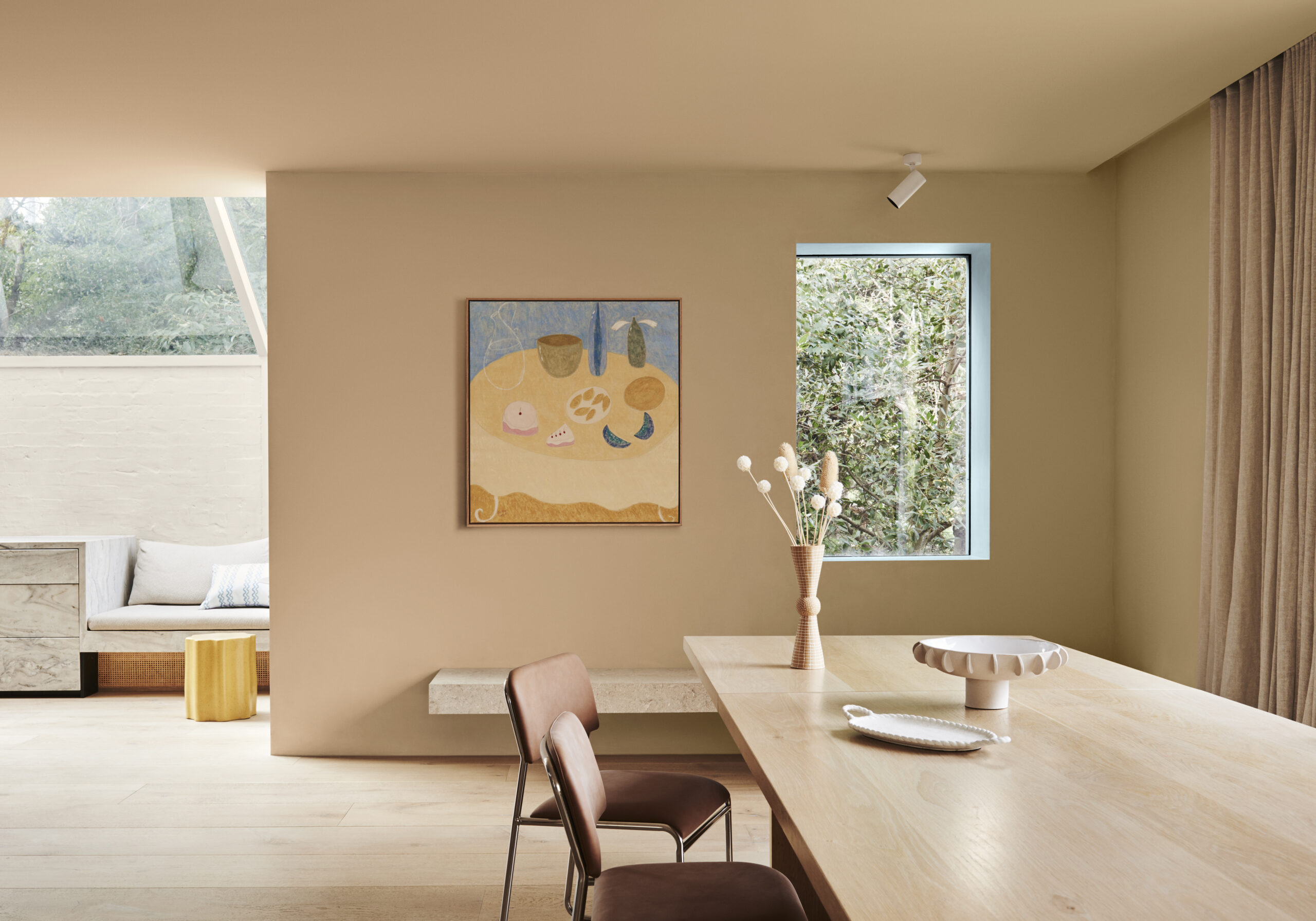
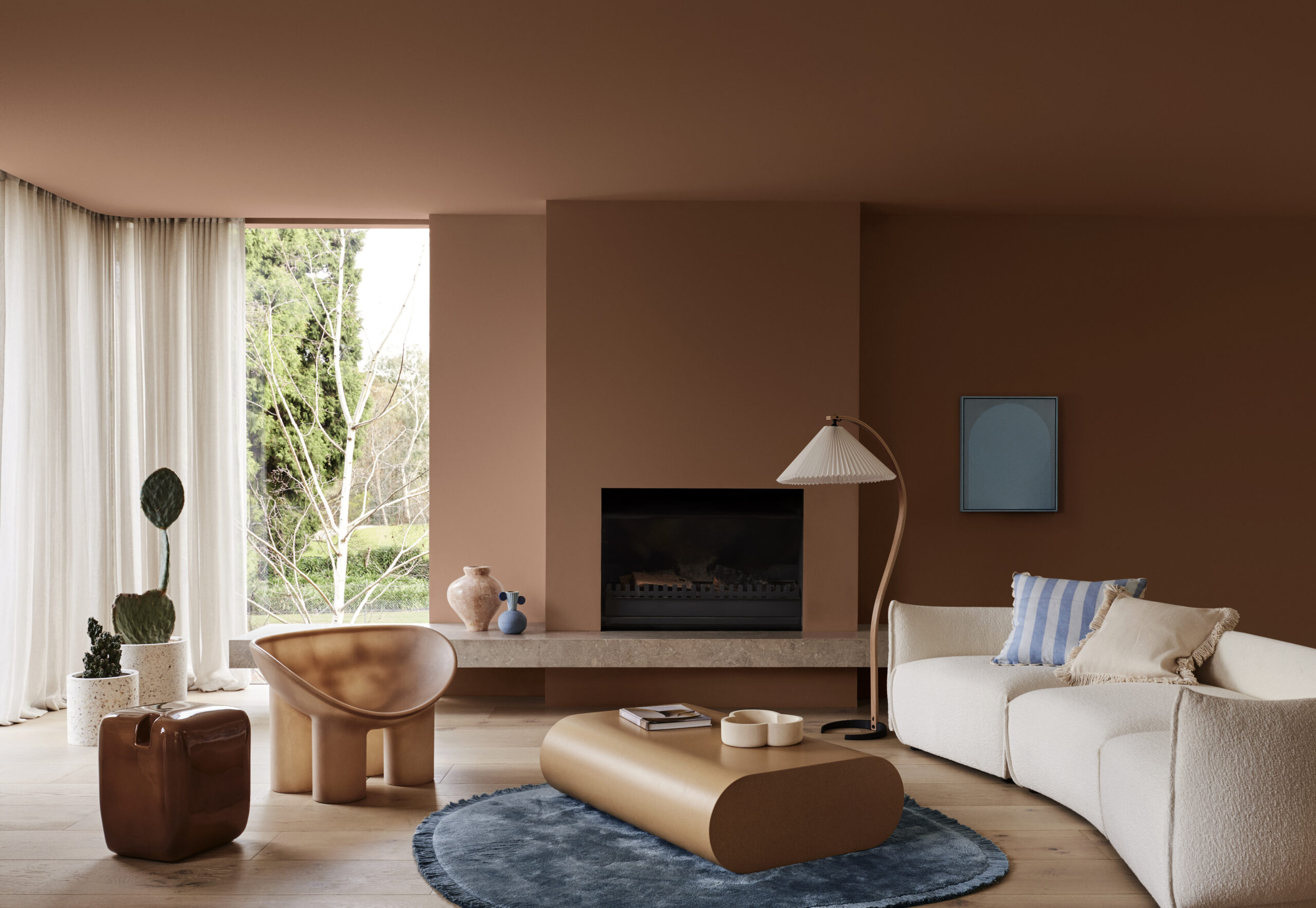
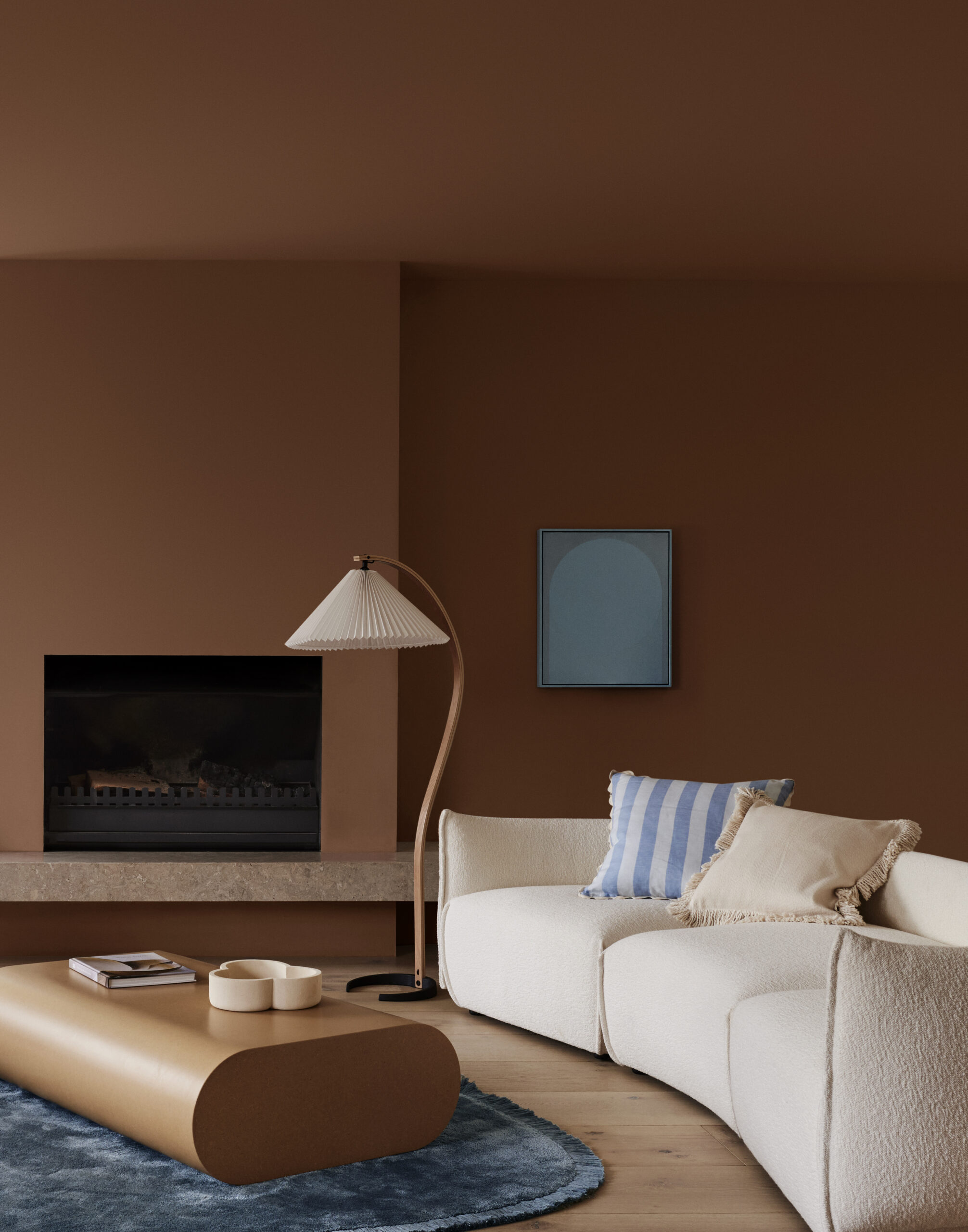
Sun Soaked: The Solstice Palette
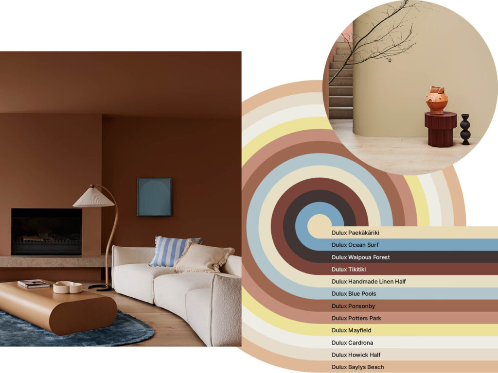
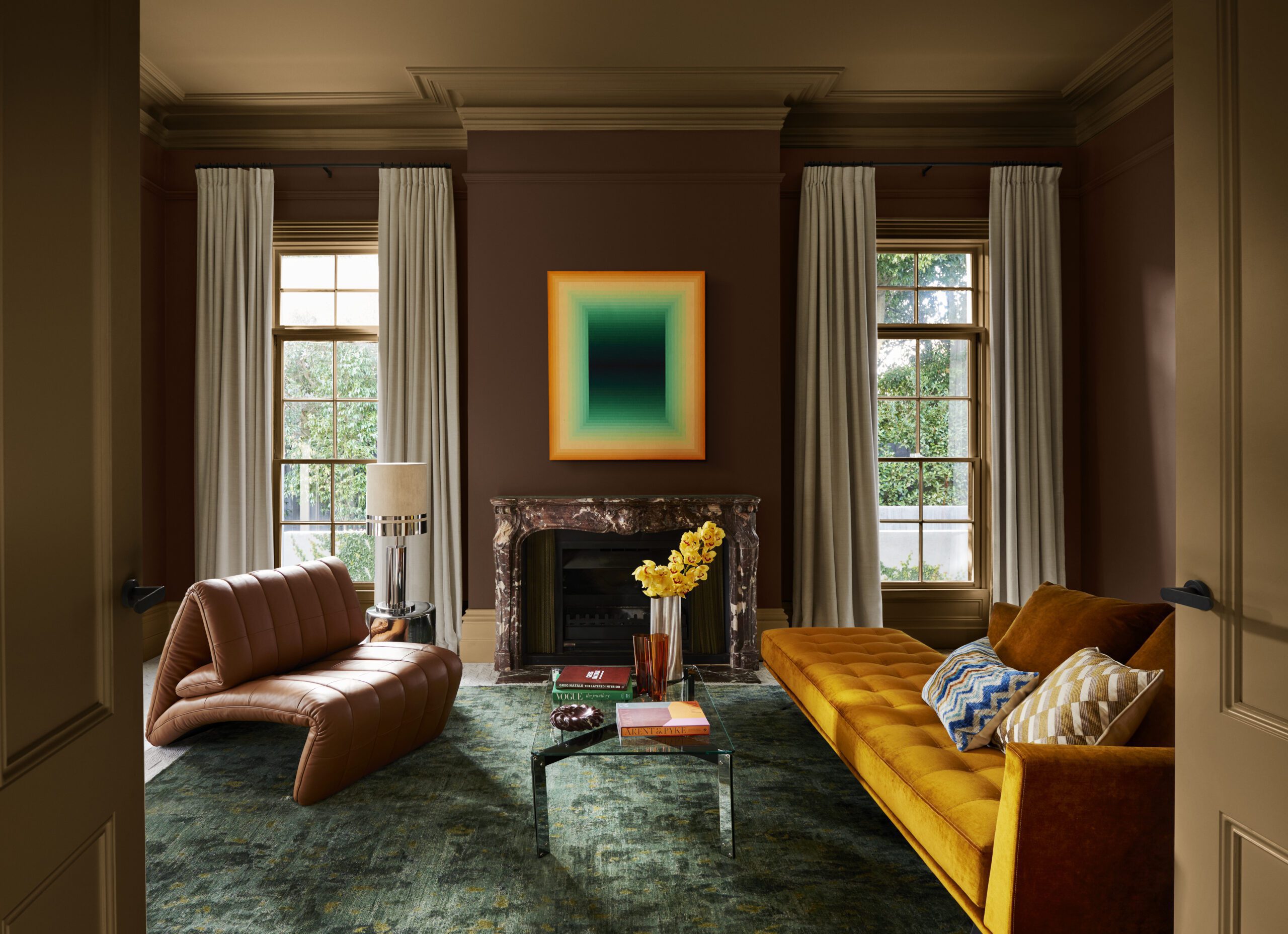
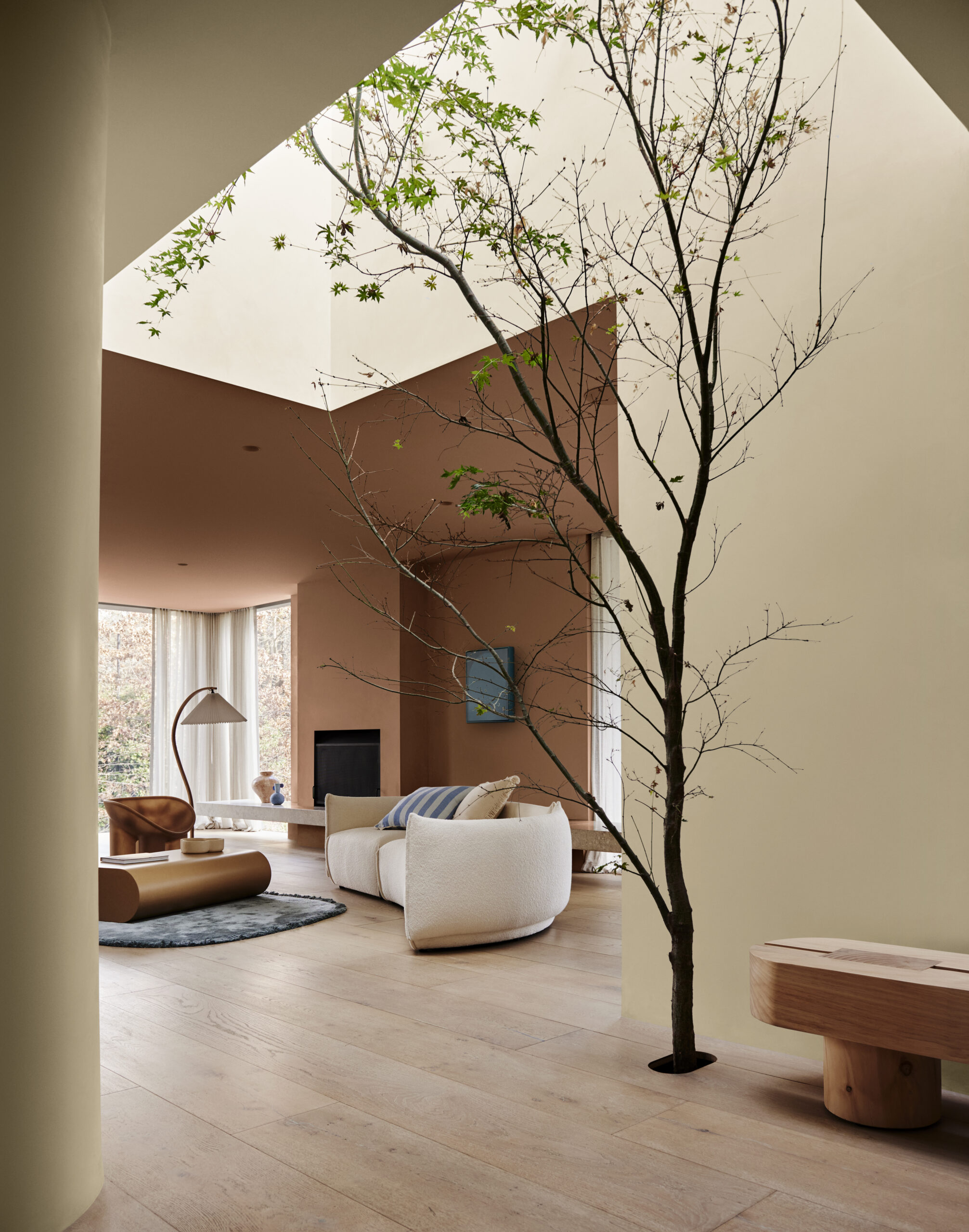
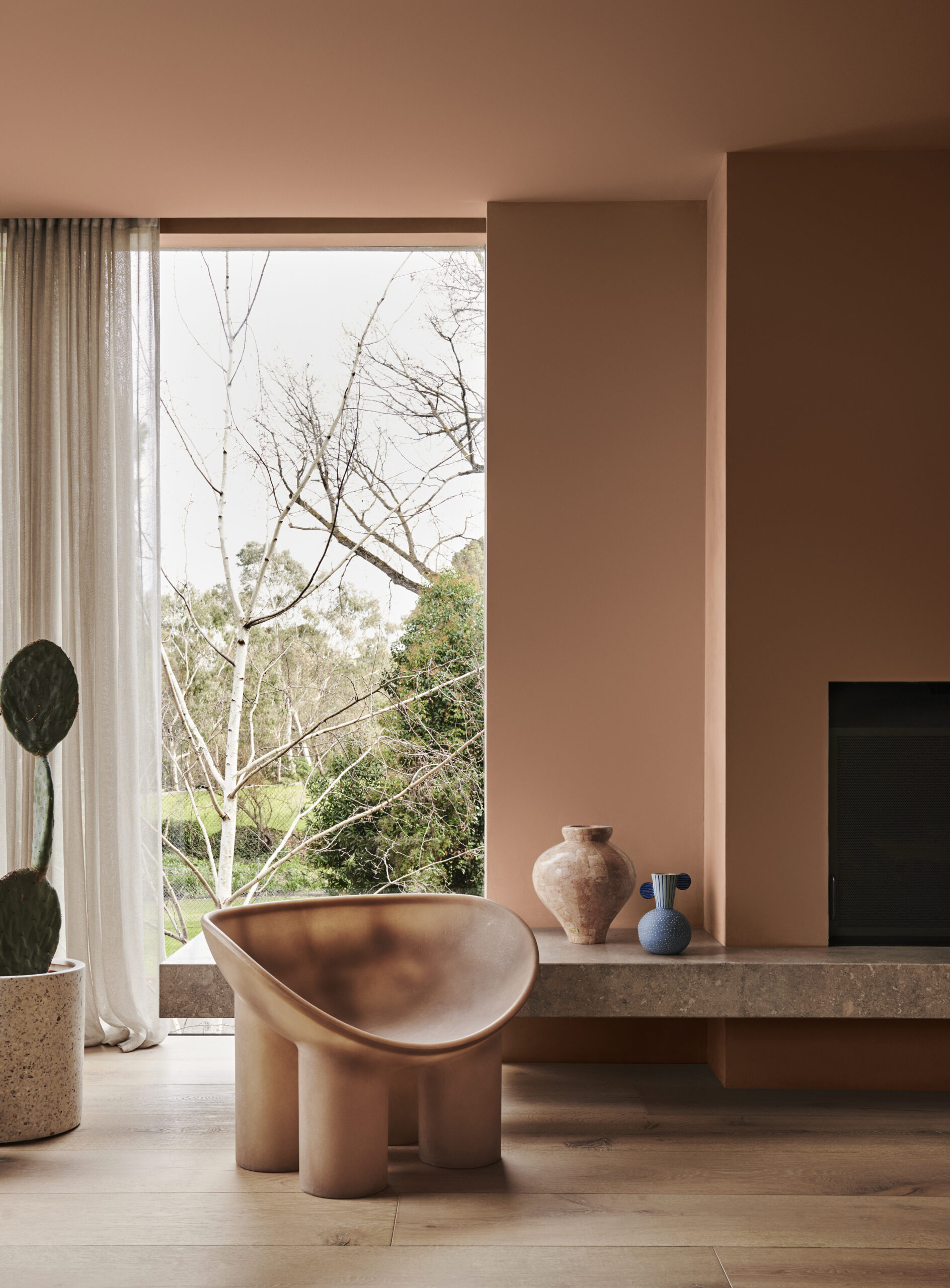
A melting pot of Mediterranean, Scandinavian, and African influences, the Dulux Solstice palette connects to the sun as its life force. It is a warm and reflective palette of rich browns, clay, and warm neutrals, with a sun-loving yellow as an accent.
Walls predominantly feature clay-brown shades with red undertones, such as Dulux Ponsonby and Dulux Potters Park, and golden neutrals such as Dulux Baylys Beach and Dulux Handmade Linen Half. Creating a sense of comfort, these sun-soaked shades are adorned with accents in lighter blues, including Dulux Blue Pools and Dulux Ocean Surf, and zesty yellows like Dulux Mayfield.
Design details are tactile, with furniture and sculptural-style decor featuring raw and unfinished materials, including concrete, terrazzo, terracotta, clay, and lava stone. Details inspired by Grecian motifs result in vessels resembling urns and braided features in textiles. Hard surfaces are softened using highly textural fabrics with imperfect slub effects, and tactile suede and velvet. The addition of high-pile carpets or rugs that feature tassels and fringing invites you into spaces to wind down and relax.
“Sun-soaked neutrals are influenced by a soft orange glow and paired with softer shades of pastel blues and citrus yellow — Solstice embodies a harmonious blend of cosy and calm styling elements, with captivating material highlights like natural stone, ceramic, and highly textured fabrics,” Davina says.
According to stylist Bree Leech, Solstice starts with inspiration from the pared-back Scandinavian design style but adds a Mediterranean and desert influence.
“From the Australian outback to the African savannah, the palette brings together warm colours with cooler accents and tactile details.” she says.