Bonnifait + Giesen design a house in the vines at Te Awanga with places to work, places to socialise – and places to do both
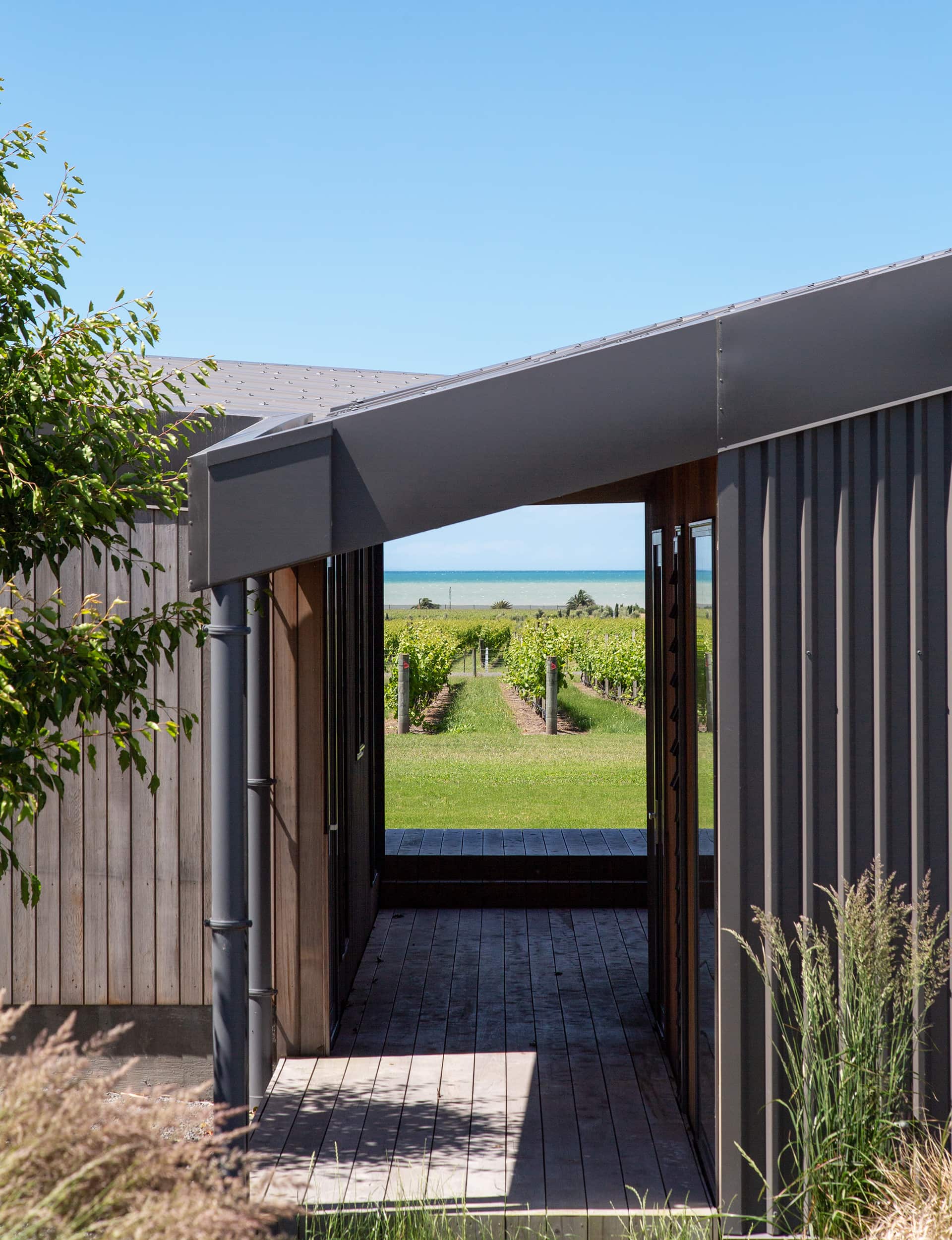
Take a look at the Te Awanga house of Catherine and David Robertson on Google and one thing jumps out at you immediately. Where its neighbours all face diligently north, angled on their axis like obedient little stones, outdoor living areas on the northern side, the Robertson house has a subtly different orientation. It faces square down the neighbouring vineyard, perfectly orientated to the implicit grid it creates. The view funnels through the vines to the sea; to the south is a sheltered courtyard. “The idea was to capture the sea view between the rows of vineyard,” says architect Cecile Bonnifait of Bonnifait + Giesen.
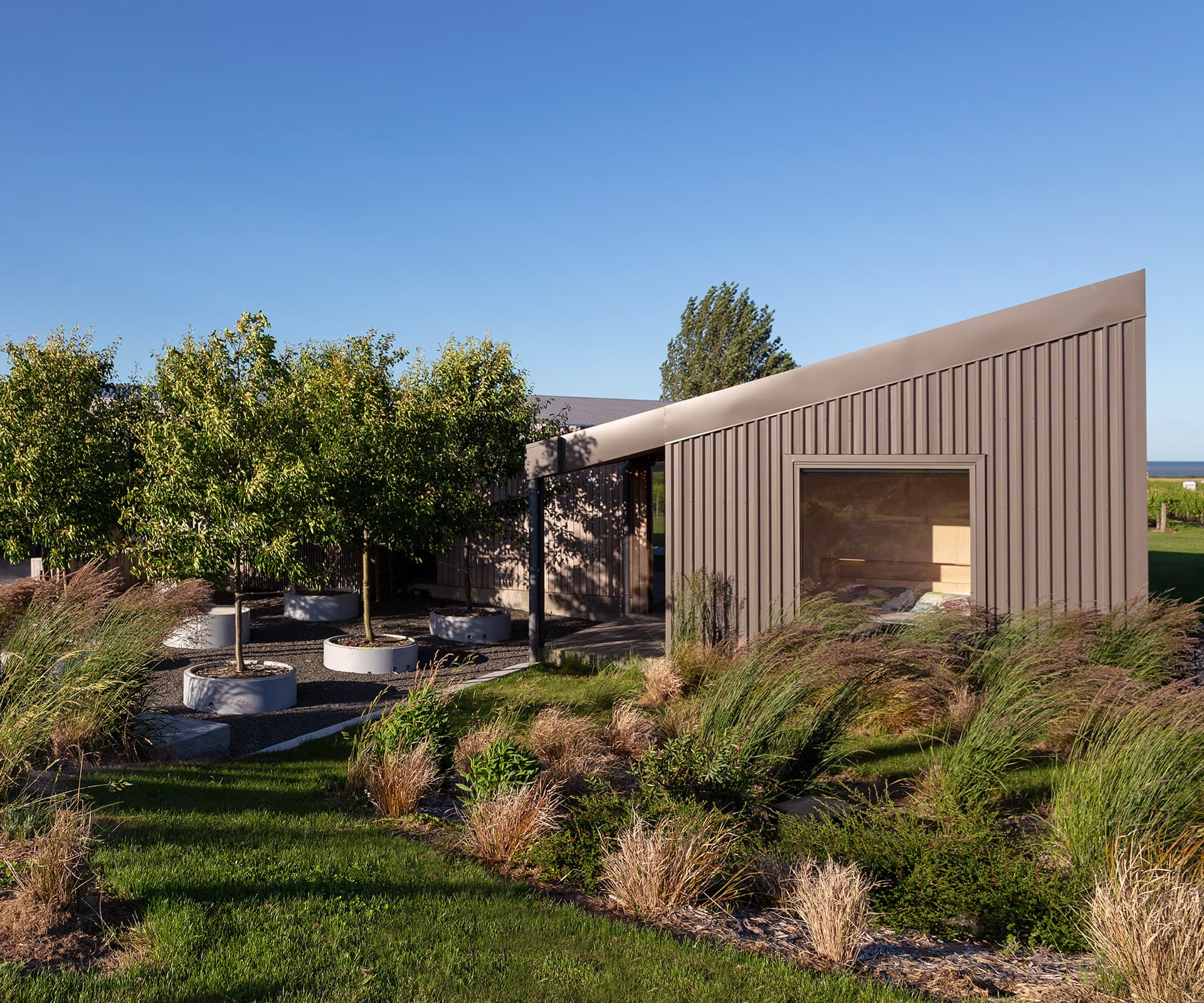
The Robertsons bought land in a farm-vineyard development in 2015: a large building plot overlooking neighbouring vines, with strict covenants including a four-metre height limit and a prescribed building platform – moves designed to protect the sea view for houses on the slight rise behind. For Bonnifait + Giesen, these design moves added to the appeal. “We liked the low profile,” says Bonnifait.
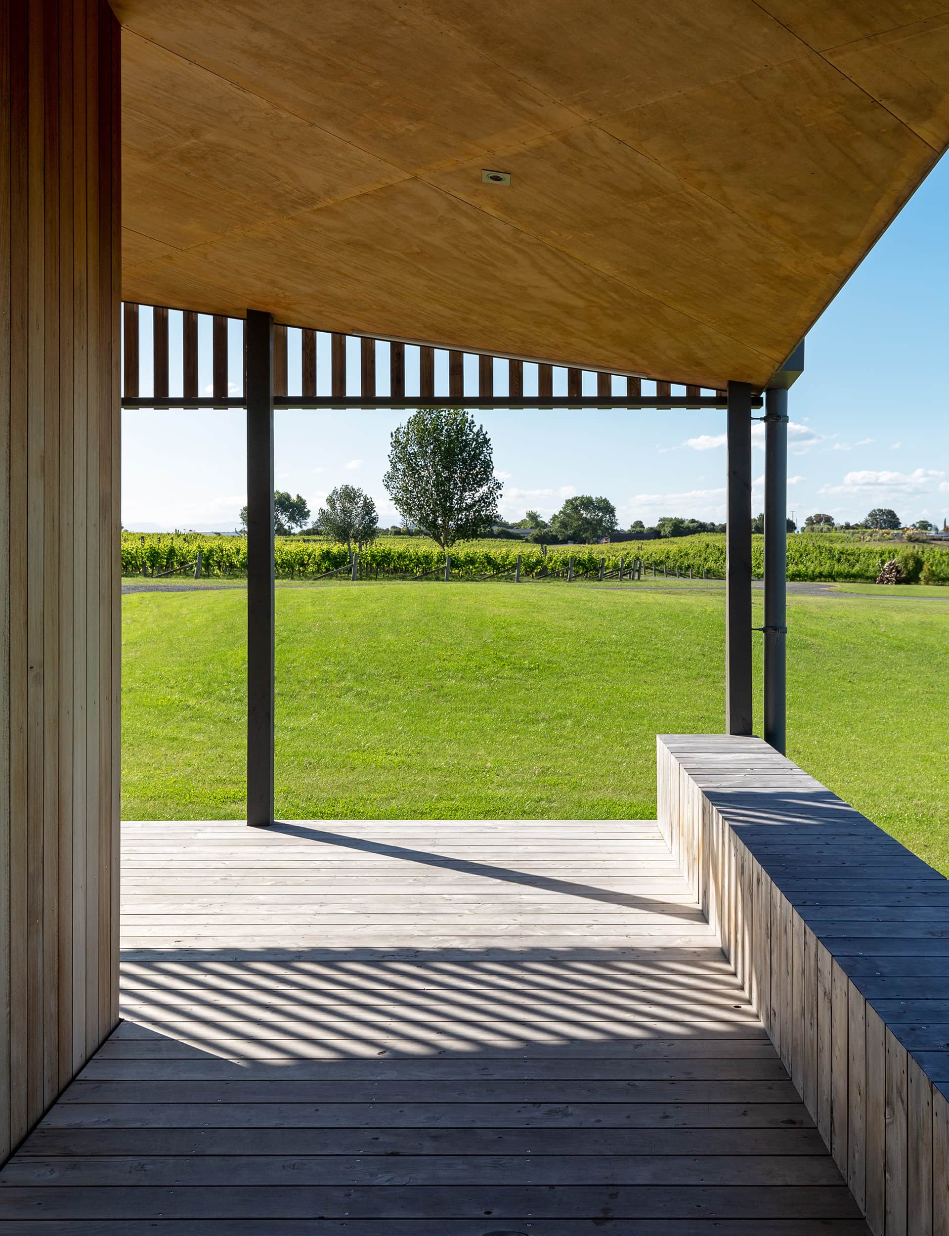
Approach the house from the road and you don’t see much more than a long, low gable of grey corrugated steel and cedar cladding, which is slowly silvering off. It’s obviously a rural building, both roughly hewn and crisp, with a lot going on. Viewed from the front, there’s a long, low gable and a generous verandah. Look at it from an angle and two gables meet in a particularly dynamic way, the roof line rising and falling, draping high over living areas before pulling down over bedrooms, a writing studio and bedroom at the far end, reached down a couple of steps and across the verandah.
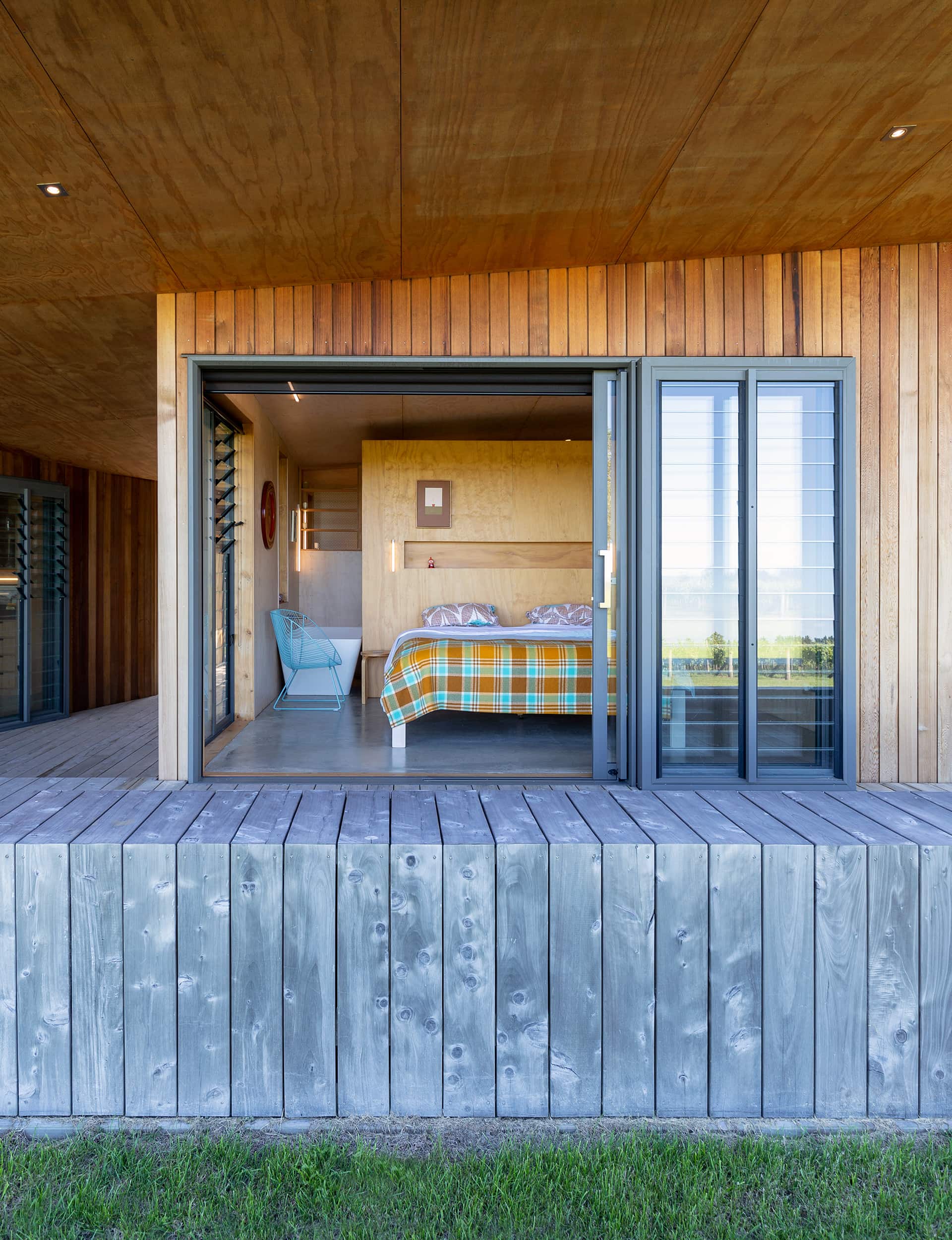
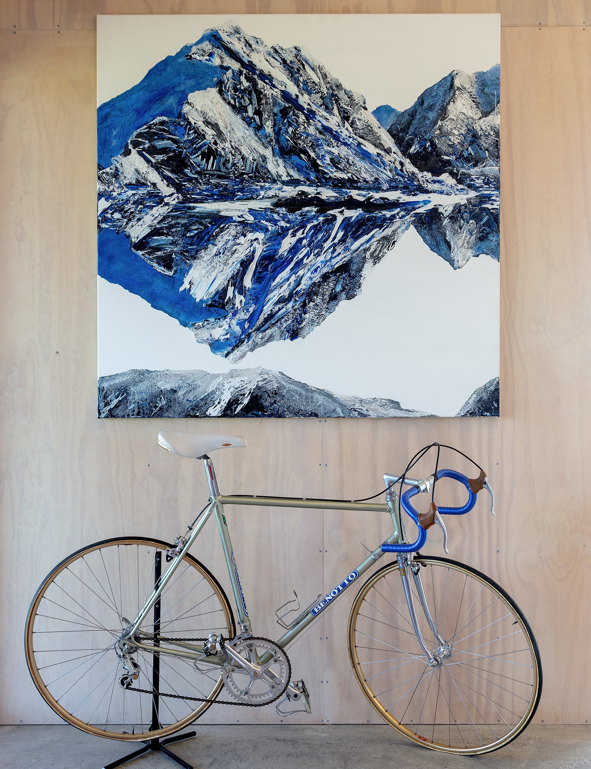
The Robertsons had a basic brief: three bedrooms, a writing studio, and a workshop for David who is a keen cyclist. Although they’re still based in Wellington much of the time, they’ve been moving to Hawke’s Bay for longer and longer periods. Eventually, it will be their permanent home, with spaces to socialise, and places to work – and places in which to do both. In a particularly charming move, the architects located the bike workshop off the back deck, with a glass garage door connecting to the courtyard, while the writing studio has a desk set in a large corner window, rather like the prow of a ship.
The determinedly rural building is approached via a deep, enclosed porch, which leads onto a generous entrance with plenty of room for boots and jackets. From there, a long hallway runs the length of the building, a line of floor-to-ceiling windows giving views onto a gravel courtyard planted with a square orchard of apple trees. To the right of the entry, a workshop and garage; to the left, a lofty open-plan living area. Further along, two compact bedrooms have pulled-down corners, snug bathrooms and built-in furniture. Straight ahead and across the verandah is the writing studio.
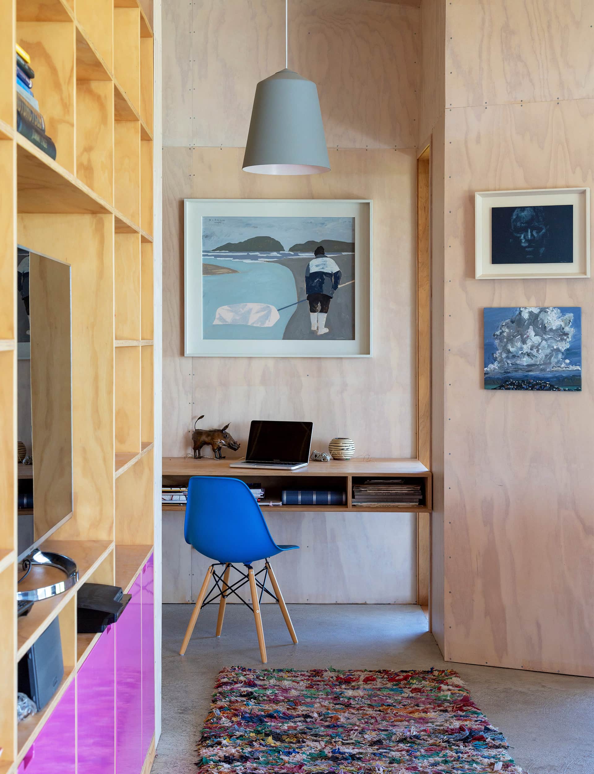
Internally, the house expresses two quite opposite ideas. Bonnifait + Giesen had designed a house nearby that’s lined entirely with plywood and has polished concrete floors – the architects have employed a similar stripped-back approach in a number of projects for both aesthetic and financial reasons. It lends a robust, almost utilitarian feel inside, though not a raw one: the corners are carefully mitred, the nail holes neatly made. It’s also high-performing, with thick 140mm walls, extra insulation and a ground-source heating system that keeps the place snug and warm year-round.
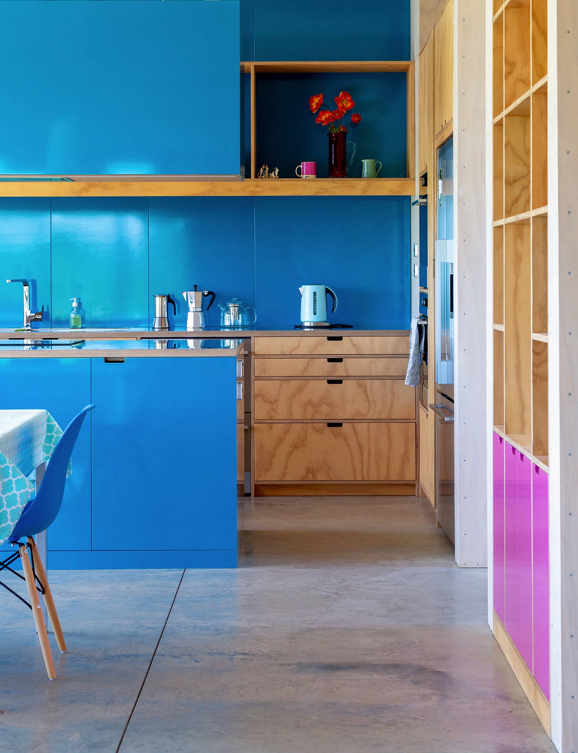
That reduced background is offset by punches of high-gloss pink and blue, which are best described as wild. They pop up on cabinetry in the living area and kitchen, and on bedroom doors – a glossy, bright contrast to ply and concrete. Catherine loves colour: the first time the architects met her, she was brightly dressed and driving a yellow car; the blue worked its way into the project reasonably quickly. Towards the end of the build, David got in touch, asking for something to offset the blue. Maybe pink? “And I said, ‘Do you mean pink pink or pink pink?’” recalls Bonnifait. ‘And he chose the most pink of all.”
The effect is startling: in the hall, pink bounces the light around. In the living area, it offsets the blue as was the intention. It’s a brilliant counterpoint to all the wood inside, and all the green outside. “It shows their personality, like a house should,” says Giesen. “They’re not beige and brown people. And that was fun.”
Words by: Simon Farrell-Green. Photography by: Russell Kleyn
[related_articles post1=”90710″ post2=”57032″]

