All too often we celebrate the new, yet little compares with the elegance of a venerable design that has stood the test of time and aged handsomely.
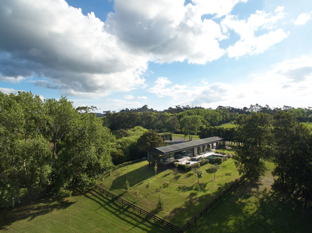
Tim and Alison Hay first occupied this home around 15 years ago. They had bought the site in north-west Auckland three years earlier when it was an old orchard with a number of paddocks. Tim, one half of the leading architecture practice Fearon Hay Architects, explains that they wanted something in the countryside, but close enough to the Fearon Hay studio in the city. The organisational elements that informed the planning of the house came naturally due to the richness of the site. The house sits within what was the shelter belt, testament to the grids and lines of the orchard, and is bordered by a stream on the boundary of the land, which wraps around the house.
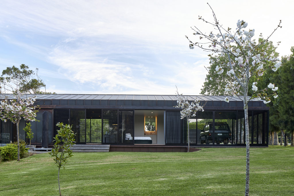
Hay says that some of the early ideas for the house included a classic roofline and a building with length. “That was in my head early … the idea of using the length to provide a sense of projection and quite a strong idea of how the living spaces would be planned out along that length.” Hay was also interested in a building that played with being grounded at the arrival point, with the ground falling away under the building as you reach the far end — similar to a wharf structure. He elaborates, “It’s a little bit nostalgic … the very long linear sheds on wharfs and how they are set on poles, and the idea of the ocean and its tides moving under the building; the landform here did that.”
Today, the house reads as its name suggests. It is a long, narrow, single height, rectangular form that has been thoughtfully positioned on the orchard site. It sits gracefully, yet with strength, on the land. The house has a simple, pitched roof clad in copper standing-seam profile. The same material drops down the building towards the land to form the exterior walls, providing a “strength of one proposition — the idea of length and material all being quite singular”. The final form of the house is grounded upon arrival and then floats over the land that drops away at the far end, giving a “lovely sense of ground falling away from you — a sense of suspension in the valley”.
The exterior of the building has aged beautifully. Hay explains, “The material choices were something we took a little bit of time to settle on, but we haven’t regretted it.” The dark tone of the building in its green setting is striking, despite there being some initial nerves about the choice. “When it went up, it was quite bright. I was nervous on the first day that it wasn’t going to achieve the result that we wanted, but actually about within a month it was 80 per cent to where it is today.” The “dark and brooding” length of mass is layered and juxtaposed with dark, fine, metal shutters over the generous areas of glazing that were conceived with the “idea of filtering light”. The spaces that make up the home under the overarching roof element are planned simply, thoughtfully, and with elegance.
After an approach via the rural-feeling loose-gravel driveway, the 98 arrival point at the home is a large covered porch on the western end of the house. With a separate barn, a typical garage was not required or desired. Hay explains, “We didn’t want to have a garage door as part of the entry experience. We needed protection from the weather when it’s raining, so you can arrive by foot or vehicle under cover.” Entrance into the internal spaces is via an unassuming walkway leading to a front door along the southern side of the house. The arrival lobby and adjacent study are extensively glazed, providing wide views to the north. Turning back towards the porch is the main bedroom. To the east is ‘the gallery’, which is a long wall down the length of the house with a view at the end. It provides “a strong sense of looking and knowing you’re moving towards something but also the idea that you are very much internal in this space”.
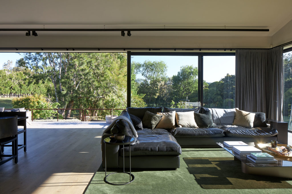
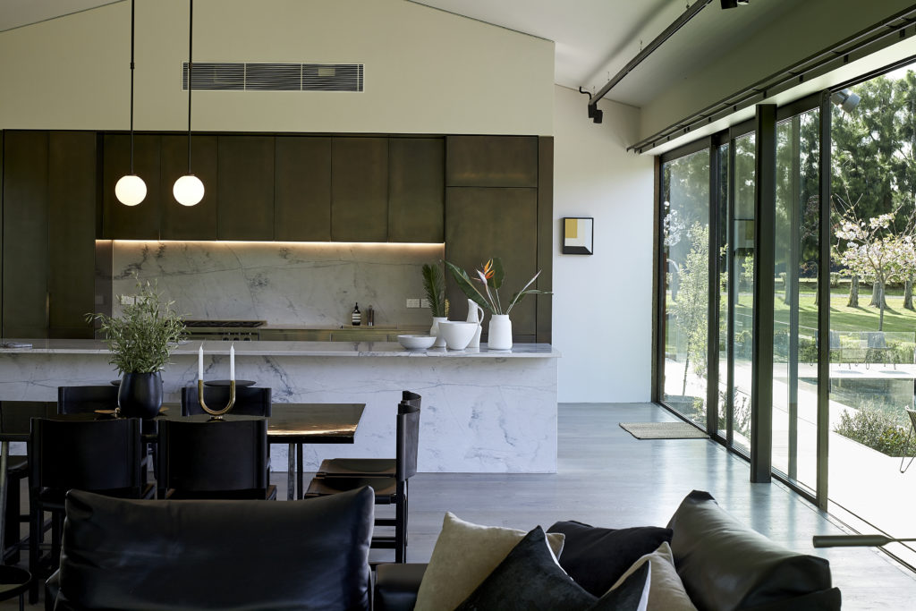
Two lobbies that form off this length are used to introduce the children’s bedrooms and the media room. A projection into the main living areas occurs at the end of the almost tunnel like length, and the space dramatically changes with the open-plan kitchen, living, and dining areas taking up the entire footprint. Large floor-to-ceiling panels of glazing wrap around most of the wall area, and the land beneath has now dropped away under the house and “you are hanging out over the valley”.
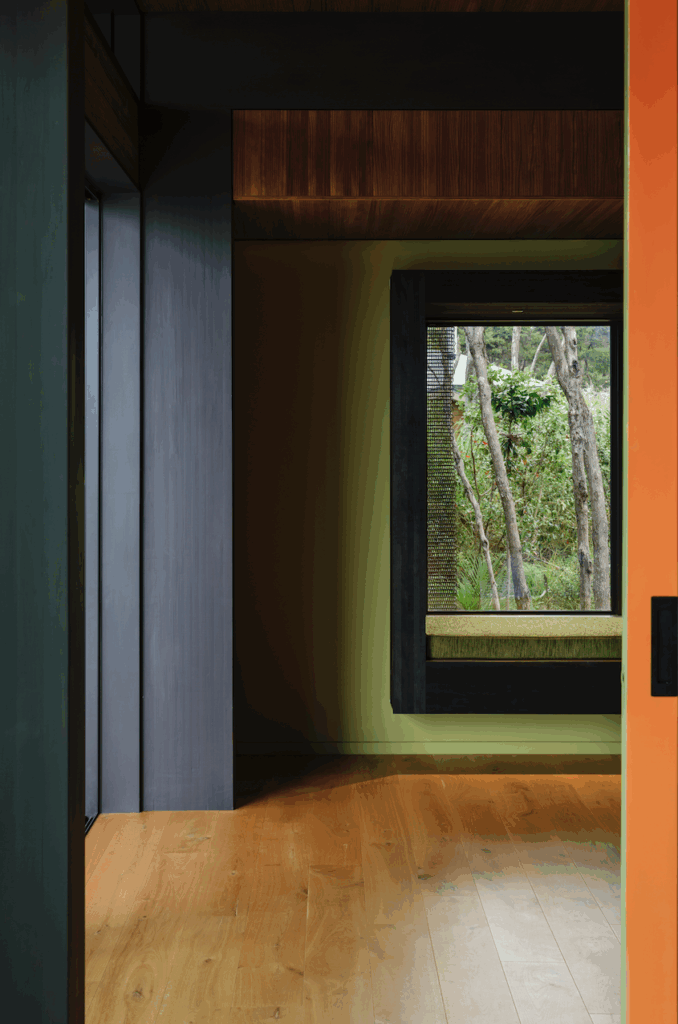
Hay tells us this is a special part of the home. “[This is] where we have our fireplace and lounge area and, on a winter day with a storm outside and the trees blowing, that’s my favourite time. There’s a sense of projection into nature … it’s a special place.” T he atmosphere inside the house differs from the darkness and solidity of the exterior. You move from the transitional space of the arrival lobby — clad in blackened cedar — to the gallery with its light French oak floors and light plasterboard walls, and then into the living area and kitchen, which gives a tasteful nod to the exterior with brass-lined cupboards. Landscaping — particularly the timber decking and swimming pool to the north — is bedded in and works effortlessly with the spaces it serves internally.
The home has been a success in the richest way possible, gently and calmly developing over the past decade and a half. “We’ve developed the use of the house a little from the original conception of the two of us using it to kids now,” Hay reveals. “It has been a project that, unlike some of our other houses, which are all done in one stage, has been developed over a period of about 14 years.” Now that is a testament to good design.
