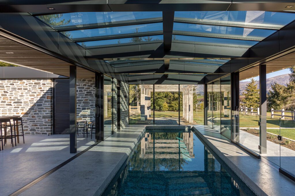
Architect Tony Koia let this house take its own form — from the immediate landscape, the views, and the mountains and lake in the distance.
There’s nothing standard when it comes to Tony’s designs, although there is poetry, beauty, and an innate synergy between built and natural environment.
It’s an intentional process, in which the architect turns away from any preconceived idea or regional vernacular, and even sometimes the client brief.
“If you’re not pushing yourself outside of your comfort zone, you’re not growing,” Tony says, both of his design methodology and the way that he works with clients.
“In this case, the clients initially wanted a traditional gabled pavilion,” he explains. What resulted was anything but, and that’s because Tony’s architecture is explorative. “The site tells you what it wants to be; I’m really just the conduit to that.”
This site is located on what is arguably one of the best-known roads in the area, just outside Queenstown. Lined with poplars, it is particularly picturesque in autumn when the landscape turns into a vibrant tapestry of colour. There are views out to Coronet Peak, to the Crown Range, and back towards Lake Hayes. There are mature trees, and layered vistas in every direction.
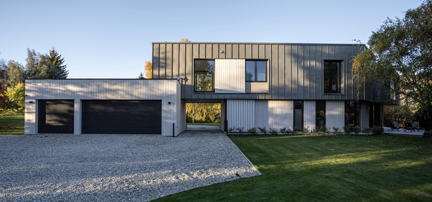
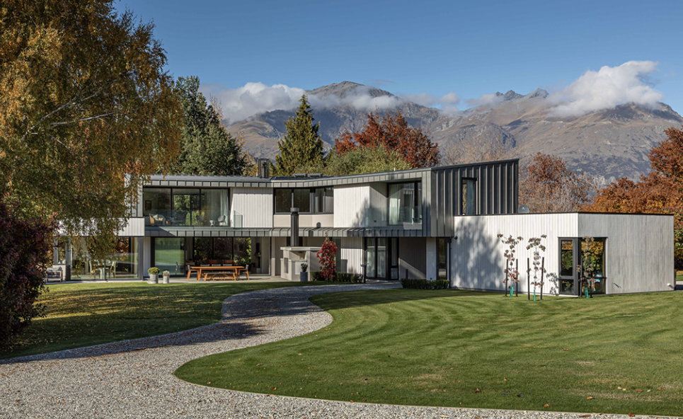
To take advantage of that, the house is laid out over two levels, turning its back to the lake and the wind; at its centre it meets and extends out in different directions. The top storey creates a bridging form that connects house with garage; at ground level, there is an opening between the two — accentuating the sense of solidity of the southern elevation and the void between its parts.
The site can be accessed from two directions, with the void creating vehicle access from either side of the property.
“It has an American feel to it with the ‘drive through’ element,” Tony says.
The roofline steps down from the centre in both directions; below, the kitchen/dining and garage form single-storey elements on either side. This meeting of roof forms at different elevations creates a sense of flowing, organic scale with a sharp angularity, much like the jagged peaks of the mountains around it.
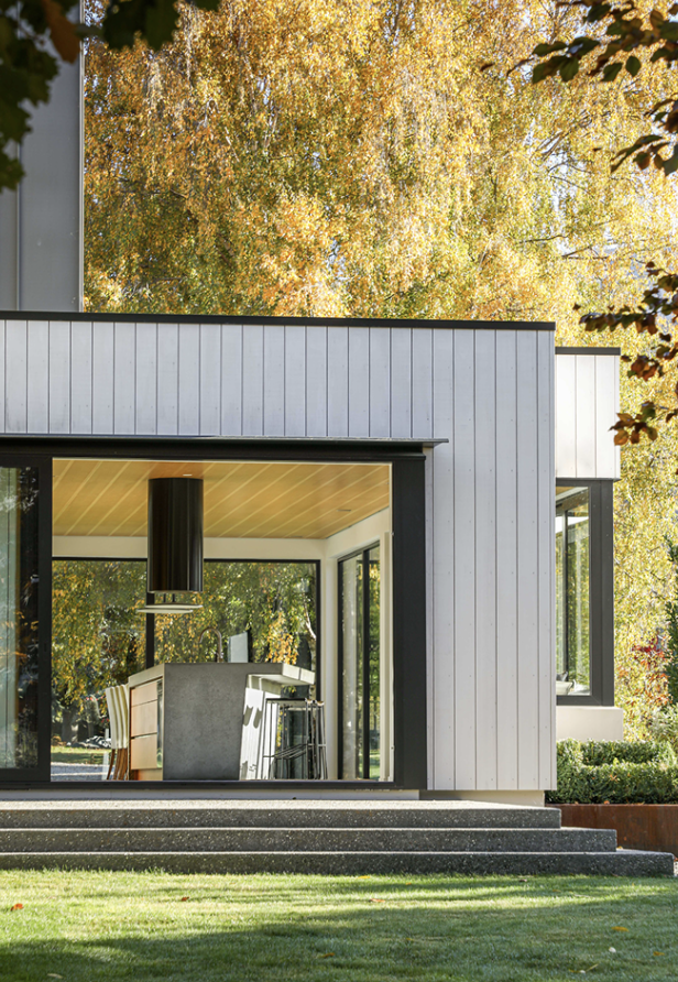
The kitchen and dining area is pushed out of the main form, creating a glazed box that has a sense of extending into the garden and a stand of trees adjacent to it. Clad in zinc and thermally modified timber, the substantial form sits lightly in the landscape — a fitting nod to the surrounding rolling terraces.
Inside, the design offers layer upon layer of exploration.
“Once we have building consent, for us the design starts again so it doesn’t lose energy. I see it as a design within a design, and I think that creates something really enriching,” Tony explains.
That’s definitely evident here. A playful double-height void is home to a visual and tactile feature: a floating timber stair surrounded by a balustrade of stainless-steel rods suspended from the hipped ceiling — waterfall like in its delicate flowing form.
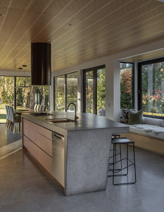
The kitchen island, created from a single in situ concrete pour, belies its size with an angular top that overhangs its base and takes on a form similar to that of the house itself.
“I often look for a motif, and the way the house bends around the northern courtyard became the motif here; it’s angular and not orthogonal,” Tony says.
“What I’ve realised over the last seven years is that there’s nothing functional about an orthogonal house. So, if form follows function, and if form follows poetry, then what is the natural expression of a house? And how do you let a house take on its own form?”
Where the house turns its back to the wind, it stretches out in two directions across multiple planes, forming a sheltered northern courtyard. “It evolved from the site for the clients, and what evolved took the clients down a pathway they were initially uncomfortable with but now really enjoy,” the architect explains.
“I think the biggest successes of this project are the way the clients use the house, moving through it with the sunrises and sunsets. There’s a real interplay between the house and landscape, and the long and close views — that’s the real power in this space: not the architecture itself, but how it exists and responds.”
Words: Clare Chapman
Images: John Williams

