With the sun on its bow and the community at its stern, this is a house in which the elements are always front of mind.
This yacht-like Northcote Point, Auckland, home is a place of ever-changing light and shade — the sun falling into its hull in a myriad of lines and patterns that ebb and flow depending on its position in the sky.
The same is true for the wind, with the house either embracing it or sheltering from it. Designed to allow various areas to easily traverse indoors and out, the configuration of spaces is dictated by the elements.
When architect Pat de Pont of Strachan Group Architects first visited the site, he was greeted by the clients who were sitting with their children under the shade of a mature elm tree at the front of a 1946 art deco–style house that was in a rather sorry state.
“We were presented with a house in really bad shape. It was clad in plaster and had asbestos running through it. It was rotting and leaking and, while liveable, ultimately wasn’t worth saving,” Pat explains.
“What struck me instantly was that tree, and the public setting of the street. People were walking past and saying hello. I realised early on that was something it was important to keep.”
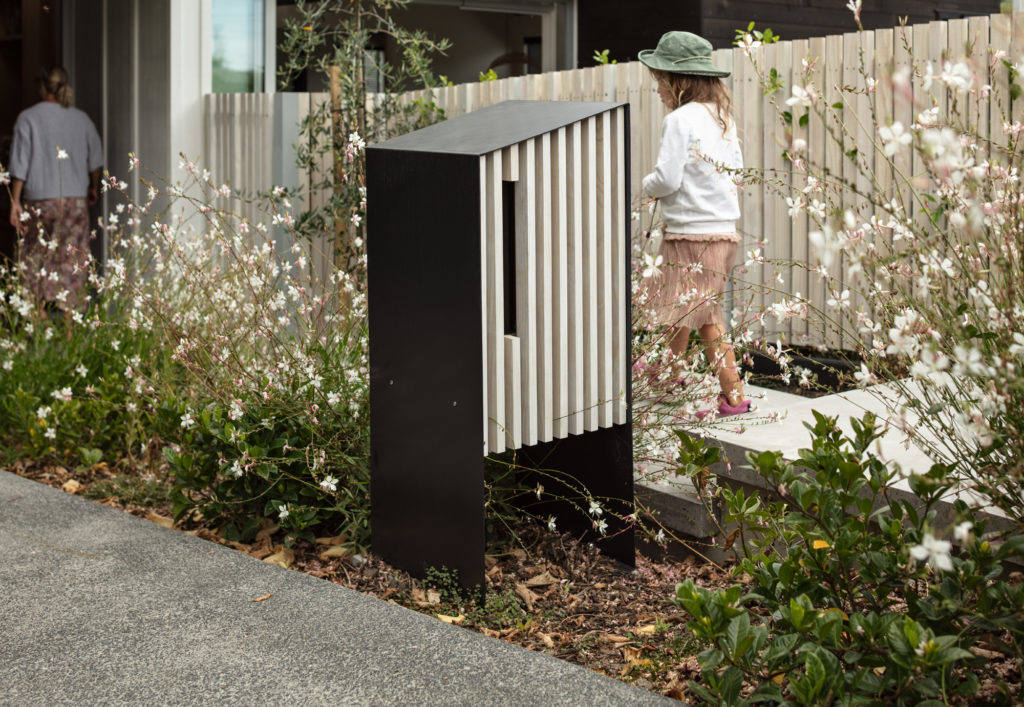
It was this, in part, which drove the early concept — one in which two distinct areas came to life, public and private, with “quite a lot of connection between the two”.
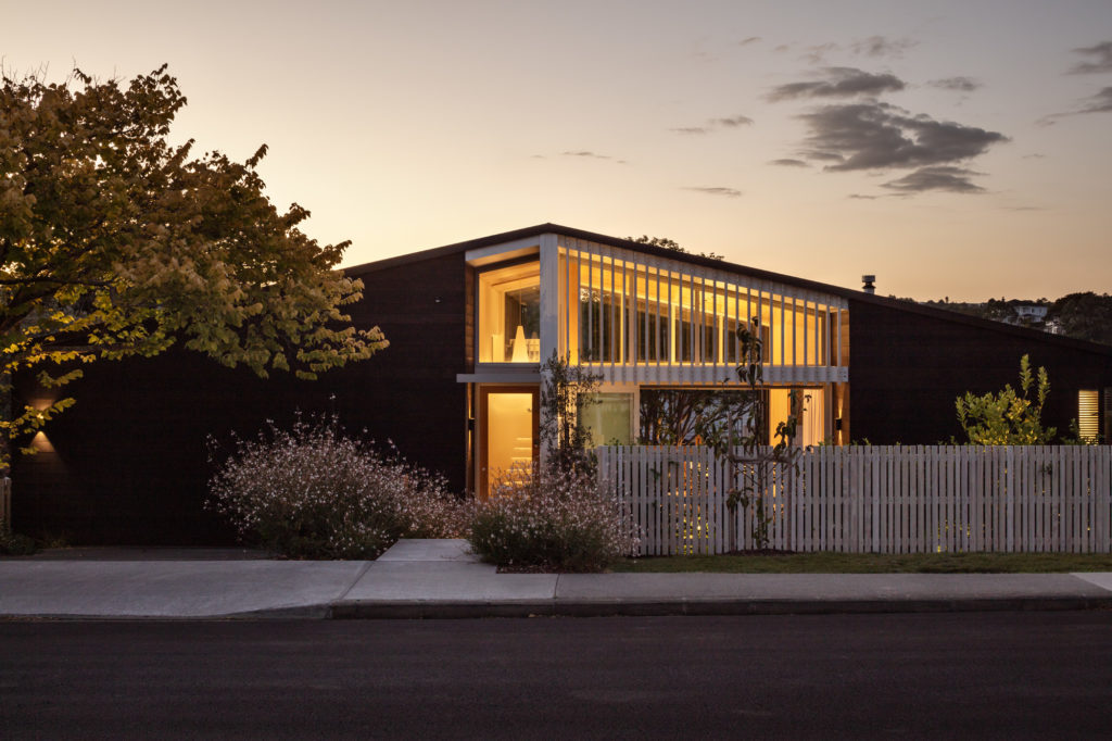
That connection begins on the eastern facade, which is framed by the original elm tree. Under a long gable, white, linear beams meet horizontal black-stained western red cedar cladding to create a contemporary bungalow form.
The plan unfolds from east to west, moving from public to private as it does. There’s a lot at play here: sun and shadow, heat and cool, volume and contraction.
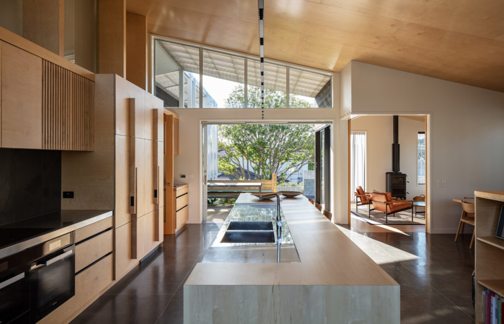
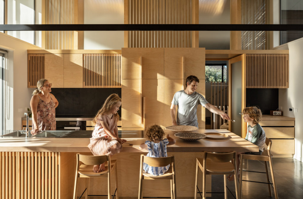
Under the highest part of the gable is the kitchen — an area partially visible from the street and eastern courtyard, and one that allows subtle sight lines through to a terrace at the rear. It’s a kitchen of unexpected volume due to its placement and the consequent lofty ceiling height.
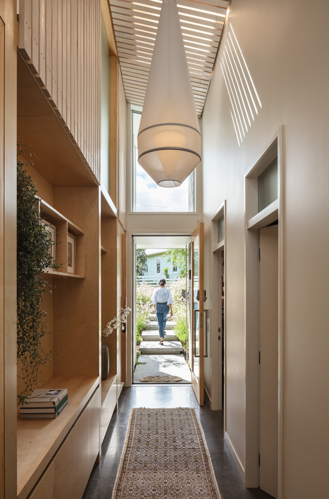
Clerestory windows to the east follow the pitched roofline and meet a plywood ceiling, while an abundance of timber creates an unambiguous feeling of warmth. It is, however, the light in this space that really offers something special.
The kitchen itself begins at the east, with the island butted up against sliding doors to the courtyard, which, when open, essentially bring the kitchen into the outdoors and embrace a connection with the street and community.
“It’s a nice transition between indoors and out, but it was also considered as a way to stop children running around the island as they tend to do when it is in the centre of a space.
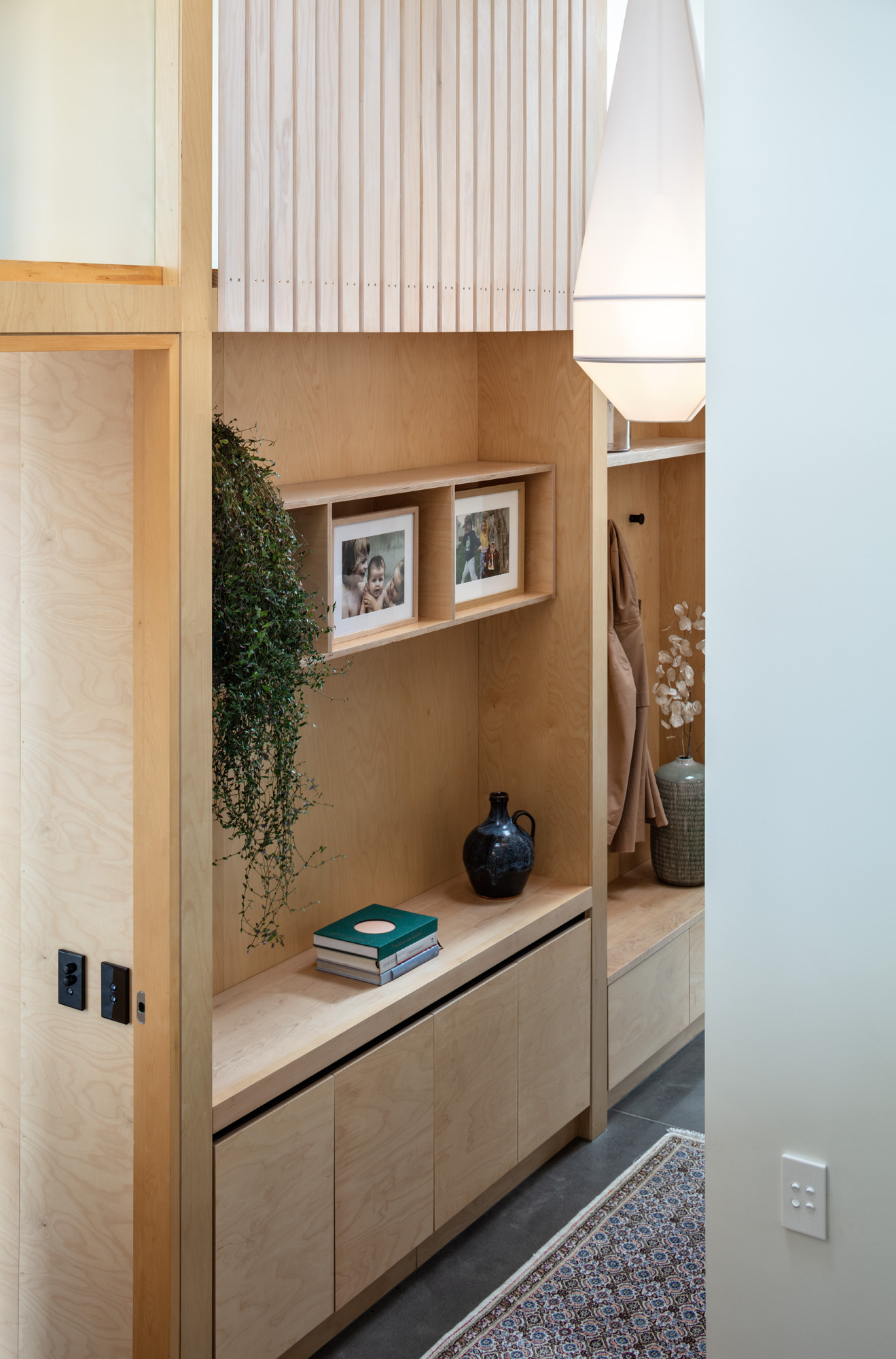
“We used the same technique in terms of sun and shade to model the inside of the home, with light and shadow that shifts during the day. It really makes it come to life,” continues the architect.
In the kitchen, that light falls, elongates, and dissipates across a palette of American maple, a birch ply ceiling, and birch veneer cabinetry, which moves between solid and vertically slatted to emulate the exterior. The combination is something to behold, with lines of light falling diagonally and horizontally across the space, creating a plethora of patterns as the sun moves throughout the day.
A concrete floor acts as a heat sink and is a key part of the home’s thermal performance.
“In this house, you’re very aware of the elements. You treat it like a yacht. When the wind comes from one direction, you shut it down — you’re always aware of where the sun and breeze are coming from,” Pat reveals.
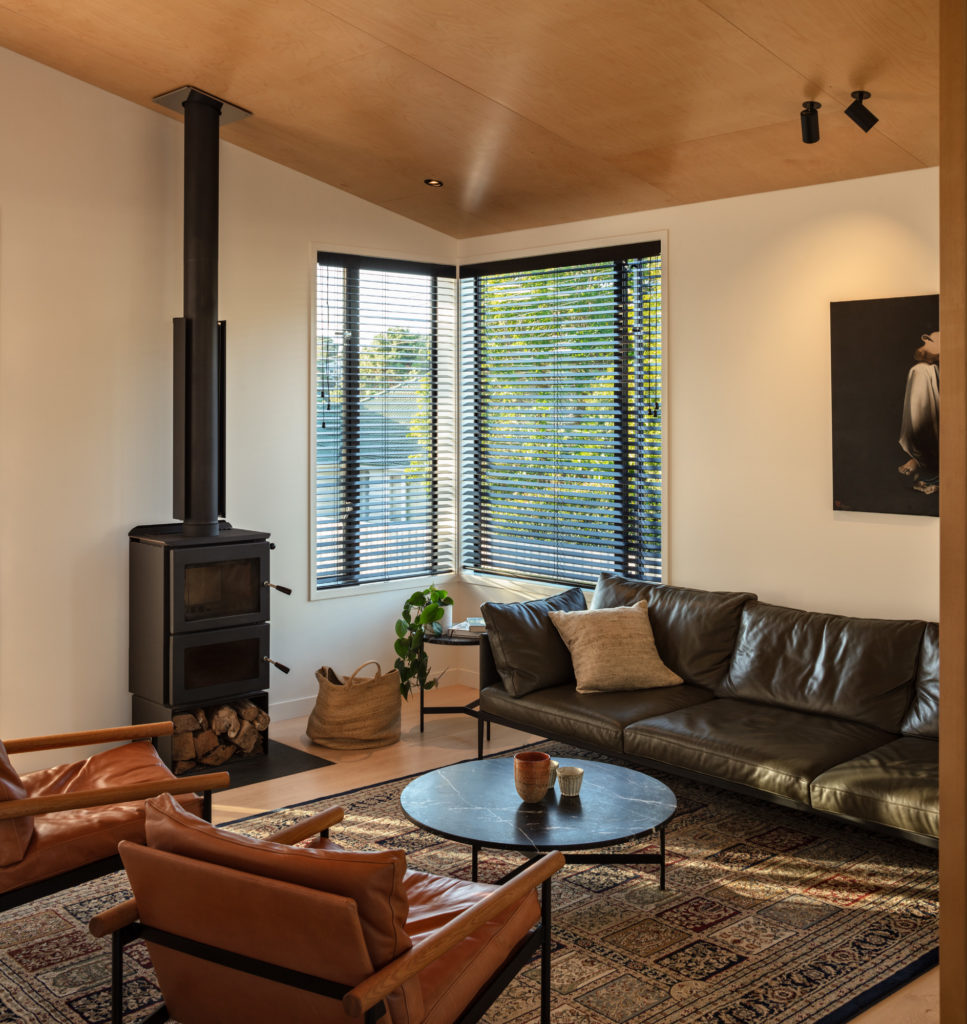
The public space extends from the kitchen; an afternoon room to the north-west is separated from the rest of the open-plan living and dining area by a delineation underfoot where the exposed concrete floor moves to timber. Here, a double wood burner defines this room as one designed as a place to retreat to in the latter part of the day.
Adjacent, towards the south, vast glazing below more clerestory windows opens out to a second, much larger, outdoor space. In this area, the site steps down from a terrace — level with the living area — which is bound overhead by a polycarbonate roof and timber underslatting in line with the linear geometries of the eastern facade and interior.
Located half a level down is access to the pool, which runs along the northern boundary, via a white linear fence. Due to its height, the southern edge of the concrete pool becomes a natural fence along the lawn.
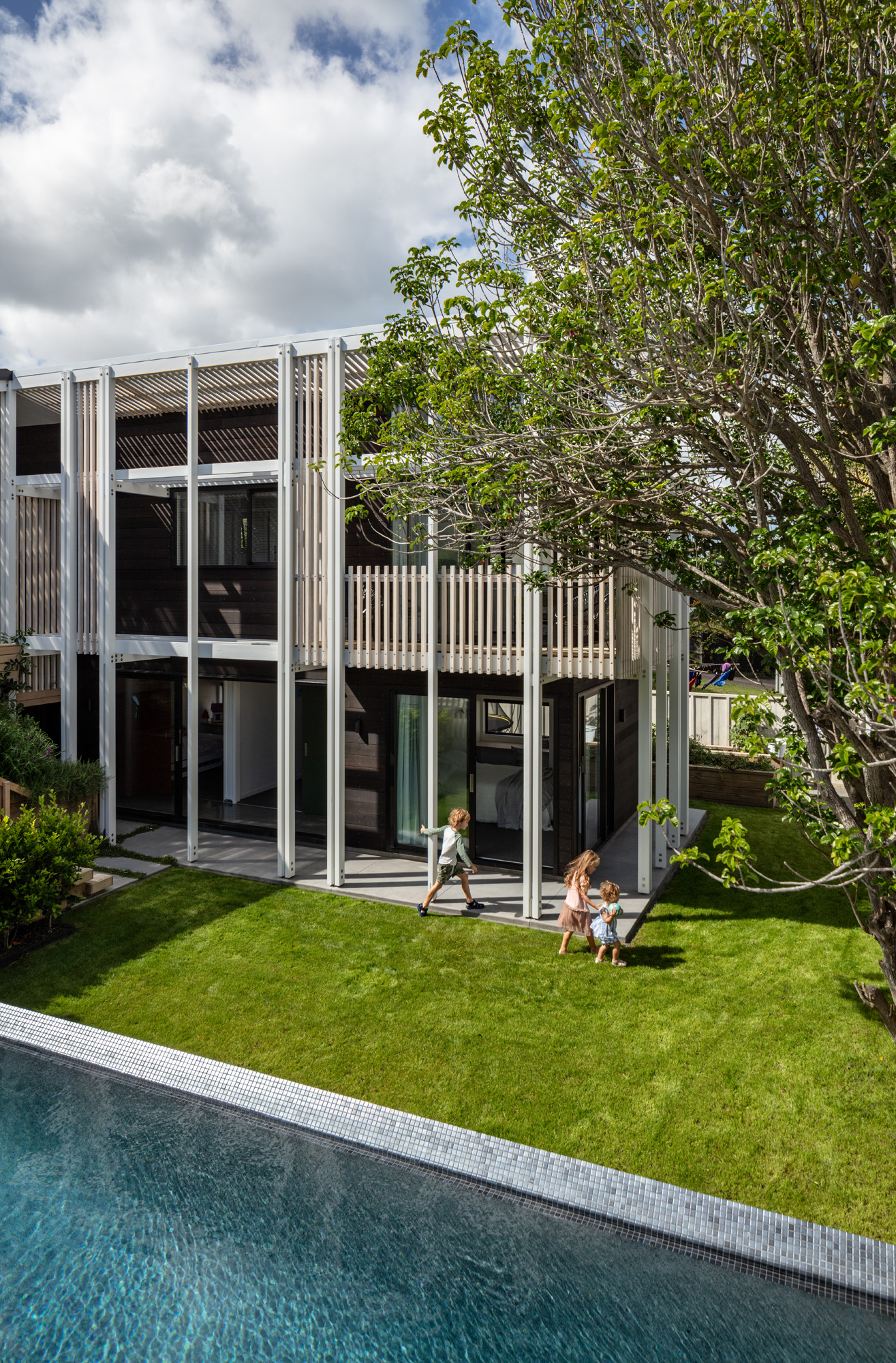
The central grass area is bounded on the other side by the home’s lower level, which houses a children’s bedroom wing and a service area incorporating the laundry. The upper level houses two more bedrooms, including the master and a mixed-use space envisioned as a media room/office — all of which face due north, overlooking the lawn and pool.
This wing makes up the longer part of an L-shaped plan, and Pat explains that, due to its orientation, it would be uninhabitable during summer without a certain level of shading or cooling. It is the northern and western elevations of this wing that stand apart in this home, and that led to its name — Zonnebries House.
Loosely translated from Dutch, Zonnebries means ‘sun breeze’. In this house the use of the external vertical shading structure is inspired by a similar architectural idea: that of brise-soleil — meaning ‘sun breaker’ — a type of shading famously introduced to contemporary buildings by French architect Le Corbusier.
Vertical white beams run the height of the facade, interspersed with areas of more density in line with the joinery.
“The bedroom wing is due north facing so the brise-soleil is used to control heat on the exposed concrete slab, keep the rooms cool, and allow doors to be opened while retaining some protection and privacy,” Pat explains.
Throughout the home’s interior, three accent colours were used: blue, red, and green. Perhaps the most noteworthy are the coloured sliding doors in the bedroom wing where the children’s rooms are located, each a different colour to introduce an element of originality.
Upstairs, the guest powder room opens off the entry hall — a place of wonder in itself, where you are first introduced to the beautiful light formations that fall across the walls thanks to skylights and linear shading overhead.
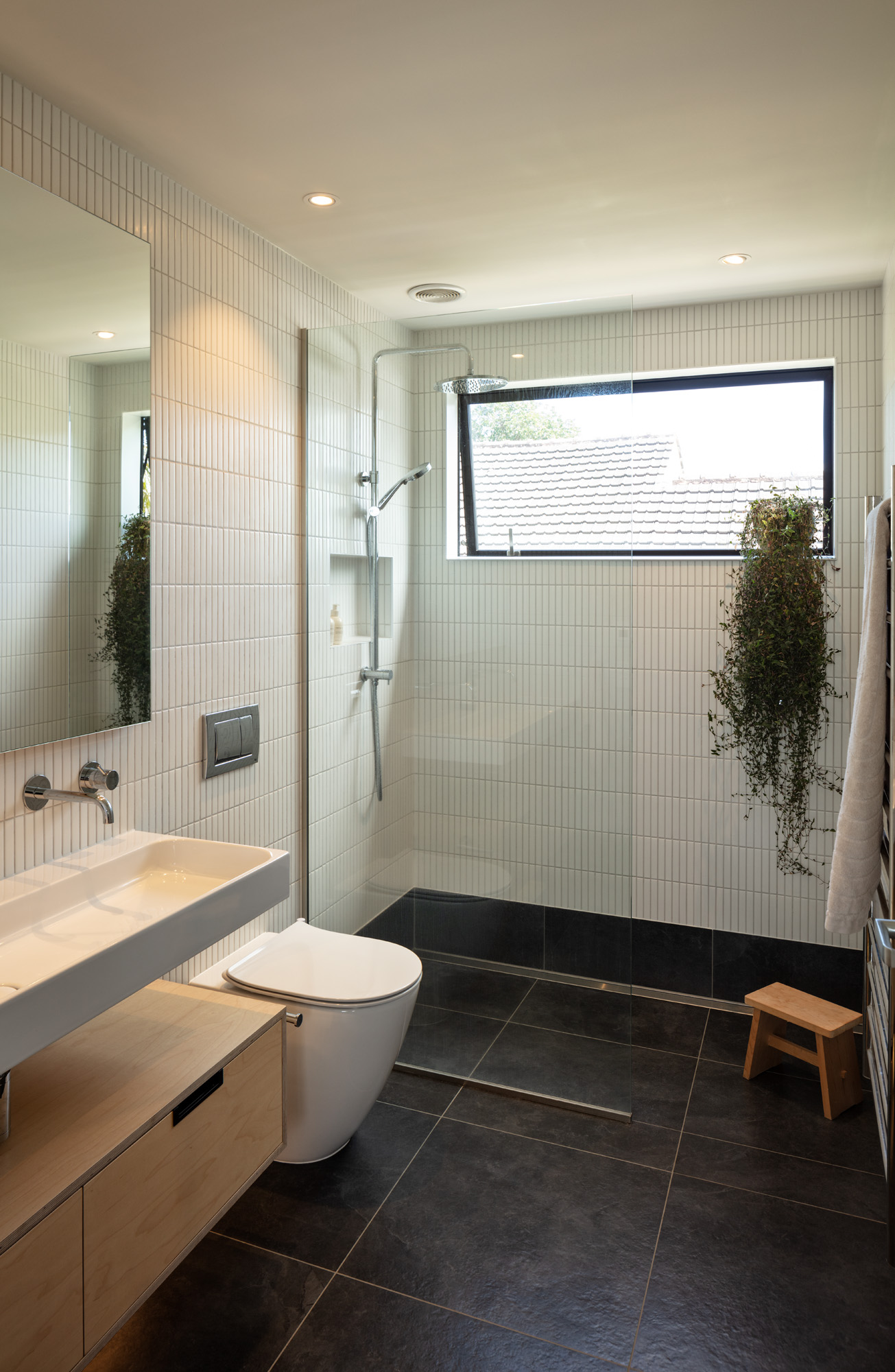
The usage of colour accents continues in this powder room with a deep blue. With dual-tone finger tiles across the walls and bespoke sink, the room is one of texture, geometric forms, and a divergence from the predominantly lighter palette elsewhere — it’s deep, moody, and devoid of the bright, warm light that defines the rest of this home.
For clients Veronica and Tom, a key part of the brief was for a family home where they would live “for the long haul”, Pat says. “They knew they would have a big family and they wanted to live here for a long time.”
Zonnebries House is just that: a timeless testament to the elements — its yacht-like beauty proffers a resilience from the exterior and a warm comfort within.
Words Clare Chapman
Photography Simon Devitt
