We discover how a material crisp palette and integrated design has allowed architect Tobin Smith to create a seamless living space in his small Christchurch home

How the kitchen design of this small Christchurch home maximises space
Designer: Tobin Smith, CoLab
Location: Christchurch
Brief: Create a continuous piece of joinery to merge kitchen with living.
Describe the project in three lines.
This kitchen is designed to maximise storage and usable work space within a small living environment.
The kitchen blends seamlessly into your open living area. Tell us how you managed this in such an elegant and understated way.
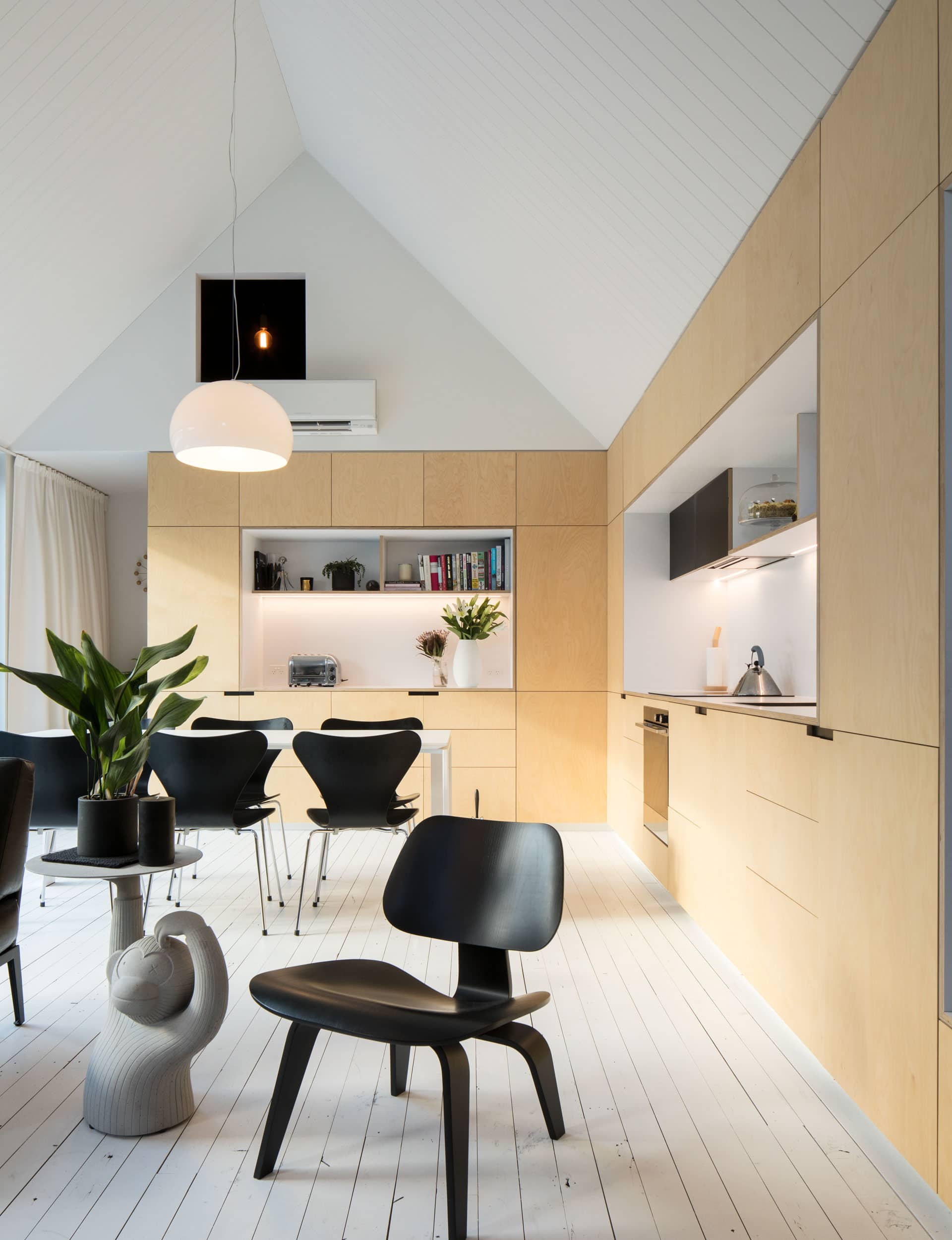
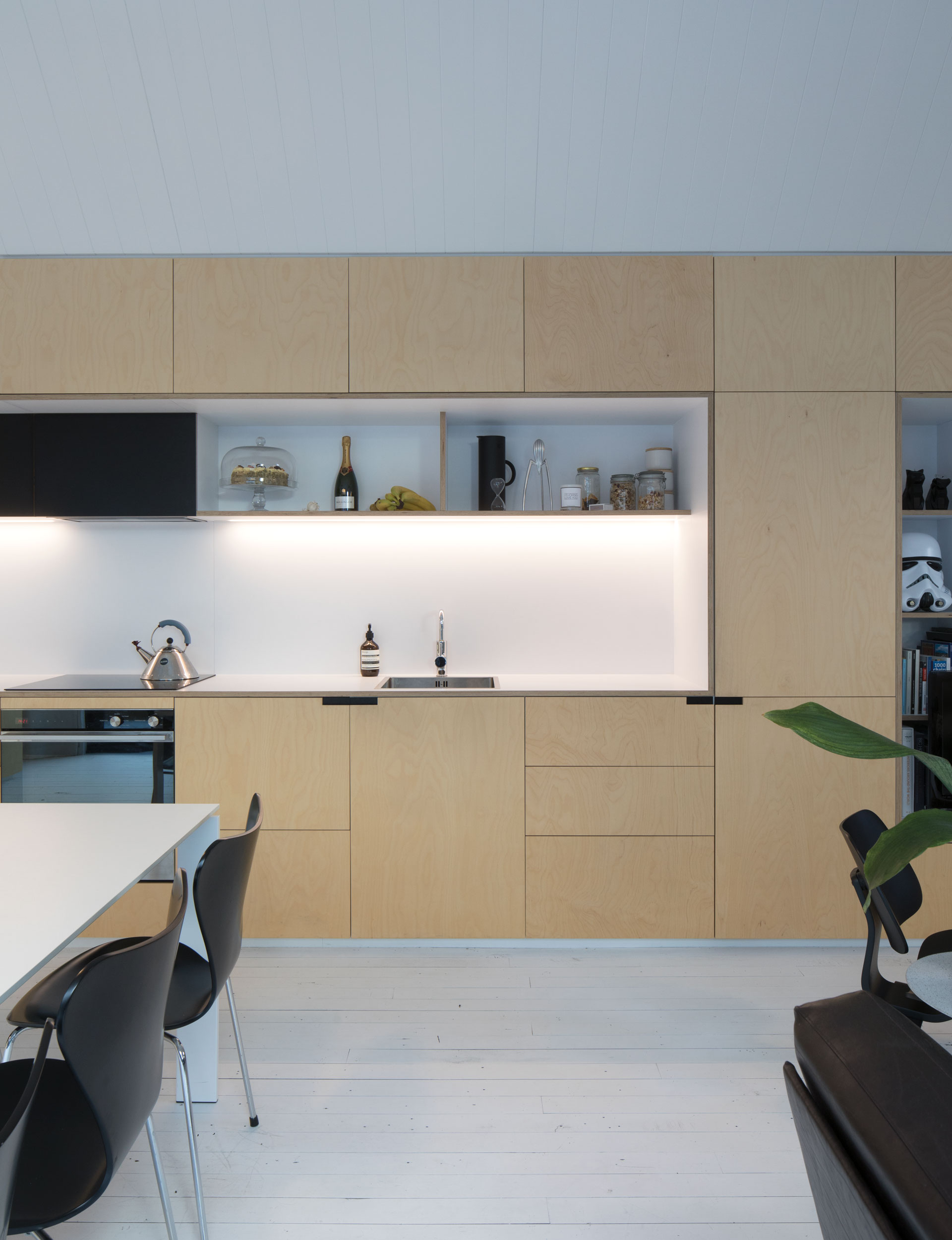
We wanted a continuous piece of joinery to run the length of the living space. Rather than considering this as individual kitchen and living room joinery, we designed a built-in wall of birch plywood with strategically placed ‘bite-outs’ that would ultimately create a workspace within the kitchen area and open shelving in the living area. A cohesive material palette and fully integrated appliances guarantee a discreet transition between the two.
Storage is always important but, in a small home, even more critical. How has it been created here?
We’ve utilised the joinery to create a room divider between the living spaces and bedrooms. This removes the depth of a timber-framed wall and allows us to claim back in additional storage and usable floor space. Every void or cavity in this joinery is utilised for storage behind push-to-open doors – low level for everyday items and high level for more long-term overflow. The often awkward internal corner unit that never seems to get used in an ‘L’ shaped kitchen has been reversed to create the laundry on the opposite side.
[jwp-video n=”1″]
What are essential considerations when designing a kitchen in a small space?
The balance between form and function is a fine line. Good storage solutions are an obvious must, whether open or concealed. Prioritising the necessary and removing the unnecessary can help declutter a space both physically and visually. For us, we saw a full dining space as a luxury that’s not commonly offered in small houses. Rather than attempting to squeeze in an island unit, we created two workspaces around the dining area. The result is an incredibly functional and social kitchen and dining room space.

How did you come to choose the painted and gaped, recycled rimu flooring?
Recycled flooring had both cost and aesthetic benefits for us. New timber floors can be quite costly and incredibly precious, almost too perfect. We wanted a floor that we could really use and not be afraid to beat up. We selected the timber more on characteristics than species, as we always intended to whiten the floor so it wouldn’t compete with the birch plywood joinery. We intentionally laid the flooring loosely to lend the house a sense of nostalgia.
Do you have any cost-saving tips for people creating kitchens on a limited budget?
Utilise simple materials well – understand their capabilities and standard sheet dimensions to modulate and maximise joinery. Align yourself with a competent and cooperative joiner; they’re working with these materials on a daily basis and can offer valuable insights.
[gallery_link num_photos=”5″ media=”https://homemagazine.nz/wp-content/uploads/2017/08/Christchurch5.jpg” link=”/inside-homes/home-features/urban-cottage-on-a-quake-damaged-christchurch-site” title=”See more of this home here”]
Words by: Suzanne Dale. Photography by: Patrick Reynolds.
[related_articles post1=”76289″ post2=”76560″]


