Designed by acclaimed modernist architect Alex Bowman, this Nelson home was transformed to fit its new family while staying true to the original aesthetic
How a gentle renovation created a Nelson family home
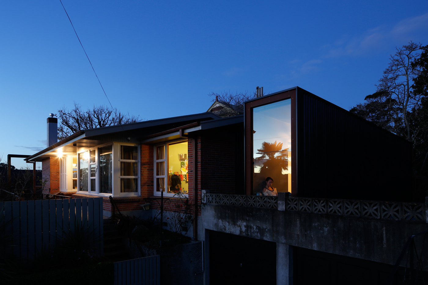
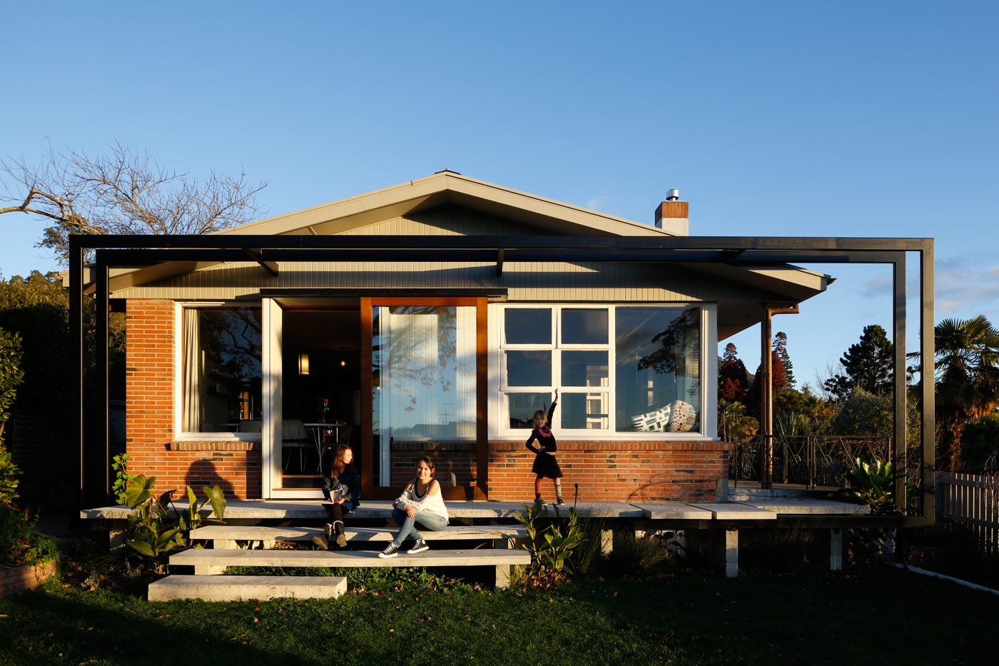
There’s a side to architect Jeremy Smith that enjoys sowing confusion. How else to explain his delight when passersby stop in surprise outside his family home? This example of 1960s modernism, set on a plinth above a quiet Nelson street, has been transformed by Jeremy into a genuine “double-take” house by two arresting additions.
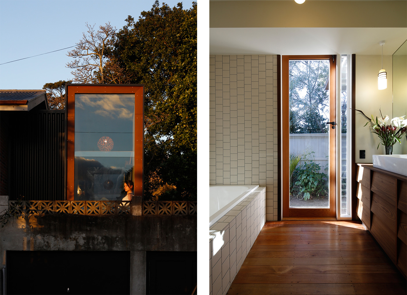
Crowning the garage at the southern end is an obviously contemporary black steel and timber box, about two metres wide, darkly glazed and ambiguous. Housing for a stairway, perhaps? At the other end, and equally at odds with its conventional façade, the little brick house is framed by… well, by a frame, a rectangle of industrial-scale steel suspended below the gable. Seen from the road, its function isn’t clear at all.
In fact, both additions are entirely purposeful, necessary elements of the architect’s clever rearrangement of a much-loved but too-small house into a home for a family of five.
Funnily enough, when Jeremy and his wife Genevieve Morrissey bought the Alex Bowman-designed house in 2009, its bijou scale was part of the attraction, despite having three daughters – Bonita, Scarlett and Coco Plum (now 15, 12 and seven respectively). Bowman, who virtually single-handedly introduced international modernism to Nelson in the 1960s, had designed this one for a retired couple. He set the small, brick and slightly brutalist home against a neighbourhood of enormous heritage villas.
The Morrissey-Smiths admired Bowman’s plan and crafted detailing; they liked the way he’d glazed it heavily to the western street-side and north, while maintaining privacy elsewhere, and they loved the elevated site. But even after converting the original twin studies into bedrooms, they were still one short. Lack of direct access to the garden was another issue.
Jeremy’s plan began with an acknowledgement of the limits. He didn’t feel inhibited by Bowman’s status as a prominent local architect, but he accepted – celebrated, really – what his predecessor did with the house.
“Alex Bowman didn’t intend this house to get any bigger,” Jeremy says. “That’s why he made a small, very contained brick building on a plinth. So we really needed to find a way of elongating it and creating space, without it appearing bigger.”
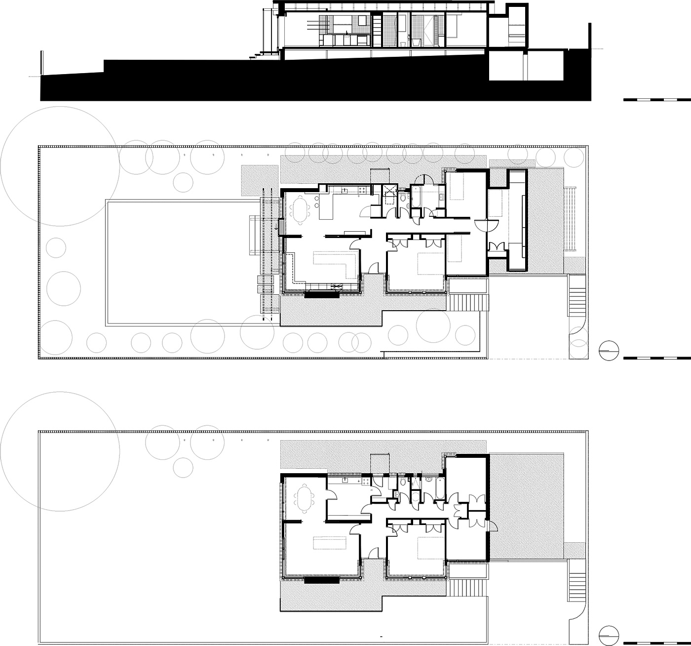
The circuit breaker was the addition of a new bedroom – that mystery box sitting on the garage, appropriately a 13th birthday present for Bonita. Viewed from outside it seems too narrow, but inside, Tardis-like, it doubles, comfortably accommodating a bed, desk and window seat.
“People are always standing down there looking up at it; I don’t know what they think it is,” says Bonita, who made the risky but inspired choice of painting her room Resene ‘Gravel’, a deep, dirty grey that sets off the pink magnolia tree framed in the eastern window, and emphasises the room’s cocoon-like feel. “It’s a space I can retreat to and relax in,” she says.
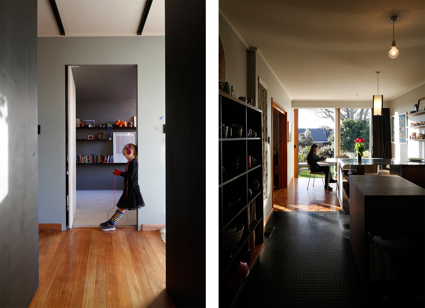
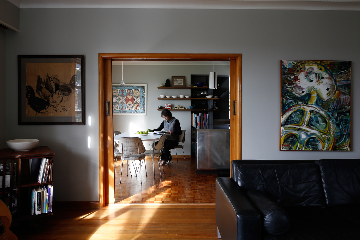
The next step was to reconfigure the entrance to the other girls’ adjacent bedrooms, creating shared access and a pool of light at the end of what had been a dead-end corridor. Combined with the removal of an internal wall to the kitchen, it has produced a view all the way through the house.
“The place feels much longer, even though we’ve only added a couple of metres,” says Jeremy, whose other big play is at the opposite end of the house, where he has opened access to the outside from the dining space. And at last, the penny drops as to the point of that massive steel frame: it’s there to support concrete steps to the garden. There’s no deck, although a wider, platform-like step immediately outside the dining space provides a comfortable spot to enjoy a drink in the sun.
Meanwhile, Smith has reworked the house’s eastern side by cantilevering the kitchen and bathrooms out to the existing eave. In a case of playing small for big results, he’s added just 600 millimetres in width to secure a kitchen with a return bench, plus much-needed separation of WC, bathroom and shower – meaning no more 7am queues in the corridor. “None of it had been changed since the 1960s, so we’ve taken the chance to update kitchen and services,” he says.
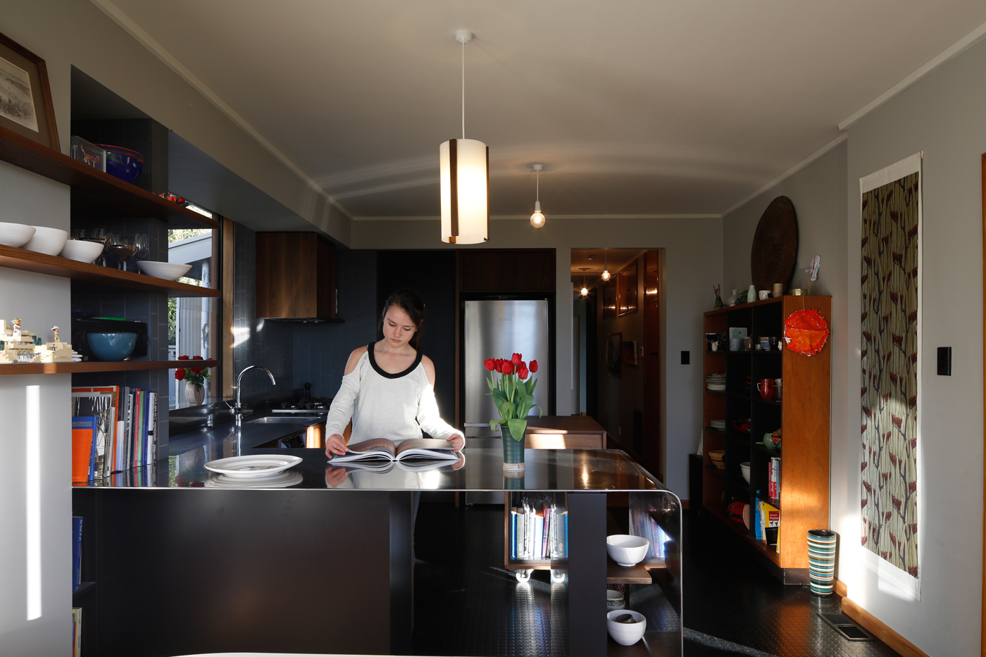
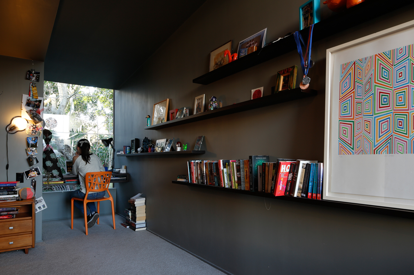
They have also introduced a darker palette, adding carbonated ash joinery and muted wall tones. “The longer we live in Nelson the more we are aware of how bright the sun is here, and this little house has a lot of glass. We’ve actively being making it darker and darker.”
Genevieve also made a happy discovery when she found that shutters to the west-facing living room windows were not follies, as she’d suspected, but useful features. They’ve been retained and produce a lovely diffused light at the end of the day.
It’s the simplicity and economy of all these gestures that impress. Jeremy has played with Bowman’s creation without upstaging it. The additions read unambiguously as new elements, but also as being clearly secondary to the old house. New windows are left unframed, and the dark ash joinery effectively highlights the warmth of the original rimu. “We were always keen that you would be able to easily tell what was here first,” says the architect. “The old house still feels more important than the things we’ve done to it.”
Genevieve remarks that visitors tend to be amazed at how much has been achieved inside, because the façade is essentially unchanged. “For the kids to have their own space is fantastic. They’re involved in our lives endlessly, but now there’s some space for them to do their own thing.”
And she has a nice take on the relationship of old and new, likening what they’ve done with Bowman’s creation to the collaborations that architects constantly engage in.
“We came in to this house and we worked with the ideas that were already here – so, in this case, it’s been a collaboration over time.”
Q&A with Jeremy Smith of ISJ Architects
HOME How much space did you add to the house? Were you surprised by how much difference this made?
Jeremy Smith Physically we added a little over two metres in length and a little over 20 metres square in area, all without requiring any new foundations. While the house remains little, we certainly now have enough room to live without being in each other’s pockets. Yes, it is surprising how little space we needed to find to turn a retirement house into a functioning family home. Yet people who knew the house before can’t work out where we found all that volume inside. It’s to do with light and careful reconfiguring to where and how we use space.
HOME How much input did the kids have with the design?
Jeremy Smith All three are very creative and involved kids. The opening of bedrooms to each other was in response to how they like to share space with each other, while being aware that sometimes they need doors. Each had a play at their own room and certainly placed critique on the rest, although us adults seemed to have a better grip on impending costs. They never quite got that pool they were drawing…
in Jeremy’s firm. With the plans in hand, Jeremy approached the alteration as he would with his own clients, asking his family: “What do you like and what don’t you like?” Top: After. Bottom: Before.
Photography by: Patrick Reynolds. Words by: Matt Philp.
[related_articles post1=”1423″ post2=”47545″]