A house in Christchurch by Pattersons pays homage to the earthquake damaged home that stood before it. See how this new-build traces the memory of the past
Great architecture preserves the memory of a quake damaged home
A few weeks ago Liz walked into her shadowy bedroom at dusk and, out of habit, reached for a pull-chord light that wasn’t there. The leadlight windows were gone, too, as was the gabled roof, the handmade kauri staircase and rimu floors.
Liz and Ian bought their two-storey home in Fendalton, Christchurch, in 1978. They moved across town from one leafy suburb to another, to a house designed by Armson, Collins and Harman architects. The couple needed more room for their three young children and “we had a list of 13 things and I think it had 12 of them”, says Liz. Despite it being on a busy road and needing some work, the former boarding house was comfortable and inviting.
The quakes that hit Canterbury twisted two internal chimney stacks, which warped the 100-year-old arts-and-crafts-style homestead and ripped pebbledash cladding from horizontal wooden lathes. Bricks blew out into the rooms and shingle from beneath burst through pipes and filled a dunny at the end of the hallway.
For a short time afterwards, Liz and Ian, now in their 70s, lived in a tent at their daughter’s house, then rented when they realised that the insurance and building process would take a while to sort out. Five years and 42 days to be exact.
When architects Andrew Patterson and Andrew Mitchell of Pattersons took on Liz and Ian’s rebuild, they knew the couple’s strong connection to the original home would be an important factor in design. It was a home in which the family had created more than three decades of memories – weddings, 21sts, Christmas functions, lunches for their sons’ Christchurch Boys’ High School mates (which always felt like half the school), Ian’s 15 years in local-body politics, Liz’s nursing career, then Fine Arts degree. “It’s unique that there was a house that we could see and walk through,” says Mitchell. “It’s our new interpretation of the memory of the house.”
Liz and Ian’s insurance policy was for a ‘like-for-like’ replacement, but they needed evidence to prove that the original house was architecturally designed. By chance, a friend of Liz’s met someone who was doing a thesis on Armson, Collins and Harman, who told them the architects had donated hand-drawn plans to a library at the University of Canterbury.
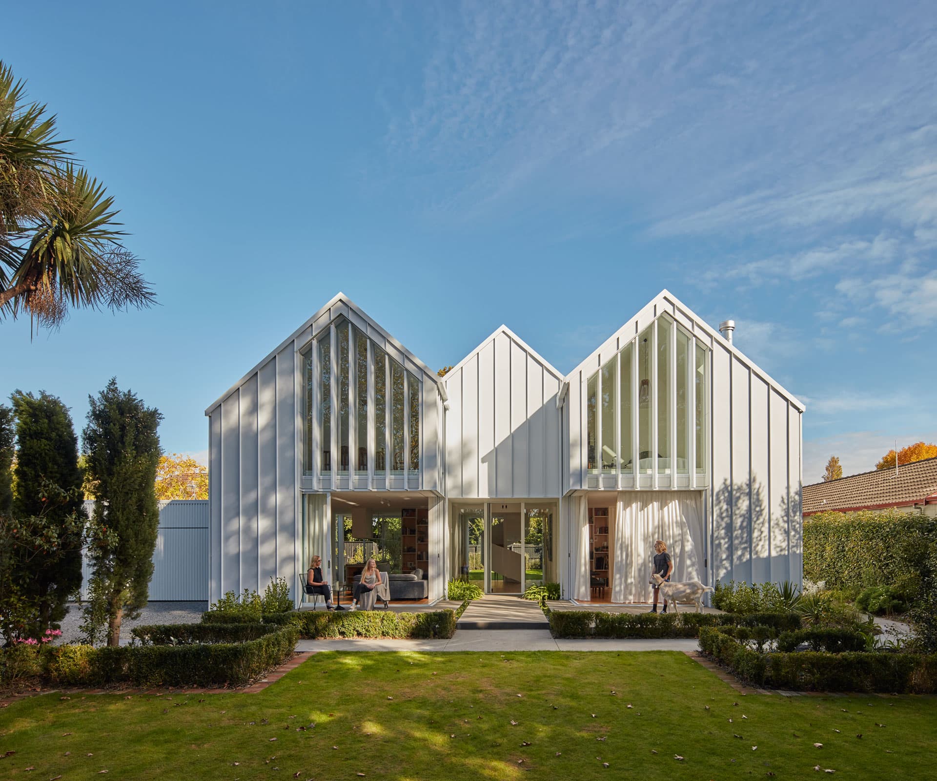
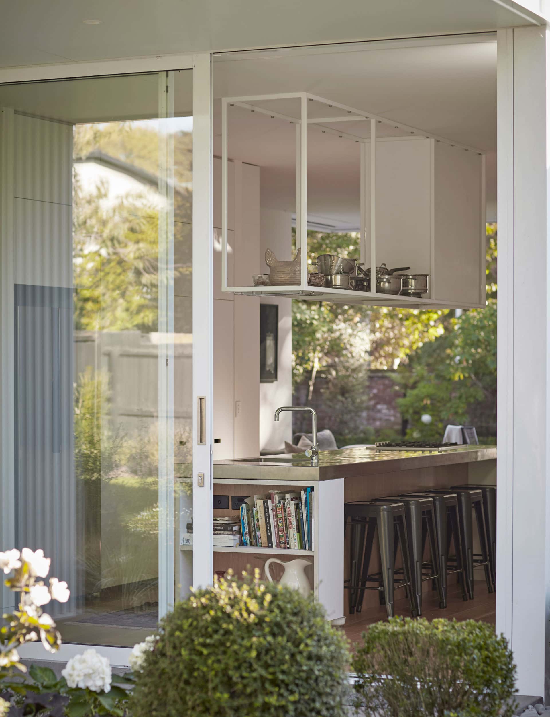
The new home was designed within the footprint of the original and its lovingly tended mature gardens. Cypresses line the driveway behind an original red brick fence and buxus hedging fringes the front of the house, giving the impression that the building has been there longer than it has. Liz says they had a few requests, such as a separate dining area, high ceilings like their old house and a stainless-steel benchtop in the kitchen. “But we didn’t care what the house looked like as long as they [the architects] were happy with it,” she says. “We just trusted them.”
Without a strong brief from the owners on how the house should look, Pattersons drew on the concept of ‘garden architecture’, as a nod to a civic project they were working on at the same time – the new Christchurch Botanic Gardens Visitor Centre, which were influenced by the glass and white steel structures within Kew Gardens in London.
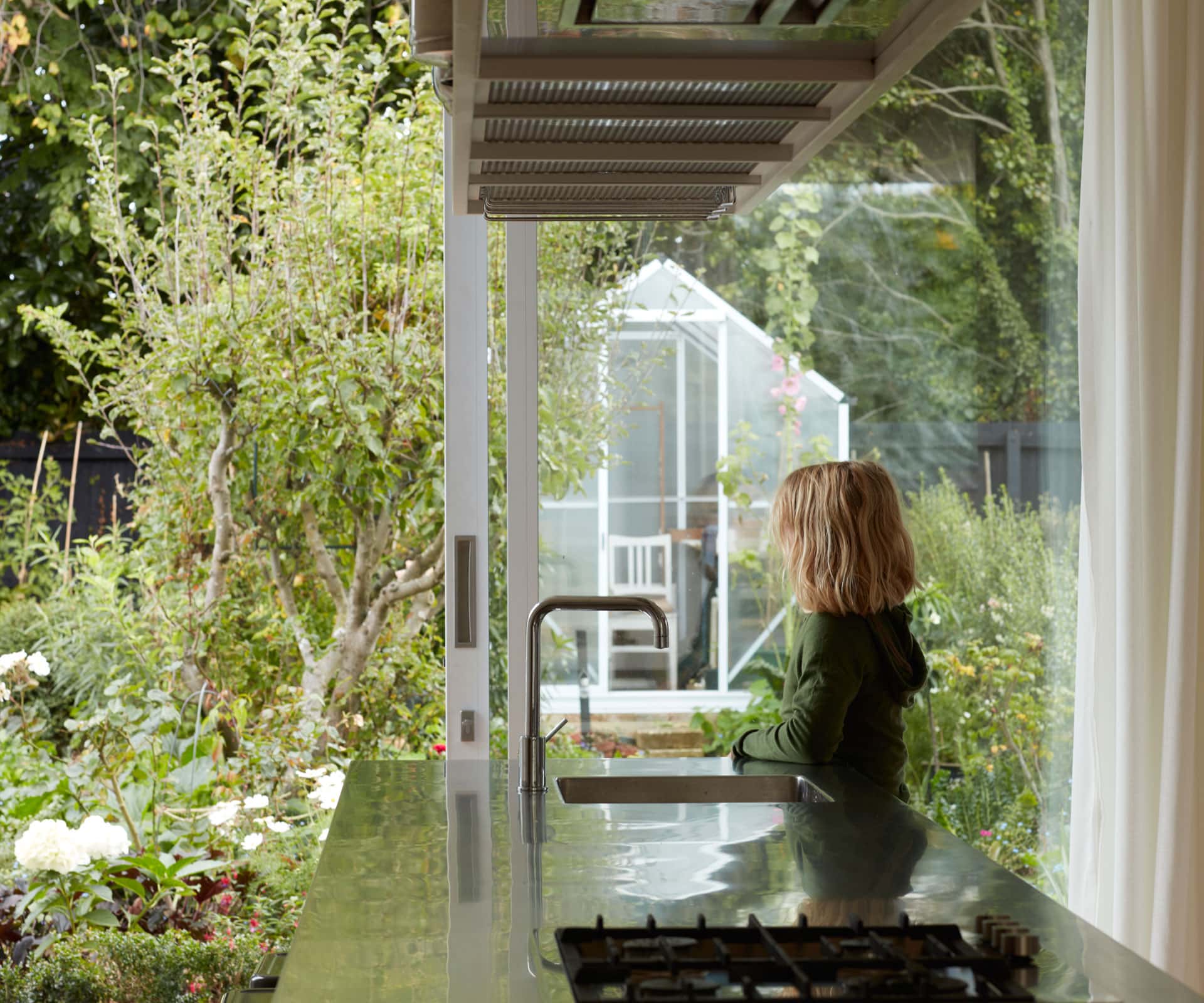
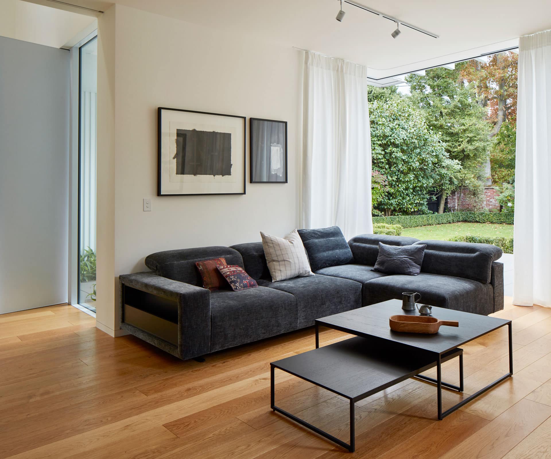
Liz and Ian’s house employs the same enduring, white scheme. The buttery white internal walls also form a backdrop to their art collection, which includes pieces by Ralph Hotere, Philippa Blair and Colin McCahon, as well as Liz’s own paintings.
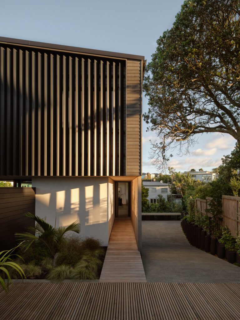
From the outside, the building repeats its angular peaks – a contemporary take on a gabled roof. Standing seam cladding gives way to vertical timber cladding in places where people interact with the building. Louvres in front of the full-height windows upstairs form a veil to the road. The louvre blades also act as an extension to the roof and cladding seams: “This integrates the blade formally; we wanted the roof form and cladding to be unified,” says Mitchell.
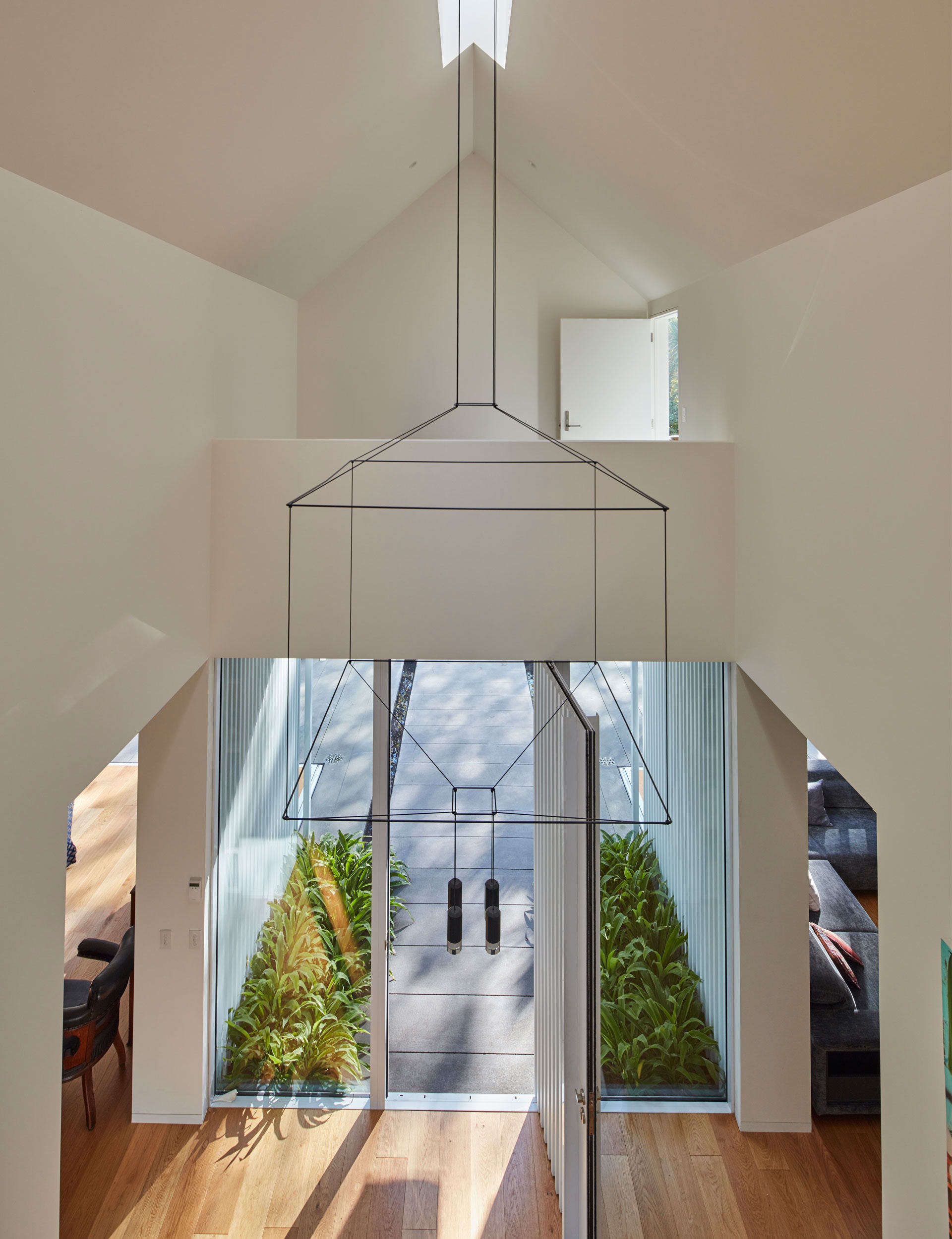
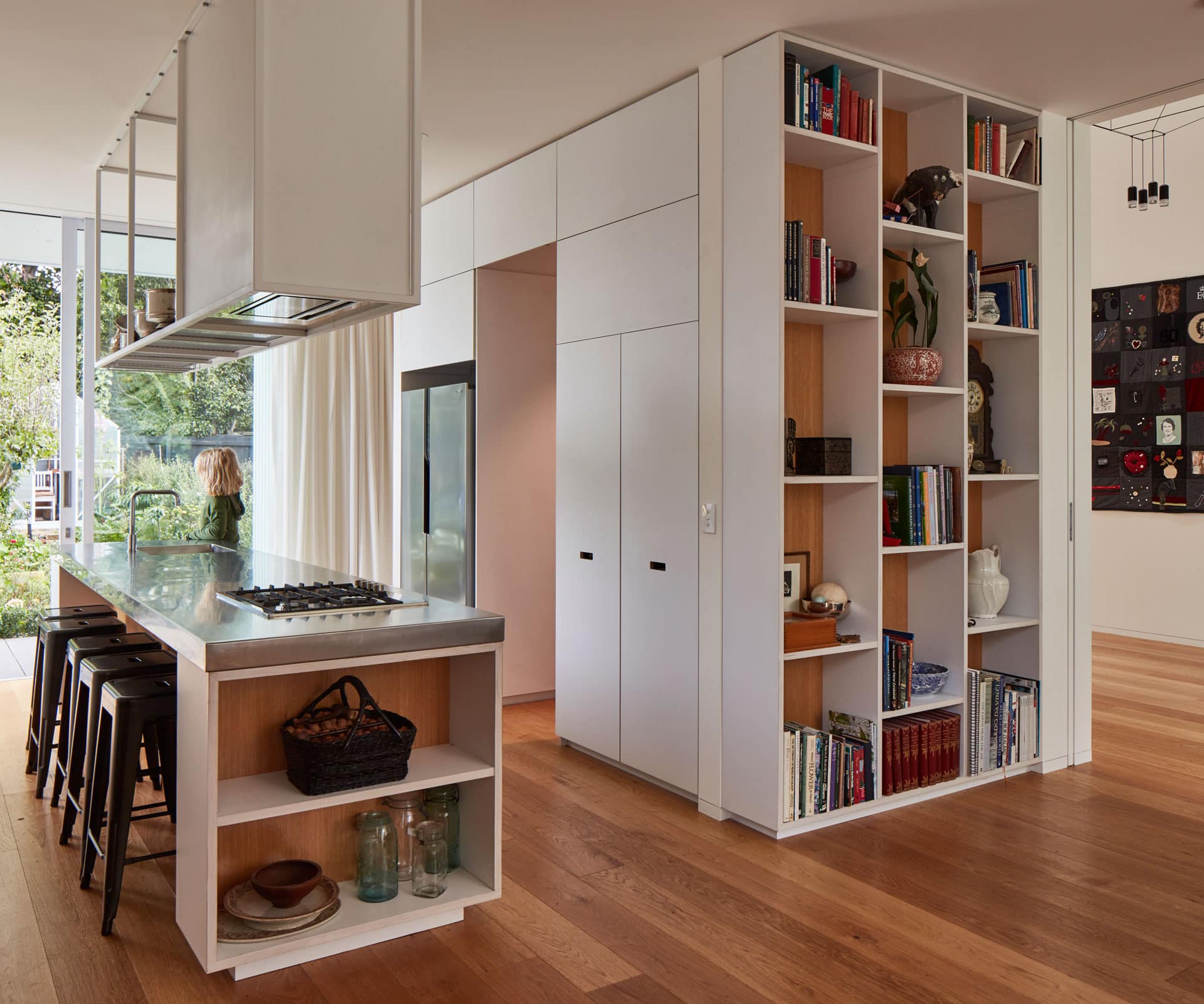
Inside, key ground-floor spaces, such as the entrance, kitchen, living, sitting and dining rooms, are placed in their original locations – “We knew how the sun worked,” says Liz – but Mitchell says the new design provides a stronger connection to the existing gardens with sight lines through the house.
To experience the house is to enter a grand hallway where the ceiling rises up more than eight metres. With the addition of some trestle tables, the space doubles as a central entertainment area for family gatherings and dinner parties of up to 16 guests.
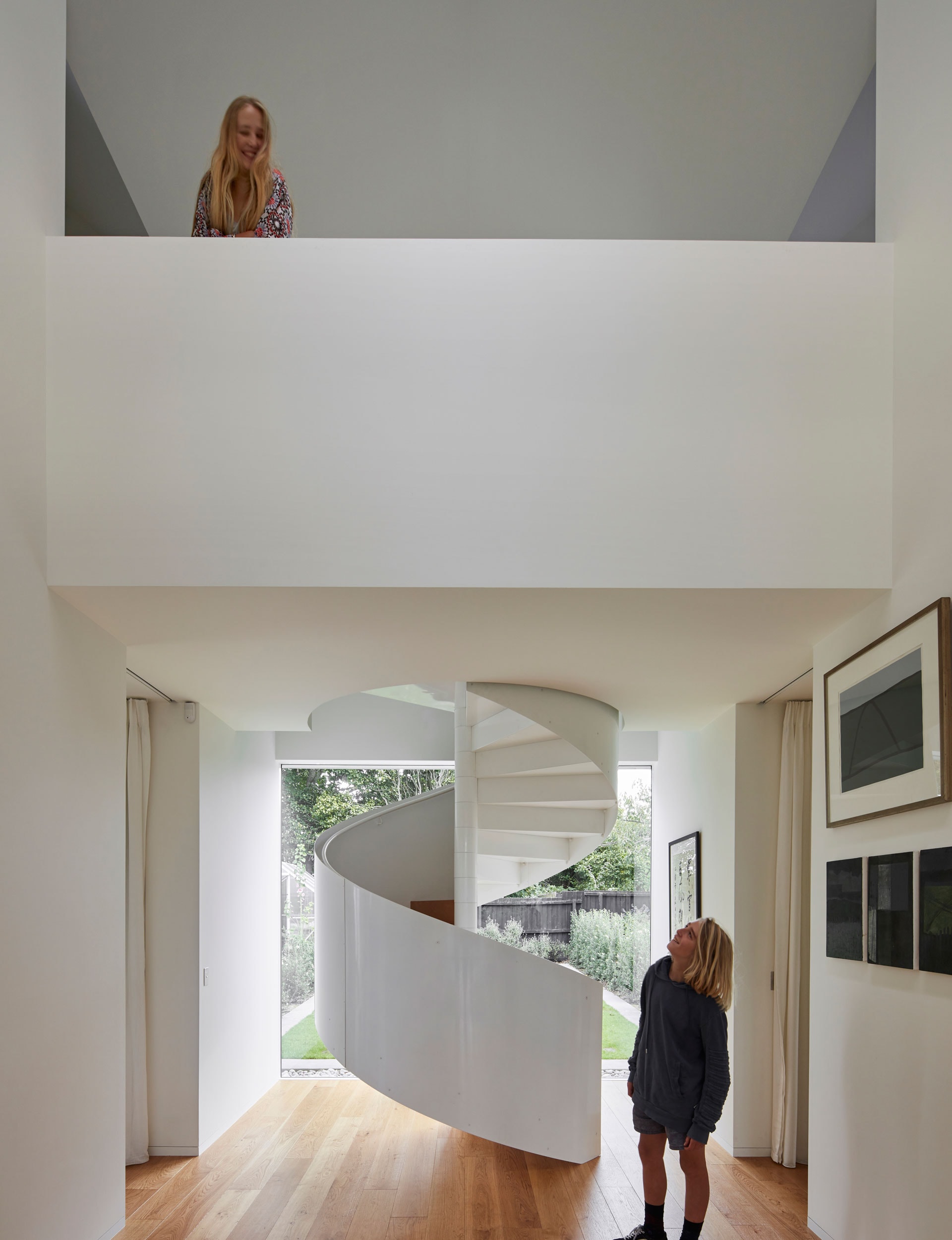
Liz says the nave-like entrance can go from being the quietest, most meditative space in the house, to the busiest during a cocktail party or with grandkids laying out their trains on the floor. “It feels right no matter what,” she says.
The space holds a hanging geometric light by designer Arik Levy and a white steel spiral staircase takes centre stage where the kauri one once stood, while an opaque, ridged skylight washes diffused, ambient light into the space. The double-height ceiling follows the gabled roof line, which makes the angular form readable from the interior.
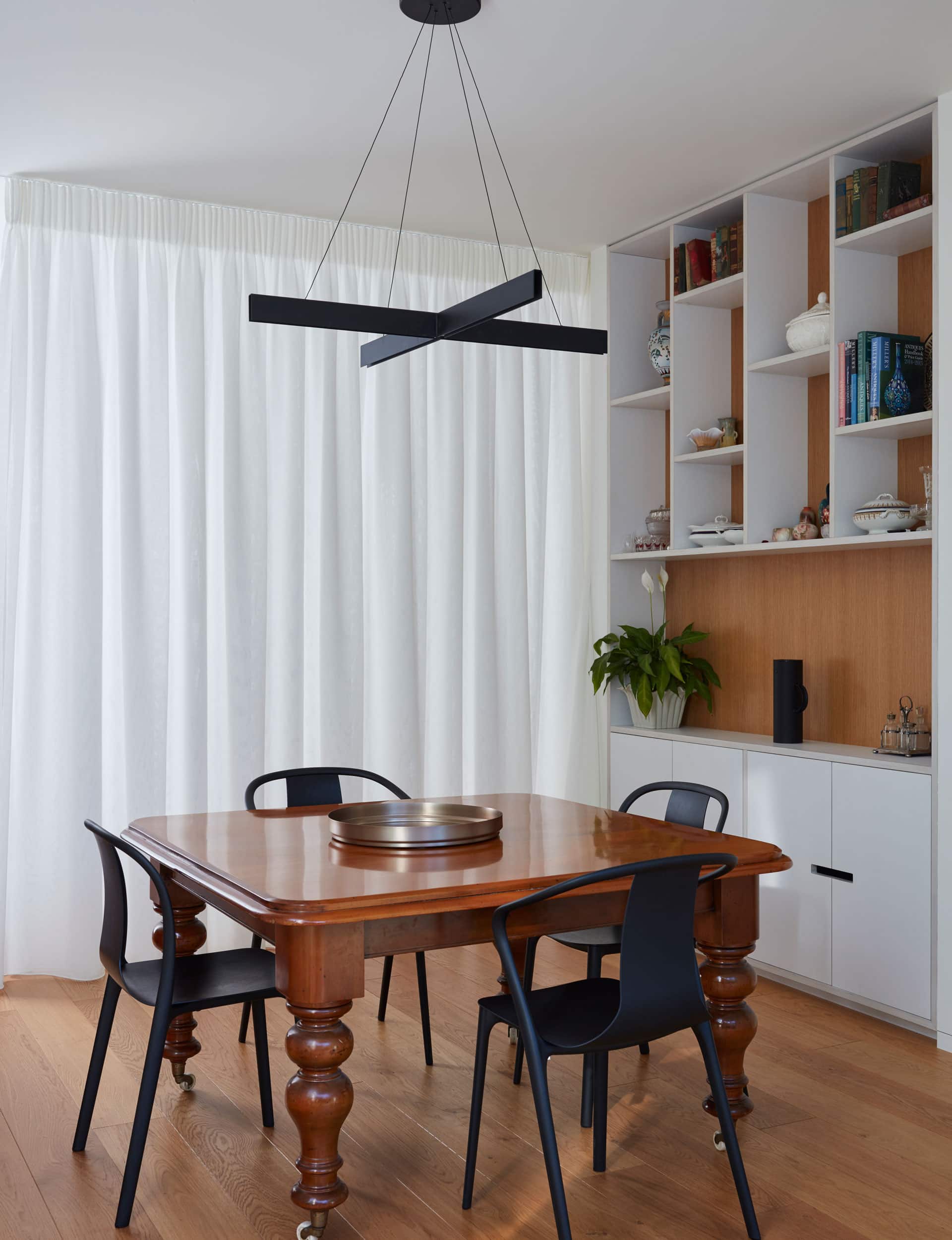
The kitchen and living are to the left, with the sitting room and dining room to the right: it’s an airy, gallery-like space, though large sliding doors disappear into wall cavities to create more intimate spaces. In the dining area, full-length curtains can be pulled closed to create a warm, cosy vibe – a modern twist on their old dining experience. “It’s like being in a very nice tent,” she says.
The laundry, a passenger lift to future-proof the house and a wine cellar are cleverly hidden within the rear of the building. “It’s quite a resolved, mature house,” says Liz. “It’s simple but to make it that simple you have to be clever.”
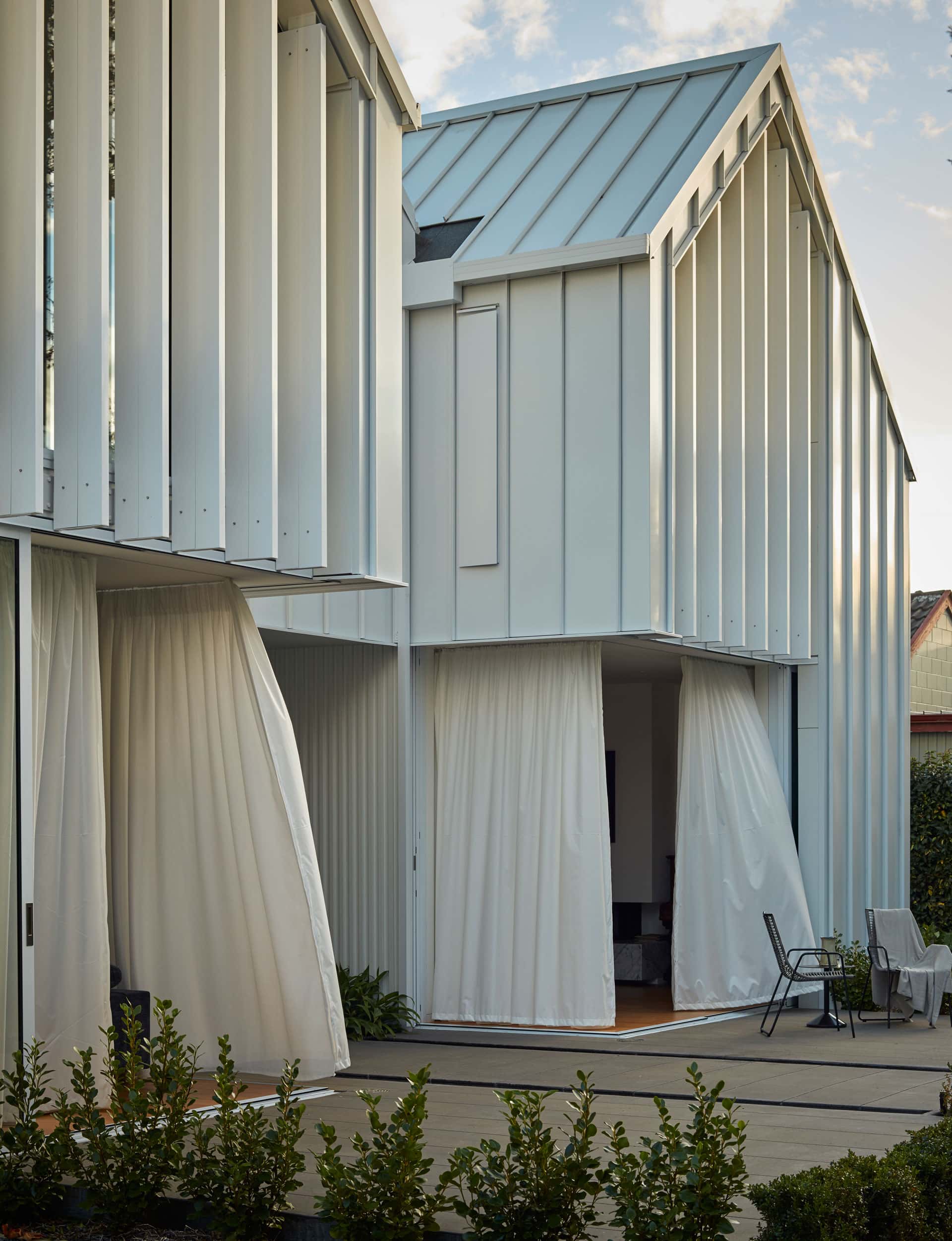
Where the view outside was previously limited by traditional leadlight windows, three-metre-high glass doors now create a constant connection to both front and back gardens.
The doors disappear entirely into wall cavities, creating a dramatic, exposed – and very airy – effect. “It was funny because I said, ‘Oh, we’ve got to have a verandah,’ and [Andrew] said, ‘You’ll just open the doors’,” Liz says. “Isn’t it amazing?” says Ian. “You feel that you’re in the garden.”
[gallery_link num_photos=”16″ media=”https://www.homemagazine.nz/wp-content/uploads/2017/06/img13-8.jpg” link=”/real-homes/home-tours/architectural-design-built-within-quake-insurance-restrictions” title=”See more of the home here”]
Upstairs is uncomplicated, with a spare bedroom, a west-facing sitting room that catches the evening sun and a children’s room for the couple’s six grandchildren. Two bathrooms (the insurance company agreed to replace an upstairs kitchen with another bathroom), Ian’s mezzanine office and the main bedroom complete the layout. “Each room has its own integrity and sense of space,” says Liz.
Mitchell says Liz and Ian took a leap of faith in going for a new, contemporary way of living, rather than simply replicating what they had lost. The result appeals across the generations. The architects took care to incorporate the memory of the old house on both a micro and macro scale – from small detailing such as vertical timber cladding in some places to the siting of the home and arrangement of spaces.
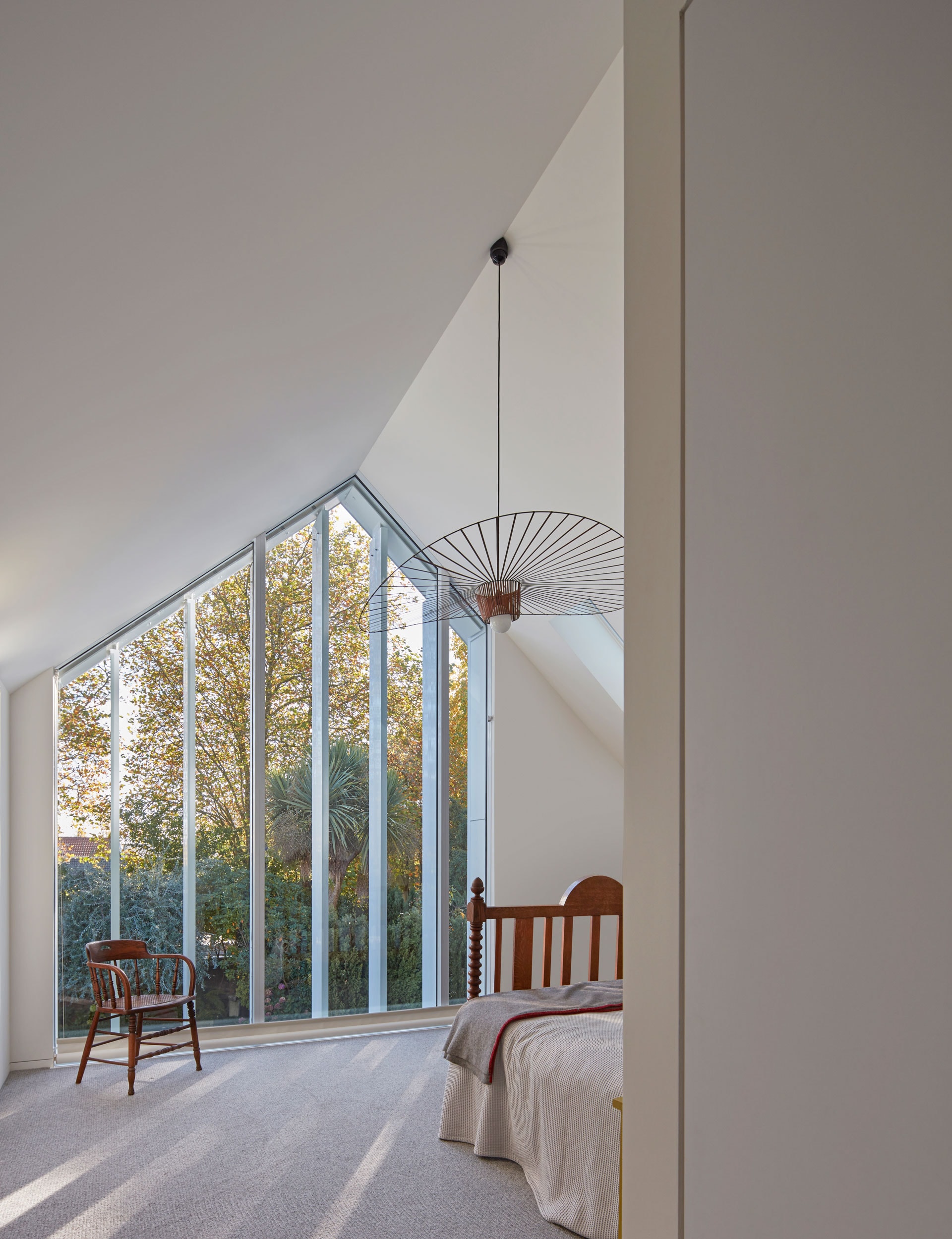
Liz was most pleased to get approval from a cousin in her mid-90s. The original house was “contemporary of its time and very pared back”, she says, but there was no way they would have gone for a replica. “It becomes imitative rather than genuine.”
Ian says the new home “absolutely” makes up for them being away from the property for so many years. When he and Liz return home, they tread the same path as always: the first night in the new house was like déjà vu. “I looked out the window and the five years just disappeared.”
Words by: Anna Frances Pearson. Photography by: Sam Hartnett.
[related_articles post1=”56169″ post2=”50812″]

