In a steep, alpine environment where the land is always moving, architect Stacey Farrell envisioned a home of parts — an experiment in what was possible — and a place that delivered no more than needed.
On a narrow road that winds up a hill towards the Moonlight Track above the Shotover River just outside of Queenstown, Stacey Farrell had routinely run past a steep site covered in blackberry and broom. It was the only one that hadn’t been developed and its presence stuck with her for some time.
“One night I couldn’t sleep thinking about it. It was a challenge. There were mature trees on the site that excited me, and I told my partner, Ben, that I knew we had to buy it. At that stage, you couldn’t even walk on the land because it was so densely covered,” Stacey explains.
Fast forward 10 or so years and a story has unfolded with an enamouring narrative that captures the ever-evolving vision of a protagonist with a spirit of determination. Stacey’s aim: to deliver a not-so-serious response to the site. That ultimately resulted in a cheerful yet thought-provoking experiment in the possibility of building no more than we need.
Step one was the clearing of the land, a job Stacey’s partner, Ben Ruffell, initially undertook by hand until, as he reveals, “I realised we could just get a digger in and do it without the hassle!”
With the land cleared, it was time for stage one to get under way in earnest. It wasn’t just the site that was challenging, with its steep incline; there were also budget constraints and the idea that stage one was to be a temporary home, a building in which to explore the possibilities of building sustainably in this semi-rural alpine environment.
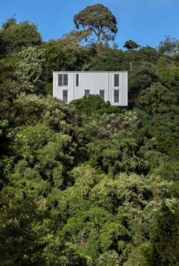
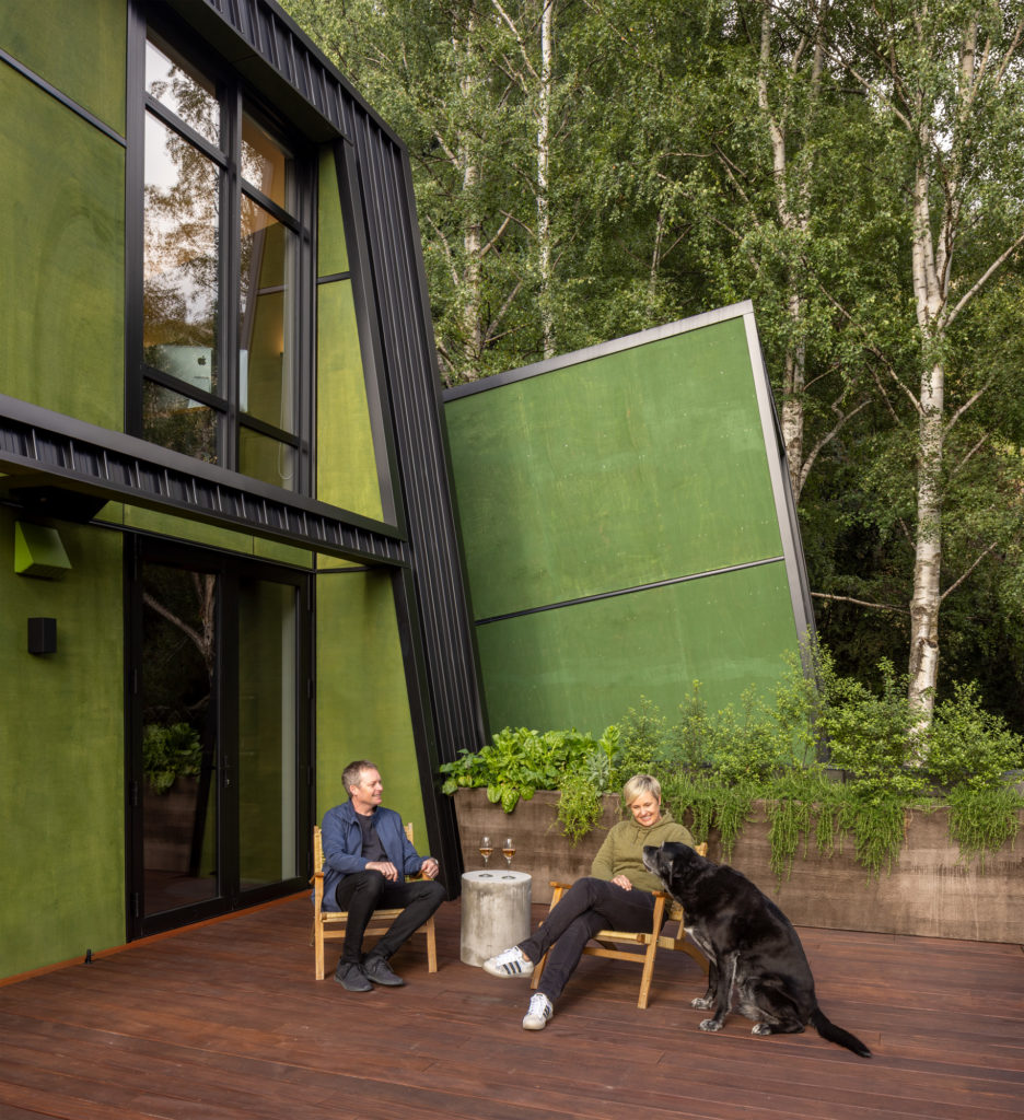
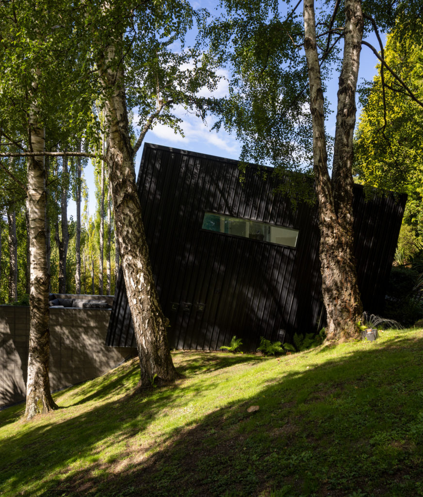
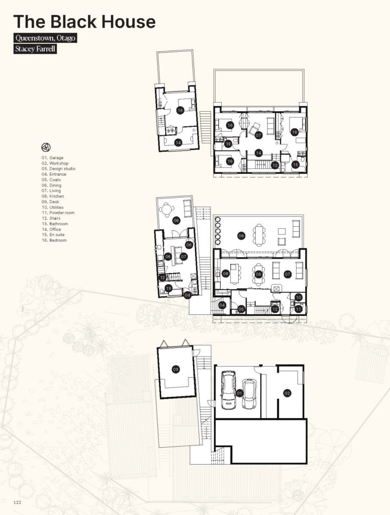
The result was effectively a 70 square metre, two-storeyed tiny home, built on concrete block foundations, that tips back into the hillside. Clad in black Colorsteel and a vivid green-stained plywood, it plays with the notion of being in the treetops. From the upper level, which houses the bedroom and en suite, it does feel “like you are up there in the trees”, Stacey says.
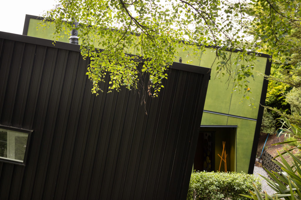
To the south is an area of native bush carefully planted by Ben; to the east a stand of mature silver birch trees. Off the living area is a substantial deck with a balustrade of concrete block, which creates the sense of the space being more like a treetop courtyard than an open deck.
A couple of years into living in this initial build, Stacey turned the garage below into an architecture studio. Here, she ran her business and planned the next stage of this project: a larger home designed for the couple to inhabit for the rest of their lives.
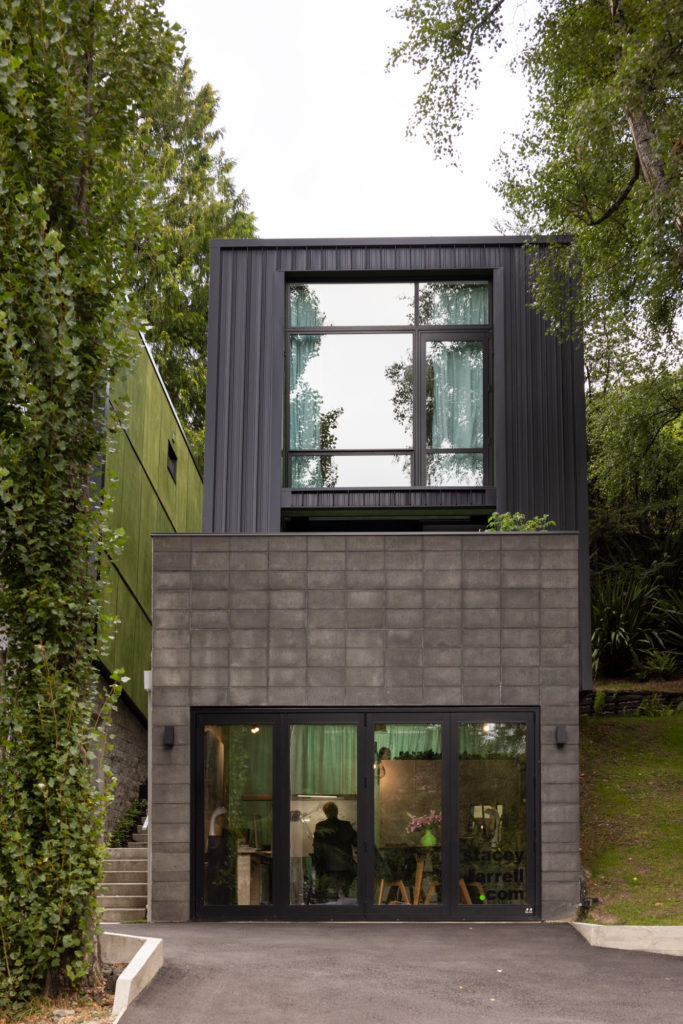
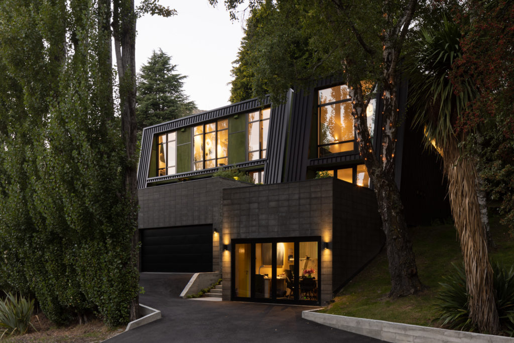
Extensive garaging at the lowest level allows for a full workshop for Ben, along with a dedicated workspace for his film business. Above, the new house follows a similar form to the first, tilted back into the hillside.
“It really digs its heels in,” Stacey says.
Entrance to both homes is by way of a shared external stair that rises up between the two forms.
“The area above the site is a landslide zone where the land is always moving. Boulders slide down and break apart; in the crevices of the broken rock vegetation creeps through,” Stacey tells us.
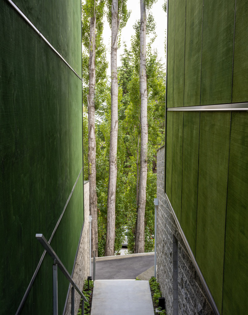
It is this concept that informed the entrance and placement of the two buildings side by side, the entrance stair planted either side, with these elevations clad in the vivid green-stained ply.
“I wanted to create a real vibrancy and an element of fun and surprise. Often, in the Queenstown area, we utilise quite sombre tones and materials, grey and stone. I wanted to create something less serious, a little bit fun, and something fresh and new,” explains Stacey. “It’s a house that evolves with us as we move through our lives.”
The first home is now tenanted, with a view to it eventually being accommodation for extended family or carers.
The main home takes in various aspects: to the north, a row of poplar trees through which glimpses of Skippers Canyon are visible; to the west, Ben Lomond; and to the east, Coronet Peak.
A generous deck above the garaging, mimicking that in the tiny house, allows for the movement of light throughout the day — three seating areas designed for the occupants to follow the sun.
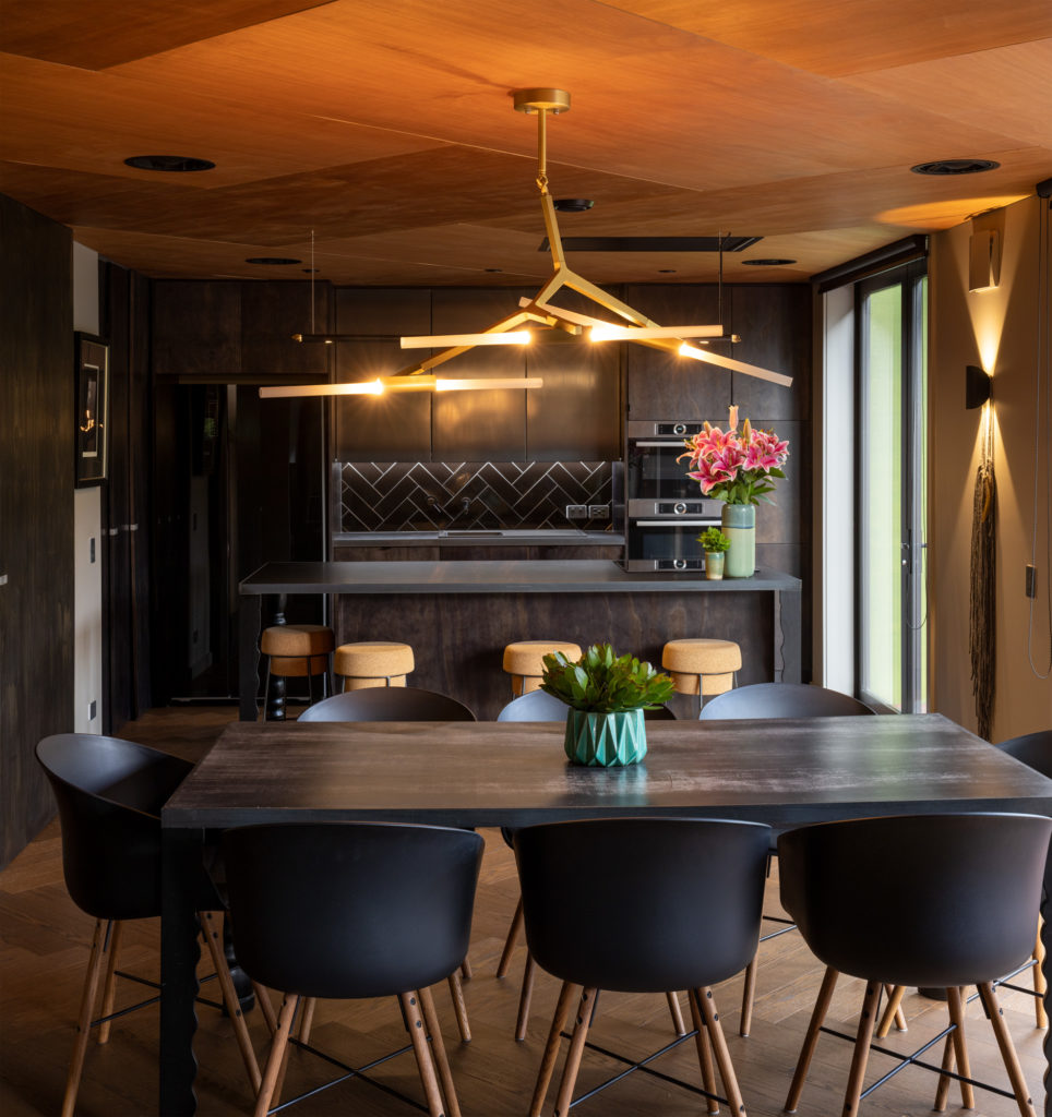
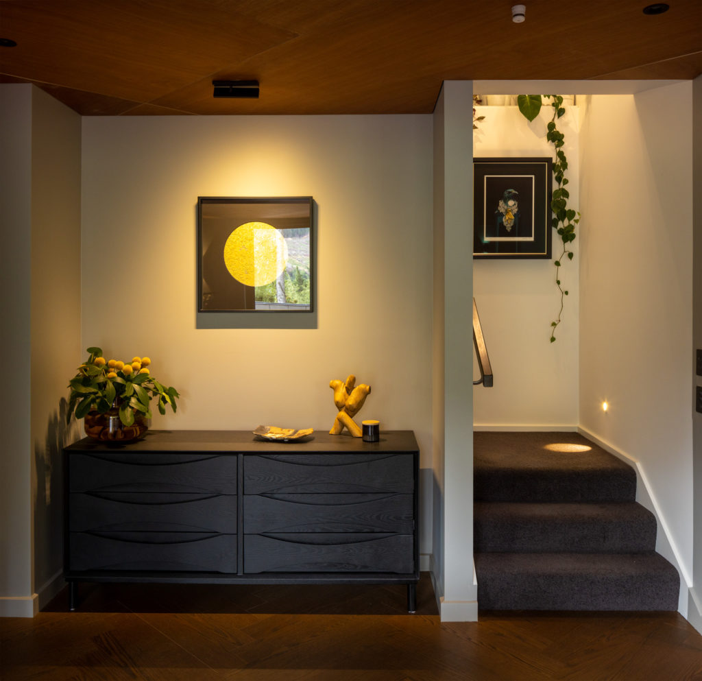
Inside, the living area and kitchen are moody and tactile. There’s a sense of movement and warmth. Herringbone parquet flooring is mirrored in the ply ceiling, also in a herringbone pattern. Between, the material palette spans steel, tiles, and Formica. Kitchen cabinetry is stained black, and the steel panels below the island bench give rise to a depth of tone, with red hues giving way to lighter tones.
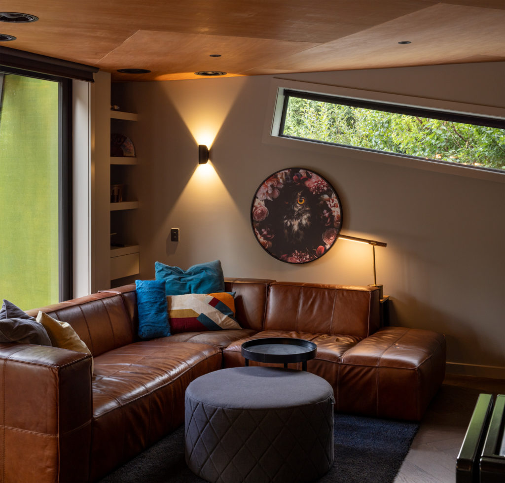
“The induction hob is on the island, so I didn’t want to break the space with a range hood. To keep it open, I used a ceiling cassette that is flush with the ceiling so as not to interrupt the space,” Stacey mentions.
This is one of many details that give this house its character. The windows are another. They’re tilted in line with the pitch of the roof so “they were able to be cut into the cladding and sized to fit between the ribs”.
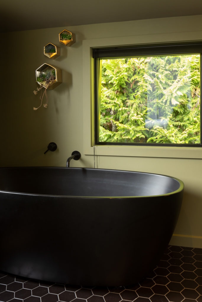
Upstairs, where three bedrooms and a second lounge are housed, is a departure from the entertaining and living area below. Here, the ceilings follow the roofline, opening up from the south towards the poplar trees and from the north to the mountains. The en suite, on the southern side of the house, is tiled in hexagonal tiles; a black, free-standing bath sits adjacent to a large window, which frames the native bush behind. The guest bedroom is an injection of fun — yellow grouting a specially sourced material for the room.
While this house delivers an array of technical elements that allow it to perform extremely well — the slab insulated below and on each side, the airlock entrances for heat retention, the high-performing joinery designed to meet passive house standards, and the outstanding result on a blower door test proving the airtightness of the building — it is the size and material selection that allowed it to become what it is: a house whose design is well worth examining when we consider what a ‘green home’ means in the context of New Zealand architecture.
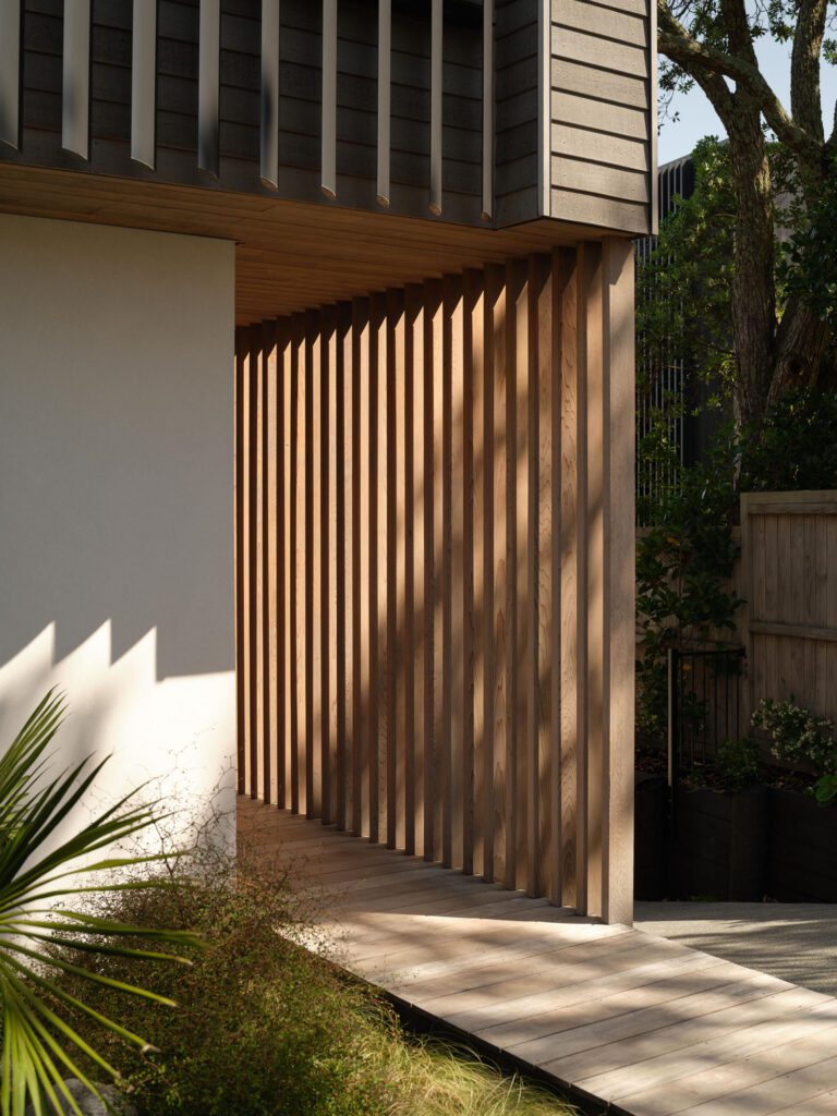
“At the moment, we are focused on carbon,” Stacey explains. “That’s not a bad thing, but I think there is much more to building sustainably. It is about the life cycle of materials, the maintenance they require over time, and the use of local materials. For example, concrete is a material of permanence that requires little or no maintenance. The Colorsteel cladding is similar in that it requires little or no maintenance, and doesn’t require frequent restaining or painting using resources. Water is also a precious resource, and I feel we overlook that in New Zealand and it tends to be squandered. If we look at the life cycle of materials, how we need to maintain them, as well as the performance of the houses we are designing, and the locality of materials, I think we can achieve a much more rounded view of sustainability.”
Next in this evolving narrative: rainwater harvesting, solar, and more planting. The story continues.
Words Clare Chapman
Images Simon Devitt
Gallery
Judges’ Citation:
Within a suburban, semi-alpine context that is prone to landslides, this home stands out, not just by the sheer strength of its ‘split boulder’ metaphor but by a selection of low-maintenance and durable materials, airlock entrances, and adherence to passive construction methods that marry aesthetics with environmental legacy and comfort with passive housing ethos.
In partnership with

