Dulux’s 2019 colour forecast, ‘Filter’, is focussed on personal identification away from digital influences. The four key palettes below aim to encourage individuality and personal expression
The 2019 Dulux colour forecast is all about disconnecting from technology
It’s not just about colour. Each year, Dulux sends a team of colour experts and trend forecasters to Milan Design Week, in which they seek to establish and sieve trends for the year ahead. In doing so, they have one eye on design trends and one eye on broader moves in society. The result for 2019 is ‘Filter’, a palette of four colours drawn on global trends and – let’s face it – anxieties for the year ahead, which play out in four key palettes.
Trending in Milan this year: earthy tones, deep purples and terracottas, paired with heritage items and classic designs. Partly, that’s drawn from a growing hunger for sustainability and wellness – a sense of healing the self and healing the planet at the same time, using themes of timelessness, simplicity, individuality and optimism.
‘Filter’, therefore, is built around finding the essence of life, favouring natural and holistic over the superficial and fleeing. “This year’s theme speaks to our collective craving for individuality and self-expression,” says Harper. “Our confidence with colour is growing, and with this the drive to create spaces that reflect our history, hopes and dreams.”
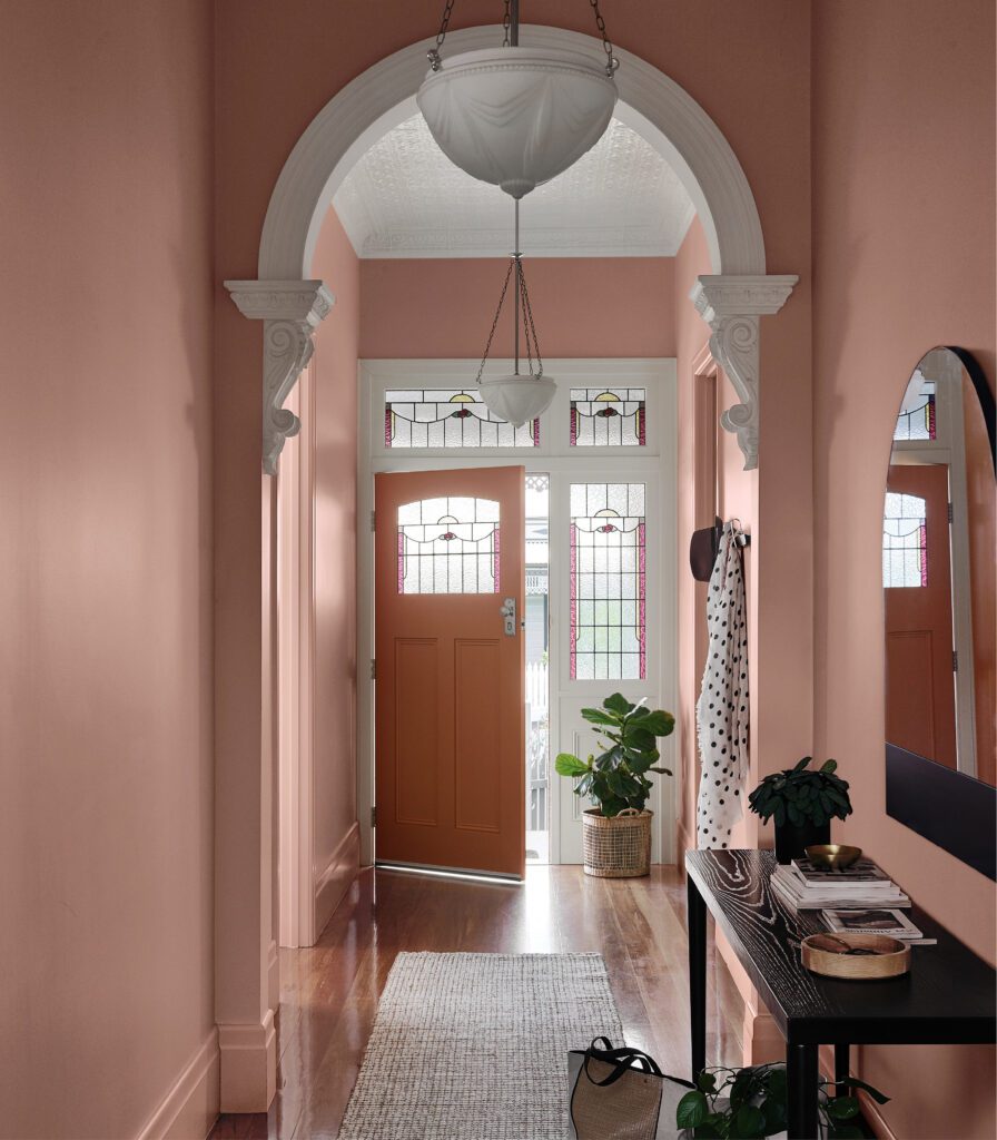
The Repair palette comes directly from a desire to reconnect with nature and form a deeper understanding of our place in the world, taking a more considered approach to the objects we use. Earthy neutrals, rich greens and spicy notes of cinnamon and sienna create a cocooning, soothing palette that is grounded in nature and vintage objects. “It sets a warm, nurturing mood in a space,” says Harper, “and creates the perfect backdrop for timber, leather and unusual collectibles.”
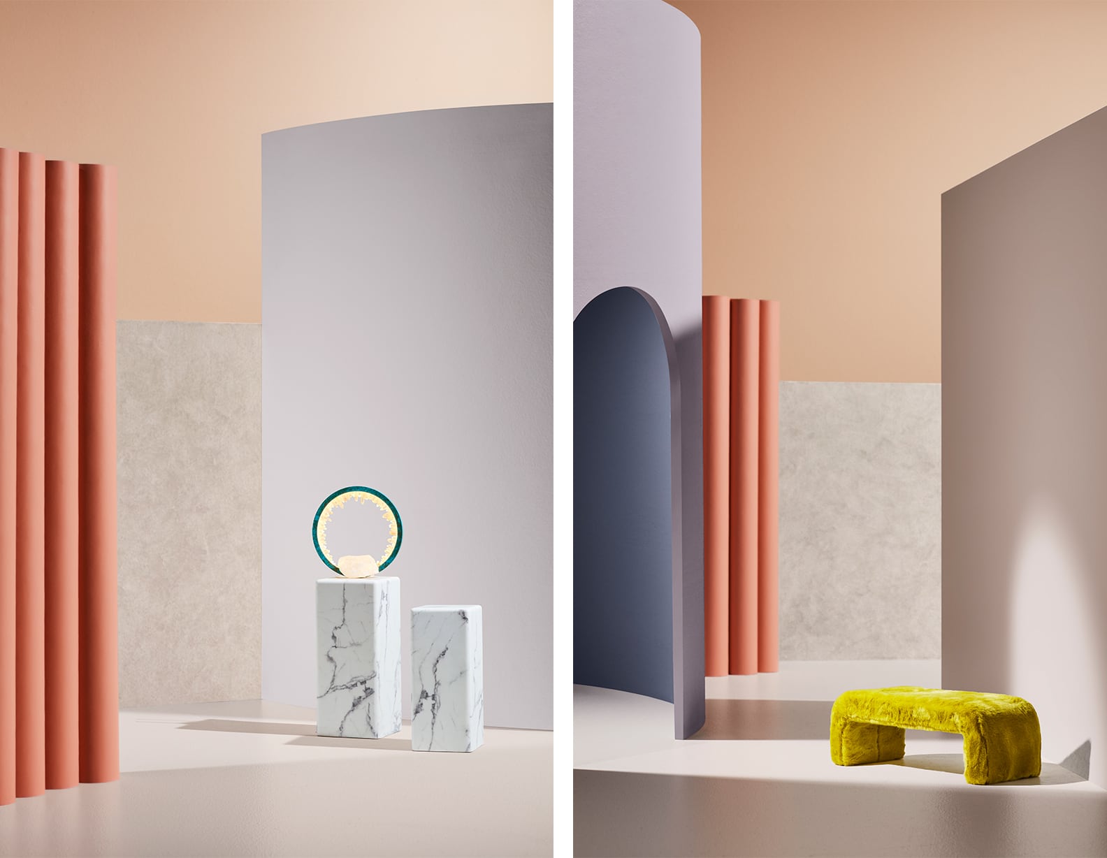
Wholeself, meanwhile, is a response to the digitally overloaded world we live in. We increasingly have an overwhelming need for stillness and quiet, and the palette delivers with gentle shades of mauve-grey, powdery pinks and touches of gold to create serene, calming interiors that allow you to take a breath. “With its soft, light tones and subtle layerings of texture,” says Harper, “it’s a palette to ignite the senses and revive a tired spirit.”
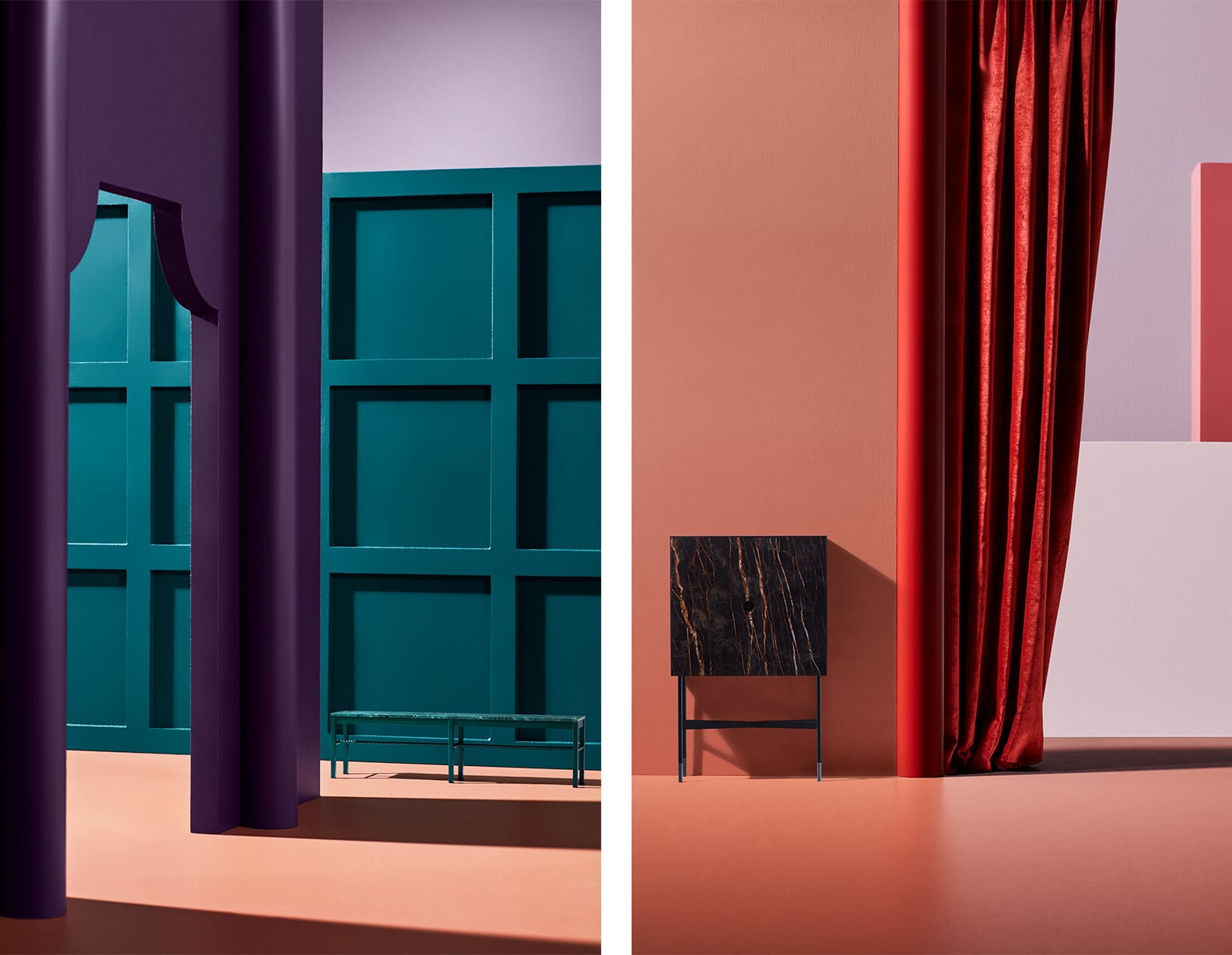
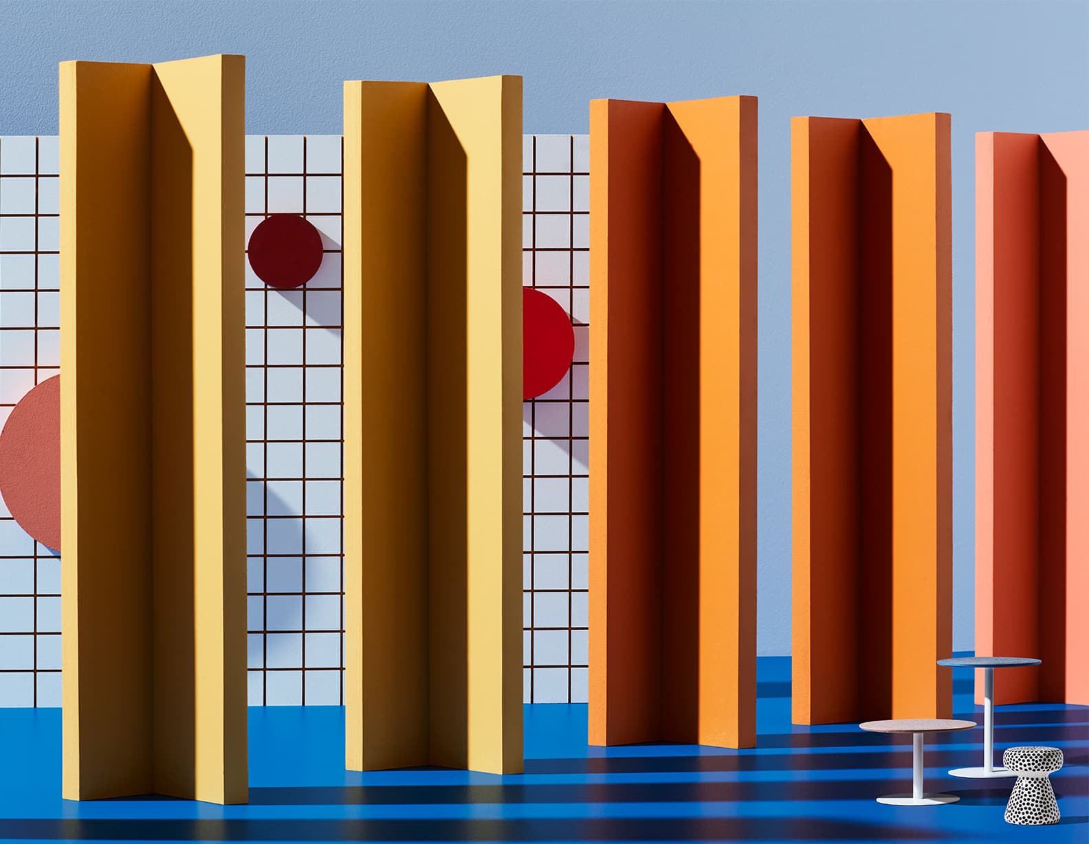
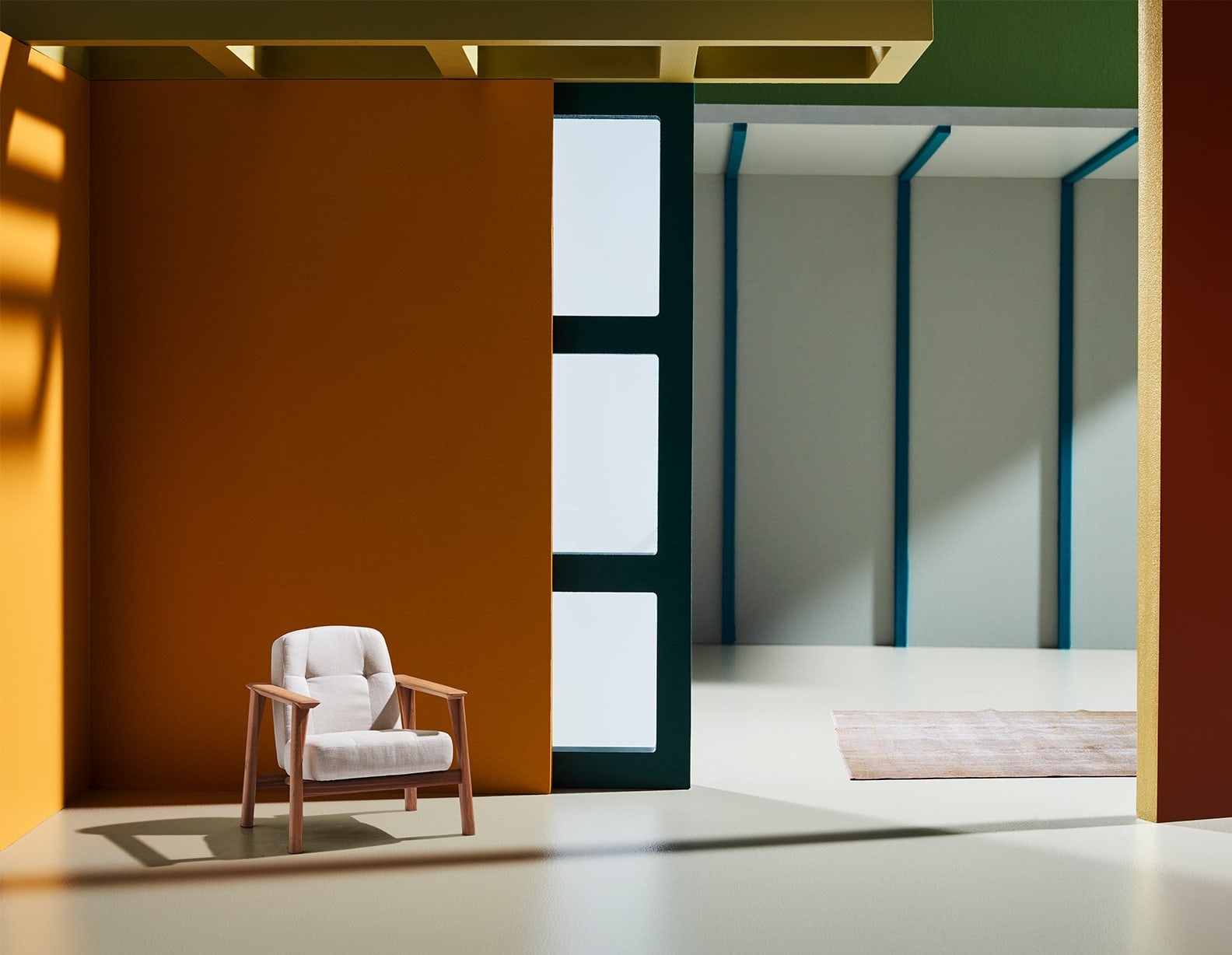
With Legacy, Dulux distances us from damaging consumerist habits, seeking to draw influence from the past – it’s a palette of intense, saturated hues including deep purple, russet and aqua, offset by brown-based pinks. There’s an elegance, and a theatre to the palette with eclectic patterns and block colour. “Think rich colour, classic furniture and sumptuous textiles used in unexpected ways,” says Harper. Purple has emerged as a base colour here, softened by lilac and mauve.
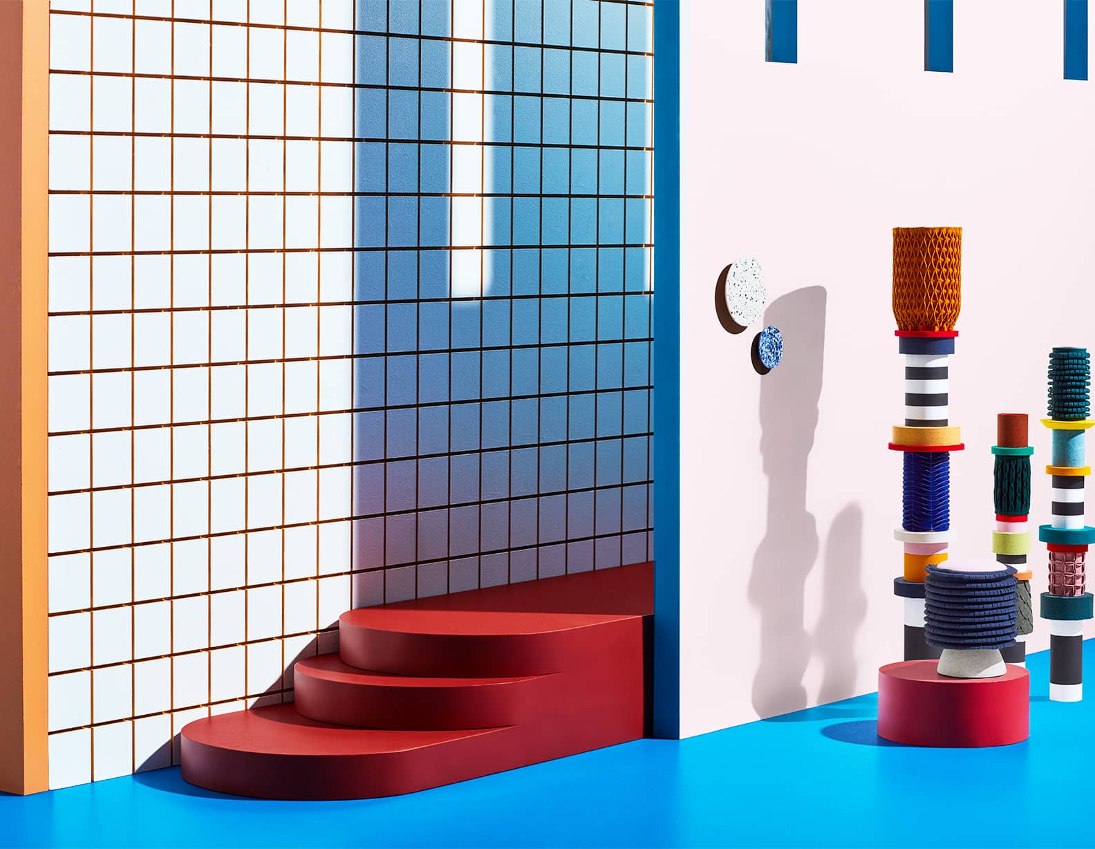
Finally, Identity is something of an outlier here, featuring striking blues, purples and shades of citrus. It’s interested in the self, but not the selfie, drawing from modern sci-fi fantasy and the anti-selfie culture, where we turn our backs on social media and please our selves. “These colours command you to be brave,” says Harper, “and experiment with unique looks in the home.”
Photography by: Mike Baker. Styling by: Bree Leech
[related_articles post1=”84200″ post2=”76332″]