Dunedin-based artist Kim Pieters let’s us inside her beautiful weather-beaten studio and discusses how she finds happiness in painting on found materials
See inside the creative space of Dunedin-based artist Kim Pieters
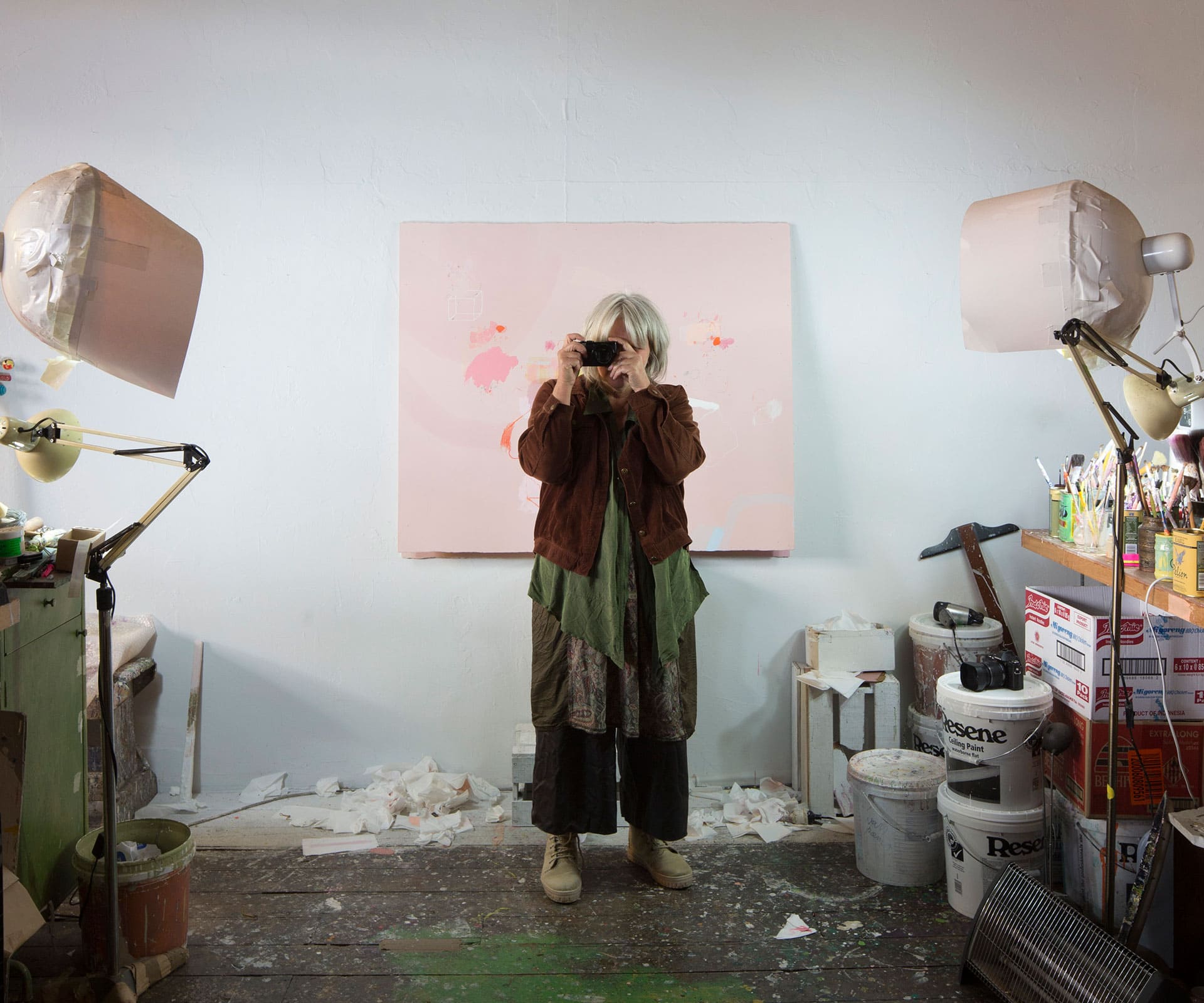
Against a white wall painted not quite to the ceiling so that bare lining hovers like a strip of beige sky above her studio, Kim Pieters props one of her latest works on an old crate and a couple of Resene tubs of house paint.
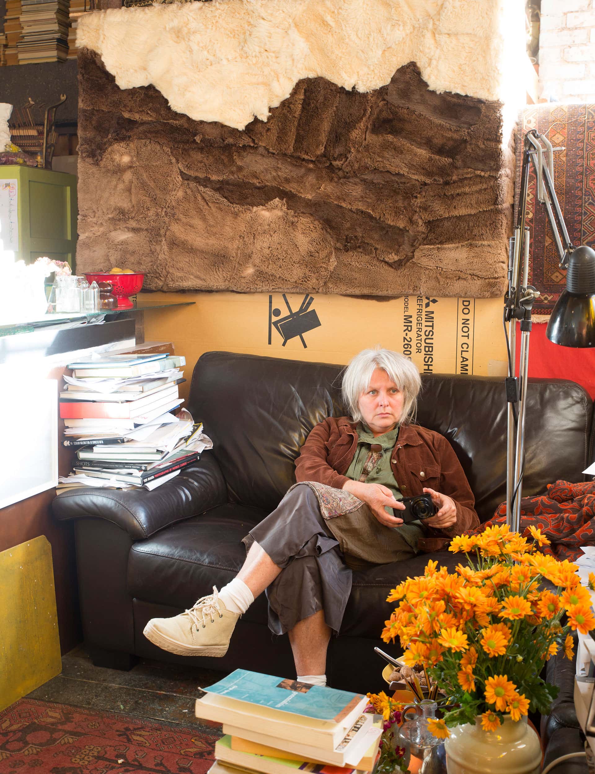
Its surface is a kind of dusty pink, marked with her characteristic little interventions: small scribbles, blots of paint like colour tests. The painting seems to float, slightly ethereal – a silence in a room filled with books, brushes and pencils, heaters, floodlights, cut flowers, and Pieters’ poised, intense presence.
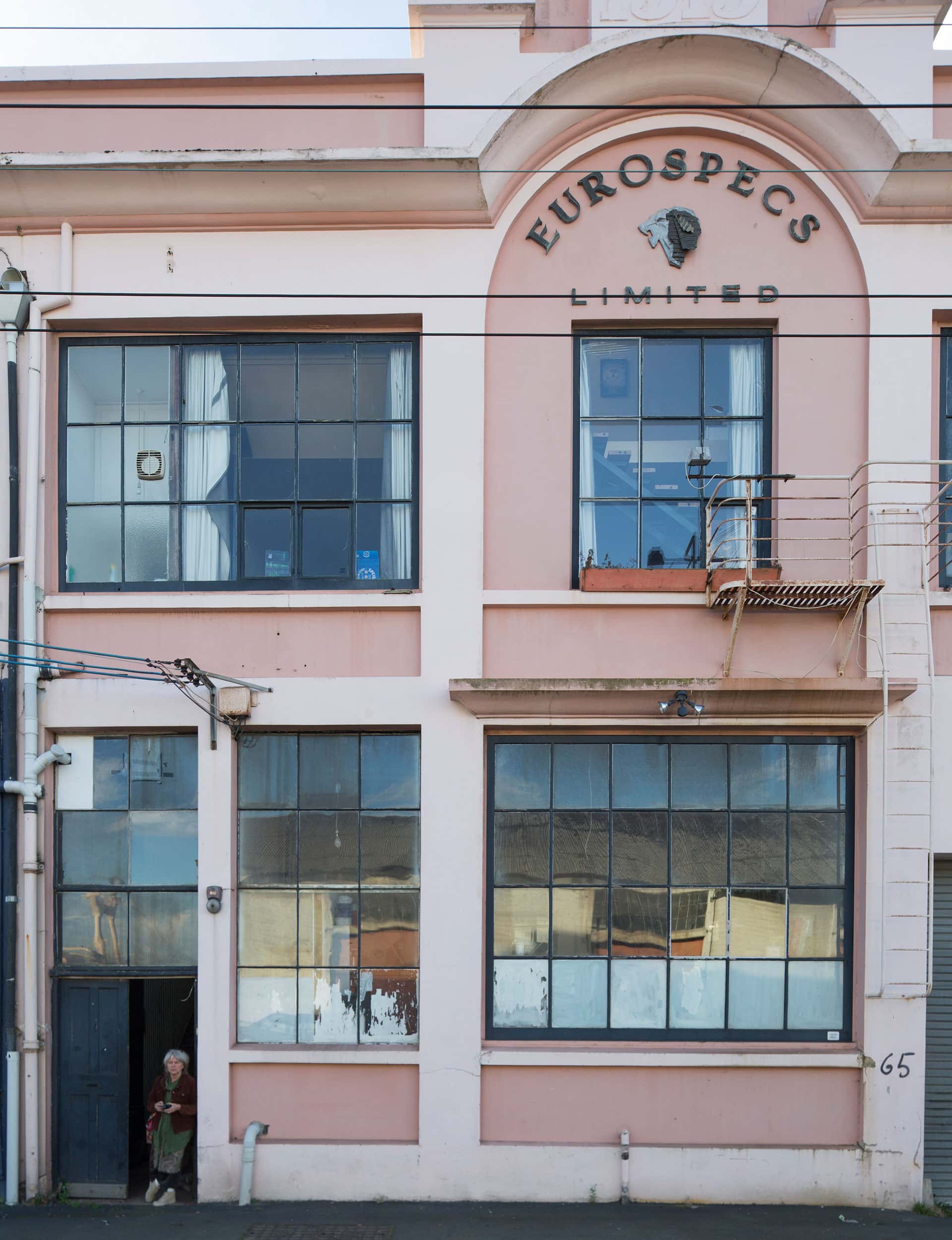
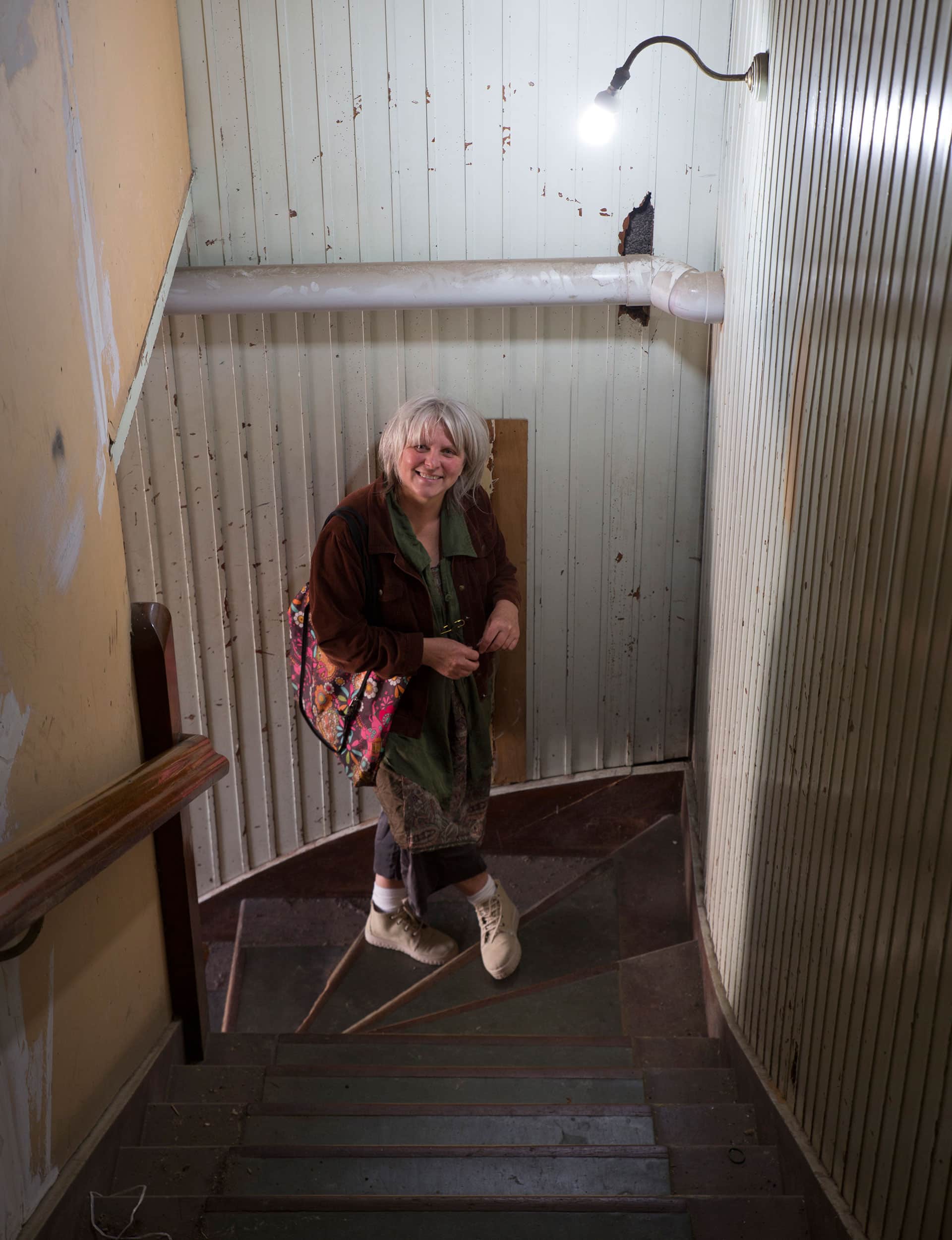
Pieters is a long-time Dunedinite, a fascinating artist whose slow-burning career is finally getting traction further north. Her studio occupies a faded, weather-beaten beauty of a building with huge windows in Dunedin’s industrial harbour area.
It seems an ideal spot for her to explore the intersections between built environments, tough terrain, and our intimate experiences of both. Although, as she tells me: “For years I’ve been threatening to move to Oamaru! It has these incredible norwest skies, and a much more pleasant climate than Dunedin.
But I think I’m in love with Dunedin. It’s surrounded by a powerful landscape. As a break from the studio there’s a choice of around seven beach or lagoon locations, which are all stunning. But the real reason is that I’m an introvert and I need a lot of empty space. Dunedin certainly gives me this.”
Pieters also works in photography, sound and installation. But her increasing national profile is connected to her paintings: subtle works that riff on the dual histories of the monochrome and the kind of scrawly abstraction best embodied by Cy Twombly.
That’s not, however, to suggest that her work is derivative; in fact, more and more critics and curators are starting to recognise how unique her merging of 20th-century art histories, local formalist traditions, and Continental philosophy really is.
In recent years, she’s had fantastic shows at Auckland’s Artspace and Wellington’s Adam Art Gallery, and was included in the Auckland Art Gallery’s big contemporary painting survey, Necessary Distraction.
“Painting is where my attention is completely absorbed,” she says. “I love photography, and have an interest in film and experimental music, but these have always been side projects for me. I don’t have the time to develop them all; I wish I did. I’m happiest when I’m painting.
It’s one of the most challenging, terrifying, exhilarating, joyful, beautiful and involving experiences of living for me. And my complete desire is that some of this experience translates to the experience of the person who sees the work.”
At the moment, she’s working on a series of paintings that will be grouped under the title The Lovers, inspired in part by her intrigue with the differences between Western and Eastern representations of love – European paintings often tending towards violation, aggression and competition, while Indian miniature traditions offer a more holistic sensuality.
That said, she doesn’t want her titles to be our only way into her work. “They’re always supplements, not meanings set in stone,” she says. “They’re important; they’re involved but remain open. When I paint I am looking to hold the unsayable. This is a folding which has a lot to do with poetry.”
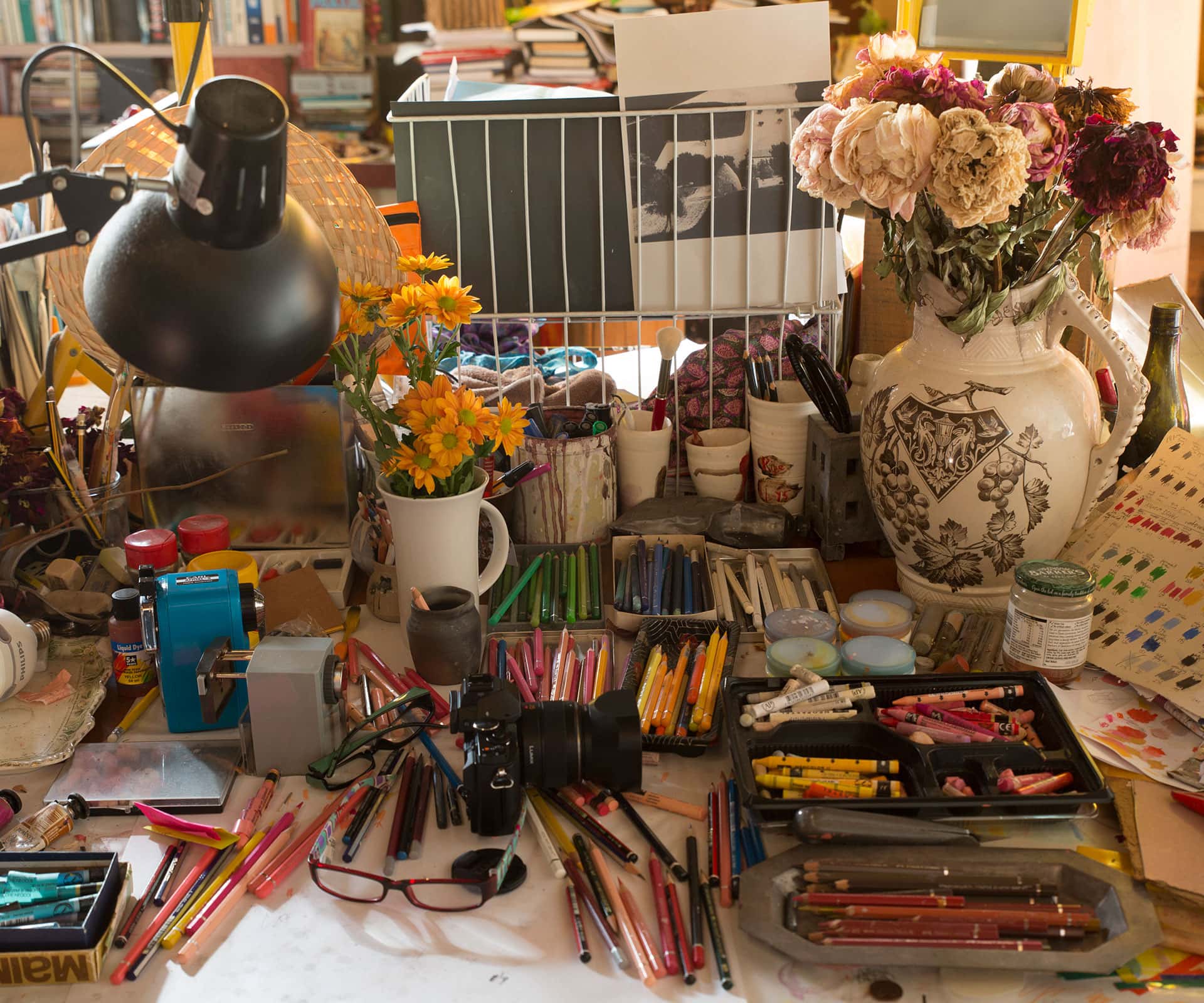
One of the great strengths of her paintings is the way this intimacy and life doesn’t just make itself known through her marks, but through what she describes as “a deep respect for the matter of the world” – something that manifests in her choice of worn, damaged hardboard as her substrates.
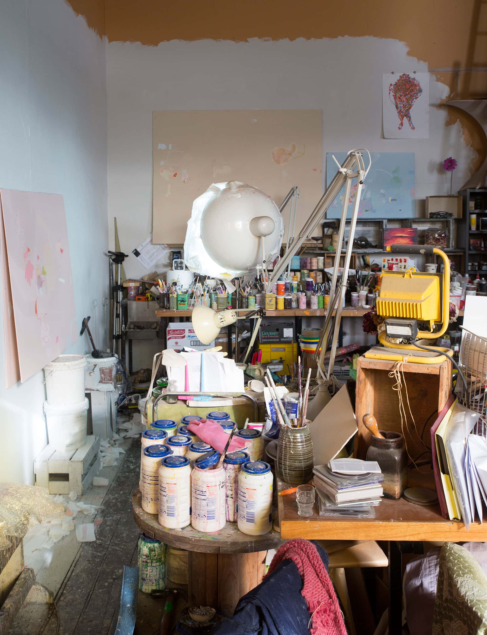
On these, she then builds up incredibly delicate painted surfaces. “I’ve worked with these so long, they feel like natural art materials to me,” she says. “I collect demolition pieces of hardboard, and I find their often ravaged states exceptionally beautiful.
There’s something magnificent about the innate life of matter revealed in their cracks and edges. The monochromes allow these to shine. I’m always shocked when people consider them wounded or broken.”
With their icy blues, indigos and vaguely pastoral greens, Pieters’ works are, in some ways, part of a long landscape tradition: there’s something definitively Southern about the light in her work. But it is the potential of abstraction, and particularly its affective qualities – its ability to move us, to change how we think and feel about our physical relationship with the world – that really drives her practice.
“I’ve been mortified to realise quite late that so many people are afraid of abstract painting,” she says. “They immediately cut off; they don’t even begin. This is terrible. And it’s something artists often forget, because the art world lives in its own bubble and often speaks only to itself.
For me, abstraction is intimately tied to ideas of experience and language. The most curious, the most wonderful thing – but perhaps also the most terrifying – is that which we can’t name. This is where everything begins for me.”
There is a consistent trait in Pieters’ thinking: a kind of romantic clarity, balanced between theoretical rigour and a deep, genuine involvement with the world around her. “I’ve taken to describing my method as ‘vital formalism’”, she says. “I use organic rather than geometric forms, but each mark is considered within the composition as a whole, almost in a mathematical way.
“I’m interested in the sublimity of the material shape, the utter strangeness of these forms, the way it’s difficult to name what’s happening – the way we can’t measure the perception of the colour blue for instance. For me, this unknowing is full of possibility.”

Her unknowing is also a form of openness; a quiet embrace of the potential of ambiguity, and an understanding, embodied by her perfectly pitched paintings, that there is a point where language stops doing justice to our lived experience, and the visual has to take over.
Words by: Anthony Byrt. Photography by: Patrick Reynolds.
[related_articles post1=”58040″ post2=”59390″]