


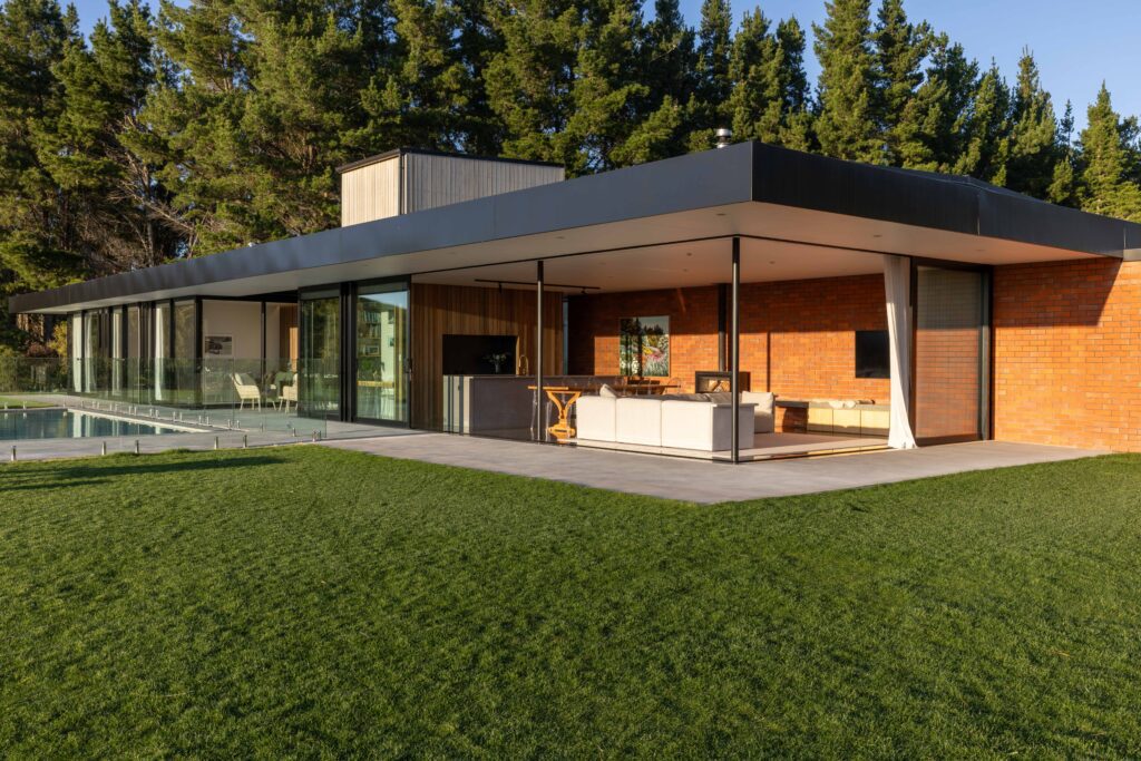
Five simple elements and the well-placed delivery of a stunning view define this minimalist, Hawke’s Bay home by Dorrington Atcheson Architects.
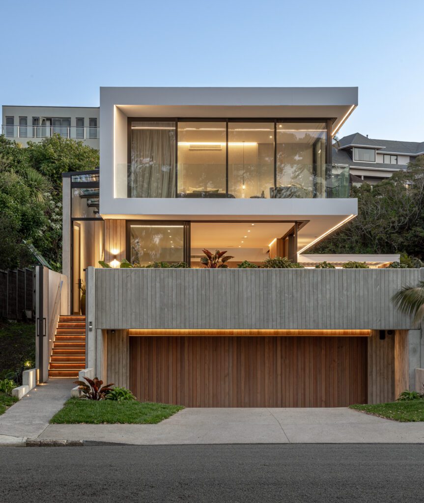
When a client’s brief is to “come up with something you think looks good”, the parameters are so open and the trust so complete that
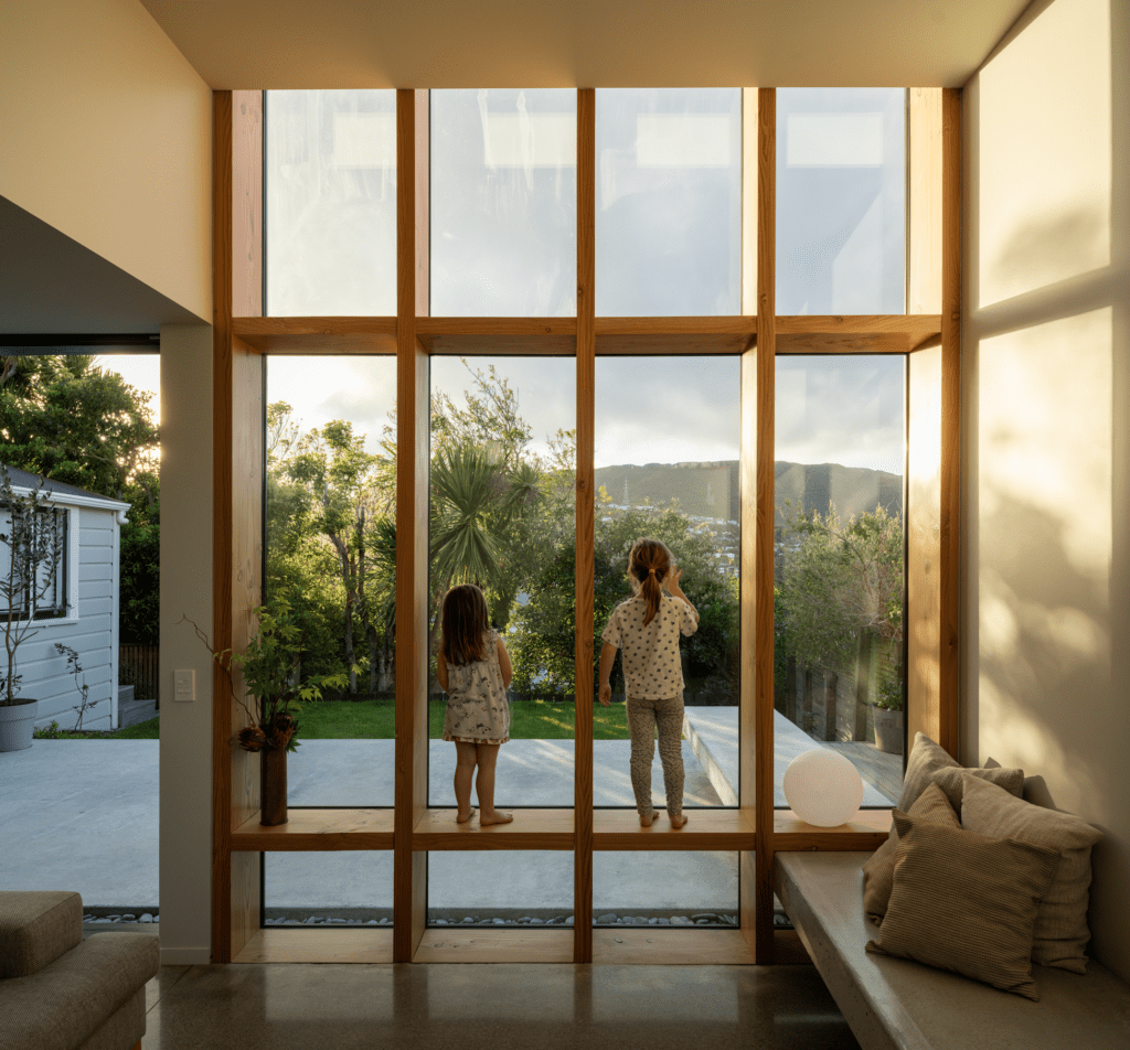
This clear insertion into the back of a century-old Wellington villa provides an extra 135 square metres and a myriad of spatial experiences for the
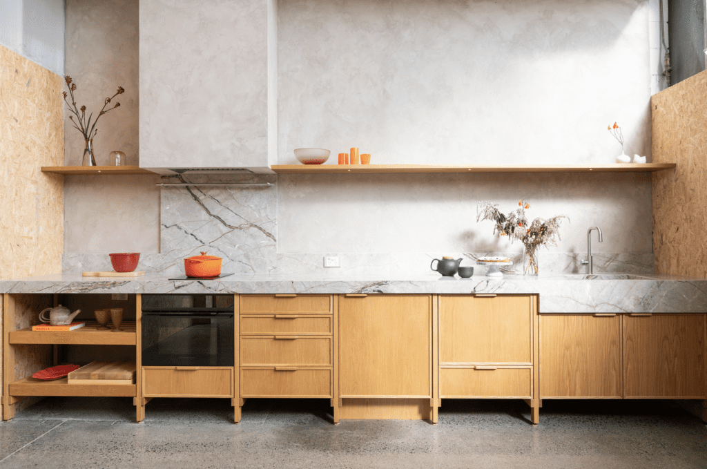
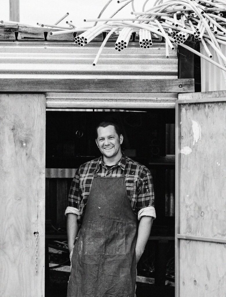
Step into the Auckland headquarters of design and make studio, Fieldcraft, and you’re immediately immersed in a world of creativity that extends well beyond these