Inspired by global trends, Dulux reveals four curated colour palettes in their 2018 forecast that are set to inspire New Zealand interiors
[jwp-video n=”1″]
Dulux reveals its 2018 colour trends
It’s possible that the annual Milan Design Week has the single-biggest effect on home furnishing around the world over the following year. Designers producing furniture, lighting, ceramics and textiles gather to show their wares and seek inspiration: it’s a huge event that takes over the city.
Each year, Dulux sends a team of colour experts to Milan. The team scours the city, seeking out an unknown ceramics maker using the discarded filings of a locksmith, for instance, or the ephemeral textile masks of Kvadrat for GamFratesi. They measure, record, weigh and argue. It’s beautiful, yes, but is it a trend? Where is the world’s collective taste heading? And, most importantly: how will this affect New Zealand homes in the years to come?
They then return to Australasia to develop and tease out these observations – hundreds of them, recorded on phones and in notebooks – into four key themes that drive the colours of the year ahead. It’s a unique way of working, rooted in thorough research; plus, New Zealand consumers get access to the resulting palettes just months after the event. No longer do we wait a year or two for the cycle to reach our shores.
This year, the team noticed raw textures and soft neutrals, juxtaposed with rich, luxurious greens and playful tropical brights. It’s part of a bigger, contemplative trend as people seek balance, connection and community in their lives. The colours are rich and moody, ranging from luxurious to ethnic in influence; they are honest and delightful to live with.
“As we let go of the idea of perfection in both our homes and other aspects of our lives,” says Davina Harper, Dulux colour expert, “we are instead seeking to create balanced, harmonious interiors that stimulate the senses while simultaneously allowing us to relax and retreat.” The result? Balance, a series of four palettes rooted in a generous, enveloping idea of home.
[jwp-video n=”2″]
Essential
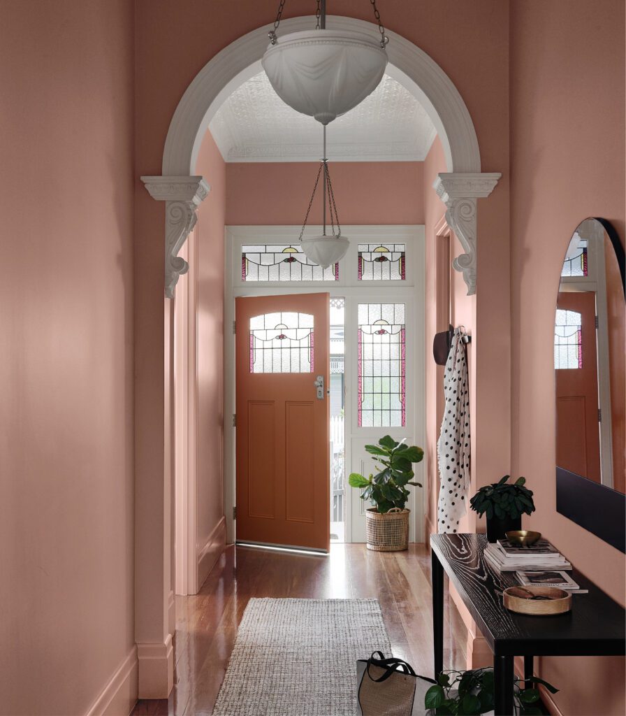
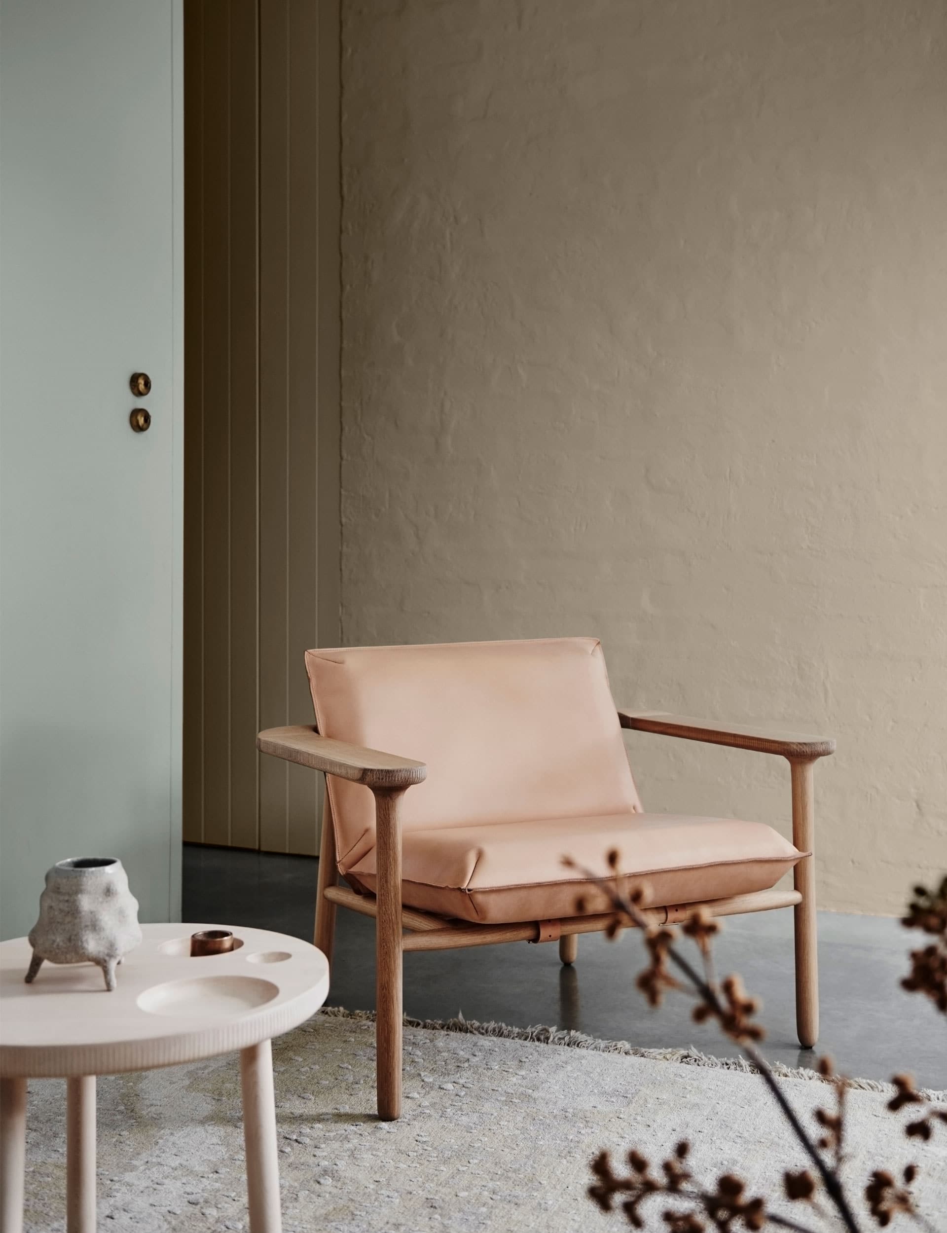
The Essential palette follows a Nordic philosophy: no longer is consumerism the status symbol it once was. Instead we’re driven to own only the things we need. It’s soft, calm and nurturing, running from warm shades of leather – Dulux ‘Clay Court’ and ‘Gnu Tan’ – through to putty and cooler grey-greens, such as ‘Spanish Olive’.
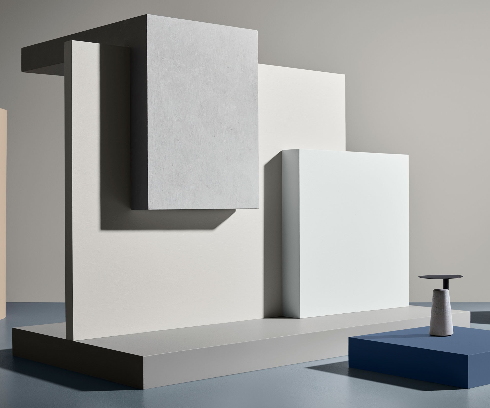
There are other highlights too – the dusky pink of ‘Mornington Half’, or the blues of ‘Little Shoal Bay’ and ‘Adele Island’. It’s a palette to both calm and rejuvenate the senses.
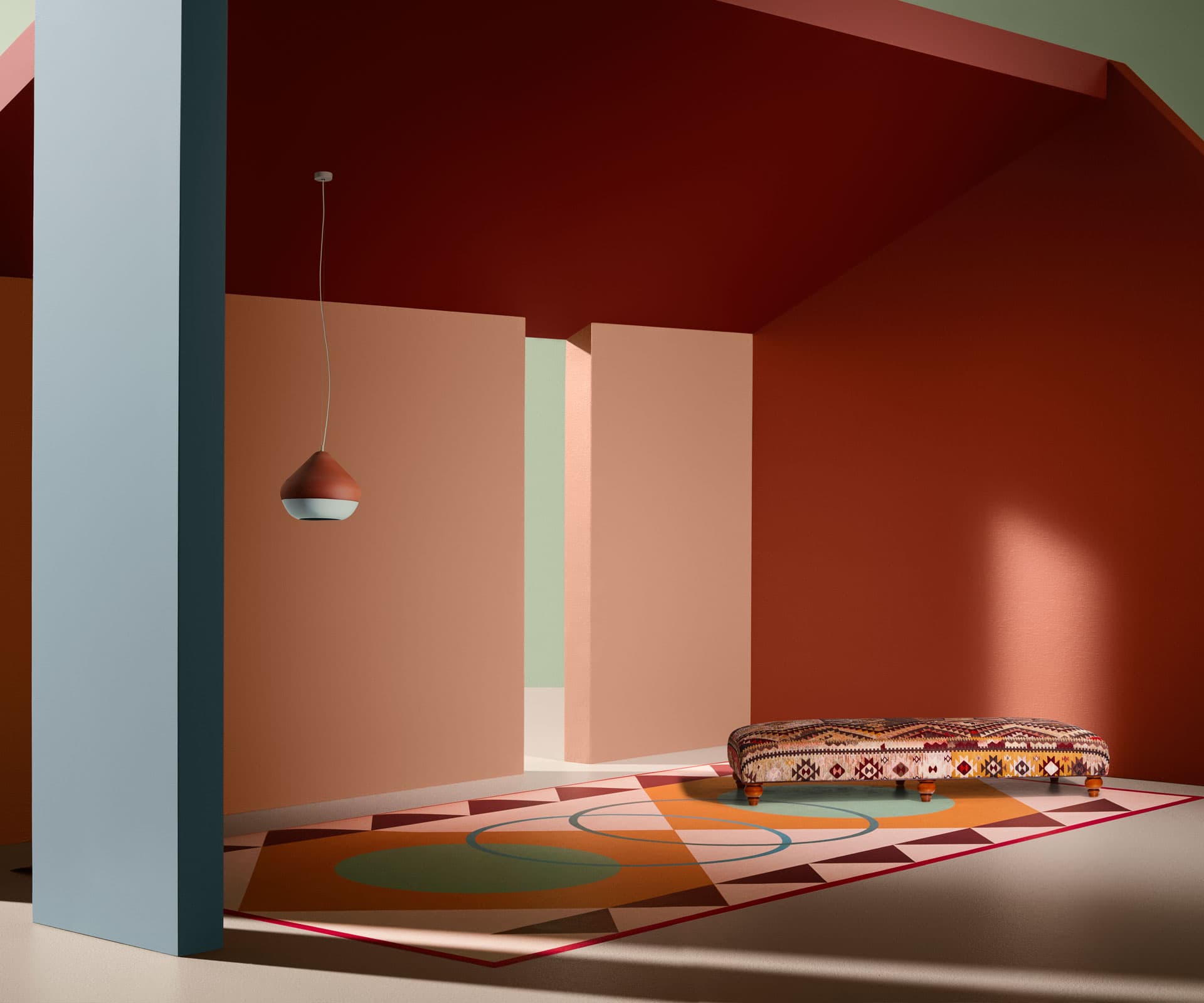
Kinship
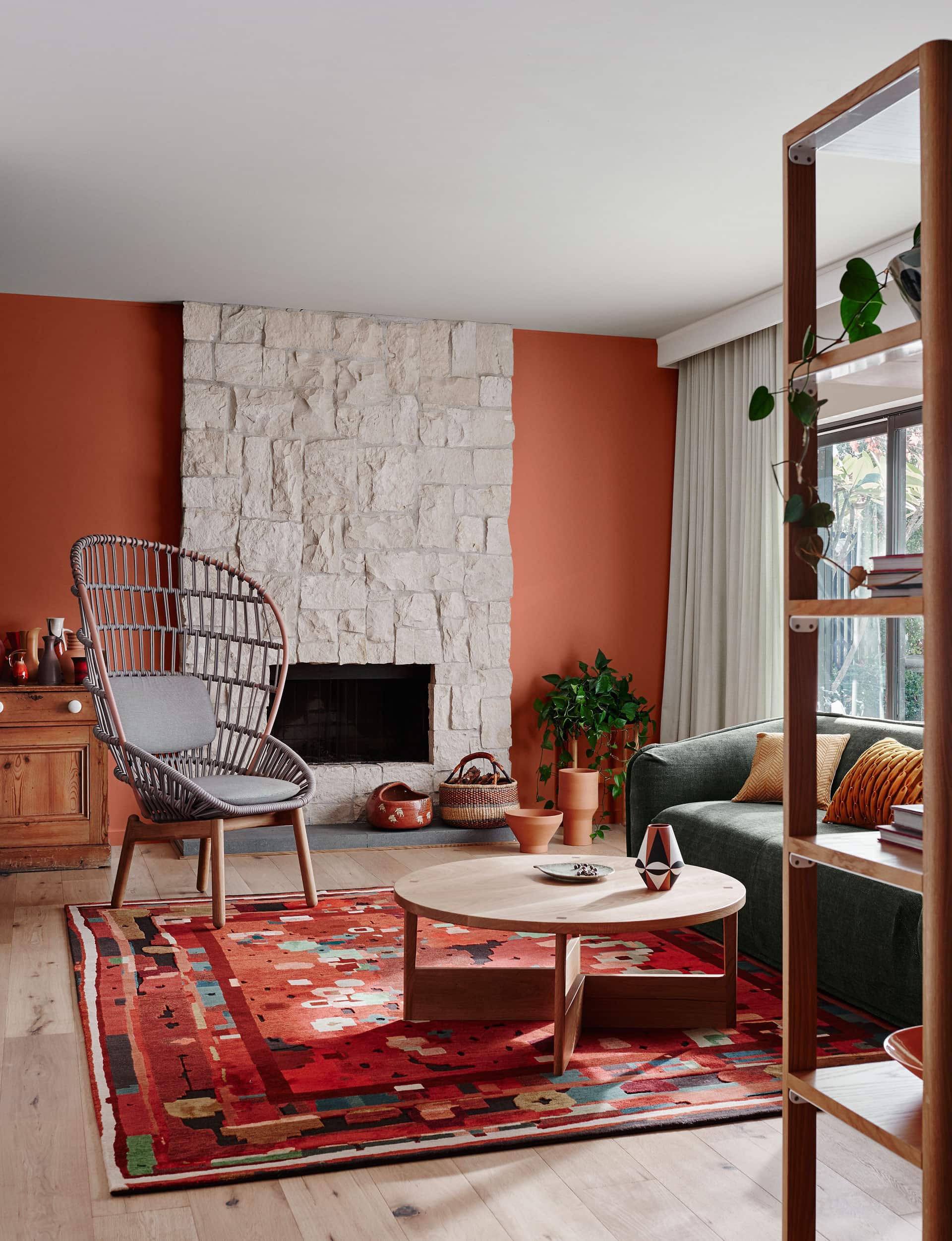
Social and political changes are afoot: uncertainty and unrest fill our news feeds. Not surprisingly, we seek trusted people in our close circle for truth and transparency. Folklore and traditions are revived: in this palette, traditional cultural heritage is renewed in a contemporary way – tassels, patterns, fringing, embroidery and carving.
There are the earthy, rich hues of Dulux ‘Motueka’, ‘Very Terracotta’ and ‘Fortrose’, mixed with cosy neutrals, such as ‘Glinks Gully’ and ‘Maiko’. This rich palette reminds us that the biggest luxuries in life are often the most simple.
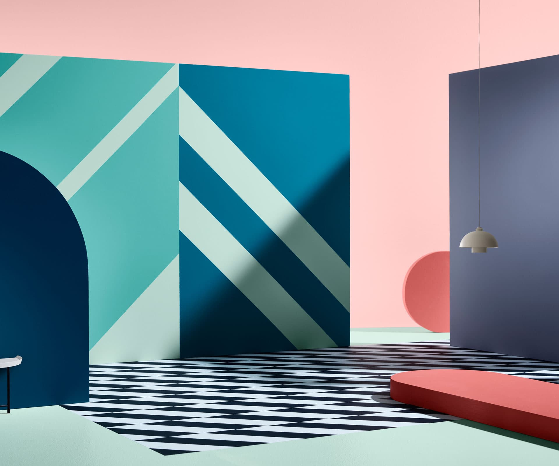
Escapade
As well as staying close to home, we’re all global citizens. Escapade celebrates luxury-hotel holiday experiences and the glamour of tropical destinations – it’s playful and colourful, with a determinedly 1980s feel in the saturated orange of Dulux ‘Tangerine Flake’, the teal of ‘Bondi’, along with the crisp, minty accents of ‘Waitiki Landing’, and running through to deeper shades of teal in ‘Manu Bay’ and blue with ‘Hurstmere Road’. And no Tropicana theme would be complete without coral – or ‘Cuticle Pink’.
Reflect
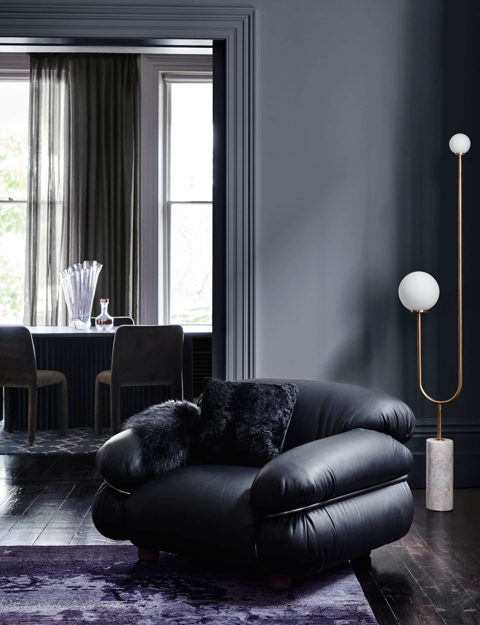
Reflect encapsulates our obsession with moody, textural luxury by combining 1970s glamour and – yes – 1990s swagger, plus a touch of 1930s elegance, to create a range of jewel-like tones that are opulent yet refined.
The palette is rich and pure: focusing on greens (‘Forbidden Forest’) and warm shades, from the pink of ‘Smoky Quartz’ to the greyed-off purple of ‘Rongotai’, showing that purple’s day has come again. Avocado, as seen with ‘Amazon Queen’, meanwhile, makes a welcome highlight.
To view the 2018 Dulux Colour Trends online magazine, visit dulux.co.nz/colour
[related_articles post1=”75932″ post2=”74565″]