Architect Dom Glamuzina updated an apartment in a glamorous 1960s building with a palette of saturated pastels, brass and marble
Welton Becket is something of an outlier in American architecture.
During his long career he designed thousands of buildings and established a practice that eventually numbered more than 500 people, with offices spread from New York to Los Angeles, and projects as varied as the Capitol Records building and Beverly Hilton in LA, and the Hotel Intercontinental Manila. He was known for buildings that were statements of prestige and power, and he was one of the first architects to create ‘total environments’, in which he and his studio designed everything from the light fittings to the furniture.
But he was also among the first of a group of ‘corporate’ architects, occasionally regarded with suspicion for a body of work that bore no single imprint but, rather, ranged from Moderne to the International style, yet was always loosely modern. He refused to discuss architectural theory. “A building,” he once allowed, “should reflect the client, not the architect.”
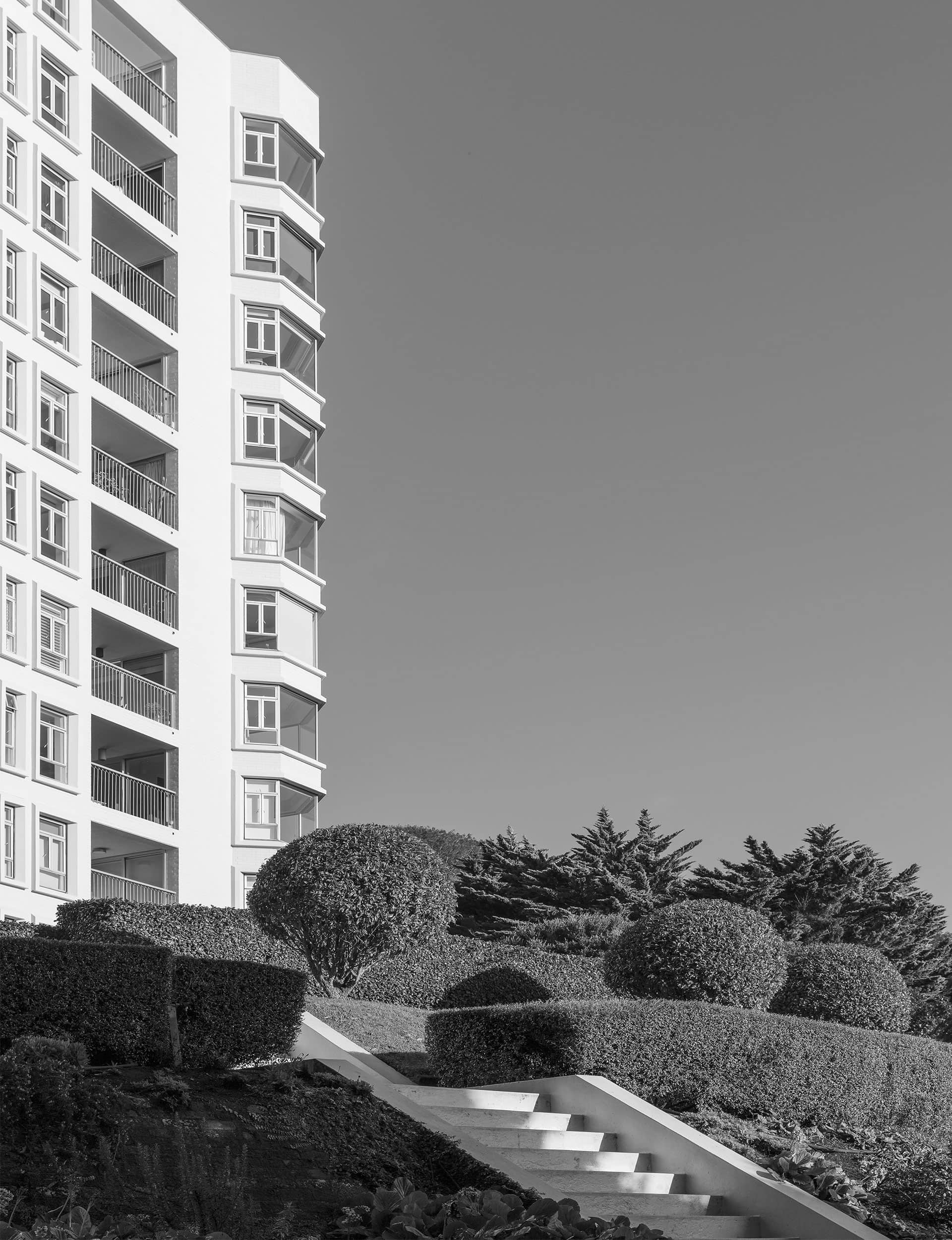
Quite how he came to design ‘The Pines’ – a white wedding-cake apartment tower on the slopes of Maungawhau/Mount Eden in Auckland – remains unclear. Designed in 1968, it was one of Becket’s last buildings (he died in 1969). Though he had previously designed a building in Auckland: the Intercontinental Hotel, which held sway for decades at the top of Waterloo Quadrant and hosted movie stars and musicians, along with locals seeking a fancy evening in its top-floor restaurant.
The Pines was one of a handful of buildings that went up in Auckland in the 1960s and 1970s, when planning rules changed to allow tall apartment buildings in suburban areas. It was the idea of the late Selwyn Robinson, who had lived there since 1930 in a two-storey colonial house on 2.7 hectares of beautifully groomed gardens just off Owens Road, Epsom. (The Queen visited in 1953 and sat in a cane chair beside the pool; Robinson stood by awkwardly in a double-breasted suit.) The site was sold to a developer who promptly demolished Robinson’s house and set about building The Pines. “What’s going to happen to this place when I die?” Robinson wrote of his rationale. “Out will come all the trees and the land will be roaded and carved up for houses.”
Three years later, the reinforced concrete building was complete: 40 apartments over 10 storeys of scalloped white tower with deep balconies and faceted bay windows sat respectfully among the groomed grounds that Robinson had wanted to protect.
Built from bright-white bricks specially manufactured by Ceramco, five decades on, The Pines is no less of a beacon: you can see it as you drive north on the motorway above Newmarket. The approach is through tall, white gates and up a smooth driveway that curves between century-old trees, some of which predate the property, and manicured lawns (five full-time gardeners tend the grounds).
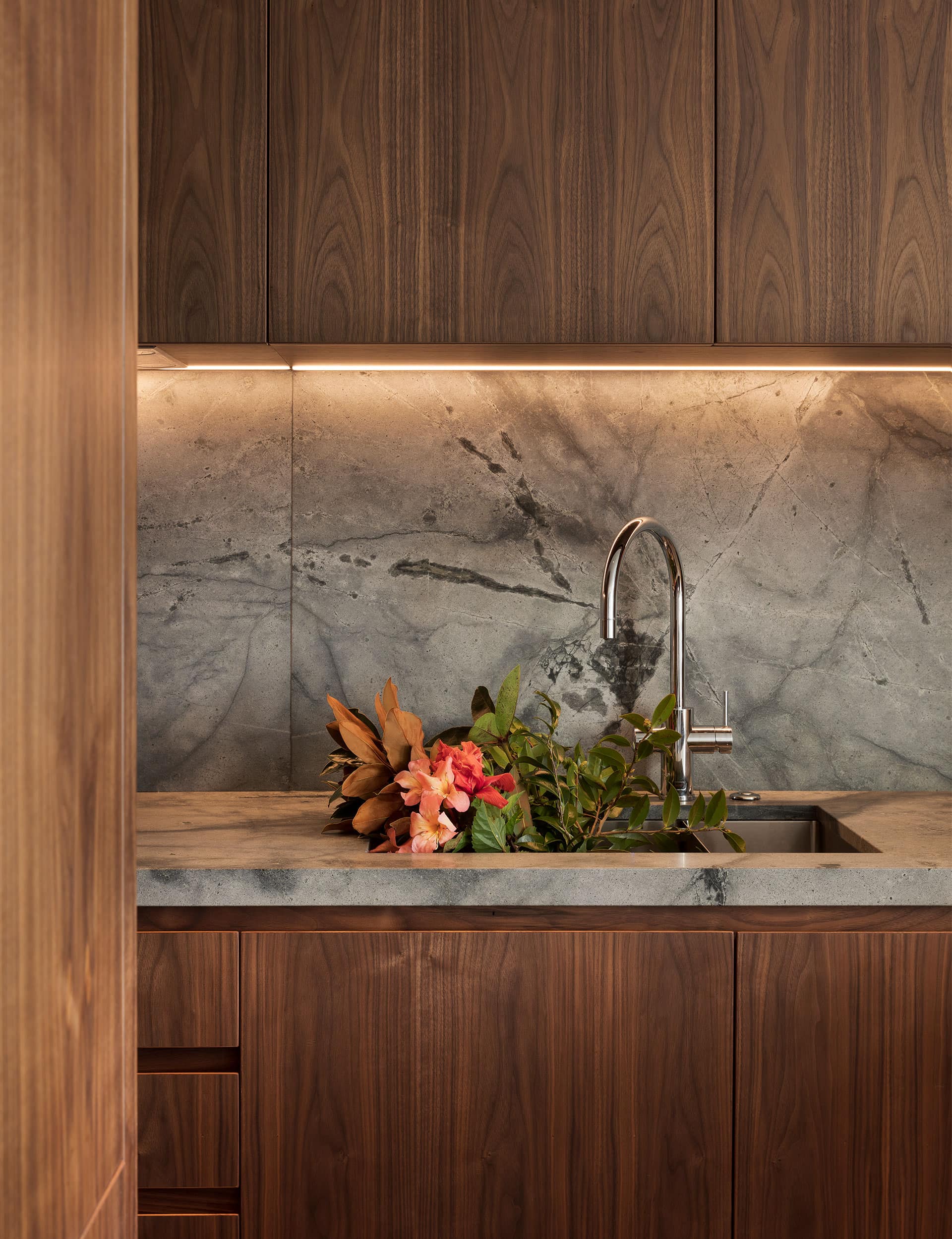
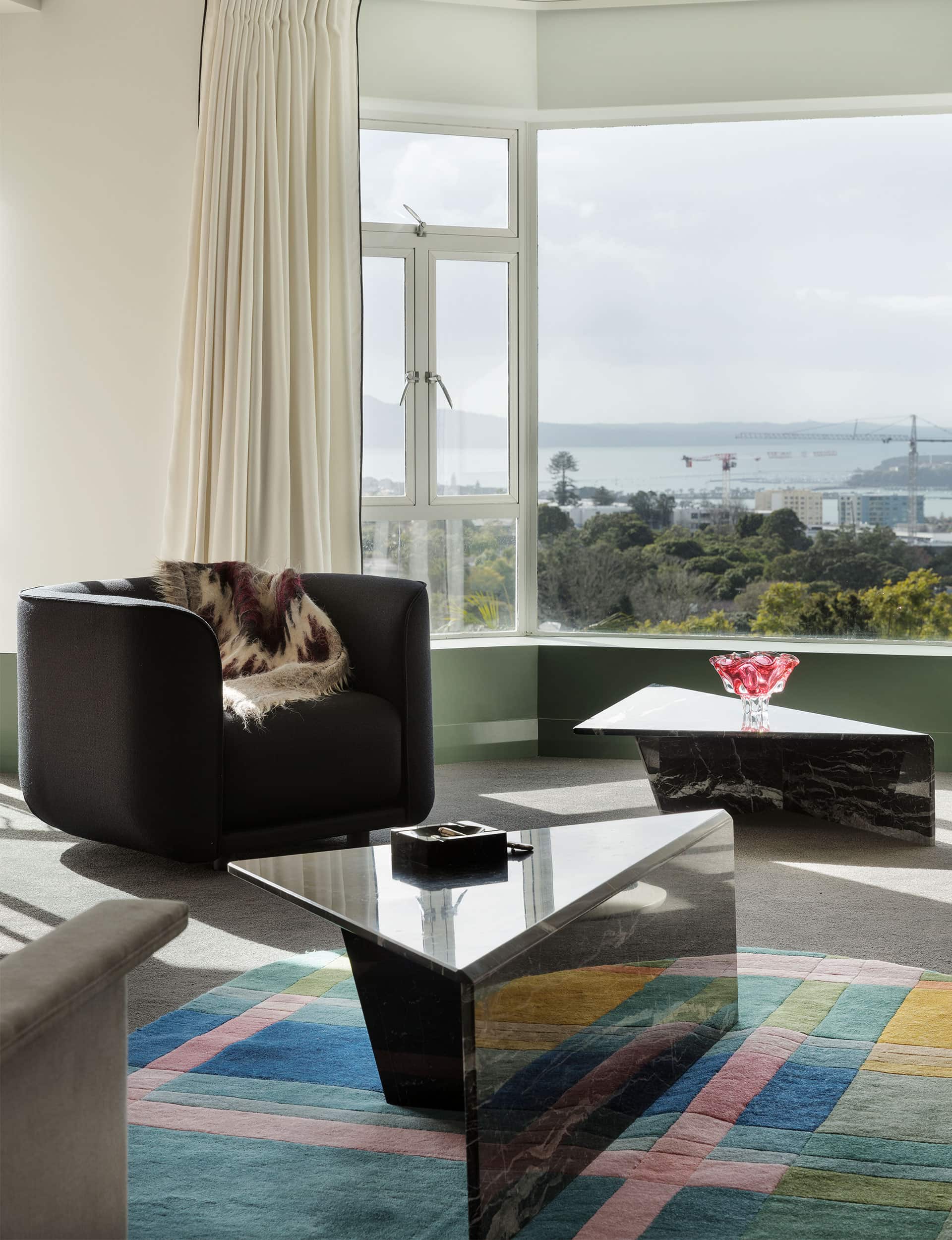
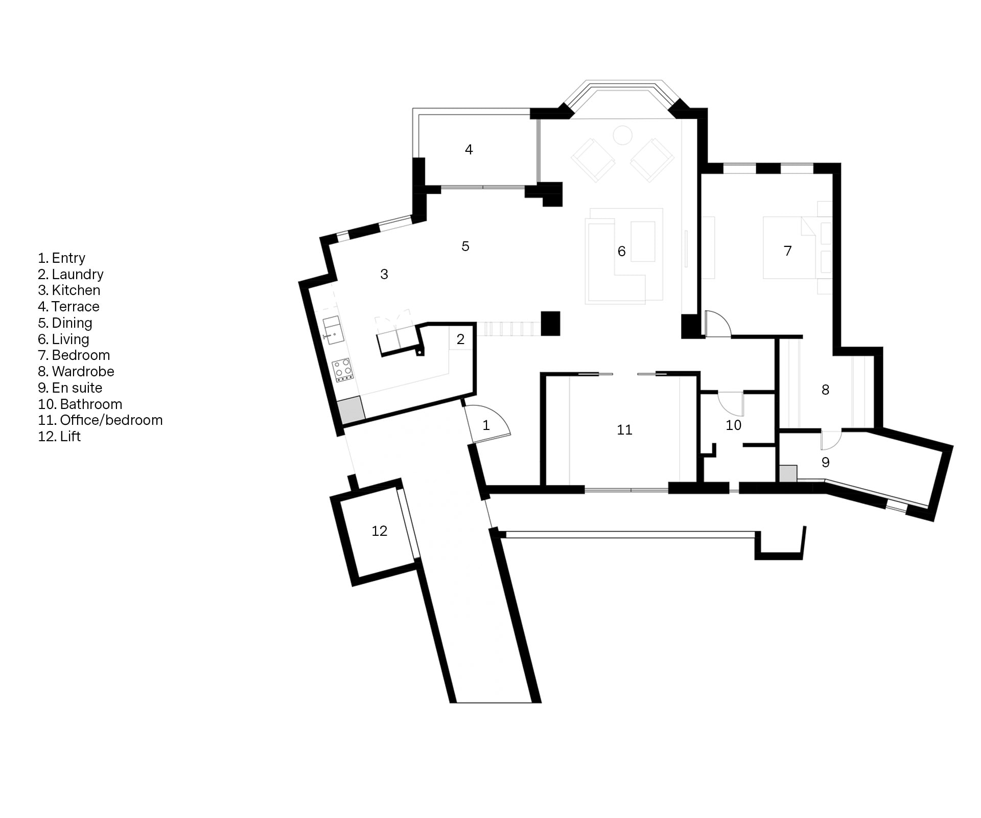
The apartment on these pages was redesigned by architect Dom Glamuzina for his father Graham. Over the years the second-floor dwelling, which has spectacular harbour views, had fared badly with layer upon layer of tiles and a pastel kitchen. The building might have been fabulous, but its faceted semi-circular exterior leads to a multitude of interior angles, with services all over the place. “It’s all based on the view,” says Glamuzina, “but it’s almost like they didn’t think about the planning of services. It was a matter of us trying a million times to make it efficient and make it work.”
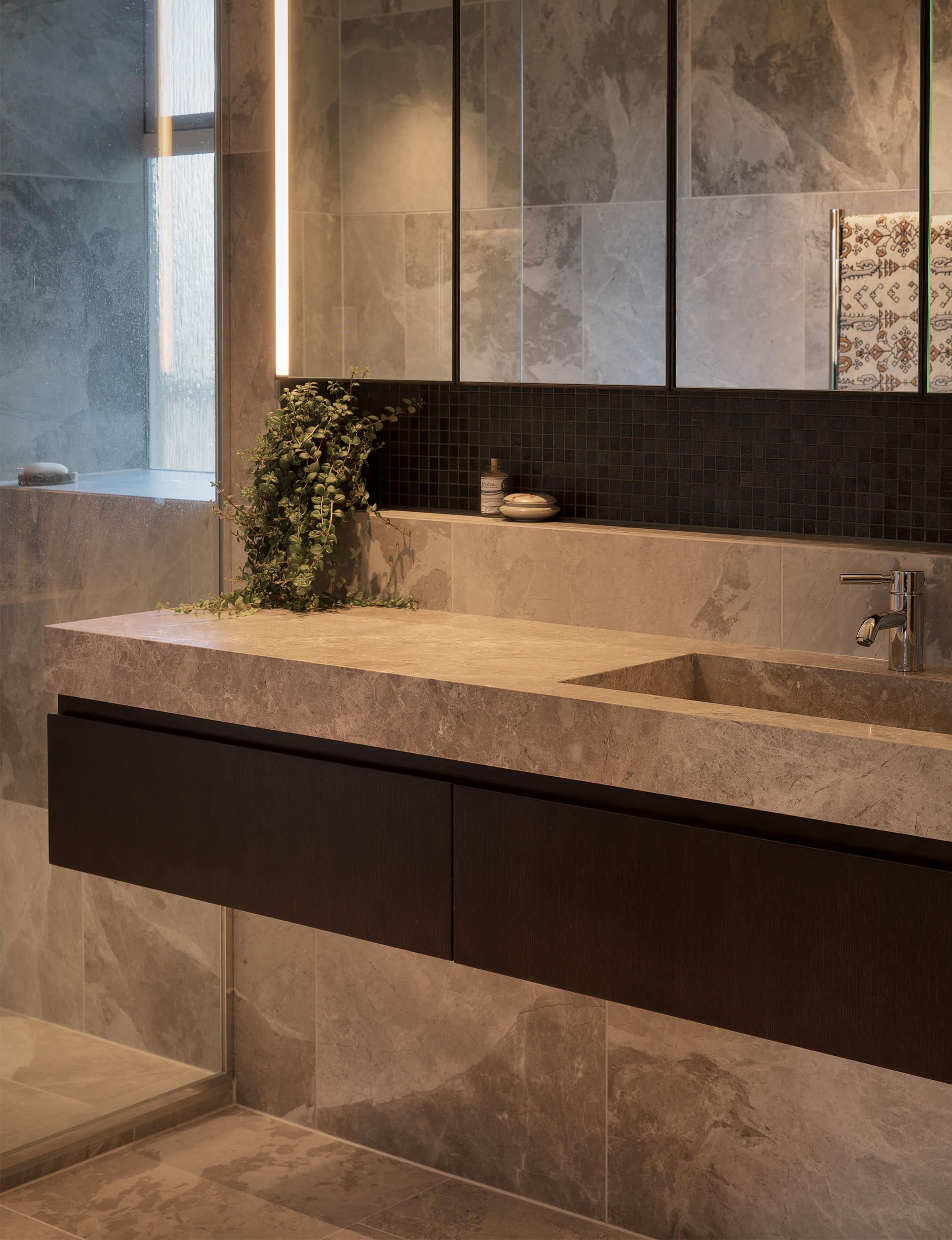
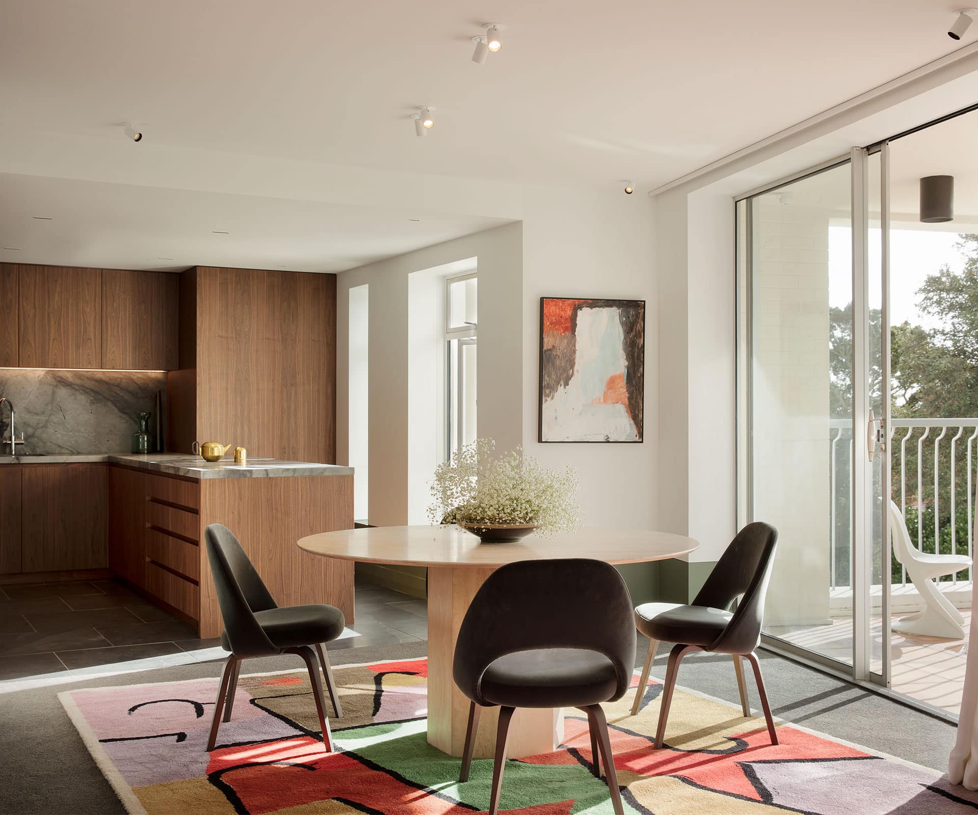
Glamuzina gutted the apartment and mapped the services, then restored everything and rebuilt walls and ceilings. Functions and rooms in the open-plan space are now defined by bulkheads and changes in ceiling height. A generous entrance precedes the open-plan living room and kitchen, off which is a spare bedroom, with the main suite located along the far end of the apartment.
Glamuzina left things largely in place, but refined the flow – opening the living area to the kitchen and tucking a laundry and service area behind; a ‘peninsula’ bench provides a delightful place to linger in the open-plan space.
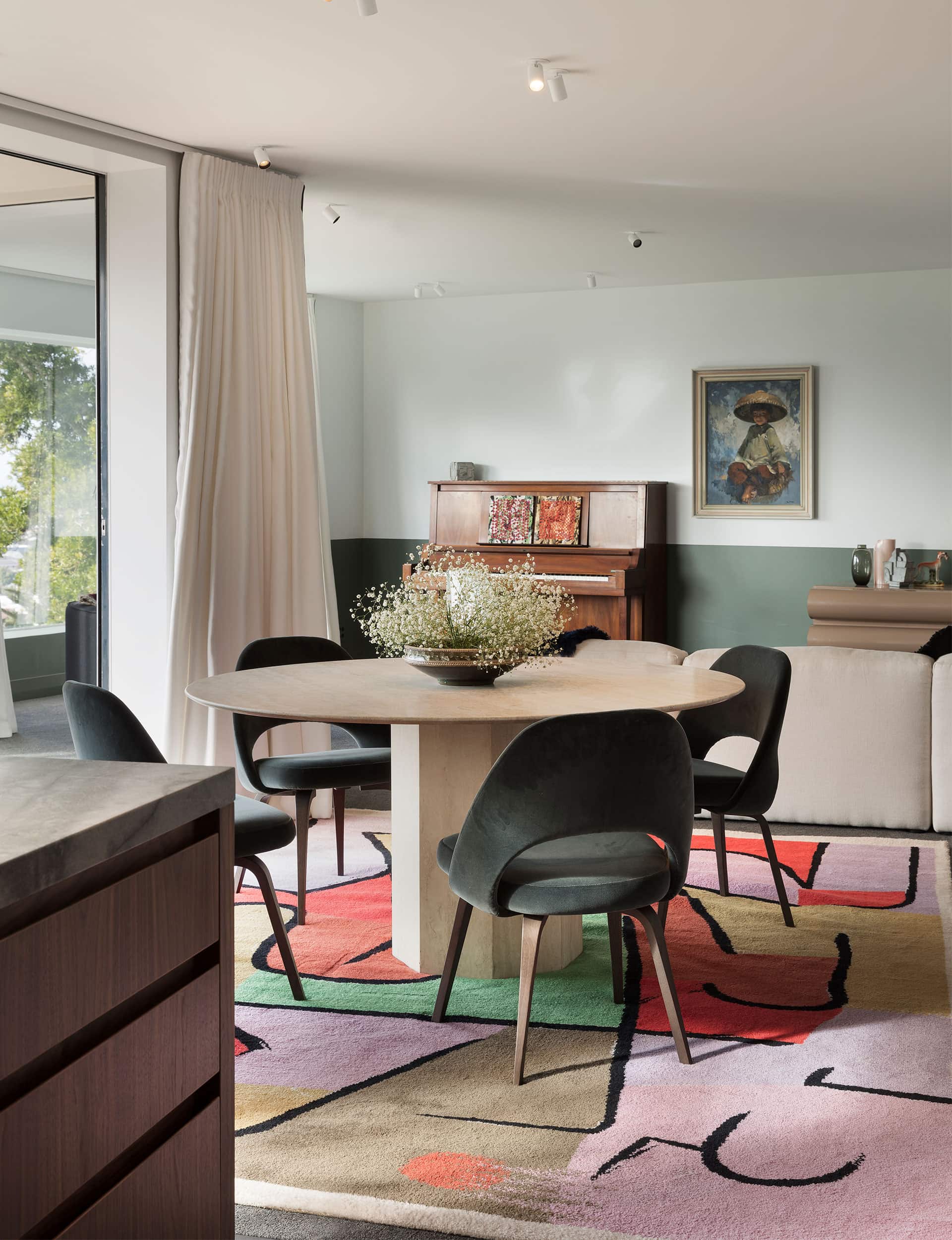
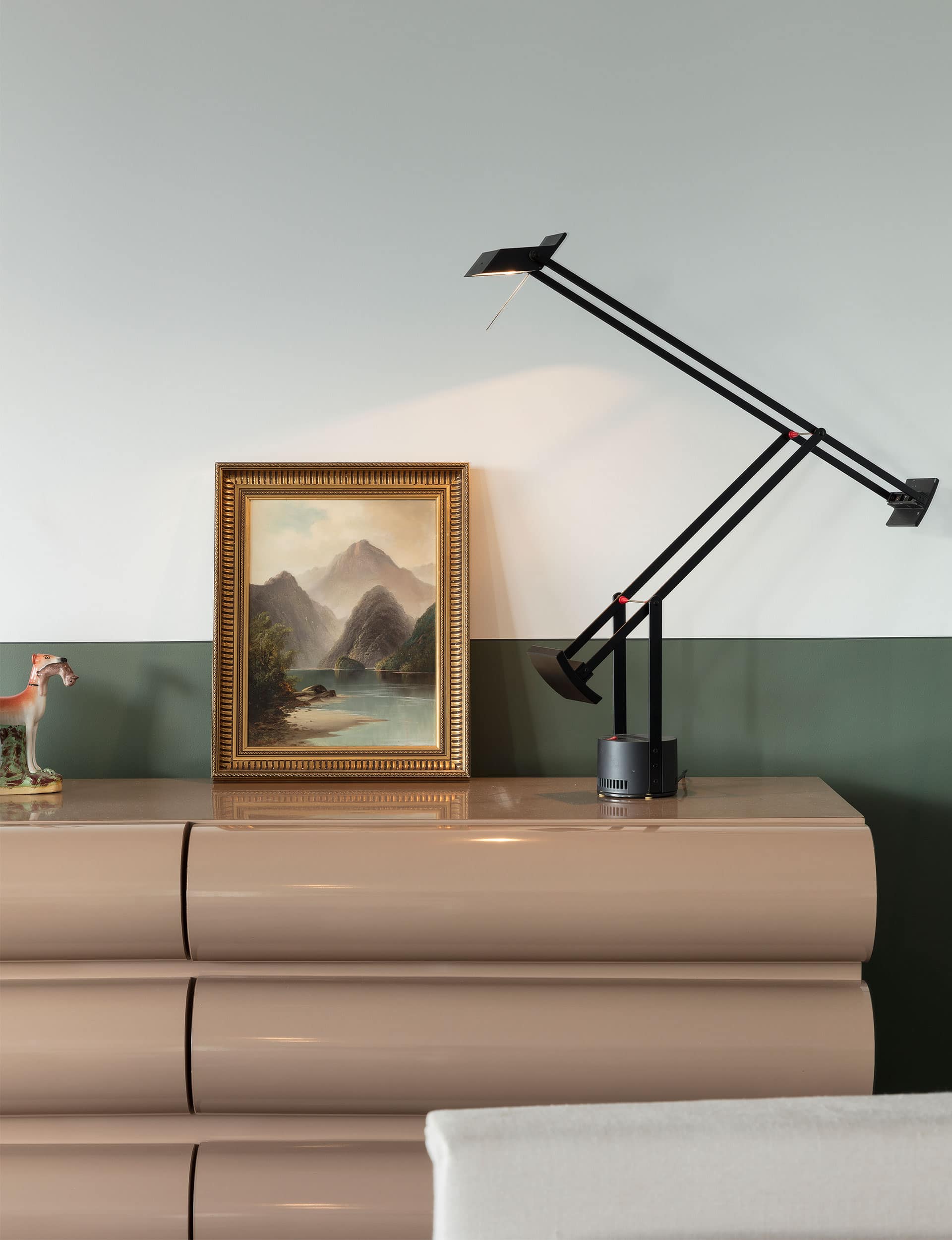
Part way into the project, the architect brought in designer Natalie Parke of Dessein Parke and together they set about creating a softly glamorous palette of green, walnut, brass and marble. “We talked a lot about the use of colour here and how to deal with it,” says Glamuzina.
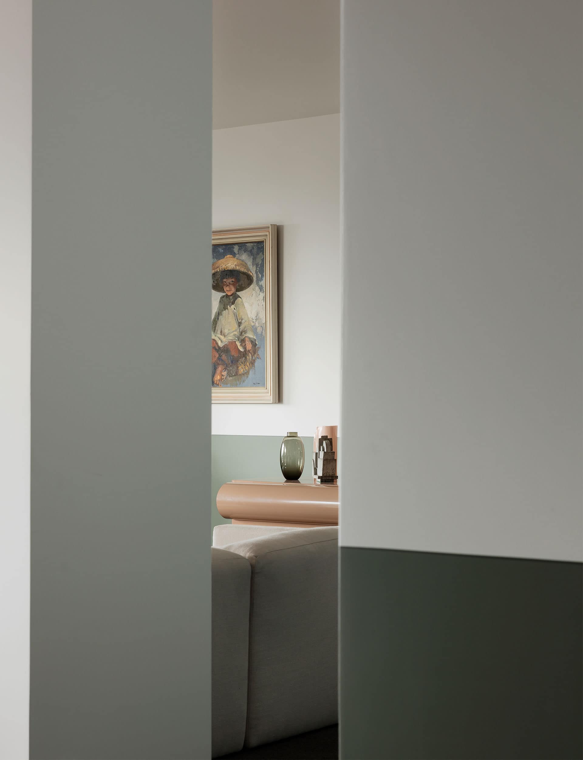
They initially discussed block colours, before realising this approach would enclose the space. Instead, they designed a ‘dado’ line that shifts up and down throughout the apartment. Sometimes, the rich green (‘Happy Valley’ by Dulux) sits on the skirting board; sometimes it runs full height. In other places, it sits half way up. “The lines are quite deco and the spaces are quite awkward,” says Parke, “so the dado evens things out a little. Largely, it’s in keeping with the feel of the place.”
It’s an approach that Welton Becket, we imagine, would have enthusiastically approved.
Words by: Simon Farrell-Green. Photography by: Sam Hartnett. Styling by: Natalie Parke.
[related_articles post1=”85202″ post2=”83604″]